• Blog
  • Shop
  • Resources
  • FAQ (Ask TGS)
  • About
  • Archive
  • Contact
  • Sign In My Account
Menu

The Gentleman Stationer

Vintage Living in the Modern World.
  • Blog
  • Shop
  • Resources
  • FAQ (Ask TGS)
  • About
  • Archive
  • Contact
  • Sign In My Account

Ink Brand Profile: New Monteverde Inks

June 7, 2017

After a bit of a hiatus, I recently started publishing ink reviews again. "The ink review" can be a staple of the pen blogger's repertoire, especially when a blog is young and you find yourself having to finance most of your own content (i.e., buy stuff to review). Ink samples come cheap, and most of us pen nerds have a nearly endless supply of ink at home anyway. 

The flip side of this is that the ink review space is crowded, with many excellent blogs specializing in ink alone. In order to get your ink reviews to stand out, you need to do something unique to develop your own "take" on things. Otherwise, you risk getting lost in the crowd. My standard ink reviews are admittedly nothing special, and don't get as much attention as a lot of the other content I publish. 

This year I decided to focus more on the brands as a whole, rather than doing a lot of reviews of individual inks, in part because the distinct manufacturer and brand trends and identities are what really interest me about stationery in the first place. You may have noticed my broader-scope reviews of Blackstone Inks, Bookbinders, and Robert Oster. So what's up next? Well, in what might be my favorite "brand revitalization" story in the past couple years, Monteverde has completely overhauled their ink lineup and launched over 30 new colors. I've had the opportunity to use four different colors over the past couple months, and I'm impressed. 

Background on Monteverde Inks

Monteverde is a brand that's owned by Yafa, a large pen company that also owns Conklin and distributes Italian brands Delta and Stipula. Monteverde has been selling their own inks for a while, and previously featured a standard color lineup of black, blue, green, brown, etc. While I've tried these inks, and they were certainly serviceable, I don't recall them being nearly as vibrant as the new colors.  In truth, they were fairly boring. (Somewhere around here, I still have a bottle of a dark gray ink they gave away to attendees at one of the past D.C. Pen Shows....) 

What do we know about Monteverde's new inks? For starters, they're made in Austria, and the rumor is that the inks come from the same factory that makes Montblanc. I have no idea whether it's true or not, but I will note that the new Monteverde inks behave similarly to Montblanc inks, in terms of dry time, feathering, etc. That is, the inks dry very quickly, even with a wet nib on Tomoe River paper, and the feathering and bleed-through is minimal, even on cheap copy paper. In case you haven’t noticed, these properties are basically my “gold standards” for inks. I often feel that I'm repeating myself, saying the inks that I use are “well-behaved” in this sense, but given the cheap paper that I have to use daily at work, if an ink bleeds and feathers all over the place, it’s useless to me. A “good” ink for my purposes also needs to dry quickly, since I generally take a lot of notes in a short period of time, and have to be able to turn the page without wondering whether or not the ink’s going to smear. Monteverde credits "ITF" - Ink Treatment Formula - which apparently is some sort of additive (probably a lubricant) designed to improve ink flow and "stave off clogging and corroding." I can’t vouch for these claims, but I will say that so far, Monteverde’s new inks check all of my boxes in terms of usability. 

On to the Color Selection....

While the Moonstone is more muted, the Burgundy, Chaorite, and Mandarin Orange are vibrant, and definitely stand out on the page. 

I’ve tried four different bottles of this ink so far: Moonstone, Chaorite, Mandarin Orange, and Napa Burgundy. I've enjoyed them all, but my current favorites are probably the Burgundy (of course) and the Chaorite. Some specific comments on each one in turn: 

  • Chaorite: The most surprising of the bunch, since I’m not a huge purple ink fan, but this one’s reminiscent of Private Reserve Tanzanite (only better behaved). It’s also been compared to “Blurple,” a “custom” ink made famous by Richard Binder that’s a 50/50 mix of Waterman Purple and Waterman Blue. Personally, I prefer the Chaorite, because it doesn’t take on the faded, washed-out look that Waterman inks sometimes do once they dry. 
  • Moonstone: A unique ink that looks like a brown when it’s wet, but dries to a dark greenish/brownish/gray shade. Despite being somewhat dry, it still flows well. It’ s probably my least favorite of the four, but a great color nonetheless and one I’ve used regularly. I'd recommend using it in a broader nib, as it can appear very light in a fine or extra-fine, especially on less-absorbent paper.  
  • Napa Burgundy: I love wine-colored, burgundy inks, and this is a great one, reminiscent of Montblanc Burgundy and Bordeaux. Great flow and extremely fast dry time. Doesn’t crust up on nibs, which is always a plus in a red ink. 
  • Mandarin Orange: A solid bright orange color that’s bright enough to use in extra-fine and fine nibs. Some oranges can get a little washed-out looking if they’re not saturated enough, but this one stands out fine in my Sailor Pro Gear Imperial Black. 
Another shot of the Moonstone, in a broader nib, showing a bit of shading. 

Another shot of the Moonstone, in a broader nib, showing a bit of shading. 

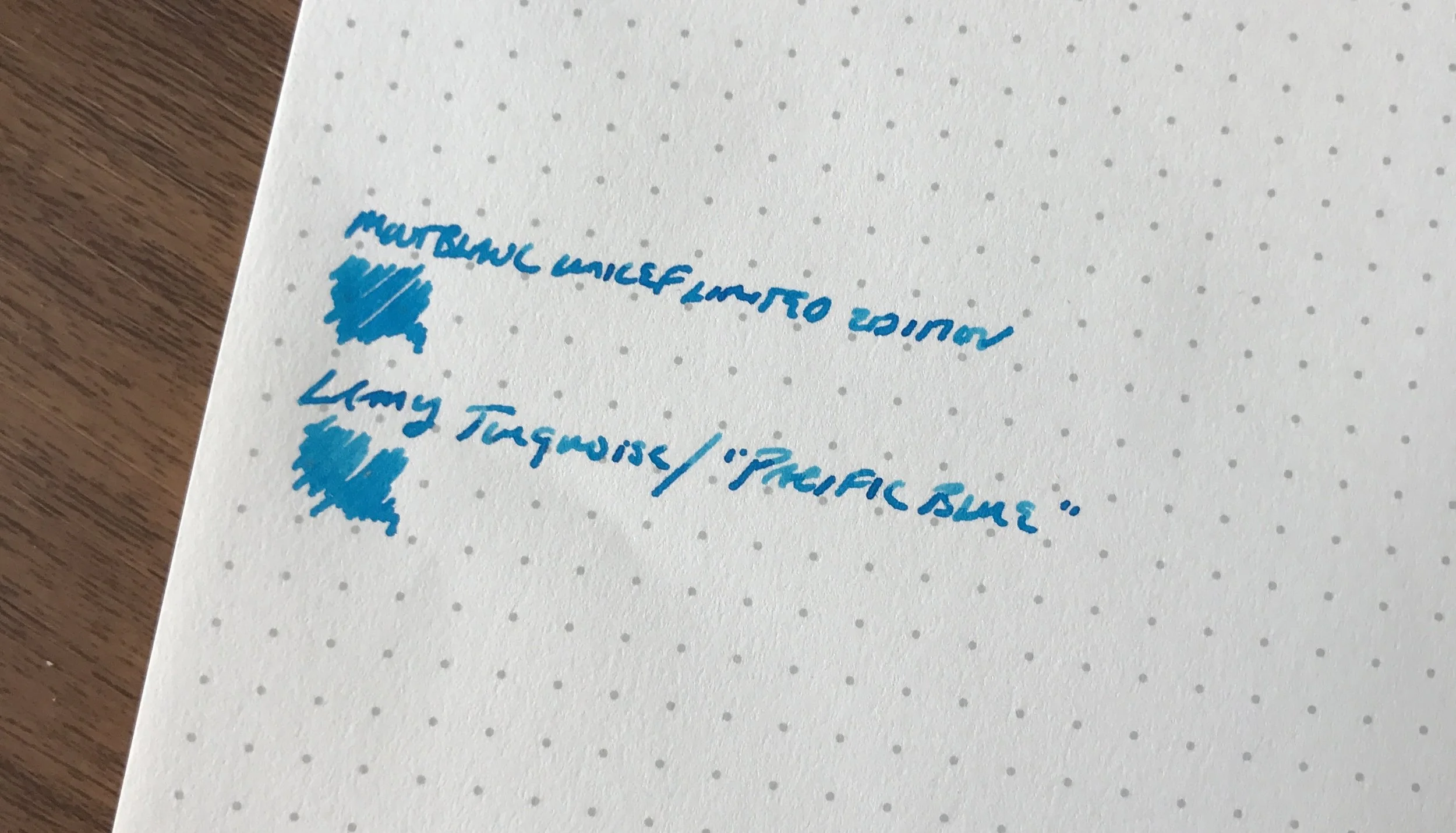
What's next on my list: Olivine, Topaz, and Fireopal. I'd also like to try out a turquoise or another light blue (Caribbean Blue, perhaps?) and see whether I can find an ink that comes close to the Montblanc UNICEF Blue. As I mentioned in a recent review, Lamy Turquoise is close to the UNICEF, but the Montblanc has a richness and sheen to it that Lamy can't quite match.

Note: Monteverde/Yafa appears to have divided these inks into two groups, the "Gemstone" collection, which is where inks such as Chaorite, Olivine, Topaz, etc. are grouped, and standard "fountain pen inks". Most retailers seem to have them all listed together, and while I don't know for sure whether there's any difference between the two groups of ink other than color and naming conventions, I suspect not.  

Where to Buy

Monteverde inks are widely available. I purchased the inks featured in this review from Pen Chalet, which stocks the entire line. Right now, Monteverde inks might be the number one price/value proposition out there. You can get a 30 ml bottle for $8, or a 90ml bottle for $13.50, which is an absolutely insane deal. If you prefer cartridges, or simply like to have a couple packs of cartridges lying around for travel or working outside the house, most, if not all, of these colors are available in 12 packs of cartridges for under $5.  

Disclaimer: I purchased these inks from Pen Chalet for my own use. This post does contain affiliate links. 

In Ink Reviews Tags Monteverde, Ink Review
1 Comment

Ink Review: Lamy Petrol and "Pacific Blue" Limited Editions (Plus a Giveaway!)

June 3, 2017

I missed out on grabbing a bottle of this year's coveted Lamy limited edition ink, Petrol, but fortunately Appelboom came to the rescue and sent me a bottle for review - AND to give away to my readers! I won't pretend to understand Lamy's strategy (or lack thereof) behind its recent limited releases, but for whatever reason they didn't make near enough Petrol, and this ink is sold out at nearly all major retailers. Other than blog giveaways, Lamy enthusiasts looking for a bottle of Petrol will probably be limited to whatever they can score on the secondary market. 

Lamy probably would have sold a ton of this ink had they manufactured it in greater quantities. Petrol is a very dark teal-black ink, making it suitable for professional use. I certainly would have purchased a bottle, maybe two.  Here's to hoping that Lamy will someday expand its standard lineup to include some of the unique colors it's tested out in the past: Dark Lilac, Copper Orange, and Petrol. (Though I'll pass on the Charged Green and its neon brethren.) IMHO, it seems like they're missing a great opportunity to revitalize the ink side of their business.

Lamy Petrol would make a great everyday writer.  

I plan on eventually picking up one of the matching Petrol Safari's, though I suspect they will remain in stock for some time, since you can still find some "Dark Lilac" pens from last year if you look hard enough.  

Don't Forget "Pacific Blue," the Other "Limited Edition"

The other oddity with respect to this year's Lamy releases is that they initially advertised a "Pacific Blue" ink to accompany their "Pacific Blue" AL-Star, only to admit later that it was simply a repackaged version of standard Lamy Turquoise.  Lamy Turquoise is an excellent ink in its own right, but why Lamy would go through the trouble of repackaging and marketing it as a Limited Edition and - at least initially - not voluntarily reveal this fact to retailers and customers is beyond me. (Well, not necessarily beyond me, but I prefer to not think that an established and well-regarded company in this industry would intentionally try to dupe its retailers and customers into purchasing something they may already own.) I've been spending some time with Lamy Turquoise, and it's a vibrant, well-behaved ink with decent shading. It's also a fair substitute for this year's limited edition Montblanc UNICEF Blue, and costs a fraction of the price.  

A comparison shot of Lamy Turquoise against the new Montblanc UNICEF Blue. They look very similar, though the Montblanc looks slightly richer and a bit more saturated in person. 

A comparison shot of Lamy Turquoise against the new Montblanc UNICEF Blue. They look very similar, though the Montblanc looks slightly richer and a bit more saturated in person. 

Where to Buy, and Giveaway Rules

Appelboom stocks the full range of Lamy Ink and other products, and many thanks to them for donating these bottles for testing and a giveaway. I enjoy Lamy inks, even though their standard color lineup tends to be a bit staid. They're widely regarded as "safe" for use in most pens, including vintage. Their black is a favorite of mine, because it has dusty purple/green undertones to it that make it a bit more interesting than your typical black ink. Unfortunately, as I noted above the limited edition Petrol ink is sold out almost everywhere, and retailers currently do not expect Lamy to make additional ink available for sale. However, there's plenty of Turquoise/"Pacific Blue" in stock, as well as the other colors in the Lamy lineup. 

Giveaway Rules and Conditions are as follows: 

  1. In order to enter the giveaway, leave a comment on this blog post indicating which bottle of ink you want. While you don't need to provide your full name, be sure to leave at least some identifying information. (A first or last name plus an initial is generally sufficient.) Lamy ink retails for approximately $12 per bottle, depending on country and retailer.
  2. The giveaway will end at 11:59pm Central Time on Sunday, June 10, 2017. 
  3. At the close of the giveaway, I will assign each entry a number and pick two winners using a random number generator. I will announce the winners on the blog the following Monday or Tuesday and give each winner exactly one week to contact me to provide a shipping address. Information submitted by entrants and/or winners will be used by me solely to ship your item and will not be sold or otherwise provided to Appelboom or any other sponsor. In the event more than one person indicates a preference for the same ink - which I imagine might be the case with the Petrol - the person who reaches out to me first to claim their prize will have first refusal. 
  4. You must leave a comment to enter. Limit one entry and one prize per person. Your odds of winning are directly proportionate to how many people enter. This giveaway is open to everyone, non-U.S. residents included, though I will have to use the cheapest shipping option available, which may not include tracking. 

Disclaimer: I was sent the products featured in this post free of charge by Appelboom for review purposes. I was not otherwise compensated for this review. This post may contain affiliate links.   

In Ink Reviews Tags Lamy Ink, Giveaway, Ink Review
53 Comments

Ink Review: Robert Oster Midnight Sapphire and Astorquiza Rot

May 20, 2017

Robert Oster Signature Inks from Australia is one of the most prolific ink brands on the market right now, seemingly introducing new colors on an almost weekly basis. I recently reviewed their acclaimed "Fire and Ice" ink, and ended up enjoying it despite the fact that I typically avoid highly saturated inks with a lot of sheen. Every Robert Oster color that I've tried has behaved so well - both in pens and on paper - that I'm making an effort to try as many of the inks as I can. A huge thank you to Vanness Pens for providing me with the two ink samples featured in this review.

Robert Oster Midnight Sapphire

The Midnight Sapphire struck me as a touch flat. Maybe it's a bit too gray for my taste? 

While Robert Oster Midnight Sapphire is an excellent ink that can serve as your everyday "blue-black," this color left me wanting something more. I guess the "sapphire" reference led me to expect a bit more blue "pop" than this ink delivers. Once it dries, it actually turns out to be a fairly standard dark blue-black ink with grayish undertones, though it does exhibit some nice shading, especially in a wet nib on Tomoe River paper. 

Robert Oster Astorquiza Rot

Astorquiza Rot is a gorgeous red ink, just not what I expected, and not a color I currently need in my collection. I didn't find quite as much shading as with the Midnight Sapphire.

I would characterize Astorquiza Rot as a darker red with hints of brown, orange, and/or copper. I originally picked this sample because I hoped it could serve as a replacement for my rapidly dwindling supply of Montblanc Alfred Hitchcock Red. As it turns out, the Hitchcock doesn't have nearly as much orange and might have a touch more black. A better comparison to the Astorquiza Rot would be Montblanc's latest William Shakespeare Limited Edition. The search for a Hitchcock replacement continues! 

Robert Oster Astorquiza Rot (top) compared against three other red inks: Montblanc Alfred Hitchcock 2012 L.E., William Shakespeare Velvet Red (current L.E.), and the Diamine/Cult Pens collaboration Deep Dark Red. 

Takeaways and Where to Buy

While neither of these inks blew me away from a color perspective, that's more of a function of my ridiculous ink collection/hoard than anything else. I simply have too many other inks that are too close to these. That said, if you're looking for a nice standard blue-black ink with a fair amount of shading, Midnight Sapphire would be a solid choice. Similarly, if you're looking for a brick/blood red, Astorquiza Rot is a perfectly serviceable red ink that seems to be fairly low-maintenance, which can be rare with colors like red and orange. Both inks flow well, dry quickly, and didn't crust up or demonstrate any other "behavioral problems."  

Robert Oster's Signature Ink Bottle

You can purchase both Midnight Sapphire and Astorquiza Rot, as well as all the other Robert Oster inks, from Vanness Pens. I'm a big fan of Robert Oster's bottles: their tall-and-slim design makes them easy to store, and at $16 for a 50ml bottle, the price is right. 

Further Reading

I've previously reviewed several other inks from Robert Oster. Check out these reviews here:  

  • Brand profile plus a review of Robert Oster Direct Sun, Tranquility, Khaki, Lime Green, and Claret
  • Review of Robert Oster Fire and Ice and Melon Tea

Disclaimer: I was provided with the ink samples in this post free of charge, for review purposes. I was not otherwise compensated for this review.   

In Ink Reviews Tags Robert Oster, Ink Review, Inks
Comment

Robert Oster Inks come in a unique tall, slender plastic bottle, which makes the inks both easier to ship and to store. 

Ink Review: Robert Oster Melon Tea and Fire and Ice

April 8, 2017

Many thanks to Lisa and Mike at Vanness Pens for providing me with some more samples of excellent Robert Oster Inks to test out! The two I'm reviewing today are Melon Tea, a brownish green (or greenish brown, depending on how you look at it), and this year's new hotness, Fire and Ice, which as you might expect from the name is a teal blue with a red sheen. I thoroughly enjoyed both of these inks, and look forward to picking up a bottle of Fire and Ice soon. (I already bought a full bottle of Melon Tea at the Baltimore Pen Show.)

Melon Tea

A writing sample on Tomoe River paper from my Hobonichi Planner. The pen used here was my Kanilea Pen Co. Mauna Kea with a medium nib. 

I'm a big fan of green ink, especially darker shades of green-black or "racing green" inks. Robert Oster Melon Tea undergoes a bit of a color shift as it dries. When I was writing with this ink, I found that it appeared more green when wet, but as it dried the ink darkened and the brown shades became much more apparent. This ink was well-behaved and gave me no trouble whatsoever. It flowed well in the pen, dried quickly, and I didn't experience any smearing or bleed-through on any paper, other than the cheapest of recycled office garbage. 

Fire and Ice 

A shot of Robert Oster Fire and Ice "straight on" without the sheen showing. Note the dark areas of shading in this picture. 

One thing that I love about Robert Oster inks is the fact that the company has been able to achieve such vibrant colors without oversaturating the inks with dye, which typically leads to problems with smearing, slow dry times, bleedthrough, etc. I'd ordinarily be hesitant to try a "crazy" color like Fire and Ice, but this ink received such rave reviews that I had to go ahead and try it for myself.

Another writing sample, this time photographed in the light and from the side. Check out the sheen! 

Fire and Ice is usually described as a dark teal or turquoise that is famous for its red "sheen," which in fountain pen ink terms refers to a layer of color (usually red) that appears on top of an ink as it dries. Other famously "sheen-y" inks include the legendary Parker Penman Sapphire, J. Herbin Emerald of Chivor, and Diamine Majestic Blue (at least in the old formulation). Robert Oster Fire and Ice doesn't disappoint, and is one of those rare hyped inks that functions perfectly well as a daily writer, in addition to having a little something extra to keep things interesting. Like Melon Tea, this ink dries very quickly and doesn't smear at all. I was somewhat shocked at how low-maintenance this ink was. 

Where to Buy

You can purchase both Melon Tea and Fire and Ice, along with many other colors of Robert Oster inks, from Vanness Pens. Robert Oster Inks are reasonably priced at $16 for 50ml, which is a bargain for ink of this quality. As I mentioned earlier, I love the form factor of the Robert Oster bottles, which are tall and skinny and make for easy storage in a drawer. They even include a label and color swatch on top of the cap!

If you missed my previous review of some other Robert Oster colors, check them out here! 

Disclaimer: Thanks to Vanness Pens for providing me with the inks featured in this review. I was not otherwise compensated for this post in any way. 

In Ink Reviews Tags Robert Oster, Ink Review, Vanness, Melon Tea, Fire and Ice
Comment

Pictured here: No. 9 Suma Purple

Sailor Kobe Inks: Completionists Need Not Apply

March 1, 2017

My obsession with Sailor ink knows no bounds. If I had to choose a favorite brand of fountain pen ink, it wouldn’t even be close: Sailor would win easily. I probably have nearly two dozen bottles of current and discontinued Sailor inks, including doubles stashed away "for posterity" as well as some exclusive inks manufactured for Japanese retailers. (For more on why I like Sailor ink in general, check out this post that I did last year.)

What I wanted to write about today are the “Kobe Inks” - the line of ink that Sailor manufactures and bottles for the Kobe-Nagasawa Department Store in Kobe, Japan. While the inks that Sailor makes for Bungubox (or “Bung Box”) - another Japanese retailer located in Hamamatsu - have received most of the attention and acclaim in the pen community (probably due to the tulip-shaped ink bottle that they unfortunately no longer use), Kobe inks tended to get overlooked. Last I checked, there were nearly 60 different colors of ink in the Kobe line, a few of which are similar to colors Sailor has issued elsewhere, but many of which are unique. 

I have four Kobe Inks in my collection: No. 4 (Foreigners’ Residence Red); No. 6 (Kobe Bordeaux); No. 9 (Suma Purple); and No. 37 (Harbour Island Blue). The inks are numbered for ease of reference, though they’ve also been given names that correspond to various places in Kobe and other themes of the city. I ordered No. 4 and No. 37 from Vanness  Pens, who stocks most of the ink, and I picked up bottles of No. 6 and No. 9 from Kobe-Nagasawa directly at the 2016 D.C. Pen Show, where they had a table. It was something else to see that many bottles of Sailor ink - and so many different colors - stacked up in one place.

I like all four of the Kobe Inks that I currently have, but I need to add some of the greens, golds and oranges that can be found in unique shades that many ink manufacturers don't attempt. 

It amazes me that Sailor can manufacture such a wide range of ink colors without running into manufacturing problems with certain batches and/or specific colors. Other ink brands like Diamine generally have a good reputation in terms of ink quality and behavior but occasionally people will experience issues with super-saturated colors (especially reds and oranges) clogging nibs, staining, or feathering on cheaper paper. Not so with Sailor. Out of all the colors of Sailor ink that I’ve tried, I have yet to find one that doesn’t function reasonably well on cheap recycled office paper. I’d also add that some of the shades of green, gold, and orange they offer can’t be found elsewhere, with the possible exception of KWZ.     

Part of the Kobe-Nagasawa table display at the 2016 D.C. Pen Show. Vanness Pens picked up whatever stock they had left at the end of the weekend (which wasn't much!). 

Where to Buy

There’s no longer any need to navigate the world of overseas eBay sellers or third-party shipping agents if you want to get your hands on some Kobe inks.  Vanness Pens carries most of the line (54 colors, last I checked), and currently have most colors in stock. The ink is priced at $30 for a bottle or $4 for a 4ml sample, which is a premium over standard Sailor inks but hey, you won’t find these colors anywhere else. Just be warned - hunting for that "perfect" color can get addictive. (Not to mention expensive!) 

Disclaimer: I purchased the ink featured in this review with my own funds for my own collection, and was not compensated for this post. 

In Ink Reviews Tags Kobe, Sailor Ink, Vanness
7 Comments
← Newer Posts Older Posts →
Store Hours and Location
Visit the T.G.S. Curated SHOP
*New* Updated "Best Pens" Guide (2025)
TGS x Hinze Pens Violet Tendencies Taschenstift Fountain Pen
Hierarchies of Fountain Pen Friendly Paper
Allex Scissors arrayed on a desk showing link to desk accessories

Join Our Patreon!
Subscribe to the TGS E-mail List

Featured Posts

Featured
Iro-Utsushi-Fine-Dip-Pens.jpeg
Oct 1, 2025
The Pilot Iro-Utsushi Dip Pen (and in General, Simple vs. Fancy Dip Pens)
Oct 1, 2025
Oct 1, 2025
Levenger-Annotation-Pad.jpeg
Sep 20, 2025
Five Boutique Paper Brands I'm Watching Closely and Why
Sep 20, 2025
Sep 20, 2025
Playing-ink-MD-Cotton-Glass-Pens.jpeg
Sep 17, 2025
What's On Your Desk? My Personal Favorite Papers for Fountain Pens, 2025
Sep 17, 2025
Sep 17, 2025
The Gentleman Stationer RSS

© Digital Divide Media, LLC, 2014-present.

All content is the exclusive property of Digital Divide Media, LLC, d/b/a The Gentleman Stationer, including “The Gentleman Stationer” website and trademark, and should not be reproduced without express written permission.  All rights reserved.

All content containing paid advertising, affiliate links, or sponsored content will be plainly disclosed by a disclaimer when/if featured.

Contact Information

Store Shipping Policy and Return Policy

Privacy Policy

Cookie Policy

Terms and Conditions

Powered by Squarespace