• Blog
  • Shop
  • Resources
  • FAQ (Ask TGS)
  • About
  • Archive
  • Contact
  • Sign In My Account
Menu

The Gentleman Stationer

Vintage Living in the Modern World.
  • Blog
  • Shop
  • Resources
  • FAQ (Ask TGS)
  • About
  • Archive
  • Contact
  • Sign In My Account

Ink Review: Did Scribo Create the Best Ink Bottle Ever?

January 14, 2021

Scribo (a portmanteau of “Scrittura Bolognese”) launched following the closure of Italian pen company OMAS, helmed by former employees who sought to recreate the same writing experience loved by generations of devoted OMAS fans. While Scribo is not a direct descendant of OMAS (the assets of the company itself were acquired out of liquidation and revived in 2018 under the label “Armando Simoni Club”), many in the pen community have found that Scribo’s nibs are the closest you can get to the feel of OMAS in a modern pen. Scribo, however, makes no attempt to duplicate the look of OMAS, with their pens and inkwells taking on a unique new aesthetic that makes the brand a lot of fun to use. I’m working on a more in-depth review of the Scribo “Feel” fountain pen, which will follow in the near future, but today enjoy this look at the company’s excellent line of inks.

Scribo inks arrive in what I can only describe as an absolutely gigantic, 90ml glass bottle. While the ink is priced at $39 per bottle, the quantity of ink you receive, presentation, and practicality of the bottle put a lot of other ink companies to shame. I love the look of the square bottle, and the wide opening and deep inkwell allow you to fill even the largest pens with ease. Another feature many have commented on is the ability to “stack” these bottles for easier storage. While you can certainly stack the bottles - the underside is hollowed out to fit over the cap of another - given the weight of these things I wouldn’t recommend stacking them more than 2-3 bottles high. Otherwise things get a little “wobbly.”

View fullsize Scribo Ink Bottles Unstacked
View fullsize Scribo Ink Bottles Two Stack
View fullsize Scribo Ink Bottles Three Stack

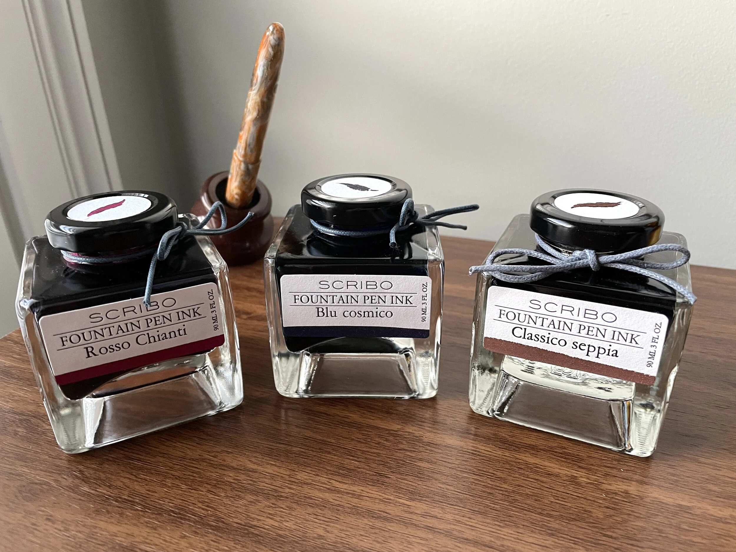
The ink itself performs nicely. The insert that Scribo includes with each bottle indicates that the company designed the ink to flow well in their extra flexible nibs, and the ink does writes fairly wet. That said, I’ve found Scribo ink to dry quickly, not smear, and not feather or bleed on fountain pen friendly paper. (It’s a bit of a mess on less expensive office copy paper, as are most wet inks.) Currently, the colors I have tested are: “Blue Cosmico” (Blue-Black), “Rosso Chianti” (a wine red), and “Classico Sepia” (a rich brown).

Scribo Rosso Chianti. The color is slightly more muted and purple IRL than in the photo, which leans towards magenta. That tone is definitely there, but it’s not as pronounced..

Scribo Blue Cosmico

Scribo Classico Sepia

Takeaways and Where to Buy

Scribo offers another good example of how the heritage of beloved former brand can live on in a new company, while still continuing to grow and bring new ideas to the table. I loved the old Omas octagonal ink bottles, but I may enjoy Scribo’s even more, and the ink itself is so good that I’m already looking to add additional colors to my collection.

I acquired these Scribo inks from Appelboom, located in the Netherlands, and international shipping is free on orders over 200 Euros. You can also purchase Scribo inks from Vanness Pens in the U.S. Bottles are priced around $39 U.S, for 90ml of excellent ink.

Disclaimer: I acquired the ink in question from Appelboom, using credit generated through the Appelboom affiliate program. The links in this post are NOT affiliate links, as I am moving away from an affiliate revenue model going forward.

In Ink Reviews Tags Scribo, Scribo Ink, Ink Review
2 Comments

Happy Holidays: A Review of Ferris Wheel Press Peppermint Drop / "Tourbillon de Menthe"

December 2, 2020

I’m officially declaring post-Thanksgiving “Cyber Week” over (at least for me), and it’s time to get back to business as usual. What better way to kick off December and the holiday season with an ink called “Peppermint Drop,” from a brand I’ve never reviewed before?

If you spend any time at all on stationery social media, you’ve probably heard of Ferris Wheel Press, a Canadian company based in Toronto that launched on Kickstarter back in 2018. While I appreciated the carefully crafted, vintage look of the brand, I didn't think the products themselves would be for me. I had heard mixed reviews about the initial batch of inks, with reports of feathering, bleed-through, and slow dry times. Ferris Wheel Press also had introduced a fountain pen, the “Brush,” which I found aesthetically interesting but too slim for my taste. Since then, Ferris Wheel Press has expanded their line of products to include more than a dozen inks, notebooks, paper, and other stationery accessories, and apparently they’ve also perfected their ink formulations.

Yet again, I’m a perfect example for why you should occasionally venture outside of your comfort zone. Lisa Vanness was kind enough to send me a 38ml bottle of Ferris Wheel Press “Peppermint Drop,” (or, “Tourbillon de Menthe”, for the francophones out there). Not only is the Ferris Wheel Press ink bottle exquisitely crafted, but I’ve had nothing but good experiences with the ink itself, and to the extent there have been issues with other colors, Peppermint Drop behaves well and might be the perfect green to use in December. I’d describe it as a “true green” with slight hints of teal, and you may get a minor degree of red sheen in swabs or wetter nibs.

Again, while the ink itself is quite good, equal attention needs to be paid to the bottle. Ferris Wheel Press originally received a lot of attention and press in the pen world for their larger, 85ml balloon-shaped bottles, but they have since introduced a smaller, 36ml bottle reminiscent of a vintage perfume bottle (or even a flask). Each bottle has a brass cap, which combined with a rubber interior seal should be durable and minimize leakage. The flat profiles on these bottles also makes them easy to store.

Takeaways and Where to Buy

I’m glad that Vanness sent me this ink to review, because Ferris Wheel Press is one of those brands that I probably would not have chosen to review myself. I suspect a lot of pen enthusiasts have taken a pass due to the brand’s conscious branding and social media promotion, which they take as a sign that these accessories aren’t for serious writers. That’s not the case. Peppermint Drop is an excellent ink that dries quickly, even on coated paper like Clairefontaine, and doesn’t feather or bleed at all. I could easily use this ink as an everyday writer and I’m interested to see if the other options in the Ferris Wheel Press lineup follow suit.

Our friends and sponsors at Vanness Pens carry the full line of Ferris Wheel Press inks, including the ink featured in this review. As I mentioned above, Ferris Wheel Press inks are available in two different bottle sizes: a larger 85ml bottle and a smaller 38ml bottle, priced at $36 and $18 respectively.

Disclaimer: The ink featured in this review was provided by Vanness Pens free of charge, for review purposes. Many thanks to Vanness for making this review possible!

In Ink Reviews Tags Ferris Wheel Press, Ink Review, Vanness Pens
Comment

Ink Review: Sailor Ink Studio 140

September 16, 2020

In Japan, Sailor holds "Studio” ink events, where you can have their master ink blenders custom blend a bottle of ink tailored to your preferences. Looking to further capitalize on the ink collecting craze, Sailor released 100 of these blends into the global market, and they hit U.S. retailers in 2019. I confess that I’m not as much of an ink obsessive as I used to be. Don’t get me wrong - I still have more ink than I will ever be able to use in my lifetime, but at some point when I see companies like Sailor and Colorverse releasing dozens of inks at a time, much less hundreds, I sort of throw up my hands and stop trying to keep track.

Some people are frustrated that Sailor moved to a smaller 20ml bottle while keeping the same pricing. Honestly, after thinking on it, the shift doesn’t bother me all that much. I’ve used maybe 3 or 4 full bottles of ink in my lifetime, and it’s probably less wasteful to purchase smaller bottles. Bringing this many different colors to market also increases production costs.

That said, the more pictures I saw of some of these Sailor Studio inks, the more they intrigued me, particularly the “double shaders,” a term that refers to inks that exhibit not just shading in terms of different tones of the same color, but different colors entirely. For example, Sailor Ink Studio 140 shown here has lavender undertones that emerge in a swab and when you write with a wetter nib.

You can see the shading, but the double-shading on this particular ink is more subtle and it didn’t photograph well. In person, you will see hints of light purple/lavender (even pink, maybe?) in the darker areas of the swab and handwriting sample.

The best thing about the Ink Studio lineup is that it’s reliable Sailor ink. Adding special properties such as sheen and shading (particularly sheen) can sometimes cause problems with ink failing to dry quickly and smearing. Not so much with Sailor, as I’ve had uniform success using any ink released by the company, and it has long been one of my favorite brands of ink to use in any pen.

The paper used for this ink review is Write Notepads Dot Grid Paper, which holds up beautifully to a wet ink swab and really shows off ink colors well.

Sailor Ink Studio 140, which is the ink pictured in this review, is a sky blue similar to Souten from the Jentle series, but perhaps a touch lighter. I had heard others remarking that some of the double-shading Studio inks can be very light, so I had some concerns that this one would be unusable for me. As it turns out, while No. 140 is light, it’s quite legible, and I had no issues using this for everyday writing, especially in a slightly wet Franklin-Christoph steel flex nib.

Takeaways and Where to Buy

As long as you’re not an “ink completionist” who feels compelled to sample every ink in a lineup, you can have a lot of fun with the Sailor Ink Studio lineup. Personally, I want to try a lot more of these “double shaders” like No. 140. The Studio Inks are sold in Sailor’s smaller, 20ml bottles priced at $18 each, and are available at site sponsor Goldspot, who provided this ink for review. Many thanks to Goldspot for making this review possible!

Disclaimer: This post contains links to paid sponsors and affiliates. Goldspot provided the bottle of ink featured in this review free of charge, for review purposes.

In Ink Reviews Tags Sailor Ink Studio, Sailor Ink Studio 140
Comment

First Look: Van Dieman's Ink

June 17, 2020

While it’s uncommon for me to run across “undiscovered” lines of ink, occasionally it happens. Such was the case with Van Dieman’s Ink, an Australian brand based in Launceston, Tasmania. Per the company’s website, they have 54 inks in their collection, 12 of which are shimmering, organized into five themed series: “The Original Colours of Tasmania,” “Hollywood,” “Midnight,” “Wilderness,” and “Tassie Seasons.” According to Yagan (Macchiato Man), who previously reviewed the brand, “Van Dieman’s Ink” is a reference to “Van Dieman’s Land,” the former name for Tasmania given for Anthony Van Dieman, a Dutch colonial governor and a backer of early expeditions to Tasmania. While Van Dieman’s Ink has been available to Australian fountain pen users for a while, U.S. retailers only recently have begun stocking these inks.

The box art on the “Wilderness” and “Midnight” series somewhat reminds me of Noodler’s Ink.

I ordered four bottles: Three inks from the “Wilderness” series and one ink from the Midnight Series. Of these four, I’ve spent the most time with the Wilderness Inks. “Black Tongue Spider Orchid” is a dusty purple, “Firetail Finch” is what I would characterize as a “pure red,” and “Eucalyptus Regnans” - my personal favorite - is a mid-to-dark green. The Midnight ink (“Eclipse”) is an off-black/dark gray.

Many thanks to Ana at the Well-Appointed Desk for supplying the Col-o-ring “Dipper” that I used for the ink swatches!

Van Dieman’s Ink seems to behave well on most papers. I experienced some slight feathering and bleedthrough after my first fill of the Black Tongue Spider Orchid, but I’m fairly sure that was due to the feed being oversaturated after filling and the pen (a TWSBI Eco) writing very wet for a while. The issue went away after a few lines. Firetail Finch and Eucalyptus Regnans both perform well, and while I’ve not had the chance to use Eclipse extensively, it appears to have similar properties.

The writing sample pictured here was done on a Baron Fig Mastermind Desk Pad, one of my favorite tools for everyday work.

Takeaways and Where to Buy

Given my experience (albeit limited) with these four inks, I plan to keep an eye on Van Dieman’s and try more of the colors. Personally, I always appreciate brands that not only make a good product, but embrace their origins and offer the opportunity to learn something new about another part of the world. For example, I knew little about the history of Tasmania, much less Tasmanian flora and fauna. Check out all 54 colors of Van Dieman’s Ink and you stand to learn a lot!

Van Dieman’s Ink is sold in 30ml bottles, and you can currently purchase at site sponsor Pen Chalet for $12.95 per bottle. All four series feature the same pricing.

Disclaimer: This post contains affiliate links. The inks featured in this review were acquired from Pen Chalet using store credit generated through Pen Chalet’s affiliate program, which is one way I support this site. Many thanks to Pen Chalet for making this review possible.

In Ink Reviews Tags Van Dieman's Ink, Ink Review, Australia
1 Comment

Ink Review: Montblanc Writers Edition Rudyard Kipling Limited Edition

April 22, 2020

Reviewing Montblanc limited edition inks formed a staple of my review content in the early days of the blog, back when their seemingly endless stream of ink releases offered something unique that no one else in the market was doing. Things have changed! As other companies expand their ink lines, and get into the special/limited edition and “themed” ink games, often at much lower price points, I’ve become more selective about which of the Montblanc inks I acquire. Lately, those have been limited to a couple inks in the Petit Prince series, the Beatles Psychedelic Purple, and the James A. Purdey & Sons whisky-scented ink. (I skipped the one that smells like cigars.) This past year, I added the Rudyard Kipling ink released in conjunction with Montblanc’s 2019 Writers Edition pen.

Montblanc Kipling is shown here compared against Montblanc Irish Green. The Kipling has much more gray/steel blue to it than the Irish Green, which is much brighter.

Montblanc aptly describes the color of the Kipling ink as “Jungle” green. It’s a mid-toned green similar to the Jonathan Swift “Seaweed Green” ink released several years ago, which I owned at some point before I sold it off in a downsizing only to immediately regret it. This particular shade of green ink looks exceptionally good in a wet pen like a stub or a broad nib, and behaves as well as your typical Montblanc ink.

A writing sample of Montblanc Kipling, shown here on Write Notepads Dot Grid Paper. This particular writing sample was done with a stock broad nib in a Montblanc 149. Montblanc’s stock broad nibs are quite stubbish, and worth trying out unmodified before you decide to have the nib ground.

Takeaways and Where to Buy

Fewer of the Montblanc limited edition inks have caught my eye recently, mainly because Montblanc has been releasing these special editions regularly for over a decade and now the colors are starting to look like repeats in many cases. If I pick one up, it’s typically an ink similar to one that I “missed” the first time around or regretfully sold off - in this case the Jonathan Swift. I’ll likely hang on to my bottle of Kipling since this medium-toned green is something of an uncommon color and I enjoy how it looks in a stubbish nib.

You can currently purchase a 50ml bottle of the Montblanc Kipling Ink from site sponsor Appelboom. At around $32 per bottle (which may fluctuate with the exchange rate), it’s not an inexpensive ink, but then again nothing from Montblanc comes cheap. At least with this particular Writer’s Edition, you get the larger 50ml crystal inkwell bottle as opposed to the smaller 30ml version.

Disclaimer: This post contains affiliate links. I participate in Appelboom’s affiliate program, which generates store credit that I use to acquire products for review purpose, such as this ink. It’s one of many ways I support the blog.

In Ink Reviews Tags Montblanc, Montblanc Kipling, Ink Review
Comment
← Newer Posts Older Posts →
Store Hours and Location
Visit the T.G.S. Curated SHOP
*New* Updated "Best Pens" Guide (2025)
TGS x Hinze Pens Violet Tendencies Taschenstift Fountain Pen
Hierarchies of Fountain Pen Friendly Paper
Allex Scissors arrayed on a desk showing link to desk accessories

Join Our Patreon!
Subscribe to the TGS E-mail List

Featured Posts

Featured
Iro-Utsushi-Fine-Dip-Pens.jpeg
Oct 1, 2025
The Pilot Iro-Utsushi Dip Pen (and in General, Simple vs. Fancy Dip Pens)
Oct 1, 2025
Oct 1, 2025
Levenger-Annotation-Pad.jpeg
Sep 20, 2025
Five Boutique Paper Brands I'm Watching Closely and Why
Sep 20, 2025
Sep 20, 2025
Playing-ink-MD-Cotton-Glass-Pens.jpeg
Sep 17, 2025
What's On Your Desk? My Personal Favorite Papers for Fountain Pens, 2025
Sep 17, 2025
Sep 17, 2025
The Gentleman Stationer RSS

© Digital Divide Media, LLC, 2014-present.

All content is the exclusive property of Digital Divide Media, LLC, d/b/a The Gentleman Stationer, including “The Gentleman Stationer” website and trademark, and should not be reproduced without express written permission.  All rights reserved.

All content containing paid advertising, affiliate links, or sponsored content will be plainly disclosed by a disclaimer when/if featured.

Contact Information

Store Shipping Policy and Return Policy

Privacy Policy

Cookie Policy

Terms and Conditions

Powered by Squarespace