• Blog
  • Shop
  • Resources
  • FAQ (Ask TGS)
  • About
  • Archive
  • Contact
  • Sign In My Account
Menu

The Gentleman Stationer

Vintage Living in the Modern World.
  • Blog
  • Shop
  • Resources
  • FAQ (Ask TGS)
  • About
  • Archive
  • Contact
  • Sign In My Account

Ink Review: Laban Greek Mythology Athena Grey and Artemis Navy Blue

February 22, 2023

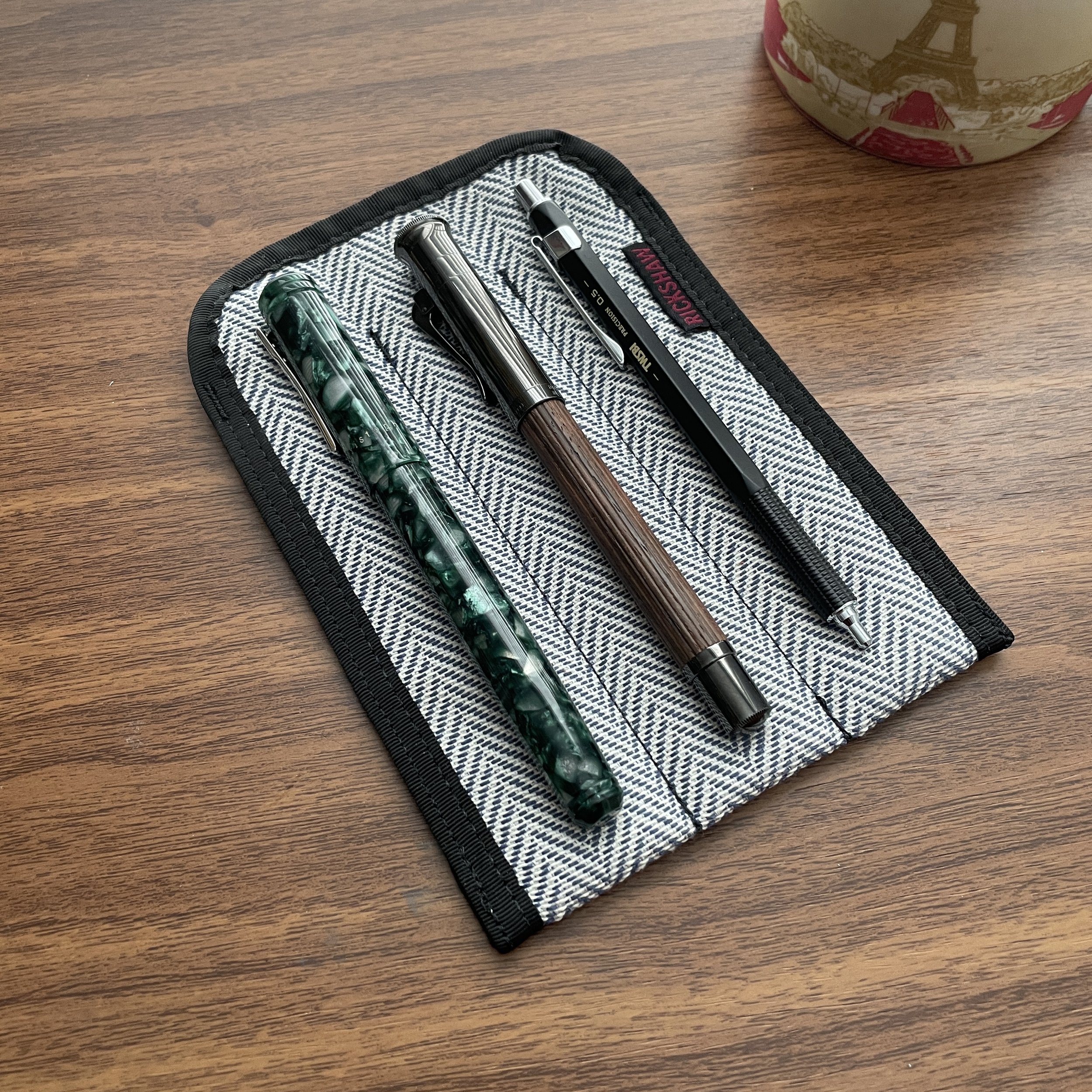
Because I have so many inks in my collection, it generally takes either an unusual color or an interesting story to prompt me to make a purchase. If I’m inspired to buy the entire line, the ink must be really special, and that’s where I found myself at last year’s Baltimore Pen Show, visiting multiple vendors trying to put together a full set of Laban’s Greek Mythology-inspired inks.

This one is all about nostalgia for me: I’m a huge history fan, was an even bigger fan of Greek/Roman mythology as a child, and I now have a child who loves history, including the ancient myths. While there’s nothing particularly unusual about most of the ten colors in this series - they’re all fairly standard riffs on inks you would expect to find in a lineup made by a pen manufacturer - each ink writes really well, and the color has been paired with a god or goddess from ancient Greek mythology. (While the colors themselves are different than what is typically associated with each of the specific namesakes, only a hardcore mythology nerd will catch this, and frankly these colors are far more practical and will appeal to more people than gold or silver, for example.)

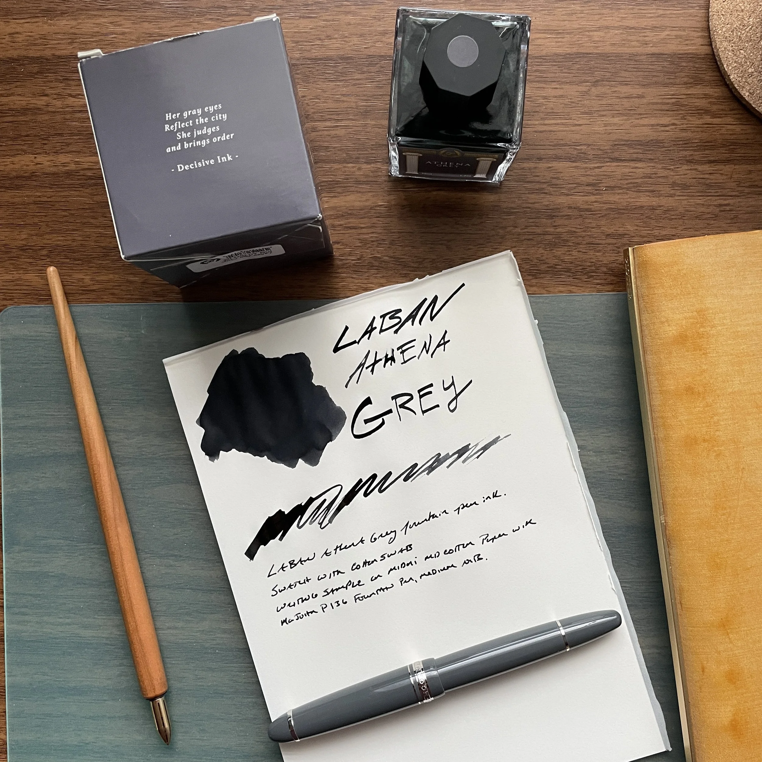
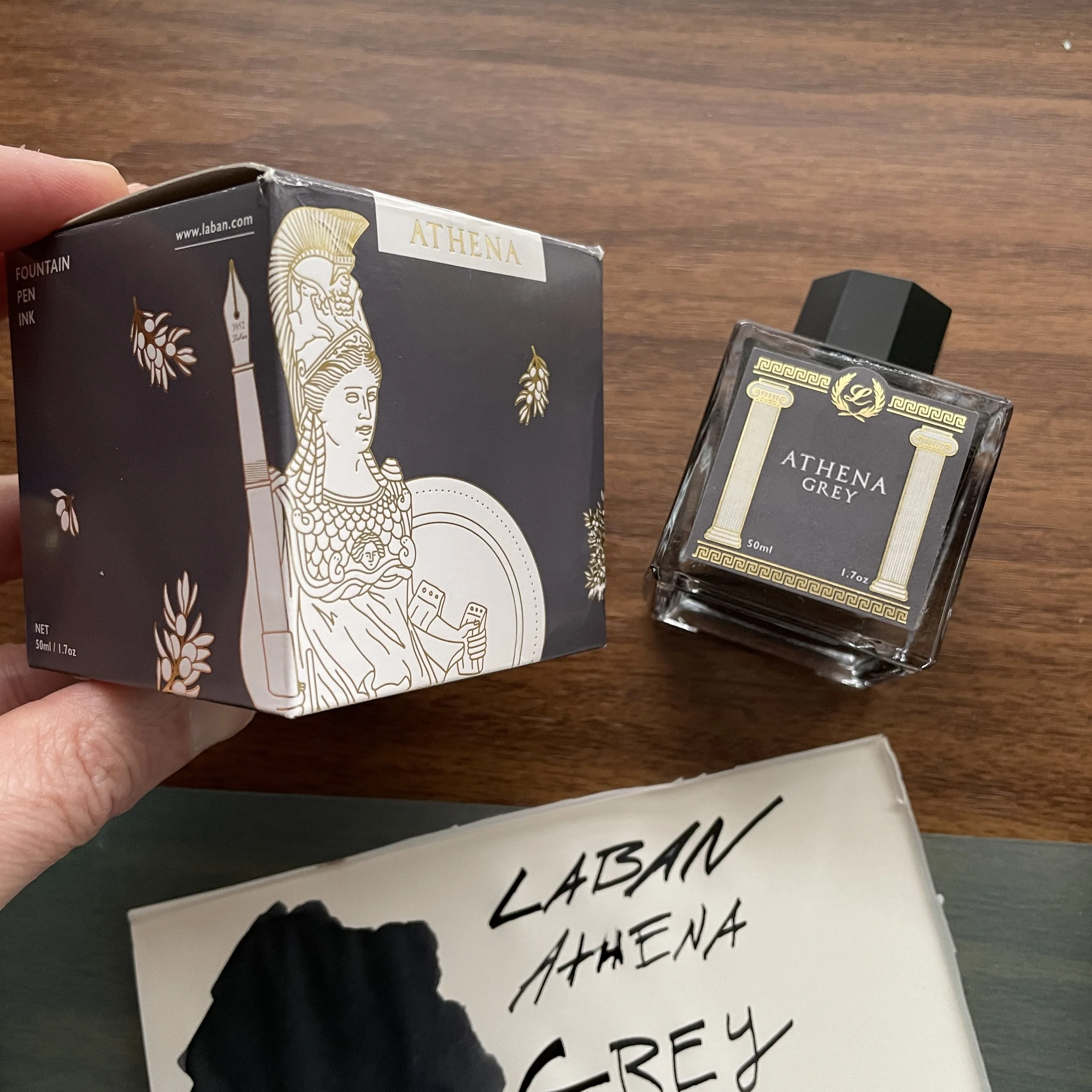
Athena Grey: the “decisive” ink. Writing samples done with Kakimori Brass dip nib and Majohn P136 on Midori MD Cotton Paper.

Athena Grey

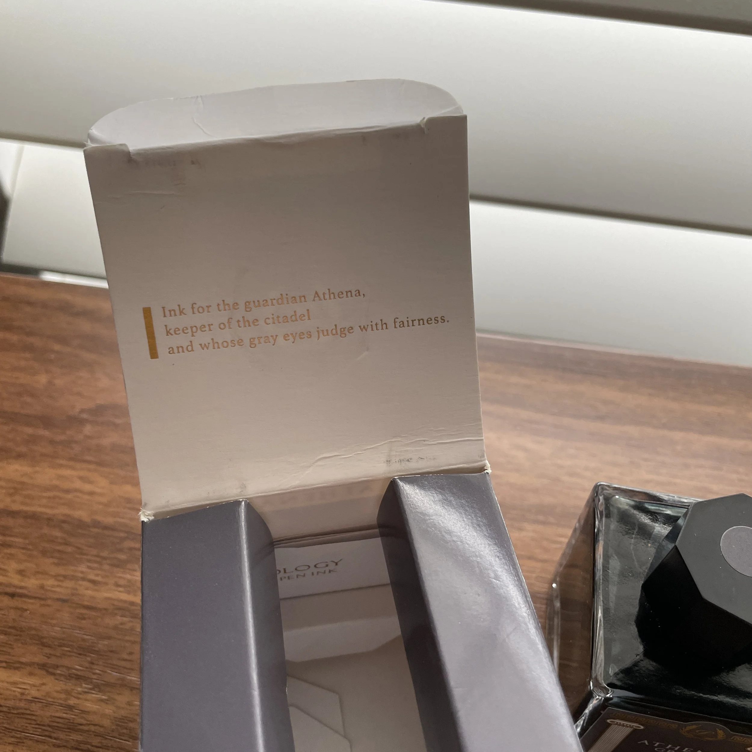
Athena Grey was the Laban ink that I first jumped at, not necessarily because of the color but because of the association. The Greek goddess of wisdom (Roman equivalent: Minerva), Athena holds a special place for me because my hometown hosts a full-scale replica of the Athenian Parthenon, complete with statue of Athena. You can read more about the backstory here, but a version of the Parthenon was first built for the 1897 Tennessee Centennial Exposition before being made permanent, with the Athena statute added later in the 1990s. The venue serves as an art museum located in Nashville’s Centennial Park.

Athena Grey is a very dark grey ink, which some might even consider black, especially when writing with fine or extra-fine nibs. In a wetter, wider nib, the ink will show as more of a dark grey with purple undertones, similar to a dark, more concentrated Sailor Chu-shu. I’ve found this particular color to be an excellent ink for everyday office work, as the color is conservative while still remaining interesting enough to intrigue fountain pen users looking for those slightly offbeat shades of classic tones.

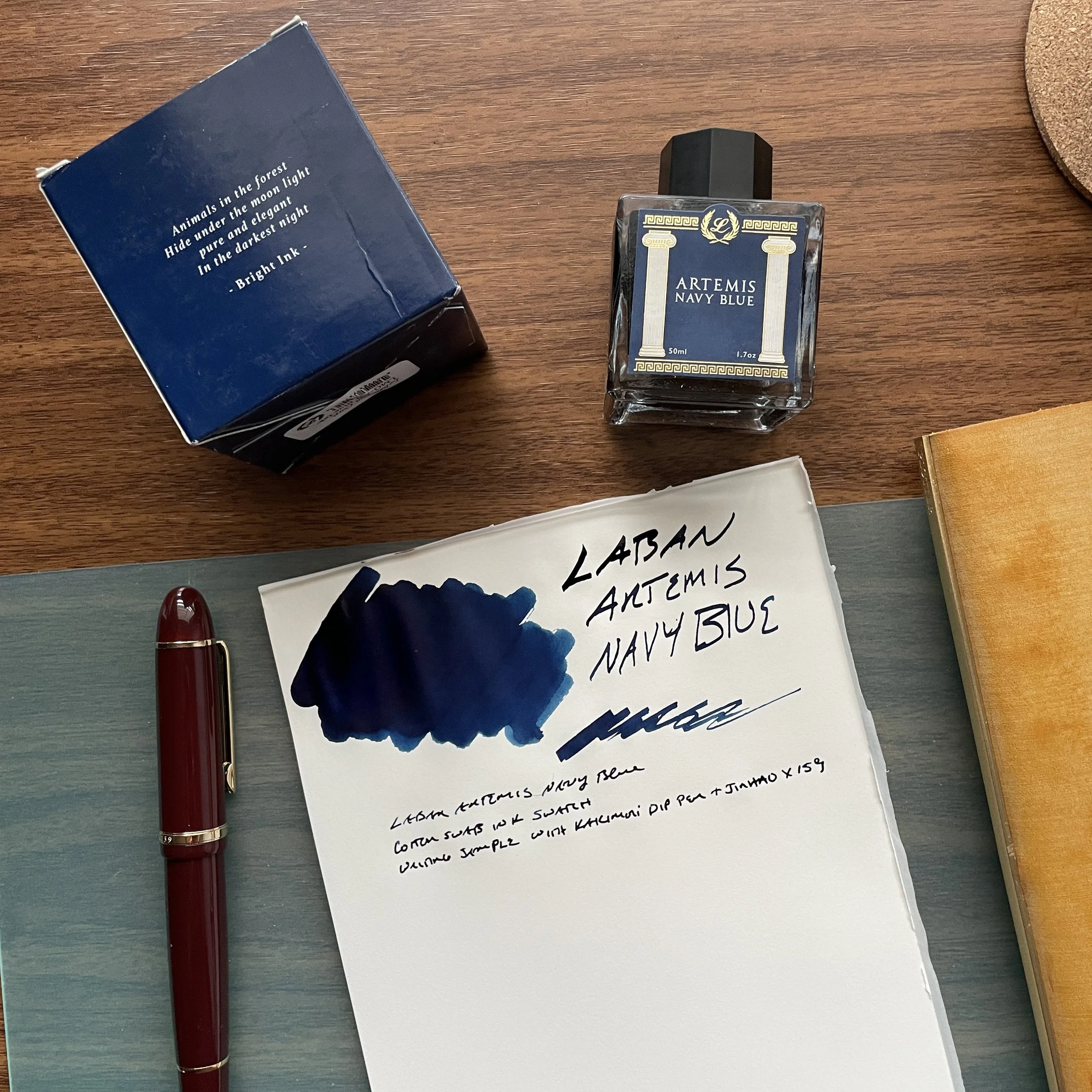
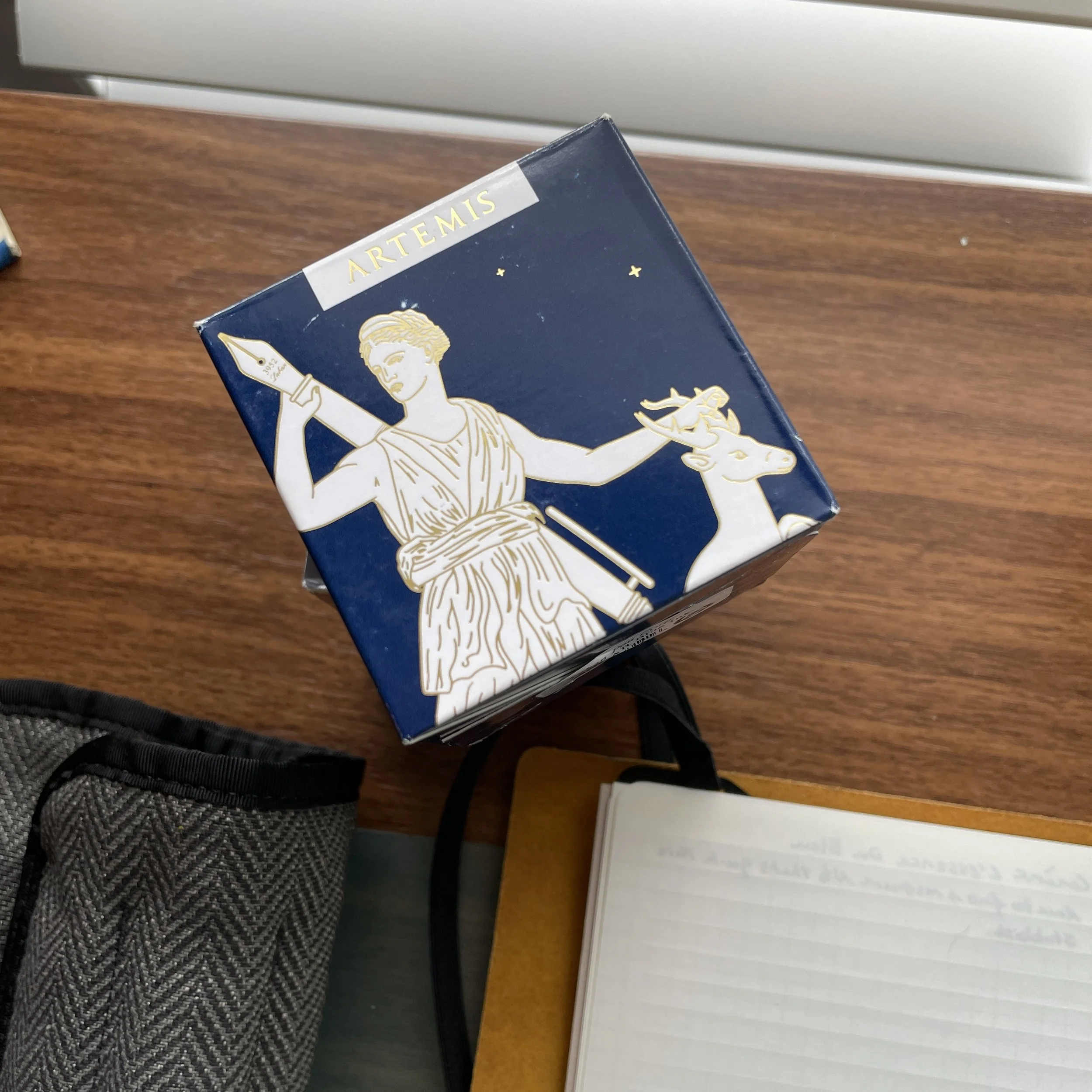
Artemis Navy Blue: the “bright” ink

Artemis Navy Blue

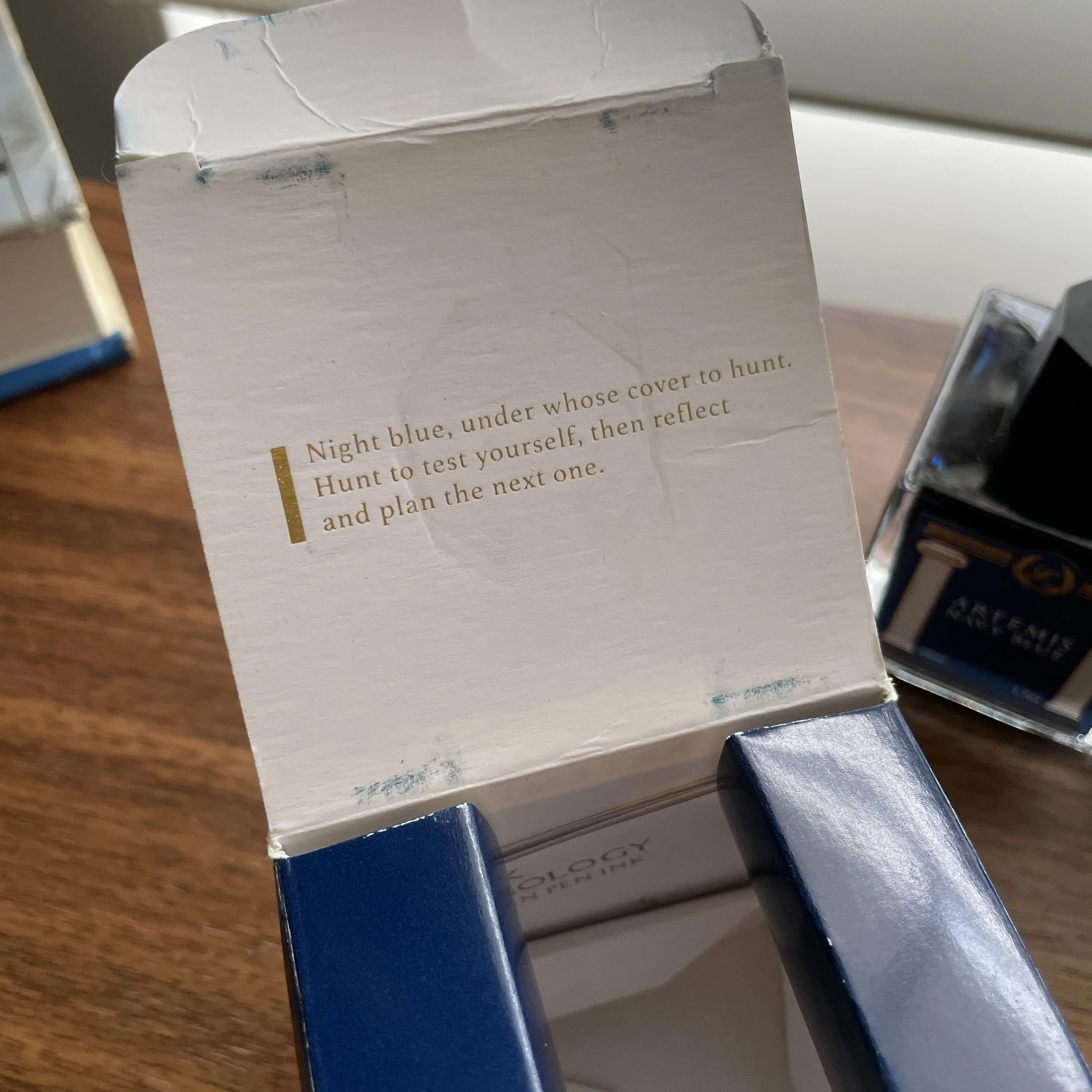
A true navy ink is surprisingly (and somewhat frustratingly) hard to find. Artemis Navy Blue is a dark, rich blue with a touch of sheen - think the now-discontinued JFK Navy Blue from Montblanc, only darker (I would say “richer”) and with less grey. Named after Artemis, the Greek goddess of animals and the hunt (Roman equivalent: Diana), the artwork features the classic motif of Artemis reaching for her bow and arrow, only to find that her bow is a fountain pen! (See the gallery below for the images from the packaging, which I find really well done.)

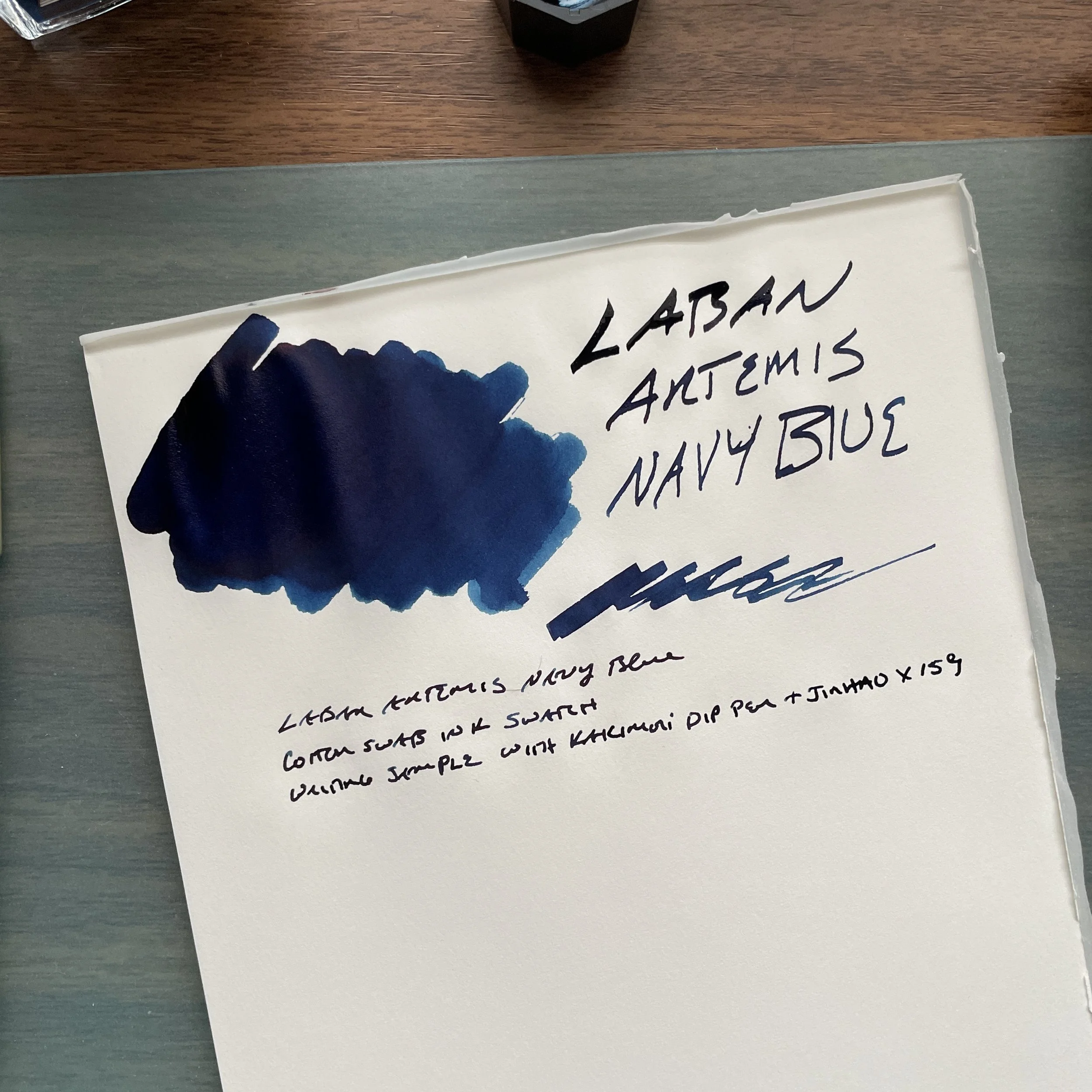
Like Athena Grey, this ink is a bit of a sleeper and actually one of the last inks I tested from the lineup because I thought it would be a “boring” blue. As it turns out, it has become one of my favorites, and was the surprise hit at pen club a couple weekends back when I brought it for people to test in person.

View fullsize Laban Athena Grey Box Artwork
View fullsize Laban Athena Grey Quote Interior Lid
View fullsize Artemis Navy Blue Box Artwork
View fullsize Laban Artemis Navy Blue Quote Interior Lid

Takeaways and Where to Buy

It’s rare that I’ve purchased all of the inks in a given series of releases, much less in a single weekend, so that should tell you something about how much I enjoy what Laban has done here. In fact, I liked these inks so much that I put them on the short list for inks I wanted to sell in our own shop, and we’re happy to be able to offer the Laban Greek Mythology inks directly as of last week. Each ink comes in a 50ml glass bottle, priced at $25.

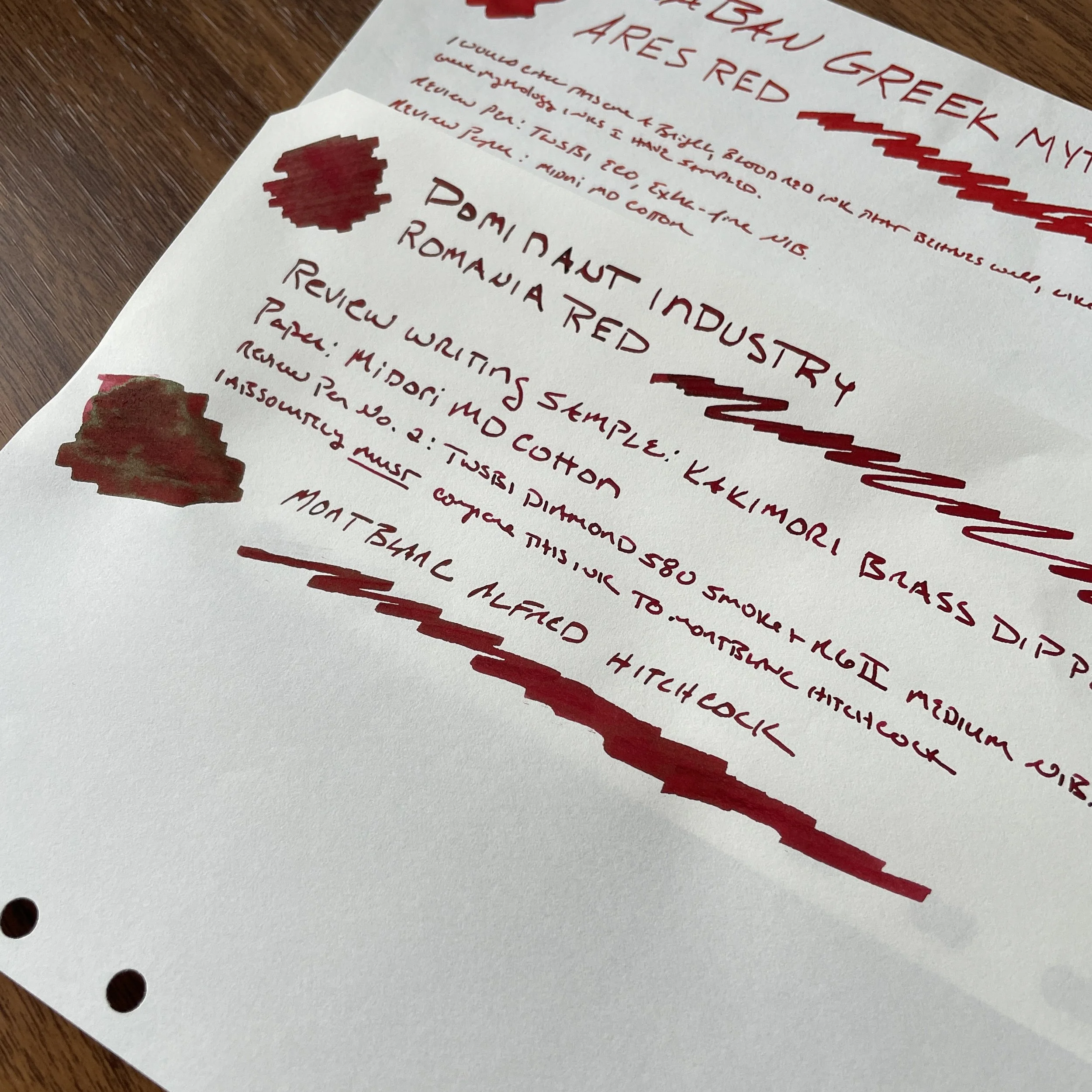
I’m starting a full comparison ink swatch sheet for this line as I review the rest of them. (Don’t ask me for this paper - go bother the folks at Plotter, because this is exceptionally good Midori MD Cotton Paper with letterpress ruling that they’ve been refusing to make generally available in the US!)

Further Reading

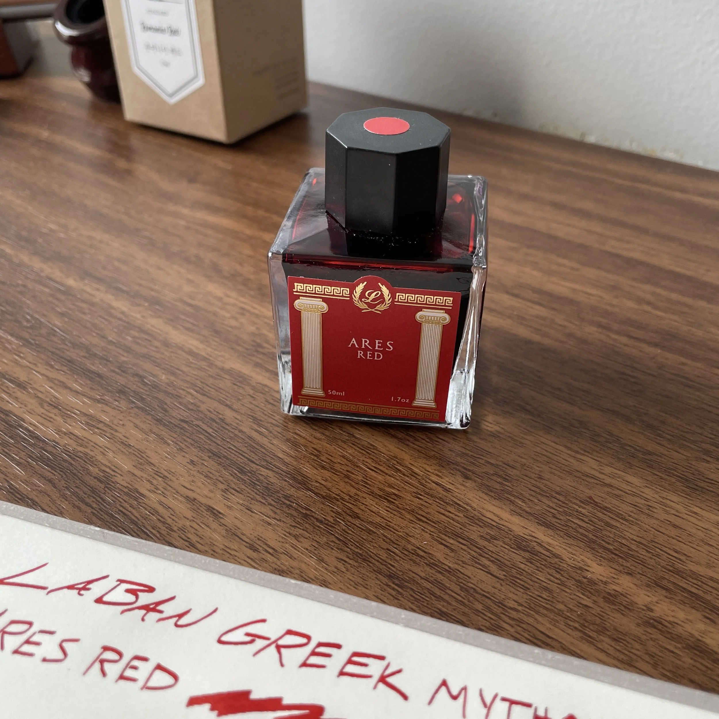
While I’m still personally working my way through this series of ten different inks, you can read my prior post on Ares Red, named after the God of war, here. I’m trying to be better about finishing reviews of full series/sets, hopefully with the goal of creating an organized archive of past content as I’ve done with fountain pens. Stay tuned!

The Gentleman Stationer is supported entirely by purchases from the T.G.S. Curated Shop and pledges via the T.G.S. Patreon Program.

In Ink Reviews Tags Ink Review, Laban Inks, Laban Greek Mythology, T.G.S. Curated Shop
1 Comment

Offbeat Ink Colors for Everyday Writing: Anderillium American Goldfinch Yellow and Ferris Wheel Press Roaring Patina Black

January 21, 2023

This year, I’ve introduced a new rotation system that hopefully will ensure I use more of my pens, especially those favorites that haven’t been getting the attention they deserve. I’ll write more about specifics once things have broken in a bit more, but the gist is that I’ve divided my pens into several categories (“Desert Island/Favorite” pens, pens from independent makers, limited/special editions from standard makers, favorite brands, etc.), and the goal is to have a 1-2 pens from each category inked up at any given time, cycling in a new pen when one is written dry or at the end of the month, whichever comes first. It’s worked well, but a side benefit of this system is that I’ve been re-inking pens more, and therefore also using more of my ink collection and finally getting around to testing out a number of inks that have been in the queue. Today I’ll talk about two that I’ve really enjoyed, both of which are offbeat colors that pleasantly surprised me.

When wet, as shown here on Midori MD Cotton paper, the ink is a brighter yellow. Note the gold tones on the drier writing sample as opposed to the swab.

Anderillium American Goldfinch Yellow: Finally, a Legible Yellow Ink I Can Use Every Day

For years now, I’ve been on a mission to find a yellow ink. I know, it’s a somewhat odd color to fixate on, but I’ve really been wanting an ink that I can use to both highlight and annotate - one that’s not too dark, but at the same time legible. The latter has been the main problem. Most yellow inks are fine as highlighters, but when you try to actually write with them it looks, well, like you’re writing with a highlighter. You can’t read it easily.

On the off-white Plotter paper, Anderillium American Goldfinch dries to a darker golden yellow hue.

Anderillium inks are known for their offbeat, somewhat unusual takes on classic fountain pen ink colors. As it turns out, “American Goldfinch Yellow,” from their Avian series (based on birds), is exactly what I’ve been looking for. When wet, the ink resembles your classic yellow highlighter, but dries to a richer gold color that’s almost, but not quite, orange. It’s legible enough to use for annotation or everyday writing, depending on your use case. I currently have this ink in my Franklin-Christoph Model 20 in “Winter Pine” acrylic, paired with a medium S.I.G. (Stub Italic Gradient) nib that’s an excellent match for how I want to use this ink.

Of the two inks I’m reviewing today, American Goldfinch Yellow is the one that’s widely available, and we carry Anderillium Inks in the T.G.S. Curated Shop, priced at $14.50 per bottle. I’ve previously reviewed other colors in the series as well, including Cuttlefish Brown, the Michigan Avenue Chicago Pen Show Special Ink, Colossal Squid Dark, and Green Kingfisher Green.

Ferris Wheel Press Roaring Patina Black

One of Ferris Wheel Press’s 2022 limited releases, I hesitated to pick this one up giving my limited use of shimmer ink, but I’m glad I have a full bottle. Roaring Patina Black is a relatively uncommon pairing of a rich black ink with gold shimmer and, according to Ferris Wheel Press, a red sheen. (I’ve not seen much of the sheen, but I’ve also not been using the right paper as most of my writing has been “practical” so far this month.) I wouldn’t characterize this ink as a pure black, as it has some rich blue/purplish-undertones that complement the gold highlights.

View fullsize Ferris Wheel Press Roaring Patina Black
View fullsize Sheen and Shimmer Up Close

Roaring Patina Black features what I refer to as “subtle shimmer” - it’s not so in-your-face glittery that you can’t use it for work, and the shimmer particles are fine enough that they won’t clog your pen. I’ve had this ink in my Graf von Faber-Castell Classic Macassar for the past two weeks without issue, and the “Art Deco” theme of this ink perfectly matches the look of the pen. Unfortunately, Roaring Patina Black was released as a limited edition so it’s no longer widely available, and I was unable to find any retailers with the ink in stock. If you can find it, buy it, because it probably won’t last very long. I enjoy Ferris Wheel Press inks, but looking back I haven’t reviewed very many, other than Peppermint Drop, another red sheener.

This week’s review pens: Franklin-Christoph Model 20 in Winter Pine (left) and Graf von Faber-Castell Classic Macassar.

Longtime readers of this site will know that I don’t use crazy inks: 80% of the time my pens are inked up with standard dark blue / dark green / dark red, but for the other 20% I like to play around with more offbeat colors. That said, even with more unusual ink colors or properties, I have little patience for inks that bleed, feather, and never dry, or only work on certain specific papers with certain nibs. Neither of the two featured here have given me any problems. Sometimes you have to hunt around - sometimes for a very long time - but well-behaved, relatively low-maintenance inks do exist outside of the standard blue/black/blue-black color scheme!

Note: Though I’ve found it to work fine in fountain pens, Ferris Wheel Press Roaring Patina Black is a shimmer ink, meaning that the ink contains fine particles of gold shimmer material. If left in a pen for too long and allowed to dry out, all shimmer inks will clog your pen. If this happens, flushing the pen with water should resolve any issues, but it’s always a best practice to clean your pen every few weeks if you’re using inks such as these.

The Gentleman Stationer is supported entirely by purchases from the T.G.S. Curated Shop and pledges via the T.G.S. Patreon Program. This post does not contain third-party affiliate links or paid advertising. I purchased the Ferris Wheel Press Ink with my own funds, for my own use.

In Ink Reviews Tags Ink Review, Anderillium Ink, Anderillium Ink American Goldfinch Yellow, Ferris Wheel Press, Ferris Wheel Press Roaring Patina Black
Comment

The Quest for the Perfect Green-Black Ink: Anderillium Colossal Squid Dark and Green Kingfisher Green

October 19, 2022

For years, I’ve been searching for that perfect dark green ink - something that’s dark enough to look almost black at work, yet has just enough of a hint of green to keep things interesting, especially when I use a broader nib. I’ve cycled through loads of green ink over the years, and have dozens in my personal collection. Have I found that “perfect” dark green? No, of course not - and it would probably take much of the fun out of the hobby if I did - but the two inks I’ll review today from Anderillium are pretty darn good: “Colossal Squid Dark” from their “Cephalopod Series,” and “Green Kingfisher Green” from their “Avian Series”.

Review writing samples were done with a Nahvalur Original Plus steel medium, and a Nahvalur Nautilus BB ground to a “Mini-Nag” by CY of Tokyo Station Pens.

Colossal Squid Dark is perhaps my favorite sleeper hit from the entire Anderillium lineup. Is it a black? Is it a green? Is it a blue-black? All of the above, and that’s what makes it interesting. If I had to peg this ink as a color I’d call it a “deep teal-black”, which will look almost pure black with hints of green and blue in finer nibs, with more of the teal shades showing in broader nibs and stubs.

Is it a green-black? Is it a blue-black? Both? You’ll probably have to decide for yourself, but either way, I love it.

Green Kingfisher Green, from the bird-inspired “Avian Series,” surprised me with how dark it was. Based on the label I expected a standard “hunter green,” but it’s actually more of a true green-black. If I had to pick out any undertones, I see some brown and maybe a hint of yellow in the thinner parts of the swab. In extra-fine nibs, however, this ink appears black.

If you angle the paper in a certain way and play with how the light hits it, you can see several different tones in Green Kingfisher Green. The writing sample here was done with a TWSBI Swipe, extra-fine nib.

Both Colossal Squid Dark and Green Kingfisher Green flow well in all pens I’ve used, dry relatively quickly despite being on the wet side, and neither bleed nor feather on most papers. I’d consider both to be good “workhorses” suitable for your everyday writing. What other inks would I consider comparable to these two, in terms of color? Based on my “Green Ink Comparison Project,” I would say that the closest three I currently have in my collection are 3Oysters “Black Moss,” Sailor Bungubox “Dandyism,” and Pilot’s 100th Anniversary Iroshizuku Ink “Hoteison”. Green Kingfisher Green is, of course, the more “true green-black” ink, while Colossal Squid Dark is more of a “teal black,” with hints of blue. Maybe even similar to Sailor Miruai (which I no longer own) but not an exact match?

This photo is probably the best representation of how these inks look in everyday use.

Takeaways and Where to Buy

Colossal Squid Dark has become a surprise favorite. I currently have it inked up in two pens, one of which I’ve had to refill (a vacuum-filler, no less). “Teal-black” is less common than “green black,” or standard blue-black, and it keeps my work interesting even though non-fountain pen nerds won’t notice that I’m writing with a non-standard color. Neither ink, however, has given me any problems, and Green Kingfisher Green is accompanying me to the office today.

Yes, I’ll keep posting photos of this display because I absolutely love it.

You can purchase Anderillium Inks, including the two shown here, directly from us in the T.G.S. Curated Shop. Anderillium was kind enough to send a full set of samples when I stocked the brand, and I’ll post reviews as I work my way through the colors in the various lineups (though I’ve already swatched them all). These inks are priced at $14.50 for 1.5oz (roughly 45ml) of ink, which represents good value, and are sold in a wide-mouth “jam jar” bottle that makes it easy to fill larger-diameter pens. The names of all Anderillium inks are nature-inspired. As i mentioned above, Colossal Squid Dark forms part of the “Cephalopod Series” - inks based on squids and octopuses - while Green Kingfisher Green forms part of the “Avian Series” - inks based on birds. Other Anderillium Inks I’ve reviewed in the past include “Cuttlefish Brown”, a classic sepia that looks brown when wet but dries more grey, and “Michigan Avenue,” another green released as a special edition for the 2022 Chicago Pen Show.

The T.G.S. Curated Shop is an authorized retailer of Anderillium Inks, as well as all other brands sold. This post does not contain links to paid sponsors or third-party affiliates.

In Ink Reviews Tags Ink Review, Anderillium Ink, Anderillium Colossal Squid Dark, Anderillium Green Kingfisher Green
5 Comments

For me, red inks nearly always go in a demonstrator, preferably an orange or yellow one.

Red Ink Research: Laban Ares Red and Dominant Industry Romania Red

September 10, 2022

It’s been a while since I updated everyone on my never-ending quest for the “perfect” red ink. (Yes, even though I’ve swabbed and sampled literally dozens of red inks over the years, and have probably 12 or so “keeper” bottles in my collection, I’m still looking.) Given that most of my recent attention has been devoted to pen show travel and building out the shop, I’ve acquired less for personal use, but that doesn’t mean I’m not still exploring. Today I’m going to look at two inks that I picked up in recent months: Laban “Ares Red” from their Greek Mythology series, and Dominant Industry “Romania Red.” Both are excellent, but the latter might be my favorite since it seems like a very close match to my now-rapidly-dwindling supply of Montblanc Alfred Hitchcock.

Laban Ares Red

Though I’ve not gotten around to reviewing the inks until now, at the Baltimore Pen Show I picked up nearly all of the Laban “Greek Mythology” Inks from various retailers. These inks were released in two series, and since I’m a longstanding mythology enthusiast there was simply no way I would pass up having all of these inks in my collection. To my knowledge, Laban hasn’t released a line of inks prior to this one, and they are surprisingly good.

Ares Red (named after the Greek god of war) is a bright red similar to classic Sheaffer Skrip, though perhaps slightly richer in tone. I had tempered my expectations somewhat, given that many people claim to have experienced slow dry times with this particular ink. That was not the case at all for me, as I’ve found Ares Red to be extremely well behaved. It dries relatively quickly, and I’ve had no feathering or bleeding in a few different pens and nib sizes. To pair with this particular ink for this review, I chose the new TWSBI ECO in Transparent Yellow, in an extra-fine nib. I have no qualms about using red inks at work, since I annotate a lot of documents, and this shade of red is perfect for markups. (I also have a thing about putting red inks in demonstrators - I especially love it when the demonstrator is orange or yellow.)

Dominant Industry probably wins the “cool bottle design” contest, though the narrow base requires you to pay attention or else you might tip it over.

Dominant Industry Romania Red

If you’re looking for a deeper red that could be a good everyday writer, you should definitely try out Dominant Industry’s Romania Red, apparently an attempt to clone Montblanc Alfred Hitchcock. “Romania Red” even has a touch of the greenish-gold sheen that Hitchcock can develop around the edges on certain papers. Like the Ares Red, this ink did not give me any trouble in terms of dry time, bleedthrough, or feathering. Either would make a good workhorse ink, and I had this one inked up for review in a TWSBI Smoke and Rose Gold RGII Diamond 580 with a medium nib. Like Laban, Korean inkmaker Dominant Industry has impressed with their overall lineup, and I have several bottles currently in rotation.

Note that the Hitchcock has just a bit more sheen to it than the Dominant Industry version. It’s not an exact match, but perhaps the closest I’ve seen, especially in everyday writing. The paper used for the writing samples is Midori MD Cotton paper.

Where to Buy and Further Reading

We stock the Laban Greek Mythology Series, including Ares Red, in our own Shop, and our friends at Vanness Pens currently carry the Dominant Industry Romania Red. Laban Inks are priced at $25 for 50ml, and Dominant Industry inks $17 for a 25ml bottle. This pricing is fairly standard, though I’d say Laban falls on the inexpensive side on a per-ml basis, while Dominant is in line with the pricing for other imported inks.

A side-by-side comparison so that you can see how these will look in everyday writing.

Do you have a special ink color that you’re constantly exploring? If so, you may want to check out this series that I put together last year, in which I swabbed all of the various inks in my collection and laminated the sample sheets. If you visited me at the D.C. Pen Show, these are the sheets I had at the table!

  • Mini-Collections: All the Blue Inks

  • Mini-Collections: All the Red Inks

  • Mini-Collections: All the Green Inks

  • Mini-Collections: All the Purple Inks

  • Mini-Collections: The Rest of the Colors

This post does not contain links to paid sponsors or affiliates. The Gentleman Stationer is supported entirely by purchases from the T.G.S. Curated Shop and pledges via the T.G.S. Patreon Program.

In Ink Reviews Tags Ink Review, Laban Inks, Dominant Industry
Comment

Ink Review: Scribo Verde Prato

July 16, 2022

I’ve enjoyed getting back to full-time reviewing, as I step back from expanding the shop and refocus the site. If you’ve missed it, I’m in the process of thinning out my accumulation of pens, inks, and paper; selling off a huge chunk of what I don’t use, and - relevant here - rediscovering things I forgot I had, such as six or seven bottles of Scribo Ink at the back of a cabinet. (Ridiculous, right?)

Scribo sells their ink in a hefty 90ml glass inkwell, which not only gives you plenty of ink for your money but also makes for an attractive desk accessory, if that’s your thing.

I’ve previously tested a few different colors from Scribo’s ink lineup, and found them all to have good flow with zero bleed and feathering. For those unfamiliar with Scribo (or “ScriBo,” as I’ve seen it written), the moniker is short for “Scrittura Bolognese”, a reference to both the company’s location and the fact that it was started by former employees of OMAS who wanted to keep that former brand’s legacy alive. Scribo places a strong emphasis on nibs and ink: the nibs tend to be “soft”, with “extra flexible” options available, and the inks are formulated to accommodate the company’s nib style with a special emphasis on inkflow. I’ve also taken an in-depth look at the ink bottle, which is impressive in its own right.

This particular ink dries fast, in addition to behaving well. This writing sample was dry to the touch within 15-20 seconds.

The ink I’m looking at today is “Verde Prato,” a very bright grass/spring green that’s a difficult color to get right. I enjoy using bright greens such as this one for highlighting and annotation, but with some brands, the dyes used in this shade of green tend to make for a drier writing experience and/or precipitate out to form nib crud. Verde Prato, however, is a different story. Scribo has done a very nice job of making a bright - almost neon - green ink that’s still highly usable and likely to stick in my collection since I don’t currently have something similar.

While I store my Scribo inks in the sturdy cardboard packaging, the caps on the ink bottles helpfully have a color reference in case you keep your inks in a drawer and have to view/organize them from above.

Takeaways and Where to Buy

As I noted above, I’ve tended to stay away from these light green inks despite generally liking the color. Unlike some brighter colors such as orange, I’ve found light greens to have a tendency towards extremely dry flow. Scribo Verde Prato flows much better than most, and going forward this one will definitely remain in the collection as my “nuclear green” option. The ink’s legibility makes it an excellent option for both highlighting and annotation.

You can purchase Verde Prato and other Scribo pens and inks from our friends at Vanness Pens. At $35, the ink isn’t inexpensive, but you do get the impressive glass inkwell bottle containing a full 90ml of ink (which is approaching Akkerman territory!).

Disclaimer: I purchased the ink featured in this review for my own use, though I purchased it so long ago I can’t recall whether I may have received a discount or not. This post does not contain affiliate links or paid advertising. To support The Gentleman Stationer, please consider shopping at the T.G.S. Curated Shop (large inventory reduction sale ongoing!) or visiting our Patreon Program.

In Ink Reviews Tags Ink Review, Verde Prato, Scribo, Scribo Ink
Comment
← Newer Posts Older Posts →
Store Hours and Location
Visit the T.G.S. Curated SHOP
*New* Updated "Best Pens" Guide (2025)
T.G.S. 2025 Holiday Gift Guide
TGS x Roterfaden TGS_25
Hierarchies of Fountain Pen Friendly Paper

Join Our Patreon!
Subscribe to the TGS E-mail List

Featured Posts

Featured
Cover On the Paper Trail Intro Clip.jpeg
Dec 3, 2025
Introducing "On the Paper Trail," a New Podcast/Video Collaboration with Lisa Vanness of Vanness Pens!
Dec 3, 2025
Dec 3, 2025
Iro-Utsushi-Fine-Dip-Pens.jpeg
Oct 1, 2025
The Pilot Iro-Utsushi Dip Pen (and in General, Simple vs. Fancy Dip Pens)
Oct 1, 2025
Oct 1, 2025
Levenger-Annotation-Pad.jpeg
Sep 20, 2025
Five Boutique Paper Brands I'm Watching Closely and Why
Sep 20, 2025
Sep 20, 2025
The Gentleman Stationer RSS

© Digital Divide Media, LLC, 2014-present.

All content is the exclusive property of Digital Divide Media, LLC, d/b/a The Gentleman Stationer, including “The Gentleman Stationer” website and trademark, and should not be reproduced without express written permission.  All rights reserved.

All content containing paid advertising, affiliate links, or sponsored content will be plainly disclosed by a disclaimer when/if featured.

Contact Information

Store Shipping Policy and Return Policy

Privacy Policy

Cookie Policy

Terms and Conditions

Powered by Squarespace