• Blog
  • Shop
  • Resources
  • FAQ (Ask TGS)
  • About
  • Archive
  • Contact
  • Sign In My Account
Menu

The Gentleman Stationer

Vintage Living in the Modern World.
  • Blog
  • Shop
  • Resources
  • FAQ (Ask TGS)
  • About
  • Archive
  • Contact
  • Sign In My Account

Ink Review: Caran d'Ache Magnetic Blue as a Classic Blue-Black

July 3, 2024

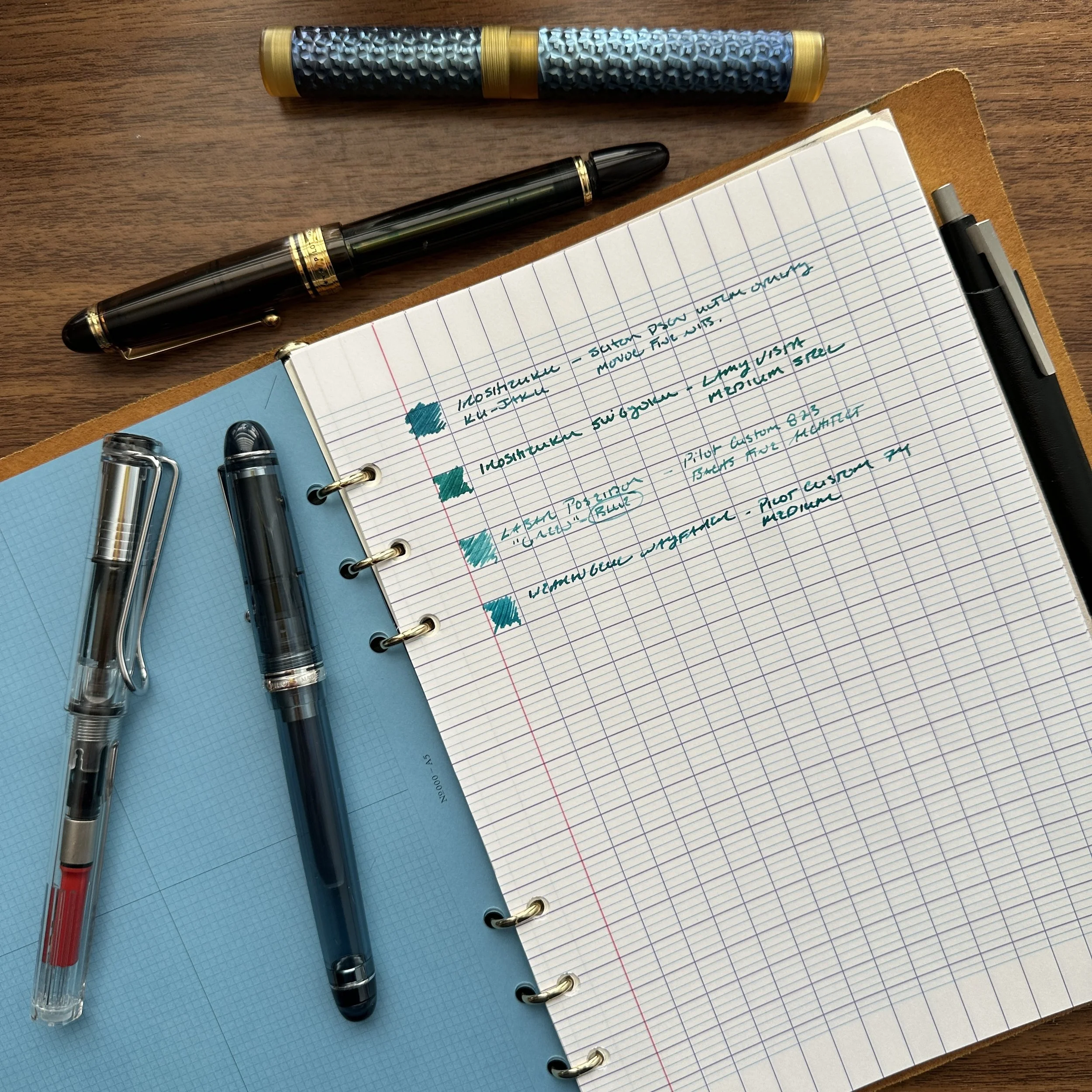
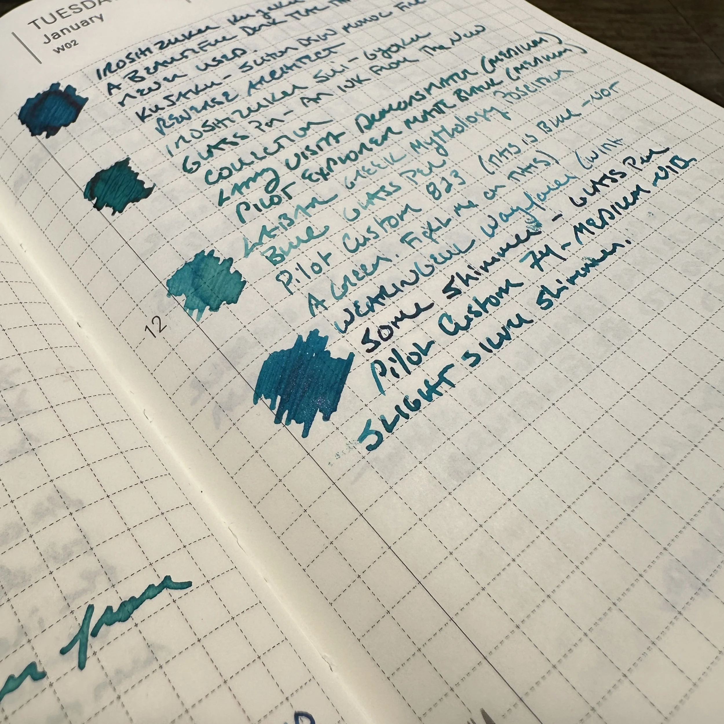
I flushed all of my inked fountain pens at the end of June. After six months worth of pen shows, testing out store product samples, and a generally chaotic schedule that often left me with little time to regroup, I once again ended up with around two dozen inked pens. Some were 3/4 empty, some had dried out, and others just needed to be cleaned because the whole scene was making me twitch.

For this fresh rotation, I went back to a variation on an experiment I'd tried in the past: inking up six pens, with two old favorites, two pens for review, and two randomly chosen pens, one custom and one vintage. For inks, I decided to work with a tried-and-true ink line that I absolutely love but don't use as much as I should: Caran d'Ache Chromatics.

The nib holder is from our collaboration with Nic Pasquale (PensByPasquale), which is now sold out. Stay tuned for more exclusive releases!

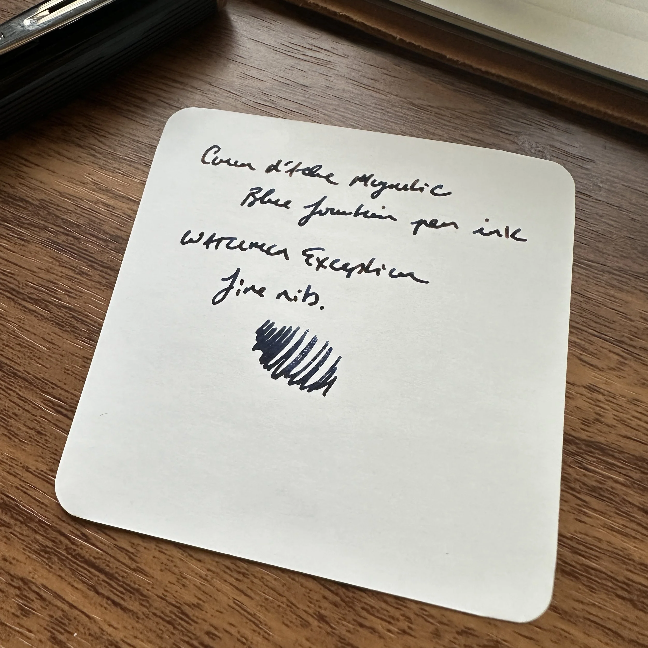
If forced to pick, my favorite of all the Caran d'Ache Chromatics inks would likely be Magnetic Blue, which is an old-school blue-black shade. A dark navy with a hint of grey, Magnetic Blue sits somewhere between traditional iron gall blue-blacks and "midnight blue" inks. I find that it generally flows quite well. On some papers, it will have a hint of red sheen, but it’s subtle. I was looking for a "classy" dark ink for my Waterman Exception I acquired in Chicago, and this ended up as an excellent pairing.

In a finer nib the ink will appear quite dark, which I love for work. It dries fairly quickly, even on non-absorbent paper.

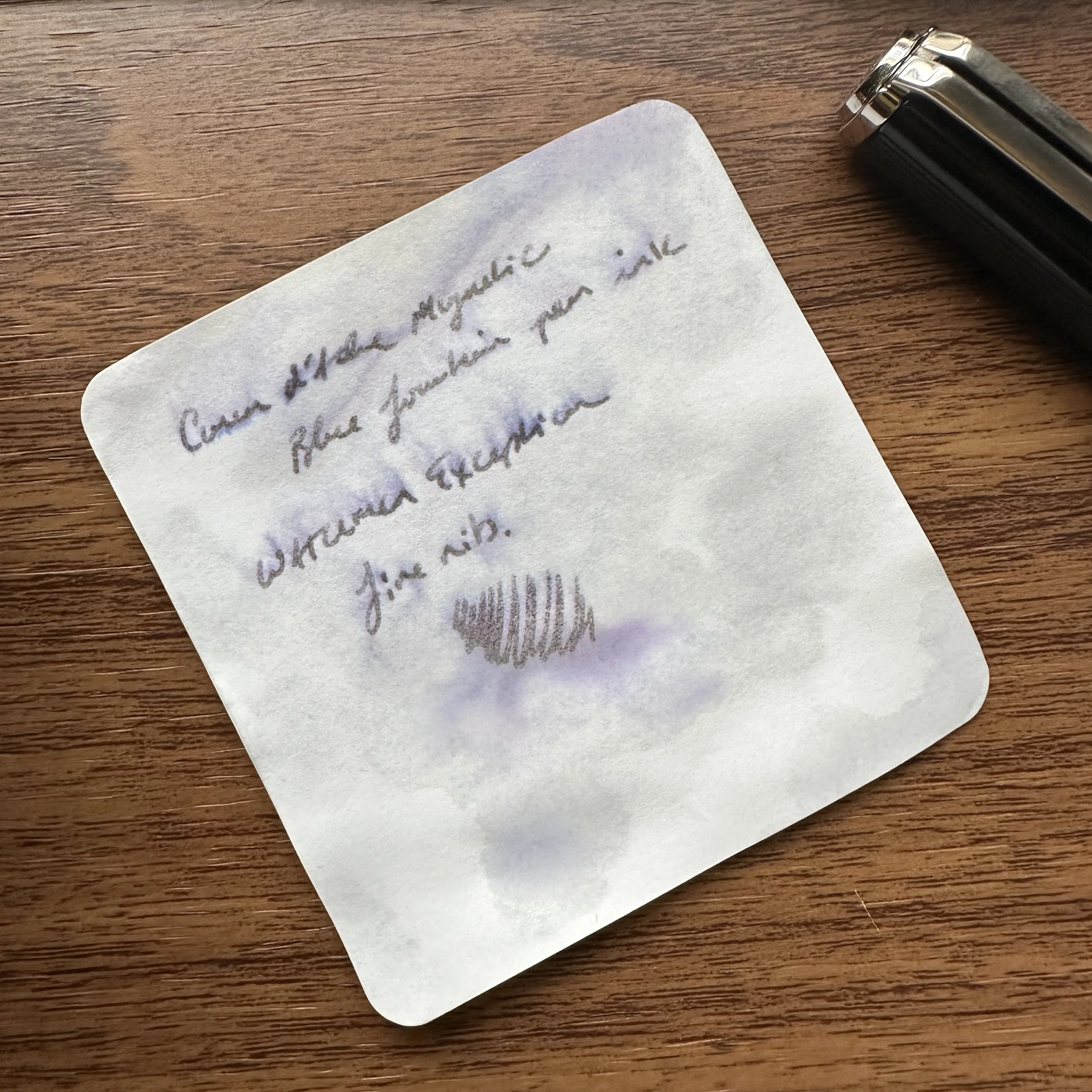
While to my knowledge this particular blue-black ink does not contain iron gall, it does have a moderate degree of water resistance. I've included a picture below of the writing sample (on Cosmo Air Light paper) after being held under a running faucet for approximately one minute. The writing remains highly legible, and this ink would easily survive a water or coffee spill onto a notebook.

View fullsize Caran d'Ache Magnetic Blue Writing Sample
View fullsize Caran d'Ache Magnetic Blue Writing Sample (Water Test)

Caran d'Ache ink used to have a reputation as being overpriced (at one point I believe it rang in at $50 per bottle), but the price has since come down to the $35 range - not inexpensive but in line with other premium inks sold in 50ml glass bottles. Personally, I love the design of the Caran d'Ache glass bottle. It's a deeper inkwell that's slightly angled to make it easier to fill larger nib pens, and the hexagonal inkwell design looks great on a desk.

We've been Caran d'Ache retailers for nearly four years now, and stock all of the various Chromatics inks in both bottle and cartridge form, as well as Caran d'Ache pens and pencils. If you enjoy our content, please consider supporting us directly!

In Ink Reviews Tags Ink Review, Caran d'Ache Ink, Caran d'Ache Magnetic Blue
2 Comments

Testing an Entire Ink Line: The Tom's Studio Bottled Fountain Pen Inks

May 15, 2024

How do you actually test an entire line of ink? Honestly, you really can’t, at least not in a reasonable amount of time. The only way you can truly “get to know” a specific ink, with all its various advantages and disadvantages, is to write with it for an extended period. While it’s certainly fun to try, it’s hard for any reviewer or retailer to do that with every ink from a specific brand, no matter how much writing they actually do. For that reason, I try to avoid making categorical pronouncements about ink brands as a whole, and do my best to write with as many different inks as I can, for as long as I can, and given an informed judgment. When you’ve used hundreds of fountain pen inks over the years, you can get a pretty good sense of how an ink will ultimately behave from your swatch book!

From the Top: Pigmented Black (060); Deep Black (01); Raspberry Sorbet (02); Neptune (03); New Forest (04); Cassis (05); Strawberry Jam (06); Mallard (07); Loch Ness (08); Constellation (09); Dove Grey (10); Iris (11) and Juniper (12). The Pigmented Black ink is water resistant.

I’ve spent the past week or so swatching and testing a new line of nineteen different Tom’s Studio fountain pen inks, and I absolutely love some of these colors. For those unfamiliar with the brand, Tom’s Studio is a UK-based manufacturer of fountain pens, dip pens, inks, mechanical pencils, and other assorted fine writing and calligraphy supplies. I was initially hesitant to order these, since many inks sold by calligraphy-focused companies tend to be thinner and somewhat watery, in order to emphasize shading in flexible nibs. There’s nothing wrong with this, and many people enjoy such inks, but for my use case I tend to favor more saturated inks that emphasize legibility. As it turns out - no such concerns here.

From Top: Mulberry (13); Marianas (14); Rambling Rose (15); Sunny Teal (16); Damson (17); and Marmalade (18). Some of these inks show a touch of sheen around the edges, but none of them are “sheen monsters” and none of them smear once dry.

I’ve been thrilled to discover that most of the inks in this line are well-saturated, but not so much that they smear or suffer from long dry times. My swatch book is a Midori MD Cotton F3 notebook, which handles fountain pen ink well while being semi-absorbent, so it’s a reasonable approximation of most paper that I use on a daily basis. The colors actually tend to be on the muted side, which suits my style, and I’ve found at least a half-dozen in this line that I could see turning into everyday writers. As a bit of a fun experiment, and to showcase my favorites, I thought it might be interesting to pair several of these new inks with my latest Chicago Pen Show acquisitions! Here’s what I chose:

Edison Jameson in Bexley Scheherazade Acrylic: No. 12 “Juniper”

This gorgeous Edison Jameson in new old stock Bexley Scheherazade Acrylic was the 2024 Chicago Pen Show Exclusive!

Tom’s Studio “Juniper” is so dark that I’d call it a purple-black. This pen needs a dark ink, but I like a hint of color!

Skogsy Low Volume Eyedropper in Beige Ebonite and Clear Acrylic: No. 13 “Mulberry”

There was a touch of an inksplosion when I opened the bottle of “Mulberry” (No. 13), but it’s a great match for this Skogsy Low-Volume Eyedropper in clear acrylic and beige ebonite!

These No. 8 nibs are becoming more prevalent in my collection….

Edison Collier in Dragon’s Night Acrylic: No. 8 Loch Ness

I’ve wanted an Edison Collier for years! I finally went for this dark, translucent “Dragon’s Night” Acrylic. I chose “Loch Ness” (No. 8) for this pen.

Loch Ness is a dark teal-black. It might match this pen a bit better if it were just a touch brighter, but I do love the ink!

Newton Prospector in D Squared “Arkansas Abalone” Resin: No. 7 Mallard

Ok, so this Newton Pens Prospector is gorgeous but pretty much impossible to pair perfectly with any ink. I went with “Mallard” (No. 7), which draws on both the green and purple/blue in the acrylic. I believe this particular pen is sold out but keep checking over at Newton Pens for details.

The variation and depth in this material is stunning!

Takeaways and Where to Buy

Overall, I think I’m really going to enjoy using some of these colors. Personally, the ones that speak to me the most out of this line are the dark blue-greens (“Mallard” and “Loch Ness”), as well as the deeper reds (“Cassis” and “Mulberry”). I suspect the really dark purples (“Constellation”, “Damson,” “Juniper,” and “Iris”) will also prove popular. The Tom’s Studio Inks retail in our shop at $16 for a 50ml bottle. We currently have 19 different colors available. To be clear, these inks are all appropriate for both fountain pens and the Lumos series refillable fineliners.

My Lumos Mini in “Ivy” with No. 14 “Marianas” and a .3mm tip. It’s become my Plotter Mini 5 Pocket Pen of choice.

Further Reading (And a Giveaway Opportunity FOr Those Who Read Through to the end!)

I’ve slowly been working my way through the entire Tom’s Studio line of products, and have previously provided overviews of their “Lumos” line of refillable fineliners, the Studio Pocket Fountain Pen (with their stock Architect Nib that’s now back in stock), and more. You can view the full line of Tom’s Studio pens, pen tips and nibs, and other accessories here.

For those of you loyal enough to read all the way to the end, we’re going to give away two bottles of Tom’s Studio Ink, and they’re both red: Cassis and Strawberry Jam! Typical TGS Giveaway Rules apply: either leave a comment on this blog post or like the Instagram Post. I will number the entries and pick two winners with a random number generator. Giveaway closes this Sunday at 11:59pm CT! It’s open to everyone but international participants may need to chip in on shipping, depending on cost. Enjoy!

The Gentleman Stationer is supported entirely by purchases from the T.G.S. Curated Shop and pledges via the T.G.S. Patreon Program. We greatly appreciate all your support!

In Ink Reviews Tags Tom's Studio, Tom's Studio Fountain Pen Inks, Ink Review
27 Comments

One of the major things that also shocked me was the number of inks I thought I had reviewed, but actually had not.

Introducing the T.G.S. Fountain Pen Ink Review Archive!

January 20, 2024

Last year, I compiled and launched an archive containing all of the T.G.S. fountain pen reviews organized by brand. This morning, I finished updating an addition: a full archive of ink reviews, organized by color family and brand. I was surprised to learn that the current total is 114 ink reviews going back to 2014! There are also some editorial “best inks for ____ purpose” posts which are organized elsewhere in the informational resources section.

A note on this archive: One of the fun things about fountain pen inks is that some of them defy categorization. An ink that might appear green to me might lean more brown or grey to others, so please don’t take any of my “labels” as definitive. I hope you enjoy, and this will be regularly updated as more reviews are completed!

The Gentleman Stationer is supported entirely by purchases from the T.G.S. Curated Shop and pledges via the T.G.S. Patreon Program. We greatly appreciate your support!

In Ink Reviews, Editorial Tags Ink Review, Fountain Pen Ink, Ink Review Archive, Content Archive
Comment
Four Offbeat Blue Inks for the Office: Writing Sample on Clairefontaine Paper

Offbeat Blue Inks: Trying Darker Teals and Turquoises

January 17, 2024

While blue ink is often the “safest” fountain pen ink out there - both for your pens and your reputation at the office - using a standard blue as your daily driver can eventually start to feel stale. I love my Waterman Blue, but given how much writing I actually do on a daily basis, I always try to keep a steady stream of “alternative blues” at the ready to avoid ink burnout. One of my favorite color families to explore are dark teals and turquoises, which add variety and possibly even a touch of sophistication to your notes and/or signatures.

Did you know that it was National Rubber Duck day at the Philly Pen Show last weekend?

Lately, I’ve focused on four inks for my core “office” rotation: Pilot Iroshizuku Sui-Gyoku, a new release which might be my current favorite from the line; Pilot Iroshizuku Ku-Jaku, an old favorite which shares many of the same tones as Sui-Gyoku, only slightly darker; Laban Poseidon Green, which I consider a blue ink despite how it’s marketed; and Wearingeul Wayfarer, a shimmer ink with subtle pink sparkles that can also be used as a standard ink if you fill the pen without first shaking the bottle.

For my “office paper” writing sample, I chose Clairefontaine Seyes/French-Ruled.

None of these inks would typically be considered exciting, but for work they strike an appropriate balance. “Professional” doesn’t have to mean “boring” - you just have to know where to draw the line. My own rule of thumb is that the ink you use in the office shouldn’t overshadow or distract from the substance of the work you are trying to do. (i.e., You want the person whose memo you are commenting on to focus on the substance of your edits, not the fact that you wrote said edits in fluorescent orange shimmer ink.) On most standard office paper, and to the fountain-pen-uninitiated, these inks will appear blue. When you’re back at your own desk, however, writing on your quality paper of choice, you’ll enjoy the bit of dark red sheen on the Iroshizuku Inks, the shading on the Laban Poseidon Blue, and if you’re really daring, the faintest hint of pink/red shimmer on the Wayfarer!

Writing samples on Tomoe River paper in a Hobonichi A6 Journal.

General Takeaways and Where to Buy

If I recommend an ink for “office use”, it’s because I’ve found the ink to dry relatively quickly, and to resist bleeding and feathering on all but the cheapest of papers. All three meet these requirements, and they’re also relatively inexpensive. The Iroshizuku and Laban inks are priced at under $25 for a full 50ml bottle, and while Wayfarer is a bit pricier at $22 for 30ml, you do tend to pay more for inks with special properties like shimmer. I have to add that I love the look of the Iroshizuku bottles, and have for years kept at least one on my desk at the office as a conversation piece.

If you enjoy our content and are interested in any of the inks featured, we would greatly appreciate your support by visiting and purchasing via our shop. We carry both Pilot Iroshizuku and Laban Greek Mythology Inks in the T.G.S. Curated Shop, and for brands we don’t carry (such as Wearingeul), we would refer you to our friends at Vanness Pens!

Wearingeul Wayfarer Close-Up Shimmer Shot

Every so slight shimmer can be work-appropriate. Just know your workplace!

Editor’s Note: Why Should You Care About Ink Color?

Whenever I write a post like this one, I receive questions and comments about “why I care what people think” about the ink I use in the office. First of all, let’s be realistic - while there are workplaces that would tolerate the use of glitter/shimmer ink on professional correspondence, many do not. You know your office and what you can get away with. For many of us, simply writing with a fountain pen - and the “messiness” it entails - pushes the envelope in and of itself.

Second, many professions (like law) require the use of certain ink colors for specific purposes, with blue the most common for signatures and official documents. In my experience, standard blue ink tends to be the most universally accepted and to behave the best on the widest range of different paper, including cheap recycled copy paper. Teals and turquoises, such as those shown here in today’s post, have mostly similar ink formulations so the performance does not change dramatically.

The Gentleman Stationer is supported entirely by purchases from the T.G.S. Curated Shop and pledges via the T.G.S. Patreon Program. We greatly appreciate your support!

In Ink Reviews Tags Inks, Workhorse Inks, Inks of Choice
3 Comments

Diving into Diamine Inkvent for the First Time: Days One and Two

December 2, 2023

2023 marks the first year that I’ve acquired a Diamine Inkvent Calendar and had my stuff together far enough in advance to play along here on the blog. This “project” is pure fun for me and a bit out of my comfort zone for the blog, not being known for ink reviews and also as someone who’s admittedly a bit “boring” in terms of the inks they use on a daily basis. So how’s it going? So far, so good, and as expected about 1/3 of the inks have turned out to be colors that I would use semi-regularly.

Note: In order to allow myself adequate time to photograph and video each ink, I’m currently working about five days ahead. So even though we’re technically only on “Day Two” of Inkvent, I’ve already opened and swatched through Day 5.

How Does the Diamine Inkvent Calendar Work?

Like a typical Advent calendar. You receive a box that has 25 numbered “doors” punched into it. If you use the calendar as intended, you open one door for each day of Advent. The calendar contains 25 bottles of different inks behind each door: 24 15ml bottles and one 30ml bottle, with the latter intended to be a “special” ink opened on Christmas Day. Diamine claims these inks are all unique for each year’s Inkvent, and they have started releasing the inks in full bottles about six months later.

What Inks Are In and Inkvent Calendar?

Diamine includes 25 different ink samples featuring “Holiday-themed” inks from across their various lines, including standard ink, Shimmer Inks, and even “Chameleon” inks (shimmer inks that change color depending on the light). This week, Door No. 1 included “Fortune’s Gold,” a gold ink with gold shimmer that leans yellow-green in different light. Door No. 2 contained “Cashmere Rose”, a dusty pink that’s more my style, and will probably end up inked soon as I have several pens getting ready to run dry and will need a refill.

This year, I plan to use a large Col-o-Ring Folio pad to swatch all 25 inks side by side. Many thanks to my friend Ana over at the Well-Appointed Desk for supplying the large Col-o-Ring!

What Are You Going to Do with All That Ink?

Probably keep the ones I like and give away the ones I won’t use, including most of the Shimmer and Chameleon series. It’s not that I don’t enjoy playing around with these inks - I might use them to jot quick holiday messages to friends and family - but afterwards will probably pass them along since inks containing shimmer or heavy sheen don’t receive much long-term use from me.

How to Follow Along with Inkvent 2023

I won’t be posting regular Inkvent updates here on the blog - there’s simply too much ink to do individual reviews, though I might do a general overview at month’s end. I will, however, be doing daily - or as close to daily as I can manage - posts over on Instagram and YouTube, as well as posting more detailed thoughts on the inks on the Patreon Channel. If you’d like to follow along in person with your own Inkvent Calendar, we still have a few available in the shop. Enjoy the holiday season!

The Gentleman Stationer is supported entirely by purchases from the T.G.S. Curated Shop and pledges via the T.G.S. Patreon Program. If you’re looking for gift ideas, check out our 2023 Holiday Gift Guide!

In Ink Reviews Tags Diamine Inkvent 2023, Inkvent, Fountain Pen Inks
Comment
← Newer Posts Older Posts →
Store Hours and Location
Visit the T.G.S. Curated SHOP
Updated "Best Pens" Guide
On the Paper Trail Podcast
TGS x Roterfaden TGS_25
Hierarchies of Fountain Pen Friendly Paper

Join Our Patreon!
Subscribe to the TGS E-mail List

Featured Posts

Featured
Cover On the Paper Trail Intro Clip.jpeg
Dec 3, 2025
Introducing "On the Paper Trail," a New Podcast/Video Collaboration with Lisa Vanness of Vanness Pens!
Dec 3, 2025
Dec 3, 2025
Iro-Utsushi-Fine-Dip-Pens.jpeg
Oct 1, 2025
The Pilot Iro-Utsushi Dip Pen (and in General, Simple vs. Fancy Dip Pens)
Oct 1, 2025
Oct 1, 2025
Levenger-Annotation-Pad.jpeg
Sep 20, 2025
Five Boutique Paper Brands I'm Watching Closely and Why
Sep 20, 2025
Sep 20, 2025
The Gentleman Stationer RSS

© Digital Divide Media, LLC, 2014-present.

All content is the exclusive property of Digital Divide Media, LLC, d/b/a The Gentleman Stationer, including “The Gentleman Stationer” website and trademark, and should not be reproduced without express written permission.  All rights reserved.

All content containing paid advertising, affiliate links, or sponsored content will be plainly disclosed by a disclaimer when/if featured.

Contact Information

Store Shipping Policy and Return Policy

Privacy Policy

Cookie Policy

Terms and Conditions

Powered by Squarespace