• Blog
  • Shop
  • Resources
  • FAQ (Ask TGS)
  • About
  • Archive
  • Contact
  • Sign In My Account
Menu

The Gentleman Stationer

Vintage Living in the Modern World.
  • Blog
  • Shop
  • Resources
  • FAQ (Ask TGS)
  • About
  • Archive
  • Contact
  • Sign In My Account
Four Offbeat Blue Inks for the Office: Writing Sample on Clairefontaine Paper

Offbeat Blue Inks: Trying Darker Teals and Turquoises

January 17, 2024

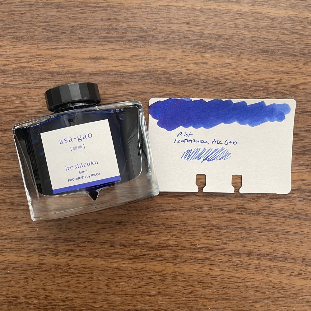
While blue ink is often the “safest” fountain pen ink out there - both for your pens and your reputation at the office - using a standard blue as your daily driver can eventually start to feel stale. I love my Waterman Blue, but given how much writing I actually do on a daily basis, I always try to keep a steady stream of “alternative blues” at the ready to avoid ink burnout. One of my favorite color families to explore are dark teals and turquoises, which add variety and possibly even a touch of sophistication to your notes and/or signatures.

Did you know that it was National Rubber Duck day at the Philly Pen Show last weekend?

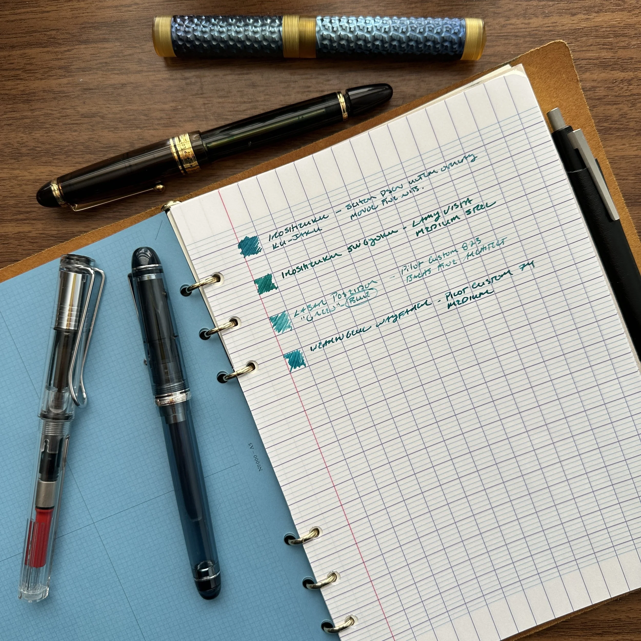
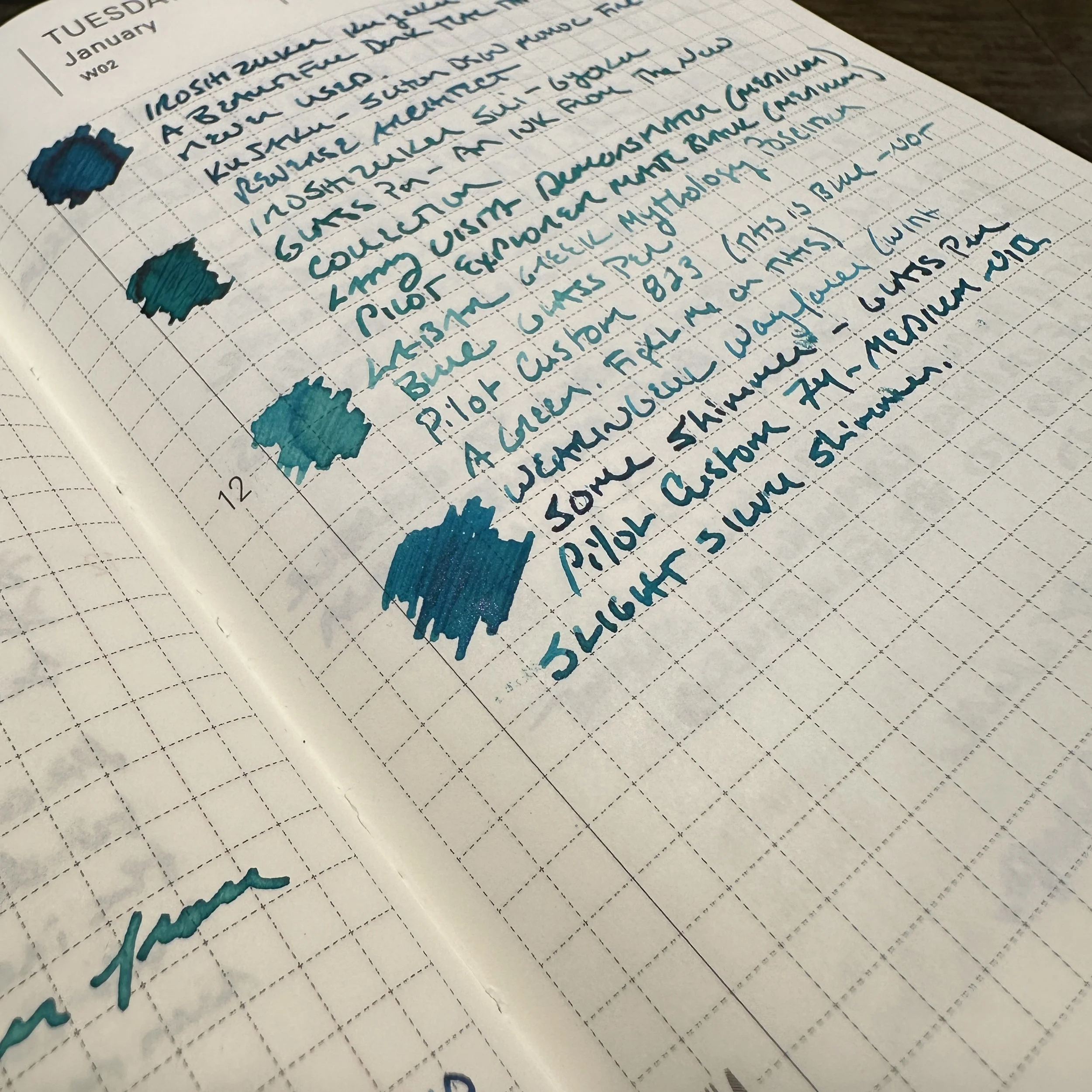
Lately, I’ve focused on four inks for my core “office” rotation: Pilot Iroshizuku Sui-Gyoku, a new release which might be my current favorite from the line; Pilot Iroshizuku Ku-Jaku, an old favorite which shares many of the same tones as Sui-Gyoku, only slightly darker; Laban Poseidon Green, which I consider a blue ink despite how it’s marketed; and Wearingeul Wayfarer, a shimmer ink with subtle pink sparkles that can also be used as a standard ink if you fill the pen without first shaking the bottle.

For my “office paper” writing sample, I chose Clairefontaine Seyes/French-Ruled.

None of these inks would typically be considered exciting, but for work they strike an appropriate balance. “Professional” doesn’t have to mean “boring” - you just have to know where to draw the line. My own rule of thumb is that the ink you use in the office shouldn’t overshadow or distract from the substance of the work you are trying to do. (i.e., You want the person whose memo you are commenting on to focus on the substance of your edits, not the fact that you wrote said edits in fluorescent orange shimmer ink.) On most standard office paper, and to the fountain-pen-uninitiated, these inks will appear blue. When you’re back at your own desk, however, writing on your quality paper of choice, you’ll enjoy the bit of dark red sheen on the Iroshizuku Inks, the shading on the Laban Poseidon Blue, and if you’re really daring, the faintest hint of pink/red shimmer on the Wayfarer!

Writing samples on Tomoe River paper in a Hobonichi A6 Journal.

General Takeaways and Where to Buy

If I recommend an ink for “office use”, it’s because I’ve found the ink to dry relatively quickly, and to resist bleeding and feathering on all but the cheapest of papers. All three meet these requirements, and they’re also relatively inexpensive. The Iroshizuku and Laban inks are priced at under $25 for a full 50ml bottle, and while Wayfarer is a bit pricier at $22 for 30ml, you do tend to pay more for inks with special properties like shimmer. I have to add that I love the look of the Iroshizuku bottles, and have for years kept at least one on my desk at the office as a conversation piece.

If you enjoy our content and are interested in any of the inks featured, we would greatly appreciate your support by visiting and purchasing via our shop. We carry both Pilot Iroshizuku and Laban Greek Mythology Inks in the T.G.S. Curated Shop, and for brands we don’t carry (such as Wearingeul), we would refer you to our friends at Vanness Pens!

Wearingeul Wayfarer Close-Up Shimmer Shot

Every so slight shimmer can be work-appropriate. Just know your workplace!

Editor’s Note: Why Should You Care About Ink Color?

Whenever I write a post like this one, I receive questions and comments about “why I care what people think” about the ink I use in the office. First of all, let’s be realistic - while there are workplaces that would tolerate the use of glitter/shimmer ink on professional correspondence, many do not. You know your office and what you can get away with. For many of us, simply writing with a fountain pen - and the “messiness” it entails - pushes the envelope in and of itself.

Second, many professions (like law) require the use of certain ink colors for specific purposes, with blue the most common for signatures and official documents. In my experience, standard blue ink tends to be the most universally accepted and to behave the best on the widest range of different paper, including cheap recycled copy paper. Teals and turquoises, such as those shown here in today’s post, have mostly similar ink formulations so the performance does not change dramatically.

The Gentleman Stationer is supported entirely by purchases from the T.G.S. Curated Shop and pledges via the T.G.S. Patreon Program. We greatly appreciate your support!

In Ink Reviews Tags Inks, Workhorse Inks, Inks of Choice
3 Comments

Tones Within Tones: Blue-Black Inks of Choice

June 17, 2023

We’re running a sale this weekend in the shop for Father’s Day - through 11:59pm on Sunday, June 18, take 10% off paper and desk accessories using the coupon code “DAD10” at checkout!

A while back I did an "inks of choice" post in which, for the first time, I discussed my favorite inks by broad color category. This wasn't easy, as many of the colors I love and use on a regular basis aren't easy to categorize. Is it a blue? A blue-black? A dusky purple? Is this a yellow or an orange? A red or a brown? Is burgundy it's own color family? (You get the idea.)

Lately I've been involved in a project at my job that has required me to do more writing than I've done in a long time, given my mostly supervisory responsibilities at this point in my career. This has resulted in (1) a lot of different pens getting written dry; and (2) lots of different pens getting inked up, mainly with unassuming blue-black inks chosen for both performance and the fact that they're less distracting than other brighter options. Whenever I get caught up in a project like this one, and find myself looking at multiple inks in the same color family, I end up struck by how much variation there is among supposedly "identical" inks and ultimately realize that it's a key part of why I have so much fun with this hobby. Here, you have six inks that vary pretty wildly, even within brands. At the same time, it’s fun to see the commonalities that certain brands have, like that Pilot red sheen!

My standard ink testing paper is Midori MD Cotton. It accurately reflects color despite being slightly off-white, and showcases ink properties such as sheen and shading fairly well.

Five Inks of Choice (Blue-Black)

Iroshizuku Tsuki-Yo. Tsuki-Yo won the "Blue-Black" slot in the "Favorite Inks" post, and as I mentioned in that post, the main reason I love Tsuki-Yo so much is because it's not your traditional blue-black ink. Typically translated as "Moonlight", this ink features a navy undertone with reddish sheen - an office-friendly ink with just enough subtlety to make it interesting for fountain pen aficionados.

Iroshizuku Shin-Kai. Shin-Kai is what I would call the "true" blue-black in the Iroshizuku lineup. Typically translated as "Deep Sea," Shin-Kai somewhat resembles standard Pilot Blue-Black, but dries to an almost steel grey with blue undertones and, again, red sheen.

Pilot Blue-Black. Whenever I get a new Vanishing Point or other Pilot cartridge-converter pen, often the first ink to run through that pen is a standard Pilot Blue-Black ink cartridge. This particular ink has a degree of water-resistance, which is one reason why so many people enjoy it. What surprises me the most with this ink is the degree of red sheen this ink exhibits, which is even more pronounced than its Iroshizuku counterparts.

I forget how much red sheen Pilot inks exhibit, until I swatch them next to other brands. The standard Pilot Blue-Black is kind of crazy, though the sheen only really comes out

Caran d'Ache Magnetic Blue. The "Grey-Blue-Black" of this group, albeit with purple (?) undertones when wet, Caran d'Ache Magnetic Blue is the most "traditional" blue-black ink of this group. It exhibits some shading but no sheen.

Platinum Blue-Black. Another standard Japanese blue-black ink that I use primarily in cartridge form, Platinum Blue-Black is more blue than other options, and also shows a good degree of water resistance.

Sailor Nano Souboku. Sailor makes a line of "nano" pigmented inks that are permanent, yet still "safe" for use in fountain pens. I've reviewed Kiwa-Guro (the "Nano-Black") in the past, but I've had this pack of the blue-black Souboku cartridges for more than a year and figured that I needed to put them through the rotation. Souboku looks almost teal when wet, and dries to a lighter blue-black shade than the other inks shown here. I like the Sailor "Nano" pigmented inks because they are permanent and tend to perform well on even the cheapest of office papers.

These three are the more “standard” blue-black inks that I’ve used.

Note: Why so many cartridges, you may ask? During my office reorganization/clean-out project from earlier this year, I came across more than a dozen boxes of cartridges, some of which had to be tossed because the ink had evaporated. Cartridges don't last forever, so if you have them, use them!

The Gentleman Stationer is supported entirely by purchases from the T.G.S. Curated Shop and Pledges via the T.G.S. Patreon Program.

Look Ma! No Bleed-through!

In Ink Reviews Tags Inks of Choice, Blue-Black Inks, Pilot Blue-Black, Iroshizuku, Platinum Blue Black, Caran d'Ache
Comment

The Gentleman Stationer Ink Cabinet. Part of it.

The Gentleman Stationer's Favorite Fountain Pen Inks, Inaugural Edition (2023)

May 27, 2023

While I publish an annual list of "Best Pen" recommendations, inks are far trickier, made especially difficult by the dozens of brands and thousands of different colors now available, which wasn't the case when I first started TGS. Over the years, I've done a few lists of my favorite inks for specific purposes, such as office use and annotation, but have shied away from anything more categorical. Then I had the idea: What if I made a list of my current preferred ink for each color category, which I could easily update over time? Here are the rules I came up with:

  1. The ink has to be available. No limited editions that are impossible for people to find because that's no fun to read. (Those can have their own list, if people are interested.)

  2. Broad color categories only with no sub-categories. Keep it simple. Here, I've organized this initial list with 12 slots that loosely tracks the major colors that pen companies typically include in their lineup.

  3. I have to have used the ink in multiple pens over the past year. Some of these inks have been used more than others (brown and yellows don't actually get much time in my rotation), but generally, frequency of use + simple joy determines whether an ink makes the cut.

Here we Go! Fountain Pen Inks of Choice by Color (2023)

Pilot Iroshizuku Asa Gao

Blue: Pilot Iroshizuku Asa-gao. I sometimes go far too long without using this particular ink, but whenever I use it to fill a pen I wonder why I don't just keep a bottle of it on my desk. A bright royal blue that borders on "electric," but is still professional enough to use at the office. It reminds me of Waterman blue that doesn't fade to a duller color after drying.

Black: Lamy Black. When choosing a black ink, some go for the darkest line possible, but not me. I prefer some shading and undertones, especially the purple cast that Lamy Black has when it dries, which gives the ink added depth.

Blue-Black: Iroshizuku Tsuki-Yo. The name translates as "Moonlight", and though I can't exactly explain why, it fits this shade of ink perfectly. Tsuki-Yo leans more blue on the blue-black scale, and exhibits a slight red sheen on some papers. As one of the longest-running inks in my collection, which at the moment I have loaded into three pens, Tsuki-Yo might be my favorite of the Iroshizuku Inks and one of my favorite inks of all time.

Turquoise: Kaweco Paradise Blue. Some of you may be surprised to see two Kaweco inks on this list, but I absolutely love Kaweco's ink offerings and find them extremely underrated. The inks are vibrant, low-maintenance, and inexpensive, and the fact that they come in both cartridges and bottles ensures that you can use them in your Kaweco Sports as well as your piston fillers.

Kaweco Palm Green Fountain Pen Ink

Green: Kaweco Palm Green. I consider Kaweco Palm Green to be of the most underrated inks of all time, not just in the Kaweco lineup. It’s a beautiful rich color that I use regularly even if it can take a bit of time to dry.

Red: Dominant Industry Romania Red. If you were going to have a blood-red vampire-themed ink, it would be this one. This bold, rich color flows well, dries quickly, and doesn't create nib crud. Vampire-themed inks cannot be “pink”, which seems to be a hot topic of conversation these days. Fight me ;)

Burgundy: Montblanc Burgundy Red. The hardest color for me to choose (since most of my favorite burgundy inks are limited editions). I finally went with standard Montblanc Burgundy Red. Though perhaps not as vibrant as some of Montblanc's special edition burgundies, it's a consistently good performer that's a favorite standby.

Orange: Laban Apollo Orange. This orange has been making its way through my orange and yellow TWSBI demonstrators for the past six months. Inspired by the Greek God Apollo, whose symbol traditionally is the sun, this is a “pure orange” ink with a slight tinge of red to help with the legibility.

Yellow: Anderillium American Goldfinch Yellow. The first yellow ink I've found that's truly legible, due to its gold/goldenrod hue, American Goldfinch Yellow can be used for actual writing in addition to highlighting and annotation.

Brown: Laban Demeter Brown. A dark brown, but not quite a brown-black. For my brown inks, I tend to enjoy the darker browns and sepias, because they take on a vintage look as they dry.

Waterman Tender Purple Fountain Pen Ink

Purple: Waterman Violet. Not "Tender Purple" or whatever they're calling it these days. Violet. Be warned that of all the Waterman inks, this one has a tendency to stain, so be sure you don't mind your converter (or clear demonstrator) having a slight purple tint long-term. (Definitely do not use in light-colored celluloid pens.) That said, it’s one of the most vibrant purple inks out there, and when I want my writing to stand out, this is my choice.

Grey: Scribo Grigio. I've been on a massive grey ink kick over the past year, and I keep returning to Scribo Grigio. While some might argue with me on this point and call the ink more of a blue-black, I'm going with grey here and the blue tint is what makes it interesting.

Pink: Laban Aphrodite Pink. This final color is extremely difficult, but at the end of the day I have to go with Aphrodite. Some would say this isn't a pink ink at all, but the criteria here dictate that I have to stick with an ink that I've actually used over the past year. In the pink category, this is the clear winner.

Some of the aforementioned inks we sell directly in the T.G.S. Curated Shop, where we are running a Memorial Day Weekend Promotion (10% Off) with the code “SUMMER23” at checkout. Otherwise I have linked to retailers who are friends of mine. This post does not contain paid advertising or affiliate links.

In Ink Reviews, Top 5 Tags Best Inks, Inks of Choice, Fountain Pen Inks
9 Comments
Store Location
Visit the T.G.S. Curated SHOP
*New* Updated "Best Pens" Guide (2025)
TGS x Hinze Pens Violet Tendencies Taschenstift Fountain Pen
Hierarchies of Fountain Pen Friendly Paper
Allex Scissors arrayed on a desk showing link to desk accessories

Join Our Patreon!
Subscribe to the TGS E-mail List

Featured Posts

Featured
Pilot-Iroshizuku-Yama-Budo-Writing-Sample.jpeg
May 24, 2025
Joe's Picks: Five Favorite Inks From Pilot's Iroshizuku Lineup
May 24, 2025
May 24, 2025
Yamamoto-Gray-Paper-Sampler-Set.jpeg
May 10, 2025
Discovering Unusual Paper: "Paper Tasting" Sets from Yamamoto Paper
May 10, 2025
May 10, 2025
Four-Micarta-Fountain-Pens.jpeg
Apr 19, 2025
Yes, Micarta for me! I finally got my hands on Some Micarta Pens, Plus My Own Special Edition
Apr 19, 2025
Apr 19, 2025
The Gentleman Stationer RSS

© Digital Divide Media, LLC, 2014-present.

All content is the exclusive property of Digital Divide Media, LLC, d/b/a The Gentleman Stationer, including “The Gentleman Stationer” website and trademark, and should not be reproduced without express written permission.  All rights reserved.

All content containing paid advertising, affiliate links, or sponsored content will be plainly disclosed by a disclaimer when/if featured.

Contact Information

Store Shipping Policy and Return Policy

Privacy Policy

Cookie Policy

Terms and Conditions

Powered by Squarespace