Taccia is on a roll, having recently doubled the size of their much-loved Ukiyo-e series of fountain pen inks from 16 to 32 colors. Earlier this month, we received an initial shipment of the Kuniyoshi series, which sold quickly but has since been restocked. Just this past week (with our restock) we also received eight (8) new Hokusai inks. I’ve swatched all of the new colors and from this most recent release, Nakahanada and Rikan-Cha are probably my two favorites!
Hokusai Nakahanada is best described as a dark teal black, with some sheen. Note that these new releases also have artwork on the bottles.
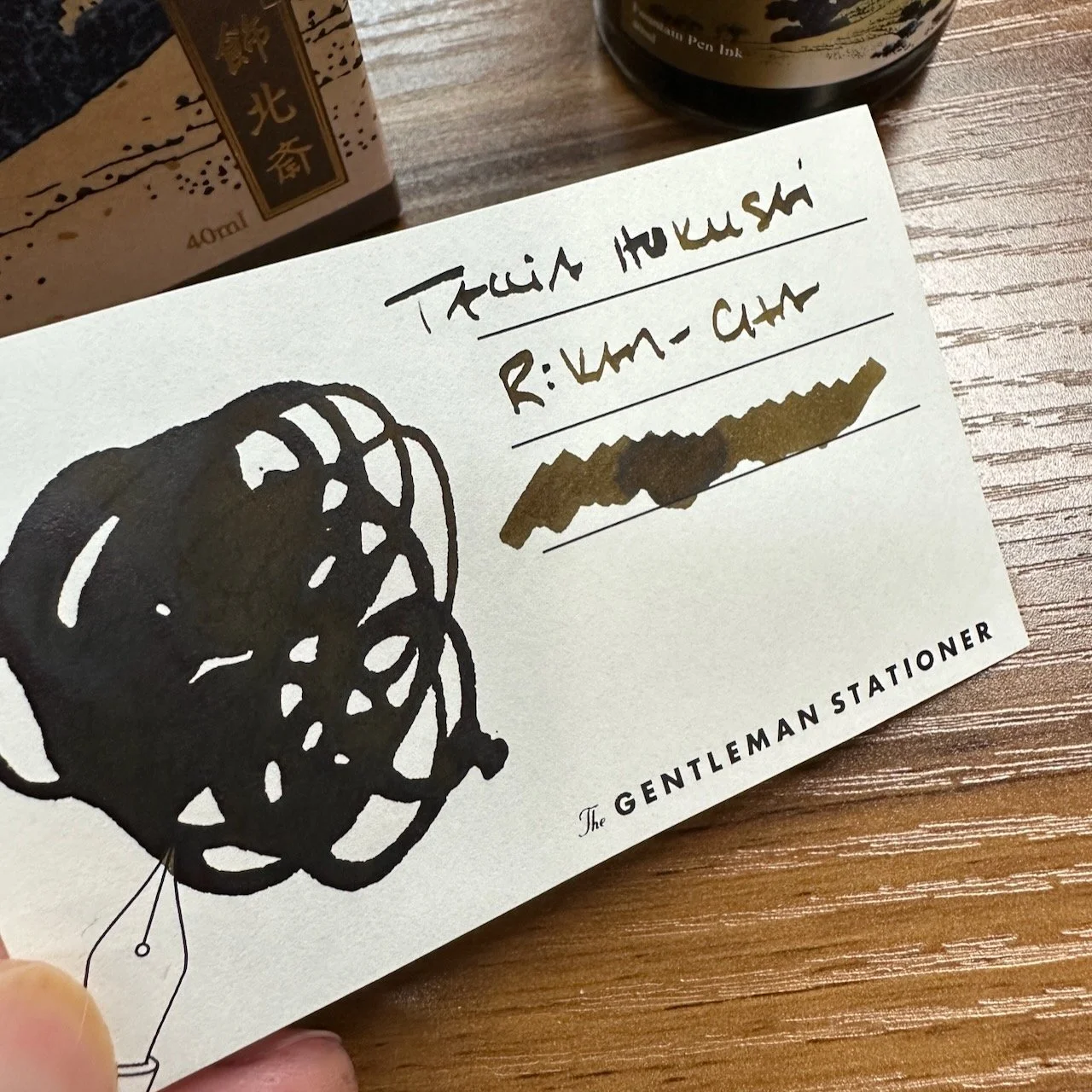
Rikan-Cha is a dark greenish brown.
Most of the Taccia Ukiyo-e inks are currently available, including all of the Kuniyoshi and the 8 most recent Hokusai inks. They can be purchased both in our online shop and in the Nashville store, and as always you can compare color swatches using our shop swatch books.
We will be open normal hours this week in our Nashville shop, from 1-6pm Thursday and Friday, and from 10am-6pm Saturday. Stop by to see these and more in-person!