• Blog
  • Shop
  • Resources
  • FAQ (Ask TGS)
  • About
  • Archive
  • Contact
  • Sign In My Account
Menu

The Gentleman Stationer

Vintage Living in the Modern World.
  • Blog
  • Shop
  • Resources
  • FAQ (Ask TGS)
  • About
  • Archive
  • Contact
  • Sign In My Account
Colorverse Colorvent and Diamine Inkvent Calendars

Inkvent and Colorvent 2024: Recapping the First 10 Days of December

December 11, 2024

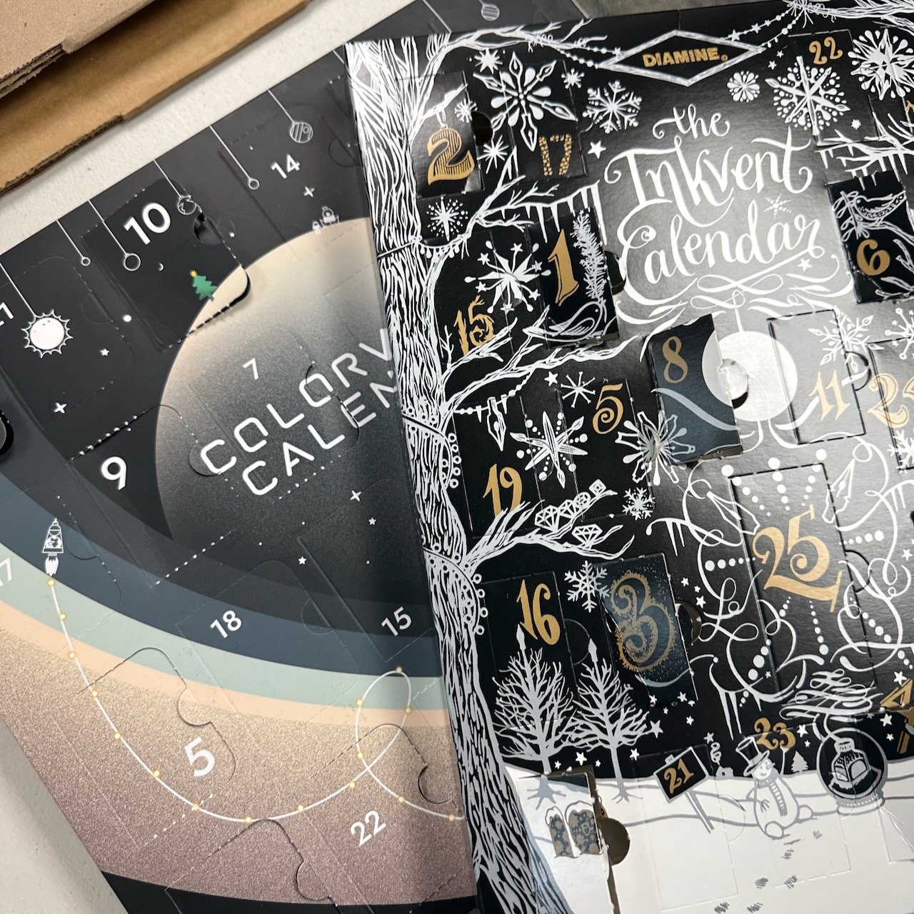
There’s pretty much an Advent calendar for every interest these days. Tea, coffee, beer, wine, chocolate, pencils, art supplies, and - of course - fountain pen ink! Believe it or not, there are now three different fountain pen ink advent calendars on the market: the Diamine Inkvent Calendar (the original); the Colorverse “Colorvent” Calendar (new this year); and the Enigma Stationery Inkvent Calendar (put together in-store, and which collects different brands).

This year, I purchased a Diamine Inkvent and Colorverse Colorvent calendar, and have been walking through each of the inks on the T.G.S. Instagram Account (check out the stories). As a bit of a twist, this year I added a highly scientific poll to each Instagram Story that allowed readers to vote Yay, Nay, or “Blah” for each ink. Here are the top three inks for each calendar, by vote:

Top Three Diamine Inkvent Inks So Far

Diamine Inkvent, Day One: Baltic Breeze. This one surprised me a bit with it’s popularity, but I guess it appeals to a lot of people.

Day 8: Marley. A bit of a multi-shader and subtle color, so no surprises this one was a favorite.

Diamine Icy Lavender Inkvent Day 5

Again, this one was not one of my top three, but these icy cool shimmer inks are always favorites.

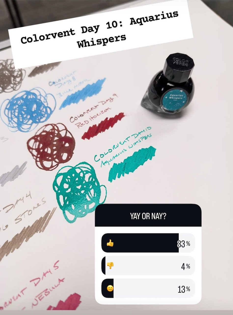
Top Three Colorverse Colorvent Inks So Far

Cool color, but not my personal favorite. I think people were just happy to see something other than red, taupe, or navy blue.

It will not surprise anyone that Red Horizon is my personal favorite of all the inks to date. Colorverse indicated they might add a few of the more popular Colorvent inks to the standard line, and I hope this one makes it as I’ll want a giant bottle.

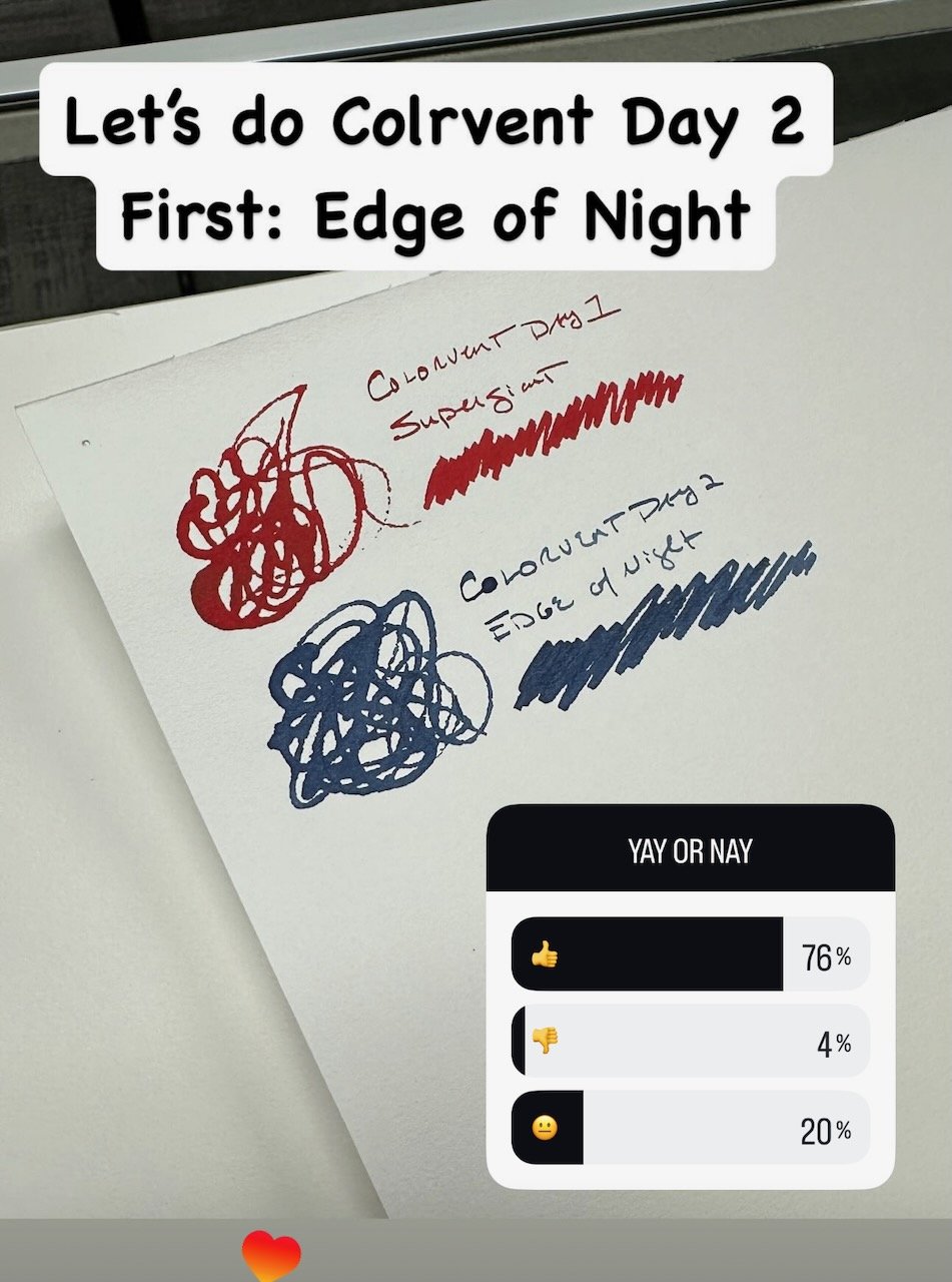
It only took two days for a typo! I was kind of surprised that this was one of the more popular Colorvent inks. It’s a great color - don’t get me wrong - but not as festive as some of the other calendar options.

Takeaways and General Observations on Each Calendar as a Whole

I don’t have a clear “favorite” in terms of Inkvent vs. Colorvent. The two calendars are VERY different, and will appeal to different people. I’ll share my own thoughts on each, as well as one ink I felt was unfairly maligned at the polls.

  • Overall Festiveness. Diamine Inkvent wins by a long shot. Nearly all of the inks are winter and holiday-themed, and of the first 10, a whopping six are shimmer inks, compared to one for the Colorvent.

  • Usability. Of the two calendars, the Colorverse Colorvent calendar has more inks that I would use for everyday writing. There are fewer shimmer inks and bright holiday-themed colors, and as a whole - at least through the first 10 days - the colors are more muted, understated tones which I appreciate. So far, purchasing the Colorvent calendar would give you a very nice collection of inks that are usable year-round.

  • Value. Here, I’ll probably give the slight edge to Diamine, mainly due to a greater ink variety and a much lower price, but it’s close. While neither calendar is inexpensive, with Diamine Inkvent priced at $120 and the Colorvent Calendar at $180, Diamine is 30% less. Diamine gives you 24 12ml bottles of ink and one larger 30ml for the last day. Colorverse gives you 24 15ml bottles. I will add that the Colorvent Calendar makes a more impressive gift - Colorverse uses its signature glass bottles (making for a substantial-feeling package), and also went above and beyond on the packaging design, including a short blurb “behind the door” that describes the inspiration for each ink.

And finally, here’s the one ink that shocked me with how poorly it did in the polling. Diamine “Wishing Tree” doesn’t photograph very well because there’s a lot of subtle color-shifting and understated shimmer going on. I’ll have to post some additional photos later, because I’m probably keeping this one.

The Colorverse Colorvent Calendar and the Enigma Inkvent Calendars sold out long ago, so you’re probably too late to pick one up unless you can convince someone to sell you a calendar on the secondary market. It’s not too late to play along with Inkvent, however! Diamine makes a LOT of Inkvent Calendars, and they are still available at many retailers (including us). We only have one or two left at the time of publication.

If you missed out on the inky Advent calendar that you wanted, we still have plenty of ink available in our shop, including lots of recently added brands! If you’d like to peruse ink in person, we have extended holiday hours Thursday through Sunday. Come see us!

In Ink Reviews Tags Colorverse Colorvent Calendar, Diamine Inkvent 2024, Ink Review, Editorial

First Impressions: Five Favorite Inks from the Teranishi Guitar Lineup

November 9, 2024

I was a bit too late to get these listed in the Thursday drops post, but I spent most of the day before flying out to the Chicago Planner Conference swatching and photographing the entire line of Teranishi Guitar inks, fresh in from Japan! (Technically, the official name for the line is the “Teranishi Guitar Taisho Roman Haikara” inks, but let’s just go with “Teranishi Guitar” for the sake of brevity in today’s post.)

I love the presentation on these inks - I rarely pay much attention to boxes but the artwork looks nice and the bottles seal well.

The inks are manufactured by Teranishi Chemical Industry Co., Ltd, which is a Japanese maker of markers and art supplies located in Osaka, and while they have been popular in Japan for years, they’re less commonly available in the United States. I’m happy to be able to offer them (and, if I’m honest, to have the opportunity to play around with the entire line). Based on my initial swatching and review, here are my five favorite colors so far

Teranishi Guitar Gentle Green

So far, my favorite of the bunch. The color-shifting and sheening properties are similar to Taccia Hokusai-sabimidori, though the tones lean more green.

Teranishi Guitar Antique Black

An off-black with reddish/sepia undertones (depending on the paper)? Count me in. The reddish sheen here is particularly pronounced on the Col-o-ring card I used to swatch the ink.

Teranishi Guitar Smoky Navy

Teranishi Guitar Smoky Navy Swatch

This dark blue has a LOT of depth, with grey and red in addition to navy coming through.

Teranishi Guitar Brilliant Mint

Teranishi Guitar Brilliant Mint Swatch

Brilliant Mint might be the sleeper of this line: it’s appearance ranges from mint to aqua to more of a turquoise, depending on paper and lighting.

Teranishi Guitar Classy Burgundy

Teranishi Classy Burgundy Swatch

The maroons and burgundies might be my favorite color family, and it’s hard to find one without too much brown or red or purple. Teranishi’s take is fairly well-balanced and what I would call a classic burgundy ink. I’m really looking forward to writing with this one.

Teranishi guitar Initial Impressions and Purchase Details

Based on my initial tests, the Teranishi Guitar inks behave quite well, with excellent flow and good depth of color. As you can see from the pictures above, several of the inks will show a fair amount of sheen on some papers, though it’s not overwhelming, and these inks all had reasonable dry times with the Kakimori Brass Nib I use for my ink swatches. If I had to draw a comparison between the Teranishi Guitar inks and others I’ve used in the past, I would point to Taccia and Sailor inks as comparable options.

Guess what I chose for my Fountain Pen Day 2024 present to self? A Green Lamy 2k! I paired it with Teranishi Gentle Green and love the combination.

The Teranishi inks are priced at $23 for a 40ml bottle, and as of now all 16 colors are available for purchase in our shop, both online and in-person. Please check this page for updated brick-and-mortar hours. I typically update the shop hours on Monday for the coming week.

The Gentleman Stationer is supported by purchases from the T.G.S. Curated Shop and pledges via the T.G.S. Patreon Program.

In Ink Reviews Tags Teranishi Guitar, Teranishi Guitar Taisho Roman Haikara, Teranishi Inks, Ink Review, TGS Curated Shop
1 Comment

Ink Review: Three Dark Purples from Tom's Studio (Juniper, Iris, and Constellation)

October 26, 2024

This post started out as an experiment in which I attempted to find the perfect dark purple ink to pair with my Bokumondoh-enhanced Montblanc 149, but I ended up experimenting with and extensively testing the three darkest purple inks from the Tom’s Studio ink lineup. I figured I would go ahead and write up my thoughts on each one of them. Read on to the bottom to see my final verdict on the best match for the 149!

You can really see the variation in tone between the top writing sample (made with the 149’s stub nib and a glass swizzle stick), the bottom left (.8mm Drillog dip pen), and a Kakimori dip nib, the latter of which is still wet.

No. 12: Juniper (“The Sheening Dark Purple”)

Tom’s Studio Juniper was the first ink that I tried, because I thought the combination of the dark purple and the gold sheen would pair quite well with the gold trim and raden finish on the 149. I wasn’t wrong, and have really enjoyed this pairing. It helps that, despite being a super sheener that finishes with a thick gold sheen over the dark purple, Juniper doesn’t smear once it’s dry. Those who love sheening inks - especially those inks that sheen in multiple colors - understand how rare that can be. In recent years, however, I’ve noticed that inkmakers have improved the overall performance of “sheeners,” and nowadays you don’t experience as often the situation where you open a journal entry from weeks/months/years ago and the ink still hasn’t dried. :(

I took a pass at Juniper with a couple of different ink swatching tools to see if I could capture the different appearances of the ink. In a fine or extra-fine nib, it will look almost black (which I love), but the gold sheen takes over. The Kakimori writing sample (at right) has not completely dried yet, so this is how the ink looks when it’s still wet.

No. 9: Constellation (“The Purple Black”)

I would call Constellation the “non-sheening Purple Black” in this line. Well, there is some sheen, but it’s more of a glisten, roughly the same color as the ink itself (with maybe a hint of red?) so you’d still call this a purple once it dries. Constellation might also be the least “interesting” of these three inks, because it’s a fairly conservative, solid color. That said, it’s an excellent work ink that won’t look out of place on official correspondence or around the office. I would add that Constellation works great in the Tom’s Studio Lumos pens because it’s so saturated, and I’ve had this one loaded into my Lumos mini for several months without issue.

Tom's Studio Constellation Writing Sample

Constellation dries to a mostly dark purple-black. The tones are subtle.

No. 11: Iris (“The Classic Purple”)

Iris might be one of my new favorite purple inks. It’s bright without being “nuclear”, with neither too much red nor too much pink, and it’s definitely not blue. It hits that “Waterman Violet” vibe, maybe slightly toned down and a bit darker? I enjoy using purples, but in order for me to be able to use them consistently at home and at work, the tone can’t be too crazy. This particular ink dries quickly, and I’ve had no issues with bleedthrough or staining (another potential issue to watch with brighter purples).

Takeaways and Where to Buy

The Tom’s Studio ink line has turned into one of my everyday favorites (and not just because it’s what I’ve had hanging around the shop - though that’s an added benefit). As someone who appreciates darker colors and more subdued versions of pastels, most of these inks match my personal taste, and the fact that they’re relatively saturated makes them work well in the Lumos fineliners as well as fountain pens. If you’re interested in reading further about other colors, you can check out this previous post. I’ve found all of these inks low-maintenance and very well-behaved in the pens I’ve used them in, and have enjoyed the purples and the greens/green-blues the most.

Tom’s Studio Inks are made in the U.K., possibly by Diamine, though it’s unconfirmed, and that would be consistent with the quality.

If I had to pick a favorite from the three I reviewed in this post, it would be a toss-up between Iris and Constellation. Iris offers that pop of bright purple/violet while not being eye-searing or too pink, while Constellation is the purple-black that I would use every day. Juniper will occasionally make it into the rotation, but I’m REALLY wanting to load the Iris into the Bokumondoh pen and get a bit of contrast between the black pen body and the ink!

I do kind of wish the Juniper would stay that pure purple black color once it dried!

Tom’s Studio fountain pen inks currently come in 19 different colors and are priced at $16 for a 50ml bottle of ink. We also carry most of the Tom’s Studio Pens in our shop, and are freshly restocked with new arrivals.

The Gentleman Stationer is supported by purchases from the T.G.S. Curated Shop and pledges via the T.G.S. Patreon Program. If you enjoy our content, please consider supporting us directly. If you’re in the Nashville, Tennessee area, please visit us at our physical store!

In Ink Reviews Tags Tom's Studio Inks, Fountain Pen Ink, Ink Review
1 Comment

The nib on the Platinum Desk Pen (which I’ve installed on a Platinum Plaisir) is a bouncy steel extra-fine that many love for drawing and works great with Platinum Carbon Black.

Ask TGS: Permanent Inks for Artists and Attorneys

July 17, 2024

Whenever I get asked about permanent inks, it's typically a question from an artist or an attorney. Many artists enjoy inks that allow them to draw a dark line and then wash over it with ink or watercolors (or both), whereas the attorneys are typically concerned about permanence of a signature on a legal document and preservation of work product.

This writing sample shown above was soaked for approximately 20 minutes in a sink full of water. This is the result. The paper wrinkled and started to fall apart more than the ink bled.

So what are my recommendations? While I'm not an artist, nearly all of my artist friends recommend Platinum Carbon Black as a drawing and sketching ink of choice. Carbon Black is a pigment ink, similar to other inks such as Sailor Kiwa-Guro "Nano Black", Noodler's Bulletproof Black, Tom's Studio Pigment Black, among others. These inks are formulated differently than most fountain pen inks, in that they rely on pigments that dry quickly and bond to the paper rather than water-based dye, and therefore have very fine particles that can potentially clog your pen if left to dry out. That's not to say they are "unsafe" - these inks are very much intended for use in fountain pens, but they do require periodic maintenance in the form of a thorough cleaning, especially when changing ink colors. The upside? I can say that these inks are absolutely "waterproof," not just water-resistant. (In addition to the photograph shown here, I posted a short video to YouTube demonstrating how I soaked this piece of paper in standing water and how the ink barely moved at all.) And if the ink does end up drying out and clogging your pen, a simple flush with water should fix the issue.

Water-resistant, but not waterproof: Caran d’Ache Magnetic Blue, a blue-black that was also soaked in the sink for the same amount of time.

For attorneys - and speaking as one myself - I would say that you have a bit more leeway. If you need absolute permanence (i.e., for a signature on a contract), you can of course use a pigmented ink or a ballpoint. But if what you're concerned about is preserving handwritten notes or marked-up documents, or simply avoiding losing work product due to spilled water or coffee, there are other suitable options to serve that more limited purpose. For example, certain blue-black inks such as Pilot Blue-Black, TWSBI Blue-Black, Pelikan Blue-Black, Caran d'Ache Magnetic Blue, etc., are highly water-resistant to the point that most writing will survive a simple spill, especially one that is cleaned up quickly. Similarly, any ink that contains iron-gall will have high water-resistance, including the line of Platinum "Classic" inks. (As with pigmented inks, you should clean your pen thoroughly to avoid mixing iron gall inks with standard fountain pen inks, which could result in clogs.)

Though pigmented black inks and blue-black inks with iron-gall content get the most attention (probably because they have been around the longest), companies do make other colors of permanent inks. Shown here are Platinum Pigment Blue cartridges (which we carry in our shop), and other options include the Kakimori pigment inks, Noodler’s “Bulletproof” inks, and Sailor Storia line, which come in a wide array of colors.

I personally don't worry much about permanence with fountain pen inks. In nearly 20 years of using fountain pens, I can count on one hand the number of times I've completely lost a piece of writing due to a spill, none of which ended up being of any importance. That said, I will regularly use low-viscosity ballpoints such as the Uni Jetstream whenever permanence could be at issue. You can even use pencil, which is both water and fade-resistant, though documents that must be permanent for legal reasons generally require ink.

Do you have a favorite permanent or water-resistant ink? Drop a comment!

The Gentleman Stationer is supported entirely by purchases from the T.G.S. Curated Shop and pledges via the T.G.S. Patreon Program. If you enjoy our content, please consider supporting us directly!

In Ask TGS, Ink Reviews Tags Fountain Pen Inks, Ink Review, Platinum Ink, Platinum Pigment Inks, Ask TGS
3 Comments

Ink Review: Caran d'Ache Magnetic Blue as a Classic Blue-Black

July 3, 2024

I flushed all of my inked fountain pens at the end of June. After six months worth of pen shows, testing out store product samples, and a generally chaotic schedule that often left me with little time to regroup, I once again ended up with around two dozen inked pens. Some were 3/4 empty, some had dried out, and others just needed to be cleaned because the whole scene was making me twitch.

For this fresh rotation, I went back to a variation on an experiment I'd tried in the past: inking up six pens, with two old favorites, two pens for review, and two randomly chosen pens, one custom and one vintage. For inks, I decided to work with a tried-and-true ink line that I absolutely love but don't use as much as I should: Caran d'Ache Chromatics.

The nib holder is from our collaboration with Nic Pasquale (PensByPasquale), which is now sold out. Stay tuned for more exclusive releases!

If forced to pick, my favorite of all the Caran d'Ache Chromatics inks would likely be Magnetic Blue, which is an old-school blue-black shade. A dark navy with a hint of grey, Magnetic Blue sits somewhere between traditional iron gall blue-blacks and "midnight blue" inks. I find that it generally flows quite well. On some papers, it will have a hint of red sheen, but it’s subtle. I was looking for a "classy" dark ink for my Waterman Exception I acquired in Chicago, and this ended up as an excellent pairing.

In a finer nib the ink will appear quite dark, which I love for work. It dries fairly quickly, even on non-absorbent paper.

While to my knowledge this particular blue-black ink does not contain iron gall, it does have a moderate degree of water resistance. I've included a picture below of the writing sample (on Cosmo Air Light paper) after being held under a running faucet for approximately one minute. The writing remains highly legible, and this ink would easily survive a water or coffee spill onto a notebook.

View fullsize Caran d'Ache Magnetic Blue Writing Sample
View fullsize Caran d'Ache Magnetic Blue Writing Sample (Water Test)

Caran d'Ache ink used to have a reputation as being overpriced (at one point I believe it rang in at $50 per bottle), but the price has since come down to the $35 range - not inexpensive but in line with other premium inks sold in 50ml glass bottles. Personally, I love the design of the Caran d'Ache glass bottle. It's a deeper inkwell that's slightly angled to make it easier to fill larger nib pens, and the hexagonal inkwell design looks great on a desk.

We've been Caran d'Ache retailers for nearly four years now, and stock all of the various Chromatics inks in both bottle and cartridge form, as well as Caran d'Ache pens and pencils. If you enjoy our content, please consider supporting us directly!

In Ink Reviews Tags Ink Review, Caran d'Ache Ink, Caran d'Ache Magnetic Blue
2 Comments
← Newer Posts Older Posts →
Store Location
Visit the T.G.S. Curated SHOP
*New* Updated "Best Pens" Guide (2025)
TGS x Hinze Pens Violet Tendencies Taschenstift Fountain Pen
Hierarchies of Fountain Pen Friendly Paper
Allex Scissors arrayed on a desk showing link to desk accessories

Join Our Patreon!
Subscribe to the TGS E-mail List

Featured Posts

Featured
Pilot-Iroshizuku-Yama-Budo-Writing-Sample.jpeg
May 24, 2025
Joe's Picks: Five Favorite Inks From Pilot's Iroshizuku Lineup
May 24, 2025
May 24, 2025
Yamamoto-Gray-Paper-Sampler-Set.jpeg
May 10, 2025
Discovering Unusual Paper: "Paper Tasting" Sets from Yamamoto Paper
May 10, 2025
May 10, 2025
Four-Micarta-Fountain-Pens.jpeg
Apr 19, 2025
Yes, Micarta for me! I finally got my hands on Some Micarta Pens, Plus My Own Special Edition
Apr 19, 2025
Apr 19, 2025
The Gentleman Stationer RSS

© Digital Divide Media, LLC, 2014-present.

All content is the exclusive property of Digital Divide Media, LLC, d/b/a The Gentleman Stationer, including “The Gentleman Stationer” website and trademark, and should not be reproduced without express written permission.  All rights reserved.

All content containing paid advertising, affiliate links, or sponsored content will be plainly disclosed by a disclaimer when/if featured.

Contact Information

Store Shipping Policy and Return Policy

Privacy Policy

Cookie Policy

Terms and Conditions

Powered by Squarespace