• Blog
  • Shop
  • Resources
  • FAQ (Ask TGS)
  • About
  • Archive
  • Contact
  • Sign In My Account
Menu

The Gentleman Stationer

Vintage Living in the Modern World.
  • Blog
  • Shop
  • Resources
  • FAQ (Ask TGS)
  • About
  • Archive
  • Contact
  • Sign In My Account

Pen Review: Kikkerland Retro Pens as a Bic Clic Replacement

December 8, 2018

Last year I declared the Bic Cristal “(Arguably) the Greatest Pen Ever Made.” Clickbait? Maybe, but I also didn’t get much disagreement. The Cristal has been around forever, beloved by everyone from students to accountants to artists. This past year, the Cristal refill even spawned its own Kickstarter project - a machined aluminum barrel called the “Baux Pen”. (It’s awesome, by the way, and any Bic devotee should consider picking up a couple once they hit the open market.)

No I didn't get shortchanged. These Kikkerland “Retro” pens are sold in packs of five, but one of the pens is living in my travel backpack.

But while millions of Bic Cristals are still produced every year, is it really the most beloved and/or iconic Bic pen? That’s questionable, considering how much people love the Bic Clic, the retractable ballpoint pen that you’ll recognize instantly if the name itself doesn’t ring a bell. The Bic Clic was the original quick-deployment pen used by reporters, doctors, attorneys, clerks, cops - well, you get the point, pretty much anyone who needed a reliable pen that was easy to use “in the field.” Bic ballpoint refills pretty much last forever, and you’ll run across boxes of vintage promotional Clic pens at yard sales and flea markets, many of which still have working refills 20 years later.

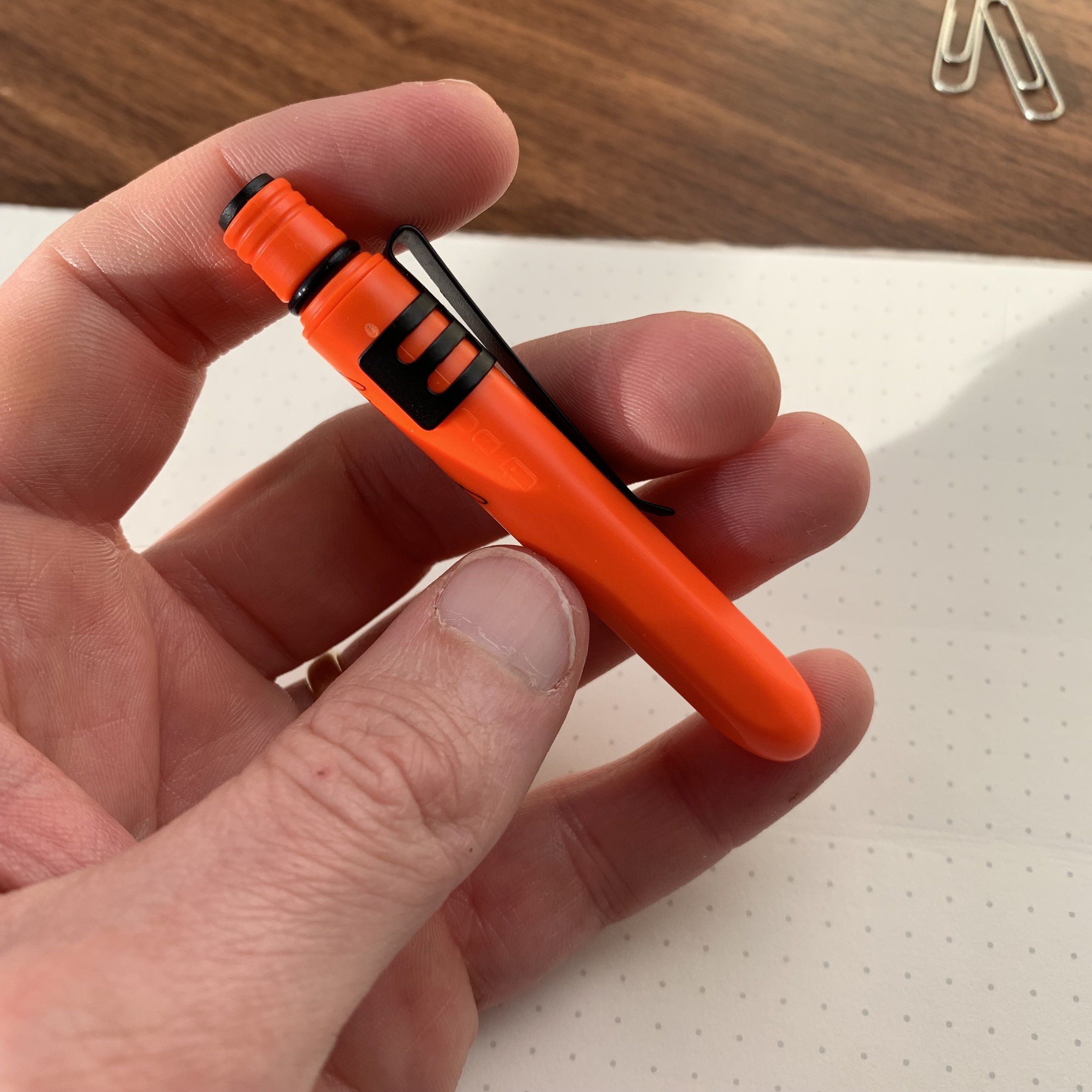
Look familiar? It’s a slightly nicer version of the pressed metal Bic Clic clip and nock. The Kikkerland version has a brushed texture.

To the dismay of many, Bic no longer makes the classic “Clic” pen for the regular market. If you want the classic, vintage-style retractable Bic pen (and have it actually be branded “Bic”), you’ll apparently need to spring for a large volume order of customized pens, or purchase someone else’s private-labeled version, like the ubiquitous Field Notes click pens or, as pictured here, the generic Kikkerland version.

Another shot of the clips and a close-up of a couple retro colors

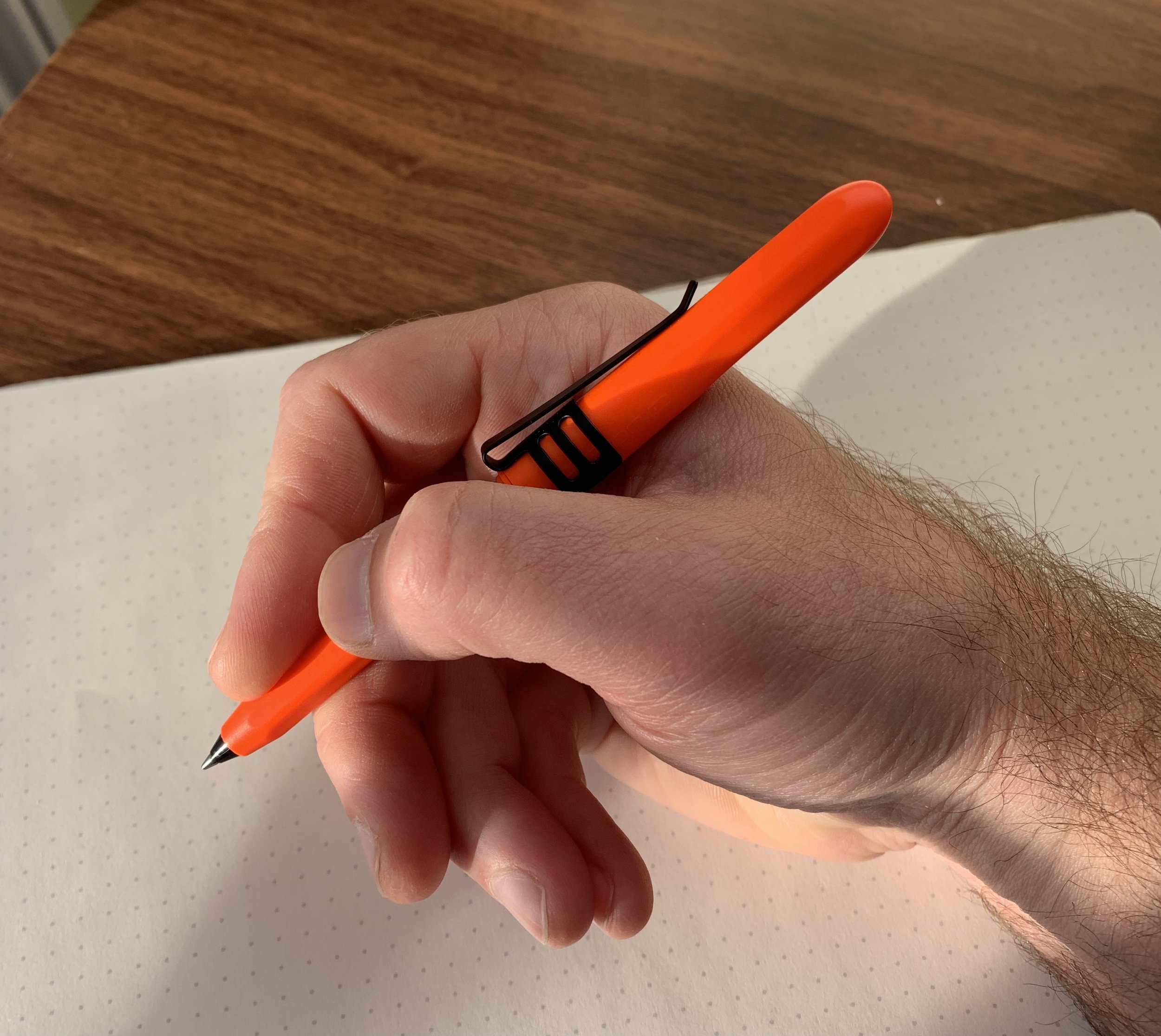
Personally, I like the 1960s-esque retro styling of the Kikkerland pens. It looks as though they’ve tried to make an “upgraded” version of the BiC Clic, with a more finished clip, and nock mechanism that feels solid. There’s no rattling and the pen extends and retracts with a solid “thunk” and an audible - pretty loud, actually - click. Students and fellow office monkeys will be glad to know that they can annoy the heck out of someone with this pen in a boring class or meeting. In terms of the refill, the Kikkerland version appears identical to the Bic refill in one of my Field Notes pens.

Takeaways and Where to Buy

I like these pens (and Bic Clics in general). The Kikkerland pens are slightly pricey for what they are (a disposable ballpoint click pen) but the price wasn’t particularly egregious and the nostalgia factor sold me. No regrets here for this Bic fan.

I’ve stopped trying to predict where I’ll see Kikkerland stationery products “in the wild.” I occasionally run across them in bookstores, which is where I picked up this pack of Retro Pens. If these interest you, Amazon is probably the easiest way to grab a 5-pack and they currently qualify for Prime shipping. Kikkerland also sells metallic versions. Other old-school retractable ballpoints include the Bic-Clic branded Field Notes Pen I mentioned above, and the “government-issue” Skilcraft ballpoints that everyone seems to love but that I’ve never used. I really should do another guide/list sometime!

Disclaimer: This post contains affiliate links.

In Pens Tags Ballpoint, Bic Clic, Kikkerland, Retro
Comment

Pen Review: Pokka Pen / Rite-in-the-Rain All-Weather Pen

December 6, 2018

If you recall the story behind the original Pokka Pen, Terry developed the concept because he was tired of losing his expensive Fisher Space Pens, and wanted something relatively replaceable that offered a similar writing experience. While the original Pokka Pen was, and remains, a high-quality, cost-effective replacement, it lacked certain features that made the pressurized Fisher cartridge so great - namely exceptional waterproofing and the ability to write upside down. Enter the “All-Weather” Pokka Pen a couple years later.

This Pokka All-Weather Terry sent me for review came equipped with the new clip, available for purchase separately and shown here on a “Blaze Orange” All-Weather Pokka Pen.

Designed in partnership with both Fisher and Rite-in-the-Rain, the two leading companies in the “all-weather” EDC writing space, the All-Weather Pokka Pen features a pressurized Fisher cartridge and the “Rite-in-the-Rain” logo emblazoned on the side. Otherwise, the All-Weather Pokka Pen is identical to the standard Pokka, which isn’t a negative in my book because the original Pokka Pen has a nearly perfect design and build for a product in its intended niche.

View fullsize Pokka All-Weather Closed
View fullsize Pokka All-Weather Extended for Writing

The pen works as expected. One pleasant surprise was a very fine tip size on the cartridge - finer than either the standard Pokka Pen or the Fisher Space Pen. For someone who writes relatively small, I always enjoy discovering new options for fine-tip ballpoint pens, and this one has been a steady companion in the car and in my coat pocket.

Takeaways and Where to Buy

I actually ended up preferring the All-Weather Pokka Pen to the standard Pokka (and even the standard Fisher Space Pen) due to the finer tip size and the slightly drier ink. Pokka and Fisher nailed the cartridge, which is a joy to write with and works flawlessly.

Rite-in-the-Rain, or in the sun! The Pokka All-Weather in Blaze Orange compared against my Fisher Space Pen Brass Bullet.

The only thing that gives me some pause is the current price point and lack of refill availability. A standard Pokka Pen costs roughly $2-3 per unit, depending on how many of them you purchase, with refills available if you don’t want to just recycle the pen body after it runs dry. The All-Weather pens currently costs just under $13 for a two-pack, which makes sense given the relatively expensive pressurized cartridge, but no refills are currently available. Rather than lay out $13 for two disposable pens, some people may choose to go ahead and purchase a Fisher Space Pen that they can refill if they aren’t scared to lose it. (Note: Regular Pokka refills weren’t available when the product first launched, and pressurized refills may be introduced at a later date.)

You can purchase the All-Weather Pokka Pen directly from the Pokka website, along with the standard Pokka Pens in all of their great patters and colors, and using the coupon code “GENTSTA” you can get 10% off your purchase. Pokka Pens make great stocking stuffers, btw, and my family has enjoyed receiving them for the past couple of years! For that reason I’ve included them in the past couple of TGS Holiday Gift Guides.

Disclaimer: Pokka Pens sent me the samples featured in this review free of charge, for review purposes.

In Pens Tags Pokka Pens, Fisher Space Pen, Rite in the Rain, EDC
Comment

From Left: Sailor Sapporo Mini; Sailor Pro Gear Color; Sailor Pro Gear Imperial Black.

Pen Review: Sailor Pro Gear Sapporo Mini

December 1, 2018

Sailor discontinued the "pocket” version of its popular Pro Gear fountain pen, the Sapporo Mini, a few years ago, prompting a run on retailers’ remaining stock and, from what I recall, somewhat of a frenzy at a recent Atlanta Pen Show when a former Sailor distributor showed up with a handful of pens she was looking to unload. What many people don’t realize, however, is that Sailor continues to make these pens for the Japanese market, including for Nagasawa department store’s private label, “PenStyle." Fans of Sailor will know that Nagasawa has a close relationship with the pen company, and that Sailor private labels dozens of “Kobe Inks” for the store in addition to special edition pens.

The Nagasawa cap finial (left) compared against the standard Sailor design (right). Note that the yellow used in the Sapporo Mini is a deeper, mustard yellow, which I prefer to the brighter yellow acrylic used on the Pro Gear Color.

The differences between a standard Sailor Sapporo Mini and the Pen Style version are mostly cosmetic. The cap band is engraved “PenStyle Memo,” and instead of the Sailor anchor logo, the finial features a plain yellow dot bordered in black. While the nib is stamped “Sailor” at the bottom, leaving no doubt who made it, the primary artwork is an engraved dragon with “Kobe” and “1882” inscribed over it - a reference to the founding date of Nagasawa, from what I understand.

A different style of nib engraving, but you still know it’s a 14k Sailor nib, meaning that it’s stiff as a nail but quite smooth.

You all know that I love the standard Pro Gear, and if you’re also a fan of that pen, or a fan of the Pro Gear Slim, you’ll appreciate the Sapporo Mini as a true “pocket carry” iteration of those pens. Capped, the Sapporo Mini is tiny, fitting almost entirely inside my closed hand. Unposted, the pen feels very small and too short to be usable by almost anyone - it’s meant to be posted. The short barrel has threads at the back, allowing you to post securely, and this pen extends to almost the same length as a standard Pro Gear Slim. While it’s definitely on the smaller side, I can use it comfortably for longish periods of time.

Once this pen is posted and fully extended, it’s actually not that small (shown here compared against a standard Pro Gear).

View fullsize Sailor Sapporo Mini Posted
View fullsize Sailor Sapporo Mini Capped
View fullsize Sailor Sapporo Mini Unposted

Note that the Sapporo Mini is cartridge-only, as the barrel is too short to accept a converter. (Sailor apparently made a “mini converter” for this pen years ago, but discontinued it.) Typically, the lack of a converter option wouldn’t bother me much, since I have a bunch of cartridges lying around at any given time, but Sailor cartridges are proprietary so this ended up being a bit of a pain. I chose to stock up on cartridges of Sailor’s pigmented inks. I’m partial to the Souboku Blue-Black, but the Kiwa-Guro Nano-Black is also excellent.

Sailor’s pigmented “nano” blue-black, Souboku, has a great color that’s fairly unique. It’s water-resistant and dries quickly.

The Sailor Nano-ink cartridges have an extra little touch that I find kind of charming.

Takeaways and Where to Buy

I purchased my Sapporo Mini in yellow because, well, I have a thing for yellow pens and if yellow is an option, I’m probably going with that. The pen also comes available in red or black, with a choice of extra fine, fine, and fine-medium nibs. If you’re in the States, you can order through eBay Seller Cool Japan, where you can pick one of these up for a bit less than the price of a standard Pro Gear Slim. Cool Japan also carries a range of other Sailor/Nagasawa collaborations and other special editions, including Pro Gear Slims in custom colors like Tarumi Apricot, the Sailor 1911 Standard Clear Demonstrator with black-plated trim (referred to as the “Proske”), and the “Tequila Sunrise” Pro Gear from Sailor’s “Cocktail” series.

I keep this pen in my collection for two reasons. First, it’s a unique iteration of one of my favorite pens, the Sailor Pro Gear, and I suspect it eventually will have some value as a collectible because I don’t see Sailor/Nagasawa making this pen forever. Second, I only have one Sailor “Fine-Medium” nib in my collection, and I love this line width.

One final thought on “pocketability” - I don’t use this pen as a true “pocket pen” because it’s plastic and far from indestructible. That said, I do enjoy having a more portable version of the Pro Gear that’s very light in the shirt or jacket pocket, especially when I travel. While this isn’t a pen I ink up all the time, it’s also not one I can see myself parting with anytime soon.

Further Reading

If you like the look of the Sapporo Mini, check out my other reviews of the full-size Sailor Pro Gear fountain pens. I’ve previously reviewed the “Imperial Black” version, the Pro Gear Sky limited edition, and the “Soleil” version of the piston-filling Pro Gear Realo, which was another limited edition collaboration between Sailor and Japanese retailer Bungubox. While I’ve scaled back my collection in recent years, the Pro Gear remains one of my favorite fountain pen designs of all time.

Disclaimer: I purchased the pens featured in this review with my own funds, for my own collection. This post contains affiliate links.

In Pens Tags Sailor Pro Gear, Sailor Sapporo Mini, Kobe Nagasawa, Pen Review, eBay
Comment

Pen Review: Graf von Faber-Castell Classic

November 14, 2018

I firmly believe that Graf von Faber-Castell makes some of the most beautiful stationery items in the world. The high-end, luxury arm of the global Faber-Castell stationery empire, their stated goal is to “embody ‘Luxury in Simplicity’ by combining selected materials, functionality and superb aesthetics.” While I’m not yet sure that the overall design of their pens works for me from a purely functional perspective, I can’t argue with the beauty and the quality.

At first I wasn’t sure how I felt about the two-toned gold nib, but ultimately I think it works paired with the dark brown wood.

The GvFC Classic, which I’ll review here, is the company’s flagship pen. I wouldn’t call the design “simple” - there’s a lot of different design elements going on - but at the same time GvFC has made an elegant writing instrument that doesn’t lose its functionality as a pen that you could use every day. And the nib… I’ve written before about how I think Faber-Castell makes some of the best stainless steel nibs available, including at relatively low price points. The 18k gold fine nib on the pen I tested writes even better, and has a surprising bit of spring to it. You won’t get much line variation, as it’s still a relatively stiff 18k nib, but a touch of bounce makes for a smooth and comfortable writing experience.

As with most pens made from wood, each Graf von Faber-Castell Classic and Classic Anello is going to show variations in the wood grain, making each pen unique.

As with most pens made from wood, each Graf von Faber-Castell Classic and Classic Anello is going to show variations in the wood grain, making each pen unique.

The two core elements of the Classic are Graf von Faber-Castell’s signature cap and the wood used to make the barrel. The different versions of the Classic are named to reflect the various woods used, including ebony, pernambuco, snakewood, grenadilla, and macassar. The standard Faber-Castell Classic features solid wood barrels with a ribbed texture, while the “Classic Anello” model, pictured here, features wooden barrels with inlaid metal rings.

The coin-edging on the top of the cap is one of my favorite details on this pen.

In my opinion, along with the nibs, the caps on Faber-Castell pens set them apart. The Graf von Faber-Castell Classic features a platinum-plated, solid metal cap that looks sort of like a chimney or old-fashioned smokestack that flares out at the top with coin edging. It’s similar, but not identical, to the cap used on Graf von Faber-Castell’s iconic - and somewhat ridiculous - “Perfect Pencil”. Even on most of their lower-end pens, Faber-Castell uses sturdy, spring-loaded clips that attach well to pen cases, bags, and shirt pockets. (Yet another sign that these pens aren’t just eye candy, but meant to be used.) The downside to these caps, however, is the weight, which brings me to….

What About Posting…?

Finally, the big potential drawback for me, and the reason why, at least to date, I don’t have a Graf von Faber-Castell Classic in my collection: this pen doesn’t post. (Technically, the pen will post, but the weight of the metal cap on the back end renders the pen far too heavy to make posting comfortable for even short writing sessions.) On the flip side, for such a slender pen, the Classic feels perfectly balanced and comfortable unposted. The combination of wood/metal construction, a long grip section, and a bit of added length helps in this regard. Prior to an extended test-run with the Classic, I had thought that the Classic would be too slim, and that I’d ultimately conclude “nice pen; not for me.” That’s not the case. I’m still considering this pen, especially now that I know they have a dark-trim Macassar version, but I need to get comfortable with the fact that I won’t be able to post it.

View fullsize Graf von Faber-Castell Classic Unposted
View fullsize Graf von Faber-Castell Classic Posted

Takeaways and Where to Buy

I’m a huge fan of standard Faber-Castell products, and, as I expected, I also enjoyed my first experience with the Graf von Faber-Castell Classic. In fact, I would say that if the ability to post your pens is not a must-have feature, a Classic is a no-brainer addition to any high-end pen collection. The 18k nib writes exceptionally well, and the intricate combination of wood and metal in the design, especially the GvFC signature clip and cap, render Graf von Faber-Castell pens unlike anything else on the market.

Pricing on the Graf von Faber-Castell Classic typically runs from $400-500. The Classic Anello Grenadilla, as pictured here, is priced at $458 at Appelboom, based on the current exchange rate. While certainly an expensive pen, the Classic sits on the lower end of the pricing spectrum for luxury brands of this quality. Site sponsor Appelboom, who loaned me this pen for review, carries the full range of Graf von Faber-Castell products.

Did I mention that the packaging and presentation on GvFC products are top notch? A few more pictures are shown below, including the presentation box which doubles as a three-slot pen case.

View fullsize Graf von Faber Castell Logo on Presentation Box
View fullsize Graf von Faber-Castell Classic in the Presentation Box
View fullsize GvFC Classic Anello, Grenadilla
View fullsize GvFC Classic Anello Grenadilla, in Presentation Box

Further Reading

I’ve recently reviewed several Faber-Castell pens, including the E-motion Pure Black and the Loom, and both pens have remained fixtures in my rotation. They are also significantly less expensive than the Graf von Faber-Castell pens, demonstrating that you can get the same Faber-Castell quality for less money. Their ink is also excellent.

Disclaimer: The pen featured in this review was loaned to me by Appelboom for review purposes. This post contains affiliate links.

In Pens Tags Graf von Faber-Castell, Appelboom
Comment

Pen Review: The Esterbrook "Estie"

November 8, 2018

Getting to handle the new Esterbrook pens was one of the highlights from this year’s D.C. Pen Show. When Kenro first announced that they had acquired Esterbrook back in April, I suspected they would turn out something good, but the Estie far exceeded my expectations. Given the history with the “new” Esterbrook brand, first resurrected a few years ago to little acclaim and much derision in the pen community, I was concerned that the Estie wouldn’t get a fair shake, but it appears that the reception has been largely positive, mainly because you can’t argue with the fact that the quality is top notch.

For my two review pens, I chose Esties in Cobalt Blue with chrome trim and Tortoise with gold-plated trim. An ebony model is also available, and you can opt for either trim on any color pen.

Particularly striking to me is how this pen feels in the hand. I’ve used a LOT of turned acrylic pens - I probably own dozens - but the materials chosen for the Esties feel solid and have a lot of warmth, reminiscent of ebonite or celluloid (even though they’re obviously not). The section in particular is quite comfortable, and I find myself wanting to write with this pen for long periods of time. I also absolutely love the vintage cigar shape. Though I’m not a collector of vintage pens, I very much appreciate vintage-inspired design, and the Estie sports the beautifully streamlined look of a classic Sheaffer balance, sans cap band or any adornments other than the clip and an engraved “Esterbrook” logo.

Two features are being used extensively to market the Estie: the “cushion cap” closure and the “MV Adapter,” the latter of which is available for purchase separately, and allows you to use your vintage Esterbrook nibs in the new pen. After some initial skepticism, I’m a fan of the cushion-cap. It’s a spring-loaded inner cap that requires you to push the cap down and turn in order to engage the threads to close the pen. It takes a time or two to get used to, and after that you don’t notice it much. The one thing I don’t love about it is that it makes it difficult to post the cap straight on the barrel - a very minor annoyance, but I’m a poster, so there it is. On the other hand, the purpose behind the cushion cap is similar to Platinum’s “Slip & Seal” system on the 3776 Century: the nib won’t dry out even if you leave the pen sitting unused for long periods of time. This may be convenient for some people, but it’s not so much a selling point for me, nor is it a feature I’m likely to test. I tend to write my pens dry fairly quickly.

The MV Adapter alters the overall look of the pen quite a bit. The adapter only comes in black, and vintage Esterbrook nibs are narrower than their modern JoWo counterparts. From an aesthetic perspective, if you’re looking to purchase this pen primarily for the MV Adapter, consider the Ebony model.

Similarly, while vintage Esterbrook enthusiasts who own a large collection of vintage nibs might view the MV Adapter as an essential, those who merely want a smooth steel nib on their daily workhorse can probably take a pass. I honestly prefer the feel of modern steel JoWo nibs to standard Esterbrook fines or mediums, and wouldn’t spring for the MV Adapter unless you want to use your vintage Esterbrook stubs, flexies, or stenography nibs. (Confession: I’m not a vintage Esterbrook enthusiast. I like the “J” series and Dollar Pens just fine, but I only own one or two vintage nibs, and I didn’t get particularly invested in the drama over the sale of the brand. The MV Adapter therefore doesn’t have much emotional resonance with me personally.)

Even the packaging has a retro flare. I love the cloth box.

Even the packaging has a retro flare. I love the cloth box.

That said, major kudos to Kenro for making peace with vintage Esterbrook enthusiasts, and for envisioning a way to connect the “new” and “old” Esterbrook pens by incorporating a key feature of the vintage brand: the ability to swap the absolutely massive array of available Esterbrook nibs. The MV Adapter works quite well, though you do have to use a different converter, and I suspect that the relaunch of the brand and nib compatibility will prompt vintage nib hoarding and, eventually, price gouging. While Esterbrook nibs are fun to play around with, I don’t personally think the quality justifies the prices some people are willing to pay today for what amounts to a stainless steel nib that can be kind of scratchy. For the prices charged on some of the vintage specialty nibs you could purchase a custom grind.

View fullsize Esterbrook Estie Unposted
View fullsize Esterbrook Estie Posted

Takeaways and Where to Buy

Short answer: the Estie is a great pen that I can wholeheartedly recommend as an everyday writer, but it’s the overall classic look of the pen and comfort in the hand that wins my recommendation, rather than a fancy cap closure or vintage-nib adapter that, frankly, most brands do just fine without and that I could take or leave.

Esterbrook Pens are available from most Kenro retailers and were widely distributed at launch. Site sponsors Pen Chalet, Vanness Pens, Anderson Pens, and Goldspot all stock the Estie. (Full Disclosure: I acquired the Cobalt Blue Estie pictured here from Pen Chalet using affiliate credit, and Kenro sent me the brown Tortoise Estie for review purposes.) The pricing of the pen has prompted some debate. Currently the standard (MSRP) pricing on the Esterbrook Estie is around $195, with the retailer “street price” around $156, after applying all permissible discounting and coupon codes. The standard Estie comes in three colors: Cobalt Blue, Tortoise, and Ebony, with all colors available in either chrome or gold-plated trim. Esterbrook also has released an oversized version of the Estie, available in Ebony only, at a MSRP of $250 and a street price of $200.

Some people have remarked that this pricing is inconsistent with the spirit of the brand. Esterbrook, after all, was a “budget-friendly” pen back in its heyday. Some vintage Esterbrooks cost only a dollar (hence the “dollar pen” models). I tend to disagree with such assessments. In today’s market, given the realities of manufacturing and distribution costs, $150 seems to be the price point at which smaller brands are able to make a high-end fountain pen without running into significant quality control problems. Turned acrylic pens are more expensive than cheaper injection-molded plastic models, and the $155 price point is lower than both Edison and Franklin-Christoph pens, with which the Estie compares favorably. Plus, if we want these companies to stick around to serve a small (albeit growing) niche market, they need to be able to turn a profit.

Disclaimer: This post contains affiliate links.

In Pens Tags Pens, Esterbrook, Estie, Kenro
4 Comments
← Newer Posts Older Posts →
Store Location
Visit the T.G.S. Curated SHOP
*New* Updated "Best Pens" Guide (2025)
TGS x Hinze Pens Violet Tendencies Taschenstift Fountain Pen
Hierarchies of Fountain Pen Friendly Paper
Allex Scissors arrayed on a desk showing link to desk accessories

Join Our Patreon!
Subscribe to the TGS E-mail List

Featured Posts

Featured
Yamamoto-Gray-Paper-Sampler-Set.jpeg
May 10, 2025
Discovering Unusual Paper: "Paper Tasting" Sets from Yamamoto Paper
May 10, 2025
May 10, 2025
Four-Micarta-Fountain-Pens.jpeg
Apr 19, 2025
Yes, Micarta for me! I finally got my hands on Some Micarta Pens, Plus My Own Special Edition
Apr 19, 2025
Apr 19, 2025
2025-Arkansas-Pen-Show-haul.jpeg
Mar 29, 2025
Unboxing the Arkansas Pen Show Haul! Two Nib Grinds, Inks, and a New Pen
Mar 29, 2025
Mar 29, 2025
The Gentleman Stationer RSS

© Digital Divide Media, LLC, 2014-present.

All content is the exclusive property of Digital Divide Media, LLC, d/b/a The Gentleman Stationer, including “The Gentleman Stationer” website and trademark, and should not be reproduced without express written permission.  All rights reserved.

All content containing paid advertising, affiliate links, or sponsored content will be plainly disclosed by a disclaimer when/if featured.

Contact Information

Store Shipping Policy and Return Policy

Privacy Policy

Cookie Policy

Terms and Conditions

Powered by Squarespace