• Blog
  • Shop
  • Resources
  • FAQ (Ask TGS)
  • About
  • Archive
  • Contact
  • Sign In My Account
Menu

The Gentleman Stationer

Vintage Living in the Modern World.
  • Blog
  • Shop
  • Resources
  • FAQ (Ask TGS)
  • About
  • Archive
  • Contact
  • Sign In My Account

Pen Review: Leonardo Momento Zero Arlecchino

February 8, 2020

Italian brand Leonardo Officina Italiana - referred to as “Leonardo” for short - has developed into one of the major success stories in the modern fine writing market. Founded after the collapse of Delta by designer and penmaker Salvatore Matrone (who previously worked for Delta), Leonardo has gradually expanded its lineup from the original Momento Zero to include the “Furore,” the newly announced “Messenger,” and the pen reviewed here, the “Momento Zero Grande.” I’ve chosen to review a limited edition version of the latter: the Momento Zero Grande Arlecchino (“Harlequin”) that was announced a few months back.

Leonardo’s packaging on the Arlecchino is reminiscent of OMAS, from the box liner to the faceted ink bottle. (The ink is excellent, by the way. Look for a separate review soon.)

The Problematic History of the Omas Arlecchino

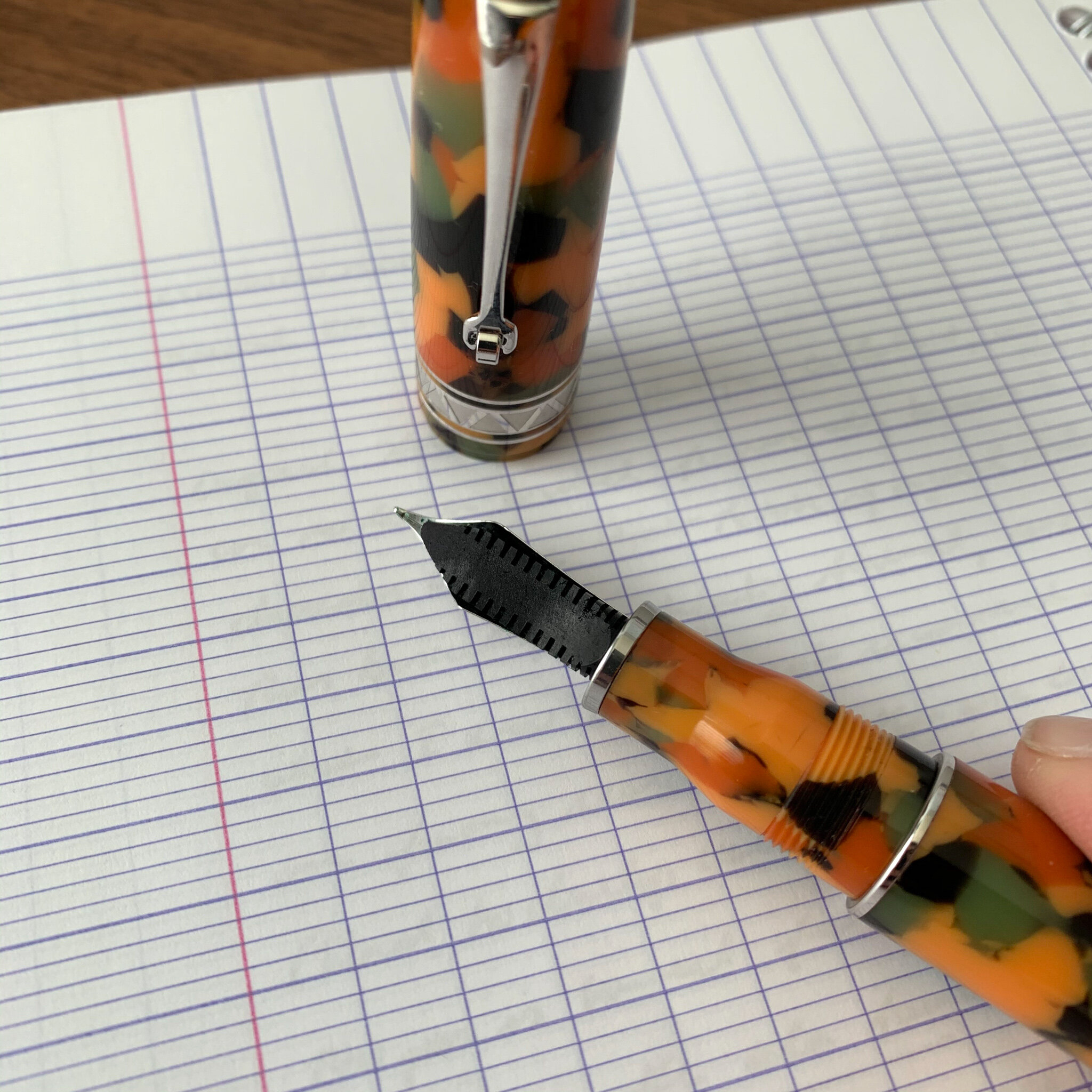
This particular pen is inspired by the Omas limited edition “Arlecchino” fountain pen from the early 2000s, of which only 750 were made. While beautiful, the celluloid used to make these pens had a tendency to degrade over time, resulting in cracks and deterioration in the structure of the pen. Instead of attempting to work with the classic Arlecchino celluloid - if any even remains usable - Leonardo (or someone assisting in the production of these pens) developed an acrylic that closely resembled the original, with similar shades of green, black, and orange scattered throughout. I don’t know that it’s been clearly communicated that the material used to make the Leonardo Momento Zero Grande is NOT the same material used by Omas, given that I’ve received multiple comments from those concerned that this pen will disintegrate. The structural issues affecting celluloid generally do not affect acrylic resin (provided it is competently made), and this particular “Arlecchino” pen does not pose the same long-term durability issues.

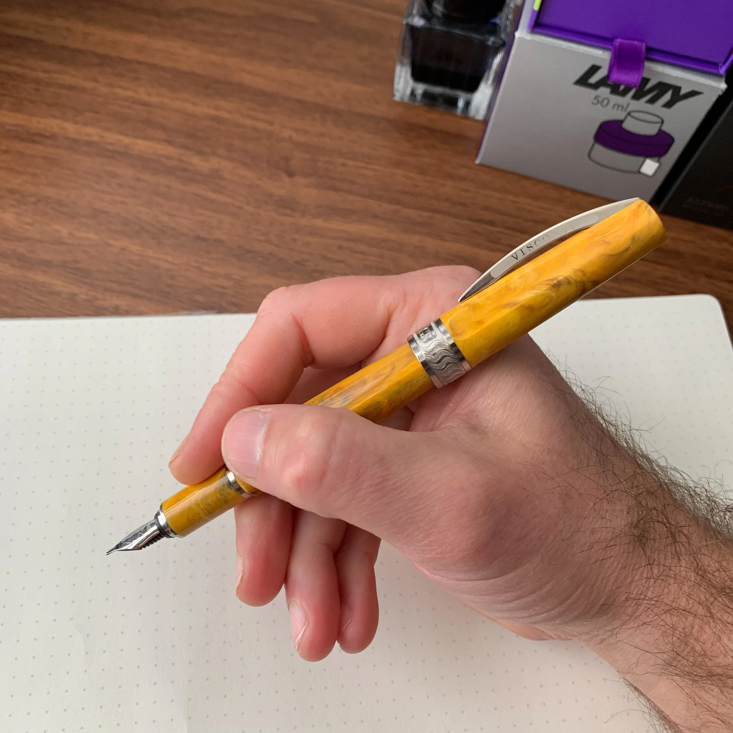
The “Arlecchino” acrylic features darker orange, olive green, and black flecks within a lighter orange/peach base color.

Design and Build Quality of the Momento Zero Grande

Like the standard Momento Zero, the build quality on the larger version is exceptional. I understand that all Leonardo pens are hand-turned, and the pens reflect a high degree of expert craftsmanship in both the design and the finish. The appeal of any pen from a design standpoint is naturally subjective. Longtime readers of this blog know that I was a fan of Delta - at least their “subtler” designs - and the Momento Zero Grande falls squarely within that tradition.

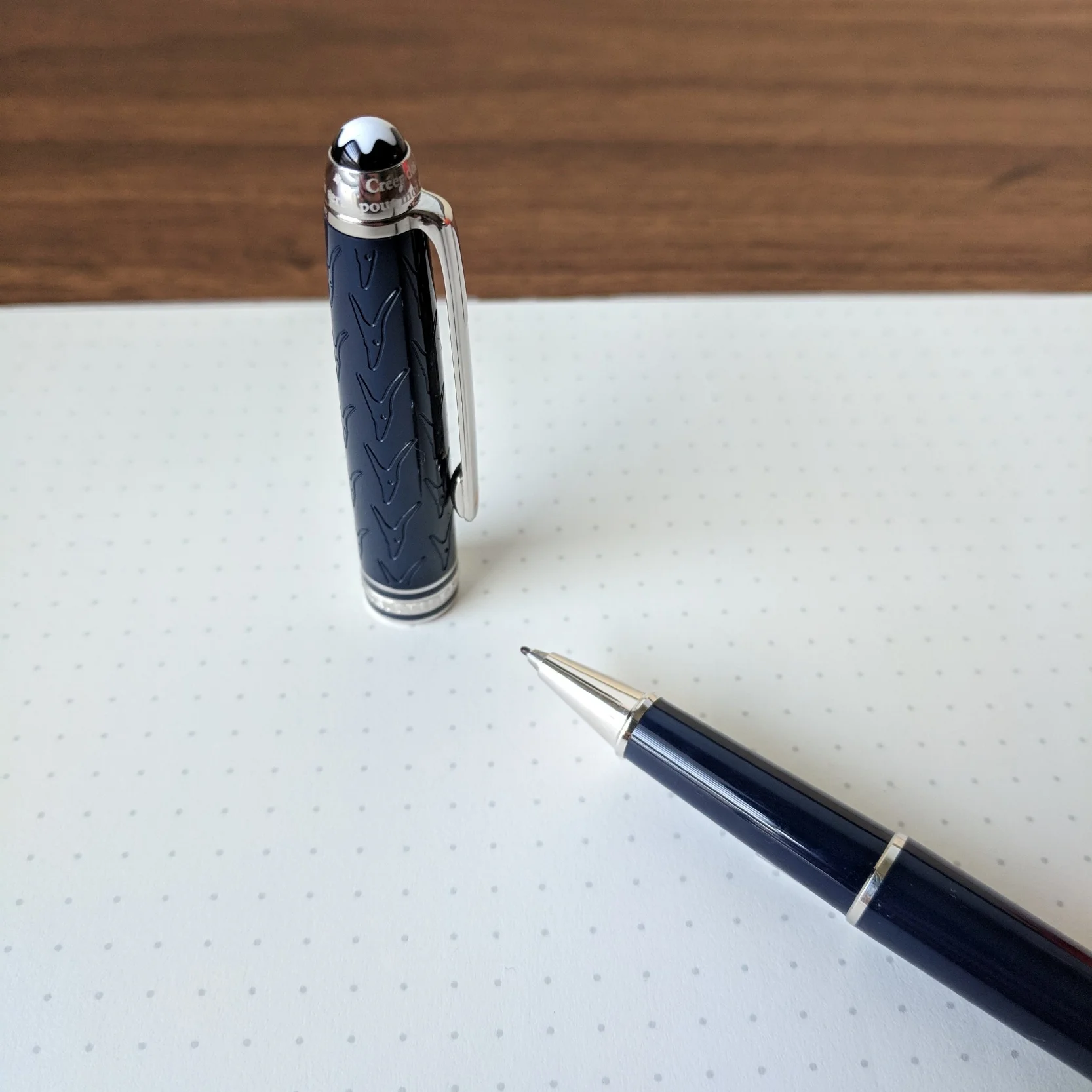
Like many larger Delta Pens, the Momento Zero Grande features a piston/captured converter system that holds a lot of ink. To fill the pen, you don’t need to unscrew the section. The blind cap reveals the end of the converter - in effect the hidden “piston knob” - that fans of Delta pens either loved or hated.

The Arlecchino is far from a minimalist pen, and the material itself may come across as a bit loud to some, but it’s generally free from unnecessary adornments. Leonardo elected use a subtle zigzag engraving on the cap band and the ring just below the blind cap. The design, along with the Greek key pattern etched onto the captured converter, lends the pen an Art Deco vibe.

This is a high capacity converter which threads onto the section. I assume it can be removed for cleaning, but I’m not sure I would do it. I like that you can unscrew the section to check your ink level.

Nib and Overall Writing Experience

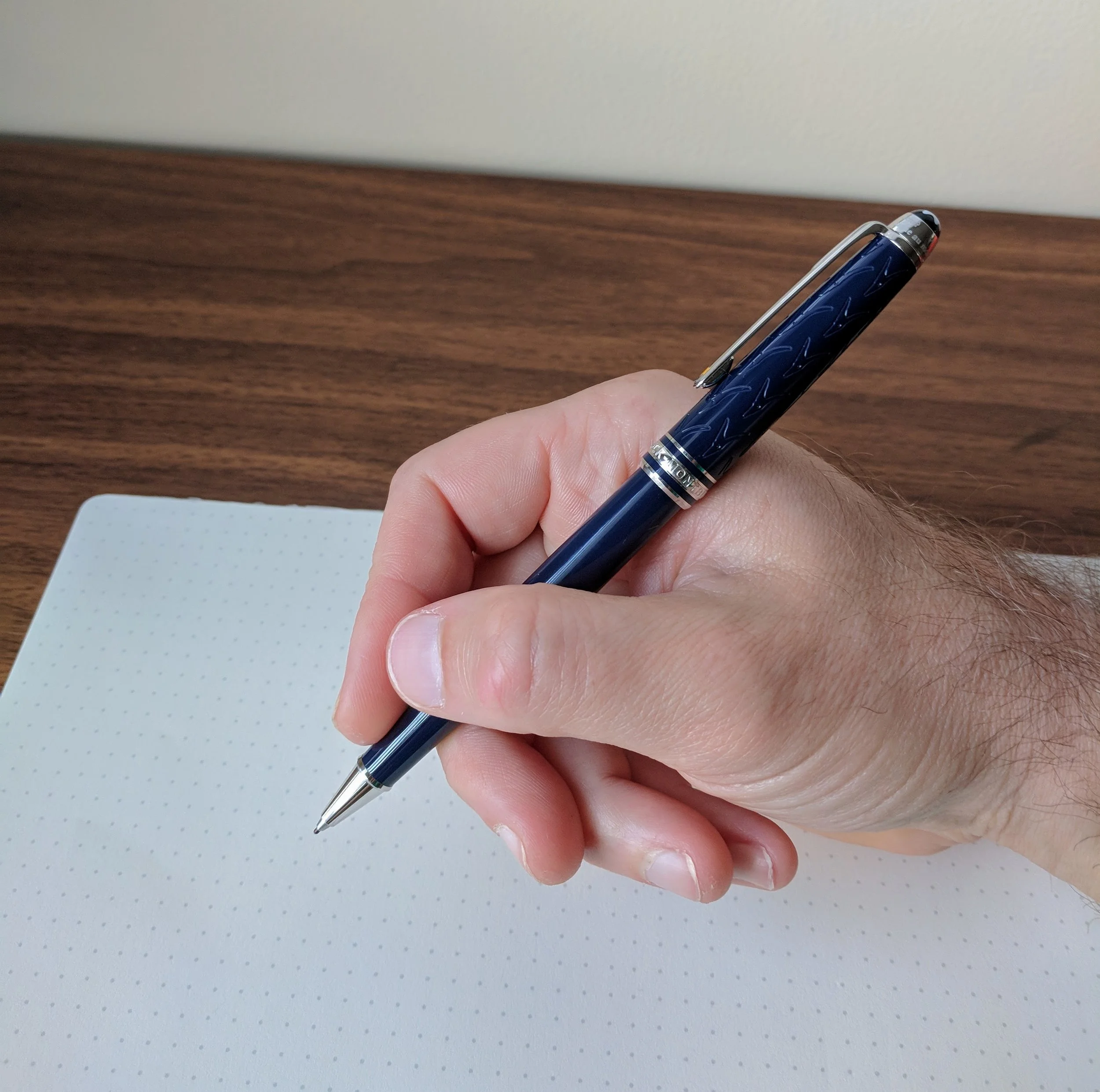
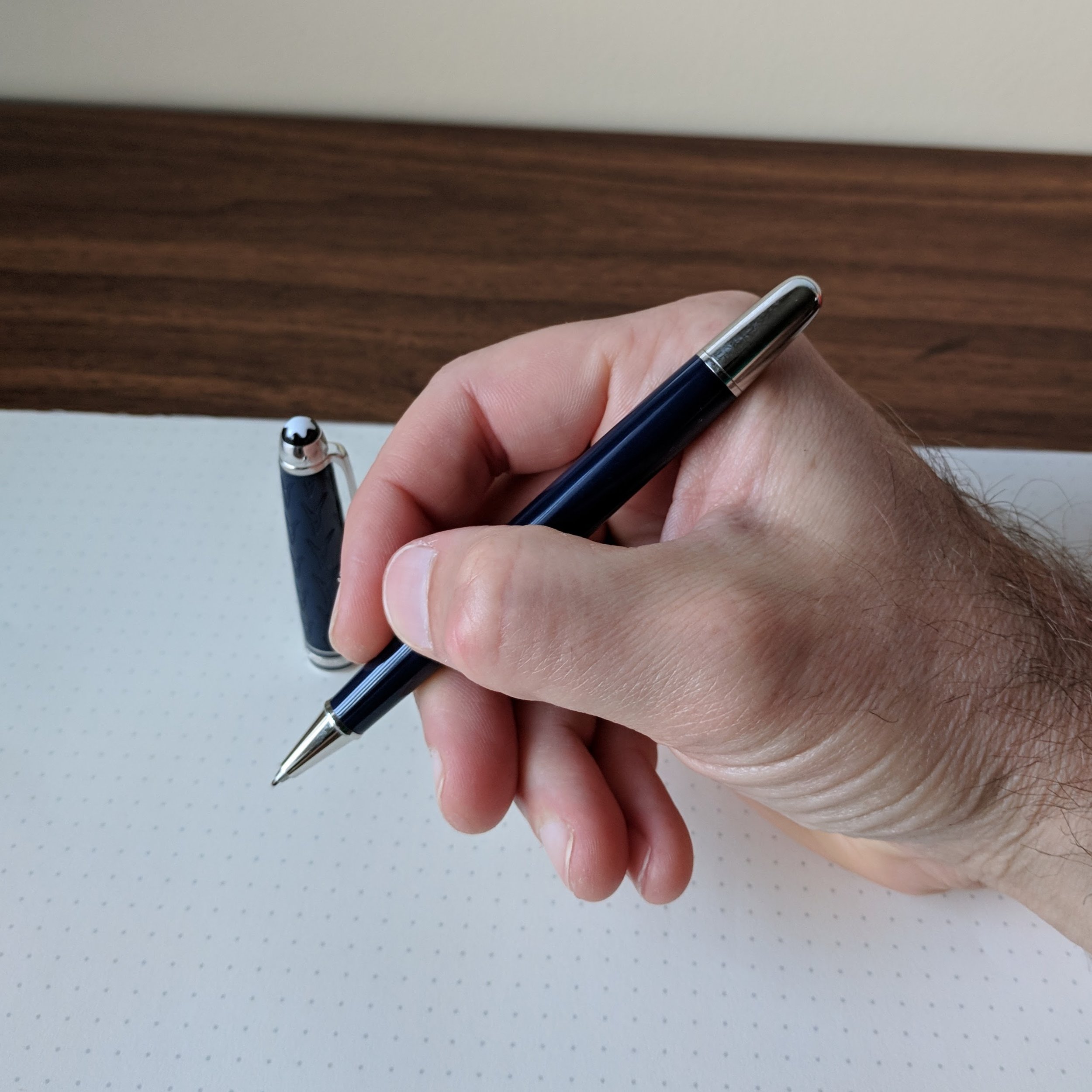
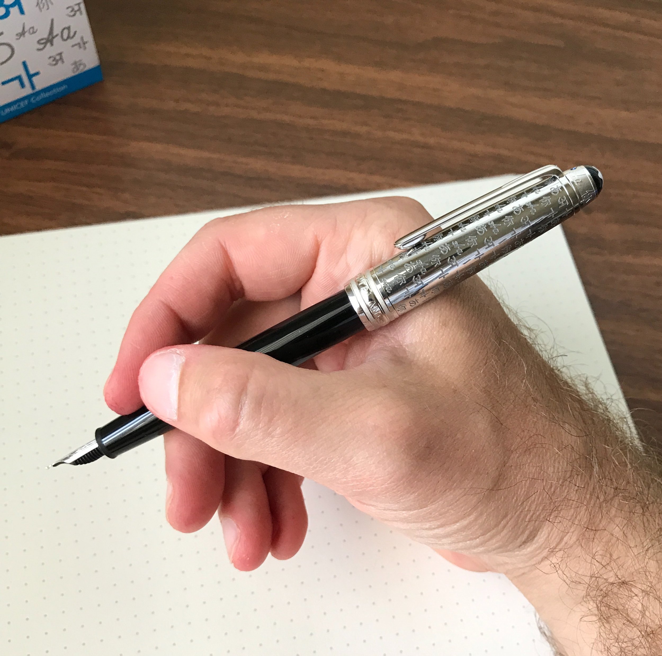
The Momento Zero Grande is a large pen. There’s no getting past that, and the size and weight will work for some but not others. After writing with this pen for a month, I actually think it’s at or near the limit of what I could consider comfortable - BUT I love it. Unposted, the balance is perfect for me, because the added weight from the captured converter system falls directly between my thumb and forefinger. Those with smaller hands will likely find the Momento Zero Grande too large and back-weighted. Larger hands shouldn’t have a problem, and may even be able to post this pen comfortably.

View fullsize Momento Zero Grande Unposted
View fullsize Momento Zero Grande Posted

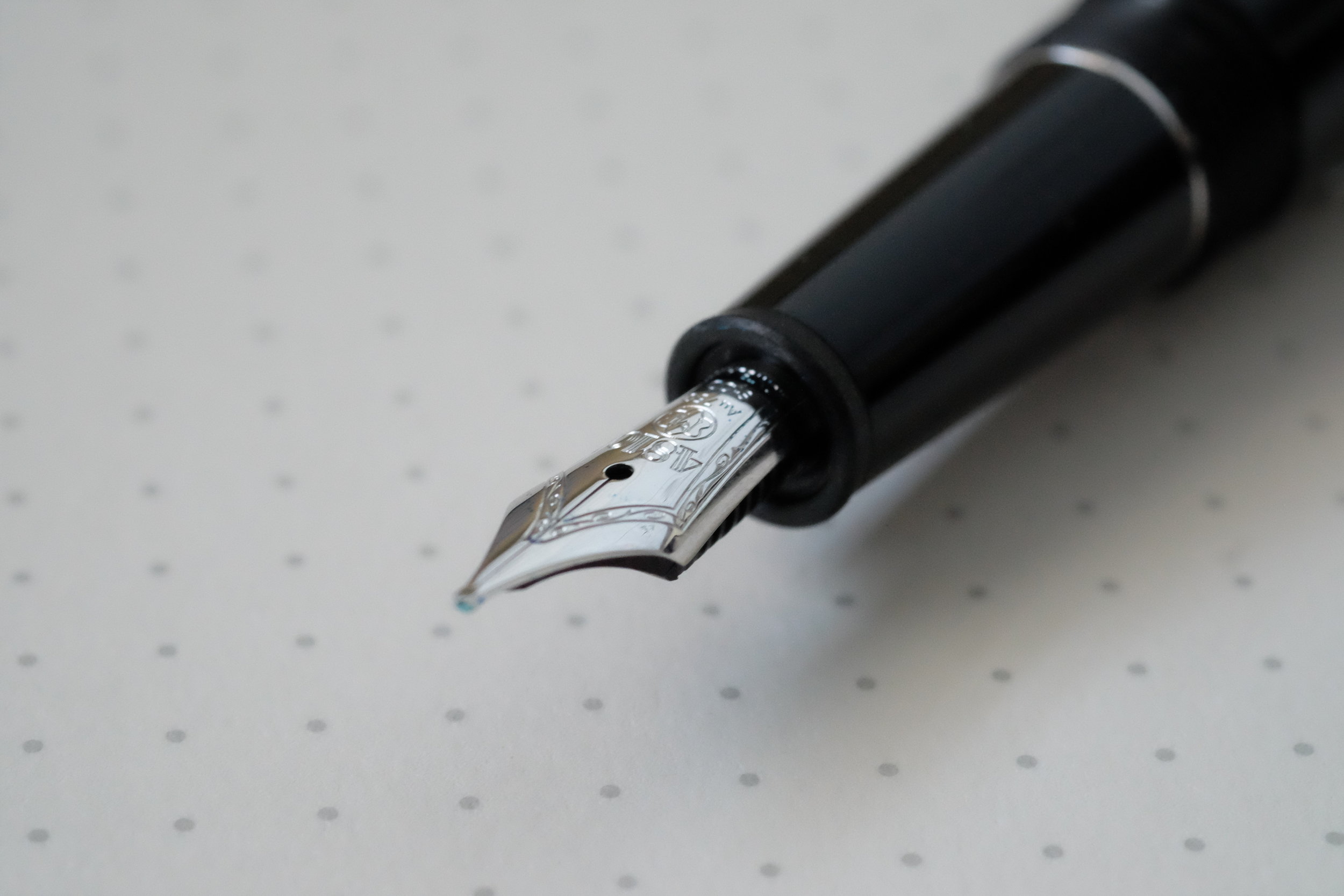
The standard Momento Zero Grande features a stainless steel No. 6 Bock nib, which is typically tuned quite well out of the factory but I sometimes find that I have to reset the nib to adjust ink flow. The Arlecchino limited edition featured here comes with a 14k gold nib on an ebonite feed, and writes quite well, like all the other Leonardo pens I own with this nib/feed combination. I opted for a fine nib here, and while I might characterize the line it writes as closer to an extra-fine, it has a steady inkflow with none of the Bock quality control issues that might give someone pause.

View fullsize Leonardo Momento Zero Grande 14k Nib
View fullsize Leonardo Momento Zero Grande ebonite feed

The color patterns in the Arlecchino material makes this a perfect pairing with green and red inks. Writing sample shown here with Montblanc Irish Green, which I reviewed this past week.

Takeaways and Where to Buy

Because Leonardo speaks to my vintage-inspired design aesthetic, this pen was a no-brainer purchase for me, and I snapped up No. 67/100 immediately. Fans of the Momento Zero probably shouldn’t hesitate to pick one up, especially since the “Grande” line features some of the more interesting materials Leonardo has used. In addition to the Arlecchino, Leonardo also released a series of “Art Deco” ebonite pens that I waited too long on, but I may try to grab one on the secondary market in the “Mustard” color. As noted above, my one word of caution on this pen is the sizing. If you’ve had trouble using larger pens in the past, you may want to hold a Momento Zero Grande in person before purchasing, or buy from a retailer with a flexible return policy in case the pen turns out to be too large and/or heavy.

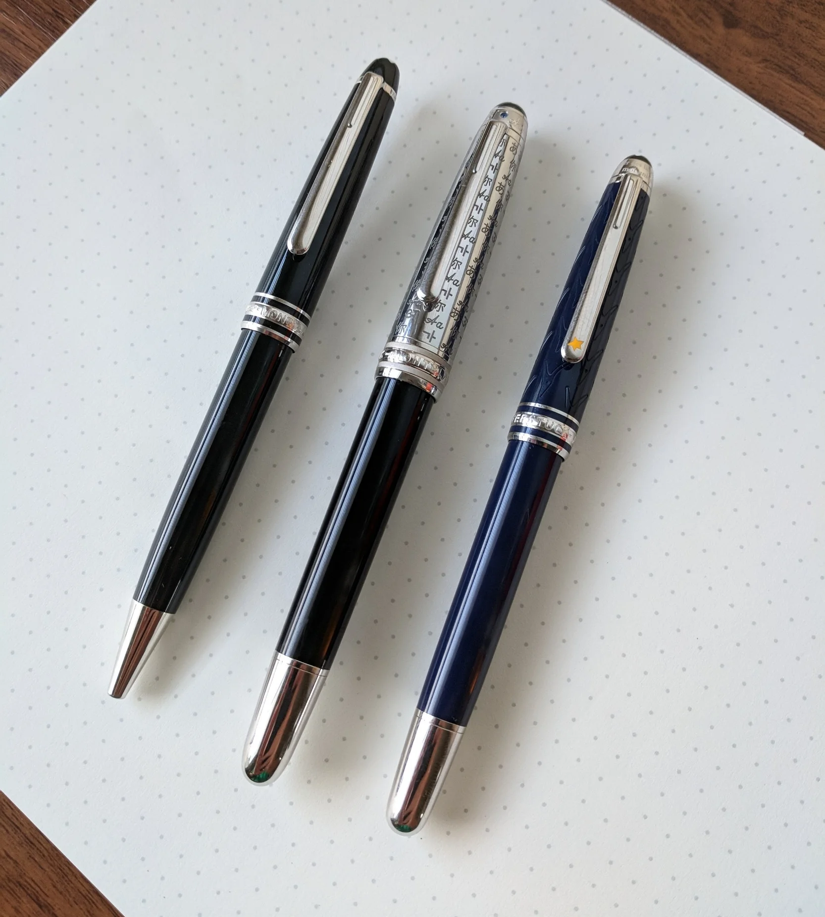
I was surprised to see that the Momento Zero Grande was actually longer than the Montblanc 149, which I’ll be putting into rotation this month. Here, the Arlecchino is shown compared against, from left: (1) Standard Leonardo Momento Zero (in “Pietra Marina” Sea Stone Acrylic); (2) Montblanc 149; and (3) a Lamy 2000.

As Leonardo pens have grown in popularity, the Momento Zero and the Momento Zero Grande have become more widely available. I purchased the Arlecchino pen featured in this review from site sponsor Appelboom, which still has pens in stock, but only with gold trim. A few stores still appear to have both versions, including Casa della Stilografica and Novelli. The Arlecchino special edition is priced at around $480 at Appelboom, which I consider standard (or even on the lower side) for a larger handmade limited edition pen with a gold nib. If you’re interested in the standard Momento Zero Grande, my go-to sources for Leonardo Pens are Appelboom in Europe and The Nibsmith and Pen Chalet in the United States. The standard pen (with a steel nib) is priced anywhere from $260-300, and some retailers offer a gold nib for an upcharge.

Recommendations for Further Reading

Since it’s release, I’ve written several posts on the Leonardo Momento Zero and various limited and special editions. My original review can be found here, which includes pictures of the celluloid “Maestro Set” I acquired last year, and I wrote a follow up on the Leonardo x Pen Chalet special edition collaboration in which they released a Momento Zero reminiscent of the discontinued Delta Dolcevita. Finally, if you’d like a writing sample of Leonardo’s 14k stub nib, see Part II of my “Stock Stub Nibs” profile.

Disclaimer: I purchased the pen featured in this review with my own funds, for my own use, though I did use some store credit generated through the Appelboom affilate program, one of may ways I use to support the blog.

In Pens Tags Leonardo Momento Zero Grande, Appelboom, Pen Review
Comment

Pen Review: Visconti Mirage Fountain Pen

November 13, 2019

Last year, Visconti introduced several lower-priced products into their lineup, in an attempt to diversify away from the ultra-high end pens for which the brand has become known. Until now, even Visconti pens with steel nibs approached $200, but the new Visconti Breeze and Visconti Mirage are both consistently priced at a much lower, and, dare I say it, almost entry level price point? The Breeze can be found at sub-$100, depending on your retailer, and Visconti has emerged as a player in a segment of the pen market that is becoming increasingly competitive.

I love the resin on this pen. Previously, to get pens in similar patterns you would have to shell out for a Visconti Van Gogh or a Visconti Rembrandt.

The pen featured in this review is the Mirage - priced slightly higher than the Breeze - and it presents quite a bit of value. Here, Visconti has managed to offer a quality writer at a reasonable price, while still incorporating the luxury spirit of the brand and retaining the brand’s hallmarks, such as the iconic Visconti clip. My favorite aspects of this pen include:

  • Material. Appelboom sent me the “Amber” Mirage to review, and it’s made from a beautiful vegetal resin reminiscent of some of the Visconti Van Gogh pens, specifically my “Vincent’s Chair” edition, though this material has a touch more orange/brown to it. The body of the pen features a soft hexagonal design that is comfortable to hold, and the rounded facets, combined with the clip, make this a great pen for work because it’s not going to roll off a desk.

  • Cap Design. I love how Visconti still includes its signature “Arc” clip on these lower-priced pens. Though some people react strongly to the shape, I’m a fan, and I think the clip adds a lot of sophistication to what would otherwise be a relatively ordinary pen design. The cap also features a magnetic twist closure, which feels quite secure with no wiggle when capped. The one feature of the Mirage I could do without is the oversized cap band, which I found a bit much, especially the word “MIRAGE” written across the front.

  • Nib. In terms of an out-of-the-box writing experience, I’ve found that Visconti’s steel nibs write better than their much more expensive palladium offerings. Though the steel nibs sometimes need a bit of smoothing, they aren’t so wet as to be unusable on anything but the most fountain-pen friendly paper, which is the issue I’ve had with more expensive Visconti pens. The steel nib on this Mirage is an excellent writer, but I do wish Visconti had opted for a larger No. 6 nib instead of this No. 5. It always strikes me as a bit awkward to have a smaller nib on a full-size pen.

If Visconti is going to go with this oversized cap band, why not continue the etching all the way around and omit the “Mirage” engraving? I don’t mind subtle branding, and “Visconti” etched on the clip doesn’t set me off, but there’s no need to go further than that.

View fullsize Visconti Mirage Posted
View fullsize Visconti Mirage Unposted
View fullsize Visconti Mirage Nib
View fullsize Visconti Mirage Writing Sample

Takeaways and Where to Buy

I only had a brief time with the Mirage, since it was sent to me on loan from Appelboom and needs to go home to the Netherlands, but I came away impressed. I’m glad to see Visconti expand their lineup to include a wider variety of pens at different price points, and I hope this trend continues, especially if they can maintain consistent quality control. Visconti’s signature “Arc” clip immediately makes the Mirage look like a much more expensive pen, and if you’re a fan of Visconti’s designs, this pen would be a great introduction to the brand. Personally, the biggest thing holding me back from acquiring a Mirage for my own personal collection is the nib, which writes quite well but in my opinion looks disproportionately small on the pen.

You can purchase the Visconti Mirage from our sponsor Appelboom, currently priced at around $130, depending on the exchange rate. The Mirage comes in six different colors: Amber, Azure Blue, Coral, Emerald Green, Horn Grey, and Night Blue. Appelboom also carries the full range of Visconti pens, including the Breeze, the flagship Homo Sapiens, and a wide array of limited and special editions.

Disclaimer: Our sponsor Appelboom loaned me this pen for review purposes, free of charge. This post may contain affiliate links. Many thanks to Appelboom for making this review possible.

In Pens Tags Pen Review, Visconti, Visconti Mirage, Appelboom
Comment

Pen Review: Graf von Faber-Castell Classic

November 14, 2018

I firmly believe that Graf von Faber-Castell makes some of the most beautiful stationery items in the world. The high-end, luxury arm of the global Faber-Castell stationery empire, their stated goal is to “embody ‘Luxury in Simplicity’ by combining selected materials, functionality and superb aesthetics.” While I’m not yet sure that the overall design of their pens works for me from a purely functional perspective, I can’t argue with the beauty and the quality.

At first I wasn’t sure how I felt about the two-toned gold nib, but ultimately I think it works paired with the dark brown wood.

The GvFC Classic, which I’ll review here, is the company’s flagship pen. I wouldn’t call the design “simple” - there’s a lot of different design elements going on - but at the same time GvFC has made an elegant writing instrument that doesn’t lose its functionality as a pen that you could use every day. And the nib… I’ve written before about how I think Faber-Castell makes some of the best stainless steel nibs available, including at relatively low price points. The 18k gold fine nib on the pen I tested writes even better, and has a surprising bit of spring to it. You won’t get much line variation, as it’s still a relatively stiff 18k nib, but a touch of bounce makes for a smooth and comfortable writing experience.

As with most pens made from wood, each Graf von Faber-Castell Classic and Classic Anello is going to show variations in the wood grain, making each pen unique.

As with most pens made from wood, each Graf von Faber-Castell Classic and Classic Anello is going to show variations in the wood grain, making each pen unique.

The two core elements of the Classic are Graf von Faber-Castell’s signature cap and the wood used to make the barrel. The different versions of the Classic are named to reflect the various woods used, including ebony, pernambuco, snakewood, grenadilla, and macassar. The standard Faber-Castell Classic features solid wood barrels with a ribbed texture, while the “Classic Anello” model, pictured here, features wooden barrels with inlaid metal rings.

The coin-edging on the top of the cap is one of my favorite details on this pen.

In my opinion, along with the nibs, the caps on Faber-Castell pens set them apart. The Graf von Faber-Castell Classic features a platinum-plated, solid metal cap that looks sort of like a chimney or old-fashioned smokestack that flares out at the top with coin edging. It’s similar, but not identical, to the cap used on Graf von Faber-Castell’s iconic - and somewhat ridiculous - “Perfect Pencil”. Even on most of their lower-end pens, Faber-Castell uses sturdy, spring-loaded clips that attach well to pen cases, bags, and shirt pockets. (Yet another sign that these pens aren’t just eye candy, but meant to be used.) The downside to these caps, however, is the weight, which brings me to….

What About Posting…?

Finally, the big potential drawback for me, and the reason why, at least to date, I don’t have a Graf von Faber-Castell Classic in my collection: this pen doesn’t post. (Technically, the pen will post, but the weight of the metal cap on the back end renders the pen far too heavy to make posting comfortable for even short writing sessions.) On the flip side, for such a slender pen, the Classic feels perfectly balanced and comfortable unposted. The combination of wood/metal construction, a long grip section, and a bit of added length helps in this regard. Prior to an extended test-run with the Classic, I had thought that the Classic would be too slim, and that I’d ultimately conclude “nice pen; not for me.” That’s not the case. I’m still considering this pen, especially now that I know they have a dark-trim Macassar version, but I need to get comfortable with the fact that I won’t be able to post it.

View fullsize Graf von Faber-Castell Classic Unposted
View fullsize Graf von Faber-Castell Classic Posted

Takeaways and Where to Buy

I’m a huge fan of standard Faber-Castell products, and, as I expected, I also enjoyed my first experience with the Graf von Faber-Castell Classic. In fact, I would say that if the ability to post your pens is not a must-have feature, a Classic is a no-brainer addition to any high-end pen collection. The 18k nib writes exceptionally well, and the intricate combination of wood and metal in the design, especially the GvFC signature clip and cap, render Graf von Faber-Castell pens unlike anything else on the market.

Pricing on the Graf von Faber-Castell Classic typically runs from $400-500. The Classic Anello Grenadilla, as pictured here, is priced at $458 at Appelboom, based on the current exchange rate. While certainly an expensive pen, the Classic sits on the lower end of the pricing spectrum for luxury brands of this quality. Site sponsor Appelboom, who loaned me this pen for review, carries the full range of Graf von Faber-Castell products.

Did I mention that the packaging and presentation on GvFC products are top notch? A few more pictures are shown below, including the presentation box which doubles as a three-slot pen case.

View fullsize Graf von Faber Castell Logo on Presentation Box
View fullsize Graf von Faber-Castell Classic in the Presentation Box
View fullsize GvFC Classic Anello, Grenadilla
View fullsize GvFC Classic Anello Grenadilla, in Presentation Box

Further Reading

I’ve recently reviewed several Faber-Castell pens, including the E-motion Pure Black and the Loom, and both pens have remained fixtures in my rotation. They are also significantly less expensive than the Graf von Faber-Castell pens, demonstrating that you can get the same Faber-Castell quality for less money. Their ink is also excellent.

Disclaimer: The pen featured in this review was loaned to me by Appelboom for review purposes. This post contains affiliate links.

In Pens Tags Graf von Faber-Castell, Appelboom
Comment
Let's be honest. The star on the clip is pretty much why I chose this pen. 

Let's be honest. The star on the clip is pretty much why I chose this pen. 

Pen Review: Montblanc Le Petit Prince Classique Rollerball

August 22, 2018

I previously reviewed the fountain pen version of the Montblanc Meisterstuck “Classique”, and I still consider this model one of the more overlooked gems of the pen world. Sure, the storied 146 and 149 models get most of the attention, but both are simply too big for many people to use comfortably, and you have to pay quite a premium, especially for the special and limited edition models. The Classique is Montblanc's "mid-priced" model that is still large enough for most people to use comfortably, and offers the same Montblanc writing experience as its larger siblings.

I’ve owned a Classique ballpoint for 15+ years (graduation present), so with the addition of this rollerball to my collection I now have a full ballpoint + rollerball + fountain pen set in this size. In terms of the writing experience, there’s not too much to say here that hasn’t already been said. Montblanc makes a great rollerball refill, which their pens are designed to showcase. The Classique rollerball is a relatively slim pen - slightly slimmer than both the ballpoint and the fountain pen - but it still has some weight to it, due in part to the metal end cap. As a result, the pen has a very nice balance for writing, especially when posted. The friction-fit cap opens and closes with no rattle whatsoever, and the cap posts securely.

Comparison shot: Ballpoint, Fountain Pen (in the metal "Doue" model), and Rollerball. The fountain pen has a slightly larger diameter than the other two. 

Comparison shot: Ballpoint, Fountain Pen (in the metal "Doue" model), and Rollerball. The fountain pen has a slightly larger diameter than the other two. 

View fullsize Montblanc Classique Rollerball Posted
View fullsize Montblanc Classique Rollerball Unposted

The pen shown here is the Le Petit Prince Classique PT 163 Rollerball (if we want to be technical about model numbers). It features three key design elements from Antoine de Saint-Exupery’s story: the fox engraved in the resin on the cap, the star on the clip (which is the feature that sold me on a pen from this series), and a quote: “Créer des liens? ... Tu seras pour moi unique au monde” which translates to “To establish ties? ... To me, you will be unique in all the world.” If you’ve read the book, you’ll understand the significance, but if you haven’t, well, you need to read the book.   

The quote from the story is engraved around the top of the cap, just below Montblanc's signature "snowcap" logo. The Platinum trim complements the navy blue resin nicely. 

Takeaways and Where to Buy

I love this pen. Sure, most of it is the design, and the tie-in with one of my favorite stories from childhood (and adulthood, and, well, ever) but whatever your feelings about the brand, they make a mean pen. The form factor of the Meisterstuck Classique makes it a great everyday writer for both long-form handwriting and quick notes.

Appelboom carries a wide range of Montblanc pens, including the Classique models, in both the standard and special edition versions like the Le Petit Prince pen shown here. Also, check out my previous review of Montblanc rollerball and fineliner refills, which I consider to be some of the best.  

I've had this pen loaded with Montblanc's excellent fineliner refill, and haven't use much else, though the rollerball refills are also superb (if not the most wallet-friendly). 

I've had this pen loaded with Montblanc's excellent fineliner refill, and haven't use much else, though the rollerball refills are also superb (if not the most wallet-friendly). 

A Few General Thoughts on Montblanc as a Brand

The company takes a lot of flack for the price point of their pens, which in my opinion is unwarranted. The past few Montblanc pens I’ve purchased have had zero quality control issues, with excellent out-of-the-box nibs on the fountain pens. They also have a pretty liberal nib-exchange program and will stand behind their products as long as you purchase from an authorized retailer. Yes, at the end of the day, you are paying in part for the branding and design, not the pure functionality of the pen. The majority of Montblanc pens, however, are priced similarly to Aurora, Montegrappa, or Pelikan, especially once you get into special and limited editions, so I don’t see much of a reason to favor one of these brands over another based on how they are pricing things. If you like the pen, and can comfortably afford it, then buy it and enjoy it. If you’re looking for something else - like a no-frills workhorse or simply something at a lower price point - there are plenty of other excellent options out there to meet your needs, and I try to cover a range of options on the blog.  

In Pens Tags Montblanc, Montblanc Le Petit Prince, Montblanc Classique, Rollerball, Pen Review, Appelboom
1 Comment

Pen Review: Montblanc for UNICEF Solitaire Doue Classique and UNICEF Blue Ink

June 10, 2017

Conventional wisdom says that as you fall deeper and deeper down the stationery rabbit-hole, you start to develop a taste for more expensive products, whether that be a $1000 fountain pen or a $5 pencil. I don’t think that’s necessarily true in the sense that most people think - that you lose your enjoyment for the "simple things" - because I still enjoy a $20 Lamy Safari as much as I do a very expensive pen such as this one, just in a different way. I do think, however, that you start to develop a better sense / appreciation for why certain pens command the pricing that they do, and if your budget allows, become more willing to pay for artistry over pure function. The Montblanc for UNICEF Solitaire Doue is a great example of this. 

Background on the Montblanc for UNICEF Line

Before I jump into a review of the pen itself, I wanted to talk a bit about the Montblanc-UNICEF partnership and the idea behind this pen (as well as the other pens in this line and the limited edition ink). UNICEF (short for the United Nations International Children’s Emergency Fund) promotes the rights and wellbeing of children around the world, especially those in impoverished and/or war-torn areas. Montblanc has partnered with UNICEF for years to raise money and awareness - more than $10 million since 2004 - but as far as I know this is the first time Montblanc has released any sort of UNICEF-themed product.

All of the Montblanc for UNICEF pens feature an inlaid sapphire. 

In April, Montblanc and UNICEF announced that they would be continuing their partnership. Montblanc’s collaboration with UNICEF focuses on providing access to education, with a particular focus on helping children learn to read and write. Around the same time, Montblanc released a new line of UNICEF-themed pens, as well as a limited edition “UNICEF blue” bottle of ink. Montblanc donates a portion of the proceeds from the sale of these products to UNICEF. 

“Montblanc, in partnership with UNICEF, aims to improve learning conditions for over 5 million children around the world by providing quality learning materials and better teaching. ”
— Montblanc

The Montblanc website sets out the full details of the promotion: “Unicef does not endorse any brand or product. For every piece in the ‘Montblanc for UNICEF Collection’ sold from April 1 2017 to March 31 2018, Montblanc will donate 3% of the proceeds to support UNICEF and its literacy projects, with a minimum amount of $1.5 million being guaranteed by Montblanc.” 

3% of each pen sold is not a huge percentage. (To illustrate, 3% would mean that for every $1000 of pen sold, UNICEF would receive $30.) That said, a major aspect of this sort of project is the raising of awareness about the organization, and kudos to Montblanc for choosing UNICEF. I’d also note that Montblanc does not appear to be making money off of a “UNICEF markup.” The pricing is similar, if not a bit lower, than their other “Solitaire Doue” limited editions such as the “Blue Hour”. Given the UNICEF model's platinum plating and trim, inlaid sapphire, and the intricate design and workmanship, this is, in all likelihood, an expensive pen for Montblanc to make and my guess is that the overall profit margin is slim. I’m not at all trying to cast shade on the Montblanc-UNICEF collaboration or any other corporate-charity partnership. UNICEF has been partnering with Montblanc for more than a dozen years, so one can only assume they find the collaboration valuable. The only reason I mention the “real numbers” behind the special edition is because (1) I know people are going to ask, and (2) someone shouldn’t purchase this pen thinking that he or she is making a $1000 contribution to UNICEF. If that’s what you want to do, you’re better off donating to UNICEF directly, and I’d invite you to visit the organization’s webpage to learn more about it. 

A Design Inspired by the Rosetta Stone

The design on the cap is “inspired by the Rosetta Stone, an ancient artifact used to decipher Egyptian hieroglyphics.”

Now, on to the pen itself. The particular model featured in this review is the Solitaire Doue Classique (145). What does that mean? For starters, the 145 signals that it’s Montblanc’s smaller cartridge-converter pen, as opposed to the larger, piston-filling 146 or 149. (It’s not the smallest fountain pen Montblanc makes. That honor goes to the "W.A. Mozart".) From what I can gather, Montblanc uses “Solitaire Doue” to signify that the pen has a metal cap, which on this pen is platinum plated and engraved with the first letter of alphabets / calligraphies from around the world. Like all models in the Montblanc for UNICEF line, the cap also features an inlaid 1.3mm sapphire. With so many different design elements, you might worry that they would clash or look “too busy,” but Montblanc brings them all together very nicely. Overall, this is a very understated and classy writing instrument that I wouldn't hesitate to break out anywhere, especially in a business meeting. 

In my opinion, the Montblanc for UNICEF line has some of the better-looking special edition pens that Montblanc has released.

The barrel is Montblanc’s standard polished “precious resin,” with a twist: a metal end cap, which has the effect of nicely balancing the pen when using it unposted. Presumably, the design is inspired by the metal piston nobs that Montblanc has included on certain of its piston fillers, such as the Meisterstuck 146 Ultra Black. I initially wondered why they would include a similar feature on the cartridge-converter Classique, but after writing with this pen I understood. Despite its comparatively small size, the Solitaire Doue Classique is an extremely comfortable writer. The standard all-resin Classique, which I’ve owned in the past, it a touch too light for me to use without posting the cap, which as all Montblanc owners know will scratch the resin over time if you're not careful. 

Nib and Writing Experience 

The nib on the Solitaire Doue writes a nice wet line, and I had no trouble with ink starvation, hard starts, or skipping. As with my Heritage 1912, the quality control was exceptional. 

The UNICEF Solitaire Doue features a rhodium-plated 18k gold nib, which is not only very soft but, to me, slightly stubbish. This particular pen has a fine nib that writes more like a medium. I’d compare it favorably to the nib on my Heritage 1912, meaning that it’s soft and offers a touch of line variation, but wouldn't be considered flexible or semi-flex. I’ve personally enjoyed Montblanc’s smaller rhodium-plated nibs more than the larger nibs that appear on the 146 or 149, which tend to be more firm. 

View fullsize Montblanc-Nib-18K-Fine
View fullsize Montblanc-Classique-Unposted
View fullsize Montblanc-Classique-Posted
View fullsize Writing-Sample-Turquoise-Ink

The Montblanc for UNICEF Pens Are Accompanied by a Limited Edition UNICEF Ink 

Along with the pen, Appelboom sent over a bottle of the limited edition Montblanc for UNICEF Ink, which is UNICEF’s signature turquoise. It’s a beautiful color, which has just a touch of sheen and a lot of depth. Like all Montblanc inks, it flows well, dries quickly, and has limited feathering and bleed. I’ll definitely be picking up a bottle of UNICEF blue in the future, but this particular bottle will be given away on the blog early next week, courtesy of Appelboom! 

Takeaways and Where to Buy

The pens in the Montblanc for UNICEF line are easily some of my favorite Montblanc special editions in years, and this particular pen is my favorite of the bunch. Barring some unforeseen major expense disrupting my plans, this pen won’t be making its way back to the Netherlands. I enjoy the design, which serves as a nice conversation piece, and the nib on this pen is nothing short of phenomenal. While they're not within my budget, you may also want to check out several other items in the Montblanc for UNICEF collection, including the UNICEF 146, the Blue Solitaire 146, and the Skeleton 149 models.  

You can currently purchase this pen (and the ink!) from Appelboom in Laren, the Netherlands. Pricing with VAT included is $1033; without VAT the price is $855. Appelboom is an authorized Montblanc retailer that carries the full Montblanc line, and can fit your pen with one of Montblanc’s specialty nibs such as an oblique broad (OB), oblique medium (OM), or double broad (BB) if you so desire. 

Disclaimer: Appelboom loaned me this pen and the ink free of charge for review purposes. I was not otherwise compensated for this review. 

In Pens Tags Montblanc, Solitaire Doue Classique, Appelboom, Pen Review
Comment
Store Location
Visit the T.G.S. Curated SHOP
*New* Updated "Best Pens" Guide (2025)
TGS x Hinze Pens Violet Tendencies Taschenstift Fountain Pen
Hierarchies of Fountain Pen Friendly Paper
Allex Scissors arrayed on a desk showing link to desk accessories

Join Our Patreon!
Subscribe to the TGS E-mail List

Featured Posts

Featured
Pilot-Iroshizuku-Yama-Budo-Writing-Sample.jpeg
May 24, 2025
Joe's Picks: Five Favorite Inks From Pilot's Iroshizuku Lineup
May 24, 2025
May 24, 2025
Yamamoto-Gray-Paper-Sampler-Set.jpeg
May 10, 2025
Discovering Unusual Paper: "Paper Tasting" Sets from Yamamoto Paper
May 10, 2025
May 10, 2025
Four-Micarta-Fountain-Pens.jpeg
Apr 19, 2025
Yes, Micarta for me! I finally got my hands on Some Micarta Pens, Plus My Own Special Edition
Apr 19, 2025
Apr 19, 2025
The Gentleman Stationer RSS

© Digital Divide Media, LLC, 2014-present.

All content is the exclusive property of Digital Divide Media, LLC, d/b/a The Gentleman Stationer, including “The Gentleman Stationer” website and trademark, and should not be reproduced without express written permission.  All rights reserved.

All content containing paid advertising, affiliate links, or sponsored content will be plainly disclosed by a disclaimer when/if featured.

Contact Information

Store Shipping Policy and Return Policy

Privacy Policy

Cookie Policy

Terms and Conditions

Powered by Squarespace