• Blog
  • Shop
  • Resources
  • FAQ (Ask TGS)
  • About
  • Archive
  • Contact
  • Sign In My Account
Menu

The Gentleman Stationer

Vintage Living in the Modern World.
  • Blog
  • Shop
  • Resources
  • FAQ (Ask TGS)
  • About
  • Archive
  • Contact
  • Sign In My Account

First Impressions: The AmazonBasics Fountain Pen Is Surprisingly Good

February 15, 2020

As something of an Amazon junkie, I couldn’t help but place an order for the AmazonBasics “Refillable Fountain Pen” after reading Evan’s review over at The Penquisition. His take on this pen is consistent with my own: Amazon has created (or more likely, sourced) an excellent inexpensive fountain pen that deserves consideration as a “First Fountain Pen” recommendation for new users, or as an inexpensive cartridge pen to leave at the office or keep in your travel bag.

The packaging includes a nice presentation box for a $10 pen, so if you’re looking for an inexpensive gift to give someone potentially interested in fountain pens without dropping a ton of money. The pen does not ship with a converter, and I’ve only tested with the short international cartridges that ship in the box. I would expect a converter would work, though you may have to try a few sizes. The pen barrel is fairly narrow.

Design and Build Quality

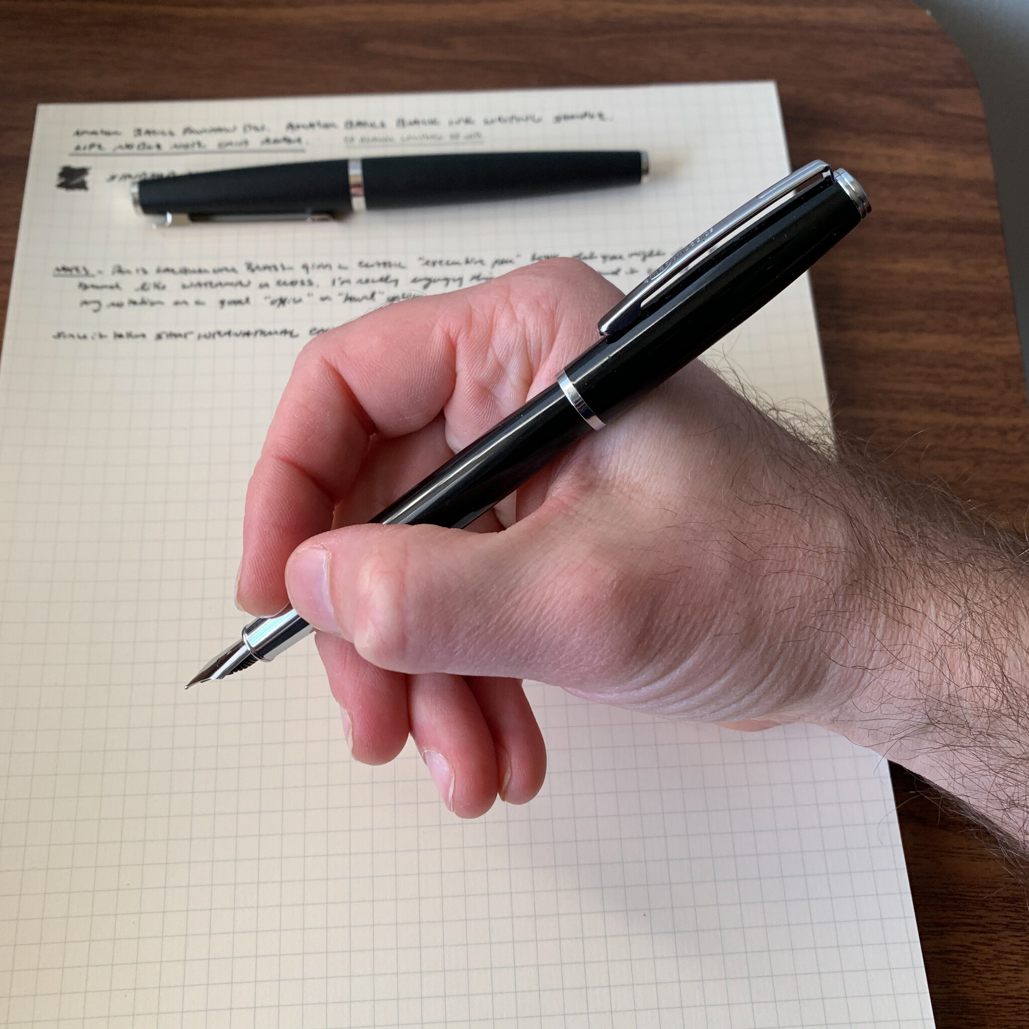
Look, this pen won’t win any design awards, but for what I paid I’m more than happy with the somewhat generic lacquered brass body with chrome trim, and I’ll even forgive the “AmazonBasics” branding stamped on the clip. Frankly, if Amazon had foregone the latter, this could easily pass to the casual observer as a Cross or Waterman pen that sells for $100 plus.

The AmazonBasics fountain pen features a classic shape and design, sort of similar to my Otto Hutt Design 06, but no one is going to confuse these two pens.

The build quality also feels far above the price point. Inexpensive pens often suffer from loose friction-fit caps that spin or rattle, but this one feels tight. The balance on this pen reminds me of my Otto Hutt Model 06, in that both can be used posted and unposted, and offer a slimmer profile without being too slim for longer writing sessions. The cap posts securely, and though some will find the metal section slippery, the overall weight of the pen is appropriate for a daily writer.

View fullsize AmazonBasics Fountain Pen Posted
View fullsize AmazonBasics Fountain Pen Unposted

Nib and Writing Experience

Amazon’s target customer for the AmazonBasics fountain pen will be perfectly happy with the medium nib on this pen. I actually like the clean design - Amazon didn’t try to stamp a logo on the nib, but rather left it plain save for an engraved “M” to designate the nib width. At the present, only fine and medium nib widths are available, which is consistent with most pens at this price point.

I have no idea who made this No. 5 stainless steel nib. Based on the look of the feed, if it’s a German nib I would say it’s a Schmidt, but it could very well be of Chinese manufacture. It doesn’t matter because my nib writes a smooth, classic western medium line. It worked well out of the box and didn’t require any adjustment whatsoever. As Evan noted in his review, this nib also writes a surprisingly smooth extra fine line if you flip it over and write using the reverse side. That’s apparently not a fluke unique to his specific pen.

Takeaways and Where to Buy

Amazon delivers the goods here: a no-frills black lacquered and chrome cartridge-converter fountain pen with a steel nib that works as advertised. For just under $10, you can’t argue that this pen isn’t good value. I actually find the AmazonBasics Fountain Pen (much) more comfortable than the Pilot Metropolitan, and for those who desire a work friendly “beater” pen made from a material other than plastic, or who are looking for a low-risk way to test the fountain pen waters for the first time, there’s no reason not to give this pen a try.

No surprises on where to buy this pen: Amazon is currently selling the AmazonBasics Fountain Pen in both fine and medium nib sizes. Currently, only one color is available, but again that could change if this pen catches on.

Disclaimer: This post contains affiliate links.

AmazonBasics Fountain Pen compared against, from left: Lamy 2000; Otto Hutt Design 06; TWSBI Eco.

In Pens Tags Fountain Pen, First Impressions, AmazonBasics, Amazon, Pen Review
1 Comment

Pen Review: Leonardo Momento Zero Arlecchino

February 8, 2020

Italian brand Leonardo Officina Italiana - referred to as “Leonardo” for short - has developed into one of the major success stories in the modern fine writing market. Founded after the collapse of Delta by designer and penmaker Salvatore Matrone (who previously worked for Delta), Leonardo has gradually expanded its lineup from the original Momento Zero to include the “Furore,” the newly announced “Messenger,” and the pen reviewed here, the “Momento Zero Grande.” I’ve chosen to review a limited edition version of the latter: the Momento Zero Grande Arlecchino (“Harlequin”) that was announced a few months back.

Leonardo’s packaging on the Arlecchino is reminiscent of OMAS, from the box liner to the faceted ink bottle. (The ink is excellent, by the way. Look for a separate review soon.)

The Problematic History of the Omas Arlecchino

This particular pen is inspired by the Omas limited edition “Arlecchino” fountain pen from the early 2000s, of which only 750 were made. While beautiful, the celluloid used to make these pens had a tendency to degrade over time, resulting in cracks and deterioration in the structure of the pen. Instead of attempting to work with the classic Arlecchino celluloid - if any even remains usable - Leonardo (or someone assisting in the production of these pens) developed an acrylic that closely resembled the original, with similar shades of green, black, and orange scattered throughout. I don’t know that it’s been clearly communicated that the material used to make the Leonardo Momento Zero Grande is NOT the same material used by Omas, given that I’ve received multiple comments from those concerned that this pen will disintegrate. The structural issues affecting celluloid generally do not affect acrylic resin (provided it is competently made), and this particular “Arlecchino” pen does not pose the same long-term durability issues.

The “Arlecchino” acrylic features darker orange, olive green, and black flecks within a lighter orange/peach base color.

Design and Build Quality of the Momento Zero Grande

Like the standard Momento Zero, the build quality on the larger version is exceptional. I understand that all Leonardo pens are hand-turned, and the pens reflect a high degree of expert craftsmanship in both the design and the finish. The appeal of any pen from a design standpoint is naturally subjective. Longtime readers of this blog know that I was a fan of Delta - at least their “subtler” designs - and the Momento Zero Grande falls squarely within that tradition.

Like many larger Delta Pens, the Momento Zero Grande features a piston/captured converter system that holds a lot of ink. To fill the pen, you don’t need to unscrew the section. The blind cap reveals the end of the converter - in effect the hidden “piston knob” - that fans of Delta pens either loved or hated.

The Arlecchino is far from a minimalist pen, and the material itself may come across as a bit loud to some, but it’s generally free from unnecessary adornments. Leonardo elected use a subtle zigzag engraving on the cap band and the ring just below the blind cap. The design, along with the Greek key pattern etched onto the captured converter, lends the pen an Art Deco vibe.

This is a high capacity converter which threads onto the section. I assume it can be removed for cleaning, but I’m not sure I would do it. I like that you can unscrew the section to check your ink level.

Nib and Overall Writing Experience

The Momento Zero Grande is a large pen. There’s no getting past that, and the size and weight will work for some but not others. After writing with this pen for a month, I actually think it’s at or near the limit of what I could consider comfortable - BUT I love it. Unposted, the balance is perfect for me, because the added weight from the captured converter system falls directly between my thumb and forefinger. Those with smaller hands will likely find the Momento Zero Grande too large and back-weighted. Larger hands shouldn’t have a problem, and may even be able to post this pen comfortably.

View fullsize Momento Zero Grande Unposted
View fullsize Momento Zero Grande Posted

The standard Momento Zero Grande features a stainless steel No. 6 Bock nib, which is typically tuned quite well out of the factory but I sometimes find that I have to reset the nib to adjust ink flow. The Arlecchino limited edition featured here comes with a 14k gold nib on an ebonite feed, and writes quite well, like all the other Leonardo pens I own with this nib/feed combination. I opted for a fine nib here, and while I might characterize the line it writes as closer to an extra-fine, it has a steady inkflow with none of the Bock quality control issues that might give someone pause.

View fullsize Leonardo Momento Zero Grande 14k Nib
View fullsize Leonardo Momento Zero Grande ebonite feed

The color patterns in the Arlecchino material makes this a perfect pairing with green and red inks. Writing sample shown here with Montblanc Irish Green, which I reviewed this past week.

Takeaways and Where to Buy

Because Leonardo speaks to my vintage-inspired design aesthetic, this pen was a no-brainer purchase for me, and I snapped up No. 67/100 immediately. Fans of the Momento Zero probably shouldn’t hesitate to pick one up, especially since the “Grande” line features some of the more interesting materials Leonardo has used. In addition to the Arlecchino, Leonardo also released a series of “Art Deco” ebonite pens that I waited too long on, but I may try to grab one on the secondary market in the “Mustard” color. As noted above, my one word of caution on this pen is the sizing. If you’ve had trouble using larger pens in the past, you may want to hold a Momento Zero Grande in person before purchasing, or buy from a retailer with a flexible return policy in case the pen turns out to be too large and/or heavy.

I was surprised to see that the Momento Zero Grande was actually longer than the Montblanc 149, which I’ll be putting into rotation this month. Here, the Arlecchino is shown compared against, from left: (1) Standard Leonardo Momento Zero (in “Pietra Marina” Sea Stone Acrylic); (2) Montblanc 149; and (3) a Lamy 2000.

As Leonardo pens have grown in popularity, the Momento Zero and the Momento Zero Grande have become more widely available. I purchased the Arlecchino pen featured in this review from site sponsor Appelboom, which still has pens in stock, but only with gold trim. A few stores still appear to have both versions, including Casa della Stilografica and Novelli. The Arlecchino special edition is priced at around $480 at Appelboom, which I consider standard (or even on the lower side) for a larger handmade limited edition pen with a gold nib. If you’re interested in the standard Momento Zero Grande, my go-to sources for Leonardo Pens are Appelboom in Europe and The Nibsmith and Pen Chalet in the United States. The standard pen (with a steel nib) is priced anywhere from $260-300, and some retailers offer a gold nib for an upcharge.

Recommendations for Further Reading

Since it’s release, I’ve written several posts on the Leonardo Momento Zero and various limited and special editions. My original review can be found here, which includes pictures of the celluloid “Maestro Set” I acquired last year, and I wrote a follow up on the Leonardo x Pen Chalet special edition collaboration in which they released a Momento Zero reminiscent of the discontinued Delta Dolcevita. Finally, if you’d like a writing sample of Leonardo’s 14k stub nib, see Part II of my “Stock Stub Nibs” profile.

Disclaimer: I purchased the pen featured in this review with my own funds, for my own use, though I did use some store credit generated through the Appelboom affilate program, one of may ways I use to support the blog.

In Pens Tags Leonardo Momento Zero Grande, Appelboom, Pen Review
Comment

Pen Review: Platinum Procyon (100th Anniversary Edition)

January 11, 2020

2019 may very well go down as the year in which Platinum cemented its status as the premier maker of reliable, low-cost pens. The ultra low-cost Platinum Preppy and the new Prefounte allow you to purchase a reliable steel-nibbed workhorse for $10 or less, and if you want a pen that looks, well, a bit less disposable, you can upgrade to the Platinum Plaisir and still get the price under $20.

The Platinum Procyon, left, compared against a Platinum Plaisir, right.

But what about the middle tier between the Plasir and the Platinum 3776 all the way up at $160? There’s not much. The Platinum Cool and the Platinum Balance are available, but these pens don’t get significant attention. It’s fairly obvious that Platinum intends the Procyon to fill this gap in their lineup. Additionally, the Procyon offers a more substantial body for users that may find the other pens mentioned above too slender.

View fullsize Platinum-Procyon-Posted-In-Hand
View fullsize Platinum Procyon Unposted

According to Platinum’s marketing materials, the Procyon features both Platinum’s patented “slip-n-seal” cap and a “newly-designed feed that allows for easier ink absorption.” I’ve personally never had an issue with the writing experience on a Platinum pen, so I’m not sure about the reason behind the feed design, but the slip-n-seal cap is nice to have. Platinum claims that you can leave ink in the pen for up to a year and the pen won’t dry out, making Platinum pens ideal for those who may want to keep a fountain pen inked up at their desk but won’t necessarily write with it every day.

The feed definitely looks different from Platinum’s other pens, but the performance is largely the same. (Not a bad thing!)

In terms of the overall writing experience, I can’t tell much of a difference between the Procyon and the Plaisir. While the nib on the Procyon is slightly larger, and features the redesigned feed, writing with the Procyon feels quite similar to writing with a Platinum Plaisir. If I had to come up with a distinction, I would say that the nib on the Procyon adds a touch of bounce, due to the longer tines. The Procyon is also a heavier pen. Also, if I had to pick one thing I don’t like about the Procyon, it would be the threaded cap. While the Preppy and Plaisir are both slip cap pens, for the Procyon Platinum went with metal threads that feel gritty. Though this hasn’t created any functional issues for me, the friction-fit closure on the cheaper pens actually feels higher-end than the more expensive Procyon.

The Platinum Procyon is a cartridge-converter pen that takes Platinum’s proprietary cartridges.

One bonus of purchasing the Procyon 100th Anniversary Edition: I discovered Platinum’s Mix-Free Inks. This set of nine basic colors can be mixed to create your own preferred shades of ink, and come in both 20ml and 60ml bottles. Platinum included three cartridges of Mix-Free “recipes” with my Procyon: Dark Violet, Aqua Emerald, and Gold Ochre. I’m working on a few of my own mixes, and will have a full review of the Mix-Free inks sometime soon. Patreon subscribers will get a preview of my “inksperiments.”

View fullsize Platinum Mix Free Ink Recipes
View fullsize Platinum Mix Free Cartridges

Takeaways and Where to Buy

Overall, I’ve enjoyed my time with the Platinum Procyon, which deserves to be mentioned alongside other fountain pens at the $50 price point such as the Pilot Prera. Personally, I prefer the size and heft of the Procyon over the Prera, which I’ve always found a bit too small for my personal taste. Platinum pens make reliable daily writers and this one is no exception.

Currently, you can purchase the Procyon from most Platinum retailers, including site sponsor Pen Chalet, which is where I acquired this pen. Early on, the Procyon was a bit difficult to find, but it appears that stocks have stabilized. I’m not sure how long the “100th Anniversary Edition” will last, but the advantage of purchasing this “special edition” remains unclear, beyond the “100th Anniversary” logo on the cap.

Disclaimer: I purchased the pen featured in this post from Pen Chalet using funds generated through the Pen Chalet affiliate program, which one way I support the blog. This post contains affiliate links.

In Pens Tags Platinum, Procyon
1 Comment

Last Chance to Grab One: Aurora 88 Sigaro Blu

December 14, 2019

I’m in a strange place with my fountain pen hobby and with this blog. Though I’ve certainly not reviewed everything thoroughly, I’ve had the opportunity to at least write with most of the major pen brands’ flagship models. If I’m honest with myself, this realization take a little bit of the fun out of the whole experience. Things don’t feel as new, and I have to work harder to get interested in new releases, and rarely get excited about yet another Sailor Pro Gear or Aurora 88 special edition. It takes something pretty special.

These days, many so-called limited editions are basically “skins” - the exact same pen with a different barrel color or material. Sure, changing up the acrylic and trim can drastically alter the look of the pen, but it rarely changes my overall opinion on the usability or functionality of the pen. That’s why it’s uncommon for me to re-review pens based solely on changes in appearance, unless I really didn’t like the look of the pen the first time around or the company makes a particularly drastic change. For example, I recently re-reviewed the Pelikan M101N because this year’s edition spoke to me while none of the prior releases did.

In addition to a couple of modern Aurora 88s, I have one vintage pen in the black/”Nikargenta” (nickel alloy) combination.

The Aurora 88 “Sigaro Blu” represents a similar situation. I’ve reviewed the Aurora 88 in two different formats: the limited edition “Minerali” demonstrator and the blacked out “Unica Nera.” The 88 is a great pen with a classic streamlined shape that’s comfortable to use. In its current form, the Aurora 88 has been around since the 1990s, but the pen’s heritage stretches all the way back to 1947 when Aurora introduced a hooded-nib pen to compete with the Parker 51. Today the Aurora 88 is available not only in standard black and silver/gold configurations, but in a wide array of limited editions and special releases. Currently, Dan Smith has at least a dozen different versions of the Aurora 88 available for purchase.

Prior to purchasing this pen, I already knew that I liked Aurora nibs and the overall form factor of the pen, but I hadn’t found a version of the Aurora 88 that was compelling enough to boost the pen into the “daily user” category. So what drove this purchase? The lacquer finish. With the Sigaro Blu, Aurora has layered light blue streaks in a webbed pattern over black lacquer, giving the pen a blue-black or navy appearance. It’s truly distinctive, and understated in a way that’s similar to Japanese Urushi lacquerwork while still maintaining its own identity. I first had the chance to see this release in person at the 2018 Atlanta Pen Show, and since this one was an expensive purchase, I had some saving to do. Fortunately I was able to snag one at a slight discount during a year-end clearance sale at The Nibsmith.

View fullsize Aurora 88 Sigaro Blu Unposted
View fullsize Aurora 88 Sigaro Blu Posted

The “Sigaro” series of lacquer pens offers a different writing experience from the standard Aurora 88. The combination of lacquer and a metal section makes for a heavier, more front-weighted pen, and the balance feels somewhat akin to the Sailor 1911 Black Luster. It’s not a perfect comparison - the 88 is a is a piston filler, making this a more substantial, heavier pen overall, but I still have no issues using this pen all day. It will post, and since the cap has a plastic insert, I’ve not had any issues with the cap threads scratching the lacquer. (Lacquer in general is pretty durable, and I don’t worry about these things anyway. I use my pens how I want to use them, and if they start showing signs of wear that’s just part of the deal.)

The fine 18k gold nib wrote perfectly out of the box, and is paired with an ebonite feed that provides generous ink flow. Aurora nibs are made in-house, and the vast majority of my experience with the brand has been positive. These nibs aren’t glassy smooth, but they’re not scratchy either (at least to me). I enjoy the tactile feel, and by not over-smoothing Aurora tends to avoid the problems other brands have with skipping and hard-starting.

I would call this a true “Western Fine.” Ink shown here is Lamy Blue-Black, a favorite workhorse.

Takeaways and Where to Buy

I love this pen, to the point where I can say that the Aurora 88 Sigaro Blu is a “Top 5” pen for me. The pen has the perfect weight and balance for my hand, and I can comfortably use this pen posted or unposted for hours. This Aurora fine nib writes the perfect line for my daily needs in terms of width and wetness.

As I mentioned earlier, I acquired this pen from Dan Smith over at The Nibsmith, who still has Sigaro Blu pens in stock. Pricing on the Aurora 88 ranges from $495 to $905, and the Sigaro Blu sits at the highest price point. You’re paying an extra $200-300 for the lacquer work, so if the look does not appeal to you and your interest in the Aurora 88 lies elsewhere, there are plenty of lower-cost options to choose from.

Disclaimer: I purchased this pen with my own funds, for my own collection. The Nibsmith is a paid sponsor of this blog.

In Pens Tags Pen Review, Aurora, Aurora 88
Comment

Pen Review Revisited: Pelikan M101N Grey-Blue Fountain Pen

December 7, 2019

I don’t revisit reviews of specific pens very often. There are so many new releases that it’s tempting to keep plowing forward and chasing the next hot thing, even though its often equally valuable to reconsider previous opinions and see whether additional experience and changing preferences lead me to different conclusions. I need to do the latter more often, and the Pelikan M101N is a case in point.

You may recall reading my review of the Pelikan M101N “Bright Red” from June 2017. At the time, the pen didn’t speak to me, and I passed on acquiring one despite the fact that it had a lot to offer: design inspired by vintage Pelikan pens from the 1930s, Pelikan’s famed workhorse piston filling system, a gorgeous (and practical) ink window, and a 14k gold nib. I thought that the size was what held me back, but after a lot of reflection, and having the opportunity to handle other editions of the Pelikan M101N, I think it was simply because the “Bright Red” version wasn’t to my taste.

The Pelikan M101N ships with a 60ml bottle of Pelikan Royal Blue ink, complete with vintage-style label. Pelikan Royal Blue is an excellent ink for everyday writing.

I can’t say the same, however, about this year’s Pelikan M101N “Grey-Blue.” As I’ve said before, the promotional photos of this pen don’t do it justice, and it’s one that you have to see in person before making a decision on it. Not to harp on the benefits of attending pen shows, but if I hadn’t had the chance to pick up this pen at a show, I never would have considered it. The stock pics make the grey-blue material look flat, almost like the generic acrylics found in kit pens, but in person it has the same vintage-style depth as other Pelikan materials. I much prefer the palladium trim to gold.

Pelikan Nibs and the Overall Writing Experience

For the most part, the Pelikan M101N offers an excellent writing experience. It’s an extremely lightweight pen for a piston filler, and after having the chance to use the pen for a more extended period of time, I’ve come to appreciate its size. Unposted, the M101N is still a bit short for anything other than quick notes, but the posted length works perfectly well for me. Fans of the Pelikan M400 Souveran should give this pen a try, though those that find the M400 too slim will probably feel the same way about the M101N.

The nib on the M101N features “Pelikan” engraved in vintage-style script, with no logo.

If there’s one thing that’s kept me from going all-in on Pelikan over the years, it’s the nibs. I don’t dislike Pelikan nibs, but I’ve always considered them a bit “blobbish,” for lack of a better term. When I say that, I mean that Pelikan nibs contain a lot of tipping material - especially the gold nibs - which not only makes them run wider than their stated nib designation but also creates a rounded line with little line variation unless you go with a stock italic or have the nib ground. (The upside to Pelikan using a lot of tipping material is that it gives nib grinders a lot to work with, making them easier to modify, or so I’ve been told.) In my experience, Pelikan nibs write very wet and can pour a lot of ink onto the page, which amplifies the effects of the tipping. I assume Pelikan does this to achieve maximum “smoothness,” which is what luxury penmakers seem to be going for these days, and to Pelikan’s credit, they manage to do this without their nibs being plagued by skipping and babies’ bottoms from overpolishing (unlike another high-end German pen company).

Still not exactly a true “extra fine” nib, but this one writes closer to its true designation out of the box than some Pelikan nibs in my collection.

I’ve generally had better luck with Pelikan stainless steel nibs, such as those on the M120 and the M20X series, and the 14k nib on the M101N, out of the box, feels closer to that writing experience than the nib on my larger Souveran pens, such as the M400, M600, and M800, most of which I’ve had modified. I still wish that the nib on this M101N wrote a finer line for an EF, but it’s still usable for my Jibun Techo planner when paired with an appropriate ink (here, the Pelikan Royal Blue included with the M101N, complete with historical bottle).

After much consideration, the M101N posted isn’t too long. It’s actually a good length for me.

Unposted, however, the Pelikan M101N is too short for anything other than the quickest of notes.

The Pelikan sizing scale, from left: M101N, M120 Iconic Blue, M400, M600, and M800. I don’t yet have a m1000. (But maybe soon?)

Takeaways and Where to Buy

The Pelikan M101N Grey-Blue will stay in my collection for the foreseeable future. It’s compact size when capped and light weight make it an excellent choice for a shirt pocket pen, and this one has seen a lot of use at the office over the past month.

Currently, site sponsor Appelboom has a couple Grey-Blue pens in stock in the extra fine and fine nib sizes. I purchased the pen pictured here from sponsor Pen Chalet during their Fountain Pen Day clearance sale, but their prices were so good that the pen sold out quickly. Barring a clearance sale, you can find the Pelikan M101N in Grey-Blue for between $480-550, though some retailers have offered flash sales with the pen priced below the $400 mark (which is crazy and absolutely makes the pen worth it). The M101N is an expensive pen, but sits towards the lower-end of Pelikan’s special and limited edition pricing scale for gold-nib pens.

If you think the M101N Grey-Blue might interest you, I wouldn’t wait to pick one up, as the pen is already getting harder to find. Since Pelikan releases the M101N only in special edition colors, there is no “standard” version available for purchase at any given time. Pelikan typically announces the annual M101N release during the first part of the year, and stock usually lingers through Christmas, with some editions remaining available for purchase for a year or so afterward. It doesn’t look like that will be the case with the Grey-Blue, however.

Disclaimer: I purchased this pen from site sponsor Pen Chalet using affiliate credit generated through the Pen Chalet affiliate program, which is one way I support the blog and acquire products for review. This post contains affiliate links.

In Pens Tags Pelikan M101N, Pelikan, Fountain Pen, Pen Review
1 Comment
← Newer Posts Older Posts →
Store Location
Visit the T.G.S. Curated SHOP
*New* Updated "Best Pens" Guide (2025)
TGS x Hinze Pens Violet Tendencies Taschenstift Fountain Pen
Hierarchies of Fountain Pen Friendly Paper
Allex Scissors arrayed on a desk showing link to desk accessories

Join Our Patreon!
Subscribe to the TGS E-mail List

Featured Posts

Featured
Joe's-Journals-New-Old.jpeg
Jul 2, 2025
Time to Pick a New Personal Journal: Maruman Mnemosyne Hardcover A5 Journal
Jul 2, 2025
Jul 2, 2025
Desk-Accessoris-Unstaged.jpeg
Jun 25, 2025
Getting Personal: Five "Stationery Adjacent" Items I Can't Live Without
Jun 25, 2025
Jun 25, 2025
Pilot-Iroshizuku-Yama-Budo-Writing-Sample.jpeg
May 24, 2025
Joe's Picks: Five Favorite Inks From Pilot's Iroshizuku Lineup
May 24, 2025
May 24, 2025
The Gentleman Stationer RSS

© Digital Divide Media, LLC, 2014-present.

All content is the exclusive property of Digital Divide Media, LLC, d/b/a The Gentleman Stationer, including “The Gentleman Stationer” website and trademark, and should not be reproduced without express written permission.  All rights reserved.

All content containing paid advertising, affiliate links, or sponsored content will be plainly disclosed by a disclaimer when/if featured.

Contact Information

Store Shipping Policy and Return Policy

Privacy Policy

Cookie Policy

Terms and Conditions

Powered by Squarespace