• Blog
  • Shop
  • Resources
  • FAQ (Ask TGS)
  • About
  • Archive
  • Contact
  • Sign In My Account
Menu

The Gentleman Stationer

Vintage Living in the Modern World.
  • Blog
  • Shop
  • Resources
  • FAQ (Ask TGS)
  • About
  • Archive
  • Contact
  • Sign In My Account

First Impressions: Hands On with the New Parker 51 Fountain Pen

February 20, 2021

It’s here! After much anticipation (and a few weather delays), yesterday I received one of the new Parker 51 fountain pens, which I first previewed in a (admittedly opinionated) post last year. I plan to review this pen in two parts: a “first impressions” post and a follow-up post after a longer period of use that will evaluate things such as build quality and reliability. While I of course will comment on how the pen compares to a vintage 51, please be advised that I ultimately plan to evaluate this pen on its own merits, as a functional writing instrument - NOT based solely on its faithfulness to the original design or from the perspective of a vintage pen collector looking for a modern replica. That’s never been my expectation for this particular pen, nor do I believe that Parker is targeting the vintage pen enthusiast market segment with this release. If that’s what you’re looking for from this pen, you will be disappointed (and in all likelihood have decided you dislike this pen already, without ever picking one up, so there’s no need to read further).

With that said, here we go!

First Impressions Out of the Box

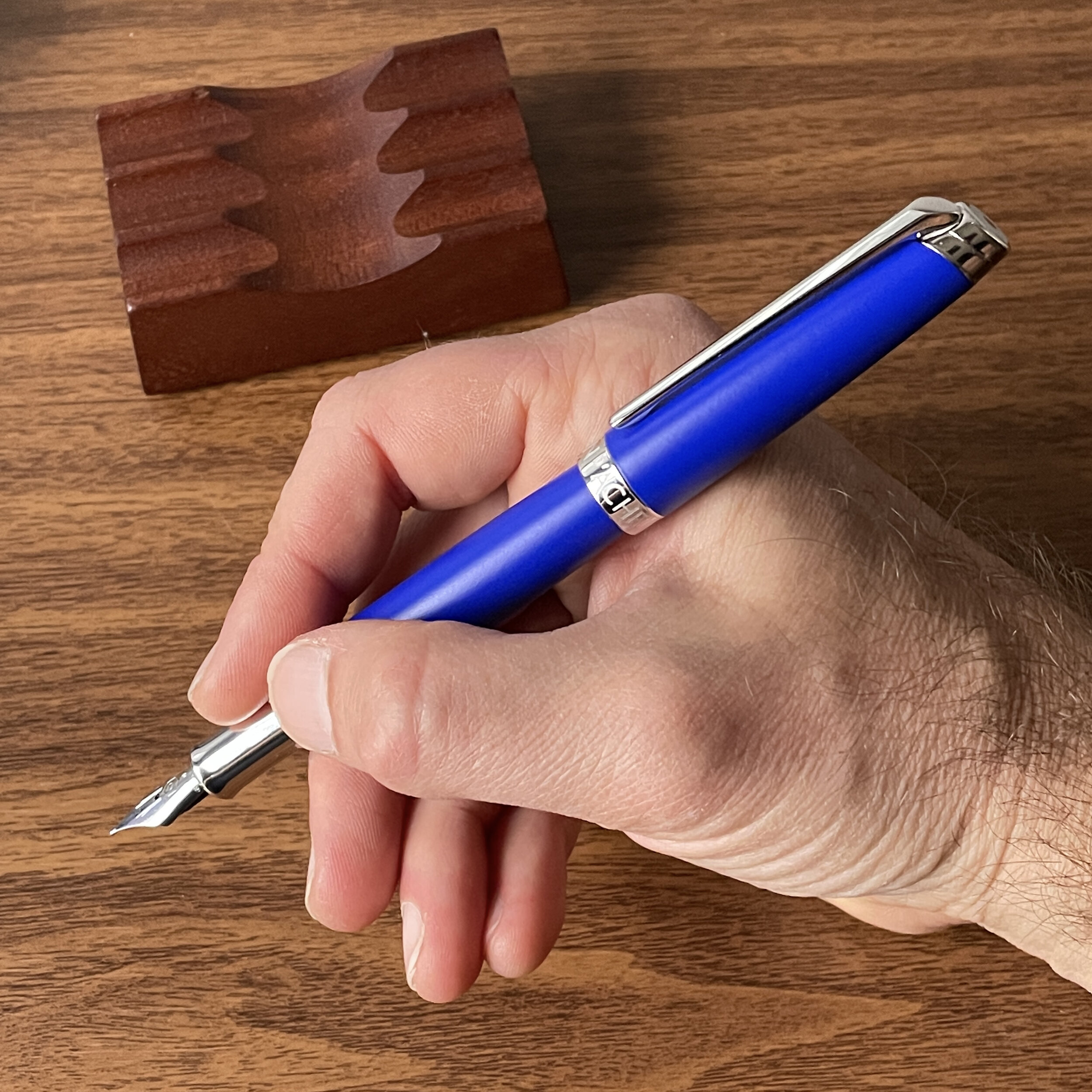
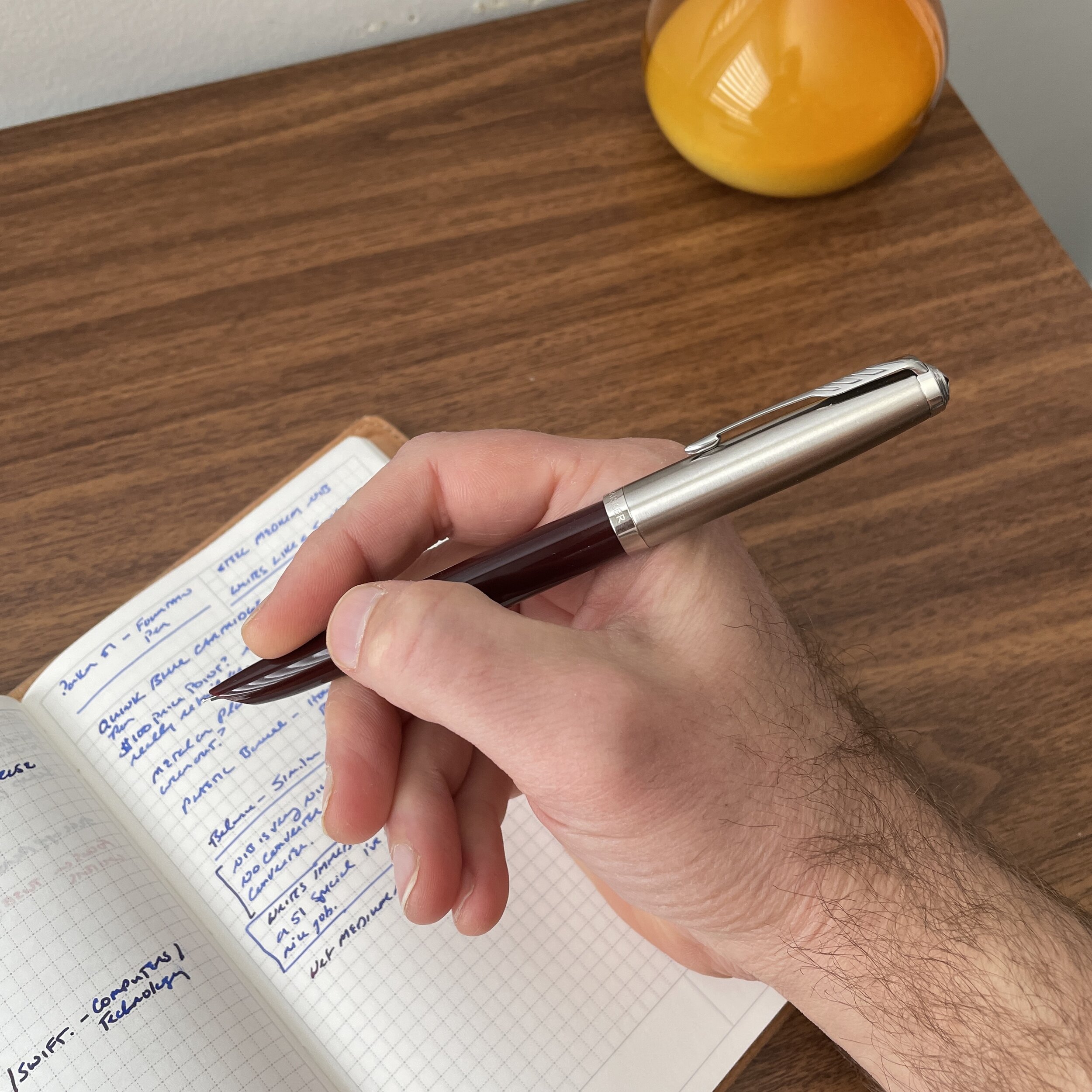
I received a Burgundy/Chrome Parker 51 with a steel nib, which shipped from Appelboom in Parker’s standard pen box. While the presentation is nothing fancy, it’s quality packaging appropriate to the price point of this pen (approximately $109 USD MSRP / $89 USD street price). Visually, Parker has done a nice job recreating the look of the vintage 51, at least with the cap on.

Once you start to handle the pen, however, you immediately realize the various differences. Keep in mind that I have not had a chance to evaluate the more expensive gold-nib version, so I can’t speak to that particular pen. That said, the less expensive “Next Generation” Parker 51 definitely feels more akin to the “Super 21,” Parker’s lower-priced pen that sold alongside the Parker 51. While I would NOT say it feels cheap, the resin/plastic lacks the warmth of the original 51, which wasn’t unexpected since most pen companies have long since moved on from vintage materials to keep production costs down, especially at this price point. With only a day or so in-hand, there’s no way to evaluate long-term durability and the possibility of any brittleness, cracking, etc., which will require one or more follow-up reviews.

The most divisive aspect of the new design is Parker’s decision to incorporate a threaded cap in lieu of the traditional friction fit/clutch cap. While I think I prefer the vintage cap to the current design, I don’t consider it a deal breaker. (Certain well-regarded Wing Sung clones have also used threaded caps.) One concern I do have involves the combination of metal cap threads and plastic barrel threads, which already feel a bit gritty. Will metal-on-plastic wear the threads down over time? Possibly. Another thing to track.

The second most controversial design choice was Parker’s decision to go with a cartridge-converter filling system rather than a vintage-style aerometric or vacumatic filling system. I still don’t understand this critique, and have never considered it a realistic expectation for this reissue because Parker is a mass-market company that hasn’t made these filling systems in decades. While I enjoy vintage filling systems as much as anyone, cartridge-converter remains the standard for modern pen companies since the ease of use broadens its appeal, and the same mechanism can be employed across all of Parker’s various product lines. I also don’t see this particular point affecting sales of this pen. Vintage pen aficionados are going to buy vintage 51s. This pen is plainly intended for either (1) new customers or (2) those, like myself, who enjoy vintage-inspired design, and even the occasional vintage pen, but perhaps want something less “precious” to carry around with them and use on a daily basis.

Nib and Writing Experience

Finally, we get to the part that I care most about, and which pleasantly surprised me: the nib and the writing experience. One thing I love about the original Parker 51 is the ergonomics of the pen, which was designed with daily use in mind. While I don’t have a vintage 51 currently in my possession to do a direct comparison, Parker appears to have maintained the original proportions, and this pen is a very comfortable, balanced writer even with the metal cap posted on a plastic barrel. The medium stainless steel nib is also quite smooth - better, in fact, than the steel nibs on vintage Super 21s and 51 Specials (the steel-nib vintage 51s) I have had in my collection in the past. The pen wrote immediately out of the box, with no skipping or hard starting after I left it sitting overnight and picked it up again in the morning. While this seems unremarkable, it’s a common problem with many modern pens, including those that sell at much higher price points.

Honestly, I was prepared for this pen to be a scratchy, dry writer that skips and hard starts. It’s none of those things. This stainless steel medium nib writes a reliably wet, traditional medium line, so regardless of how you may feel about the “reissue” aspect, this pen does what a pen is supposed to do.

Value

I can only offer preliminary thoughts here, since one component of value is quality and durability, and this is a “first impressions” review. Based on my experience so far, though, I don’t have an issue with the $89 street price for this pen, which is comparable to similar offerings by other companies. The inevitable comparisons will be to (1) buying a vintage Parker 51 on the secondary market; and (2) buying a Parker 51 “clone” from companies such as Wing Sung or Hero. So many different factors go into personal purchasing decisions that it’s not fruitful to comment extensively on either argument. I will say, however, that I find these to be apples-to-oranges comparisons. Someone looking to purchase this particular pen is not necessarily looking to buy vintage, nor should they drop $150+ on a vintage pen unless they understand the implications of caring for and maintaining a pen that hasn’t been manufactured in more than half a century. Yes, vintage 51s are remarkably durable, but they do break and wear out, and you’re on your own in terms of manufacturer and/or dealer support. With respect to the “clones,” I’ve had great ones, and I’ve had bad ones. I will say that now that Parker has resumed making modern 51s themselves, I personally would prefer to support the owner of the actual design rather than those who arguably are misappropriating others’ intellectual property.

View fullsize Parker 51 Posted
View fullsize Parker 51 Unposted

Overall Takeaways

After years of declining quality control and less-than-exciting designs, Parker has made a sincere effort to turn things around and release better pens with more interesting designs. The last several Parkers I have purchased have actually been nice writers. (I have a few modern Sonnets and a modern Duofold in my collection.) Continuing this trend, the steel-nib version of the “Next Generation” Parker 51 pleasantly surprised me. Frankly, while I tried to be optimistic and was happy to see Parker take a risky move in reissuing this pen, I wasn’t expecting much. At the end of the day, however, they seem to have delivered, especially relative to my expectations, and if Parker continues with the “51” line and introduces new colors, cap designs, etc., they could really have something interesting on their hands. Granted, I’m not as emotionally invested in this as some people apparently are, which allows me to evaluate the pen on its own merits. I do believe there is a market for a modern 51: The reality is that vintage Parker 51s will start to age significantly in the coming years, and while they are quality writing instruments of exceptional durability and longevity, they won’t last forever. They will become more scarce, and more expensive to both purchase and repair. While the vintage pens will always have their fans, and many will settle for nothing less than the original, that doesn’t mean that Parker shouldn’t offer another option. Stay tuned for a follow up!

Editor’s Note: I understand that this pen has generated strong opinions. That said, we need to keep things in perspective and the comments civil. I actively moderate the comments on this site, and reserve the right to reject any comments that contain obscenities, personal attacks on other commenters, and anything which, in my discretion, crosses the line from civil discourse, polite disagreement, and even gently poking fun at me and my opinions, into trolling or general nastiness. That is not the community I want to build here. Thanks for your understanding.

In Pens Tags Parker 51, Vintage Pens, Parker 51 Next Generation, Fountain Pens
43 Comments

Introducing the Caran d'Ache Léman Fountain Pen (in "Klein Blue" Lacquer!)

February 6, 2021

This morning I’m introducing the latest Caran d’Ache + Klein Blue collaboration product that’s made its way into The T.G.S. Curated Shop - the Caran d’Ache Léman Fountain Pen in the signature Klein Blue lacquer. I’ll confess - I’ve been more than a bit nervous in advance of this launch, as it’s my first foray into (1) stocking a limited edition fountain pen and (2) a high-end one at that, but after getting my hands on the other Klein Blue products I’ve fallen in love with this shade of ultramarine to such a degree that I couldn’t pass up the opportunity.

The Caran d’Ache Léman is, by most accounts, unfortunately overlooked by the U.S. community of fountain pen enthusiasts. Similar to pens from other European brands such as modern Waterman, S.T. Dupont, and Otto Hutt, which focus on a more understated design, the Léman tends to fly under the radar despite many characteristics that warrant closer consideration. Let’s take a look.

View fullsize Caran d'Ache Léman Unposted
View fullsize Caran d'Ache Léman Posted

By today’s standards, the Léman is a moderately sized fountain pen, measuring 5.5” capped, 5” uncapped/unposted, and 6.25” posted. Proportions-wise, it feels similar in hand to the Otto Hutt Design 06 or the Montegrappa Passione, with slightly more heft and a longer section. The body of the pen is lacquered brass, so the Léman has some weight to it, but it’s balanced to the point where I personally did not have issues writing with the pen posted or unposted. Like the Otto Hutt Design 06, the section has a concave hourglass shape to it, though as I mentioned, the Léman’s section is longer and the shape less pronounced, offering a bit more room to adjust your grip on this pen.

The Léman comes equipped with a rhodium-plated 18k gold nib, which writes a moderately wet line with just a touch of feedback that I found pleasant. The cartridge-converter filling system accepts both the included Caran d’Ache converter, as well as short international cartridges.

View fullsize Caran d'Ache Léman Cap Band
View fullsize Caran d'Ache Léman Cap Band (2)

The Caran d’Ache Léman fountain pen shown here next to the Otto Hutt Design 06.

The Caran d’Ache Léman Klein Blue Limited Edition Gift Set

I’m pleased to offer the Caran d’Ache Léman in the T.G.S. Curated Shop, in the limited edition Klein Blue finish. Due to the limited nature of this release, I was only able to procure two pens for sale, both with 18k medium nibs. Each pen ships in a gift box, with 50ml bottle of Caran d’Ache Chromatics limited edition Ultramarine ink. These are priced at $640 per set, which will include fully insured shipping. You can check out the rest of the Caran d’Ache + Klein Blue products I have available here.

Sales through the T.G.S. Curated Shop are how I plan to support this website going forward. As such, if I am posting information about a product I sell, that fact will be plainly disclosed, much as I disclose sponsor/affiliate relationships.

In Pens, TGS Curated Shop Tags Caran d'Ache Léman, Caran D'Ache, Fountain Pens
Comment

Accutron x Esterbrook Camden: A Heritage Brand Collaboration

February 3, 2021

What I refer to as “heritage brands” have taken off in recent years, and in the pen world, Esterbrook serves as the best example of a brand resurrection done correctly. While I certainly can’t speak for everyone, I’ve personally enjoyed both the Estie (Esterbrook’s first release), and the Camden (the second). This past year, Esterbrook has begun issuing both pens in special and limited edition finishes, and recently announced an exclusive collaboration with another heritage brand, watch company Accutron.

Those who follow the watch world may be familiar with Accutron, a line of watches formerly manufactured by Bulova and recently relaunched as a separate company by the Citizen Group. You can read more about both vintage and modern Accutron watches on dedicated watch sites such as Hodinkee, and the story behind the development of the technology is fascinating. Short version: Accutron watches bridged the gap between traditional mechanical watches and modern quartz watches, introducing a unique “tuning fork” movement that was one of the first mass-market electronic watches available. The vintage Accutron pictured here belonged to my father, and dates from the early 1970s.

Vintage-Accutron-Esterbrook-Camden-Comparison

To commemorate the release of the new Accutron watches, the company has partnered with Esterbrook and other American boutique brands to offer special release products that compliment the new lines, including a green Esterbrook Camden. While clearly an Esterbrook fountain pen (and marketed as such), the Esterbrook branding has been replaced by Accutron’s, including the Accutron “tuning fork” logo on the cap finial and engraving around the base of the cap.

View fullsize Esterbrook+Accutron Camden
View fullsize Accutron x Esterbrook in hand

Takeaways and Where to Buy

As I noted in my original review of the Camden, Esterbrook fountain pens make excellent writers, and the Camden is no exception. The dark green color on this pen is stunning. That said, accessibility on this particular release will be limited. The Accutron Camden limited edition is priced at $295, approximately $100 more than the MSRP on a standard Esterbrook Camden, and from what I can tell, is currently available exclusively from Accutron dealers. Clearly, this pen is targeted towards the Accutron collector and enthusiast, and if you are looking for a fountain pen to match your new electrostatic Spaceview watch, the two will pair together nicely. Most interesting to me about this collaboration, however, are Esterbrook’s emergence as a higher profile presence outside the niche of fountain pen enthusiasts, and the convergence of the watch and pen communities. As a small-scale watch collector, I’ve always believed that pens and watches complement each other, and two companies with similar histories successfully embracing the overlap in their customer bases should generate a lot of excitement about similar collaborations in the future.

Disclaimer: I received the pen featured in this review from Esterbrook and Accutron for review purposes, free of charge. This post does not contain affiliate links.

In Pens Tags Esterbrook, Esterbrook Accutron, Esterbrook Camden
1 Comment

First Impressions: Scribo Feel Fountain Pen

January 16, 2021

The other day I took an initial look at the line of inks by Scrittura Bolognese, otherwise known as Scribo, a new Italian pen company helmed by former employees of OMAS. The inks are quite good, both in terms of performance and presentation, and the Scribo ink bottle is one of the best designs I have used. But what about Scribo pens? Today, I offer my initial thoughts on Scribo's flagship fountain pen, the "Feel".

Scribo adopted the slogan "Feel the Writing," and while maybe a touch cheesy, it fits, because the Scribo Feel is an extraordinarily comfortable pen. Per Scribo's website, each pen is turned by hand from a single bar of resin, and features several well-conceived design touches intended to maximize writing comfort.

The body of the pen evokes a Doric column, fluted with twelve facets around the cap, grip section, barrel, and blind cap/piston. I found that the fluting/facets enhance my grip on the pen, giving me greater control over my writing. The texture is subtle, not sharp, especially on the section where it appears only at the end closest to the nib, allowing you to adjust the writing angle of the nib to your preference. While I would characterize the Scribo Feel as an oversized pen, approximately the same size as an Opus 88 Omar and slightly larger than a Montblanc 149, the contoured shape keeps it from feeling unwieldy. While I love both the Omar and the 149, I'd actually give the slight edge to Scribo in terms of comfort.

I have mixed feelings about the decision to engrave Scribo's slogan, "Feel the Writing," on the cap band. At the $500+ price point, I would have strongly preferred that Scribo simply continue the coin-edge band all the way around.

The Scribo Feel (center) compared against the Montblanc 149 (left) and Opus 88 Omar (right).

The major selling point for those contemplating a Scribo, however, is the nib. On its website, Scribo expressly states that the company fits its pens with "the same nib used by OMAS." While I've only owned two OMAS pens, and neither stuck because the nibs wrote far too wet for my taste, the 18k ruthenium-plated nib on this Scribo Feel writes perfectly. I knew up front that Scribo uses ebonite feeds, so I opted for an extra-fine which was the right call. Despite the fact that the pen is a wet writer, the nib still maintains a true extra-fine line on quality paper. Currently, Scribo offers two nib options: an 18k non-flexible nib in EF, F, M, and B; and a 14k "flexible" nib in the same sizes. I’m not a flex-nib person, so this was an easy choice for me.

The nib on my pen wrote perfectly out of the box. Towards the end, OMAS suffered from quality control issues on its nibs, and both of mine needed tuning badly. I've heard only good things about Scribo, however. Writing sample shown here is done on Midori MD Cotton Paper.

View fullsize Scribo Feel Nib (18k EF Ruthenium)
View fullsize Scribo Feel Ebonite Feed

Finally, while I normally don't get worked up over packaging or promotional "add-ons" such as free pen sleeves or pen cases - most freebies that manufacturers throw in are cheap and don't hold up well to actual use - the Scribo Feel ships with a cotton and leather pen wrap that to me represents added value. It seems quite durable and may see some use.

Takeaways and Where to Buy

If this pen is any indication, Scribo has a bright future and I look forward to seeing whether they release new models. While they have dabbled in other designs, including some extremely high-end limited editions and a collaboration with UK retailer Write Here, the Feel is the only standard model currently offered. Recently, Scribo has focused on expanding the range of materials and trim options in the Feel lineup.

I purchased the pen featured in this review from Appelboom Pens in the Netherlands. The specific model pictured here is the Scribo Feel in Grey-Blue with ruthenium trim, which retails for between $650-750. Like the OMAS pens that preceded them, these certainly are not inexpensive writing instruments, and the offbeat design may limit the appeal of this particular model. That said, the Scribo Feel is a well-built luxury fountain pen with a lot to offer, and compares favorably with competition from Aurora, Visconti, Montegrappa, Montblanc, and the limited edition offerings from Leonardo. Scribo is firmly on my radar and I plan to follow the brand closely in the year to come.

Disclaimer: I acquired the pen in question from Appelboom, using credit generated through the Appelboom affiliate program. The links in this post are NOT affiliate links, as I am moving away from an affiliate revenue model going forward.

In Pens Tags Scribo, Scribo Feel, Fountain Pens, Pen Review
Comment

Pen Review: Sunderland MK1 Machined Pen

December 23, 2020

The Sunderland mk1 is one of the best machined pens, if not the best, I have ever used. Period. Longtime readers of The Gentleman Stationer know that I don't hand out that sort of praise lightly, but I will where it's warranted, and here I see little room for argument. Proudly made in Coopersburg, Pennsylvania, USA by Sunderland Machine Works, the mk1 is described as "tough enough for the shop," but "good looking enough for the boardroom." Sunderland takes a different approach from most makers in this space, bypassing the "tactical pen" market and instead targeting the mk1 as a "machined executive pen." It's a strategy that's a bit risky since it arguably brings a small company into direct competition with much more established makers of executive accessories, but the mk1's combination of durability and elegance makes it a formidable entry into this market segment, especially given the quality at the price point.

The main issue I have with many machined pens is the lack of writing comfort due to size and weight, as well as their tendency towards unrefined designs that look chunky and unfinished. As Sunderland implies in their description of the mk1, some of these pens appear as though they're intended to be used as glass-breakers or weapons first, and pens second. (Given the typical target market demographic, that may in fact be the case). The mk1, however, is designed to be used as a pen, and a daily writer at that, and if you're a fan of rollerballs this could easily serve as a single-pen setup.

Yes, the threads on this pen are internal, contained in the recessed area around the tip.

The mk1 looks and feels like a much more expensive pen than its $85 price point. The fit and finish on my pen are flawless: the threads turn smoothly, the cap posts securely, and the textured, slightly concave section offers a comfortable grip. Sunderland's key innovation, however, involves the threads: they're hidden inside the tip of the pen, so no part of the barrel can interfere with your grip. This patent-pending design offers a "third way" for securing the cap on machined pens - an alternative to sharp external metal threads that dig into your hand and friction-fit caps that inevitably loosen and rattle over time. Similarly, the placement of the threads inside the cap allows you to post the mk1 deeply and securely, without any sort of unpleasant metal-on-metal grating sound or damage to the finish of the pen.

The body of the pen is machined from 6061 aluminum, and the clip from 17-4 aerospace grade stainless steel, reflecting the professional experience of the maker, who has both engineering and machining experience in the aerospace, automotive, and medical industries.

The stainless steel clip is sturdy and has excellent tension. It’s neither too loose nor too tight, and grips a shirt pocket or notebook cover perfectly.

But all this merely serves as a setup for what I consider the best part of this pen: the refill options. Rollerball and gel refill preferences are strongly subjective, so I expect many people to disagree with me here, but Sunderland's decision to design a pen to accept both the Pilot G2 gel cartridge and Montblanc's threaded rollerball/fineliner refills instantly won me over. The Pilot G2 is great - I actually think it's a crime how many pen snobs disregard the G2 seemingly for no reason other than it's popularity, overlooking the fact that there's a reason why it's one of the most popular gel pens in the world. That said, I'll likely never use a G2 in my mk1 because Montblanc's rollerball and fineliner cartridges are some of the best on the market, especially for the clientele Sunderland is targeting. I strongly prefer Montblanc's rollerball refills over alternatives such as the Schmidt P8126/P8127, because the ink Montblanc uses feathers and bleeds far less on ordinary paper. A Montblanc "fine" refill actually writes a fine line, and the "fineliner" offers a high-quality felt-tip option if that's your preference. Montblanc cartridges are threaded to minimize tip wiggle and rattling, and the fact that Sunderland machined the mk1 to allow you to screw the refill into the barrel underscores the attention to detail and commitment to a solid experience.

The mk1 disassembled with a Montblanc Rollerball refill

Sunderland mk1, left, compared against a Montblanc 144 Classique (Petit Prince Edition) and a Caran d’Ache 849 Ballpoint (“Totally Swiss” Edition)

Takeaways and Where to Buy

Fans of more elegant EDC-style pens such as the Schon DSGN Pocket 6, Tactile Turn Gist, and the Matthew Martin OG1 should certainly check out the Sunderland mk1, especially if you are looking for a sleek, streamlined pen that won't appear out of place in a work or business environment, but at the same time doesn't sacrifice any of the durability that machined metal pens have to offer.

You can purchase the Sunderland mk1 directly from Sunderland Machine Works in their online shop. Currently, the mk1 is available in eight different anodized finishes and a handful of special editions. Starting at only $85, the mk1 represents tremendous value given the innovative design and build quality. A pen like this will last a long time, providing you with many years of reliable service.

Sunderland MK1, left, compared against a Retro 51 Tornado (“The System” edition), and a Lamy 2000 rollerball.

Disclaimer: Sunderland Machine Works provided me with this pen for review purposes, free of charge. I was not otherwise compensated for this review, and all opinions expressed here are my own.

In Pens Tags Machined Pens, Sunderland Machine Works, Sunderland MK1, Rollerball, Montblanc Rollerball Refill, Pen Review
4 Comments
← Newer Posts Older Posts →
Store Hours and Location
Visit the T.G.S. Curated SHOP
Updated "Best Pens" Guide
On the Paper Trail Podcast
TGS_25 Roterfaden New Stock Available
Hierarchies of Fountain Pen Friendly Paper

Join Our Patreon!
Subscribe to the TGS E-mail List

Featured Posts

Featured
Pentel-Sign-Pen-Cover.JPG
Feb 28, 2026
Pen Review: The Pentel Sign Pen (Craft Design Technology Version)
Feb 28, 2026
Feb 28, 2026
Cover On the Paper Trail Intro Clip.jpeg
Dec 3, 2025
Introducing "On the Paper Trail," a New Podcast/Video Collaboration with Lisa Vanness of Vanness Pens!
Dec 3, 2025
Dec 3, 2025
Iro-Utsushi-Fine-Dip-Pens.jpeg
Oct 1, 2025
The Pilot Iro-Utsushi Dip Pen (and in General, Simple vs. Fancy Dip Pens)
Oct 1, 2025
Oct 1, 2025
The Gentleman Stationer RSS

© Digital Divide Media, LLC, 2014-present.

All content is the exclusive property of Digital Divide Media, LLC, d/b/a The Gentleman Stationer, including “The Gentleman Stationer” website and trademark, and should not be reproduced without express written permission.  All rights reserved.

All content containing paid advertising, affiliate links, or sponsored content will be plainly disclosed by a disclaimer when/if featured.

Contact Information

Store Shipping Policy and Return Policy

Privacy Policy

Cookie Policy

Terms and Conditions

Powered by Squarespace