• Blog
  • Shop
  • Resources
  • FAQ (Ask TGS)
  • About
  • Archive
  • Contact
  • Sign In My Account
Menu

The Gentleman Stationer

Vintage Living in the Modern World.
  • Blog
  • Shop
  • Resources
  • FAQ (Ask TGS)
  • About
  • Archive
  • Contact
  • Sign In My Account

A Review Sort-of Revisited: The Nahvalur Original Plus Fountain Pen

September 28, 2022

I say “sort-of-revisited” because I previously reviewed the “original” Narwhal Original, and in the three years or so since publication Narwhal fountain pens has not only introduced a new version of the pen with a different filling mechanism, but has rebranded with a new name and logo, and will be known as Nahvalur Pens going forward. Nahvalur made the announcement at this year’s D.C. Pen Show. Apparently “Nahvalur” is the Icelandic word for “Narwhal,” and the choice was made for unspecified branding/trademark purposes. I don’t necessarily find this aspect of the pen industry all that interesting or exciting, though there has been much discussion elsewhere about the rebrand and “other matters.” I prefer to focus on the writing experience, but I will say that I like the new Nahvalur logo, and the new “Original Plus” fountain pen continues to move the company in the right direction.

We have yet to see the new Nahvalur logo and branding on the pens themselves, as the rebrand was only recently announced. Therefore, the current stock of Nahvalur pens still bear the name “Narwhal” on the box and cap band. (Hey - it could increase the collectibility if the design changes in the future, right?)

“Original” vs. “Original Plus”: What’s the Difference?

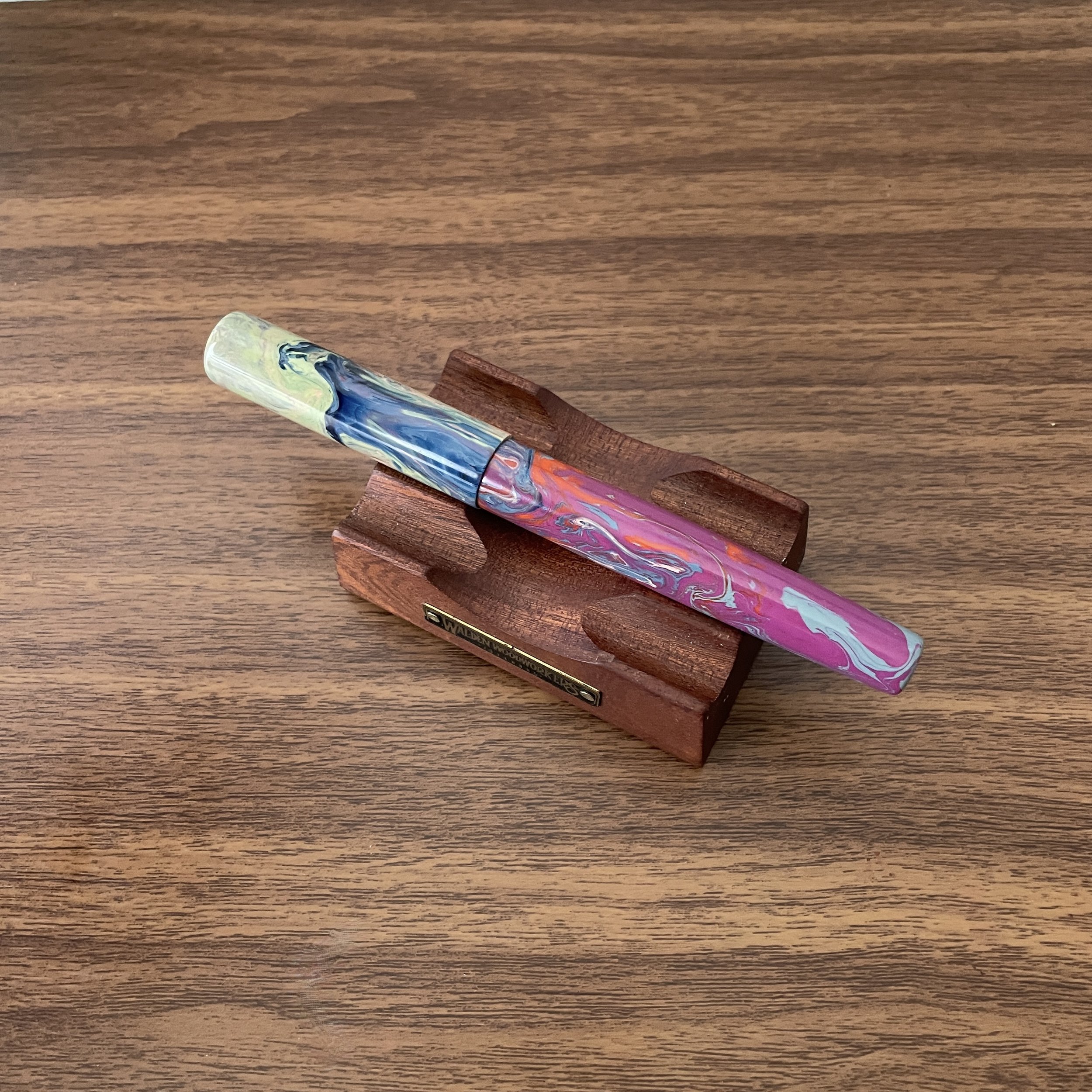
In terms of functionality, the biggest change is that on the Original Plus, Nahvalur switched the filling system from a piston to a vacuum-filler. More on that below. Aesthetically, the two pens share a lot of the same design language, with a few key distinctions. As I mentioned in my “Original” review, the bright swirled acrylic used in the first pen didn’t speak to me. As in, at all. Here, the look is much more subtle, as Nahvalur opted for a more transparent material that offers excellent visibility into the barrel while keeping swirls of the four signature colors: purple, yellow, green, and blue. It’s a subtler look that I believe will ultimately appeal to a wider audience.

Those who own both the “original Original” and the “Original Plus” will note that the band has been moved from the body of the pen to the cap, probably to accommodate the change in filling system.

Build Quality and Filling System

The first thing I remarked when I picked up the Original Plus is how solid the pen feels in the hand. At the sub-$100 price point, and especially at the sub-$60 price point, one of the first things I look at is whether or not the pen feels flimsy or insubstantial, and whether I think it will hold up to true “workhorse” use as a daily writer. Here, the Original Plus easily feels as well-built and durable as the pens I consider to be its peers, the PenBBS 456 and the TWSBI Vac700R. All of the components feel tightly threaded, with no rattling or loose parts. The longer section is comfortable to hold, and the cap quickly deploys with 2.5-3 turns.

The advantage of a vacuum filler is that it uses the entire barrel as an ink reservoir, and here the more transparent material allows you to easily see your ink supply.

As I noted, the major design change is to the filling system. Nahvalur chose to substitute a vacuum-filling system for the piston, and I commend them for doing so. Though a vacuum filler can appear intimidating to new users, they’re fairly simple to use and hold a ton of ink. To fill the pen, you unscrew the blind cap at the end, extend the plunger, place the nib into an inkwell or ink bottle, and press down. The negative pressure will suck ink into the barrel, and you can repeat once or twice more to increase capacity. Even with one fill, however, you will typically get much more than your standard piston filler and certainly more than your standard cartridge-converter pen. Note that like a Japanese-style eyedropper, a vacuum filler has a “safety valve” that engages when the blind cap is screwed all the way down, which helps prevent leaks and makes these great pens for airplane travel. At some point, however, with the valve closed the feed may run dry, and you will need to slightly unscrew the blind cap to allow more ink to flow from the barrel to the nib. If I’m using a vacuum-filler for a longer writing session, I’ll go ahead and open the valve before I get started.

The Nahvalur Original Plus unposted. While the cap technically posts on the barrel, the pen ends up being so long that I can’t imagine anyone would be able to use it that way.

Overall Writing Experience

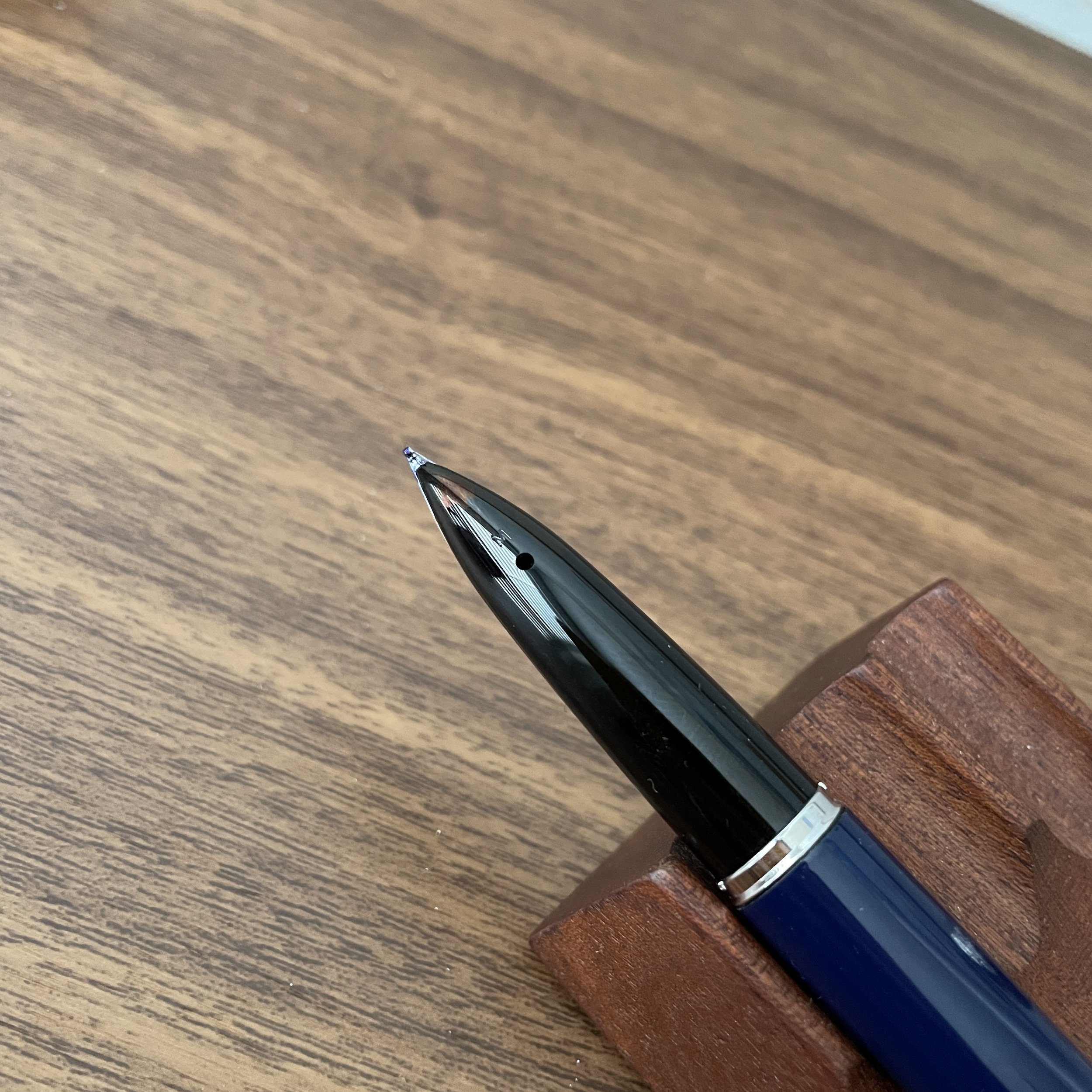
Those who enjoy smooth nibs will enjoy Nahvalur pens. Nahvalur/Narwhal has performed a lot of tuning on their nibs and feeds in-house, resulting in what I would characterize as a “glassy smooth” writing experience that requires very little pressure. As a result, the nibs write a slightly broader line than their designation and there is no “extra fine” nib option. (Even the “fine” writes more like what I’d consider a “fine-medium”.) Despite the smoothness, I’ve found Nahvalur’s nibs to perform well, and of the four different Nahvalur nibs I’ve used over the past few years, I’ve not experienced any skipping or other symptoms of “over polishing” (i.e., a baby’s bottom).

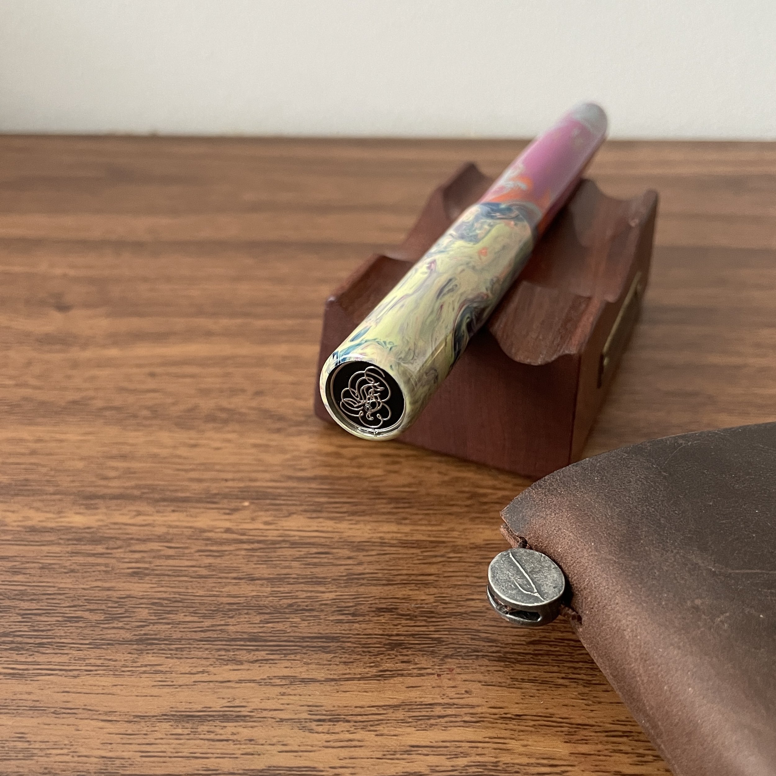
I really do hope that they keep the “leaping Narwhal” logo on the nib - it’s a charming touch.

A writing sample with a comparison between a medium and fine Nahvalur nib. Pro Tip: The broader Nahvalur nibs, and especially the “BB” option available in the Nautilus model, have a fair bit of tipping and therefore make excellent platforms for nib customization.

Takeaways and Where to Buy

With a cool vacuum filler system and priced at only $55, the Nahvalur Original Plus is a worthy successor to the Narwhal “Original,” and - at least in my opinion - improves upon the company’s original release. I personally prefer the more subtle look of the new pen, and for me the vacuum filling system is an upgrade. Of all the different fountain pen filling systems out there, vacuum-fillers seem to be the least represented, and while the Original Plus fountain pens have only been available for a short while, they seem like reasonably priced, reliable high-capacity workhorse options comparable to the TWSBI Vac700R and the PenBBS 456.

My two personal Nahvalur fountain pens that I’ve been carrying recently: the Nahvalur Nautilus in “Stylophora Berry” ebonite (left) and the Original Plus in “Gold Ocellatus”.

The Gentleman Stationer recently became an authorized retailer of Nahvalur Pens, as we expand the number of brands we can offer you directly. You can therefore purchase the Nahvalur Original Plus directly from the T.G.S. Curated Shop, in each of the four color options, priced at $55. Through the end of this week, we are running a promotional offer in which you will receive a complimentary 4ml ink sample with the purchase of any Nahvalur fountain pen. No coupon code is necessary to take advantage of this deal!

Disclaimer: The T.G.S. Curated Shop is an authorized retailer of Nahvalur Pens.

The four colors of the “Original Plus,” from left: Ocellatus Gold, Azureus Blue, Altifrons Green, and Melacara Purple. From the photos, I thought the gold/yellow would be my runaway favorite, but it turns out that they all look even better in person and I had a hard time picking. (Ultimately, “yellow pen” won.)

In Pens Tags Nahvalur, Narwhal, Fountain Pens, Pen Review
3 Comments

Review Revisited: The Waterman Carène "L'Essence du Bleu" Edition

September 21, 2022

As Waterman has revamped and updated its lineup of fountain pens over the past several years, the company has focused on five core models: the high-end Exception and Carène, the mid-tier Expert and Hémisphère, and the more entry-level Emblème. The yacht-inspired Carène, to me, remains an all-time classic, and it’s encouraging, in terms of the future of both Waterman as a brand and this particular model, to see the Carène receiving the special edition treatment. The pen shown here is the Carène “L’Essence du Bleu” special edition fountain pen, featuring an engraved palladium cap atop a dark navy blue lacquered barrel.

The “L’Essence du Bleu” special edition Carène, right, pictured next to the standard “Black Sea” finish with silver trim. The latter pen remains in my collection five years later.

I first reviewed the Waterman Carène in the standard “Black Sea” finish a bit less than five years ago. I’ve owned multiple Carènes over the years, and I can’t recall a time when I haven’t had at least one in my collection. (I’m a huge fan of Waterman pens in general: check out my review of other models by visiting the T.G.S. Fountain Pen Review Archive.) The reasons why I enjoy the Carène are, in many ways, identical to why I enjoy the Lamy 2000: the comfortable, streamlined shape; a subtle integrated nib that’s not overly ostentatious if you want to use it at work, and a consistent writing experience, especially if paired with one of Waterman’s excellent fountain pen inks.

I love the engraving on this cap - it definitely complement’s the Carène’s nautical theme.

This specific pen represents something you don’t see very often: a Waterman special edition. While Waterman has released other models, like the Expert, in the “L’Essence du Bleu” series, the Carène seems particularly well-suited to this design scheme, given the pen’s maritime inspiration. The metal cap features an engraved “wave” pattern, which looks great paired with the dark navy lacquer on the barrel.

While you can certainly use the Carène unposted, I prefer the balance and overall feel of the pen posted.

I’ve always found Carène nibs slightly wet and stubbish, and this 18k medium nib is no exception. This particular Carène lays down a consistent line of ink, even using thicker, non-Waterman inks like the Scribo Blue Cosmico shown here. Waterman quality remains on display in the Carène lineup, and this pen certainly isn’t going anywhere in terms of my own personal collection.

View fullsize Waterman Carène Nib Engraving
View fullsize Waterman Carène Medium Nib

Writing sample showing a stubbish medium Carène nib on Midori MD Cotton Paper. (Lined Plotter version is an experimental release not yet generally available for purchase.)

The Carène is slim enough to fit most planner loops, such as the A5 Plotter shown here.

Takeaways and Where to Buy

The Waterman Carène is a beautiful fountain pen that manages to remain eminently practical. With a comfortable shape that’s neither too wide nor too narrow (allowing it to fit many planner and notebook pen loops), an excellent nib, and a subtle design that doesn’t scream “look at my flashy fountain pen,” the Carène has always been a highly recommended daily workhorse here at T.G.S. As I noted above, the particular model pictured here is the “L’Essence du Bleu” special edition, which retails for around $290. This price point is excellent for a special edition with an 18k gold nib, and the “Black Sea” version with silver trim can be found priced as low as $215, with oblique broad and stub nib options available. That’s serious value in today’s market. Many thanks to our friends at Pen Heaven in the UK for providing this particular pen for review! They are full-service Waterman retailers who carry the full line of Waterman fountain pens and ink, in addition to many other brands.

Disclaimer: The Waterman Carène pictured here was provided by Pen Heaven for review purposes, free of charge. I was not otherwise compensated for this review, and this post does not contain affiliate links.

In Pens Tags Waterman Carene, Waterman, Fountain Pens, Pen Review
7 Comments

Market Watch: What's Up With All the Rainbow Pens? (NOT A COMPLAINT)

August 17, 2022

Unless you’ve been completely ignoring new releases over the past two years, you’ll have noticed that nearly every pen company, ranging from larger manufacturers down to small-batch makers, has begun to release pens in a “rainbow” finish. How this coating is described varies from company to company: TWSBI has dubbed their Diamond 580 and Vac700R models as the “Iris” finish, Conklin and Fisher Space Pen both use the “Rainbow” moniker, and Ben Walsh of Gravitas Pens has branded the finish “Skittles.” Even Leonardo has released a limited edition Momento Zero (the “Prisma”) in collaboration with Italian retailer Stilo e Stile.

Gravitas pens offers a wide variety of “Skittles” finishes. The two shown here are Matte Paisley (center), as well as the darker TiSiNX finish (right), discussed further below.

So how exactly do companies achieve the “rainbow” effect? While most companies protect their exact processes - trade secrets and all - from what I read it appears to be achieved by applying a Titanium Nitride PVD coating, with different companies varying the formula to achieve unique looks. For example, Ben Walsh is releasing the Gravitas TiSiNX, which adds Silicon Nitride to the coating in order to achieve a darker blue/purple tone, and I was lucky enough to take home one of these pen from the D.C. Pen Show.

Comparing the standard Gravitas “Skittles” finish to the TiSiNX finish (right).

The coloring on the Conklin All-American is pretty intense, and also leans much more orange/yellow than the TWSBI Iris finish, which has a pink/purple/magenta tone. I think I prefer the more subtle options.

Because PVD coating is extremely durable, you shouldn’t have to worry about the finish wearing away. In my experience to date, the PVD coating has not affected writing performance, even where the nibs have been treated. And while the special finish typically comes with a small upcharge to the standard pen, it’s not much. The prices I’ve seen have remain reasonable, ranging from $80 for the TWSBIs to around $180 for the Leonardo.

Takeaways and Where to Find This Finish

I’m actually enjoying the “rainbow” trend far more than the “glitter pen” trend that preceded it, especially as companies such as Gravitas experiment with darker tones. Of course, any trend can suddenly seem overdone (looking at you, shimmer ink), and given how successful these pens have been, I think we can expect more pen manufacturers to release their own titanium nitride pens if they haven’t done so already. So far, most companies have exercised retraint, trying to differentiate themselves with unique design touches. For example, Leonardo paired the “Prisma” trim with a bead-blasted, matte acrylic. Kaweco has even released an “Iridescent Pearl” acrylic that achieves something of the same look, and it’s safe to assume that at some point, a rainbow AL Sport or Steel Sport will follow.

The variations in tone between the various models is not necessarily apparent until you compare different pens from different companies side-by-side.

What are your thoughts? Do you find this trend played out, or do you want to see more? Personally, as long as companies keep experimenting, I’m interested to see what manufacturers can do. I generally love PVD coated pens for their durability, and it’s interesting to see colors other than black.

This post does not contain links to paid sponsors or affiliates, though the T.G.S. Curated Shop is an authorized retailer of TWSBI, which is featured here. T.G.S. is supported entirely by purchases from the T.G.S. Curated Shop and the T.G.S. Patreon Program.

In Pens, Editorial Tags Titanium Nitride, Rainbow Finish, Fountain Pens
2 Comments

Pen Review: Hinze Pens "It's Five O'Clock Somewhere"

July 30, 2022

At pen shows, it’s always Five O’Clock Somewhere! Always. Especially at the Hinze Pens table. I’ve been sitting on this review for a few months, waiting until just before a pen show when readers might be able to see and pick up a Hinze Pen for themselves. You’ll have that opportunity next week in at the 2022 Washington D.C. Pen Show, as the team from Hinze will be in attendance with a full table’s worth of pens.

This “Five O’Clock Somewhere” resin has so much contrast, and is a far cry from what “The Gentleman Stationer” typically goes for, yet somehow it works!

As I’ve sought to re-spark my interest in fountain pens and refocus my own collection, one goal has been to reduce the percentage of “stock” or “standard” pens that I own, in favor of supporting independent makers and small manufacturers. I’ve known Jim Hinze and Francisco Lopez through the show circuit for years, but had never acquired one of their pens. At this year’s Baltimore show, the pen pictured here caught my eye, and since only one pen in this particular material remained in Atlanta, I went ahead and took it home.

There are so many different color patterns and swirls in this material that it’s easy to get lost!

This particular pen is the classic Hinze model, which features a minimalist shape designed to showcase the underlying material. In this case, the resin used is dubbed “It’s Five O’Clock Somewhere,” by Starry Night Resins. While I love the pen itself - and I’ll discuss that more in a bit - the resin steals the show. it’s a swirled combination of purple, orange, blue, and grey, with subtle hints of pastel green and cream in the cap. While there are plenty of makers out there releasing colorful swirled acrylic pens, the use of grey, green, and cream in this pen alongside the purple and orange offered a unique color patter that I hadn’t seen before. I hope these blanks come back at some point because I’d love another pen in this material.

This side of the cap might be my favorite feature of the pen. I love the combination of light green, cream, pink, orange - there are just too many colors to name and it seems like I discovery more everyday. Sometimes I find myself staring at this pen, lost in thought.

The pen features a flat-topped, cylindrical shape with a longer section and subtly tapered barrel. It does not post by design. If I had to pick one thing about this pen that I love, it would be the longer section, which I have found exceedingly comfortable for extended writing sessions. As a lighter acrylic cartridge-converter pen, the longer tapered barrel is probaby necessary to create a good balance, one that I’d compare to the “Classic” or “Classic Flush” designs by the Kanilea Pen Company.

Ultimately I went with a dark blue nib - I felt this color complemented the section better than the original magenta.

A Note on Hinze Nibs

One of Hinze Pens’ trademarks are their multicolored nano-plated nibs. Unlike ordinary anodization, these nibs undergo a different process whereby they are coated in a ceramic plating that is much more durable than typical anodization. Here, I opted for a dark blue, which I felt complemented and drew out the grey-blue tones in this particular pen. (Purple or magenta would have been another option.)

Note that I did have this nib modified, so there is a small gap in the coating where Matthew Chen ground a .5mm cursive italic. Ordinarily, if you grind a coated or plated nib, there is a risk of the coating peeling back and flaking off from the area that’s been ground. So far, I’ve seen none of that with the Hinze nib, and I understand that due to the process used, there’s much lower risk of it happening. Care instructions are included with each pen, including recommendations on “safe” inks and cleaning practices.

Here’s my same pen with a different color nib, as originally shown at the Hinze Pen table at the 2022 Baltimore Pen Show back in March. You can see some additional “Five O’Clock Somewhere” pens on the right.

The inlaid finial that Hinze incorporates into their cap is a nice touch, and gives the pen a high-quality, finished appearance.

Takeaways and Where to Buy

There are many bespoke and “small-batch” penmakers out there. It’s easy to get lost and if you’re new to the fountain pen world (and the pen show world especially), to not know where to start. Hinze Pens can serve as a great starting point for those newly interested in bespoke fountain pens, or a new destination for the experienced enthusiast who enjoys unique materials in a well-made workhorse. The price point is extremely reasonable, with most pens priced from $200-250.

The Baltimore Pen Show display that initially caught my eye.

You can purchase Hinze Pens directly from the company via their website, or even better, visit them at a pen show! They will be attending the 2022 Washington, D.C. Pen Show, running from Thursday, August 4 through Sunday, August 7. Stop by and see their table. (And come see me while you’re at it!)

Disclaimer: I purchased the pen featured in this review with my own funds, for review purposes, though Hinze Pens was kind enough to offer me a discount on the price. This post does not contain paid sponsorship or affiliate links.

In Pens Tags Hinze Pens, Custom Pens, Bespoke Pens, Fountain Pens, Pen Review
Comment

Review Revisited: The Lamy 2000 4 Color Ballpoint (Multipen)

July 14, 2022

I don’t often revisit old reviews, but I’ve been in a nostalgic mood lately as I prune back my collection and decide what to keep and what I should pass along to others. I also periodically get questions about whether my opinion on certain pens I’ve recommended heavily in the past still feature prominently in my own daily use. One of those pens is the Lamy 2000 4 Color Ballpoint, more commonly referred to as the Lamy 2000 Multipen. For a refresh on my opinions of this pen, you should start by reading my original review.

A small split in the Macrolon, which is pretty shallow and hasn’t “moved” at all since I first noticed it 2 years ago. I still use the pen without incident.

Nearly five years later, everything I said in that original review still holds true. The “gravity drive” refill system, where you rotate the pen so that the refill you desire to use faces up, continues to work flawlessly, and the pen itself has withstood significant use fairly well, including relatively heavy pocket carry and briefcase travel. My pen does have a small split in the Macrolon around mid-barrel, though it’s stable and hasn’t expanded in the two years since I first noticed it.

The Sailor Imperial Black Multipen features a .5mm mechanical pencil, which is great even though I prefer the Lamy’s form factor. (The Lamy also rattles less.)

If there is one “regret” I have with this pen, it’s that the Lamy 2000 4 Color Ballpoint doesn’t feature a mechanical pencil option. If I were able to roll with three pens and a pencil in this form factor, this pen would never leave my bag. As it stands, if I think I’m going to be in a situation where a pencil might be necessary, I’ll carry the Sailor Imperial Black Multipen instead. While that particular pen is quite a bit heavier and not as comfortable to use as the Lamy, the mechanical pencil option is a huge plus.

My two preferred multipen options: the Sailor Imperial Black and the Lamy 2000 4 Color Ballpoint.

Takeaways and Where to Buy

While I don’t use multipens in general as much as I used to, the Lamy 2000 4 Color Ballpoint still makes its way into my regular daily carry. I use the same four D1 refill options as I did five years ago (two .5mm Jetstreams in blue and red, a Lamy highlighter refill, and a standard .7mm blue-black ballpoint refill that I bought in bulk years ago and which I think is Monteverde). While this particular pen is going on six years old, and carries some “battle scars,” I’d consider it stable and a worthy investment, especially given how much use I’ve gotten from it and the fact that I only paid $50 or so. You can still get these in the U.S., though the price these days is more around $80. If this particular pen ends up breaking, I’d have no hesitation about investing in another one. I’ve linked here to Jetpens, the U.S.-based retailer that also features a wide range of D1 refills that should be compatible with the Lamy 2000 Multipen.

Disclaimer: I purchased this pen with my own funds, for my own use, years ago. This post does not contain affiliate links. The Gentleman Stationer is supported by purchases from the T.G.S. Curated Shop and pledges from the T.G.S. Patreon Program.

In Pens, Multi Pens Tags Multi Pen, Lamy 2000 Multi Pen
Comment
← Newer Posts Older Posts →
Store Location
Visit the T.G.S. Curated SHOP
*New* Updated "Best Pens" Guide (2025)
TGS x Hinze Pens Violet Tendencies Taschenstift Fountain Pen
Hierarchies of Fountain Pen Friendly Paper
Allex Scissors arrayed on a desk showing link to desk accessories

Join Our Patreon!
Subscribe to the TGS E-mail List

Featured Posts

Featured
Joe's-Journals-New-Old.jpeg
Jul 2, 2025
Time to Pick a New Personal Journal: Maruman Mnemosyne Hardcover A5 Journal
Jul 2, 2025
Jul 2, 2025
Desk-Accessoris-Unstaged.jpeg
Jun 25, 2025
Getting Personal: Five "Stationery Adjacent" Items I Can't Live Without
Jun 25, 2025
Jun 25, 2025
Pilot-Iroshizuku-Yama-Budo-Writing-Sample.jpeg
May 24, 2025
Joe's Picks: Five Favorite Inks From Pilot's Iroshizuku Lineup
May 24, 2025
May 24, 2025
The Gentleman Stationer RSS

© Digital Divide Media, LLC, 2014-present.

All content is the exclusive property of Digital Divide Media, LLC, d/b/a The Gentleman Stationer, including “The Gentleman Stationer” website and trademark, and should not be reproduced without express written permission.  All rights reserved.

All content containing paid advertising, affiliate links, or sponsored content will be plainly disclosed by a disclaimer when/if featured.

Contact Information

Store Shipping Policy and Return Policy

Privacy Policy

Cookie Policy

Terms and Conditions

Powered by Squarespace