• Blog
  • Shop
  • Resources
  • FAQ (Ask TGS)
  • About
  • Archive
  • Contact
  • Sign In My Account
Menu

The Gentleman Stationer

Vintage Living in the Modern World.
  • Blog
  • Shop
  • Resources
  • FAQ (Ask TGS)
  • About
  • Archive
  • Contact
  • Sign In My Account

Pen Review: Opus 88 Minty Fountain Pen

November 5, 2022

I’m not sure if you could call Opus 88 fountain pens a “guilty pleasure” of mine, but they’ve certainly taken on a much larger role in my personal pen rotation over the past few years. From the time I first discovered the ebonite + acrylic Koloro demonstrators, to recently when I’ve been partial to the larger Omar and Jazz pens, I’ve been enamored with the high-capacity Japanese-style eyedropper filling system, which previously was only widely available in extremely high-end urushi and maki-e pens from companies such as Danitrio. Recently, Opus 88 has been expanding their lineup to include pens with more of a focus on design, incorporating different materials and color combinations that has enhanced the brand’s appeal and turned Opus 88 into a major player in the $90-200 price segment. The pen I’m reviewing today, the Opus 88 “Minty” fountain pen, is one of those recent releases.

Design and Build

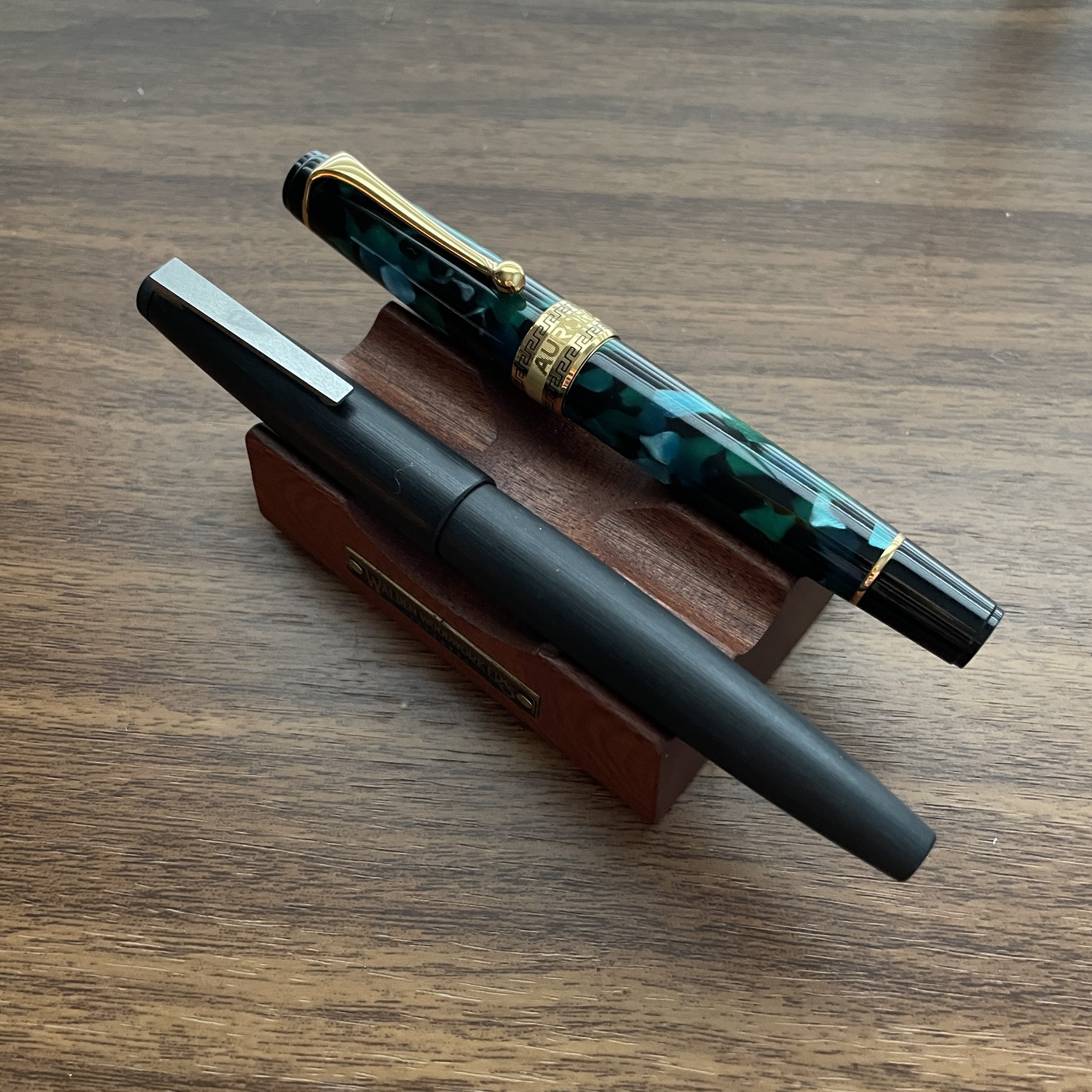
Last week I posted some photos of the Opus 88 Minty in my post revisiting the Aurora Optima, since these pens share a common design profile, which I would characterize as a “streamlined flat-top.” It’s a classic, vintage-inspired design that, at least to me, never gets old, especially when paired with materials such as the “cracked ice”-style acrylics that Opus 88 chose for this pen.

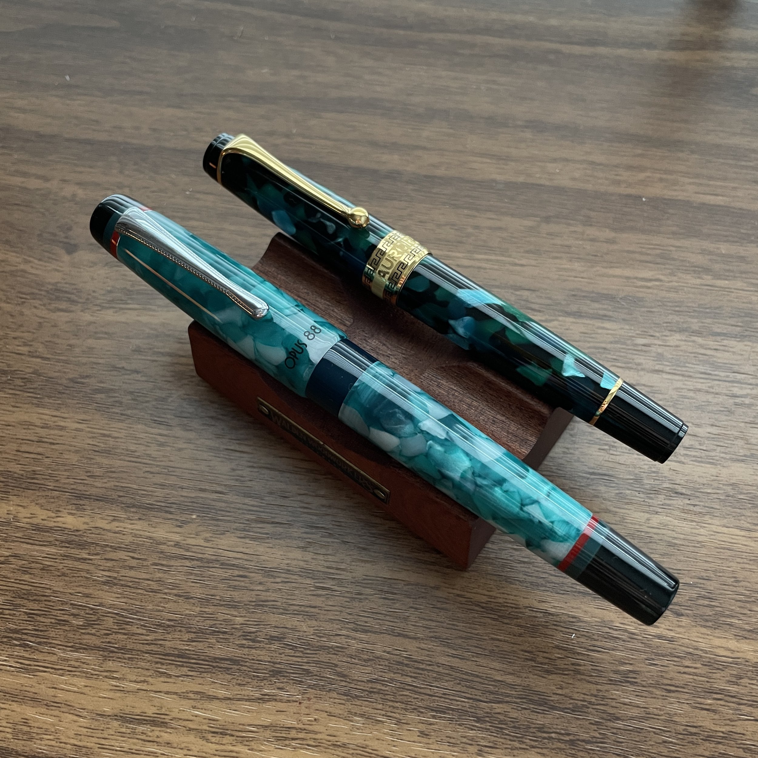
The Opus 88 Minty comes in two colors: “Light Green” and “Orange”, which despite their names I would characterize as more of a teal blue and a coral/salmon, respectively. They’re beautiful colors, especially the orange. I also like the double band of color on the finials.

As an acrylic pen, the Minty is lightweight despite its relatively large size. Surprisingly, when placed next to the clear Opus 88 Demonstrator (pictured below), the Minty is only ever-so-slightly shorter, yet due to the streamlined design it feels much more compact in the hand. It also features a longer concave grip section, with shorter, more compressed threads that don’t interfere with my grip when writing. In fact, I hardly ever feel them.

While most of the Opus 88 fountain pens that have been transparent demonstrators, the Minty has an ink window to offer visibility into your ink supply.

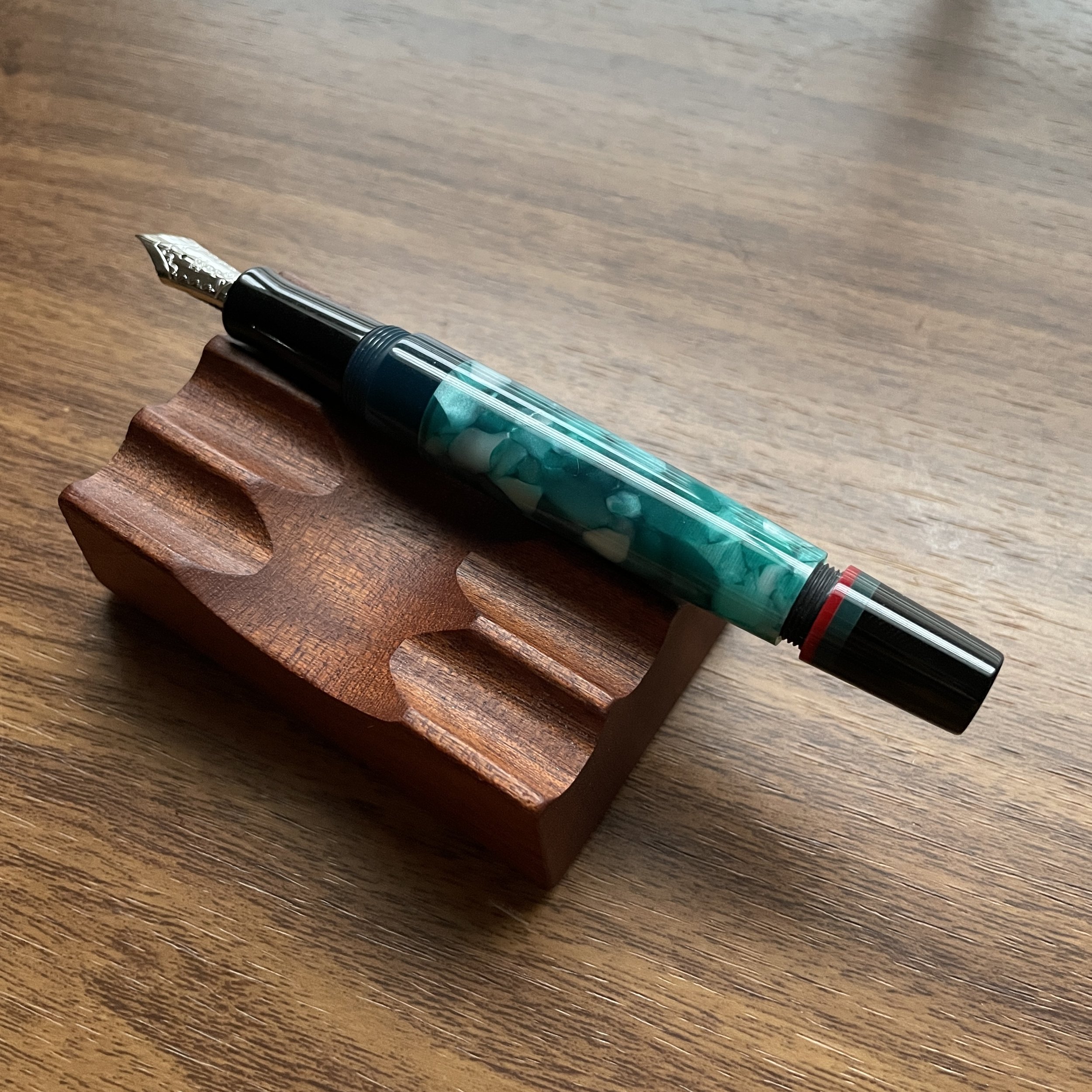
What is a Japanese-style eyedropper? You fill the pen with ink directly into the barrel, and operate the end cap like a piston to open/close a valve that allows ink to flow to the nib. This system prevents leaking and ink burping that sometimes plagues eyedropper pens, especially during travel.

Writing Experience

Opus 88 offers an exceptionally good writing experience across the board, and I don’t think I’ve actually had a poor experience with any of their pens (though some of their designs work better for my hand size and shape than others, from a comfort perspective). This particular model is a great workhorse, suitable for longer writing sessions, not just due to the large ink capacity but the rounded shape. The tapered barrel allows you to post the pen, and even though it’s longer, it’s so light you don’t notice the extra weight.

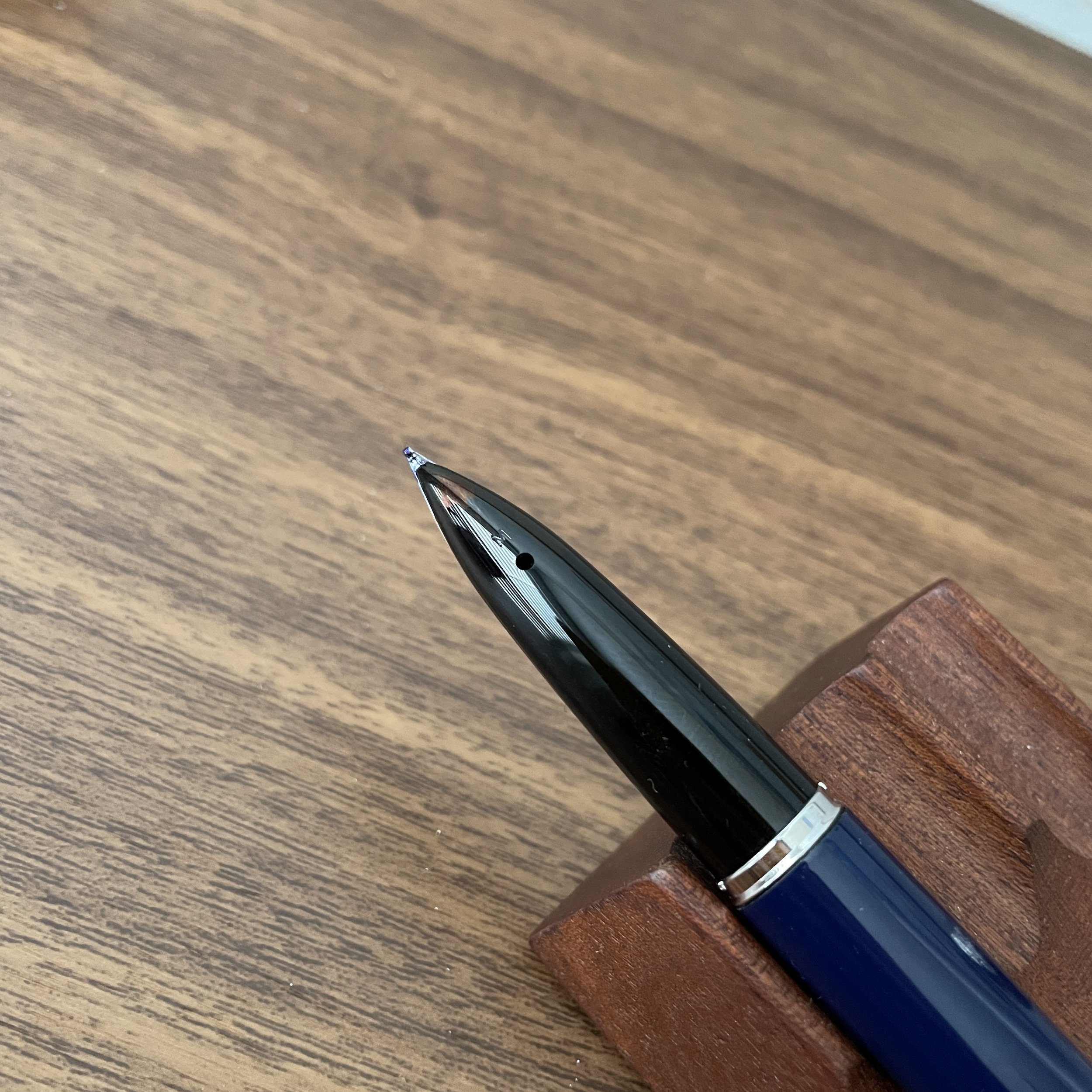
While some might consider the Opus 88’s stainless steel JoWo nib unremarkable, in my opinion it’s a fine selection for a pen at this price point, and as discussed below, it adds versatility to the pen that leaves it open to modification, if you so desire. JoWo nibs themselves are rock-solid writers, and if you’ve been in the pen hobby for any length of time you’ve probably started to accumulate at least a handful of different JoWo-threaded units that you can swap between pens.

View fullsize Opus 88 Minty Clipless
View fullsize Opus 88 Minty Posted with Clip

Overall Versatility and a Note on Modifications

Though I don’t recommend pen modifications to anyone unless you’re willing to accept responsibility if something goes wrong, one of my favorite aspects of the “Opus 88 experience” is the versatility. Like the Opus 88 Omar and Jazz fountain pens, you can swap out the stock Opus 88 JoWo nib with any other JoWo nib unit, or one of the JoWo compatible housings from Flexible Nib Factory, which allow you to use nibs from other brands such as Platinum, Pilot, Sailor, and more. (The green Minty pictured here features a Pilot PO (”Posting”) nib that I appropriated from a stock Custom Heritage 912 purchased years ago.) Another modification I’ve played around with is removing the clip, which gives you the option of creating a more streamlined pen. Again, proceed with any modifications at your own risk, as it definitely (and justifiably) voids your pen warranty.

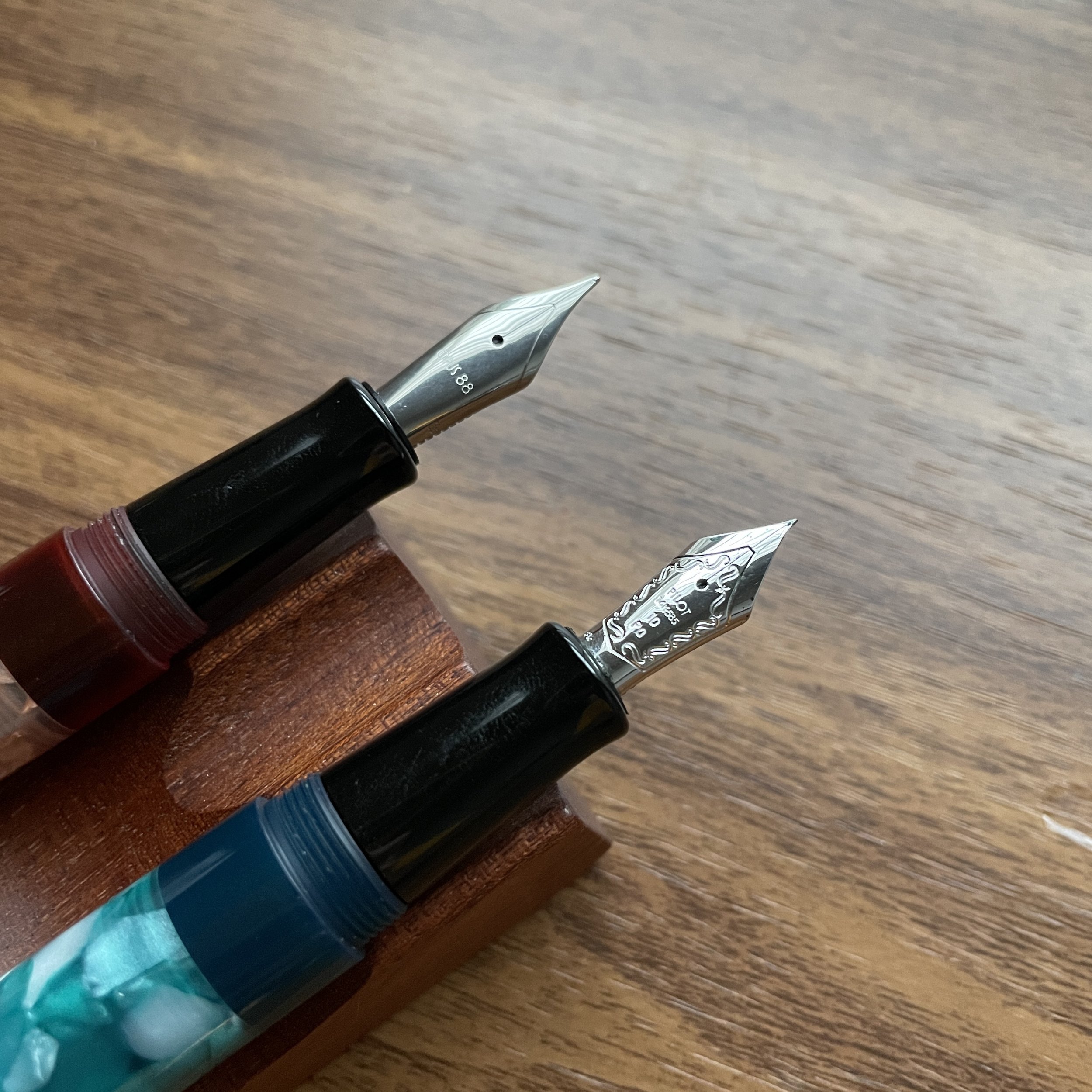
On my orange Minty, I left the extra-fine JoWo stainless steel nib in place. The green one I outfitted with a Pilot PO nib using a replacement nib housing purchased from Flexible Nib Factory.

Takeaways and Where to Buy

The Minty is a welcome addition to the Opus 88 lineup, and I hope Opus 88 does more with this shape/model going forward, perhaps in other materials and with a clipless option. I liked this particular pen so much that after Opus 88 sent me two samples for review, I inquired about adding this model to the Curated Shop, and I’m happy to have a handful of these pens available for sale. They fit the profile of exactly what I’m looking to carry going forward: well-built, versatile workhorse fountain pens that won’t break the bank.

Please note that we are continuing our Fountain Pen Day sale and promotions/giveaway through the weekend! Until tomorrow (November 6, 2022), take an additional 10% off your order using the coupon code “FOUNTAINPEN” at checkout, and receive a complimentary ink sample with all fountain pen purchases, including the purchase of any Opus 88 fountain pen.

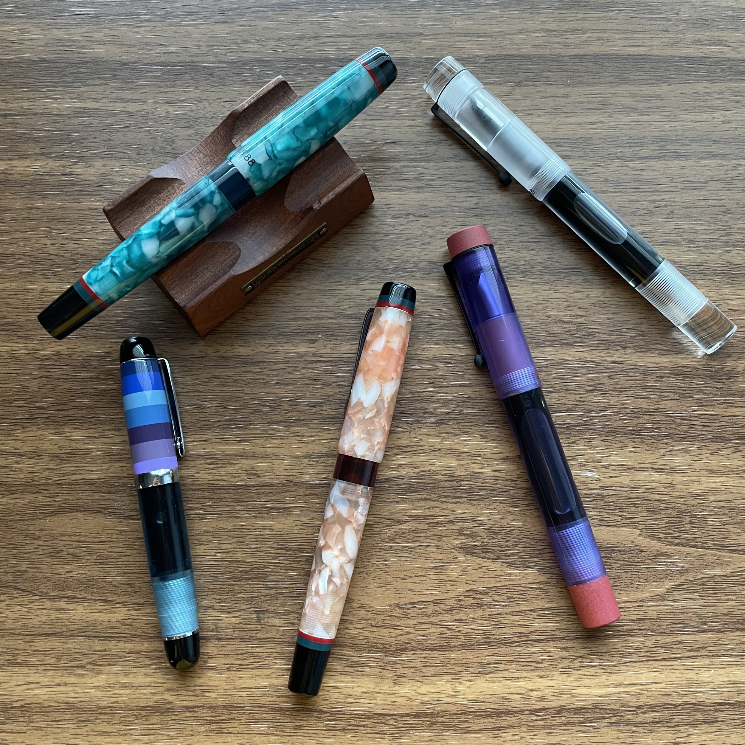
Several new Opus 88 eyedropper fountain pens that I have in for review. Please stay tuned!

Further Reading on Opus 88

Opus 88 is a manufacturer based in Taiwan that currently offers a wide range of fountain pens in a variety of styles and materials. To read more about Opus 88 as a company, as well as some of the other models they offer, visit the Opus 88 section of the T.G.S. Fountain Pen Review Archive.

The Gentleman Stationer is supported entirely by purchases through the T.G.S. Curated Shop and pledges via the T.G.S. Patreon Program. If you’re in the market for any of the stationery that we carry directly, please consider purchasing from us, as it allows us to remain independent of third-party advertising or affiliate support. We are authorized retailers of all brands sold (with the exception of “Gently Used” secondhand products).

In Pens Tags Opus 88 Minty, Opus 88, Fountain Pens
8 Comments

My Favorite Style of Pen: A Second Look at the Aurora Optima Fountain Pen

November 2, 2022

Since this coming Friday is Fountain Pen Day, it’s only appropriate that both of my main posts this week be devoted to, well, fountain pens! Today’s post is less a full review than a further observation based on several years of heavy use. Back in 2016 I reviewed the Aurora Optima, on loan from my friend Thomas. While I enjoyed that pen, it was a bit out of my price range at the moment and I didn’t end up picking one up until a couple of years later, when I added the green Auroloide version pictured here. I wanted to take a moment today to remark not only on how much I have enjoyed the Optima, but in particular the shape.

Sailor Pro Gear Imperial Black (left) compared against the Aurora Optima. These two share a similar profile.

If you’ve followed the blog over the years, you likely know that I have several pen models that are personal favorites, including the Lamy 2000 and the Sailor Pro Gear. If you add the Aurora Optima and the Opus 88 Minty (a recent addition) into that mix, you’ll also notice a trend: I apparently favor a streamlined flat-top design, mostly in pens that post.

Lamy 2000 (left) vs. Aurora Optima.

Why do I like this shape so much? As with all things fountain pens, it’s largely a matter of personal preference. “Postability” plays a huge role: Most days I’m running between meetings in different offices and conference rooms, writing perched on different chairs and sometimes even on a bench in the back of a courtroom or leaning against the wall in a crowded conference room. I can’t really worry about what I’m going to do with the cap of my fountain pen.

But a lot of what I enjoy about this pen design is personal in the sense that the shape fits my hand better than nearly every other style. With both the Lamy 2000 and the Pro Gear, the pen fits my hand best posted; the Optima sits in the midrange size-wise, at a point where I can generally use it either posted or unposted; and the Opus 88 is more on the upper end of the range, where I can post it if necessary (it’s very light), but when I’m at a desk or at home I find the size perfect unposted.

The Opus 88 Minty (left) and the Aurora Optima (right)

Takeaways and Where to Buy

If I found myself in a position where I had to choose a single model of fountain pen to use forever, never purchasing another pen ever again, chances are that it would likely be one of the pens pictured here. A primary goal of my writing here at T.G.S. has been to encourage people, when making a purchasing decision, to look beyond the aesthetics of a pen or piece of stationery to how well it will work for them in everyday use. While pens like the stock Aurora Optima or Lamy 2000 may not be the most visually exciting from the perspective of today’s FOMO, limited-edition driven market, they have staying power among fountain pen aficionados for a reason: they’re well-built workhorses that will let you write comfortably, for long periods of time.

An overhead comparison of four pens with a similar classic shape.

You can purchase the Aurora Optima pictured here from most Aurora dealers, as it’s the standard green model with gold trim. I picked this one up from Dan at The Nibsmith, who doesn’t appear to have this particular color in stock at the moment, but our friends at Dromgoole’s do have it priced at $476. The Lamy 2000 and Sailor Pro Gears are also widely available at retail, generally priced at around $200 and $300-$350, respectively. For a similar look in a larger pen, you might consider the Opus 88 Minty (which we do sell directly), a Japanese-style eyedropper that not only holds a LOT of ink, but sits in at the $125 price point. I plan to review the Minty separately at a later date.

Further Reading on the Aurora Optima

I originally reviewed the Aurora Optima in Nero Perla Auroloide, and in that review I discuss most of the technical specs, etc. on that pen. I’ve also reviewed the Aurora Optima Rollerball, which features the same excellent overall shape in a rollerball format.

This post does not contain affiliate links. The Gentleman Stationer is supported entirely by purchases through the T.G.S. Curated Shop and the T.G.S. Patreon Program. The site takes a lot of time and effort to maintain, and we greatly appreciate your support if you have the opportunity to make a purchase through our online store or throw a couple of dollars our way via Patreon. Many thanks!

In Pens Tags Fountain Pens, Fountain Pen, Aurora Optima
3 Comments

Pen Review: Nahvalur Nautilus Ebonite Fountain Pen

October 5, 2022

Last week, I looked at the Nahvalur “Original Plus,” the updated vacuum-filler version of the Nahvalur “Original” fountain pen, and this week I’ll turn my attention to what is fast becoming Nahvalur’s “flagship”: the Nautilus fountain pen. Originally released under the Narwhal branding - with some current models still featuring the “Narwhal” engraving and logo on both the nib and cap band - the Nautilus has been around for a few years but recently has gained traction following a series of special editions and pen show exclusives in unique ebonites. The two pens I’m looking at in this post include a pen show exclusive that I received in Atlanta (the blue striated limited edition, numbered 205/400) and the “Stylophora Berry” release that I picked up in D.C. at the Nahvalur table.

Two different ebonites: striated blue (left) and “Stylophora Berry” (right).

Design and Build Quality

The Nautilus has received quite a bit of attention since its release due to its distinctive looks, which are plainly inspired by its namesake, the famed submarine from Jules Verne’s 20,000 Leagues Under the Sea. (RIP best Disney ride ever.) Nautical motifs predominate, including a torpedo/submarine shape, an engraved “waves” pattern on the cap band, and three “porthole” ink windows, which I consider more of a design flourish than anything else. The “portholes” can sometimes struggle to let in enough light to offer great visibility on the ink supply, but it’s still a cool visual touch nonetheless.

The porthole ink window and engraved cap band (still showing Narwhal branding, as this pen was released prior to the rebrand).

By far, my favorite aspect of the Nautilus fountain pen is Nahvalur’s use of premium ebonite in striking striated patterns. Why do I enjoy ebonite as a material for fountain pens? For starters, it feels solid in the hand - lightweight yet sturdy, with a warmth that acrylics and resins sometimes lack. You get a lot of visually interesting variation in the material that exudes some of the vintage vibe you get from celluloid or cellulose acetate without the price premium that those materials command.

Writing Experience

Given its shape, the Nautilus obviously doesn’t post. Nonetheless, this is a well-balanced pen that’s incredibly comfortable to write with, even for extended periods of time. Like the Original Plus, the nib on the Nautilus is smooth and requires very little pressure to write. The dark blue Nautilus pictured here initially featured a round double-broad (BB) nib with a lot of tipping - not usually my cup of tea - and while it wrote well out of the box, I chose to have it ground to a “Mini-Naginata”-style nib by C.Y. of Tokyo Station Pens. It’s of course now an excellent writer. My Stylophora Berry Nautilus (the purple pen) has a standard Nahvalur fine nib, and while it definitely writes on the broader side for a “fine”, the consistently wet line makes for a pleasant writing experience.

Nahvalur Nautilus Nib

The engraving on the nib is the same as on the Original Plus, though both of these Nautilus pens have rose gold nibs and trim. As a general observation, Nahvalur fountain pens tend to feature a fair bit of tipping, making them excellent platforms for nib customization (especially in the “B” and “BB” nib widths).

Since it’s a piston filler, the Nautilus holds a lot of ink, making it a writer’s workhorse. I’ve had one of these pens in rotation at any given time since late Spring, and I’ve especially enjoyed using them in my journals for longer sessions at night and early in the morning. Larger, unique pens like the Nautilus tend to be a bit too “conversation-piece-y” for my office environment, but I have taken them to work with me, and there’s absolutely no reason why you couldn’t rely on this pen as your daily driver. I will note that for whatever reason, I’ve found that ebonite pens don’t necessarily travel well in that they tend to burp ink in response to air pressure and temperature changes more than other types of pens. If you’re looking for a pen to take on an airplane, go with the Original Plus, which features a shutoff valve.

Writing samples for the Nahvalur Nautilus standard fine nib (top) in Wearingeul Metamorphosis, and custom-ground BB nib (bottom) in Anderillium Colossal Squid Dark. The Anderillium “Cephalopod” ink series seems like a great match conceptually for these pens. Writing sample is on Life Noble Note paper in grid layout.

Takeaways and Where to Buy

One reason why I love the Nautilus is that there’s nothing quite like it currently on the market. If I had to choose a “peer” pen, I would compare it to something like the Opus 88 Jazz or Omar (with a slight price increase to account for the piston and the premium ebonite), and the standard Leonardo Momento Zero with a steel nib. I would avoid calling any of these pens direct “competitors,” because they are extremely different aesthetically, and Nahvalur pens definitely have their own unique visuals and writing feel.

You can really see the unique pattern in the ebonite on the sections of both pens.

As Nahvalur has grown as a company and expanded its retail presence, the Nautilus lineup has likewise expanded and can now be found at most Nahvalur retailers. The T.G.S. Curated Shop currently stocks the Nahvalur Nautilus in the aubergine “Stylophora Berry” ebonite pictured here, priced at $160. There will be more versions joining in the near future. As I’ve mentioned before, one of the major things I look for when deciding to bring new items (and especially pens) into the shop is value, and after six months of regular use, the Nautilus continues to impress at this price point. Any time a company releases a unique-looking ebonite piston filler under $200, they have my attention, and I look forward to seeing what Nahvalur has in store for this particular model in the future.

A size comparison, showing two Nahvalur Nautilus fountain pens with, from left, the Nahvalur Original Plus in Gold Ocellatus, a TWSBI 580, and a Schon DSGN full-size.

Disclaimer: The T.G.S. Curated Shop is an authorized retailer of select Nahvalur Fountain Pens, including the Nahvalur Original Plus and Nautilus “Stylophora Berry” pictured here. While I acquired the Stylophora Berry with my own funds, I did receive the blue “Pelagia Noctiluca” for review purposes, free of charge. This post does not contain third-party affiliate links.

In Pens Tags Nahvalur, Nahvalur Nautilus, Fountain Pens
1 Comment

A Review Sort-of Revisited: The Nahvalur Original Plus Fountain Pen

September 28, 2022

I say “sort-of-revisited” because I previously reviewed the “original” Narwhal Original, and in the three years or so since publication Narwhal fountain pens has not only introduced a new version of the pen with a different filling mechanism, but has rebranded with a new name and logo, and will be known as Nahvalur Pens going forward. Nahvalur made the announcement at this year’s D.C. Pen Show. Apparently “Nahvalur” is the Icelandic word for “Narwhal,” and the choice was made for unspecified branding/trademark purposes. I don’t necessarily find this aspect of the pen industry all that interesting or exciting, though there has been much discussion elsewhere about the rebrand and “other matters.” I prefer to focus on the writing experience, but I will say that I like the new Nahvalur logo, and the new “Original Plus” fountain pen continues to move the company in the right direction.

We have yet to see the new Nahvalur logo and branding on the pens themselves, as the rebrand was only recently announced. Therefore, the current stock of Nahvalur pens still bear the name “Narwhal” on the box and cap band. (Hey - it could increase the collectibility if the design changes in the future, right?)

“Original” vs. “Original Plus”: What’s the Difference?

In terms of functionality, the biggest change is that on the Original Plus, Nahvalur switched the filling system from a piston to a vacuum-filler. More on that below. Aesthetically, the two pens share a lot of the same design language, with a few key distinctions. As I mentioned in my “Original” review, the bright swirled acrylic used in the first pen didn’t speak to me. As in, at all. Here, the look is much more subtle, as Nahvalur opted for a more transparent material that offers excellent visibility into the barrel while keeping swirls of the four signature colors: purple, yellow, green, and blue. It’s a subtler look that I believe will ultimately appeal to a wider audience.

Those who own both the “original Original” and the “Original Plus” will note that the band has been moved from the body of the pen to the cap, probably to accommodate the change in filling system.

Build Quality and Filling System

The first thing I remarked when I picked up the Original Plus is how solid the pen feels in the hand. At the sub-$100 price point, and especially at the sub-$60 price point, one of the first things I look at is whether or not the pen feels flimsy or insubstantial, and whether I think it will hold up to true “workhorse” use as a daily writer. Here, the Original Plus easily feels as well-built and durable as the pens I consider to be its peers, the PenBBS 456 and the TWSBI Vac700R. All of the components feel tightly threaded, with no rattling or loose parts. The longer section is comfortable to hold, and the cap quickly deploys with 2.5-3 turns.

The advantage of a vacuum filler is that it uses the entire barrel as an ink reservoir, and here the more transparent material allows you to easily see your ink supply.

As I noted, the major design change is to the filling system. Nahvalur chose to substitute a vacuum-filling system for the piston, and I commend them for doing so. Though a vacuum filler can appear intimidating to new users, they’re fairly simple to use and hold a ton of ink. To fill the pen, you unscrew the blind cap at the end, extend the plunger, place the nib into an inkwell or ink bottle, and press down. The negative pressure will suck ink into the barrel, and you can repeat once or twice more to increase capacity. Even with one fill, however, you will typically get much more than your standard piston filler and certainly more than your standard cartridge-converter pen. Note that like a Japanese-style eyedropper, a vacuum filler has a “safety valve” that engages when the blind cap is screwed all the way down, which helps prevent leaks and makes these great pens for airplane travel. At some point, however, with the valve closed the feed may run dry, and you will need to slightly unscrew the blind cap to allow more ink to flow from the barrel to the nib. If I’m using a vacuum-filler for a longer writing session, I’ll go ahead and open the valve before I get started.

The Nahvalur Original Plus unposted. While the cap technically posts on the barrel, the pen ends up being so long that I can’t imagine anyone would be able to use it that way.

Overall Writing Experience

Those who enjoy smooth nibs will enjoy Nahvalur pens. Nahvalur/Narwhal has performed a lot of tuning on their nibs and feeds in-house, resulting in what I would characterize as a “glassy smooth” writing experience that requires very little pressure. As a result, the nibs write a slightly broader line than their designation and there is no “extra fine” nib option. (Even the “fine” writes more like what I’d consider a “fine-medium”.) Despite the smoothness, I’ve found Nahvalur’s nibs to perform well, and of the four different Nahvalur nibs I’ve used over the past few years, I’ve not experienced any skipping or other symptoms of “over polishing” (i.e., a baby’s bottom).

I really do hope that they keep the “leaping Narwhal” logo on the nib - it’s a charming touch.

A writing sample with a comparison between a medium and fine Nahvalur nib. Pro Tip: The broader Nahvalur nibs, and especially the “BB” option available in the Nautilus model, have a fair bit of tipping and therefore make excellent platforms for nib customization.

Takeaways and Where to Buy

With a cool vacuum filler system and priced at only $55, the Nahvalur Original Plus is a worthy successor to the Narwhal “Original,” and - at least in my opinion - improves upon the company’s original release. I personally prefer the more subtle look of the new pen, and for me the vacuum filling system is an upgrade. Of all the different fountain pen filling systems out there, vacuum-fillers seem to be the least represented, and while the Original Plus fountain pens have only been available for a short while, they seem like reasonably priced, reliable high-capacity workhorse options comparable to the TWSBI Vac700R and the PenBBS 456.

My two personal Nahvalur fountain pens that I’ve been carrying recently: the Nahvalur Nautilus in “Stylophora Berry” ebonite (left) and the Original Plus in “Gold Ocellatus”.

The Gentleman Stationer recently became an authorized retailer of Nahvalur Pens, as we expand the number of brands we can offer you directly. You can therefore purchase the Nahvalur Original Plus directly from the T.G.S. Curated Shop, in each of the four color options, priced at $55. Through the end of this week, we are running a promotional offer in which you will receive a complimentary 4ml ink sample with the purchase of any Nahvalur fountain pen. No coupon code is necessary to take advantage of this deal!

Disclaimer: The T.G.S. Curated Shop is an authorized retailer of Nahvalur Pens.

The four colors of the “Original Plus,” from left: Ocellatus Gold, Azureus Blue, Altifrons Green, and Melacara Purple. From the photos, I thought the gold/yellow would be my runaway favorite, but it turns out that they all look even better in person and I had a hard time picking. (Ultimately, “yellow pen” won.)

In Pens Tags Nahvalur, Narwhal, Fountain Pens, Pen Review
3 Comments

Review Revisited: The Waterman Carène "L'Essence du Bleu" Edition

September 21, 2022

As Waterman has revamped and updated its lineup of fountain pens over the past several years, the company has focused on five core models: the high-end Exception and Carène, the mid-tier Expert and Hémisphère, and the more entry-level Emblème. The yacht-inspired Carène, to me, remains an all-time classic, and it’s encouraging, in terms of the future of both Waterman as a brand and this particular model, to see the Carène receiving the special edition treatment. The pen shown here is the Carène “L’Essence du Bleu” special edition fountain pen, featuring an engraved palladium cap atop a dark navy blue lacquered barrel.

The “L’Essence du Bleu” special edition Carène, right, pictured next to the standard “Black Sea” finish with silver trim. The latter pen remains in my collection five years later.

I first reviewed the Waterman Carène in the standard “Black Sea” finish a bit less than five years ago. I’ve owned multiple Carènes over the years, and I can’t recall a time when I haven’t had at least one in my collection. (I’m a huge fan of Waterman pens in general: check out my review of other models by visiting the T.G.S. Fountain Pen Review Archive.) The reasons why I enjoy the Carène are, in many ways, identical to why I enjoy the Lamy 2000: the comfortable, streamlined shape; a subtle integrated nib that’s not overly ostentatious if you want to use it at work, and a consistent writing experience, especially if paired with one of Waterman’s excellent fountain pen inks.

I love the engraving on this cap - it definitely complement’s the Carène’s nautical theme.

This specific pen represents something you don’t see very often: a Waterman special edition. While Waterman has released other models, like the Expert, in the “L’Essence du Bleu” series, the Carène seems particularly well-suited to this design scheme, given the pen’s maritime inspiration. The metal cap features an engraved “wave” pattern, which looks great paired with the dark navy lacquer on the barrel.

While you can certainly use the Carène unposted, I prefer the balance and overall feel of the pen posted.

I’ve always found Carène nibs slightly wet and stubbish, and this 18k medium nib is no exception. This particular Carène lays down a consistent line of ink, even using thicker, non-Waterman inks like the Scribo Blue Cosmico shown here. Waterman quality remains on display in the Carène lineup, and this pen certainly isn’t going anywhere in terms of my own personal collection.

View fullsize Waterman Carène Nib Engraving
View fullsize Waterman Carène Medium Nib

Writing sample showing a stubbish medium Carène nib on Midori MD Cotton Paper. (Lined Plotter version is an experimental release not yet generally available for purchase.)

The Carène is slim enough to fit most planner loops, such as the A5 Plotter shown here.

Takeaways and Where to Buy

The Waterman Carène is a beautiful fountain pen that manages to remain eminently practical. With a comfortable shape that’s neither too wide nor too narrow (allowing it to fit many planner and notebook pen loops), an excellent nib, and a subtle design that doesn’t scream “look at my flashy fountain pen,” the Carène has always been a highly recommended daily workhorse here at T.G.S. As I noted above, the particular model pictured here is the “L’Essence du Bleu” special edition, which retails for around $290. This price point is excellent for a special edition with an 18k gold nib, and the “Black Sea” version with silver trim can be found priced as low as $215, with oblique broad and stub nib options available. That’s serious value in today’s market. Many thanks to our friends at Pen Heaven in the UK for providing this particular pen for review! They are full-service Waterman retailers who carry the full line of Waterman fountain pens and ink, in addition to many other brands.

Disclaimer: The Waterman Carène pictured here was provided by Pen Heaven for review purposes, free of charge. I was not otherwise compensated for this review, and this post does not contain affiliate links.

In Pens Tags Waterman Carene, Waterman, Fountain Pens, Pen Review
7 Comments
← Newer Posts Older Posts →
Store Location
Visit the T.G.S. Curated SHOP
*New* Updated "Best Pens" Guide (2025)
TGS x Hinze Pens Violet Tendencies Taschenstift Fountain Pen
Hierarchies of Fountain Pen Friendly Paper
Allex Scissors arrayed on a desk showing link to desk accessories

Join Our Patreon!
Subscribe to the TGS E-mail List

Featured Posts

Featured
Pilot-Iroshizuku-Yama-Budo-Writing-Sample.jpeg
May 24, 2025
Joe's Picks: Five Favorite Inks From Pilot's Iroshizuku Lineup
May 24, 2025
May 24, 2025
Yamamoto-Gray-Paper-Sampler-Set.jpeg
May 10, 2025
Discovering Unusual Paper: "Paper Tasting" Sets from Yamamoto Paper
May 10, 2025
May 10, 2025
Four-Micarta-Fountain-Pens.jpeg
Apr 19, 2025
Yes, Micarta for me! I finally got my hands on Some Micarta Pens, Plus My Own Special Edition
Apr 19, 2025
Apr 19, 2025
The Gentleman Stationer RSS

© Digital Divide Media, LLC, 2014-present.

All content is the exclusive property of Digital Divide Media, LLC, d/b/a The Gentleman Stationer, including “The Gentleman Stationer” website and trademark, and should not be reproduced without express written permission.  All rights reserved.

All content containing paid advertising, affiliate links, or sponsored content will be plainly disclosed by a disclaimer when/if featured.

Contact Information

Store Shipping Policy and Return Policy

Privacy Policy

Cookie Policy

Terms and Conditions

Powered by Squarespace