• Blog
  • Shop
  • Resources
  • FAQ (Ask TGS)
  • About
  • Archive
  • Contact
  • Sign In My Account
Menu

The Gentleman Stationer

Vintage Living in the Modern World.
  • Blog
  • Shop
  • Resources
  • FAQ (Ask TGS)
  • About
  • Archive
  • Contact
  • Sign In My Account

While I’ll talk Safaris first and inks second, I’ll note that I love the ink choices. Lamy is once again at their best with darker inks.

First Look: 2024 Lamy Special Edition Safari and Inks

February 21, 2024

Lamy takes a lot of criticism - some fair, some not - about a perceived lack of “risk-taking” in their product line, especially when it comes to special editions. Frankly, Lamy tends to err on the side of caution, releasing pens (ahem, Safaris) certain to sell well among a broader, more casual audience even if they don’t excite the pen enthusiast crowd. As a longtime Lamy fan, this year’s Safari release is a welcome departure from what Lamy typically does, and I hope it signals the beginning of more experimentation with color.

Two New 2024 Lamy Safari Designs: “Violet Blackberry” and “Pink Cliff”

This year, Lamy appears to have specifically responded to criticism of their recent limited edition “Strawberries and Cream” Safari release for failing to mix and match colors. This time, not only have they given us multicolored Safaris, but these have radically different barrels and sections, including one pen with a hot pink section that caught me totally by surprise with how good it looked.

Lamy Special Edition Safaris Pink Cliff Violet Blackberry Uncapped on Tray

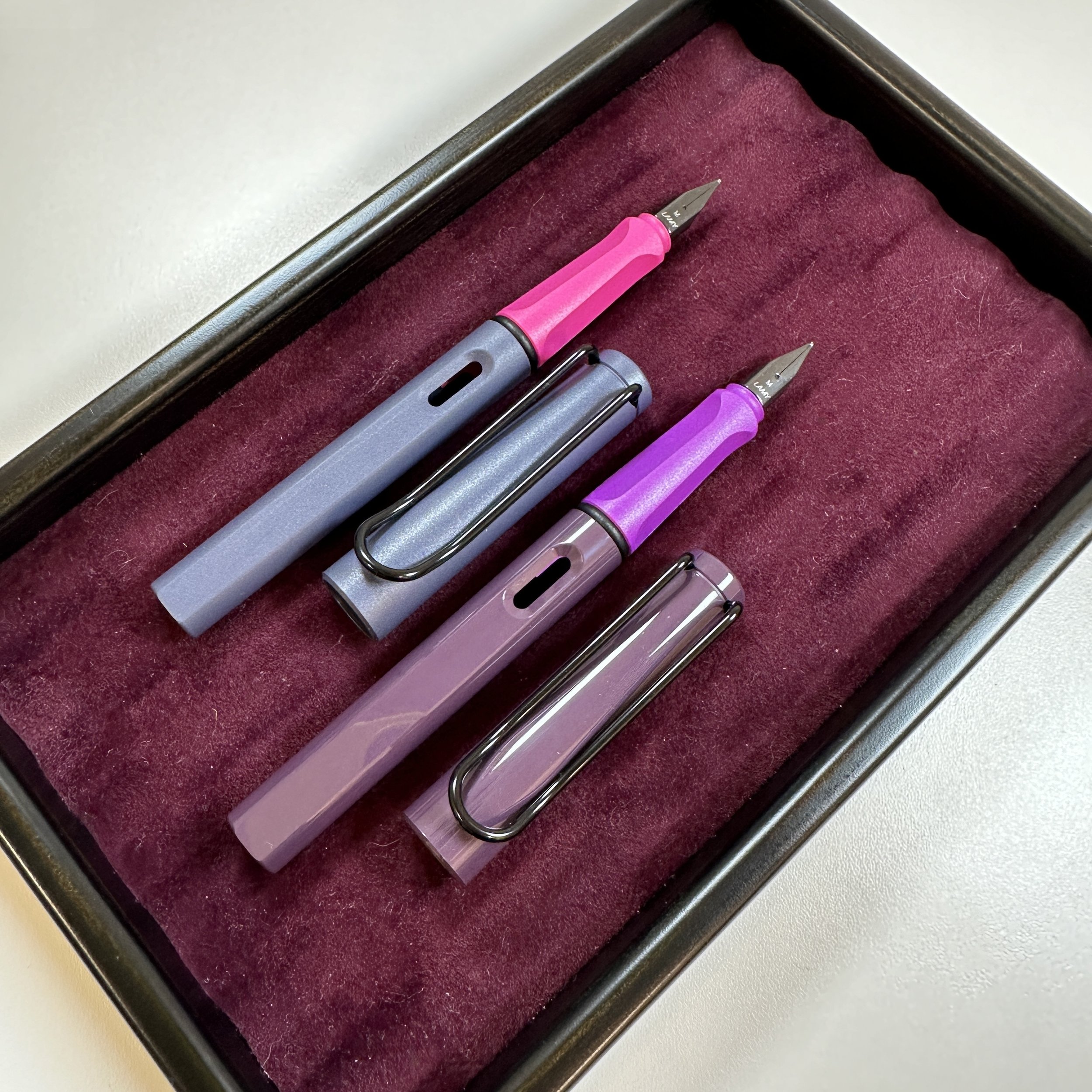
I love that one of the two pens is glossy and the other is matte. Many enthusiasts strongly prefer one of the two Safari finishes, and I’ll take a matte Safari any day.

“Violet Blackberry” features a two-toned purple finish, with a glossy muted dark violet/eggplant barrel and a brighter, matte section in a tone of purple that I assume is the “blackberry” portion of this pen. Paired with a black clip and nib, both colors make for a nice combination. That said, I’m partial to the second pen “Pink Cliff.” (Shocking, right?) Despite finding the name a bit confusing, I’m all over this one, which pairs a matte slate-blue barrel with a bright pink section.

Lamy Special Edition Safaris Cap Finials

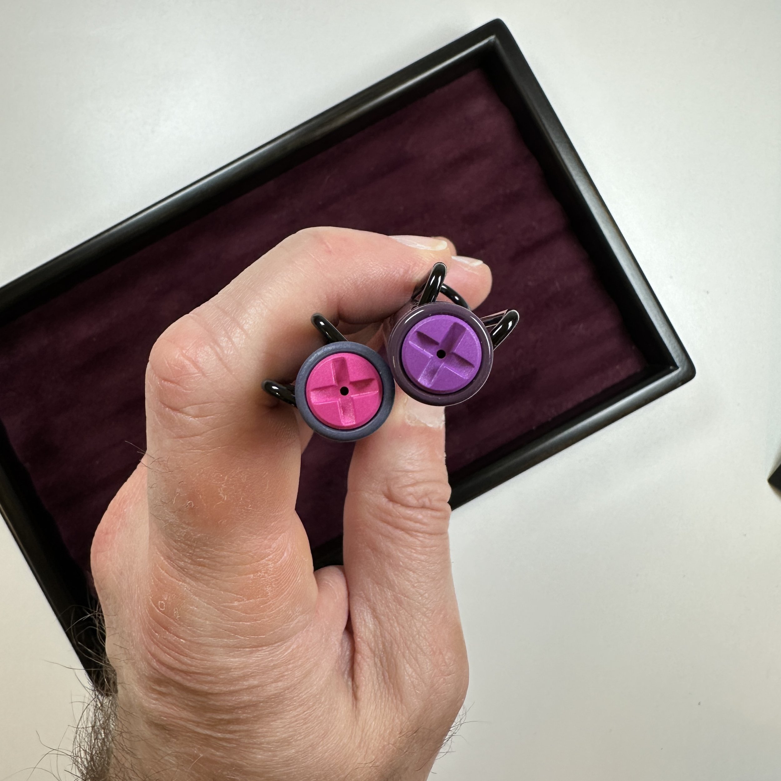
Each pen has a cap finial to match the section. The colors look much more vibrant (and honestly better) in person than they did in the early promotional photos that Lamy released. I hope that once people see these pens in person - or see retailers’ own product photos - the pens will get more attention.

View fullsize Lamy Safari Violet Blackberry Capped
View fullsize Lamy Safari Pink Cliff Capped
View fullsize Lamy Safari 2024 Editions Logo Work

Two New Matching Inks for 2024

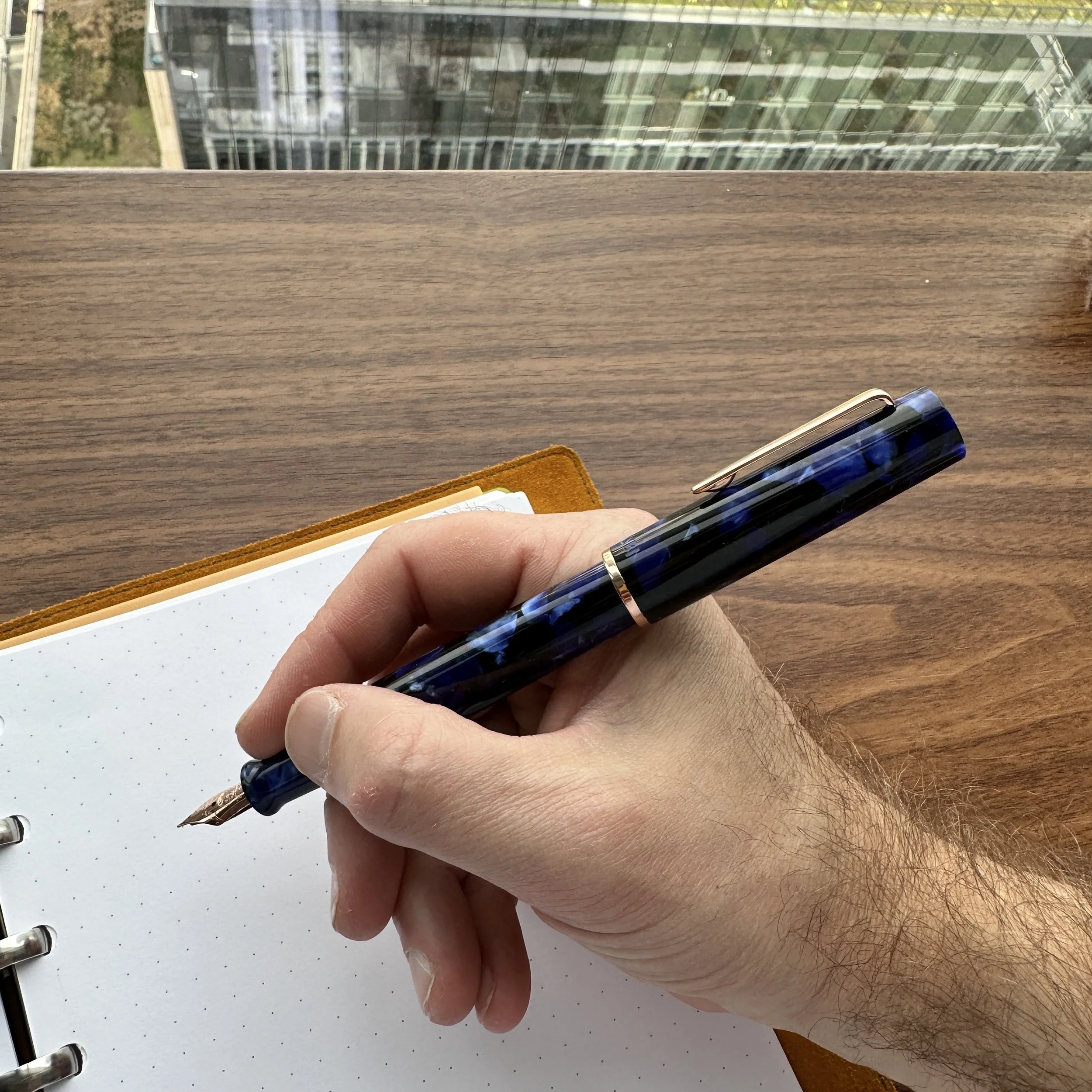
As I mentioned up top, I consider Lamy to be at their best when they release darker inks. Their lighter tones tend toward undersaturation, but their standard blue-black remains a favorite, and past limited edition inks such as Petrol and Dark Violet command steep prices on the secondary market. Though perhaps not quite as unique as those two tones, this year’s “Cliff” and “Violet Blackberry” releases return to that darker palette. I would describe “Cliff” as a dark navy with subtle red/pink sheen, and the more conservative of the two options. “Violet Blackberry” will get the most attention - it’s a super-sheener ink that lays down a dark purple line when wet, but a gold sheen takes over almost immediately. Despite the heavy sheen, the ink seems to behave well, and my initial swatch didn’t have issues with smearing after it dried. Longer term testing will be required, of course.

Lamy Special Edition 2024 Cliff and Violet Blackberry Writing Sample

I love the base tones for both of these inks. As you’ll see in the next picture, the gold sheen appears as the ink dries and will cover most of the purple, in the same way that the greenish sheen on Dark Lilac did in wetter pens.

Takeaways and Where to Buy

Though the color combinations are somewhat nontraditional, I really enjoy what Lamy has done this year. So far, Pink Cliff is my favorite of the two pen designs, mainly because of the matte finish. The juxtaposition of the blue-grey and “hot pink” will also annoy people at work - even better! (j/k) And while I can’t yet declare a favorite between the two inks, I suspect I will lean towards “Cliff” because I’m a sucker for really deep blues. That said, I’m absolutely inking up both this morning into their respective matching pens, and plan to write with them for a while before declaring a winner. I’m not normally a fan of the so-called “sheen monster” inks, but I might enjoy Violet Blackberry if keeps up the good behavior.

Lamy Violet Blackberry Showing Sheen

Since the TGS Curated Shop is an authorized Lamy retailer, we have stock of all of the new Lamy Safari pens, including fountain pens and rollerballs. We also have limited stock of the bottled ink, though we can probably get more if it sells out quickly. When I visited with Lamy at NY Now earlier this month, I didn’t get the impression that supply was overly limited, though the cartridges are not yet available.

The Gentleman Stationer is supported entirely by purchases from the T.G.S. Curated Shop and pledges via the T.G.S. Patreon Program.

In Pens Tags Lamy, Lamy Safari, Lamy Safari Special Editions, Special Edition
Comment

TWSBI Precision Pens, the Full Set.

Pen Review: The TWSBI Precision Fountain Pen

January 10, 2024

Despite epitomizing so-called old technology, do you know what product continues to be enduringly popular? The woodcase pencil. Do you know what else tends to sell insanely well, though they’re a bit more of a cult taste? Hexagonal pens designed to mimic the feel of the pencil. Often marketed as “drafting” or “technical” pens, these are one of the most heavily requested products, both for review purposes and for the shop. The now-discontinued Rotring 600 fountain pen remains the darling of this category, yet for years TWSBI has sold a fountain pen version of its “Precision” line. I can’t believe I’m just now reviewing it.

Hexagonal Pens: They’ll never roll off the desk! The TWSBI Precision fountain pen, second from right, shown with the Caran d’Ache 849 Paul Smith (top), the Rotring 600 (right), the Mark’Style Days Metal Gel Ballpoint, an the TWSBI Precision Ballpoint/Mechanical Pencil (far left).

I first got my hands on the Precision ballpoints and mechanical pencils last year. I loved them both and they are constantly in my “go-anywhere” rotation, especially when I’m working and need a reliable, understated no-nonsense writing instrument. The Precision fountain pen is a larger take on the same format, with brushed “gunmetal” construction that assumes as understated a look as a fountain pen like this one can possibly have. I do appreciate added texture on metal pens: this one feels especially good in the hand with excellent balance and just the right amount of “grippiness” to prevent slippage.

Something about a technical pen gives you an increased sense of … precision… especially when writing or annotating. I opted for a fine nib on the fountain pen, and I’ve been using it regularly to take smaller notes. The nib is the same as on the TWSBI Diamond 580, though you will need to swap the nib manually (friction fit) as I’m told the nib units are designed slightly differently.

View fullsize TWSBI Precision Unposted In-Hand
View fullsize TWSBI Precision Posted In-Hand

Though traditionally intended for “technical” professionals such as architects, there’s no reason you can’t use a so-called drafting pen for everyday writing. The Precision writes comfortably due to the rounded section (no knurling here), and I’ve found the pen to feel best unposted. That said, the piston knob/blind cap on the back of the pen does come equipped with a double set of o-rings to allow you to post the cap securely, and while a touch long for my taste, the pen certainly remains usable.

Like most TWSBI fountain pens, the Precision fills with TWSBI’s reliable piston mechanism, and this particular model includes an ink window just above the section threads so you can monitor your ink level. Here the Precision borrows from the TWSBI “Classic” - yet another TWSBI back-catalogue item I’ve never reviewed. While the Precision doesn’t hold as much ink as the TWSBI ECO or the Diamond 580, you’ll still get a significant amount of writing from each fill. I’ve had this one inked for a couple of weeks and it’s not run dry on me yet despite fairly heavy use at work. As noted above, the pen sports the same nib as the Diamond 580, and offers the same reliable writing experience.

The TWSBI Precision (Center) compared against a TWSBI Eco and a TWSBI Diamond 580. Size-wise, the precision sits in the middle of the pack, more akin to the Classic.

Takeaways and Where to Buy

The TWSBI Precision reaffirms, once again, my decision to spend some time revisiting companies’ “back catalogues” and reviewing older models that I bypassed in the early days of T.G.S. The Precision is an excellent fountain pen, especially for $80 (compared to $300+ for some of the vintage Rotrings), making it a great way to try out this type of writing instrument. The nibs are standard TWSBI Diamond 580 nibs, though the nib units are slightly different and you will need to swap the nib directly (by pulling and replacing) rather than using the Diamond 580’s threaded nib unit. The design offers TWSBI fans and/or those looking for a reasonably priced “technical” fountain pen something quite different to add to their rotation.

I’m somewhat surprised TWSBI has not expanded the Precision fountain pen lineup with at least one or two other colors, such as standard black and silver to match the ballpoint and mechanical pencil. Given the demand for this type of fountain pen, and Rotring’s exit from the technical fountain pen market, there should be a natural opening, and that brushed metal finish would look exceptionally good in multiple colors.

For further reading, be sure to check out our review archive featuring additional reviews of TWSBI and other brands. You can purchase the TWSBI Precision fountain pen, as well as other TWSBI products, directly from us in the T.G.S. Curated Shop. The content side of the Gentleman Stationer is entirely self-supported via the shop and the Patreon Program.

In Pens Tags Technical Pen, TWSBI Precision, TWSBI, Fountain Pen, Pen Review
2 Comments

Strategic Paper Replacement: Adventures in E-Ink, Part I (The Physical Writing Experience)

January 6, 2024

I have a love-hate relationship with so-called “digital paper”, both the idea and the reality. I've owned some version of Apple's iPad Pro for years, but stopped upgrading it after a while due to general disuse. While it occasionally comes in handy when I need to sign something electronically, mark up a longer document for my day job, or where a hand markup needs to be easily distributed to a wider group via e-mail, I otherwise find the writing experience on the iPad to be (1) far less satisfying than writing on real paper due to the lack of a tactile experience; and (2) subject to the same distractions as a computer, to the point where it's much harder to lose yourself in the work than with a notebook and a pen.

But I'm a reader, researcher, and notetaker by nature, so I’ve continued to experiment. I accumulate a LOT of paper, and the idea behind a digital writing device still intrigues me. I'm not opposed to digital tools where they are the best option and solve a real need, such as minimizing the volume of "junk paper" I generate, and anything that streamlines the process of organizing and archiving handwritten notes is a plus.

To that end, I acquired two e-ink devices last year, Amazon's Kindle Scribe and the Remarkable 2 e-ink tablet. While I can't say that I've fully bought in to either system, both devices pleasantly surprised me with the extent to which they duplicate, physically and mentally, the experience of writing on paper. While I originally sought to write a single comprehensive post discussing my thoughts on e-ink and these devices as a whole, I quickly realized that such a piece would quickly get too long and unwieldy, so I'm going to break it out into multiple installments. First up: my thoughts on the physical writing experience, including available pen options.

  1. Writing on both the Kindle and Remarkable 2 feels more like actual paper than the iPad. The matte screens simply feel better than writing on glass. While the friction requires you to periodically replace the tip of the stylus as it wears down, replacements are generally inexpensive. (As an aside, I have tried the Paperlike screen protector for the iPad, and still prefer the feel of both e-ink tablets.)

  2. The pens/styli I have used are more comfortable to use for longer writing sessions than the Apple Pencil. Of the two "stock" options available, I actually prefer the Kindle Scribe Premium Pen ($59.99) over the much more expensive Remarkable Marker Plus ($129). Recently, I've been using aftermarket options, including the Lamy EMR AL-Star and the Lamy Safari "Twin Pen" (a multi pen that also includes a D1 ballpoint refill for when you want to switch writing modes). All of these options use Wacom's EMR (Electromagnetic Resonance) technology - no batteries are involved, so you don't have the battery anxiety that can be an issue with the Apple Pencil during a long working session or if you forget to charge it.

  3. I find the writing experience nearly as distraction-free as physical paper. Personal experience may vary, but I can "lose myself" in reading and writing with an e-ink tablet in a way that I've never experienced with an iPad. Whether it's due to digital distraction always being a click away, blue light, or something else, I don't know, but that's the reality.

The Remarkable 2 allows you to choose from a variety of line options, and vary both style and width. EMR technology is responsive to pressure, creating line variation that corresponds to light/heavy writing pressure. You will also see the “color option” I discuss below.

EMR pens feature different nib sizes - this is the round tip on the Lamy AL-Star.

For those who want to write a finer line (or who want to write on “glossy surfaces”, such as a Samsung device), Lamy makes a pointier nib. It will likely wear down quicker on matte surfaces.

Remarkable 2 Marker

The standard Remarkable and Kindle styli both feel very much like a pencil. I prefer their weight and balance to that of the Apple Pencil.

Potential Drawbacks To Consider

  1. While there is very little latency ("lag") in the current generation of e-ink tablets, it's still there. I've not found it to interfere with my enjoyment of the overall experience, and I would describe it as “minimal” with both the Scribe and the Remarkable 2.

  2. The lack of a color display limits the ability to highlight and annotate documents in different colors. While the settings do allow you to change colors, you'll only be able to view color in exported documents, not on the device. (I know you can change colors with the Remarkable 2 - I've not tried on the Kindle Scribe as Amazon's software makes it fairly difficult/inconvenient to import and organize PDFs and other documents for annotation purposes so I generally don’t use it that way. More on that in a later installment.) Other companies have recently released tablets with color e-ink screens, but they are expensive (i.e., approaching $700).

  3. Some might find the technology expensive for a single use device. That said, with as much as I read and write (hours per day), $300 for the tablet doesn't strike me as outrageous. Remarkable-branded accessories can be pricey and raise the price of the device to around $600 if you opt for the most expensive pen and folio, but if all you want is a simple no-keyboard folio cover and a Wacom-compatible pen, there are much less expensive generic options out there that don’t compromise the experience.

So What's Still to Come?

In addition to recommitting to a journaling habit, one of my goals for 2024 is to be a bit more systematic in how I use paper, and especially in how I organize notes so that I'm able to locate them for reference later. I've been using the Remarkable 2 as both a digital notebook and e-reader (mainly for articles that I want to highlight and annotate in pdf form), with the Kindle Scribe as my primary reading device for longer books that I can annotate yet don't want to carry with me when I'm traveling. Both devices allow me to export markups to my computer for archiving.

The Remarkable 2 software syncs your handwritten notes with the desktop app, and has functions that include handwriting conversion and the ability to type annotations directly into the document from your computer. I’ll go into the functionality in more depth at a later date, but you can export the documents in PDF form to save elsewhere or distribute to others as necessary.

At some point I will do more in-depth installments on the ins and outs of each tablet, including my thoughts on the software and any friction points encountered while integrating these devices into a workflow. To that end, if you're considering purchasing an e-ink tablet, I would carefully consider how you want to use it before making a decision. If you're essentially looking for an e-reader with a large screen that you can use to make handwritten notes and highlights, and use occasionally as a digital notebook, the Kindle Scribe gives you access to Amazon's large library (including Kindle book you already own) with basic e-ink notebook functionality. On most Kindle books the handwriting function is generally limited to "sticky notes" (picture below), but this is already changing as Amazon tweaks their software, and “write anywhere” books are being made available in the Kindle Store. At the moment, the Remarkable 2 has more out-of-the-box functionality and a more intuitive interface, allowing you to read (and annotate) DRM-free e-books, PDFs, and online articles sent to the Remarkable via a Chrome extension. If you spring for the (pricey) keyboard cover, you even can turn the Remarkable 2 into an e-ink typwriter similar to a Freewrite. For those whose primary goal is notetaking and handwriting, I would recommend starting with the Remarkable or something like it.*

As with standard Kindle highlights and typed notes, Amazon allows you to export a pdf of your notes and annotations.

*Note: I recognize other options are available. I know many people who enjoy their Supernote and Boox tablets, but I'm not currently interested in the ability to add Android apps and I otherwise don't see enough of a difference in the handwriting functionality to convince me to buy another device.

This post does not contain affiliate links. TGS is supported via purchases from the T.G.S. Curated Shop and pledges via the T.G.S. Patreon Program. If you enjoyed this content, please consider supporting us!

In Editorial, Pens Tags Remarkable 2, Kindle Scribe, E-Ink Devices, Digital Divide
3 Comments

Pen Review: TWSBI Kai Limited Edition Fountain Pen

November 15, 2023

TWSBI rarely adds new pens to their lineup, with the last completely new shape being the TWSBI Swipe. While some might view the recently released TWSBI Kai as a “new addition”, that’s not entirely true: TWSBI previously released limited runs of similar acrylic piston fillers, spaced approximately 2-3 years apart. The first, the TWSBI “Aurora”, was a green pen in short supply, while the second, the TWSBI “Draco”, received a broader release and more people were able to get their hands on them. The Kai seems to be more widely available, though TWSBI continues to describe it as a limited release. That’s not unusual - most TWSBI editions such as the special edition ECO and Diamond 580 fountain pens are made for a period of time and then retired, but the standard (i.e., clear acrylic, black/white, rose gold) versions remain available. What is unusual is the absence of this otherwise unnamed acrylic piston filler from the regular lineup. It’s solely a limited edition pen.

The TWSBI logo is subtly engraved on the finial, as opposed to the inlaid red plastic logo.

I Would Love to See More Regular Higher-End TWSBI Fountain Pens

I’ve really enjoyed working with the TWSBI Kai for the past couple of weeks. Having missed out on the Draco, I made sure to reserve a Kai for myself as part of my larger order for the shop. The pen has not disappointed - the Kai both looks great and serves as a comfortable workhorse with a shape somewhat reminiscent of the Aurora Optima. The Kai shares the same streamlined flat-top profile - an all-time favorite - though the Kai does not post as deeply as the Optima. Fortunately, like most TWSBI piston fillers, it’s also lightweight and well-balanced even unposted.

No surprises here. The Kai uses the same nib as the Diamond 580, which offers the same reliable writing experience I’ve come to expect.

There’s nothing particularly remarkable or unexpected about the writing experience itself - the Kai is classic TWSBI, and uses the same reliable nib as found in the Diamond 580 series. (The Kai doesn’t use the interchangeable nib units, however, as the nib is friction-fit.) What does make this pen stand out, however, are the visuals. I’ve always admired this series of TWSBI releases, and remain puzzled by their irregularity. The Kai is a beautiful pen, featuring a deep indigo blue-flecked acrylic trimmed in rose gold, which TWSBI always does extremely well. The material has a lot of depth, and I’d venture that the pen looks more expensive than its price point would suggest.

As a more general matter, I’ve noticed that TWSBI’s nib consistency has improved in recent years, and that there is more delineation between the sizes. This EF nib actually writes an extra-fine line. Not a fine (or even a medium like some I’ve used in the past), but a true extra-fine.

A few design touches distinguish the Kai from other TWSBIs. First, there’s no red anywhere on the pen. Most TWSBI models feature the signature red TWSBI finial on the cap, yet the logo on the Kai is engraved. I go back and forth on whether I would prefer the Kai with a pop of red, but at the end of the day feel that TWSBI made the right choice by not adding additional plastic to a higher-end offering.

View fullsize TWSBI Kai Unposed In-Hand
View fullsize TWSBI Kai Posted In-Hand

Second, the barrel and inner cap feature metal rose-gold threads, which work smoothly without any grating noise or excess friction. The pen uncaps in two turns, allowing for quick deployment, and the threads sit high enough on the barrel (behind the ink window) that they don’t interfere with my grip. If I had one critique of the design, it would be the posting issue I mentioned above. Flat-top pens such as this one - including favorites like the Aurora Optima and Sailor Pro Gear - seem especially suited for posting. Could TWSBI have slimmed down the barrel just a bit more? Perhaps, but apart from the Diamond Mini and Vac Mini, TWSBI has never designed pens that post well, and the fact that the Kai is no exception doesn’t surprise me. (Note: As shown above, like most TWSBIs, the Kai does technically post, just not deeply, and I find it uncomfortably long and awkward to use this way.)

The metal threads just work here. I find the pop of rose gold on the barrel visually interesting.

So Where Exactly Does the Kai Fit into TWSBI’s Lineup?

I would organize the current TWSBI fountain pen lineup as follows:

  • Entry Level Pens: TWSBI Go ($18.99); Swipe ($26.99); and TWSBI ECO and ECO-T “Standard” ($32.99)

  • Mid-Range: TWSBI ECO and ECO-T “Special Trim” editions ($49.99 - $70), TWSBI Diamond 580 and Diamond Mini “Standard” ($50-$65); Vac Mini ($60); Vac700R ($65)

  • Upper Mid-Range: TWSBI Diamond 580 Rose Gold Editions ($80-$85); Vac700R Iris ($80); Precision ($80)

  • “High End”: TWSBI Kai, Aurora, and Draco Special Editions ($130 - the Draco and Aurora were actually priced higher at $150(?))

As you can see, that’s a pretty compressed range in terms of price point, with even the “high-end” TWSBI pens not breaking the bank. TWSBI is known for never having targeted the gold-nib market or the “luxury” price point, hence their fairly dominant market position in the sub-$100 fountain pen segment. I would like to see the Kai, or some version thereof, become a permanent offering. Even if there’s no standard version, having one special or limited pen always available would round out TWSBI’s lineup and expand their appeal beyond those who enjoy the demonstrators.

One of these things is not like the others.

Takeaways and Where to Buy

I’m enjoying the TWSBI Kai, and I’m glad I picked one up to compensate for missing out on the Draco (though I’d love to see them bring back that burgundy and black combination). While the Kai is a bit more expensive than other TWSBI piston-fillers, the price is consistent with higher-end pens from brands like Opus 88 and Nahvalur, and maybe even a little lower. It would be great to be able to recommend the Kai as a workhorse fountain pen to those seeking a slightly more traditional design than the Diamond 580 or Vac700R. There’s certainly demand - the Kai has sold well, and I’ve seen Dracos selling on the secondary market for hundreds of dollars!

The Kai is a classy pen that wouldn’t look out of place next to pens twice the price.

As TWSBI retailers, we carry the TWSBI Kai in the T.G.S. Curated Shop, and have a selection of these pens currently in stock. It’s unclear when the next run will be made available after these sell out, though I seem to recall that the Draco stuck around for six months or so. The Kai is priced at $130.00, which is the top of the TWSBI range, though in line with the price point of many other similarly-styled resin piston fillers.

Further Reading on twsbi

I’ve managed to review most TWSBI pens, with a couple exceptions, over the years. If you’d like to review previous content, please check out the Fountain Pen Review Archive, which is organized by brand, including TWSBI.

The Gentleman Stationer is supported by purchases from the T.G.S. Curated Shop and pledges via the T.G.S. Patreon Program. This post does not contain paid advertising or third-party affiliate links.

In Pens Tags TWSBI, TWSBI Kai, Fountain Pens
4 Comments

A New Take on an Old Favorite: The Kobe Affection Kyomachi Legend Blue 1911L Fountain Pen

November 8, 2023

Well, that’s quite a name! As I may have mentioned, one of the many things I got to see first-hand during my August pen show excursions was the development of a new partnership between our friends at Vanness Pens and Nagasawa Stationery in Kobe, Japan. What does that mean to me? Well, for starters I have access to a ton of exclusive Nagasawa Stationery special edition Sailor fountain pens to review, including the “Kobe Affection Kyomachi Legend Blue 1911L Fountain Pen,” a royal blue and gold-themed fountain pen that adopts the same general format as the Sailor 1911 Black Luster, a long-time favorite and one of my more comfortable everyday writers.

The gold flecks in the blue acrylic make for a stunning, yet still understated, material.

Three Things That Make This Pen Stand Out from the Rest of My Collection

Three things make this particular fountain pen something of an outlier for me personally, almost to the point where I’m surprised I chose to review it. (Almost.)

  1. The pen not only has gold trim, but gold flecks throughout the royal blue acrylic, creating a shimmery appearance or, per the current lingo, “chatoyance.” I typically don’t go for gold, but I couldn’t pass up this combination and it literally grew on me within minutes of inking it up.

  2. The pen has a broad nib. While medium (or a medium stub) is typically as wide as I’ll go with my everyday writers, lately I’ve experimented with broad nibs and this broad Sailor 21k nib might be the best of the lot. More on that below.

  3. The pen has a metal section. While I don’t consider a metal section “disqualifying”, I tend to be quite picky about which metal sections I’ll use. At a minimum, they need to have some texture, and I find the plating on Sailor’s metal sections to have a more tactile feel that avoids slippage during longer writing sessions.

I reviewed the Sailor 1911 Black Luster back in 2017, and everything I enjoy about that pen still holds true today, especially with respect to the weight and balance. The only difference I would call out is that for whatever reason, the non-black-ion-plated Sailor 21k nibs (such as the gold one here) feel much more substantial and less “fragile”. As I noted in my prior review, I’ve bent two black Sailor nibs in the past with minor bumps and table drops, but this broad seems more durable and less “soft” for lack of a better term, though I still wouldn’t describe it as a stiff nib.

The Sailor Kobe fountain pens are also notable because they feature Nagasawa’s weathervane logo. I enjoy this design, probably more than the standard Sailor scrollwork.

With respect to the nib, I love how it writes. When most people think of Japanese fountain pens, they focus on the extra-fine and fine nib sizes, but often neglect the mediums and especially the broads. I find such oversights unfortunate. If you’re a fan of medium 14k nibs from German makers such as Bock and JoWo, the Sailor broad nib has similar line width yet offers a smoother writing experience. I’ve heard the same about Pilot, and I’ll be looking to try one of their broad nibs soon.

For those who will ask, this paper ruling is Clairefontaine Seyes-Ruled, or “French Ruled”. The review ink is Sailor Souboku pigmented blue-black. Here, I’ve compared a writing sample from the Sailor 21k broad nib to a writing sample from a JoWo extra-fine Stainless Steel nib. While noticeable, there’s much less of a difference between a German stainless EF nib and a Japanese 21k Broad nib than I would have expected.

Notes on the Name: Why “Kyomachi Legend Blue?”

The name “Kobe Affection Kyomachi Legend Blue” continues Nagasawa’s trend of naming their special edition pens and inks after specific locations in Kobe, Japan and the immediate vicinity, which is where Nagasawa Stationery is based. Per the information provided by Nagasawa, Kyomachi is the area where the Kobe City Museum is located. If there’s one thing that will catch my interest about a line of limited edition fountain pens or inks, it’s when the product has a strong sense of “place” and reflects something of its designer/creator. Every time I research a Nagasawa product, I learn something new about Kobe, which makes me want to visit all the more. (If you’re curious, the popular “Sailor Kobe Ink” series is also developed for Nagasawa, and you learn a lot researching the origin of the various names in the lineup and how the specific colors were carefully matched to each theme or location.)

The balance of this pen, when posted, is nearly perfect for my hand size and writing style.

Takeaways and Where to Buy

Like the 1911 Black Luster, I love this pen and it makes for a great daily writer. That said, you’ll have to really love Sailor and their Japanese special editions in order to spring for it. Sailor pricing is what it is, and doesn’t seem to be changing anytime soon. Once I have one of their pens in hand, however, I tend to forget about the cost. Sailor delivers a quality high-end writing experience and the “Kyomachi Legend Blue” is no exception.

With the Black Luster priced at $392, the Nagasawa Kyomachi Legend Blue in the 1911L format tops that and goes for $450. The 1911S (“standard” or “slim” size) version lacks the metal section and is priced at $300, and, yes, there is a King of Pen version (again without the metal section) priced at $880. Vanness Pens is the exclusive U.S. retail partner for Nagasawa Stationery, and you can view the rest of their current stock here.

Further Reading

If you’d like to see a video of this pen, including a writing sample, please check out this short video that I filmed for our YouTube channel. For reviews of other Sailor Pens, check out the “Sailor” page in our Fountain Pen Review Archive.

The Gentleman Stationer is supported by purchases from the T.G.S. Curated Shop and pledges via the T.G.S. Patreon Program. As always, many thanks to our friends at Vanness for providing this pen for review.

In Pens Tags Nagasawa, Sailor 1911, Vanness Pens, Pen Review
2 Comments
← Newer Posts Older Posts →
Store Location
Visit the T.G.S. Curated SHOP
*New* Updated "Best Pens" Guide (2025)
TGS x Hinze Pens Violet Tendencies Taschenstift Fountain Pen
Hierarchies of Fountain Pen Friendly Paper
Allex Scissors arrayed on a desk showing link to desk accessories

Join Our Patreon!
Subscribe to the TGS E-mail List

Featured Posts

Featured
Pilot-Iroshizuku-Yama-Budo-Writing-Sample.jpeg
May 24, 2025
Joe's Picks: Five Favorite Inks From Pilot's Iroshizuku Lineup
May 24, 2025
May 24, 2025
Yamamoto-Gray-Paper-Sampler-Set.jpeg
May 10, 2025
Discovering Unusual Paper: "Paper Tasting" Sets from Yamamoto Paper
May 10, 2025
May 10, 2025
Four-Micarta-Fountain-Pens.jpeg
Apr 19, 2025
Yes, Micarta for me! I finally got my hands on Some Micarta Pens, Plus My Own Special Edition
Apr 19, 2025
Apr 19, 2025
The Gentleman Stationer RSS

© Digital Divide Media, LLC, 2014-present.

All content is the exclusive property of Digital Divide Media, LLC, d/b/a The Gentleman Stationer, including “The Gentleman Stationer” website and trademark, and should not be reproduced without express written permission.  All rights reserved.

All content containing paid advertising, affiliate links, or sponsored content will be plainly disclosed by a disclaimer when/if featured.

Contact Information

Store Shipping Policy and Return Policy

Privacy Policy

Cookie Policy

Terms and Conditions

Powered by Squarespace