• Blog
  • Shop
  • Resources
  • FAQ (Ask TGS)
  • About
  • Archive
  • Contact
  • Sign In My Account
Menu

The Gentleman Stationer

Vintage Living in the Modern World.
  • Blog
  • Shop
  • Resources
  • FAQ (Ask TGS)
  • About
  • Archive
  • Contact
  • Sign In My Account

The Best Paper for Everyday Writing, Part VI: Legal Pads

October 18, 2023

While I had originally envisioned “The Best Paper for Everyday Writing” as a five-part series, based on reader questions, I thought it made sense to expand it to include a stand-alone article on “Legal Pads”. I’ve placed the term in quotation marks because it’s regularly used to describe several very different types of stationery, ranging from the traditional 8.5” by 14” U.S. “legal-sized” pad of paper to any writing pad that is glue-bound on top and features detachable perforated sheets. I use the broader definition, since in my experience as an attorney fewer and fewer people are using actual legal-sized paper each year, and most of the legal pads I see in everyday practice now feature either letter (8.5” x 11”) or A4 (8.3” x 11.7”) sizing.

The main question I get from readers is very straightforward: What is the best fountain pen friendly legal pad available today? The answer, however, is NOT so obvious, because people prioritize different things. For example, many office workers will churn through a lot of legal pads (think three or four per week), so they look for the least expensive option with acceptable fountain pen performance. I don’t go through as many pads as I used to, so I no longer take this approach myself. Therefore, I’m not up to date on which Amazon or eBay brand of inexpensive legal pad is currently using decent paper - batch performance tends to change from year to year or even month to month. I tend to stick with slightly more expensive paper that delivers consistent performance with fountain pens, rollerballs, and fineliners, and that is how I’ll approach this post.

In my mind, a classic “legal pad” has to allow you to easily fold sheets over the top, and feature a backing board sturdy enough to permit notetaking while standing up. In order to write on both sides of the page, you will have to tear the page out (hence, perforations).

My Favorite Fountain Pen Friendly Legal Pads

  1. Clairefontaine “Pupitre” Writing Tablets. My long-time favorite for a legal-style writing pad remains the classic Clairefontaine “Pupitre” series. Available in A4 and A5 sizes, this durable writing pad is both glue and staple-bound across the top, and features a wrap-around cover in addition to a thick chipboard back for maximum durability and ease of use while standing. The combination of paper quality and high-end construction has kept this pad at the top of my list for many years, and I can’t recall a time when I didn’t have at least three of these in my office desk.

  2. Rhodia A4 Dot Pads. The reliable Rhodia Pad can be found pretty much anywhere these days, including in big-box art supply and craft stores, so they get extra points for availability when you may not have a brick-and-mortar pen store nearby and need quality paper quickly. Also, when I’m looking for dot grid paper, which can easily be turned sideways to use in a “landscape” orientation, Rhodia is my go-to. Of course, Rhodia pads are available in other rulings and a wide range of sizes. I place them at No. 2 on this list, essentially tied with Maruman Mnemosyne, for the same reasons discussed below.

  3. Maruman Mnemosyne A4 Pads. Basically, Maruman Mnemosyne pads tie with Rhodia after Clairefontaine in my book, with Clairefontaine given the edge due to the slightly sturdier build. Rhodia edges out Mnemosyne based on availability. That said, Mnemosyne paper is excellent quality, and if you enjoy having a dedicated space for a header at the top of the page, their layout makes it very easy to organize your notes. Maruman also makes a range of portfolios/padholders across a range of price points, including both PVC and vegan leather options.

  4. Write Notepads Memo Pads. Featuring excellent paper and versatile layouts that include a “Meeting” format, these memo pads are sold in packs of two and therefore also offer good value. While the Write Memo Pads have a backing board, they don’t have a cover like the first three pads on this list, so they’re not quite as durable for portable use, but I’ve absolutely used them in a portfolio. Note that these are letter-sized (8.5” x 11”) and not A4.

  5. Plotter A4 Pads. DesignPhil’s proprietary paper is exceptionally fountain pen friendly, but the A4 writing pad itself is (1) tailored toward users of the Plotter system, and (2) suffers from durability issues that will keep most people from using this as an everyday legal pad. You can use the Plotter A4 pads in either traditional “portrait” or “landscape” mode (i.e., horizontally or vertically), and the paper comes hole-punched for an A5 Plotter binder along the top edge. Because A5 is exactly half the size of A4, you can simply fold the sheet in half (or do a tri-fold) to carry with you in your binder. As a fairly heavy Plotter user, I’ve been experimenting with one of these pads in my A4 Roterfaden, and the primary drawback is that the pad doesn’t have a sturdy backing board or binding and falls apart fairly easily. This product appears to be designed primarily with desk use in mind, where you tear the sheets out one by one as you use them.

Honorable Mention: Midori MD and MD Cotton Writing Pads

Intended more as a desk pad than a traditional legal pad, the Midori MD and MD Cotton pads are glue bound on two sides (crosswise and lengthwise), which ensures the paper lies flat and prevents “curling” of pages as you get to the end of a pad. I include these as honorable mention because, while you can’t use them easily in a portfolio or padholder without breaking the binding, they are excellent pads of paper and can absolutely be used to take legal pad-style notes as necessary.

Thick backing boards on the Clairefontaine Pupitre (top), the Write Notepads Memo Pad (middle), and Maruman Mnemosyne (bottom).

Further Reading

To catch up on the rest of the “Best Paper for Everyday Writing” series, check out our “Best Paper” Resource Page. I may need to do yet another post in the series in response to several reader requests for recommendations on pads for letter writing and written correspondence, which is an entirely different category (though again there may be some overlap). Stay tuned!

The Gentleman Stationer is supported entirely by purchases from the T.G.S. Curated Shop and pledges via the T.G.S. Patreon Program. This post does not contain third-party advertising or affiliate links.
In Editorial, Paper Products, Top 5 Tags Best Paper, Legal Pad, Editorial
1 Comment

The Gentleman Stationer Ink Cabinet. Part of it.

The Gentleman Stationer's Favorite Fountain Pen Inks, Inaugural Edition (2023)

May 27, 2023

While I publish an annual list of "Best Pen" recommendations, inks are far trickier, made especially difficult by the dozens of brands and thousands of different colors now available, which wasn't the case when I first started TGS. Over the years, I've done a few lists of my favorite inks for specific purposes, such as office use and annotation, but have shied away from anything more categorical. Then I had the idea: What if I made a list of my current preferred ink for each color category, which I could easily update over time? Here are the rules I came up with:

  1. The ink has to be available. No limited editions that are impossible for people to find because that's no fun to read. (Those can have their own list, if people are interested.)

  2. Broad color categories only with no sub-categories. Keep it simple. Here, I've organized this initial list with 12 slots that loosely tracks the major colors that pen companies typically include in their lineup.

  3. I have to have used the ink in multiple pens over the past year. Some of these inks have been used more than others (brown and yellows don't actually get much time in my rotation), but generally, frequency of use + simple joy determines whether an ink makes the cut.

Here we Go! Fountain Pen Inks of Choice by Color (2023)

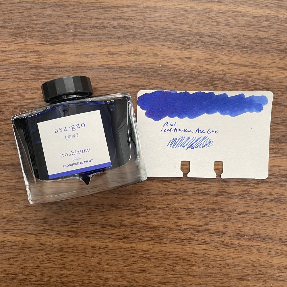
Pilot Iroshizuku Asa Gao

Blue: Pilot Iroshizuku Asa-gao. I sometimes go far too long without using this particular ink, but whenever I use it to fill a pen I wonder why I don't just keep a bottle of it on my desk. A bright royal blue that borders on "electric," but is still professional enough to use at the office. It reminds me of Waterman blue that doesn't fade to a duller color after drying.

Black: Lamy Black. When choosing a black ink, some go for the darkest line possible, but not me. I prefer some shading and undertones, especially the purple cast that Lamy Black has when it dries, which gives the ink added depth.

Blue-Black: Iroshizuku Tsuki-Yo. The name translates as "Moonlight", and though I can't exactly explain why, it fits this shade of ink perfectly. Tsuki-Yo leans more blue on the blue-black scale, and exhibits a slight red sheen on some papers. As one of the longest-running inks in my collection, which at the moment I have loaded into three pens, Tsuki-Yo might be my favorite of the Iroshizuku Inks and one of my favorite inks of all time.

Turquoise: Kaweco Paradise Blue. Some of you may be surprised to see two Kaweco inks on this list, but I absolutely love Kaweco's ink offerings and find them extremely underrated. The inks are vibrant, low-maintenance, and inexpensive, and the fact that they come in both cartridges and bottles ensures that you can use them in your Kaweco Sports as well as your piston fillers.

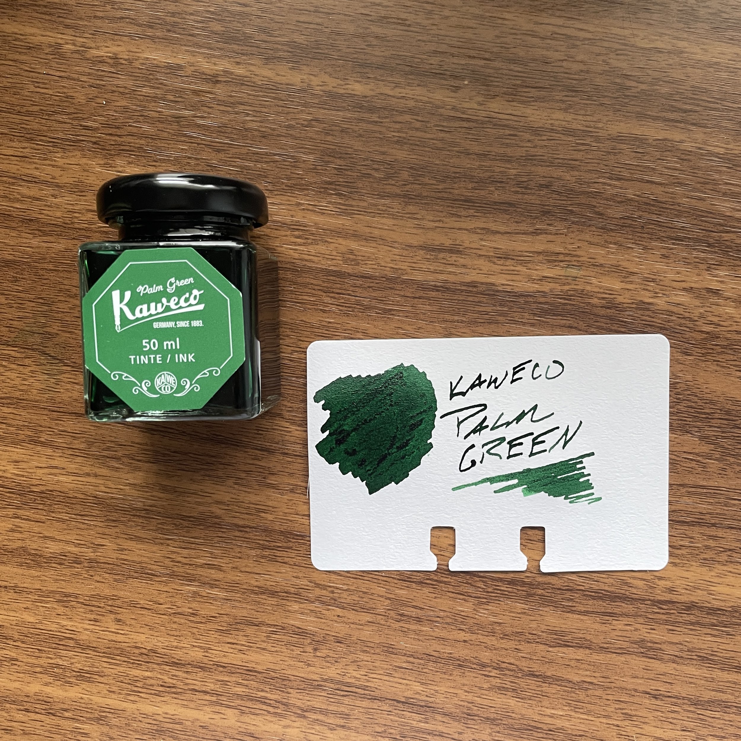
Kaweco Palm Green Fountain Pen Ink

Green: Kaweco Palm Green. I consider Kaweco Palm Green to be of the most underrated inks of all time, not just in the Kaweco lineup. It’s a beautiful rich color that I use regularly even if it can take a bit of time to dry.

Red: Dominant Industry Romania Red. If you were going to have a blood-red vampire-themed ink, it would be this one. This bold, rich color flows well, dries quickly, and doesn't create nib crud. Vampire-themed inks cannot be “pink”, which seems to be a hot topic of conversation these days. Fight me ;)

Burgundy: Montblanc Burgundy Red. The hardest color for me to choose (since most of my favorite burgundy inks are limited editions). I finally went with standard Montblanc Burgundy Red. Though perhaps not as vibrant as some of Montblanc's special edition burgundies, it's a consistently good performer that's a favorite standby.

Orange: Laban Apollo Orange. This orange has been making its way through my orange and yellow TWSBI demonstrators for the past six months. Inspired by the Greek God Apollo, whose symbol traditionally is the sun, this is a “pure orange” ink with a slight tinge of red to help with the legibility.

Yellow: Anderillium American Goldfinch Yellow. The first yellow ink I've found that's truly legible, due to its gold/goldenrod hue, American Goldfinch Yellow can be used for actual writing in addition to highlighting and annotation.

Brown: Laban Demeter Brown. A dark brown, but not quite a brown-black. For my brown inks, I tend to enjoy the darker browns and sepias, because they take on a vintage look as they dry.

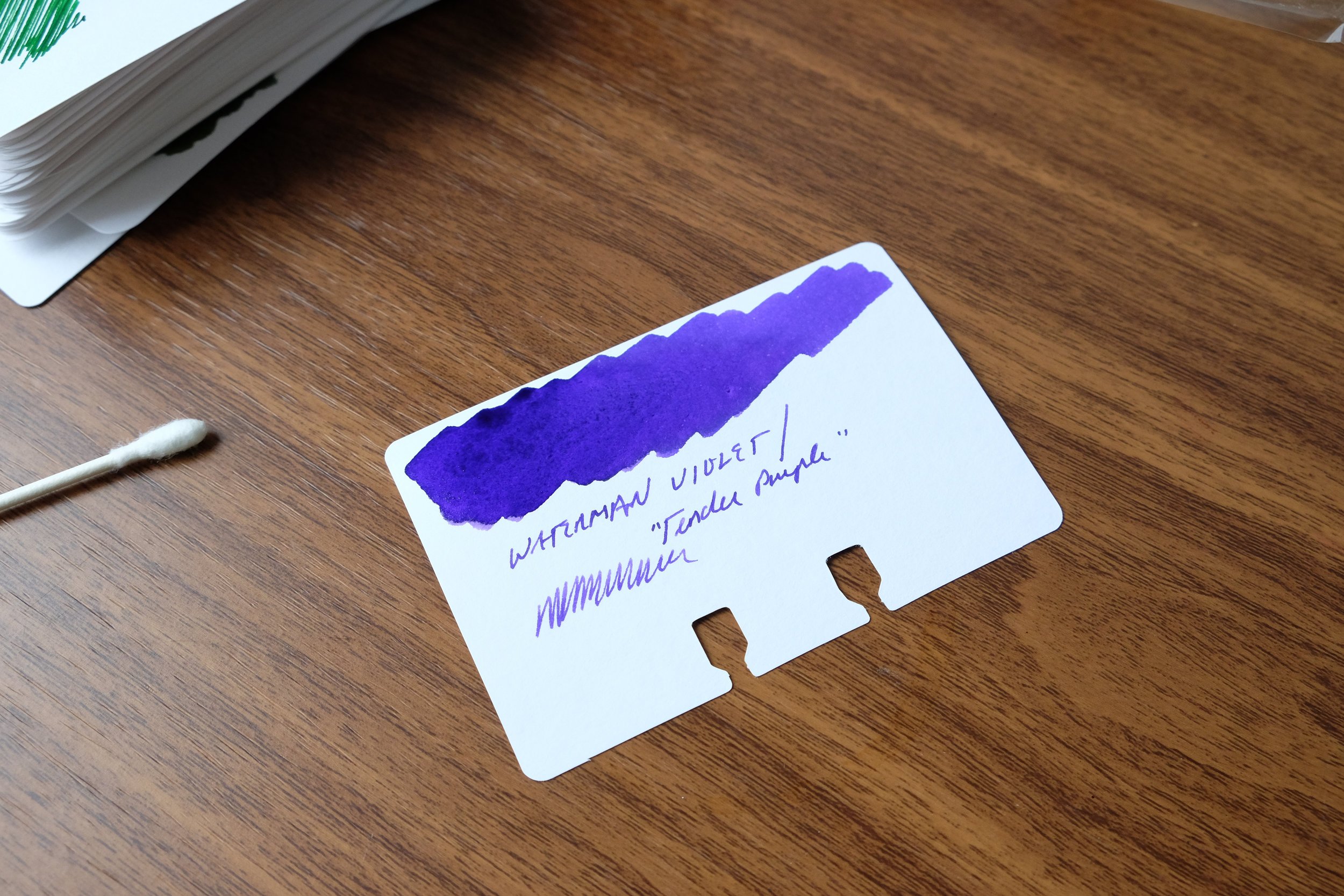
Waterman Tender Purple Fountain Pen Ink

Purple: Waterman Violet. Not "Tender Purple" or whatever they're calling it these days. Violet. Be warned that of all the Waterman inks, this one has a tendency to stain, so be sure you don't mind your converter (or clear demonstrator) having a slight purple tint long-term. (Definitely do not use in light-colored celluloid pens.) That said, it’s one of the most vibrant purple inks out there, and when I want my writing to stand out, this is my choice.

Grey: Scribo Grigio. I've been on a massive grey ink kick over the past year, and I keep returning to Scribo Grigio. While some might argue with me on this point and call the ink more of a blue-black, I'm going with grey here and the blue tint is what makes it interesting.

Pink: Laban Aphrodite Pink. This final color is extremely difficult, but at the end of the day I have to go with Aphrodite. Some would say this isn't a pink ink at all, but the criteria here dictate that I have to stick with an ink that I've actually used over the past year. In the pink category, this is the clear winner.

Some of the aforementioned inks we sell directly in the T.G.S. Curated Shop, where we are running a Memorial Day Weekend Promotion (10% Off) with the code “SUMMER23” at checkout. Otherwise I have linked to retailers who are friends of mine. This post does not contain paid advertising or affiliate links.

In Ink Reviews, Top 5 Tags Best Inks, Inks of Choice, Fountain Pen Inks
9 Comments

My three Stacey Robinson Navigator Fountain Pens in, from left, Conway Stewart Pistachio, Conway Stewart Razor Shell, and a beige striated ebonite.

Mid-Year Review: Top Five 2022 Acquisitions

June 18, 2022

I’ve been more selective with my acquisitions this year, having previously pared back my personal collection and consciously taken on fewer items for review, preferring instead to focus on more in-depth consideration of those pens I do choose to write up. Mostly, this has involved further refining exactly what I enjoy in a pen and/or a nib that makes me want to use it every day. Somewhat surprisingly, I’ve gravitated more towards smaller, more streamlined designs, and my nib choice has moved towards those grinds with an architect/Naginata profile as opposed to the cursive italics and stock mediums that previously made up the bulk of my rotation. For this year’s Mid-Year Review: Top Five Acquisitions, I’ve chosen three pens and two nib grinds, all of which have been in continuous rotation for multiple months. To the extent you’ve not seen a stand-alone review of specific pens (such as the Stacey Robinson Navigator), look for one later in the year.

  1. Schon DSGN Full Size Fountain Pen. By far my favorite pen release from the past two years is the Schon DSGN Full Size Fountain Pen, and I’ll include in this entry not just the anodized pens, but the “engineered plastics” collection as well, including both the ultem and PEEK models. Ian nailed the size, shape, and balance on this pen - it’s the ultimate all-day, everyday writer.

  2. Custom Nib Studio “Perspective” Nib. Gena Salorino’s “Perspective” grind is one of the most versatile I’ve ever used, easily allowing me to move between an extra-fine and bold line within the same sentence, as necessary, depending on how I angle the pen. Be sure to read my review for some additional discussion on how the right nib grind can transform a pen from “meh” to one that you want to pick up and use every day.

  3. Stacey Robinson “Navigator” Fountain Pens. A perfect example of why you should attend pen shows to find those makers who might otherwise fall through the cracks, Stacey Robinson’s “Navigator” fountain pen easily qualifies as my personal “pen show find” of the year. Featuring a size and shape similar to the Schon DSGN Full Size fountain pens, I picked up THREE of these pens in Atlanta - two in relatively rare Conway Stewart acrylics I’ve been coveting, and a third in a gorgeous beige striated ebonite.

  4. Schon DSGN Pocket Six in Aged Copper. While the standard Schon DSGN Pocket Six has been around for a couple of years now, Ian has been known to bring one-off “show special” finishes to pen shows, like this copper faceted pen with an applied “antiqued” patina. (My challenge for the rest of the year is to NOT spend all of my money at the Schon DSGN table in the first fifteen minutes.)

  5. Mark Bacas “Predator” Nib. Another custom nib makes this mid-year list - the “Predator Hybrid” by Mark Bacas, which combines a XXF tip with a reverse architect. I’m beginning to value versatility in nib grinds, including not only the writing properties of the nib itself but also the ability to swap the nib between different pens. (For this grind, I sent Mark a TWSBI Diamond 580 nib unit so that I can use it in any of my TWSBI 580 fountain pens.)

My Schon DSGN Pocket Six in Faceted Antiqued Copper (right), next to a Pocket Six in Faceted Brass.

Further Reading

This post is the last entry in a three-part “Mid-Year Review,” which I typically do when I take my summer vacation every June. Don’t miss Part I: Favorite Review Posts from the First Half of 2022, and Part II: Favorite Shop Additions. For more general “Top 5” lists, check out the annually updated 2022 “Best Pen” Recommendations.

This post does not contain paid third-party affiliate links. The Gentleman Stationer is supported entirely by purchases from the T.G.S. Curated Shop and pledges via the T.G.S. Patreon Program.

In Top 5, Editorial Tags Mid-Year Review, Top 5
Comment

2022 Mid-Year Review, Part II: Favorite Shop Additions and A Huge Thank-You!

June 16, 2022

Thanks to you all, both the T.G.S. Curated Shop and the T.G.S. Patreon Program have grown significantly over the past year, which has allowed this site to shift from near-complete reliance on a third-party sponsorship/affiliate supported business model to one that’s self-sustaining. Not only do I believe that this is the healthiest approach in terms of keeping the site economically viable over the long term, but it’s been far more satisfying to me personally to select, vet, and choose my own curated set of recommended products, as opposed to relying on third-parties to deliver the writing experience readers ultimately expect after making a purchase following a review or other guidance I’ve offered.

For today’s mid-year recap post, I decided to focus on my five favorite products introduced in 2022, with a single selection from different product categories. I’ve got one pen, a paper product, a planning product, pen cases, and some washi tape (NSFW alert). I hope you enjoy using these products as much as I’ve enjoyed selecting and stocking them.

  1. TWSBI Swipe Fountain Pen in Salmon. While the Swipe fountain pen is available in several other colors, for some reason this muted orange grabs me. I still haven’t picked one out for myself because I haven’t decided on the perfect matching ink (as one does).

  2. Clairefontaine French-Ruled Looseleaf Sheets. My favorite stationery product of all time, and the one that started me down this personal rabbit hole of obsession, is now available in the shop! While the looseleaf sheets are a personal favorite, I love Clairefontaine’s French-ruled paper in general, and it’s available in notebook form.

  3. Midori MD Diary Stickers. While they’re not huge sellers - probably because people are puzzled as to how, exactly, to use them - these simple and inexpensive planning products have revolutionized my own work notebooks because they easily allow me to set up a month-per-page calendar. The stickers come dated or undated.

  4. Lochby Cases. I talked yesterday about the Quattro Four-Pen Case, and how it’s one of the best products I’ve reviewed this year. In general, the Lochby case lineup (and accompanying 68gsm Tomoe River paper products) have been a massive success, as I’m always on the lookout for quality waxed canvas products given their durability and aesthetics as they wear over time.

  5. Grown-Person Washi Tape. Because sometimes you just need something that quickly describes the day in your journal without having to actually rehash it.

Please note that I am traveling the week of June 11 and orders placed during this time will ship out in five business days. I always include extras (stickers, notecards, ink samples, washi tapes, etc.) to orders placed during a travel period! Many thanks for your support.

In Top 5, TGS Curated Shop Tags Top 5, Mid-Year Review, T.G.S. Curated Shop
Comment

2022 Mid-Year Review: Favorite Review Posts from the First Half of 2022

June 15, 2022

Well, maybe the “almost” first half of 2022. In normal times - and I guess we’re mostly back in normal times now - I take vacation in mid-June, and during that week I publish recap posts sharing favorite posts from the first half of the year. For this year’s format, I thought I’d do something a little different and pick my favorite product review post from each month. Enjoy!

  1. January: Otto Hutt Design03 Fountain Pen. Otto Hutt has always been, to me, one of the more underappreciated German pen brands, offering exceptional quality and unique design at a fair price point. The Design03 is a slimmer pen, yet it’s well-balanced enough to offer a comfortable writing experience. It also comes in a variety of attractive finishes.

  2. February: My Experience with the Drillog Metal Dip Pen: Hype vs. Reality. The Drillog dip pen finally arrived in December, and I spent the first few months putting it through paces. Unfortunately, my .5mm version did not write particularly well, but I’m happy to report that Drillog replaced it for me with a .8mm that performs much, much better. I’m working on a follow-up piece to address the differences in the two tip sizes, but suffice to say, if you’re looking to mainly do writing, as opposed to technical drawing or art, I’d recommend choosing the wider nib.

  3. March: Schon DSGN Peek-A-Boo: So What Exactly is PEEK, Anyway? Schon DSGN’s engineered plastics fountain pens include both the ultem and PEEK versions, all three of which sport the same design that I find incredibly comfortable for longer working sessions. It helps that they accept JoWo nibs, allowing you to swap in your favorite customized nib unit, and are set up for easy eyedroppering to maximize ink capacity.

  4. April: Lochby Quattro Four Pen Case. If there’s one item I’ve acquired this year that’s become a staple in my everyday carry, it’s the Lochby Quattro Four Pen Case, a zippered waxed canvas case that snugly holds four fountain pens in conveniently offset pen slots, to minimize contact and potential damage to the finish of your pens.

  5. May: Exploring Custom Nibs: Predator Hybrid by Mark Bacas. Another excellent “investment” in my everyday carry, I had Mark grind one of his specialty nibs onto a TWSBI Diamond 580 Nib Unit. The Predator Hybrid features an ultra-extra fine tip on the “normal” side, and an architect/brush on the reverse.

All opinions expressed in reviews are my own. The Gentleman Stationer is supported entirely by purchases from the T.G.S. Curated Shop and pledges via the T.G.S. Patreon Program.

In Editorial, Top 5 Tags Mid-Year Review, Editorial, Top 5
Comment
← Newer Posts Older Posts →
Store Location
Visit the T.G.S. Curated SHOP
*New* Updated "Best Pens" Guide (2025)
TGS x Hinze Pens Violet Tendencies Taschenstift Fountain Pen
Hierarchies of Fountain Pen Friendly Paper
Allex Scissors arrayed on a desk showing link to desk accessories

Join Our Patreon!
Subscribe to the TGS E-mail List

Featured Posts

Featured
Pilot-Iroshizuku-Yama-Budo-Writing-Sample.jpeg
May 24, 2025
Joe's Picks: Five Favorite Inks From Pilot's Iroshizuku Lineup
May 24, 2025
May 24, 2025
Yamamoto-Gray-Paper-Sampler-Set.jpeg
May 10, 2025
Discovering Unusual Paper: "Paper Tasting" Sets from Yamamoto Paper
May 10, 2025
May 10, 2025
Four-Micarta-Fountain-Pens.jpeg
Apr 19, 2025
Yes, Micarta for me! I finally got my hands on Some Micarta Pens, Plus My Own Special Edition
Apr 19, 2025
Apr 19, 2025
The Gentleman Stationer RSS

© Digital Divide Media, LLC, 2014-present.

All content is the exclusive property of Digital Divide Media, LLC, d/b/a The Gentleman Stationer, including “The Gentleman Stationer” website and trademark, and should not be reproduced without express written permission.  All rights reserved.

All content containing paid advertising, affiliate links, or sponsored content will be plainly disclosed by a disclaimer when/if featured.

Contact Information

Store Shipping Policy and Return Policy

Privacy Policy

Cookie Policy

Terms and Conditions

Powered by Squarespace