Kickstarter Lawsuit Filed As Backer Fails to Deliver

As some of you might know, when I'm not writing here I spend my days--and some of my nights--as an attorney, and I couldn't help but post this when it landed in my inbox yesterday.  Apparently, Bob Ferguson, the Washington State Attorney General, has filed a lawsuit against the makers of the Kickstarter card game, Asylum, for failing to deliver a finished product to his 810 backers who had provided him with $25,000 in funding.  35 of those backers lived in Washington State.  This unprecedented development certainly came as interesting news to me, as we pen enthusiasts are known to back a Kickstarter project or two, often with little to no assurance of whether or not we are paying for a project that will never deliver, or whether we will end up paying $50 for a "custom-designed" product that the backer purchased in China for $0.89.  The question has been asked in more than one forum, what recourse do we have against obvious fraudsters, when there's no real economic incentive to sue when you're out of pocket less than $100?  Apparently some state attorney generals are listening to consumer concerns, and it merits watching whether or not this becomes a trend.       

Some other links and stories:

Gamer Rant, Kickstarter Lawsuit May Set Precedent on Future Successful Campaigns

Gizmodo, The Government is Finally Trying to Make Kickstarter Scammers Pay


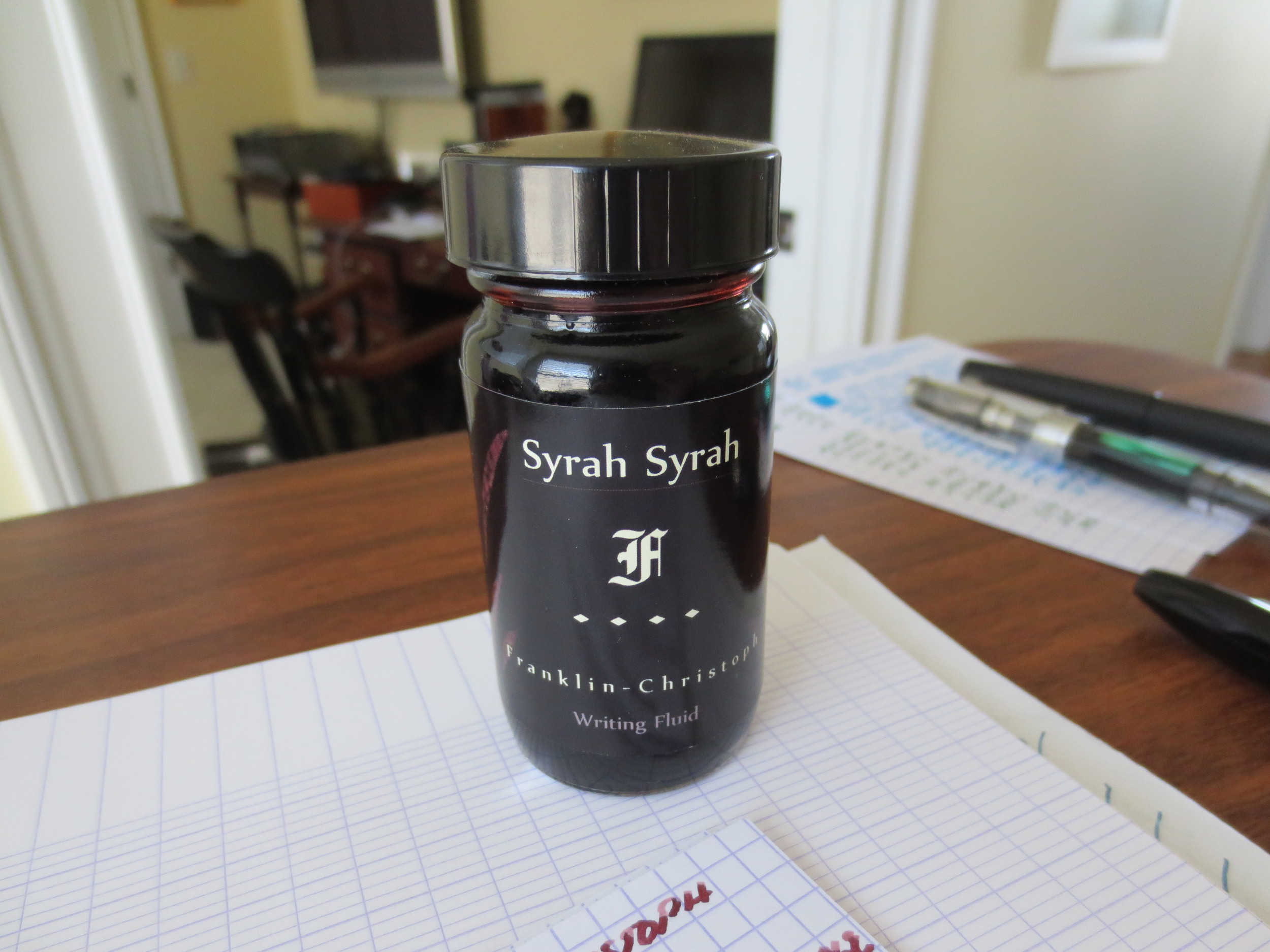
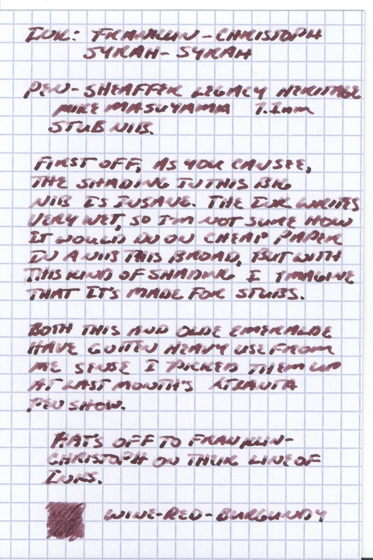
Ink Review: Franklin-Christoph Syrah Syrah

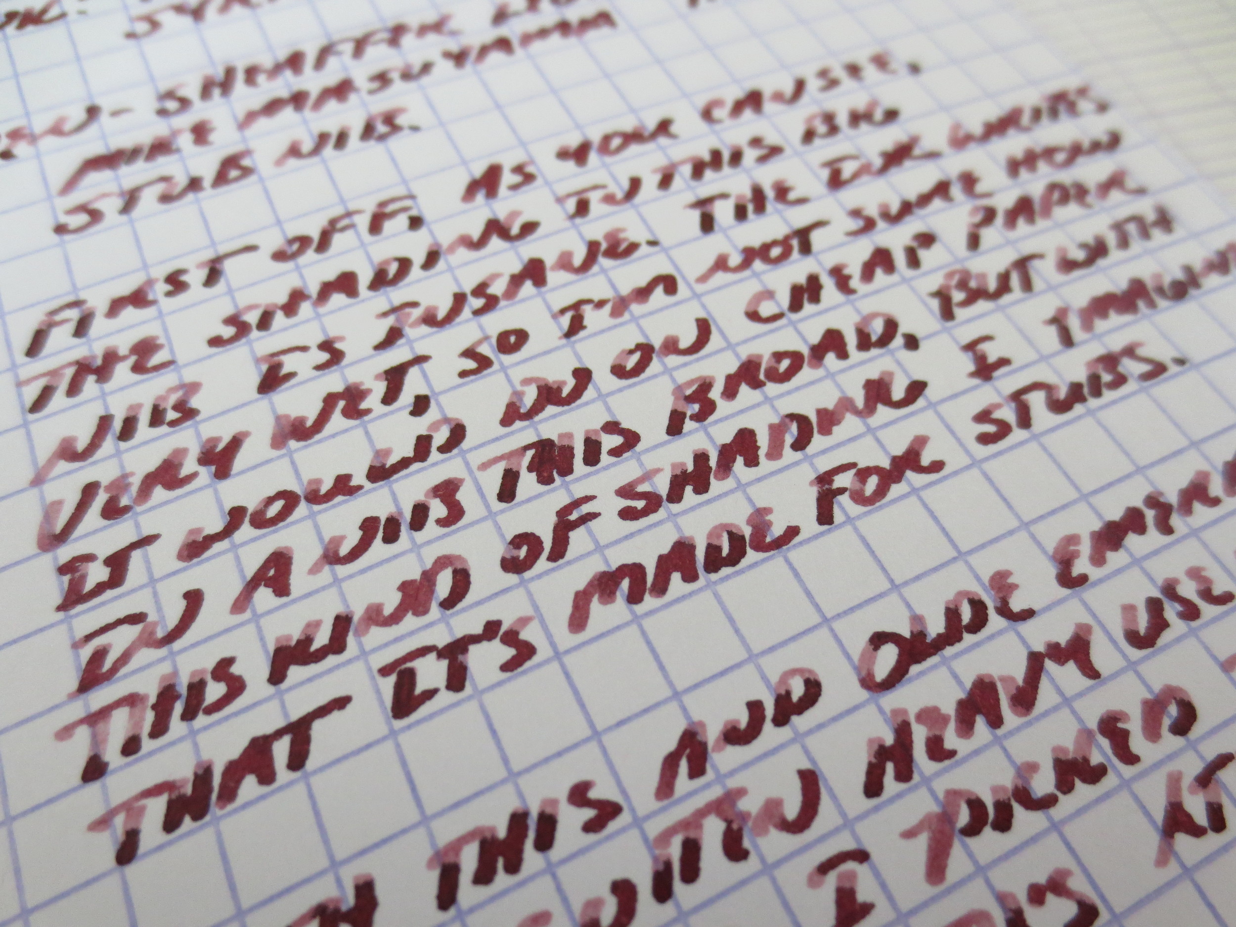
This is the second of two reviews of Franklin-Christoph's bottled ink that I picked up at last month's Atlanta pen show.  This one is their red color, "Syrah Syrah," which as you might expect is a burgundy wine-colored ink.  Like the Olde Emerald, it offers shading galore, especially in a stub nib like this 1.1mm Masuyama on my Sheaffer Legacy Heritage.

Excellent shading, but if I had one gripe, it's that the ink is fairly watery and sometimes railroads on slicker paper.  This is the same Exacompta Index card stock that I use for all my reviews.  This is a smallish price to pay, however, for a red ink that's as easy to clean out of a pen as this one.

This ink has good flow, especially for a red.  In my experience, red inks sometimes get crusty around the nib and are hard starters.  I've not had that issue here.  There's no bleed through or feathering on good paper like my Exacompta card stock.  On a Doane legal pad, there was some bleed-through, as you'd expect from a stub nib and an ink this wet, but hardly any feathering so my pen was still usable.  I've not used it in a fine or extra fine yet, which are my day-to-day users, so I may post an update as it makes its way through the rotation.  

In Praise of the Original Field Notes

I worry that somewhere along the line, what made the original Field Notes so great is getting lost in the recent craze over the limited "colors" editions, which seem to be getting ever more exotic in the form of the Shelterwood and the like.  Disclaimer:  I have all of the colors editions since Night Sky, and have not tried the Shelterwood yet.  I am sure the notebook is as nice as the gorgeous paper looks, and I am certainly not trying to hate on Field Notes for embarking on these artistic endeavors which no doubt take them a lot of time and give their customers, me included, countless hours of enjoyment.  That said, for the first time this week, I cracked open a pack of these beauties.

Nothing fancy here.  Field Notes Craft Paper, Ruled with lines. 

I had watched them languishing on my office bookshelf at work for months, while I filled up two Drink Locals, a Night Sky, and two Doane Paper utility journals.  All of those products were excellent, and I have multiples of each.  But for reasons I can't really explain, this plan ruled craft notebook has been my favorite.  I've filled up a third of it in four days, a pace nearly unheard of for me, in a combination of gel pen, pencil, rollerball, ballpoint, and even fountain pen, all of which the ruled paper takes surprisingly well. 

Aaron Draplin's beautifully simple original design, with its unadorned Futura font, is what made this product great from the get go, and the sturdy, functional construction and just flat-out nice paper makes you want to write in it.  Sure, you can't draft a novel with a 1.5mm stub nib fountain pen filled with Noodler's Apache Sunset, but who would do that anyway in a pocket notebook?

I love the Khaki-colored ink.  I'd probably like graph more, but I'm enjoying the ruled for now.

I sometimes think my life would be a lot more interesting if I incorporated some shady transactions.

After buying (and using) Field Notes regularly for almost a year, I think I'm ready for a colors subscription, and not for the reason you might thing.  I had been hesitant because I didn't know what I would do with two free packs of original craft, but now, I view that as a true bonus.

And here's to hoping that Field Notes issues some more colors editions similar to their first, for those of us who missed out on Butcher Blue, Orange, and Grass-Stain Green.      

Retro Edition: Pens from High School and College

Have you ever wondered how the pens you used in school would stack up against the pens you use today?  So over the holidays this year I was helping my parents clean out their garage (by reclaiming boxes of my stuff that had been stored there for 15 years) and, of course, I found boxes of pens from high school and college.  I quickly tested them, and tucked the ones that still worked into a drawer in my desk until I got a chance to see how they still compared.  I pulled them out this afternoon and here's the best of what I found:

The pens, not the Field Notes. From top: 2 Bic clic stics, Sanford Uni-Ball Onyx (fine), Sensa X400 Rollerball, Bic Atlantis ballpoint in blue, Sanford Uniball Micro, Bic Atlantis ballpoint in black, Uniball Vision Fine, Pentel RSVP RT, junk hotel ballpoint, and Pilot Precise V7.

1.  Sensa X400 Rollerball:  The best of the lot, partly because it's got sentimental value as the first "nice" pen I ever purchased.  I had put it aside at some point in college because the refill had run out, and for whatever reason I could not find another one at the time.  I recently replaced it with a .5 mm Schmidt rollerball refill (with the same ink as the famous Retro-51 Tornado).  It writes a nice clean line in the Field Notes with minimal bleed.  Comfortable to use, like a high-end Dr. Grip with a good refill.  This pen will find its way into the rotation.  

2.  Pilot Precise v7 Rolling-Ball Liquid Ink:  This pen used to be my workhorse, that is, when my parents would actually buy them for me because they were so expensive.  I see these referenced as the "Pens that Started It All" by multiple people.  You know what?  It's still good.  I'd probably opt for the .5mm these days but I still have a few packs of these around and I still use them. 

3.  Uniball Vision (Fine):  I hate these things and always have.  People love them, and buy them in droves, for whatever reason, but I've always found that they feather, bleed through, and smear.  They write a really messy line, and always make my handwriting look terrible.  At this point you might as well write with a sharpie marker. The Vision Elite offers a better experience. 

4.  Uniball Onyx (Fine):  Slightly better than the vision, in part because of its jet black ink (Onyx, get it?), but still performance problems.  They were cheap, and we used to have dozens of them sitting around the house.

5.  Uniball Micro:  The best of the Uniballs, and a pen I would probably use today if I had to.  It writes a cleaner line and doesn't bleed through or feather nearly as much.  I used to use these a lot in college because you used to be able to get a box of a dozen for under $10, and they lasted a fairly long time for rollerballs. 

6.  Bic Atlantis:  These are probably pens I used in college or law school, because they seem relatively new and I don't remember Bic making an "Atlantis" pen earlier than that.  Both the blue and the black started right up, and they left clean lines for ballpoints with no skipping.  The black pen was slightly better than the blue.  Certainly not my favorite, but a quality ballpoint has its place in the car, taking notes in the kitchen, or clipped to my field notes and stuffed into the pocket of my jeans. 

7.  Bic Clic Stic "Swanky's Taco Shop" Limited Edition:  I had to include this one, for obvious reasons, and to be honest it's my second favorite out of the bunch.  The ink's a nice bright blue, the refill is smooth, and it works great on the field notes paper.  There's a reason the Bic Clic, in all its various iterations, remains a classic pen.  (Of all the cheap pens available, they're the ones that Field Notes chose to brand and sell with their notebooks.  I have a pack of those and they're also great.)  This pen was immediately clipped to the front of my Field Notes.    

8.  Pentel RSVP RT Ballpoint:  I don't even know where this pen came from.  Even back in the dark ages, when I was using pens swiped from hotels, I didn't use pens this bad.  The pen writes, but the blue ink is so light and the line so inconsistent that I tossed it in the trash.  I didn't bother disgracing my Field Notes by entering a writing sample.
Sorry Uniballs, but you don't measure up to my current standards.

The current champ out of this bunch.

There you have it.  All things considered, my past self did not embarrass me as much as I originally feared.  Most of these pens are still "keepers," in that none are going directly in the trash, and the Sensa will be restored to a position in the rotation.  A more thorough review will probably come soon. 

Also, my apologies for what I know are terrible photos in this review, but the iphone was all I had handy.

Pen Review: Omas 360 (Old Version)

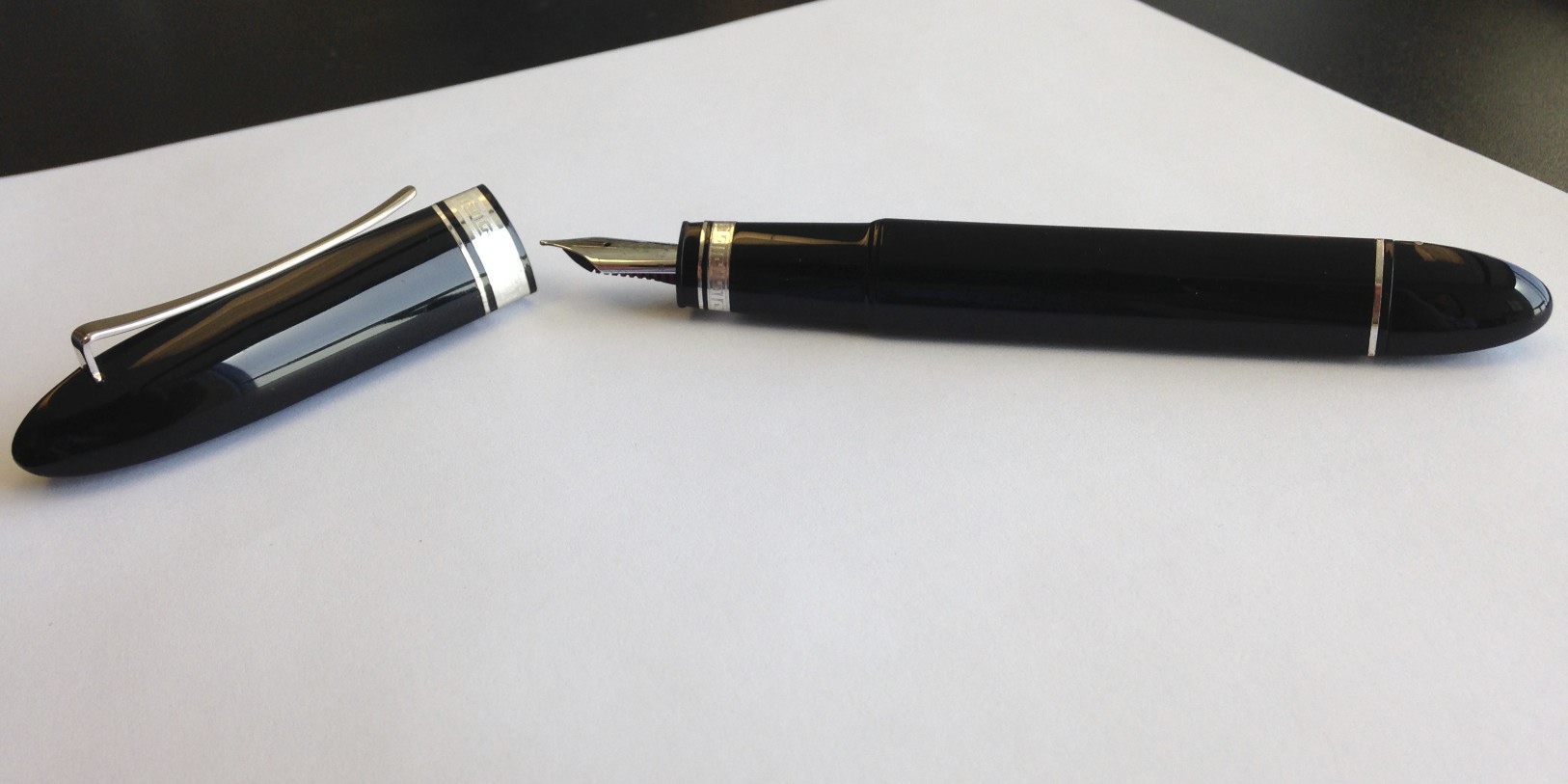
Over the past two weeks or so I've been writing with my primary Atlanta pen show acquisition, a classic model Omas 360 fountain pen.  (Side Note:  I've used the term "classic" as opposed to "vintage."  Omas introduced the 360 in the 1990s, so it's not been around as long as other Company designs such as the Ogiva or the Paragon, which I believe date to the 1930s, if not earlier.)   

I love the lines on this pen.  It's triangular in shape, so it won't roll off the desk.  I'm also a huge fan of the Omas "greek key" trim. 

A few years back, Omas changed the design of the 360, omitting the rounded cap-top in favor of an angled-flat top that more prominently displays the Omas "O" logo.  They also changed the pen from a piston filler to a cartridge-converter model, horrifying many traditionalists.  I like the new look, and I don't mind CC model pens.  I travel a lot for work, and if I want to take a fountain pen with me on the road a pack of cartridges is perfectly adequate.  Given my terrific experience with this pen, I fully intend to pick up the newer model at some point.

For my first 360, however, I wanted the original.  From listening to the Anderson Pens podcast I had heard that Atlanta featured a prominent dealer in vintage/discontinued Omas pens.  The 360 was actually far down my list of pens to acquire at this show, but I've always wanted one (black, with silver trim), and the price was way, way, way too good to pass up.  I managed to negotiate a small additional discount because of some pretty severe nib misalignment, but fortunately I was third on Mike Masuyama's list (following Mr. Pen Addict himself, Brad Dowdy) so the nib was no deal-killer.  

Build Quality

The 360 is a solid, well made pen.  It's made of resin, so it's not particularly heavy, and it's a good size (slightly under 6 inches capped).  The 360 is large enough to comfortably use unposted.  You can post the pen, and the cap fits perfectly onto the back, but posting transforms the 360 into a long pen and the balance is somewhat off due to top-heaviness.  I've been using the pen both ways, but generally unposted.  The piston is smooth, and it holds a reasonable amount of ink.  

Nib

Omas nibs are known for their smoothness, and for being slightly "springy."  This one is no exception.  The one trouble spot with these pens is that they are often set to write extremely wet right out of the box.  This has been was my experience (I have an Omas Ogiva that is currently being worked on), and I've seen this issue commented on elsewhere.  http://tinyurl.com/8kbhmud.  I immediately took the pen to Mike Masuyama and had him smooth the nib and reduce the flow.  The pen now writes a beautiful, smooth, fat medium line. 

A nice, standard Medium Nib.  Silky Smooth.

Triangular Section    

One thing that people either love or hate about this pen is the fact that the section, like the rest of the pen, is triangular.  Personally, I've got a thing for triangular writing instruments, both pens and pencils, so this wasn't an issue for me.  The pen sits well in the hand, given how I hold a pen, but I can see that it's a love-it or hate-it thing.  If you hold the pen in a way that causes the triangular section to dig into you fingers, this won't work for you.  In the new 360, Omas apparently has rounded off the section so that it will appeal to more people.  I've not seen or held the new version, so I can't comment further.

The Verdict

So far, I really like this pen.  I can see it making its way into the regular rotation.  It's a great pen to keep on your desk, since it doesn't roll, and the unique shape and styling almost makes it a piece of art.  The Masuyama nib seals the deal.

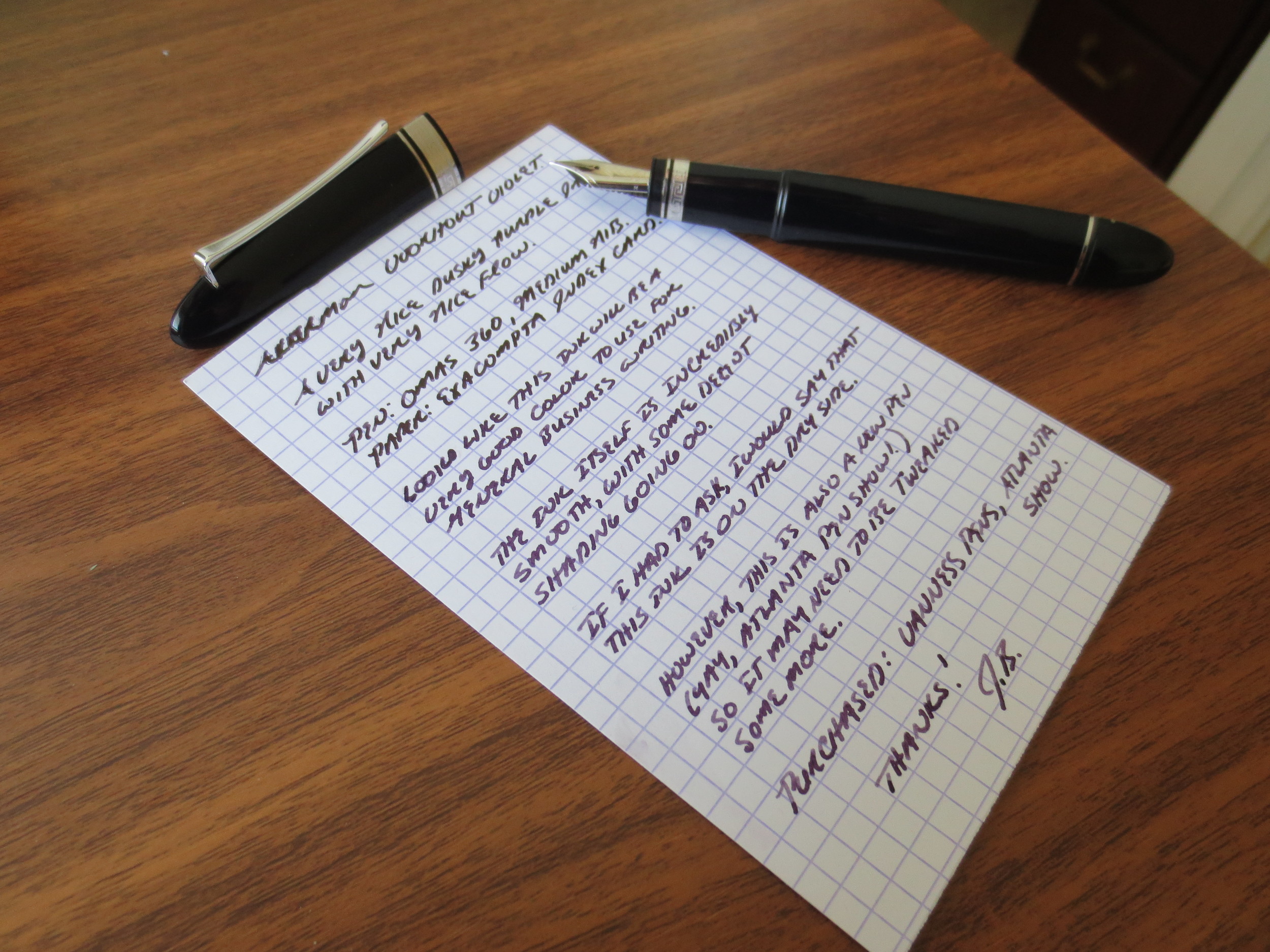
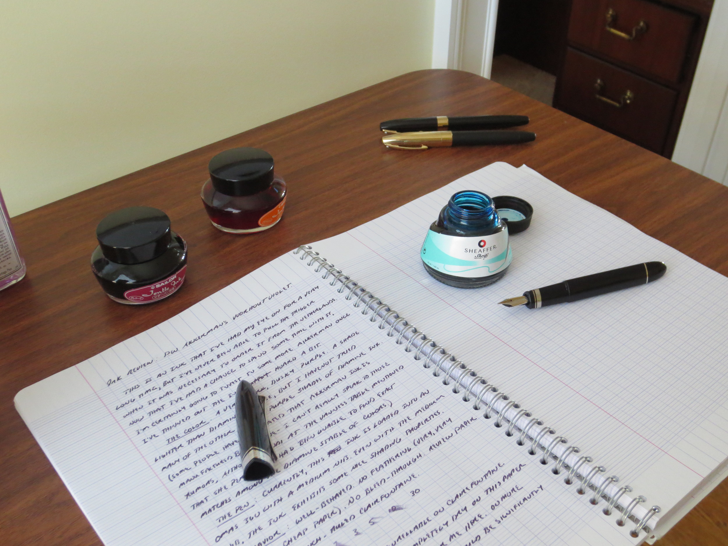
Three photos, from left to right:  The pen uncapped, a writing sample with P.W. Akkerman Voorhout Violet, and how I spent my Saturday morning.