Ink Review: Sheaffer Skrip Turquoise

Turquoise inks started appealing to me after I read a review somewhere of one of the "classic" vintage inks, Sheaffer's original Peacock Blue.  Somewhere along the line, the ink was renamed simply "Turquoise," probably after Sheaffer's U.S. ink factory closed and production was moved to Slovenia.  I've never had the opportunity to try the original Peacock Blue, but I am a huge fan of Sheaffer's Turquoise. 

One major disappointment when Sheaffer revealed their new "modern" ink line was that they had done away with their traditional "inkwell" bottle in favor of this smaller, triangular bottle that can make it more difficult to get at all of the ink, especially if your pen has a larger nib.

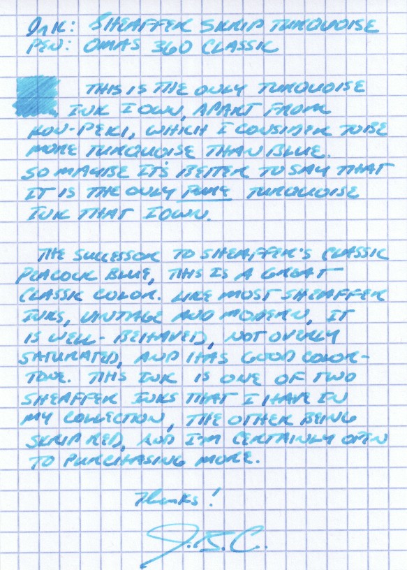
For lack of a better way of expressing myself, I would characterize Sheaffer Turquoise as having a good, pure turquoise tone.  It's got enough blue in it to make the ink dark enough to be used as a regular writing ink, yet not so heavy on the dark blue or green that would render it more teal than turquoise.  Some people might hesitate to do so, but I have no issue using this ink at work.

For some reason (maybe the green background), this photograph seems to be a more accurate representation of the actual color I see on a day-to-day basis.  Depending on the pen and the paper, it can look very similar to Iroshizuku Kon Peki.

I picked this ink up at the D.C. pen show a couple years back, when I sampled several turquoise inks at the ink testing table.  I liked this one the best.  I've found that in order to get good shading using this ink, you should use a broader nib.  Generally, it's a very well-behaved ink that doesn't feather or bleed, even on the cheapest-of-the-cheap office paper that I'm forced to use at work.  I've even been able to use this ink on Field Notes paper (with a medium nib!) without feathering, depending on the pen.  Some people complain that Sheaffer's selection of colors is boring, but I disagree with that characterization.  The selection of colors may be "standard," in the sense that the have the traditional blue/black, blue, green, black, brown, red, and purple offerings, but there's something to be said for a company sticking with what it knows, especially where the result is this good.  (Side note:  I've heard that Sheaffer revamped their Slovenian-manufactured ink formulas a couple years back to make the colors more vibrant, among other things, so if you have bottles that are more than one or two years old, of if your merchant's stock was old, YMMV.)  Personally, I've never worried about staining, clogging or other maintenance issues using these inks.  A great review of Sheaffer's entire line of inks can be found on Glenn Marcus's blog here.

I also have a bottle of Sheaffer Skrip Red, a classic, as well as a few bottles of vintage Skrip Washable Blue.  Reviews of those forthcoming.

Nock Co. Mega Review Part III: Hightower and Brasstown

Save the best for last, they say (here, it's more like "the best of the best").  In this final installment of the three-part "all the cases" Nock Co. review, I'll be taking a look at my two personal favorites:  the Hightower and the Brasstown. 

The Hightower

From what I can tell, there really is nothing else like the Hightower out there on the market.  It's a bifold case that holds "three" pens on the left (see my photos below and you'll see why I put "three" in quotation marks"), and "one" notebook on the right (same caveat).  Needless to say, this is an incredibly versatile pen case.  The construction is similar to the Sassafras and the Maryapple in materials, design, and quality, meaning that all are excellent.  I chose the Kickstarter limited-edition color scheme with Peacock Blue Exterior and Midnight Interior.  Sorry folks!  From what I hear this one's not coming back!

The Brasstown

The Brasstown is the "big boy" of the Nock Co. crew:  a six-pen wrap that folds into a larger Chimneytop-style case and still leaves room to store a handful of loose pens, pencils, erasers, etc. on the sides.  The interior pen roll uses enough fabric to ensure that your pens don't touch one another, and the clip from one pen won't scratch the body of its neighbor.  As others have remarked, I have zero concern about storing high-dollar pens in this case.   

I will add, per my earlier suggestions in Part I of this series, that the Brasstown is definitely long enough to store woodcase pencils on the side.  My only concerns would be lead breakage and graphite dust, both of which would be solved by capping your pencils.  I've not tried this yet.  For the Brasstown, I chose the Orange/Mango color scheme, which looks awesome, though sometimes at work I wish that I'd chosen something a bit more subdued.

Conclusions

Of these two, I think the Hightower works best for me as a daily carry case to and from work.  The Brasstown, however, is always full, given that it holds a wide variety of pens, as shown, and the extra storage inside the case makes it extremely handy.  I took this case to the Atlanta Pen Show last month, simply because of the capacity. 

In terms of overall conclusions, it's hard to believe that Nock Co. is just a startup.  While I had relatively high expectations from this Kickstarter, the fact that I received seven cases of this quality for $75 blew me away.  These are polished products that reflect a high level of sophistication in terms of both manufacturing tolerances and an understanding of their customer base.  I have not seen any pen storage options on the market right now that will give you equally well-built cases at this price point.  From my understanding, it was Brad and Jeffrey's goal to fill this niche, and they've more than accomplished that.  

So what would I personally like to see from Nock Co. in the future?  A dedicated pencil option, certainly, which I understand may be on the way.  Given the durability of the nylon used to construct these cases, it would also be great to have a folio option that fits Rhodia pads, or a notebook cover that would fit those A4/A5/B5 notebooks with the flimsy paper or cardboard covers that simply don't hold up to being carted around in a bag.  

Something tells me we won't have to wait long to see more great stuff on the way. . . .

Nock Co. Mega Review: All The Cases, Part II

Part two of the Nock Co. "All the Cases" review:  the Lookout, the Sassafras, and the Maryapple. 

The Lookout

The Lookout is your basic three-pen holster.  I chose the Midnight/Foliage color scheme.  Like the other Nock Co. products, it's a great looking case, and it has enough padding to give comfort that your pens are being protected.  It fits all pens well.  Pictured are an Omas 360, Ti Pen, and a Sheaffer Legacy Heritage.  If I had to recommend one pen case to someone who needed basic pen storage for high quality pens, I would recommend this case.  It provides the same--if not better--protection than my more expensive leather cases, at a fraction of the price.

The Sassafras

The Sassafras is the "all pen" bifold case (as opposed to the Maryapple, the "all notebook" bifold, and the Hightower, the "pens + notebook" bifold).  This is another great storage option, and once again, I chose the Midnight Blue/Foliage combination.  The case holds three pens on the left in slots that are intended for one pen each (although with certain slender pens, you may be able to fit in two).  On the right, the slots are bigger, presumably intended to hold multiple cheaper pens that you don't mind bumping into one another.  I've been using the Sassafras to store my Karas Kustoms pens (Retrakt, Bolt and Render K), my Kuru Toga, and any inked up fountain pens that I'm not actually carrying with me at the time.  If I were taking an extended trip, and wanted to carry three nice pens, plus some pencils and markers, the Sassafras would be my chosen companion.  This case will get some heavy use this summer and fall, as I've got some good "writing trips" lined up. 

The Maryapple

I'm carrying this case right now in combination with the Brasstown, and I've got it loaded with two notebooks and my Exacompta index cards.  It makes sense at the moment because I am at the point where I'm close enough to filling up a Field Notes that I need to carry a spare with me.  Otherwise, however, I'm not sure that the Maryapple is the most practical case for my daily carry, especially since I have the Hightower, which holds pens and writing material together.  I absolutely love this color scheme, though. 

I have nothing remotely negative to say about any of these three cases.  The construction is superb, they fit a wide variety of different needs, and I will likely turn to all of them at one time or another.  Well done Nock Co.!  Keep it coming!  

Nock Co Three Part Mega Review: All the Cases, Part I

Hat's off to Brad and Jeffrey for completing their epic Kickstarter journey and launching Nock Co, which I sincerely hope will be supplying all of us with storage (and more) for our endlessly expanding pen accumulations/collections/addictions.  I was one of those who took the plunge on the "All the Cases" option (which, for $75, was a total steal), and received mine in early March.  I've spent some time with each of the cases and will review them in turn, starting with the the most basic (the Chimneytops), then moving on to the Maryapple, the Lookout, and the Sassafras, and finally, the Hightower and the Brasstown. 

Each one of these cases is marked with the extremely well-designed and well-made Nock Co. Tag. 

First Up, the Chimneytops

I might as well start with the "entry level" cases, the Chimneytops.  There's nothing fancy about these:  just well-designed canvas zip-cases designed to hold most standard-sized pens.  They can also hold a variet of other things, such as ink cartridges, erasers, mechanical pencil lead refills, etc.  I use the small Chimneytop to carry a handful of "disposable" pens (i.e., gel pens, ballpoints, rollerballs, marker pens) that I always have on me, and use the larger Chimneytop to store ink cartridges and mechanical pencil lead.    

Small Chimneytop in Midnight, on the left; Large Chimneytop in Steel, on the right.  A wide variety of pens fit into these cases.  Pictured are the Sakura Pigma Micron, Pilot Juice, Signo DX, Signo 207, and Sharpie.

The Good

These are nearly perfect, general purpose pen cases.  I say "nearly perfect," because I have one small quibble, below, but the construction on these is flawless, and I suspect these will meet the needs of 95% of the pen addict population.  The heavy duty Nylon exterior is certainly durable enough to survive being toted around in my messenger bag on a daily basis for the past three months, which I imagine is fairly typical of the use these will receive from most people.  I love the colors, which are pretty accurately depicted in the photos in this review.

The Bad

Not so much "the bad," because I don't know how much this point affects the majority of people who bought these cases, but I wish these would have been made the slightest bit longer so as to accommodate woodcase pencils.  True, well-used woodcase pencils that have been shortened significantly will fit in the Chimneytops.  This takes at least a few sharpenings, though.

This may be a me-specific problem, but newly sharpened wood pencils, like the Draplin Design pencil on the left, and the General's Semi-Hex and Palomino on the right, won't fit into the Chimneytops.  I've had some luck angling them into the larger case, but you run the risk of breaking your point because the fit is pretty snug. 

Again, this is but a mere quibble, since most people did/will purchase these cases to store pens and mechanical pencils, not woodcase pencils, but it would have been a nice option to have.  Perhaps in the future?  Overall, I'm impressed with the quality of construction, the colors, and the sheer versatility of the Chimneytops.  Next up later this week:  the Maryapple, the Lookout, and the Sassafras.

Pen Review: Pilot Razor Point II (Ultra Fine Tip)

Until recently, felt-tipped or porous-tipped marker pens (often simply called "fineliners") were never something I had considered using on a day-to-day basis.  It wasn't until I had read the Pen Addict's reviews of the Sakura Pigma Micron--a pen I had never tried--that I picked up some marker pens on a business trip to New York City at the inimitable DaVinci Artist Supply.  This first lot included a Micron in a .3mm tip (the "02" model), a Copic Multiliner in a .35mm tip, and a pack of the "Fine" Sharpie pens.  I use all of these pens, and plan to post a thorough review of each of them in due time, but neither of these initial purchases really did it for me in terms of an everyday writer.  They work great for jotting notes and doodling--and the Micron is the Field Notes Pen if you want dark black ink and absolutely no bleed through--but the Micron's tip felt a little fragile for heavy use, and I found the inks in the Copic and the Sharpies not quite dark and wet enough for my preference. 

Enter Pilot.  I'm a longtime user of Pilot pens, and as I mentioned in an earlier post, the Pilot Precise Liquid Ink Pen was the first pen I ever purchased by the box, way back when I was in school.  Pilot has excellent dark black ink, even in its disposable pens.  (If, like me, you can handle a bit of bleedthrough on super-cheap papers, a black Pilot pen might meet all of your black-ink needs.)  On a whim, I picked up a four-pack of Pilot V Razor "Extra Fine" Marker Pens.  Too broad.  They wrote that great dark black line, but the width didn't allow me to do the type of tiny note-taking and annotation that I need to do at work.  So I went online to see if Pilot made an even finer version of the pen, and I found these, at 10.99 for a dozen, on Amazon.

At 10.99/dz, you certainly can't beat the price.

After using this pen nearly exclusively for a week, I can safely say that this is a great fineliner.  There has been no breakdown in the tip, from what I can tell, and the inkflow has remained consistent.  That said, there is some (I would say minimal) bleedthrough with the ink.  This is a true fineliner, intended for writing, so the ink is not super-precise and well-behaved like you would find in a technical drawing pen such as the Pigma Micron or the Copic Multiliner.  What you lose in ink properties you gain in durability, and any issues with the ink still has not stopped me from using this pen on both sides of the page in a Field Notes notebook.  I would say the bleedthrough is less than you would experience with any sort of fountain pen or rollerball.    

This is the tip after two-weeks of heavy use.  Minimal, if any, breakdown, and the pen is still going strong.  I suspect that if I had used fineliners prior to using fountain pens, tip durability might be an issue, but for fountain pen users who are accustomed to writing with less pressure, durability is less of a concern.

If you are looking for a purchase that will run you approximately $.92 / pen, IMHO the Razor Point II can't be beat.  You can find a Micron in the $2-3 range (for a single pen), but to me, who is more or less a cheapskate, that still stings a bit if/when you lose it, or when the tip breaks down when the pen is only half empty.  I'm pretty sure I've already misplaced one of the Pilot V Razors (if it didn't "walk" of my desk at work when I was out of town last week), and even that is eating at me.  Don't laugh, I know I have problems.