Pen Review: Pilot G2 Limited

I've been on a Pilot pen kick recently.  Somewhere, somehow, I ended up with a "20% off your total purchase at Staples" coupon, so I drove to the mall a couple miles from my house intending to pick up another pack of Razor Points.  Staples didn't have these, but I walked away with some new daily writers that I've been using regularly, including this Pilot G2 Limited. 

The G2 Limited is intended to be the barrel "upgrade" for those who want something a step up from Pilot's stock G2 plastic pen. Sort of like the Pentel Energel "Alloy" model is to the run-of-the-mill Energel. Those are cool too. Staples was sold out.

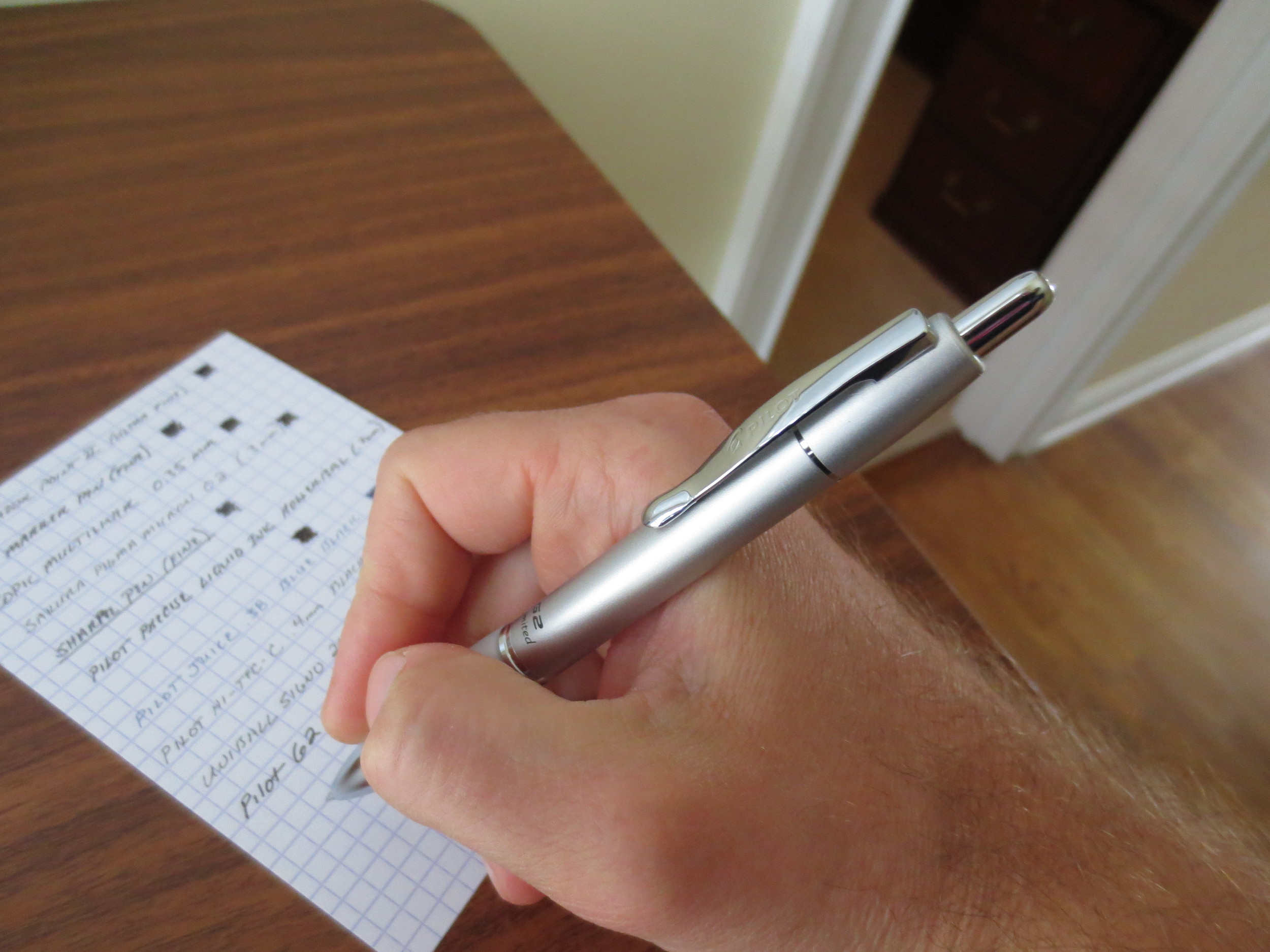
Pilot advertises the G2 as the "#1 Selling Gel Pen," which may be self-promotion, but also may actually be true, since these pens are everywhere.  Pilot has issued multiple renditions of the pen, including the "G2 Mini," the "G2 Pro," the "G2 Professional," and even a charity line that includes a breast-cancer fundraising edition.  The model that caught my eye, however, was the silver G2 Limited, which I managed to score for about $8.50, after my discount.

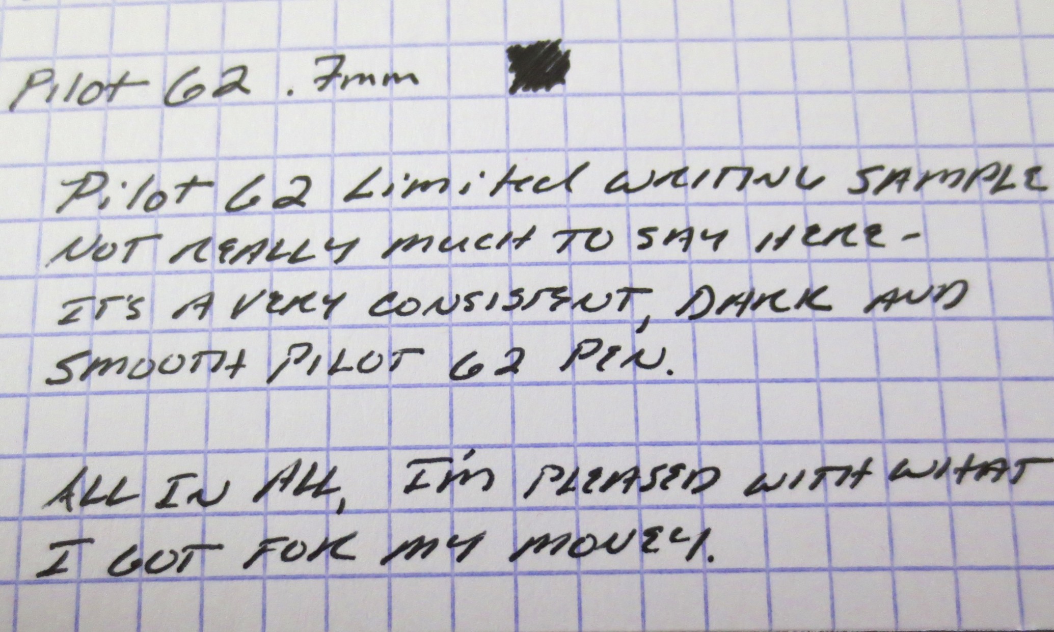
Don't get me wrong, this is an $8 pen.  It's made of plastic.  There's some play in the joints where the parts fits together, but not enough to make it rattle, which is the point at which it would get annoying to me.  The knock is pretty solid and retracts/unretracts the point without sticking or rattling.  The pen comes with the .7mm G2 refill in black.  I typically prefer the .5mm refill in blue (or even the "Ultra Fine" .38mm in either the G2 or Juice line), but I need a black pen at the moment and I've actually come to enjoy the .7mm.  It's incredibly smooth, leaves a very dark line, and in a week of use, I have not seen any of the "blobbing" that people complain about with the .7mm point. 

A comparison with some other common gel pens in .38mm, .4mm, and .5mm. I typically opt for a narrower line than the standard .7mm, but this line is clean enough that it's more than usable for me. Check out how dark that black ink is.

People may disagree with me on this, but the smoothness and darkness of Pilot's ink formulations continues to win me over every time.  I prefer the G2 over the Uniball Signo 207 or the Zebra Sarasa, the Hi-Tec-C over the Signo DX, and the Pilot Precise over just about any other liquid ink rollerball on the market (although this last category's not really a hard one to win).  On the fountain pen side, my Vanishing Point and Custom 74 are regularly inked with Iroshizuku or the Pilot/Namiki Blue-Black Cartridges.  I think I made it through high school using the old Pilot Explorers.  I have not managed to scavenge some Acroballs yet, but will do so in my next Jetpens order.

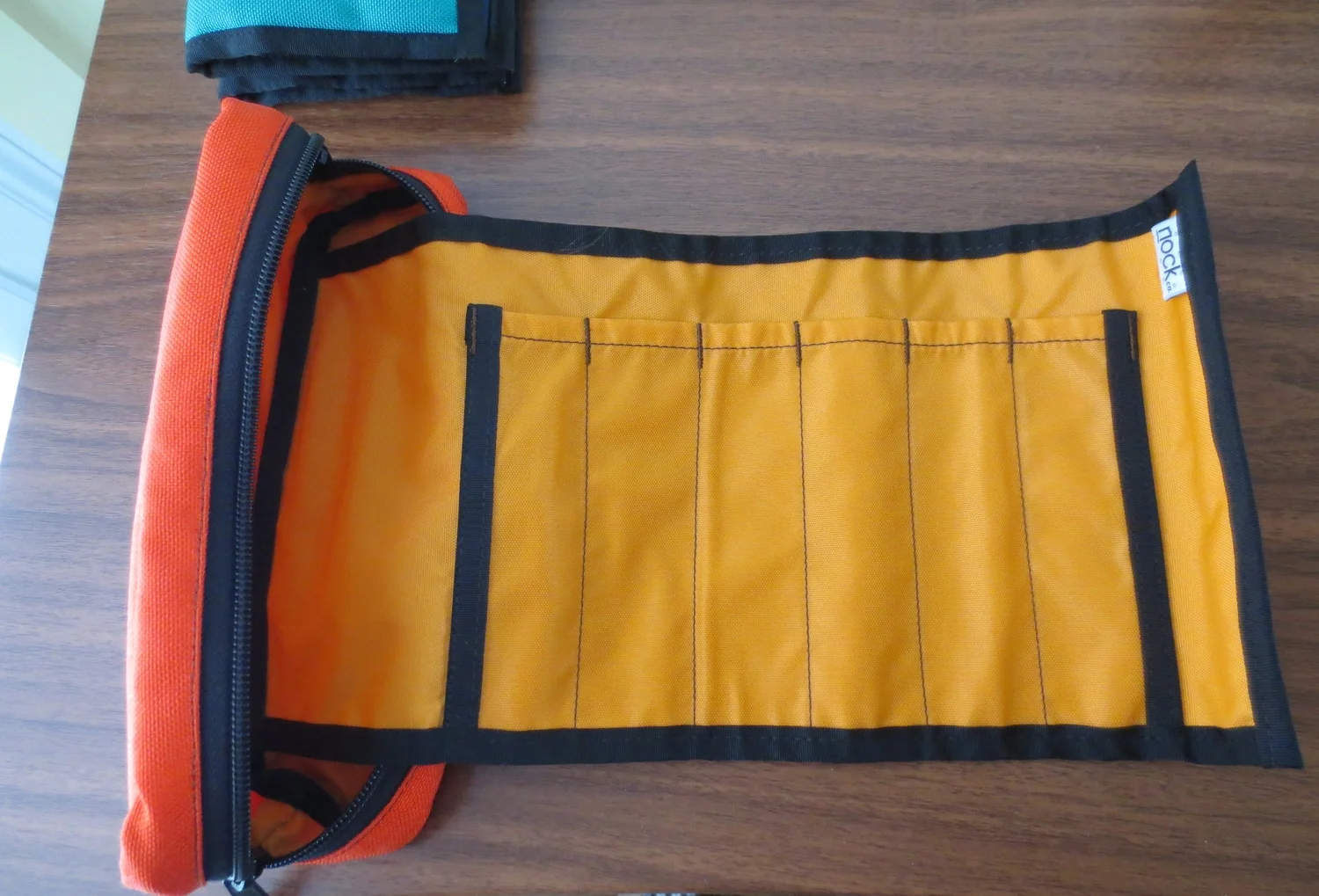
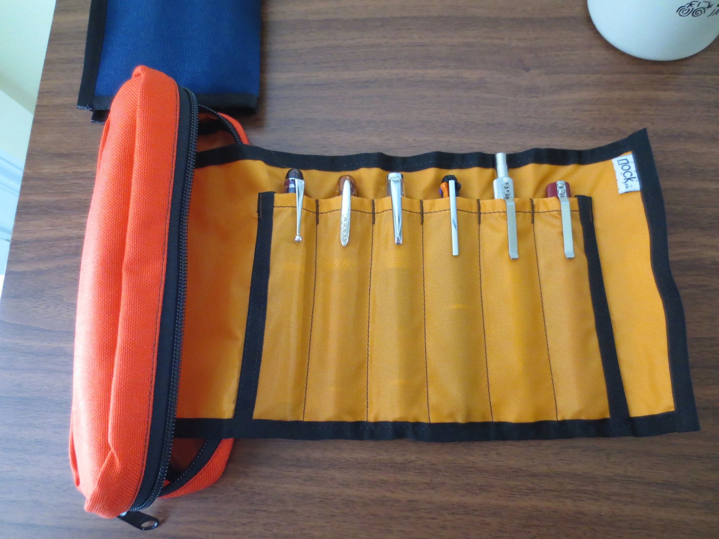
In this same run to Staples, I picked up a Dr. Grip Gel and a Dr. Grip Full Black, after hearing rumors that the line was being discontinued.  The Dr. Grip Gel takes a G2 refill, so it may not warrant a separate review, but the Full Black has a hybrid ballpoint ink that I'm really liking at the moment and am using regularly.  There will be some more Pilot reviews soon. 

Pencil Week: Musgrave Pencils

One of the last remaining pencil companies that manufactures in the United States is the Musgrave Pencil Company, which resides just twenty-five miles or so down the road from me in Shelbyville, Tennessee, the “Pencil City.”  Musgrave advertises itself as having been “Manufacturing Since 1916,” which also seems to be when they developed their website, www.pencils.net, often described as “adorably outdated.”  (UPDATE 9/13/18: Musgrave reached out and recently informed me that they have launched a new website! This one looks sharp!)

I purchased my Musgraves from Pencils, Etc., an Amazon seller located in the Shelbyville area that I assume to be Musgrave or someone affiliated with them.  I’ve never seen either of these pencils for sale anywhere else.  Pencils, Etc. sells their goods for $16 / 3 dozen, which is a respectable price, and comparable to General’s Semi-Hex pencils purchased directly from the manufacturer.  I bought two lots:  Musgrave’s “909 Ceres #2”, and some plain, unmarked black round #2 pencils.  The pencils came packaged in plastic bags, in typical “bulk lot” fashion.  I eagerly tore them open and sharpened up a few.  They sharpened well, for non-cedar pencils (probably basswood), and both are well worth the money I spent on them.  They both have the same pink eraser that works well, and that I would compare to a Pink Pearl.

Top: The Musgrave Ceres 909, their standard #2 pencil, proudly marked as made in "Pencil City," USA.

Bottom: Basic Black #2 pencil.

Nothing fancy about this packaging, but it gets the job done.

The 909 Ceres:

The 909 Ceres appears to be Musgrave’s basic yellow #2 pencil, and if that’s what you’re looking for it’s an excellent option.  The core is quality, and sharpens to a nice point.  I would compare this pencil to the new, Musgrave-manufactured Palomino Golden Bears.  The pencils have the same sharp ridges as the new Golden Bears, and are not rounded for comfort as are most modern hexagonal pencils.  Some people don’t mind this, but I’ve found that it makes it difficult for me to write with these pencils for long periods of time. 

Point retention on the Ceres is excellent.  The lead is dark, but as I’ll note below, I prefer the softer, even darker lead of the unmarked rounded pencil.

909 Ceres writing sample on Clairefontaine Seyes-ruled paper.

The “Basic Black” Rounded Pencil

For lack of a better term, I’ll dub these pencils the “Basic Black” model.  When I purchased these a month or so ago, Pencils, Etc. offered these in multiple colors (and you can probably find an even broader selection if you reached out to Musgrave directly).  I’m a sucker for round pencils, and always have been.  I find them far more comfortable than their hexagonal brethren, even if you have to worry about them rolling off the desk.  What really kills it for me, though, is the core.  It’s labeled as a #2 pencil, but it’s ever-so slightly softer and darker than the Ceres, while maintaining most of the point-retention properties. 

As you can see here, the core of the Basic Black Musgrave pencil (bottom) is just a hair darker than the 909 Ceres, and it's also smoother.

Basic Black Musgrave writing sample.

The comfort combined with the dark core makes this pencil a nearly perfect daily writer for me.  In the first picture, you can see the difference between the Ceres (shown up top), and the Basic Black.  Sorry Ceres, but I’ve found myself reaching for the Basic Black whenever I need to do more writing than jotting a few quick notes.  I’m glad I have three dozen!  Once Musgrave gets their store up and running, I’ll consider buying more and maintaining a stash of these.

Ink Review: Sheaffer Skrip Turquoise

Turquoise inks started appealing to me after I read a review somewhere of one of the "classic" vintage inks, Sheaffer's original Peacock Blue.  Somewhere along the line, the ink was renamed simply "Turquoise," probably after Sheaffer's U.S. ink factory closed and production was moved to Slovenia.  I've never had the opportunity to try the original Peacock Blue, but I am a huge fan of Sheaffer's Turquoise. 

One major disappointment when Sheaffer revealed their new "modern" ink line was that they had done away with their traditional "inkwell" bottle in favor of this smaller, triangular bottle that can make it more difficult to get at all of the ink, especially if your pen has a larger nib.

For lack of a better way of expressing myself, I would characterize Sheaffer Turquoise as having a good, pure turquoise tone.  It's got enough blue in it to make the ink dark enough to be used as a regular writing ink, yet not so heavy on the dark blue or green that would render it more teal than turquoise.  Some people might hesitate to do so, but I have no issue using this ink at work.

For some reason (maybe the green background), this photograph seems to be a more accurate representation of the actual color I see on a day-to-day basis.  Depending on the pen and the paper, it can look very similar to Iroshizuku Kon Peki.

I picked this ink up at the D.C. pen show a couple years back, when I sampled several turquoise inks at the ink testing table.  I liked this one the best.  I've found that in order to get good shading using this ink, you should use a broader nib.  Generally, it's a very well-behaved ink that doesn't feather or bleed, even on the cheapest-of-the-cheap office paper that I'm forced to use at work.  I've even been able to use this ink on Field Notes paper (with a medium nib!) without feathering, depending on the pen.  Some people complain that Sheaffer's selection of colors is boring, but I disagree with that characterization.  The selection of colors may be "standard," in the sense that the have the traditional blue/black, blue, green, black, brown, red, and purple offerings, but there's something to be said for a company sticking with what it knows, especially where the result is this good.  (Side note:  I've heard that Sheaffer revamped their Slovenian-manufactured ink formulas a couple years back to make the colors more vibrant, among other things, so if you have bottles that are more than one or two years old, of if your merchant's stock was old, YMMV.)  Personally, I've never worried about staining, clogging or other maintenance issues using these inks.  A great review of Sheaffer's entire line of inks can be found on Glenn Marcus's blog here.

I also have a bottle of Sheaffer Skrip Red, a classic, as well as a few bottles of vintage Skrip Washable Blue.  Reviews of those forthcoming.

Nock Co. Mega Review Part III: Hightower and Brasstown

Save the best for last, they say (here, it's more like "the best of the best").  In this final installment of the three-part "all the cases" Nock Co. review, I'll be taking a look at my two personal favorites:  the Hightower and the Brasstown. 

The Hightower

From what I can tell, there really is nothing else like the Hightower out there on the market.  It's a bifold case that holds "three" pens on the left (see my photos below and you'll see why I put "three" in quotation marks"), and "one" notebook on the right (same caveat).  Needless to say, this is an incredibly versatile pen case.  The construction is similar to the Sassafras and the Maryapple in materials, design, and quality, meaning that all are excellent.  I chose the Kickstarter limited-edition color scheme with Peacock Blue Exterior and Midnight Interior.  Sorry folks!  From what I hear this one's not coming back!

The Brasstown

The Brasstown is the "big boy" of the Nock Co. crew:  a six-pen wrap that folds into a larger Chimneytop-style case and still leaves room to store a handful of loose pens, pencils, erasers, etc. on the sides.  The interior pen roll uses enough fabric to ensure that your pens don't touch one another, and the clip from one pen won't scratch the body of its neighbor.  As others have remarked, I have zero concern about storing high-dollar pens in this case.   

I will add, per my earlier suggestions in Part I of this series, that the Brasstown is definitely long enough to store woodcase pencils on the side.  My only concerns would be lead breakage and graphite dust, both of which would be solved by capping your pencils.  I've not tried this yet.  For the Brasstown, I chose the Orange/Mango color scheme, which looks awesome, though sometimes at work I wish that I'd chosen something a bit more subdued.

Conclusions

Of these two, I think the Hightower works best for me as a daily carry case to and from work.  The Brasstown, however, is always full, given that it holds a wide variety of pens, as shown, and the extra storage inside the case makes it extremely handy.  I took this case to the Atlanta Pen Show last month, simply because of the capacity. 

In terms of overall conclusions, it's hard to believe that Nock Co. is just a startup.  While I had relatively high expectations from this Kickstarter, the fact that I received seven cases of this quality for $75 blew me away.  These are polished products that reflect a high level of sophistication in terms of both manufacturing tolerances and an understanding of their customer base.  I have not seen any pen storage options on the market right now that will give you equally well-built cases at this price point.  From my understanding, it was Brad and Jeffrey's goal to fill this niche, and they've more than accomplished that.  

So what would I personally like to see from Nock Co. in the future?  A dedicated pencil option, certainly, which I understand may be on the way.  Given the durability of the nylon used to construct these cases, it would also be great to have a folio option that fits Rhodia pads, or a notebook cover that would fit those A4/A5/B5 notebooks with the flimsy paper or cardboard covers that simply don't hold up to being carted around in a bag.  

Something tells me we won't have to wait long to see more great stuff on the way. . . .

Nock Co. Mega Review: All The Cases, Part II

Part two of the Nock Co. "All the Cases" review:  the Lookout, the Sassafras, and the Maryapple. 

The Lookout

The Lookout is your basic three-pen holster.  I chose the Midnight/Foliage color scheme.  Like the other Nock Co. products, it's a great looking case, and it has enough padding to give comfort that your pens are being protected.  It fits all pens well.  Pictured are an Omas 360, Ti Pen, and a Sheaffer Legacy Heritage.  If I had to recommend one pen case to someone who needed basic pen storage for high quality pens, I would recommend this case.  It provides the same--if not better--protection than my more expensive leather cases, at a fraction of the price.

The Sassafras

The Sassafras is the "all pen" bifold case (as opposed to the Maryapple, the "all notebook" bifold, and the Hightower, the "pens + notebook" bifold).  This is another great storage option, and once again, I chose the Midnight Blue/Foliage combination.  The case holds three pens on the left in slots that are intended for one pen each (although with certain slender pens, you may be able to fit in two).  On the right, the slots are bigger, presumably intended to hold multiple cheaper pens that you don't mind bumping into one another.  I've been using the Sassafras to store my Karas Kustoms pens (Retrakt, Bolt and Render K), my Kuru Toga, and any inked up fountain pens that I'm not actually carrying with me at the time.  If I were taking an extended trip, and wanted to carry three nice pens, plus some pencils and markers, the Sassafras would be my chosen companion.  This case will get some heavy use this summer and fall, as I've got some good "writing trips" lined up. 

The Maryapple

I'm carrying this case right now in combination with the Brasstown, and I've got it loaded with two notebooks and my Exacompta index cards.  It makes sense at the moment because I am at the point where I'm close enough to filling up a Field Notes that I need to carry a spare with me.  Otherwise, however, I'm not sure that the Maryapple is the most practical case for my daily carry, especially since I have the Hightower, which holds pens and writing material together.  I absolutely love this color scheme, though. 

I have nothing remotely negative to say about any of these three cases.  The construction is superb, they fit a wide variety of different needs, and I will likely turn to all of them at one time or another.  Well done Nock Co.!  Keep it coming!