• Blog
  • Shop
  • Resources
  • FAQ (Ask TGS)
  • About
  • Archive
  • Contact
  • Sign In My Account
Menu

The Gentleman Stationer

Vintage Living in the Modern World.
  • Blog
  • Shop
  • Resources
  • FAQ (Ask TGS)
  • About
  • Archive
  • Contact
  • Sign In My Account

Ink Review: Montblanc JFK Navy Blue

July 11, 2015

Another Montblanc Limited Edition Ink, and yet more money flows out of my pocket.  I’ve done pretty well so far on my purchasing hiatus, which to me is even more impressive in light of how much I love this ink and how much I really want to stock up on it so I always have some available.  

Montblanc issued JFK Navy Blue to accompany its JFK Limited Edition Fountain Pen, part of the “Great Characters” series.  (If the pen strikes your fancy, Mr. Greer over at Pentime/Chatterly Luxuries has the pen listed at a really good price for these Montblanc Special Edition Pens.)  The ink is a true “navy blue,” more vibrant than the other ink bearing this description, Noodler’s Navy.  If I had to place this ink into a color group, I would call it a blue-black, but it definitely leans more to the blue end of the spectrum.  The ink has good shading and, on some papers, I've seen a tiny bit of red sheen (not much, and it doesn’t photograph at all).  Otherwise, the flow is excellent, and JFK Navy Blue shares the same properties of other Montblanc inks, including a lack of feathering and bleed-through, good dry time, and functionality on cheap paper.  

The writing sample here is done with a Conid Bulkfiller Minimalistica (fine nib) on Nock Co. Dot-Dash notecards. 

I ordered this ink from La Couronne du Compte in Tilburg, the Netherlands.  As with other Montblanc/Pelikan inks, if you’re in the U.S. the exchange rate may now make it more economical to order from abroad, but unless you can get a promotion or discount on shipping the end result may be the same.  Last I checked, the JFK ink was getting harder to find.  Stateside, Fahrney’s Pens and Pen Boutique have this ink in stock, and it runs $19.00 per bottle.     

I paid for this ink with my own funds, and was not compensated monetarily or otherwise for this review.

In Ink Reviews Tags Ink Review, Montblanc
2 Comments

Ink Review: Montblanc Corn Poppy Red

July 4, 2015

As the dollar appreciated against the Euro earlier this year, it became economical to order some of the more expensive inks such as Montblanc and Pelikan Edelstein from Europe.  I placed an order with La Couronne du Compte in Tilburg, the Netherlands, and the inks I picked up included Montblanc’s new addition to their “regular” line of inks, Corn Poppy Red.  

One of the knocks on Montblanc’s ink stable is that until now, they did not have a “true red” in their lineup.  In the late 1990s/early 2000s, Montblanc did offer a “Ruby Red,” which I’ve reviewed and did not care for.  Ever since they’ve stuck with the burgundy/bordeaux wine themes for their red option, which is just fine with me as I typically prefer darker reds to use in my everyday writing.  Once I saw this one, though, I jumped.  

The ink looks somewhat orange when photographed, but when it dries on paper the color is what I would consider a "pure red."  

Corn Poppy Red is definitely what I would consider a “true” red.  There are no pink or orange undertones going on here, as sometimes happens with other inks labled “Poppy.”  Because of their all-around excellent properties, Montblanc inks are among my favorites, and this one is no exception.  Even though I loaded the Corn Poppy Red into a fairly wet Stipula stub nib, the ink worked well on all but the cheapest papers, and even then any feathering and bleed-through was minimal.  There is some shading, but it’s not particularly pronounced, and I imagine that it will only come out with broader nibs on the right paper.  

You get the full 60ml!  I've heard conflicting rumors about whether or not Corn Poppy Red is a limited edition or an addition to the regular lineup.  While some retailers list this ink as a LE, since it's offered in the larger 60ml bottle my money is on Corn Poppy Red as a new regular.  That said, there's a reason I don't gamble.  

Because this ink is (presumably) an addition to Montblanc’s regular line, it comes in the 60ml “shoe” or squared bottle, as opposed to the smaller, 30ml “special edition” bottles.  The pricing is standard (14.80 Euros or $19.00 US), making it a better value than the special edition inks that are similarly priced but give you half as much (14.30 Euros or $19.00).  

As I mentioned, I purchased this ink from La Couronne du Compte, whom I highly recommend.  If you prefer to purchase in the U.S., you can find this ink at most Montblanc retailers, including Anderson Pens and Penboutique.

Writing sample with some comparisons on Clairefontaine French-ruled (Seyes) paper.  The closest comparison is the Edelstein Garnet, which is a slightly darker color.   

Disclaimer:  I purchased this ink with my own funds, and was not compensated in any way for this review.

In Ink Reviews Tags Ink Review, Montblanc
2 Comments

Check out this Week's Pen Addict Podcast!

June 30, 2015

Special Announcement:  I'm a guest on this week's episode of The Pen Addict Podcast, Episode 161, titled "No Micarta for You!"  I'm flattered that Brad and Myke asked me to join them, and I had a great time on my first podcast ever.  Stay tuned, as the winner of last week's giveaway will be posted tomorrow.  

In Updates Tags Podcast, Special Announcement
1 Comment

The "Stamps" and "Brown Leaf" editions of the Backpocket Journal. 

Backpocket Journal by Curnow Bookbinding and Leatherwork

June 27, 2015

After reviewing my backlog of pocket notebooks, I opted for a product I have a small stash of but have never tried:  the Backpocket Journal by Curnow Bookbinding and Leatherwork. 

Vanness Pen Shop edition. 

At first glance, the Backpocket Journal doesn't break any new ground:  it's another pocket notebook similar to Field Notes, Word Notebooks, and the Baron Fig Apprentice (although Backpocket Journal predates the Apprentice).  Two things set Steve Curnow's products apart, however:  (1) the paper is much more fountain pen friendly than existing alternatives, and (2) the Backpocket Journal comes in custom covers and is hand bound with a sewn binding, which is both attractive and durable.  For those who insist on using fountain pens with their pocket notebooks, the paper is on par with the new Nock Co. dot-dash paper.  With non-fountain pens and pencils, I found that the Curnow paper was too smooth for my taste, but perhaps I've been spoiled by the super-tactile Baron Fig paper that I've grown to love.  

View fullsize IMG_1294.jpg
View fullsize IMG_1295.JPG
View fullsize IMG_1296.jpg
View fullsize IMG_1297.jpg

My writing samples show what happens when you try to push the limits of this paper with a fountain pen.  I used a TWSBI 580 with a  1.1mm stub nib, and also my stubbed Montblanc 146.  The standard Backpocket Journal paper easily keeps feathering under control, but there is slight bleed through, similar to what you would see using the same nibs on the Field Notes America the Beautiful or Shelterwood paper.  All other fountain pens performed beautifully.  Those who want to use flex or stub nibs in their pocket notebooks may want to spring for the Tomoe River paper edition.  

Pricing for the Backpocket Journal is consistent with the pocket notebook market in general:  $9 for a three-pack of the "standard" edition, and $10 for a three-pack of the custom cover editions.  The slightly more expensive Tomoe River Edition will run you $12.50, and comes with a lined guide to help keep your writing straight on the unlined Tomoe River paper.  Doug over at Modern Stationer has a great review of this product.  If I wasn't on a "new purchase" hiatus, I would order some of these immediately.  

The Backpocket Journal can be purchased directly from Curnow via their Facebook page or through the e-mail contact printed on the back of the notebook (how I purchased the "Brown Leaf" and "Stamp" Editions), or you can purchase the Vanness Edition used in the review from Vanness Pen Shop.  I received the Vanness version as a free sample when I purchased some ink at the Atlanta Pen Show (or maybe it was D.C., I lose track).   

In Notebook Review Tags Curnow, Backpocket Journal, Pocket Notebook
Comment

Four colors of the Signo 207 BLX range.  A co-worker stole the brown pen out of my pack.  I didn't like it anyway. 

Review AND GIVEAWAY: Uniball Signo 207 BLX .7mm Gel Pens

June 24, 2015

The Uniball Signo 207 is widely regarded as one of the best pens that you can pick up in just about any big box or office supply store, but it never clicked with me.  The length of the pen has something to do with this:  it's fairly short and there's not much heft.  But the refill is nice, and when it comes to readily available pocket writers, for most people the 207 ranks up there with anything else on the market. 

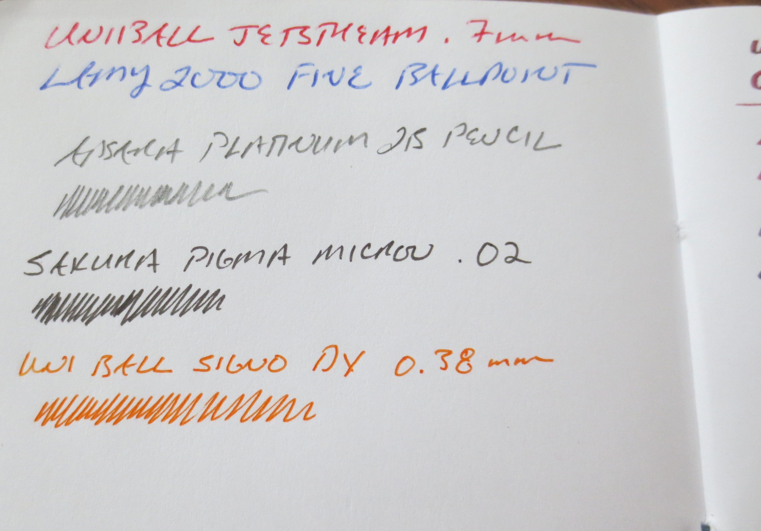
A close-up of the writing sample.  The paper is a Tops Double Docket White Legal Pad, which I'm enjoying for both pens (including fountain pens) and pencils.  Buy the white, not the yellow, which feathers like crazy with pretty much a…

A close-up of the writing sample.  The paper is a Tops Double Docket White Legal Pad, which I'm enjoying for both pens (including fountain pens) and pencils.  Buy the white, not the yellow, which feathers like crazy with pretty much any ink. 

Building on the success of the basic Signo 207, Uniball introduced the BLX series, which feature black-infused blue, green, purple, red, and brown gel inks.  (Uni offers the Vision Elite in the BLX color range, as well.)  The colors look nice, the red and the purple being my favorite, but the 207 BLX only comes in the .7mm tip size, another reason why this pen will never make it into my regular personal rotation.  

So:  consistent with last week's theme of reducing my backlog and overall stockpile, I'm passing these for pens on to one lucky reader.  The rules of the giveaway are the same as they've always been.  Leave a comment on this page OR join my e-mail list using the submission form on the left sidebar.  Joining my e-mail list will automatically enter you into my giveaways in the future.  Each subscriber or commenter will be assigned a number and I will use a random number generator to pick a winner, who will be announced exactly one week later.  Be sure and check back!  If you can't wait, here's a buy-it-now link (affiliate).  

In Pens, Giveaway Tags Signo 207, Uni
17 Comments
← Newer Posts Older Posts →
Store Hours and Location
Visit the T.G.S. Curated SHOP
Updated "Best Pens" Guide
On the Paper Trail Podcast
TGS x Roterfaden TGS_25
Hierarchies of Fountain Pen Friendly Paper

Join Our Patreon!
Subscribe to the TGS E-mail List

Featured Posts

Featured
Cover On the Paper Trail Intro Clip.jpeg
Dec 3, 2025
Introducing "On the Paper Trail," a New Podcast/Video Collaboration with Lisa Vanness of Vanness Pens!
Dec 3, 2025
Dec 3, 2025
Iro-Utsushi-Fine-Dip-Pens.jpeg
Oct 1, 2025
The Pilot Iro-Utsushi Dip Pen (and in General, Simple vs. Fancy Dip Pens)
Oct 1, 2025
Oct 1, 2025
Levenger-Annotation-Pad.jpeg
Sep 20, 2025
Five Boutique Paper Brands I'm Watching Closely and Why
Sep 20, 2025
Sep 20, 2025
The Gentleman Stationer RSS

© Digital Divide Media, LLC, 2014-present.

All content is the exclusive property of Digital Divide Media, LLC, d/b/a The Gentleman Stationer, including “The Gentleman Stationer” website and trademark, and should not be reproduced without express written permission.  All rights reserved.

All content containing paid advertising, affiliate links, or sponsored content will be plainly disclosed by a disclaimer when/if featured.

Contact Information

Store Shipping Policy and Return Policy

Privacy Policy

Cookie Policy

Terms and Conditions

Powered by Squarespace