• Blog
  • Shop
  • Resources
  • FAQ (Ask TGS)
  • About
  • Archive
  • Contact
  • Sign In My Account
Menu

The Gentleman Stationer

Vintage Living in the Modern World.
  • Blog
  • Shop
  • Resources
  • FAQ (Ask TGS)
  • About
  • Archive
  • Contact
  • Sign In My Account

Otto Hutt uses very simple, minimal branding on their pens, and I find their matte finish both gorgeous and comfortable to hold.

Pen Review: Otto Hutt Design 06

October 5, 2016

Germany has several high-end pen companies whose products rarely make it to this side of the Atlantic, and if they do, they are imported in such small quantities that they are difficult to find and rarely reviewed online. Retailers who stock some of these brands don't promote them heavily. I'm talking about brands like Otto Hutt, Cleo Skribent, Diplomat, and - until recent years - Kaweco, Faber-Castell and Graf von Faber-Castell. I was contacted a couple months ago by representatives of Pen Heaven, a UK-based online retailer, asking whether I would be interested in collaborating with them on a review. The design of the Otto Hutt pens intrigued me, and they agreed to send me one of the pens for review. 

Background and Brief History

Otto Hutt packaging is very functional, and somewhat similar to Lamy (though not as minimalist). There are no flashy wood or metal boxes, just cardboard/foam packaging that is sturdy enough to protect the pen while looking nice. 

As I mentioned, Otto Hutt is a German pen manufacturer based in Pforzheim, a town known for its jewelry. According to the Company's website, Otto Hutt has been in business since the 1920s, and originally specialized in writing implements made from silver. The current Otto Hutt lineup features seven fountain pens ("Design 01" through "Design 07"), along with ballpoint and rollerball offerings. The pen I'm reviewing here is "Design 06", which is one step below the "flagship" of the Otto Hutt line, the "Design 07."   

Nib

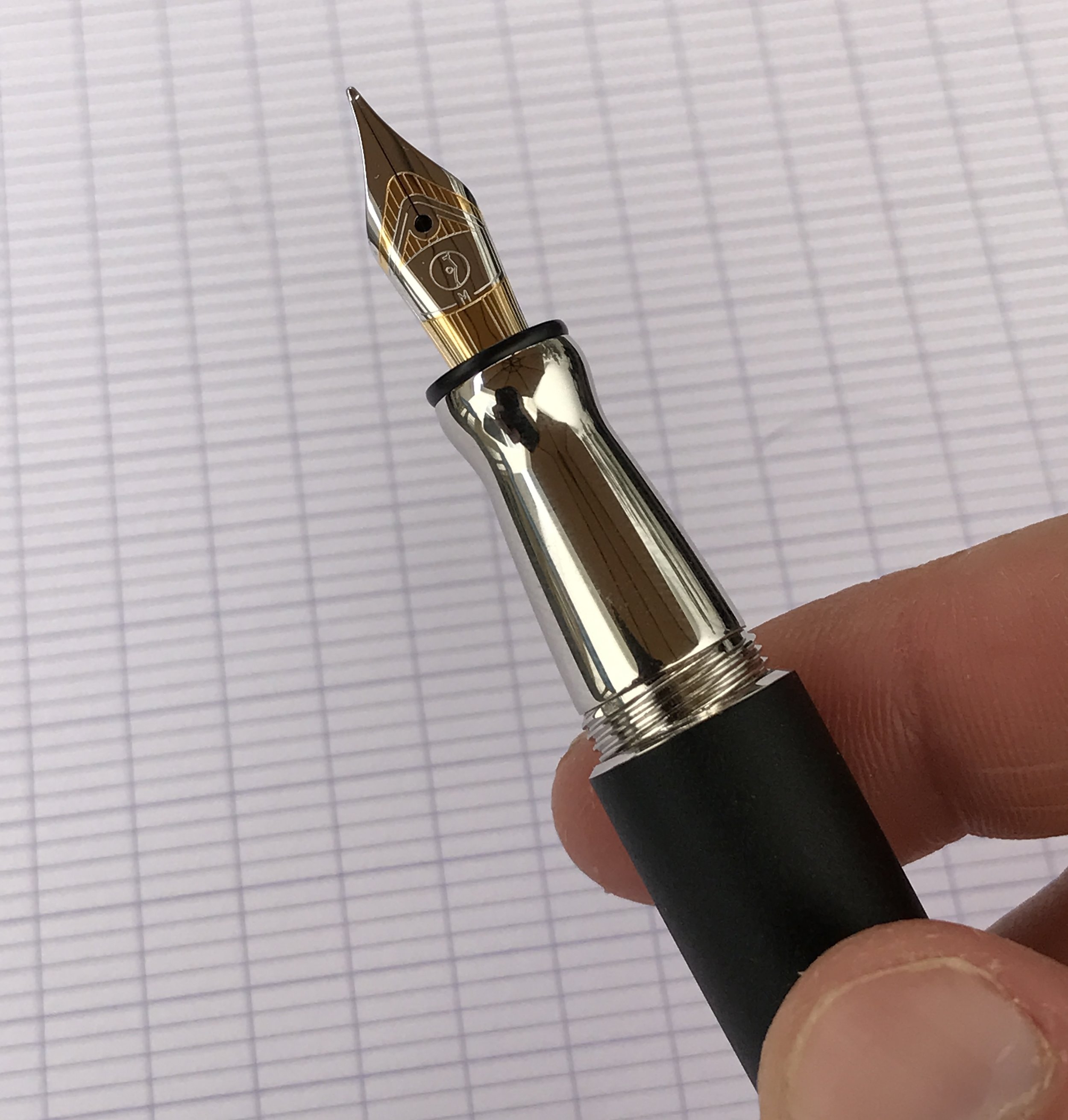
I found the detailing on this nib really attractive. I like the understated Otto Hutt logo. 

The nib is the star of the show here. Otto Hutt uses nibs said to be manufactured by Peter Bock AG, which are stamped with the Otto Hutt logo. The nib on my pen is exceptionally smooth, and even has a bit of softness to it. Normally, there's no mistaking a steel nib for a gold nib, but this one could easily pass for a two-toned rhodium-plated gold nib. Even better, the alignment on the nib was perfect, and there were no variations in ink flow during multiple all-day writing sessions. The nib writes what I'd consider to be a "true medium" line.  

Build

The pen's compact design and good balance helps offset the weight of the metal construction. 

The Design 06 sports a compact, Bauhaus-inspired design (per the Otto Hutt website), and I've enjoyed the classic matte black / chrome color scheme. The pen also comes in red and pink, with the pink pen featuring rose gold trim. The latter color combination is especially pretty.

The finish and tolerances on this pen are top notch. The cap and body line up perfectly flush with each other, the pen has no rough edges, and the lacquer finish is flawless. All of these place my Otto Hutt a notch above pens I've used from Diplomat (or even Lamy). Perhaps my favorite thing about this pen is that the threads are cut so that it takes only a single turn to screw or unscrew the cap, which closes securely. The pen also has a spring-loaded clip, which easily attaches to a shirt pocket. 

View fullsize Otto Hutt Design 06 Uncapped
View fullsize Otto Hutt Design 06 Unposted
View fullsize Otto Hutt Design 06 Posted

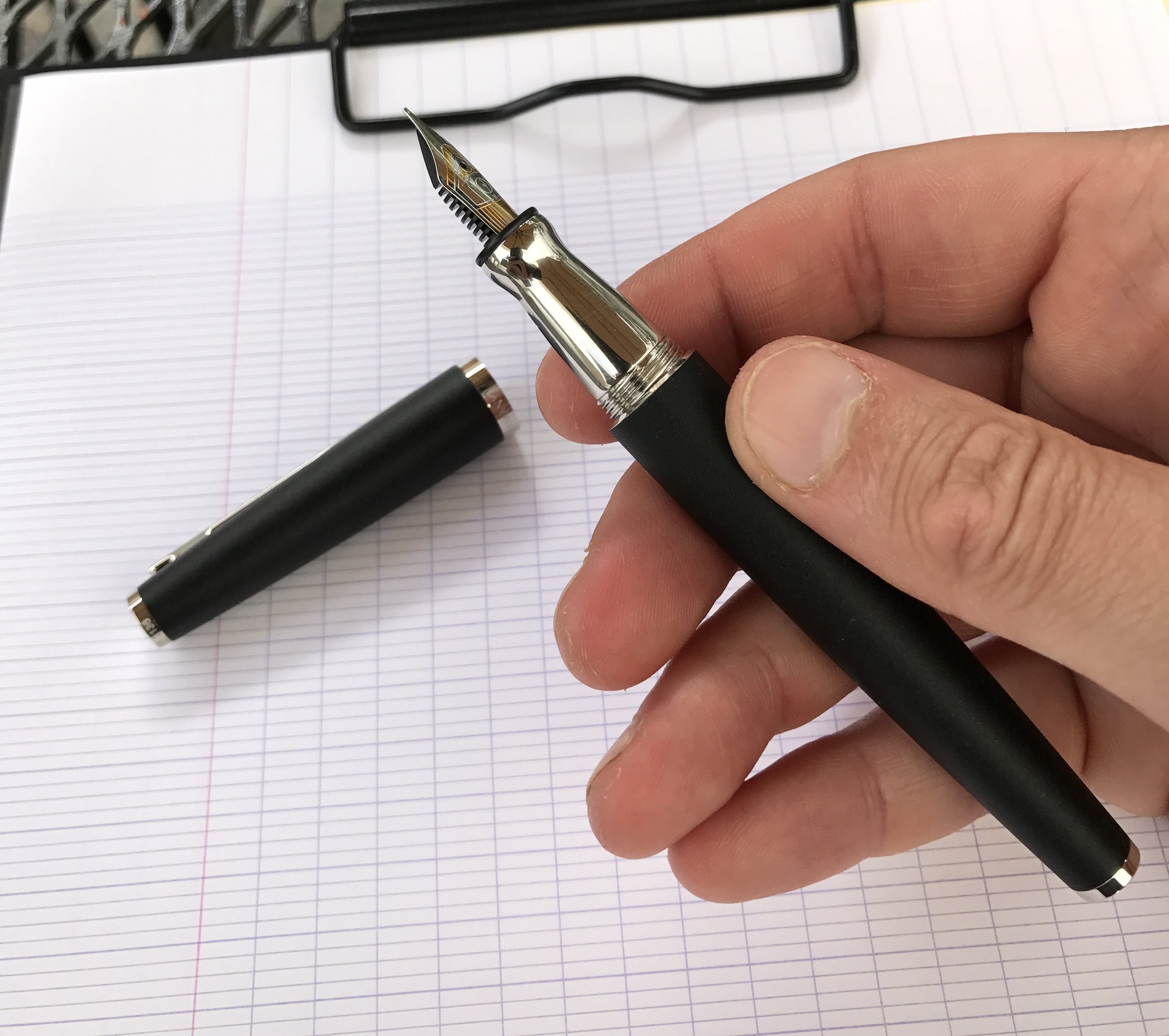
Otto Hutt has its roots in metalworking, so this is a metal pen. The section is polished stainless steel, and has an hourglass-shape to prevent slippage. The body of the pen is also metal (probably brass or steel), and is coated in a thick matte lacquer. Unlike other metal pen bodies I've reviewed in the past - the Lamy Studio is the one that comes to mind - the matte black coating is thickly and evenly applied, so there appears to be little risk of it chipping or flaking off. I can't find a single flaw in the finish on the Design 06. I consider it a step up from pens like the Studio and the Diplomat Aero. While I like those models, I'm often able to find flaws (chips, flaking, scratches, etc.) in the finish of otherwise brand-new pens. 

Because it's metal, the Design 06 is a relatively heavy pen. But despite its heft, the pen is still very comfortable to use. My review notes and initial draft of this post took me over an hour and spanned three handwritten pages (Clairefontaine French-ruled paper), yet I had no hand fatigue. I found the pen to be exceptionally well-balanced, even when posted.    

Pricing and Value

Otto Hutt pens featuring a steel nib are generally priced anywhere from $100-200, while gold-nibbed pens run in the $400-800 range. The pricing is fairly standard for German pens of this quality, and I would say that it's comparable to the pricing on Graf von Faber-Castell pens. Caran d'Ache is another pen company with a similar pricing structure, though CdA is based in Switzerland and not Germany.  

Takeaways

This pen is a big winner for me. Normally, I'm not a fan of steel-nibbed pens making their way north of the $130 mark, BUT I will make exceptions where the manufacturer clearly has put a significant amount of effort into making a nib both write exceptionally well and look good. That is certainly the case here, and this pen is as nice a writer as any gold nib pen that I own - out of the box and without any modifications, I might add. Otto Hutt pens are not cheap, but I'd be willing to pay the premium for quality. Given how good of an experience I had with the Design 06, I'm already looking to add another Otto Hutt pen to my collection. 

There is a bit of a "step-down" from the barrel to the section, but since I tend to grip my pen towards the front (i.e., at the nib-end of the section), the step didn't bother me. 

There is a bit of a "step-down" from the barrel to the section, but since I tend to grip my pen towards the front (i.e., at the nib-end of the section), the step didn't bother me. 

As a side note, I think I may be the first pen blogger to review an Otto Hutt pen! In case you haven't noticed, I was excited to write this review. As fountain pens experience a bit of a "renaissance," and more and more people pay attention to pens online through blogs, forums, etc., it's increasingly rare to find lesser-known high-quality brands.  

Where to Buy

Very few, if any, U.S.-based retailers carry the full Otto Hutt line. As I mentioned above, Pen Heaven, a UK-based retailer, graciously sent me this pen for review purposes. Pen Heaven stocks all of the various Otto Hutt models, along with pens from Faber-Castell, Graf von Faber-Castell, Lamy, Kaweco, Diplomat, and more. The pen arrived beautifully wrapped and packed, along with a personalized note, which is a touch that I always appreciate.  

If you're interested in ordering the same pen featured in this review (Otto Hutt Design 06), the link can be found here.

Disclaimer: Pen Heaven provided me with this pen free of charge, for review purposes. 

In Pens Tags Pens, Otto Hutt
1 Comment
From left: Field Notes Pencil, Palomino Blackwing 602, Palomino HB, Dixon Ticonderoga, and a vintage Faber-Castell American. 

From left: Field Notes Pencil, Palomino Blackwing 602, Palomino HB, Dixon Ticonderoga, and a vintage Faber-Castell American. 

My Five Favorite Pencil Posts

October 1, 2016

I use pencils every day. In fact, if I think about it, the pencil is probably my most-used writing implement after the fountain pen, but for some reason I've struggled to fit pencil-related content into the rotation here at TGS. I hope to change that soon, but in the meantime, I've pulled some of my favorite pencil posts from the archive for your enjoyment. 

  1. Pencils! Pick Five. Where I take a look at the Palomino HB, the Palomino Blackwing 602, the Dixon Ticonderoga HB, the vintage Faber-Castell American, and the Field Notes Pencil. Of these five, the Palomino HB and the Blackwing 602 see weekly, if not daily, use.  

  2. Pencils! Five More. A brief review of the Dixon Ticonderoga Laddie, the Staedtler Wopex, the General's Semi-Hex #2, the General's Cedar Pointe #2, and a vintage Dixon Oriole #2.5. Of these five, the Dixon Ticonderoga Laddie and the Cedar Pointe get the most love. 

  3. Palomino Golden Bear. Still my favorite budget pencil. I have these stashed in the pencil cup on my desk at work as "loaners." At $3 per dozen, they're a steal (and yes, they get "stolen" all the time).

  4. Ticonderoga Laddie. I eventually did a longer review of the Laddie, which is still my favorite "mini-Jumbo" Pencil. I've also heard good things about the Laddie Tri-Write, if you're into triangular pencils, but I have such a large stash of the original there's no need for me to buy more.   

  5. The Mongol Reborn. Papermate makes a version of the classic Mongol pencil for the Venezuelan market. They aren't exceptional pencils, but the nostalgia factor makes them kinda cool. 

Five Pencils I Use
Palomino Golden Bear
Ticonderoga Laddie
Papermate Mongol

I'm back from vacation as of tomorrow, so look for things to get back to normal this week. Thanks for reading, and I hope you've enjoyed some of these posts you may have missed the first time around! 

In Editorial Tags Pencils, Links
Comment

I reviewed this Pelikan M600 early on, and it's one of the pens that stuck in the rotation, along with my Montblanc 146. 

TBT The Early Days of The Gentleman Stationer: Montblanc, Pelikan and More

September 28, 2016

I spent some of my mornings over the past couple of days reading back through the early posts on the blog.  It was fun to watch how my review style and photography changed over time (for the better, mostly), and also really informative to see how certain pens I thought would make it in to the "regular rotation" ended up getting sold off for one reason or another. For those of you who are new to the blog, here are some links to older reviews that you may have missed the first time around, plus some updated impressions of certain pens. 

  1. Montblanc 146 Review. The first big pen review that I did on the blog, of a pen that's still a stalwart in my collection. This nib and I have had a love-hate relationship, to the point where I went to sell it a couple times but ended up pulling it off the market. For now, it's back in my good graces, thanks to Mike Masuyama. I eventually need to do an updated review. 

  2. Omas 360. A pen that I wish I still had, if only for posterity's sake, now that Omas has gone out of business. I've had a few Omas pens pass through my hands over the past several years, but none of them stuck mainly because I found the nibs too wet for my taste. 

  3. My Favorite Field Notes: Drink Local Ales. Still my favorite Field Notes Colors edition. I've sold off the majority of my Colors stockpile, because most of the paper is not very functional for the types of pens that I use, but I've got a nice little stash of the editions that I do like, including these. 

  4. Retro Pens from High School and College.  I remember having a lot of fun writing this one. Believe it or not, some of these pens are still available fifteen or twenty years later, so I've added links to where you can find them today. 

  5. Pelikan Souverain M600. I have a Pelikan M800 that I absolutely love, but I firmly believe that the M600 is the right size Pelikan for "most people." I still use mine all the time (though I've added a custom "Concord Turk" grind from Mark Bacas). I've updated my purchasing recommendations for this pen to reflect changes in the fountain pen marketplace over the past couple of years. If you are looking to purchase a Pelikan with the nib tuned and/or custom ground, I'd recommend purchasing from Dan Smith (The Nibsmith), whose turnaround time is excellent. 

View fullsize Omas 360
View fullsize Field Notes Drink Local Ales (with Doane Paper)
View fullsize Montblanc
View fullsize Pelikan Souverain M600 Nib

Keep an eye out this week as I dig back further through the TGS archives!

In Editorial, LInks Tags Links, Editorial
Comment

What's the winner in the "Best Ink for Editing / Annotation category? I'm partial to Sheaffer Skrip Red, a highly underrated ink. 

Best Fountain Pen Inks for Editing and Annotation

September 24, 2016

People often ask me what I use my pens for. Most days, it's either note-taking in meetings, editing, or outlining. Marking up documents like legal briefs and memos is probably where I burn through the most ink. But what makes an ink great for editing and annotation? Most people would say “it has to be red,” and true enough, I love red inks. There’s also a school of thought that red ink is inappropriate for grading/mark-ups because it has a negative connotation (especially in schools), and that you should branch out on the color spectrum. I don’t necessarily buy into the idea that the color red is pejorative, but I’m all for using different as many different colors of ink as possible. (Obviously).

When I’m deciding which ink to use in my “editing pens,” several characteristics are nonnegotiable: 

  • Bright colors. You want your marks to stand out on the page. This becomes especially important if you are editing punctuation, where marks might be fairly small. Don’t edit using a black pen. I have partners who do this and it drives me insane. Same with pencils. I love to use pencils at work, just not for marking stuff up.  
  • Good flow. Avoid inks that tend to dry up on the nib and hard start if you leave the cap off the pen for thirty seconds. Also, I typically edit using an extra-fine or needlepoint nib, so any ink I use for editing or annotation MUST work well in these pens.
  • Quick dry time. You don’t want to hand someone a marked-up document and have the ink smudge all over their fingers. The combination of a mess and comments that are nearly impossible to read won't endear you to your co-workers.
  • Works well on cheap paper. Let’s just say that most of the documents I work with on a daily basis don’t get printed out on Clairefontaine or Rhodia.   

The Top 5 Inks for Editing

So what makes the grade? Here are my “Top 5 Inks for Editing and Annotation.” As with most of my "Top 5" lists, I've included a link to a full review of the ink (either mine or someone else's) and a purchasing option.  

  1. Sheaffer Skrip Red. I’ll start with the most classic and the most economical. Sheaffer Skrip Red is one of the best “pure red” inks on the market, and it’s cheap. Sheaffer inks in general are highly underrated. (Purchase Here) 
  2. Akkerman #28 (Hofkwartier Groen). You want something that’s going to stand out? This grass-green ink jumped very quickly to the top of my list and I’ve had it loaded in at least two pens since I purchased it. Not the cheapest alternative, but it works well on most papers, and you get both a large volume and a cool bottle. (Purchase Here)
  3. Sailor Jentle Apricot. I have no idea why Sailor discontinued what I and many others considered the best orange ink ever, but despair not because it’s coming back . . . sort of. This Fall, Sailor will re-release the remaining “Four Seasons” inks, including Kin-Mokusei, an orange Apricot-clone. I already have several bottles of Apricot, so I’m not in the market, but if you’ve missed this ink in the past grab it now! (Pre-Order Here, or if you can't wait, Bung Box Oranges of Lake Hamana is a solid - but pricey - alternative.)
  4. Bung Box Norwegian Wood. For some reason, I gravitate to green and orange for a lot of editing, when I’m not using red. I love Sailor inks, so Bung Box Norwegian Wood is my favorite Kelly/Irish Green color. It’s extremely expensive, so if I had to recommend a more economical color, I’d go with Montblanc’s excellent Irish Green. (Purchase Bung Box Here / Montblanc Irish Green Here)
  5. Kaweco Ruby. Kaweco’s inks don’t get nearly enough love. If I’m carrying a Kaweco pen, more often than not I’m using a cartridge of Kaweco Ruby, which is my favorite color of the bunch (though the new Sunrise Orange is growing on me). (Purchase Here)   

Runners Up

I have drawers and shelves full of absolutely insane ink colors that I’ve used to edit (often with interesting results at work). A few that I use regularly but for one reason or another won’t make the Top 5: 

  • Callifolio Adrinople.  A pinkish red ink that I’ve enjoyed using. An interesting color without being eye-searing. What keeps it out of the Top 5 so far is that Callifolio inks aren’t very saturated, and therefore they sometimes have a hard time standing out in very fine nibs. (Purchase Here)
  • Noodler’s Apache Sunset. If you don’t mind a little bleed through, and you use a very fine nib to minimize the dry time, this is an awesome reddish orange and one of the only Noodler’s Inks that I use on a regular basis. The fact that you have to be really finicky about the pen and paper you use with this ink keeps it off the Top 5 list. (Purchase Here)
  • Bung Box Sapphire. If I feel like editing in blue, I use this ink because it pops so much. A beautiful, though pricey, color. I’ll gladly pay for this Bung Box ink because I haven’t yet found an alternative I like nearly as much. (Purchase Here)
  • Montblanc Alfred Hitchcock. Best blood-red ink EVER. But totally discontinued years ago, and therefore really unfair to include on a "Top 5" list. Franklin-Christoph's new Urushi Red and Diamine Oxblood are both solid alternatives.

Any inks that you think should be included on this list but aren't? I'm all ears! 

Disclaimer: This post contains affiliate links.

In Top 5 Tags Top 5, Ink Review
6 Comments

Two Kaweco pens that have pleasantly surprised me: on the left, the Kaweco Brass Sport, and on the right, the Kaweco Supra. Check out the patina forming on that brass! 

Top Brass: the Kaweco Brass Sport and the Kaweco Supra

September 21, 2016

Kaweco dominates the “pocket fountain pen” category. While other pen companies dabble in the space, Kaweco is really the only one that's devoted significant resources to mastering it. I’ve tried the full range of Kaweco’s offerings, including some full size models, yet I keep coming back to Kaweco’s pocket pens. Today, I’m going to take a look at two newer models of Kaweco portable fountain pens in brass: the Brass Sport and the Supra. 

Kaweco Brass Sport

The modern Kaweco pen company is a relaunch of a classic German pen manufacturer that passed through several bankruptcies and ownership changes before folding in 1981. The company was most recently resurrected by the Gutberlet family in the mid-1990s, and is by all accounts very successful in its most recent incarnation.  The Kaweco Sport has driven much of this success, and is itself a reimagining of a classic model of Kaweco pen, though the vintage Sports were piston fillers (which can still be found, but not for cheap). In the past, I’ve reviewed Kaweco’s AL-Sport and AC-Sport pens, which I like, but my favorite Sport model is the one featured here: the Brass Sport. 

The Brass Sport has the same form factor as the standard Kaweco Sport. It's heavier, but I've found the pen very well-balanced. Much more so than other all-brass or all-stainless steel pens.

When they first see the Brass Sport, most people, myself included, worry about weight. The standard Kaweco Sport is plastic, so it’s very light, and AL-Sport and AC-Sport models aren’t much heavier since they’re primarily made from aluminum. But with this pen, the weight doesn’t bother me. Like the other Sport models, because of the shorter length, the Brass Sport is well balanced because it isn't top-heavy. I can comfortably use the pen posted rather than unposted, as I prefer. That said, if you absolutely hate to post your pens, the heftier metal construction makes the Brass Sport more comfortable to use unposted than your typical Kaweco Sport.  The Brass Sport also uses the same #4 Bock nib as most other Kaweco pens, so it offers a familiar writing experience.  There’s nothing really new to say here with respect to the nib, other than that Kaweco now sells 14k gold nibs that fit the Sport series (sold separately by select retailers). The rumor is that Kaweco will be introducing rhodium-plated gold nibs sometime this year. 

Kaweco Supra

Shortly after launching the Brass Sport, Kaweco introduced another brass pen, which is a different take on their tiny Lilliput fountain pen. The standard Kaweco Lilliput is so small and light that I can’t use the aluminum version for more than jotting a few lines of notes. (Kaweco has since issued brass and stainless steel models of the Lilliput, which I haven’t tried but which have garnered excellent reviews because the added heft makes them easier to use for longer writing sessions.) Kaweco’s “Supra” is a larger, all-brass pen based on the Lilliput’s design. The Supra features the same compact, capsule-like shape as the Lilliput, but I found it much more comfortable to use. 

The Kaweco Supra compared side-by-side with the Kaweco Brass Sport. Here, the Supra is in it's "pocket pen mode," making it more compact than the Sport. 

Unposted, the pen is unusably short, but Kaweco intends for you to thread the cap onto the end of the barrel to put the pen in “writing mode.”  

View fullsize Kaweco Supra Unposted
View fullsize Kaweco Supra Posted

Like the Brass Sport, the Supra is very well balanced, and I didn’t notice the weight of the Brass much at all.  But the best part about the Supra’s design is that you can adjust the length of the pen. Included in the box with the Supra is a small brass tube that you can thread onto both the section and the barrel, turning the Supra from a very small pocket tool into an almost full-length pen. I had fun playing with the Supra at both lengths, but at the end of the day I prefer it without the extender. The longer version was too top-heavy for me to use posted, and for a pocket writing tool I don’t want to have to worry about dealing with the cap. 

The Kaweco Supra in it's "extended mode". Check out the patina that's developed on the "used" portion of the Supra compared against the unused extender insert.

As someone who generally dislikes all-metal pens, both the Sport and the Supra have pleasantly surprised me. I’ve been “on the go” a lot lately, whether traveling for work or family obligations, so much of my writing has been with whatever pen I happen to have with me in my pocket. I’ve come to appreciate these brass Kawecos because you can toss them in a pocket without worrying about whether the pen will get scratched by keys, cracked, etc. - they’re essentially indestructible. The fact that they have some heft also makes them harder to lose, because you’ll notice if the pen falls out of your pocket. While Kaweco nibs can run a bit on the dry side, they are, on the whole, reliable, serviceable writers. 

The thing that I really like about the Kaweco Supra is that it uses a larger #6 nib. The bigger Kaweco nib is much smoother and has better flow than the #4 nibs used in the Sport series. 

And finally, a few shots of what I consider the best thing about brass pens: they don’t stay shiny as you use them, but rather develop a patina with age. In my case, it didn't take very long at all. Here's a gallery of some shots that I think show off the patina pretty well.  

View fullsize Kaweco Brass Patina 1
View fullsize Kaweco Brass Patina 2
View fullsize Kaweco Brass Patina 3
View fullsize Kaweco Brass Patina 4

Where to Buy

I purchase almost all of my Kawecos from Pen Chalet, which stocks the full range of Kaweco products at great prices. The Brass Sport retails for $100, and the Supra retails for $140. While certainly not inexpensive, these prices are consistent with the pricing on other all-metal brass fountain pens.  

Disclaimer: The pens featured in this review were provided to me free of charge for review purposes. Many thanks to Kaweco for allowing me to try out the Supra, and to Pen Chalet for sending me the Brass Sport.

In Pens Tags Pocket Pens, Kaweco Brass Sport, Kaweco Supra
3 Comments
← Newer Posts Older Posts →
Store Location
Visit the T.G.S. Curated SHOP
*New* Updated "Best Pens" Guide (2025)
TGS x Hinze Pens Violet Tendencies Taschenstift Fountain Pen
Hierarchies of Fountain Pen Friendly Paper
Allex Scissors arrayed on a desk showing link to desk accessories

Join Our Patreon!
Subscribe to the TGS E-mail List

Featured Posts

Featured
Joe's-Journals-New-Old.jpeg
Jul 2, 2025
Time to Pick a New Personal Journal: Maruman Mnemosyne Hardcover A5 Journal
Jul 2, 2025
Jul 2, 2025
Desk-Accessoris-Unstaged.jpeg
Jun 25, 2025
Getting Personal: Five "Stationery Adjacent" Items I Can't Live Without
Jun 25, 2025
Jun 25, 2025
Pilot-Iroshizuku-Yama-Budo-Writing-Sample.jpeg
May 24, 2025
Joe's Picks: Five Favorite Inks From Pilot's Iroshizuku Lineup
May 24, 2025
May 24, 2025
The Gentleman Stationer RSS

© Digital Divide Media, LLC, 2014-present.

All content is the exclusive property of Digital Divide Media, LLC, d/b/a The Gentleman Stationer, including “The Gentleman Stationer” website and trademark, and should not be reproduced without express written permission.  All rights reserved.

All content containing paid advertising, affiliate links, or sponsored content will be plainly disclosed by a disclaimer when/if featured.

Contact Information

Store Shipping Policy and Return Policy

Privacy Policy

Cookie Policy

Terms and Conditions

Powered by Squarespace