• Blog
  • Shop
  • Resources
  • FAQ (Ask TGS)
  • About
  • Archive
  • Contact
  • Sign In My Account
Menu

The Gentleman Stationer

Vintage Living in the Modern World.
  • Blog
  • Shop
  • Resources
  • FAQ (Ask TGS)
  • About
  • Archive
  • Contact
  • Sign In My Account

Star Wars Stationery Extravaganza!

November 4, 2017

It's a good time to be both a Star Wars fan and a stationery enthusiast! With the impending release of Star Wars: The Last Jedi coming up on December 15, you've probably seen "Star Wars" swag of all sorts on sale anywhere from Target to Office Depot. Here, I'll take a quick look at two products that have received a lot of press: the Cross Townsend "Star Wars" Limited Edition in Stormtrooper white, and the Sheaffer Star Wars fountain and rollerball pens that you may have even seen at your local Office Depot. 

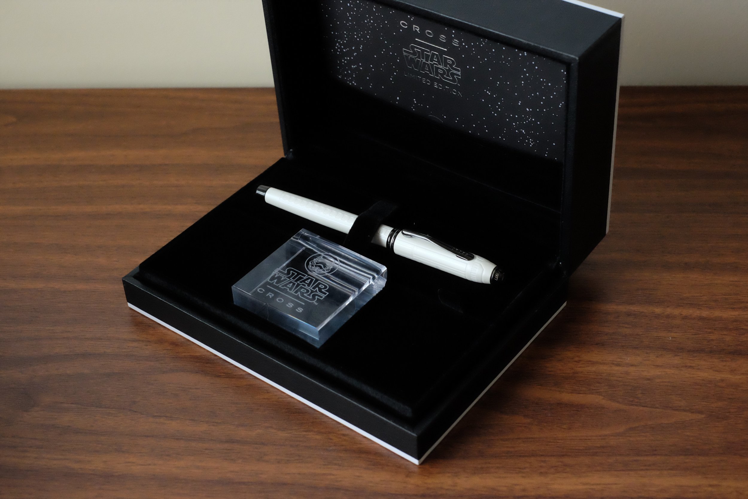
The Cross Townsend Star Wars Pens come with this nifty clear acrylic pen stand. 

Cross Townsend

The Cross Townsend Star Wars special edition pens received a lot of press at their initial release, in connection with Star Wars: The Force Awakens back in 2015. While most commentary directed at these pens focused on the (too high, IMHO) price point, I found the designs well-executed, especially the "Stormtrooper" and "R2D2" pens. Goldspot was kind enough to loan me a Stormtrooper to review, and while I didn't feel comfortable carrying a loaner pen of this value "out in the wild," I did write with it for a bit and have some initial impressions. 

The only branding on this pen is the Imperial logo with a small, tastefully executed "Star Wars" imprint (with LFL trademark, as was probably required). 

What I liked: 

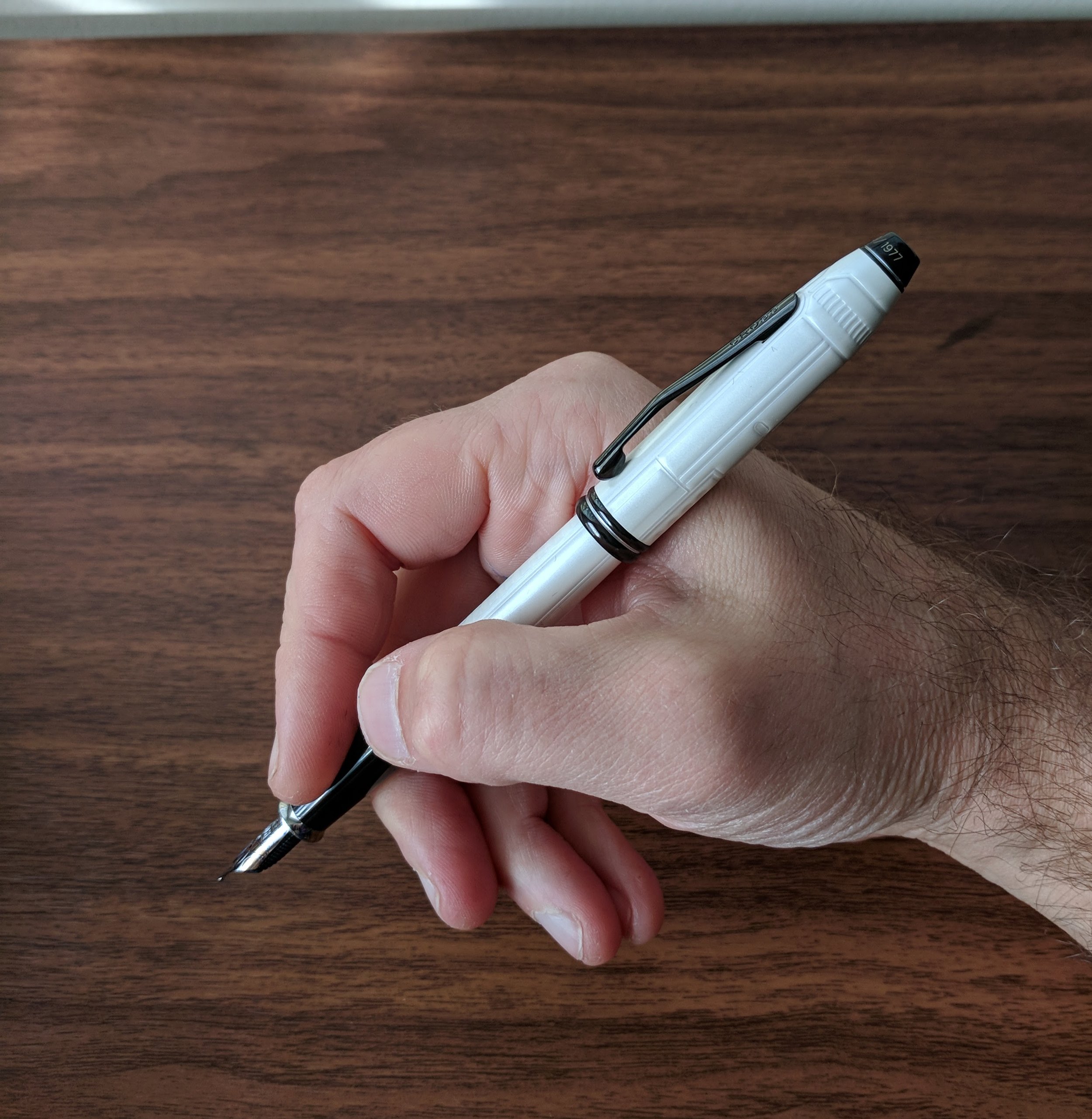
  • Design: The Star Wars theme is understated and not at all gaudy. As you can see from the pictures, a small Imperial logo appears on the back side of the cap, and I love how the limited edition run ends at "1977." The pen is a pleasant shape, and comfortable to use either posted or unposted, though when posted the cap wiggles and rattles a bit. 
  • Nib: The medium two-tone 18kt gold nib on this pen is an outstanding writer - wet and smooth, though the pen writes more like a broad than a true medium. While Cross makes most of its nibs in-house (with nibs on certain models made by Sailor Japan), this nib both looks and feels like a Pelikan nib. Why? Because apparently Pelikan is also making nibs for Cross. Pelikan is not an inexpensive brand - in part because of the craftsmanship that goes into their excellent nibs, and I suspect that drives up the price on these pens. (More on that below in "What I did not like").  

Look familiar? The nib on the Townsend looks remarkably similar to a Pelikan M400 nib, though it's 18kt instead of the standard Pelikan 14kt. (It's also an exceptional writer.)

What I Did Not Like: 

  • Price. While it's a nice pen, the $575 price bumps you into Pelikan M800 territory. I'm aware that die-hard Star Wars fans who also love fountain pens have snapped these up, but I likely will take a pass because $575 is a LOT of money. Even once you factor in the Pelikan nib, the comparably-sized Pelikan M400 starts around $350. 
  • Cap and Clip. Not the design, but the construction. The cap is friction-fit, and there's a bit too much wiggle, both when the pen is capped and posted. The clip isn't spring-loaded, and the folded metal construction looks like a minor upgrade from those used on much less expensive Cross pens. The fit and finish here doesn't rise to the level of a nearly $600 pen.  

The clip design and construction on the Townsend didn't exactly blow me away. 

Overall, the pens that I would consider comparable to the Cross Townsend would be the Aurora Ipsilon, the Parker Sonnet, and - with respect to the nib - the Pelikan M400. All of those pens are excellent, and the Parker and Pelikan are personal favorites, but they sit at a price point well below what Cross is asking for here. 

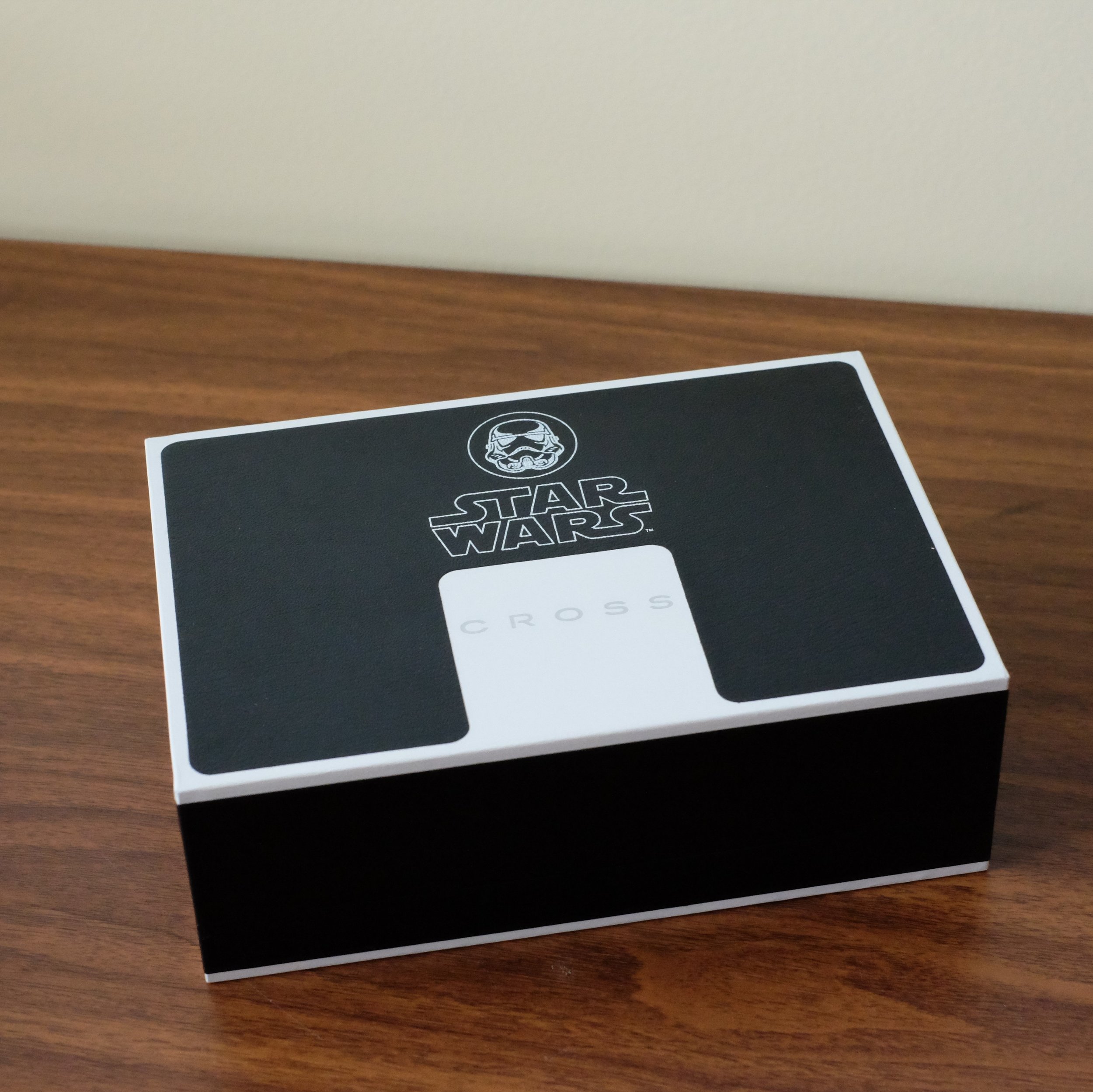
View fullsize Cross Townsend Box
View fullsize Cross Townsend in packaging
View fullsize Cross Townsend Unposted
View fullsize Cross Townsend Posted

Cross recently announced the release of three new limited edition Townsend pens in the following themes: Han Solo, Chewbacca, and Boba Fett. 

The Sheaffer Star Wars Pens

Though I'm a semi-die hard Star Wars nut, I probably couldn't justify the purchase of the Townsend. Sheaffer, on the other hand, knocks it out of the park with their latest release, coming in at just over or just under $20, depending on whether you go with the rollerball or fountain pen version.

Why did both Cross and Sheaffer decide to jump in on the "Star Wars" pen game? For starters, they're the same company. Cross acquired Sheaffer from Bic in late 2014, so it's a fair assumption that these two pens are part of the same overall branding strategy/collaboration between Disney (which now owns the rights to Star Wars) and Cross. 

I love that Sheaffer has now decided to include the white dot on all their pens, resurrecting an iconic trademark that used to appear only on high-end models. 

Personally, I think the Sheaffer is the better pen of the two, all things considered. It's an inexpensive pen, yet at the same time feels well made. When I first saw pictures of these pens posted online, I expected cheap, thin plastic fountain pens with a cellophane/plastic wrap decoration applied to them that would flake and peel off over time. Not the case. The Star Wars detailing is either painted or a well-applied decal. Sure, it might wear away over time, but it's a $20 pen. Construction-wise, the plastic on these pens feels pleasantly thick and sturdy, and probably would withstand minor drops onto a hard surface.

The nib selection is excellent, as long as you like medium! Each design is also available as a rollerball pen, which accepts Sheaffer's "Gel Rolling Ball Refill." This refill may be proprietary - I've not found another refill among my collection that fits but check out Ana's refill guide for possibilities. 

The Sheaffers also offer a great writing experience, especially at the $20 price point. The round section is soft rubber, so it's grippy and very comfortable to use. These nibs won't win any awards for character, but for a workhorse stainless steel nib on a cheap fountain pen, the quality was consistent across both pens that I tried, with the Sheaffer writing a wet line without any skipping. The pens are a bit long posted but they're also very light so I could go either way. Well done, Sheaffer!   

Writing Sample, in black gel and fountain pen ink. The Sheaffer fountain pen comes with one Sheaffer proprietary cartridge.

If you're interested in ordering online, Goldspot has the full range of Sheaffer Star Wars pens in stock, in both fountain and rollerball.  Many thanks to Goldspot for making this review possible! 

Further Shopping Options

Finally, if you're a fan of Bic products, or simply want to spend even less money to scratch your "Star Wars" itch, you'll want to check out the Star Wars-themed Bic ballpoint pen, Bic Multipen, and Bic Mechanical Pencils. Oddly, I've not seen these carried in any office supply stores - and I've looked pretty hard - so you may be limited to ordering online.  (The other day, I could swear I saw a Star Wars-themed Bic cigarette lighter that said "Join the Dark Side," but now I can't find it anywhere. Must've ruffled a few feathers and been pulled.)

Disclaimer: The Cross Stormtrooper pen and the Darth Vader Sheaffer fountain pen were sent to me by Goldspot for review purposes (the Stormtrooper pen on loan). This post contains affiliate links.  
In Pens Tags Star Wars, Townsend, Pen Review
Comment
The three pens on the left have sold via Instagram. Starting on the fourth from left, (1) new Parker Urban; (2) Cleo Skribent Classic Piston Filler; (3) Cleo Skribent Color; (4) Delta Rediscover Pompeii; (5) Delta Journal; (6) Montegrappa White/Ruth…

The three pens on the left have sold via Instagram. Starting on the fourth from left, (1) new Parker Urban; (2) Cleo Skribent Classic Piston Filler; (3) Cleo Skribent Color; (4) Delta Rediscover Pompeii; (5) Delta Journal; (6) Montegrappa White/Ruthenium. Check the "For Sale" page for pricing details.  

The "For Sale" Page is Live Again!

November 2, 2017

I didn't make quite as much progress as I thought I would cleaning out my drawers and closets, but I have an initial batch posted for resale now (all fountain pens). Check the "For Sale" page over the next week or so, as I plan on adding some inks, pencils, paper, and potentially more pens.

Thanks for all your support!  

In Sale Tags For Sale, Sale
Comment

Pencil Review: The (Palomino) Blackwing Pearl

November 1, 2017

The Blackwing Pearl is the third and - so far - final iteration of CalCedar’s Blackwing revival. Ironically, this was the Blackwing release that I was most excited about, yet it’s also the one that was the biggest letdown in terms of performance. On paper, the Pearl should be my favorite pencil. I love the pearlescent white lacquer, and white pencils are uncommon. Per Blackwing’s description, the Pearl also features “a balanced and smooth graphite core that is softer than the graphite found in the Blackwing 602, but firmer than the graphite found in the Blackwing.” In other words, a dark pencil like the original Blackwing with better point retention for writers. So what gives?

Multiple people have observed that the graphite core in the Pearl smears more than the core in the original Blackwing, despite being firmer. I’ve had the same experience, and for that reason alone I prefer the original Blackwing and/or the 602. I have a thing about being able to write on both sides of a piece of paper, and a pencil that smears and ghosts drives me crazy.

A writing sample of all three Blackwing pencils, plus a "one pass" smear test. Notice the Pearl at the bottom, 

That’s not to say that the Pearl is a bad pencil - far from it - it’s much less smeary than a lot of other pencils, but if I’m shelling out $22 for a dozen Blackwings, and can get a darker line and less smearing and ghosting with the original and a perfectly adequate dark line with the 602, that leaves the Pearl as the odd-pencil-out. (I can actually tell very little difference between the point retention on the original Blackwing pencil and the Pearl, by the way, though the Pearl is slightly harder.)

The three Blackwing finishes, from top: (1) Blackwing original; (2) Blackwing 602; and (3) Blackwing Pearl

As with their other pencils, Blackwing recently revised the design of the Pearl, which now differs from the pencil pictured here. While the Pearl still features the white finish, Blackwing has changed the imprint from black to gold and swapped in a white eraser. I’ve not seen the “new Pearl” in person, so I can’t say for sure how I feel, but this seems like a mixed bag. The white eraser looks nice, but the gold imprint…? I think I might prefer the black.

Takeaways and Where to Buy

Like the other pencils, Blackwing has featured the Pearl’s “smooth and balanced” graphite core in its series of limited edition “Blackwing Volumes” pencils, including the recently released Volume 1, a tribute to the singer-songwriter Guy Clark, and Volume 725, the initial limited edition Blackwing with a “sunburst” finish, based on Bob Dylan’s electric guitar at the Newport Music Festival. For some reason, the Pearl core has appeared in the music-themed editions. Intentional?....

As of 2024, The Gentleman Stationer is now an authorized retailer of Blackwing, so you can purchase directly from us and show your support!

The Pearl (top) compared against the Blackwing Volumes 1, which is a round pencil with a gray wash. 

This review is the third installment of an anticipated multipart review of the various Blackwing pencils on the market today. If you liked this post, please check out Part I - my review of the original Palomino Blackwing with some background on the revival of the brand, Part II - my review of the Blackwing 602, as well as my earlier review of the Blackwing line of notebooks.

Disclaimer: I purchased the pencils featured in this review with my own funds, for my own use. This post contains affiliate links.

In Pencil Review Tags Pencils, Blackwing, Blackwing Volumes, Blackwing Pearl
Comment

Pen Review: 3952 X800

October 30, 2017

Several weeks back Ron at Pen Chalet reached out and offered to send me a pen from a new line out of Taiwan, “3952,” for which Pen Chalet is the exclusive U.S. distributor.  As always, I quickly agreed, since I’m ever on the lookout for pens from brands that I’ve never tried - something that’s rare these days.  

3952 is a division of BonArtek, a Taiwanese writing instrument manufacturer. I have no prior experience with any pens by BonArtek, and to the best of my knowledge, until the release of the 3952 pens, they have not sold any pens under their own mark or the “3952” brand in North America or Europe. “3952” derives its name from the height of Mount Jade, the highest peak in Taiwan at 3952 meters high.  The initial batch of 3952 pens includes three models: a rose wood pen with a metal cap, an abalone shell model, and the X800, which is a larger black and chrome metal pen featured here.

First Impressions

3952 has done a nice job with the presentation and packaging on the X800, which looks high end without appearing ostentatious or wasteful, and is appropriate to the price point of the pen.

View fullsize 3952 Packaging
View fullsize 3952 X800 in Packaging

The pen itself definitely has that a certain “metal pen look”, which you either appreciate or you don’t. The barrel feels like coated brass with an engraved “twist” pattern, and features a smooth chrome section. My pen appears to be very well-machined, with none of the dings, chips, or manufacturing flaws that you see on cheaper metal pens. The smooth section itself is quite comfortable to grip and I haven’t had any issues with it becoming slippery. (As I think I noted in a previous review, one of the ways in which I’m trying to improve my handwriting and overall penmanship is by loosening my “death grip” on the pen. As a result, metal sections haven’t bothered me as much because my hand gets much less sweaty/oily, but I digress.) The pen does post, but the hefty metal cap will make this pen too unbalanced for most people, save those who have very large hands. While I prefer to be able to post my pens, the X800 has a nice balance to it unposted, with the metal section front-weighting the pen.

View fullsize 3952 X800 Unposted
View fullsize 3952 X800 Posted

My favorite feature of the X800 is the cap and magnetic closure. Many modern pens use either a threaded cap, which screws onto the barrel and takes time to deploy, or a friction-fit “snap” closure, which often utilizes a plastic inner cap that can loosen (or even crack) over time. 3952 has chosen to use a magnetic cap that closes very securely with a quarter twist. I also appreciate how the clip is incorporated into the overall design of the pen, similar to the Karas Kustoms Ink. The clip itself is tight with very little wiggle, while still allowing you to slip the pen into a shirt pocket or clip it to a pen sleeve in a bag.

The clip is integrated into the design of the cap. It's not coming loose anytime soon. 

Writing Experience

3952 Pens use a cartridge/converter filling system with stainless steel Bock nibs, which are generally smooth and reliable, but they won’t show you much in the way of line variation or overall “character.” I personally tend to find steel Bock nibs slightly dry. This one was no exception, though skips or hard starts were rare, coming mainly after I had left the pen sitting for over a week.

Factory standard medium nib and section. If you look closely, you can see how 3952 incorporated a curved metal "lip" at the base of the section, which serves as the "threading" for the twist closure.

Out of curiosity, I pulled the stainless nib and swapped in a Bock titanium nib and feed from another pen, which worked perfectly and now this pen is what I would call an insanely good writer. This, of course, is entirely a matter of personal preference, since I prefer more ink on the page than most steel nibs offer "out of the box" and lean towards moderately wet gold nibs for most of my writing. (I typically modify my steel nibs to write wetter than the “factory setting.”) Though 3952 does not offer nib upgrades (at least not yet), you can pull the nib from the X800 and swap in another Bock nib and feed "borrowed" from another pen or purchased separately from a source like fpnibs.com.

If you want to swap a Titanium nib into this pen, you probably will want to use the feed that came with the Ti nib unit, since Titanium nibs generally have heavier flow and the feed channels are cut differently.

Takeaways and Where to Buy

3952 makes a solid fountain pen. The X800 is a comfortable, well-balanced writer with a reliable German stainless steel nib from a reputable manufacturer. The magnetic twist closure on the X800 is probably the trait that most distinguishes the pen from its competition, and one I wish that other pen companies would incorporate, given that slip caps tend to loosen and/or crack over time. 

As I mentioned above, through the end of the year you can purchase 3952 fountain pens from Pen Chalet as the exclusive U.S. distributor. The MSRP on the 3952 X800 is $187. Street price, after incorporating standard discounts/coupon codes, is around $135, which places the X800 in the same price bracket as brands such as Faber-Castell, Diplomat, and Otto Hutt. One pen that the X800 might be comparable to is the Diplomat Excellence. Diplomat pens use JoWo nibs, and the 3952 pens use Bock. JoWo and Bock both make a good nib, but they do have a different feel to them, with Bock nibs typically writing slightly drier out of the box, in my experience. While the X800 holds its own in terms of quality, I suspect that 3952 may gain the most traction with their other offerings such as the Rose Wood and Abalone Shell fountain pens, which are somewhat unique designs at this price point and have received good reviews. 

Disclaimer: The pen featured in this review was sent to me by Pen Chalet for review purposes, free of charge. This post contains affiliate links.
In Pens Tags Pen Review, 3952
Comment

Pencil Review: The (Palomino) Blackwing 602

October 25, 2017

A year after the relaunch of the Blackwing, CalCedar found themselves in the position of having to choose between forging ahead with their new vision for the brand, reflected in the “non-traditional” design of the first Palomino Blackwing pencil, and appeasing the Blackwing purists, who were clamoring for a more “authentic” pencil in line with the vintage Eberhard Faber original.

The result was the Palomino Blackwing 602, which catered to both constituencies by incorporating new design elements while maintaining a “vintage” look. Most notably, the new pencil featured a pearlescent gunmetal lacquer similar to later iterations of the vintage Blackwing, and also reintroduced the classic slogan “Half the Pressure, Twice the Speed,” on the barrel. While some find the tagline nonsensical (and apparently there was some internal debate over whether to revive it at all), it may have its origins with stenographers, who appreciated the pencil for its ability to make dark, legible notations while still maintaining a decent wear rate. CalCedar tweaked the original design somewhat, using a black eraser instead of pink, and omitting the black stripe from the ferrule.  

Blackwing 602 with the black eraser swapped out in favor of classic pink. And, no, I don't chew my pencils. The "teethmarks" are from the excellent Carl Angel-5 sharpener (also marketed as the Classroom Friendly Sharpener). 

Just recently, Blackwing again changed the design of the 602 to bring it even closer to the original vintage pencil, switching the default eraser color from black to pink. Previously, the only way you could get a Blackwing 602 with the “vintage pink” eraser was by purchasing a pack yourself (sold separately) and swapping them out, or by purchasing the Chuck Jones special edition Blackwing 602 (now discontinued).  

The Blackwing 530, one of the limited Blackwing "Volumes", included a black stripe on the ferrule - a design element that appeared on some, but not all, vintage Blackwings. I love the look of the ferrule stripe. 

In addition to different aesthetics, the Blackwing 602 uses a firmer core of Japanese graphite, designed to maximize point retention while at the same time sacrificing as little smoothness and darkness as possible. Personally, I think CalCedar succeeded. The 602 doesn’t have Caran d’Ache Swiss Wood-style point retention (and that pencil is borderline too hard for me), but two Blackwing 602s, freshly sharpened to a long point, will get me through an hour-long meeting at work with heavy notetaking. Someone who writes with a lighter hand than I do might squeeze out even more mileage.

While I love the original Palomino Blackwing, if I had to stock a classroom or an office supply closet with the best Blackwing for most people - I can dream, right? - my choice would be the 602. The Blackwing 602’s combination of point retention, darkness, and looks makes it an excellent choice for everyday work situations, such as when I’m going into a meeting and won’t have access to a sharpener.

Takeaways and Where to Buy

As I mentioned in last week’s review, the original Blackwing pencil remains my favorite simply because it’s somewhat unique to find a pencil that makes such a dark line while remaining usable for writing for any length of time. The Blackwing 602, however, runs a close second, and sees a lot of use at my desk.

As with the original, Blackwing regularly features the 602 core in the Blackwing Volumes special edition pencils, including Volumes 211 (John Muir); 344 (Dorothea Lange); 205 (Jade); 56 (Joe DiMaggio).

As of 2024, The Gentleman Stationer is now an authorized retailer of Blackwing, so you can purchase directly from us and show your support!

I own two of the Blackwing Volumes editions that featured the 602 core: the Blackwing 211 (John Muir) and the Blackwing 344 (Dorothea Lange). The Blackwing 344 features the most recent logo and branding. 

This review is the second installment of an anticipated multipart review of the various Blackwing pencils on the market today. You can check out Part I - my review of the original Palomino Blackwing with some background on the revival of the brand - here, as well as my earlier review of the Blackwing line of notebooks.

Disclaimer: I purchased the pencils featured in this review with my own funds, for my own use. This post contains affiliate links.

In Pencil Review Tags Pencil, Blackwing, Blackwing 602, Blackwing Volumes
1 Comment
← Newer Posts Older Posts →
Store Location
Visit the T.G.S. Curated SHOP
*New* Updated "Best Pens" Guide (2025)
TGS x Hinze Pens Violet Tendencies Taschenstift Fountain Pen
Hierarchies of Fountain Pen Friendly Paper
Allex Scissors arrayed on a desk showing link to desk accessories

Join Our Patreon!
Subscribe to the TGS E-mail List

Featured Posts

Featured
Pilot-Iroshizuku-Yama-Budo-Writing-Sample.jpeg
May 24, 2025
Joe's Picks: Five Favorite Inks From Pilot's Iroshizuku Lineup
May 24, 2025
May 24, 2025
Yamamoto-Gray-Paper-Sampler-Set.jpeg
May 10, 2025
Discovering Unusual Paper: "Paper Tasting" Sets from Yamamoto Paper
May 10, 2025
May 10, 2025
Four-Micarta-Fountain-Pens.jpeg
Apr 19, 2025
Yes, Micarta for me! I finally got my hands on Some Micarta Pens, Plus My Own Special Edition
Apr 19, 2025
Apr 19, 2025
The Gentleman Stationer RSS

© Digital Divide Media, LLC, 2014-present.

All content is the exclusive property of Digital Divide Media, LLC, d/b/a The Gentleman Stationer, including “The Gentleman Stationer” website and trademark, and should not be reproduced without express written permission.  All rights reserved.

All content containing paid advertising, affiliate links, or sponsored content will be plainly disclosed by a disclaimer when/if featured.

Contact Information

Store Shipping Policy and Return Policy

Privacy Policy

Cookie Policy

Terms and Conditions

Powered by Squarespace