• Blog
  • Shop
  • Resources
  • FAQ (Ask TGS)
  • About
  • Archive
  • Contact
  • Sign In My Account
Menu

The Gentleman Stationer

Vintage Living in the Modern World.
  • Blog
  • Shop
  • Resources
  • FAQ (Ask TGS)
  • About
  • Archive
  • Contact
  • Sign In My Account

Ink Review: Sailor Rikyu-Cha

February 24, 2018

One of the things that I love about Sailor inks, aside from their excellent quality and overall versatility, is the range of offbeat colors that Sailor offers. An ink that I picked up last year but only just now got around to reviewing is Rikyu-Cha, a unique green-brown that definitely appears more olive green in the bottle/pen but dries to a brownish shade on the page. 

You can see how green this ink looks when wet. Check out the gallery below, as I've tried to document the color shift from green to brown as the ink dries. 

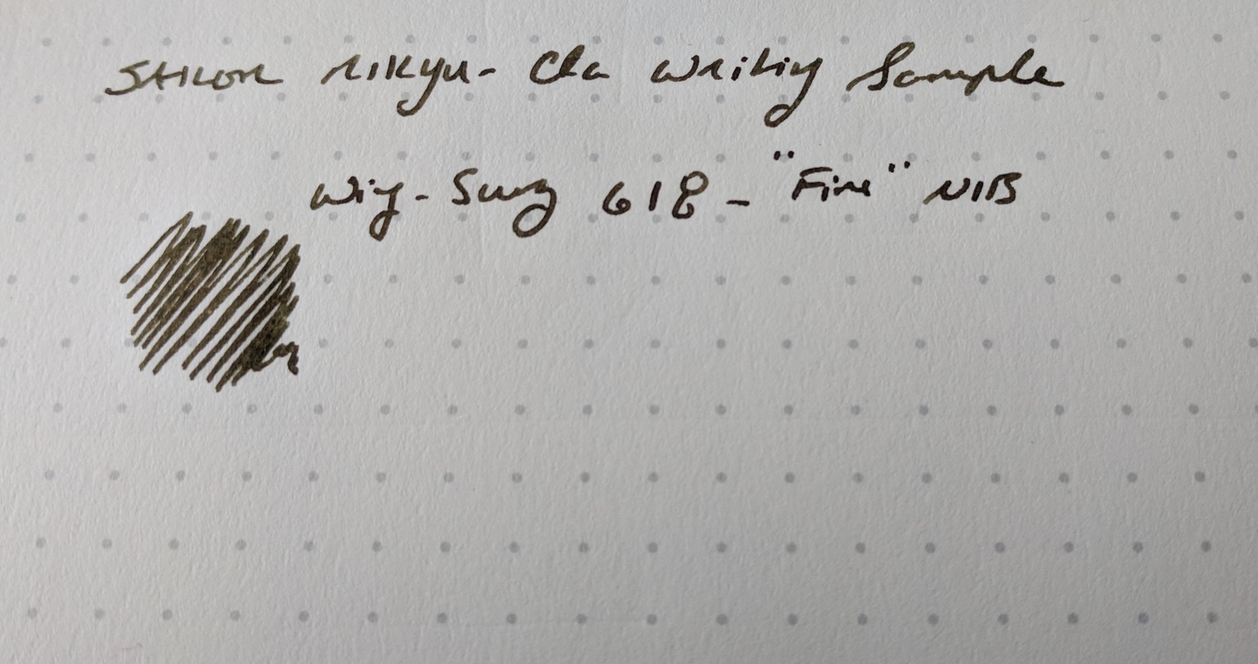
Like all Sailor inks, I've experienced no issues with bleedthrough or feathering. This ink also dries incredibly fast, which combined with it's darker color makes it a good choice for me to use at work. I've had this loaded into a Wing-Sung 618 demonstrator for most of the past two weeks, and have enjoyed the pen/ink combination. 

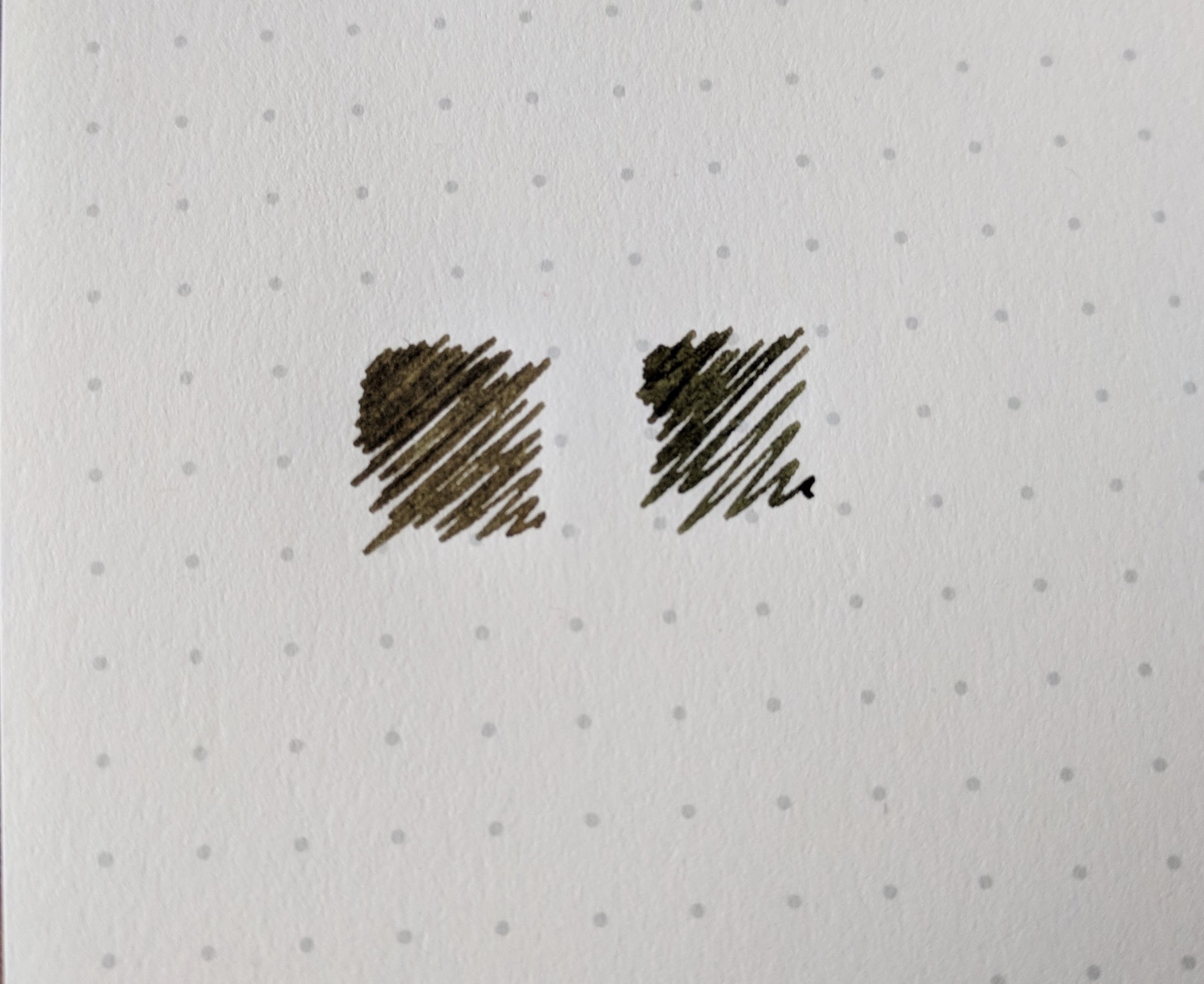
Robert Oster Signature Melon Tea dries quite a bit darker. You can see the green (and even a bit bluish) undertones to the Rikyu-Cha from where I dripped coffee on the swab.  Intentionally, I promise. 

For comparison purposes, the closest ink in my own collection color-wise is probably Robert Oster Melon Tea, though the Rikyu-Cha definitely falls more on the reddish-brown end of the spectrum, and even has a bit of sheen to it.

Sailor Rikyu-Cha Writing Sample
Rikyu-Cha Wet/Dry Writing Sample

Takeaways and Where to Buy

I like this ink, which will definitely stay in the rotation for the foreseeable future. If Rikyu-Cha interests you, our sponsor Pen Chalet stocks the full range of Sailor Inks, and periodically has them on sale. Now that Sailor has reissued certain previously discontinued colors (such as personal favorites Apricot and Epinard), there are 25+ different colors available in the regular line. While the prices have increased in the past few years, Sailor inks still represent excellent value at $18 MSRP.

You can also out some of my previous reviews of other Sailor inks, including: Apricot (a bright orange); Souten (a sky blue); Yama-Dori (a dark teal); Doyou (a dark brown); Epinard (a dark green); Shigure (a dark purple); Miruai (Sea Green); and Nioi-Sumire (a violet blue).  Of course, this doesn't include the seemingly endless array of store-brand inks that Sailor makes for Japanese retailers Bungubox and Kobe Nagasawa. I have reviews of these elsewhere on the site, but there are too many to list them all here! 

Disclaimer: I purchased the ink featured in this review with my own funds, for my own use, though I did receive a slight discount. This post contains affiliate links. 

In Ink Reviews Tags Sailor, Ink Review, Sailor Rikyu-Cha
Comment

Pen Review: Conklin Duragraph

February 21, 2018

I've previously only reviewed one Conklin pen - the Mark Twain Crescent Filler - and came away from that review impressed with both the looks and the build quality. While I felt that the sale pricing on that pen was reasonable, especially given the unique design, I wasn't sure that the feature set on the pen (steel nib, so-so trim) justified the standard MSRP of $175. I did enjoy Conklin's steel stub nib option, however, and spent some time looking for that same writing experience in a less pricey package. 

Honestly, I probably could have gone without this engraved cap finial on the Duragraph, especially since the pen already has "Conklin" engraved on the cap band. But at the $50 price point, you can't always expect absolute elegance.  

Honestly, I probably could have gone without this engraved cap finial on the Duragraph, especially since the pen already has "Conklin" engraved on the cap band. But at the $50 price point, you can't always expect absolute elegance.  

I found it, and, more, in the Duragraph. Out of all the modern Conklin designs, the Duragraph is my favorite. Like the Crescent Filler, it features vintage-inspired style (think 1920's "flat-tops" from Parker and Sheaffer), some unique acrylics that you don't typically see on a pen priced this low, and a good nib. The filling system is cartridge/converter, which isn't really a surprise given the pen's $50 price point. 

The stainless steel stub nib on the Duragraph is the same nib that was on the Crescent Filler that I tested. It writes well, with no significant skips or hard starts. Like many lower-cost steel stubs, this one doesn't have much tipping material, so some might find it a bit crisp or sharp. The nib writes wet enough that I can still describe it as a smooth writer, it's just that this pen won't be considered a gusher like some gold stubs. That's perfectly fine for me, since this is a nib that I can normally use at work on cheaper paper, especially if I choose the right ink.  

This nib provides good line variation. Without much tipping material, the nib will give you a very narrow cross-stroke. 

The Duragraph is a moderately sized pen, and I can easily use it unposted. The hourglass-shaped acrylic section provides a comfortable grip. While the pen does technically post, this makes the pen comically long, like a nightstick. Maybe if you have huge hands this would work, but not for me. 

Yes. 

Ummm, No. 

Takeaways and Where to Buy

If you like the vintage-inspired designs, Conklin should be a brand on your radar in the $40-75 price bracket. Conklin still has a bit of a bad rap in some circles of the pen community, due to the fact that the quality was "spotty" at best when the brand was first relaunched several years ago. It's now owned and distributed by Yafa, and I understand that respected Italian pen company Stipula manufactures the pens for Conklin, or at least many of the components. The quality and consistency are both much better today.  

A close-up shot of the "Cracked Ice" acrylic, which is gorgeous. The Duragraph comes in at least six other variations, including Amber, Forest Green, Ice Blue, Orange Nights (which appears "inspired" by the Delta Dolcevita, R.I.P.), Purple Nights, a…

A close-up shot of the "Cracked Ice" acrylic, which is gorgeous. The Duragraph comes in at least six other variations, including Amber, Forest Green, Ice Blue, Orange Nights (which appears "inspired" by the Delta Dolcevita, R.I.P.), Purple Nights, and an apparently unnamed red and black model. 

While the Conklin Duragraph is widely available from most major pen retailers, I purchased this one from our sponsor Pen Chalet, which currently has the Duragraph available for $52 (and sub-$50 with a coupon code). In my opinion, this represents very good value. As I observed with the Crescent Filler, if you're a fan of vintage pen design, but don't want to mess with expensive restoration and/or the finicky nature of vintage filling systems, modern Conklins represent a good compromise without significant financial investment.

Disclaimer: I purchased the pen featured in this review from Pen Chalet with my own funds. I did receive a discount on the purchase. This post contains affiliate links. 

In Pens Tags Conklin, Pen Review, Duragraph
4 Comments

The fact that "Lamy" is upside down on the clip sort of epitomizes the problems / odd design choices with this pen. 

Pen Review: Lamy Aion

February 17, 2018

Lamy's recently released "Aion" fountain pen is the first pen I've reviewed in a long time that I consider a major disappointment for me. Not because it's necessarily a "bad pen" - it's more that it doesn't live up to the premium price tag and the extreme amount of hype surrounding it. 

Let's start with the hype. When Lamy first announced this pen and the initial pictures hit the pen blogs, people disliked the design and were very skeptical that this large, chunky metal pen could (1) be light enough to comfortably use as the sort of daily workhorse for which Lamy is known; and (2) be competitive at the $90 price point. Once the pen arrived in stores, however, some changed their tune. The Aion has received glowing reviews, and I read that someone referred to this pen as a "Lamy 2000 killer." My reaction: "Are you kidding me?" 

Three Lamy Pens (from left): the Aion, the Lamy 2000, and the Studio.  Links are to prior reviews I did of the other two pens. 

Three Lamy Pens (from left): the Aion, the Lamy 2000, and the Studio.  Links are to prior reviews I did of the other two pens. 

The Aion's design, in my opinion, falls more in the "big and clumsy" bucket alongside the Lamy Dialog 3. Unlike the Dialog 3, however, the Aion isn't heavy. It's more that the pen is just unwieldy, posted or unposted. If it were just a hair shorter and a touch slimmer, it might be perfect, but I can't get this pen to feel comfortable in my hand.

View fullsize Lamy Aion Posted
View fullsize Lamy Aion Unposted

On a pen, size and weight are purely matters of personal preference. People also have their own design preferences. The major annoyance I have with this pen, however, relates to build quality: the cap spins freely and rattles when the pen is closed. To me, this is a design flaw that makes the Aion feel like a much cheaper, lower-quality pen. The Studio shows that Lamy knows how to make a metal pen with tight tolerances, where the cap snaps closed securely, so I'm not quite sure what's going on here. But I do know that if I'm going to be asked to pay $70-plus for a pen, any sort of rattling or loose fit is unacceptable, especially coming from an established company like Lamy with a long history in manufacturing that presumably knows how to do it right. Three different Aions that I've handled have had the cap-rattle issue. If this is a design choice by Lamy, I consider it a bad one that prevents me from enjoying the Aion as a premium pen.  

Note the rounded look on the Aion's stainless steel nib, which many have compared to the nibs on Montblanc's "M" series and "Starwalker" pens.

I agree that the slightly tweaked stainless steel nib looks great and writes well. The clip on the Aion also looks very nice (strange upside-down typography notwithstanding). Overall, however, the fit and finish on this pen are underwhelming, and leaves me with the impression that Lamy went looking for a pen that would be extremely inexpensive to manufacture, but could be sold as an intentionally "minimalist" product at a premium price. I'm all for clean lines, form-follows-function, Bauhaus-style design, but the whole package on the Aion is lackluster.  

Takeaways and Where to Buy

Lamy set the MSRP on the Aion at $90. Most retailers have it listed at $71, which is the same as the same as the steel-nibbed Studio. In my opinion, the Lamy Studio is a much better pen - it's not even a close call. The Studio is better balanced for comfort, the fit and finish are higher-quality, and you have the option to upgrade to a gold nib. The Aion does sport a matte grip section, which some may prefer over the Studio's polished chrome. 

To summarize: I'm not a huge fan of the Aion, but its brutally minimal aesthetic appeals to a lot of people out there. Personally, I think the pen looks unfinished and doesn't feel as high quality as other Lamy pens, especially at this price point. The nib on the Aion, however, is an excellent writer, so there shouldn't be any concerns that you won't get a functioning pen out of the purchase. If you like the Aion, it's widely available from Lamy retailers, including our sponsor Pen Chalet, priced at $71 (and less with applicable discount codes). 

Further Reading

Other people have a different opinion on the Aion, and I acknowledge that I'm being a bit contrarian here. To read some other takes, check out this review over at the Pen Addict, Ed's thoughts at EdJelley.com, and Pete's review over at PeteDenison.net. 

Disclaimer: I received this pen from Pen Chalet free of charge for review purposes. This post contains affiliate links.  

In Pens Tags Lamy, Lamy Aion, Pen Review
11 Comments

Leather Goods from Baron Fig: The Guardian and The Sheath

February 15, 2018

Baron Fig has recently supplemented their accessories lineup to include a whole slew of new colors. While I’ve written much about Baron Fig’s pens, notebooks, and paper, I’ve never reviewed any of their leather products. Here, I’ll take a quick look at two that I recently received.

“Guardian” Confidant Cover

The Guardian is a high-quality leather cover for Baron Fig’s flagship product, the Confidant notebook. Available in two sizes, “Flagship” and “Plus”, the cover adds some protection to the Confidant’s cloth cover, which will come in handy if, like me, you tend to use your notebooks over a longer period of time and need the covers to hold up. If you’re a planner person, and you’ve chosen to go with the Baron Fig Confidant Planner for 2018, I’d definitely recommend investing in a leather cover to ensure that your planner survives the full 12 months. A smaller Guardian is also available for the pocket-sized Vanguard softcover notebook, which seems as though it could double as a wallet.

Pictured here is a Baron Fig Confidant (Dot Grid) in the "Plus" size. (Squire and Sheath for scale.) 

Pictured here is a Baron Fig Confidant (Dot Grid) in the "Plus" size. (Squire and Sheath for scale.) 

I appreciate that the Guardian doesn’t add much bulk to your notebook. Initially, the cover is a tight fit, and for the first week or so the front cover of the notebook may not lay completely flat when the notebook is closed. Eventually, the leather stretches out a bit, and it’s no longer an issue. The Confidant still lays flat when the notebook is open.

There is no branding on the front of the Guardian cover. The only Baron Fig branding is an imprint on the back inside flap, which makes for a very clean design.

“Sheath” Pen Sleeve

One of the more practical accessories that Baron Fig offers is the “Sheath” pen sleeve, tailor-made to fit the Squire. I advise against carrying liquid ink rollerball pens in your pocket or loose in a bag - if the tip of the pen accidentally makes contact with fabric, it can ruin your clothes. A close-fitting leather pen sleeve not only protects the pen, but protects you from your pen! (Or from yourself, whichever it may be.)

I do wish Baron Fig had omitted the “sword” motif from the front of the Sheath, and left the Guardian as a more minimal leather sleeve. While I can live with it, and I understand that their brand is based on adding a bit of whimsy to the otherwise staid stationery industry, I can’t help but feel that the imprint cheapens the look of the product a bit.

The Sheath features the Squire's "sword" logo on one side, and a Baron Fig imprint on the other. 

The Sheath is a straightforward product. You slide the Squire (here, the Brass "Key" edition) into one end of the leather sleeve/pouch. It's a tight fit, so no worries about the pen sliding out. 

The Sheath is a straightforward product. You slide the Squire (here, the Brass "Key" edition) into one end of the leather sleeve/pouch. It's a tight fit, so no worries about the pen sliding out. 

Takeaways and Where to Buy

Overall, I’m impressed with the build quality of Baron Fig’s leather goods, all of which are made in the USA. My favorite aspect, however, is the range of available color choices. Rather than your ordinary brown, black, and natural leather options, Baron Fig decided to go with something completely different, offering both the Guardian and the Sheath in Fig Wine (a burgundy-ish red), Charcoal (pictured here on the Sheath), Blue Slate (self-explanatory), Yellowgold (pictured here on the Guardian), Rose Quartz (the recently released pink option), and Light Brown (the conservative “tan” option). I know, for someone who talks so much about “work appropriate” products that won’t turn heads at the office, who would’ve thought that I would opt for the bright yellow leather notebook cover?

You can order the Guardian Confidant cover and the Sheath pen sleeve directly from Baron Fig, via their website. The Guardian starts at $79 for the standard A5-ish “Flagship” version, and $109 for the larger “Plus” version. The Guardian Vanguard is $45. The Sheath pen sleeve costs $24. While these prices aren’t cheap, they’re well within the range of reasonableness for leather goods of this quality.

Disclaimer: Baron Fig sent me the Guardian Confidant cover for review purposes, free of charge. I purchased the Squire Pen Sheath with my own funds, for my own use.

In Accessories Tags Baron Fig, Notebook Cover, Pen Sleeve, Leather, Accessories
Comment

Swabs of the four Kyo-iro Inks from Kyoto TAG

Ink Review: Kyoto TAG Kyo-Iro 02 (Ohara's Morning Snow)

February 10, 2018

During my visit to Vanness Pens in December, Lisa and Mike were kind enough to send me home with samples of essentially the full line of Kyoto TAG inks, save for a couple that were out of stock. If you're unfamiliar with these inks, they're yet another line of specialty Japanese inks developed for specific stores. These inks are made by the TAG stationery store in Kyoto, Japan using traditional Japanese dyeing techniques and named after locations in and around Kyoto.  

Swabs of the Kyo-no-oto inks from Kyoto TAG

The Kyoto TAG inks are divided into two groups: Kyo-iro and Kyo-no-oto inks. So far, I've had the opportunity to use three of these inks extensively: Kyo-no-oto 01 Nureba-iro (a very interesting black ink with undertones of blue and green, as well as some sheen); Kyo-no-oto 02 Imayou-iro (a bright pink ink that's surprisingly usable as an everyday writer); and Kyo-iro 02 Morning Snow of Ohara (a deep blue black/blue-gray). So far, the latter is my favorite of the bunch. 

Morning Snow of Ohara (Kyo-iro 02) which can alternately appear blue-black, blue-gray, or even purplish, depending on the light. 

Kyo-iro 02 / Morning Snow is a softer dark blue that probably falls into the "blue-black" category, though the tone changes depending on the lighting. It's a highly usable, work-friendly ink that shades nicely. Standard blue-black inks can be a bit on the boring side, so it's always fun to find one that has some character.  

All of the Kyoto TAG inks that I've used have been super well-behaved, and I've had no issues using Morning Snow on cheaper copy paper at work, even in a stub nib. This is pretty remarkable to me because I've found the Kyoto TAG inks to be on the wetter side, with above-average ink flow. Morning Snow of Ohara stands a chance of becoming a go-to blue ink for work, since it's interesting, yet at the same time not distracting. Another thing I'll note is how easy these inks are to clean out of pens - I had no trouble quickly flushing the Nureba-iro or the Morning Snow, and even the Imayou-iro cleaned up easily, which is notable for a pink ink. I'd characterize these inks as "safe" to use in most pens (with the proviso that any pink or red carries the possibility of staining). 

View fullsize Kyo-iro No. 02 - Morning Snow of Ohara
View fullsize Kyo-iro Box Label - Morning Snow of Ohara

Takeaways and Where to Buy

For the past month or so I've had this ink loaded into my Montblanc 146 Ultra Black, and I'm on my second fill. I switch inks constantly, and rarely refill a pen with the same ink twice in a row unless I'm at the office or on the road without a new option, so that tells you something about how good this ink is. It's on the list for a full-bottle purchase at the upcoming Baltimore Pen Show. 

You can purchase the full line of Kyoto TAG inks from Vanness Pens. The inks come in 40ml bottles - slightly smaller than the standard 50ml - and are priced at $28 per bottle. Since they're made in small batches and imported from Japan, they're on the pricier side, but there are much more expensive inks out there, and if you're a fan or collector of the Japanese boutique inks you don't want to miss this particular line. 

Disclaimer: Site sponsor Vanness Pens provided me with a sample of the ink featured in this review free of charge, for review purposes. The pictures of the ink bottle and label are courtesy of Vanness Pens, since I don't have a full bottle of this ink at home. 

In Ink Reviews Tags Ink Review, Kyo-iro, Kyoto TAG, Vanness
Comment
← Newer Posts Older Posts →
Store Hours and Location
Visit the T.G.S. Curated SHOP
*New* Updated "Best Pens" Guide (2025)
T.G.S. 2025 Holiday Gift Guide
TGS x Roterfaden TGS_25
Hierarchies of Fountain Pen Friendly Paper

Join Our Patreon!
Subscribe to the TGS E-mail List

Featured Posts

Featured
Cover On the Paper Trail Intro Clip.jpeg
Dec 3, 2025
Introducing "On the Paper Trail," a New Podcast/Video Collaboration with Lisa Vanness of Vanness Pens!
Dec 3, 2025
Dec 3, 2025
Iro-Utsushi-Fine-Dip-Pens.jpeg
Oct 1, 2025
The Pilot Iro-Utsushi Dip Pen (and in General, Simple vs. Fancy Dip Pens)
Oct 1, 2025
Oct 1, 2025
Levenger-Annotation-Pad.jpeg
Sep 20, 2025
Five Boutique Paper Brands I'm Watching Closely and Why
Sep 20, 2025
Sep 20, 2025
The Gentleman Stationer RSS

© Digital Divide Media, LLC, 2014-present.

All content is the exclusive property of Digital Divide Media, LLC, d/b/a The Gentleman Stationer, including “The Gentleman Stationer” website and trademark, and should not be reproduced without express written permission.  All rights reserved.

All content containing paid advertising, affiliate links, or sponsored content will be plainly disclosed by a disclaimer when/if featured.

Contact Information

Store Shipping Policy and Return Policy

Privacy Policy

Cookie Policy

Terms and Conditions

Powered by Squarespace