• Blog
  • Shop
  • Resources
  • FAQ (Ask TGS)
  • About
  • Archive
  • Contact
  • Sign In My Account
Menu

The Gentleman Stationer

Vintage Living in the Modern World.
  • Blog
  • Shop
  • Resources
  • FAQ (Ask TGS)
  • About
  • Archive
  • Contact
  • Sign In My Account

Pen Review: Tom's Studio "The Studio Pocket" Fountain Pen (and Architect Nib!)

April 24, 2024

So why did I choose to review this relatively new, niche product during the T.G.S. 10th Anniversary month? Because it provides a great example of just how much the community has changed in the past decade-plus, both from an enthusiast and retail perspective.

In the early 2010s, when I first rediscovered fountain pens and stationery as a serious interest, the range of available products was still limited to your traditional "legacy" brands (Parker, Sheaffer, Waterman, Montblanc, Aurora, Omas, etc.). Sure, there were a lot of great pens available - including many I wish I had purchased at original retail and currently covet a great deal - but the market lacked many of the offbeat, original designs from smaller makers at a lower price point. There certainly weren't many "pocket" fountain pens available, as that product category didn't take off until Kaweco expanded the Sport lineup and began introducing other popular designs such as the Liliput.

Today, smaller brands from independent makers and/or designers proliferate, such as Tom's Studio, which started out as a very small calligraphy-focused maker but which has gradually expanded into fountain pens, refillable fineliners, fountain pen inks, and even a recently released mechanical pencil. I reviewed the "Lumos" fineliner pens a week or so back, and in the meantime have been looking at two different fountain pens: the "Studio" and "Studio Pocket".

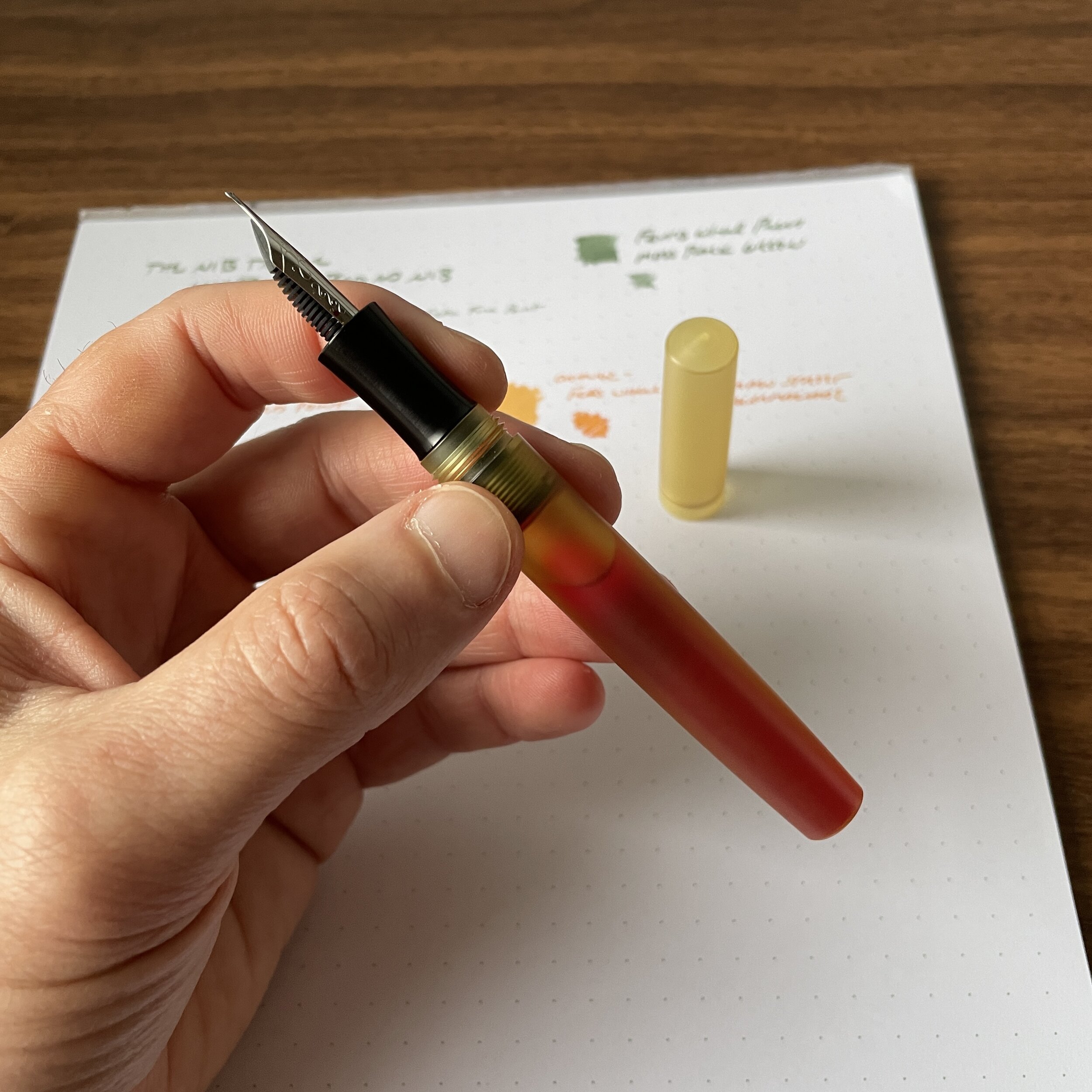
The most interesting design aspect of the Studio Pocket fountain pen is that there are no threads on the cap or barrel. The cap closes using two o-rings embedded into grooves in the barrel section, and this is also how the pen posts. (While o-rings are made of rubber and won't last forever, this type of generic black o-ring is easily replaceable.) Thus far, I've had no issues with the cap staying on the pen or the pen posting securely. I love that there are no threads to interfere with the grip.

Second, when you post the Studio Pocket, it extends to a much larger writing instrument that you typically see with pocket fountain pens. Made from machined aluminum, the faceted cap adds length without adding much weight at all. The pen rests comfortably in my hand and feels well-balanced. Sometimes manufacturers go for designs that are visually interesting but don't really end up working in the "real world" - i.e., when you actually want to write with the pen. This isn't such a situation. Per their own website, Tom's Studio pays careful attention to things like balance and ergonomics. It's not just lip service.

So far my experience writing with the Tom's Studio "Studio Pocket" has been largely positive. In addition to the o-ring posting mechanism, a hallmark of the pen is the long textured section, which is intended to make the Studio Pocket usable regardless of how you hold your pen. The texture comes from machined micro-grooves, which are increasingly common in the machined pen world as a way to minimize the slippage that will inevitably occur with an untextured metal grip.

But What About That Architect Nib:)

Yes, the Architect nib. In recent months, Tom's Studio has received much attention for their interchangeable nib units, which now includes a "Pro Flex" (Zebra G Calligraphy setup), a "Semi-Flex" (your typical stainless steel nib with a longer slit down the midde), a "Cursive Italic" (which I've found to be more of a traditional italic, but that's a matter of preference), and the Architect. So far, the Pro-flex and Architect Nibs are the best of the bunch. This is an amazingly smooth, broad architect-style nib, which at $19 offers incredible value, especially to those who have never tried an architect nib and have been hesitant to send a prized pen off to a nibgrinder simply to experiment. For those new to fountain pens, an architect nib is ground to a wedge-like shape, with narrower downstrokes and broader cross strokes. (You often hear it described as a "reverse stub.") Please note that Tom’s Studio nibs are only compatible with Tom’s Studio pens. These are specially made to fit the Studio and Studio Pocket, and while you may be able to swap them into different housings, I have not experimented with this and it’s not an advertised feature.

I've found broader architect nibs to be more forgiving of writing angles, making this a better option for a stock nib than a finer grind as it should work for more people.

You can read more about why I enjoy architect-style nibs (as well as other nib grinds) in this post. Over the years, the architect has become a favorite custom grind of mine, and it seems crazy that you can now get a stock architect that’s this good at this price point. The narrow downstrokes are compatible with my smaller handwriting, and I love the angular look it lends to my notes. The writing sample shown here is with the stock Tom’s Studio black ink cartridge on Clairefontaine paper.

The Studio Pocket is a pocket fountain pen, and marketed as cartridge-only. Each pen ships with a converter/syringe device that you can use to refill your spent cartridges with the ink of your choice.

Takeaways and Where to Buy

I've been thoroughly enjoying the Studio Pocket, which I opted for in the dark purple "Iris" color. I immediately swapped out the stock fine nib and have been using the Architect's nib nearly exclusively, and I'm fairly confident it will remain installed in this pen indefinitely. The more I use this pen, the more I appreciate the faceted design. It's both a roll-stop and a satisfying fidget toy to roll around in your hand!

Tom's Studio Studio Pocket in Multiple Colors

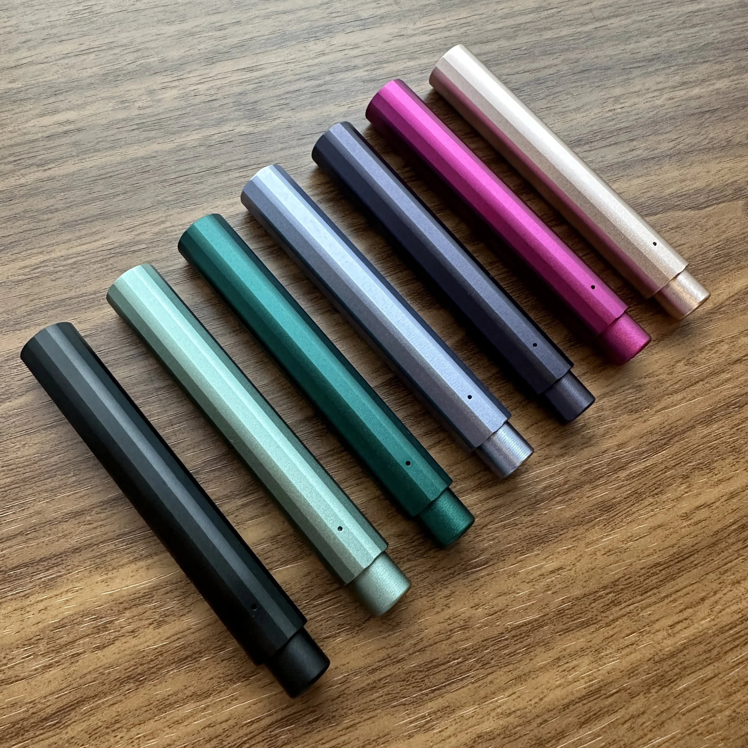
The Studio Pocket comes in seven different colors. From left: Black, Sage, Ivy, Wisteria, Iris, Mulberry, and Blush.

We've recently launched Tom's Studio as a brand in the T.G.S. Curated Shop, and it's been a popular addition. The Lumos fineliners sold out nearly immediately, and we plan to restock them as soon as possible. On the fountain pen side, we have both the original "Studio" fountain pen and the "Studio Pocket" shown here. We currently offer the Studio Pocket in either a fine or medium nib, priced at $108. Specialty nibs are sold separately, though with our next order we may consider stocking the fountain pens with the specialty nibs installed. (That's a bit of an investment, so it totally depends on the overall level of interest.) I do think that $108 +$19 for a pocket fountain pen with two nibs, one of which is a pre-ground architect, represents a decent deal, especially if you're experimenting for the first time with an architect nib and don't want to lay out $50+ for a custom grind.

The Gentleman Stationer is supported entirely by purchases from the T.G.S. Curated Shop and pledges via the T.G.S. Patreon Program.

In Pens Tags Tom's Studio, Tom's Studio Studio Pocket, Architect Nibs
5 Comments

Today’s review pens: a Scriptorium Balladeer and Schon DSGN Ultem Fountain Pen.

Spotlight On: The Nib Tailor, Featuring Architect + Inverted Architect Nib Grinds

September 18, 2021

I’ve known J.C. Ament for years, from way back when he was attending shows as an enthusiast, to when he started dabbling in nib work under his previous brand, Nibs on Point. I wanted to take a moment today to let everyone know about his latest endeavor, in which he’s embarked on nib work full time as “The Nib Tailor.” Before he took a break from pen shows, J.C. sent me two examples of his work for review: a broad “standard” Architect nib that has since lived in my Scriptorium Balladeer, and what J.C. calls an “Inverted Architect,” a nib that I’ve swapped between a bunch of different pens but which now lives in my Schon DSGN Ultem.

Before we get started looking at nib grinds, check out this eyedroppered Schon DSGN Ultem fountain pen, which is shown here holding a full 4ml ink sample!

Before we get started looking at nib grinds, check out this eyedroppered Schon DSGN Ultem fountain pen, which is shown here holding a full 4ml ink sample!

Standard Architect Nib vs. Inverted Architect Nib

For newer readers, or those unfamiliar with specialty nib terminology, an Architect nib (also sometimes referred to as a “Hebrew Italic”) is the reverse of your classic stub or italic-style nib in that an Architect has broad cross-strokes and narrow downstrokes. If the grinder is skilled, you can usually use the reverse side as a needlepoint, or ultra-extra fine, nib.

Architect’s Nib Grind, with the signature blade-like shape. Turn the nib over and write with the tip for an extra-fine line.

Architect’s Nib Grind, with the signature blade-like shape. Turn the nib over and write with the tip for an extra-fine line.

An “Inverted Architect” is, well, the inverse: it’s basically a needlepoint/extra-fine nib with an Architect grind on the top, which you can use if you invert the pen. For my particular writing style and use case, the Inverted Architect serves a unique purpose: annotation and highlighting. I can use the extra-fine tip to take notes in the margins of documents, and the Architect side for highlighting/underlining, provided I select an appropriate ink color such as a bright orange or green.

“Inverted Architect” Nib Grind, with the needlepoint tip and “flat top.”

Writing samples for both a standard Architect nib (top, in Ferris Wheel Press Moss Park Green), and an Inverted Architect (bottom, in Ferris Wheel Press Main St. Marmalade), both inks courtesy of Vanness Pens.

A Word of Caution: If you’re new to fountain pens, or have never used an Architect nib, I would strongly advise you to consider borrowing one from a pen friend or visit a pen show prior to ordering this particular grind. Architect grinds can be a bit temperamental, in the sense that they can go from smooth to scratchy very quickly depending on the angle at which you hold your pen (and they’re not “butter smooth” writers to begin with, since you’re essentially making cross-strokes with a blade). It’s extremely important that the nib grinder understands your writing angle, so if you cannot visit in person, I would send multiple photos of how you hold the pen and the angle at which the nib hits the paper. That said, if you do decide that an Architect nib is for you, this grind gives your writing truly unique character. For those interested in reading further, I’ve previously written posts about various options for nib customization.

View fullsize Ferris Wheel Press Main St. Marmalade
View fullsize Ferris Wheel Press Moss Park Green

The Nib Tailor - Available Grinds and Pricing

The two nibs shown here are just a small selection of what The Nib Tailor has to offer. You can choose from pretty much any custom nib grind, and J.C. has a detailed form for you to complete alongside your inquiry. In addition to custom work (i.e., where you send in your pen), you can purchase pre-ground nibs in various styles depending on availability. Visit the Nib Tailor website for additional details. Pricing is standard, running from $25 for a simple tuning to $55-60 for more complex grinds. In addition to mail-in work and pen shows, J.C. occasionally grinds nibs in-store at Bertram’s Inkwell, and I believe he will be there this weekend. Check out his Instagram for details.

Disclaimer: This is NOT a paid advertisement. That said, I can’t recall whether J.C. gave me these nibs for free, or whether I paid for them. Either way, he’s a friend of mine but I still think he does good work. Given the increased demand for nib work, especially at pen shows, it’s great to see new faces entering the market. It keeps nib work accessible, and ensures that future generations will have the same opportunity to enjoy customized writing experiences!

In Editorial, Unusual Stationery, Pens Tags The Nib Tailor, Architect Nibs, Inverted Architect Nib, Nib grinding, Custom Nibs, Custom Grinds
1 Comment

More Stock Nibs That Offer Line Variation

May 17, 2020

One fountain pen rabbit hole that many people tumble down quickly is nib modification. The emergence of a new generation of nib grinder, nibmeisters, nib workers, nib technicians, whatever your preferred term, has formed a major part of the resurgence in fountain pens and fine writing accessories over the past few years. Having a nib ground makes for a great way to add more personality to your writing, and even a simple nib tuning can improve ink flow and performance on some pens that write “inconsistently” out of the box. While it’s great to have these services available, it can add anywhere from $20-80 to the cost of your pen, depending on what work you have done.

I’ve written before on “stock” stub nibs - that is, nibs available from the factory pre-ground or shaped into a stub italic, which adds line variation to your writing in the form of narrow cross-strokes and wider downstrokes. You can read more about these types of nibs, which are advertised as stubs, in this series of posts titled “Stock Stub Nibs: Exploring Specialty Nibs” and “Exploring Stock Stub Nibs, Part II: Higher-End Options.”

A close-up of the slightly squared off, “stubbish” broad nib on my Montblanc 149.

What I would like to write about today is a bit different: those nibs sold by pen companies as standard extra-fines, mediums, or broads, but which don’t write like a typical rounded nib. Here are a few of my own “secrets”:

  • Lamy Studio 14k Extra-Fine Nib. I have no idea whether other 14k Lamy “Z” nibs exhibit this characteristic, because they tend to be a bit too wet for me and I stick to the extra-fine, but I’ve noticed that this nib shows subtle architect-like qualities. “Architect” or “Hebrew Italic” nibs are essentially the reverse of your classic stub or italic, and show broad cross-strokes and narrow downstrokes. It’s a relatively expensive grind, so if you’d like a pen that writes with this style of line variation, especially one with a gold nib, the “premium” version of the Lamy Studio is an option that I can highly recommend.

  • Platinum Curidas Stainless Steel Medium Nib. One of the more pleasant surprises of 2020 (and there have been relatively few of them), was the medium stainless steel nib on Platinum’s new Curidas retractable fountain pen. Though I had to replace a scratchy, dry fine nib, the medium nib arrived with perfect ink flow and subtle, yet still stubbish, line variation.

  • Lamy 2000 Broad Nib. Sometimes described as a “shovel,” the 21k Lamy 2000 broad nib leaves a broad, wet line with definite stubbish characteristics. I’ve written many pieces on my love for the Lamy 2000 fountain pen (as well as the other versions) in the past, so I won’t repeat myself here.

  • Montblanc Broad, BB, and BBB Nibs. Many high-end pen companies such as Montblanc don’t offer a “stock” stub option, at least not in name. It can be scary to spends as much as $600-$1000 on a brand new Montblanc pen and send it off for nib work that automatically voids the warranty. Standard Montblanc broad, double-broad, and triple-broad nibs can be extremely stubbish to begin with, so if you want a stub, before you make an appointment with a nib grinder, consider ordering one of these stock nib sizes and trying it out unmodified first.

The fairly sharp, squared-off broad nib on my Lamy 2000 Stainless Steel model.

“Stub” Writing Samples

This particular Studio 14k nib isn’t the absolute best example, but you can still see the subtle architect-like shaping of the tipping material. Others I have in my collection might be slightly more pronounced.

Note the slightly broader cross-strokes on the writing sample from the Lamy Studio.

As you can see from these writing samples (all done on Baron Fig Mastermind paper, for reference), if you’re thinking of one of these nib modifications, consider trying stock nibs first. You may be pleasantly surprised. Of course, YMMV with each individual nib, and there is always the chance that you’ll get one that isn’t stubbish at all, or that writes a more or less pronounced line than the ones pictured here. It always helps to let the pen store know exactly what you’re looking for, especially with brands like Montblanc, and they try their best to pick out the best nib for your needs.

These are just examples that I pulled from pens in my own collection. I want to open this up for comments! Are there any other nibs you’re aware of that should be on this list?

Disclaimer: This post contains links to paid sponsors and affiliates.

In Pens Tags Stock Stubs, Architect Nibs, Stub Nibs
2 Comments
Store Location
Visit the T.G.S. Curated SHOP
*New* Updated "Best Pens" Guide (2025)
TGS x Hinze Pens Violet Tendencies Taschenstift Fountain Pen
Hierarchies of Fountain Pen Friendly Paper
Allex Scissors arrayed on a desk showing link to desk accessories

Join Our Patreon!
Subscribe to the TGS E-mail List

Featured Posts

Featured
Joe's-Journals-New-Old.jpeg
Jul 2, 2025
Time to Pick a New Personal Journal: Maruman Mnemosyne Hardcover A5 Journal
Jul 2, 2025
Jul 2, 2025
Desk-Accessoris-Unstaged.jpeg
Jun 25, 2025
Getting Personal: Five "Stationery Adjacent" Items I Can't Live Without
Jun 25, 2025
Jun 25, 2025
Pilot-Iroshizuku-Yama-Budo-Writing-Sample.jpeg
May 24, 2025
Joe's Picks: Five Favorite Inks From Pilot's Iroshizuku Lineup
May 24, 2025
May 24, 2025
The Gentleman Stationer RSS

© Digital Divide Media, LLC, 2014-present.

All content is the exclusive property of Digital Divide Media, LLC, d/b/a The Gentleman Stationer, including “The Gentleman Stationer” website and trademark, and should not be reproduced without express written permission.  All rights reserved.

All content containing paid advertising, affiliate links, or sponsored content will be plainly disclosed by a disclaimer when/if featured.

Contact Information

Store Shipping Policy and Return Policy

Privacy Policy

Cookie Policy

Terms and Conditions

Powered by Squarespace