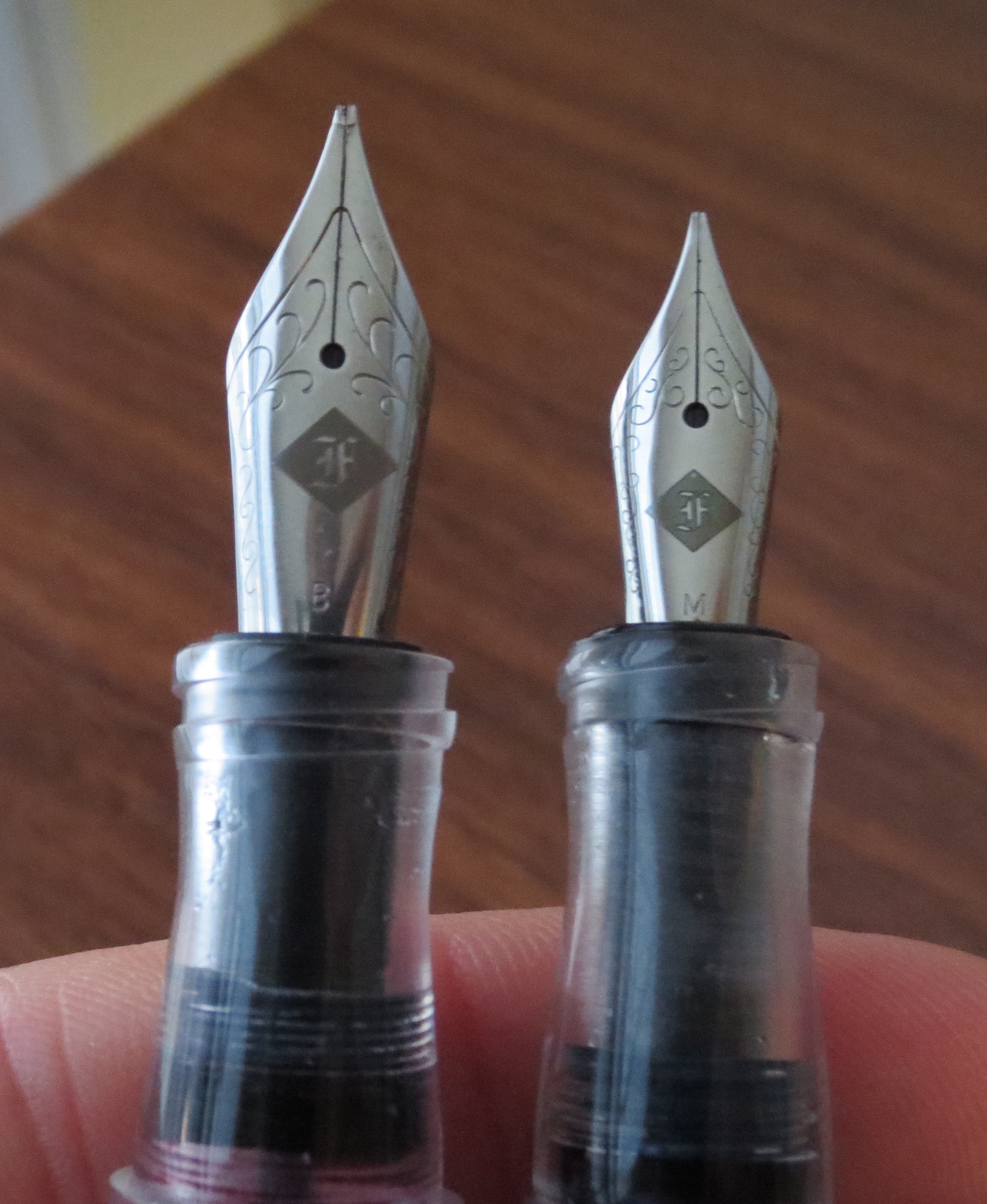
I’ve known J.C. Ament for years, from way back when he was attending shows as an enthusiast, to when he started dabbling in nib work under his previous brand, Nibs on Point. I wanted to take a moment today to let everyone know about his latest endeavor, in which he’s embarked on nib work full time as “The Nib Tailor.” Before he took a break from pen shows, J.C. sent me two examples of his work for review: a broad “standard” Architect nib that has since lived in my Scriptorium Balladeer, and what J.C. calls an “Inverted Architect,” a nib that I’ve swapped between a bunch of different pens but which now lives in my Schon DSGN Ultem.
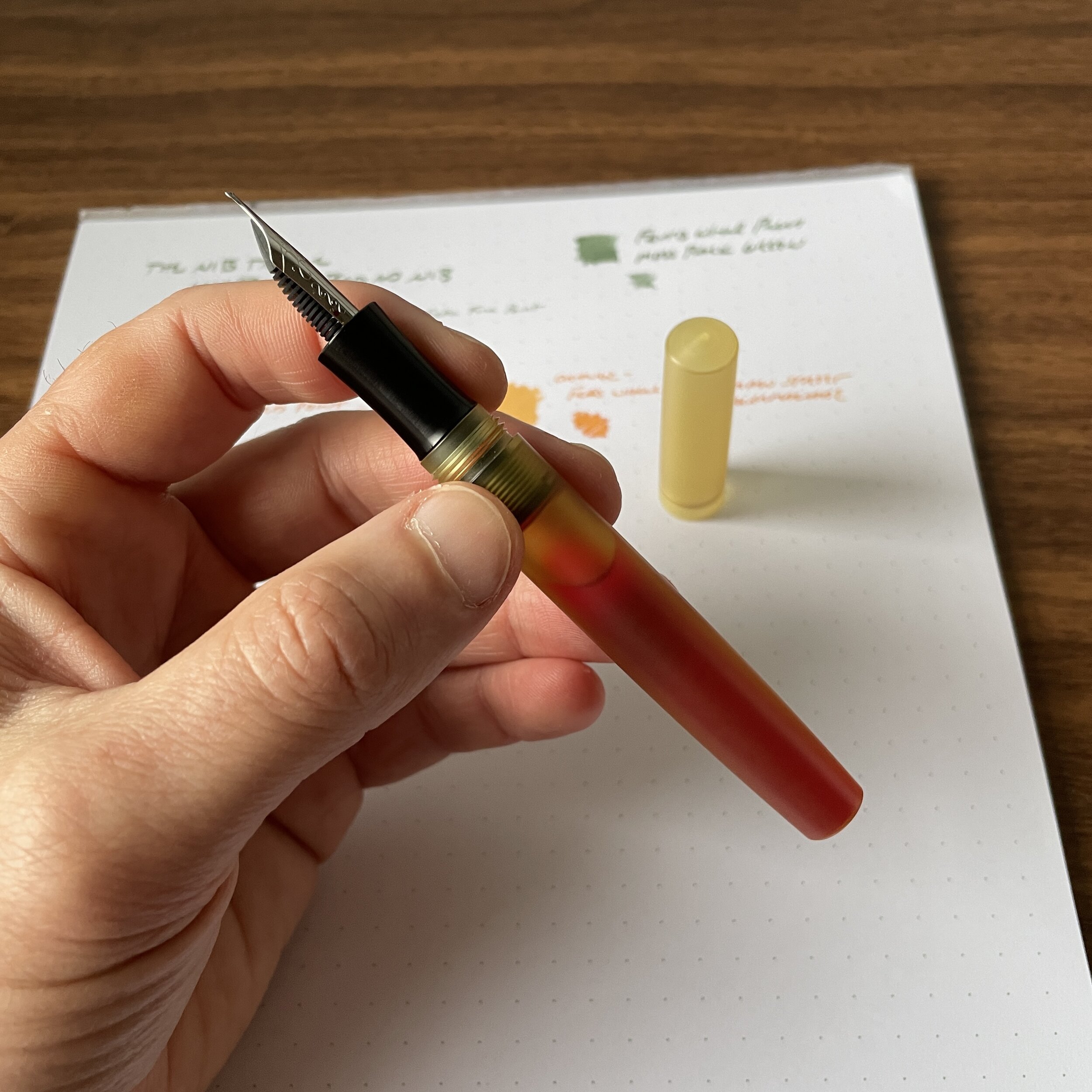
Before we get started looking at nib grinds, check out this eyedroppered Schon DSGN Ultem fountain pen, which is shown here holding a full 4ml ink sample!
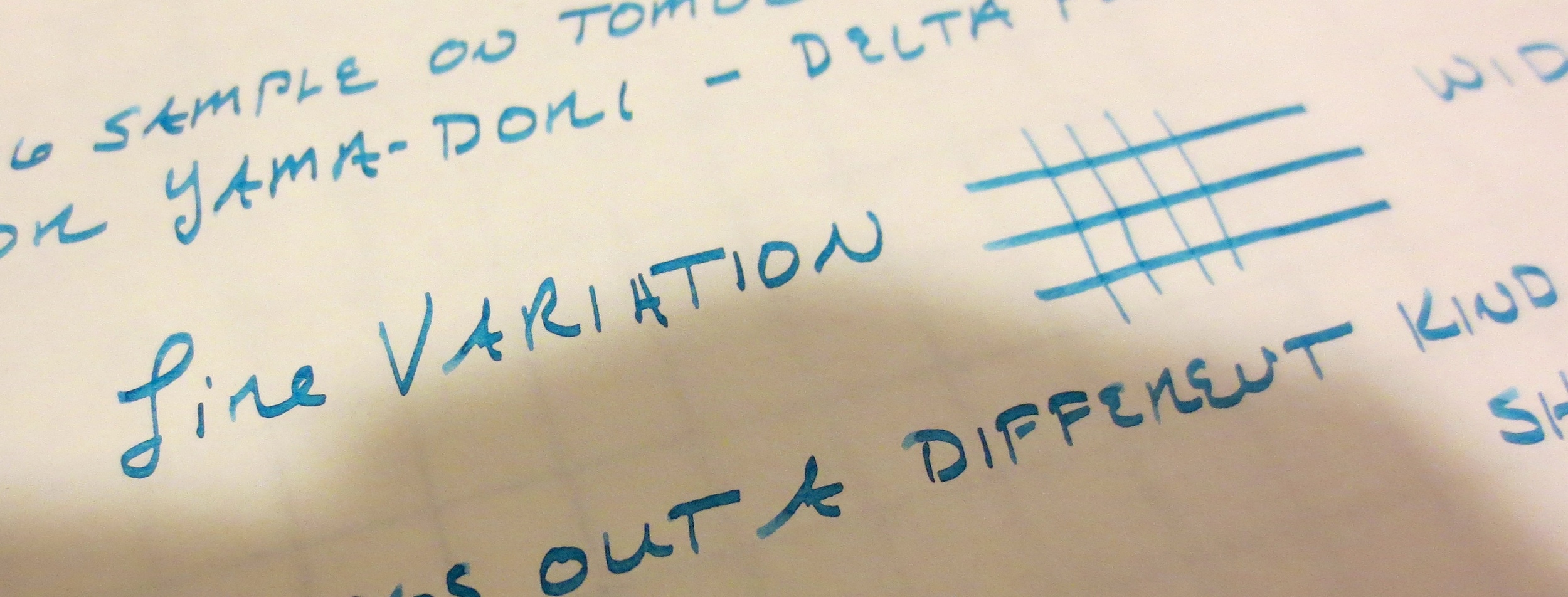
Standard Architect Nib vs. Inverted Architect Nib
For newer readers, or those unfamiliar with specialty nib terminology, an Architect nib (also sometimes referred to as a “Hebrew Italic”) is the reverse of your classic stub or italic-style nib in that an Architect has broad cross-strokes and narrow downstrokes. If the grinder is skilled, you can usually use the reverse side as a needlepoint, or ultra-extra fine, nib.

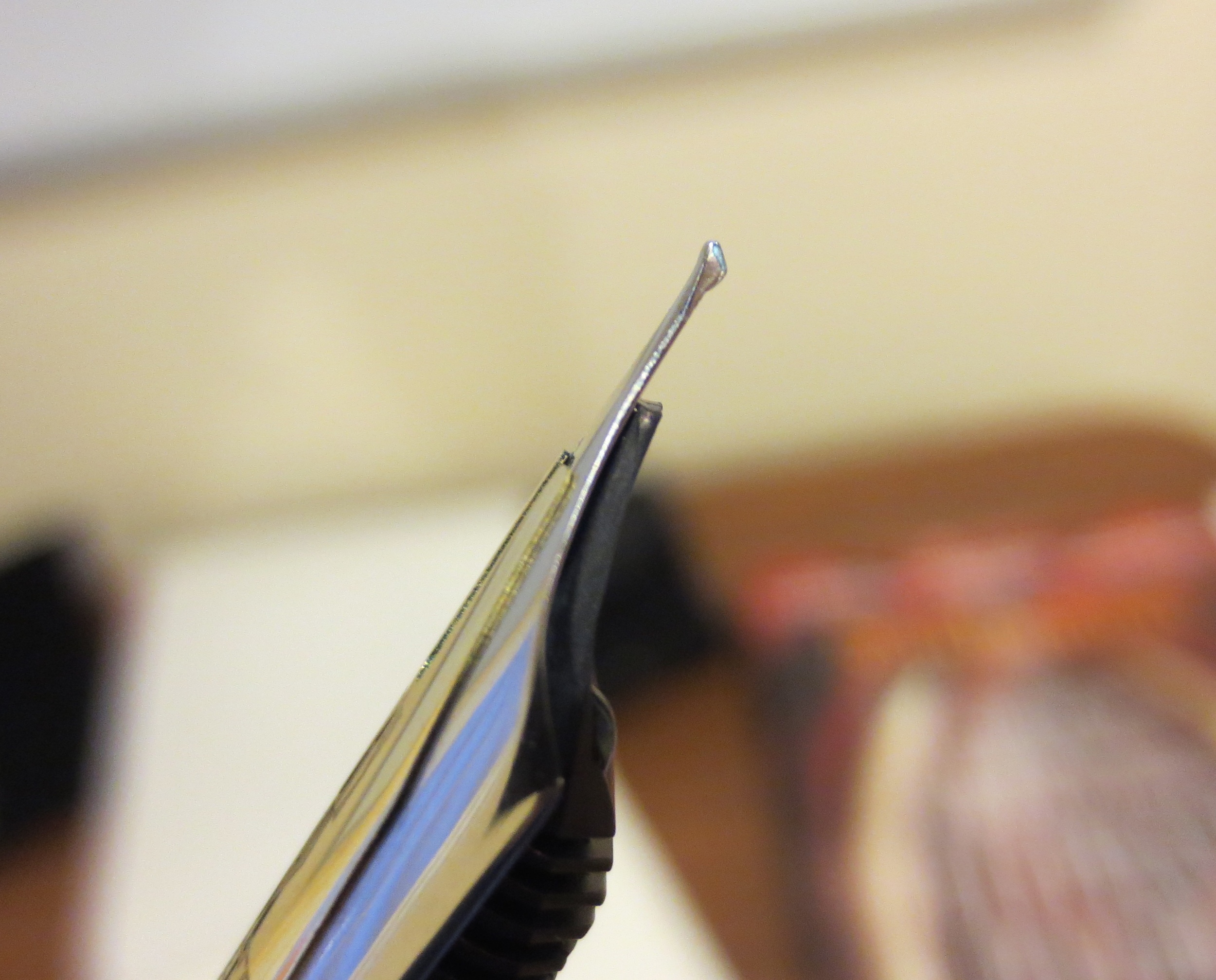
Architect’s Nib Grind, with the signature blade-like shape. Turn the nib over and write with the tip for an extra-fine line.
An “Inverted Architect” is, well, the inverse: it’s basically a needlepoint/extra-fine nib with an Architect grind on the top, which you can use if you invert the pen. For my particular writing style and use case, the Inverted Architect serves a unique purpose: annotation and highlighting. I can use the extra-fine tip to take notes in the margins of documents, and the Architect side for highlighting/underlining, provided I select an appropriate ink color such as a bright orange or green.
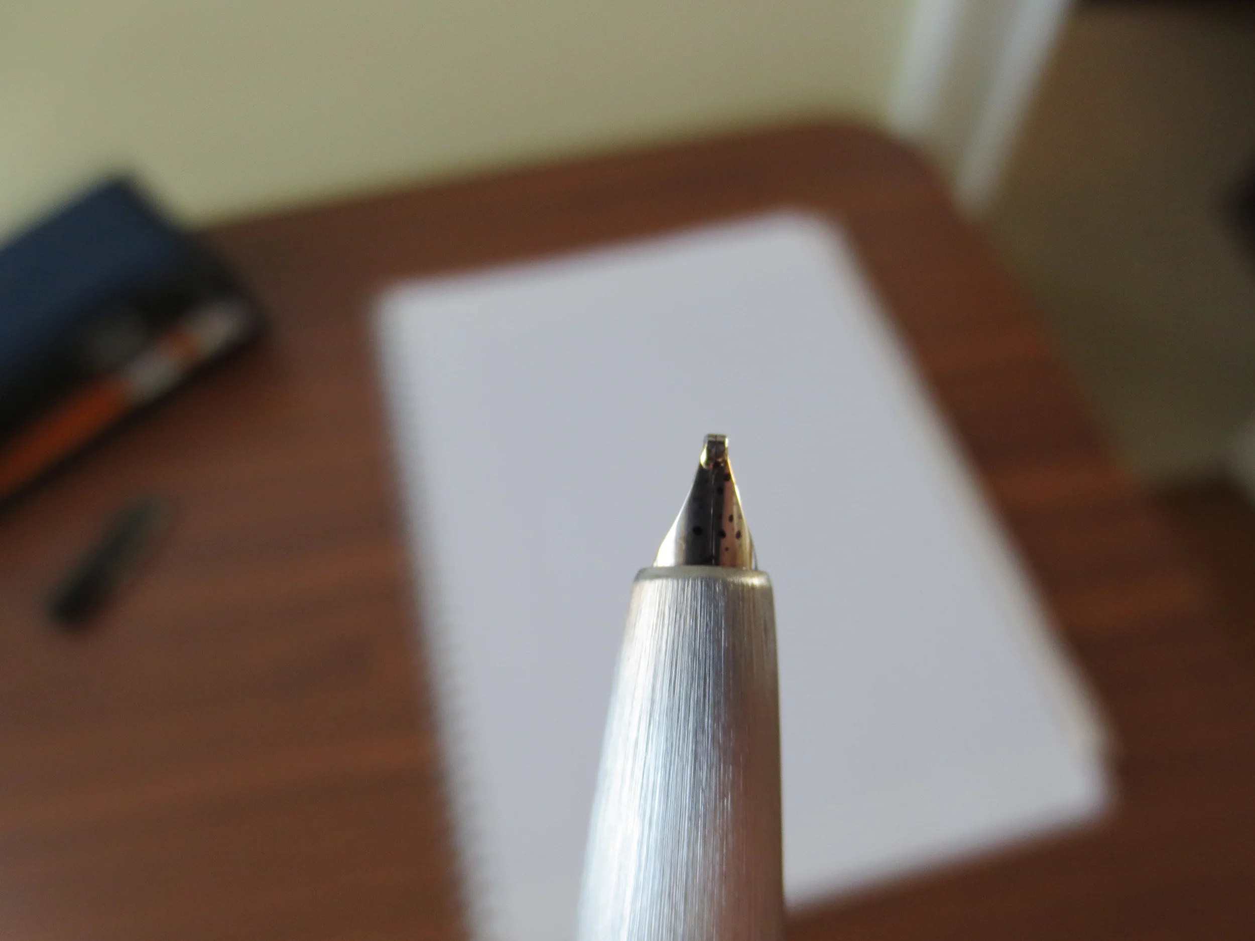
“Inverted Architect” Nib Grind, with the needlepoint tip and “flat top.”
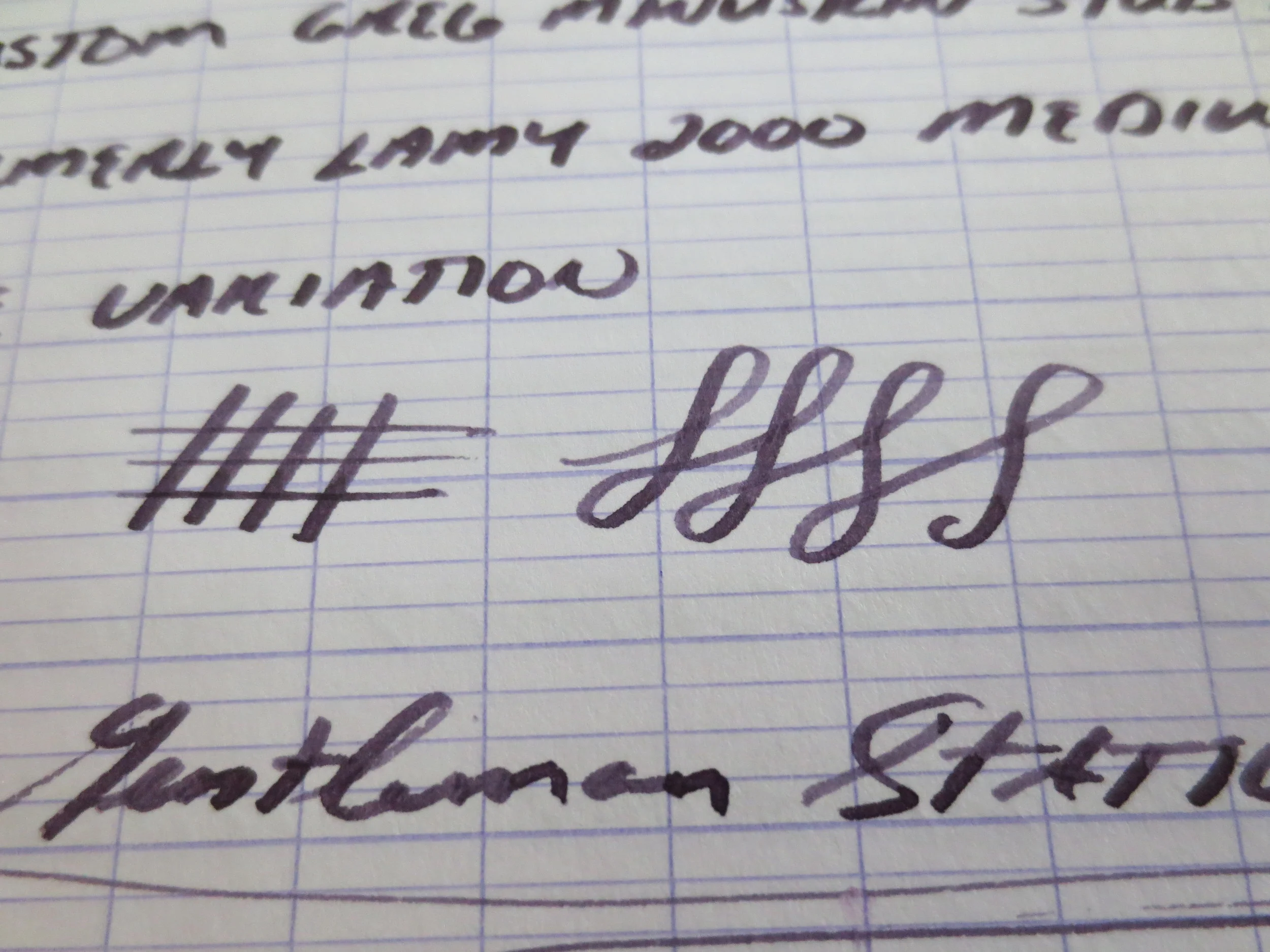
Writing samples for both a standard Architect nib (top, in Ferris Wheel Press Moss Park Green), and an Inverted Architect (bottom, in Ferris Wheel Press Main St. Marmalade), both inks courtesy of Vanness Pens.
A Word of Caution: If you’re new to fountain pens, or have never used an Architect nib, I would strongly advise you to consider borrowing one from a pen friend or visit a pen show prior to ordering this particular grind. Architect grinds can be a bit temperamental, in the sense that they can go from smooth to scratchy very quickly depending on the angle at which you hold your pen (and they’re not “butter smooth” writers to begin with, since you’re essentially making cross-strokes with a blade). It’s extremely important that the nib grinder understands your writing angle, so if you cannot visit in person, I would send multiple photos of how you hold the pen and the angle at which the nib hits the paper. That said, if you do decide that an Architect nib is for you, this grind gives your writing truly unique character. For those interested in reading further, I’ve previously written posts about various options for nib customization.


The Nib Tailor - Available Grinds and Pricing
The two nibs shown here are just a small selection of what The Nib Tailor has to offer. You can choose from pretty much any custom nib grind, and J.C. has a detailed form for you to complete alongside your inquiry. In addition to custom work (i.e., where you send in your pen), you can purchase pre-ground nibs in various styles depending on availability. Visit the Nib Tailor website for additional details. Pricing is standard, running from $25 for a simple tuning to $55-60 for more complex grinds. In addition to mail-in work and pen shows, J.C. occasionally grinds nibs in-store at Bertram’s Inkwell, and I believe he will be there this weekend. Check out his Instagram for details.
Disclaimer: This is NOT a paid advertisement. That said, I can’t recall whether J.C. gave me these nibs for free, or whether I paid for them. Either way, he’s a friend of mine but I still think he does good work. Given the increased demand for nib work, especially at pen shows, it’s great to see new faces entering the market. It keeps nib work accessible, and ensures that future generations will have the same opportunity to enjoy customized writing experiences!