Ink Review: Pilot Blue-Black

Pilot-Namiki Blue-Black is a good workhorse ink:  it's not flashy, but it's reliable in the sense that it works on most types of paper and has a nice, classic blue-black tone that's appropriate for school, business and most other daily uses.  I have this ink in cartridge form (I picked up a package of 10 carts at Kinokuniya during my last visit to New York City), and it finds itself in regular rotation through my Vanishing Point and my Custom 74.  For a blue-black ink, the Pilot ink leans more to the "blue" end of the spectrum, especially when wet, although I would still consider this a "classic" blue-black.  Highly recommended.

As you might notice, the cartridges are proprietary, so you will only be able to use them in Pilot Pens.

Sample Paper is Exacompta Index Card.
Ink Review: Kaweco Blue-Black

My apologies in advance for not having a photograph of the bottle, but this ink was given to me in single-cartridge form by a friend kind enough to loan me a couple pens for review.  Kaweco's expanded line of inks are fairly new (at least in their current bottle form), so there's not many reviews out there of the various colors.  In the brief time I spent with this ink, I really enjoyed it.  It's a blue-black ink that leans more towards the "steel blue" or "blue-grey" end of the spectrum, at least in a drier nib.  As you can see from my photographs, the more ink you lay on the paper, the more pure "blue" color you get in the writing sample. The ink shades nicely and is well- behaved.  The next time I'm in the market for a blue-black ink in this specific shade, Kaweco presents a very valid option!    

I tried this in two pens:  a Kaweco Elite with a broad nib, and a Jinhao x450 with a 1.1mm Goulet Stub.  The ink flowed well in both pens, although it tended to run a little dry in the stub after an extended period.  There was never any skipping or railroading, however.

Here you can see a close up of the shading, and compare the Kaweco ink with the Pilot Blue Black ink Cartridge and the Pilot Hi-Tec-C in Blue-Black, two of my favorite daily writers.

Here's the stub writing sample in close-up, using the previously reviewed Jinhao X-450. 

Pen Review: Kaweco Allrounder

I mentioned to a friend of mine that I was considering purchasing one of the full size Kawecos, and he offered to loan me two from his collection to test out for a day or so:  the Kaweco Allrounder and the Kaweco Elite.  I popped in a couple of Kaweco ink cartridges I had been meaning to try, and spent a long morning trying to decide whether these two pens were the pens for me.  After spending the morning with the Allrounder, I'm not 100% sold on Kaweco's full size pens as opposed to the Sport line.  That said, I'm sufficiently intrigued by the looks of the Kaweco Dia2 that I'm going to wait until I have a chance to try that pen before making a final decision whether or not to take the plunge.

The Kaweco Allrounder is a gorgeous pen.  It's also solidly constructed from machined aluminum, with stainless trim.  I'm a sucker for red pens, so this one had me from the get-go.

Build Quality

The Allrounder is an aluminum pen, much like the AL Sport, though this pen has a round barrel (as the name reflects).  The pen is very well machined and constructed.  Like the AL Sport, I imagine that it will collect some dings and scrapes with use and age, but as with the Sport that will add to the pen's character.  Despite being a metal pen, it's light (one of the virtues of aluminum as a material).  The cap screws on firmly, with no jiggling or rattling, and the clip is secure.  Typical high quality German construction from Kaweco!

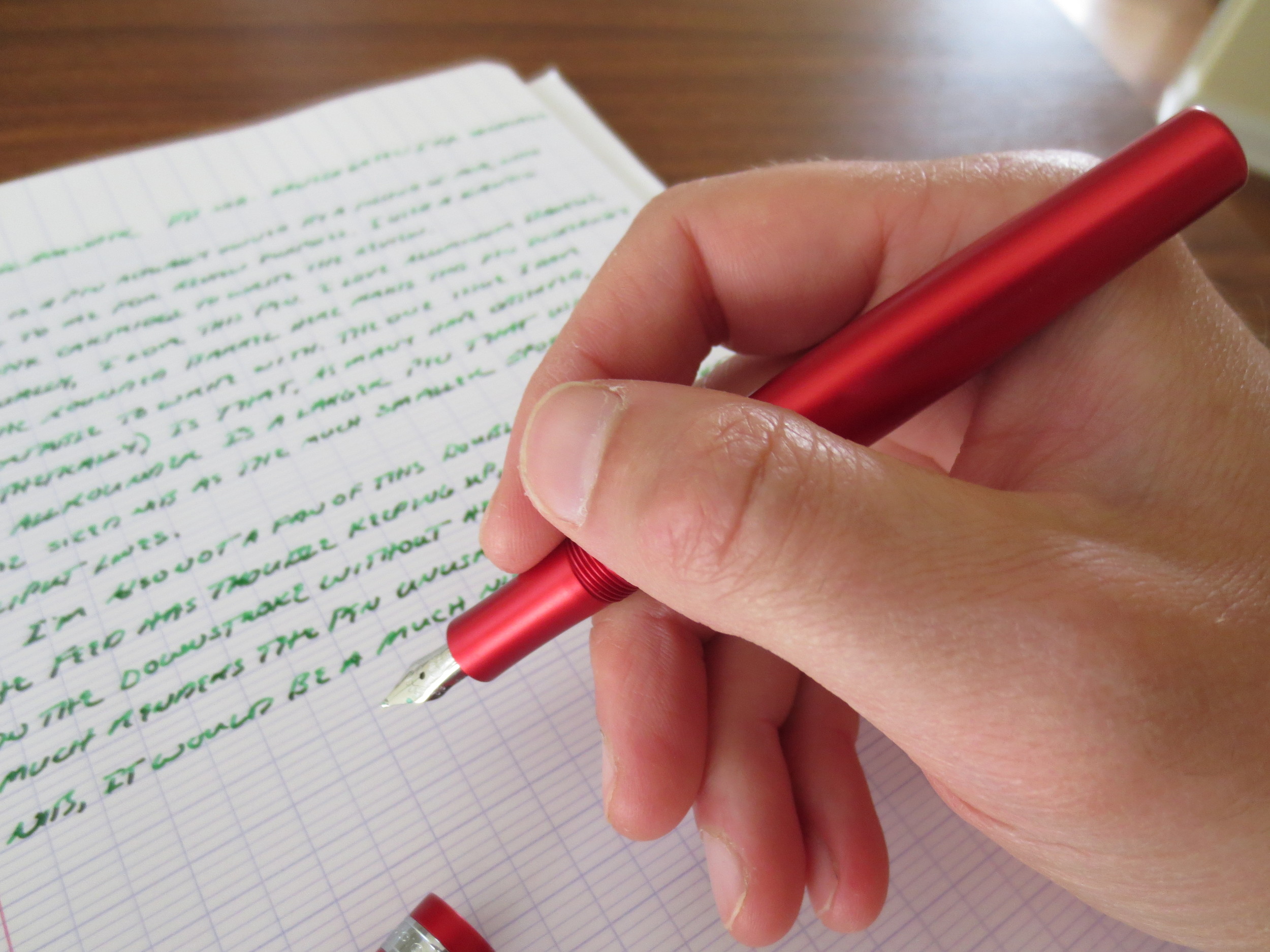
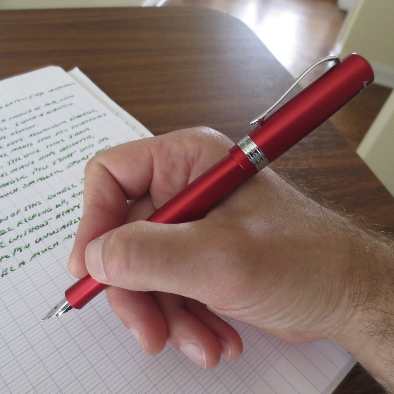
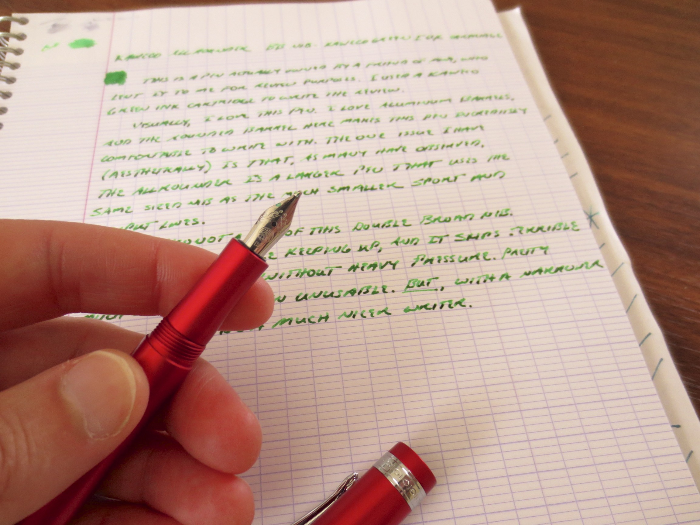
You can get a sense of how nice looking and well constructed this pen is.  Note the nib, which I would venture is disproportionately small to the size of the pen.

The Nib

The nib is where this pen may have lost me.  Much has been made of the size of the nib:  it arguably looks too small for the pen.  Kaweco has used the same great nib from the Sport line, but on this larger pen, it seems a bit undersized.  Also, this particular nib was a double broad.  I'm not one to use a double broad for general day-to-day writing, unless it's a stub.  However, I can still appreciate a smooth, generously flowing B or BB nib when I use one.  This nib gave me some trouble because the ink flow was inconsistent and required me to use heavy pressure in order for the pen not to skip.  If I do end up purchasing this pen (or the Dia2, which also uses this nib), I think I will opt for the fine or the medium.

A Note on the Ink

This review was written with a cartridge of Kaweco's "Palm Green" Ink.  I have to say, I've been extremely impressed with the quality of Kaweco's ink offerings.  The Green is a vibrant green color that is well-behaved and exhibits great shading.  It flushed right out of the Allrounder with one squirt of a bulb syringe when it was time to clean the pen up and return it to my friend.  Once I've worked my way through some of my ink horde over the summer, I may pick up a bottle or two of Kaweco's colors at a pen show, to save on shipping and maybe secure a discount off the relatively steep price of the ink ($14 for 30ml!?). 

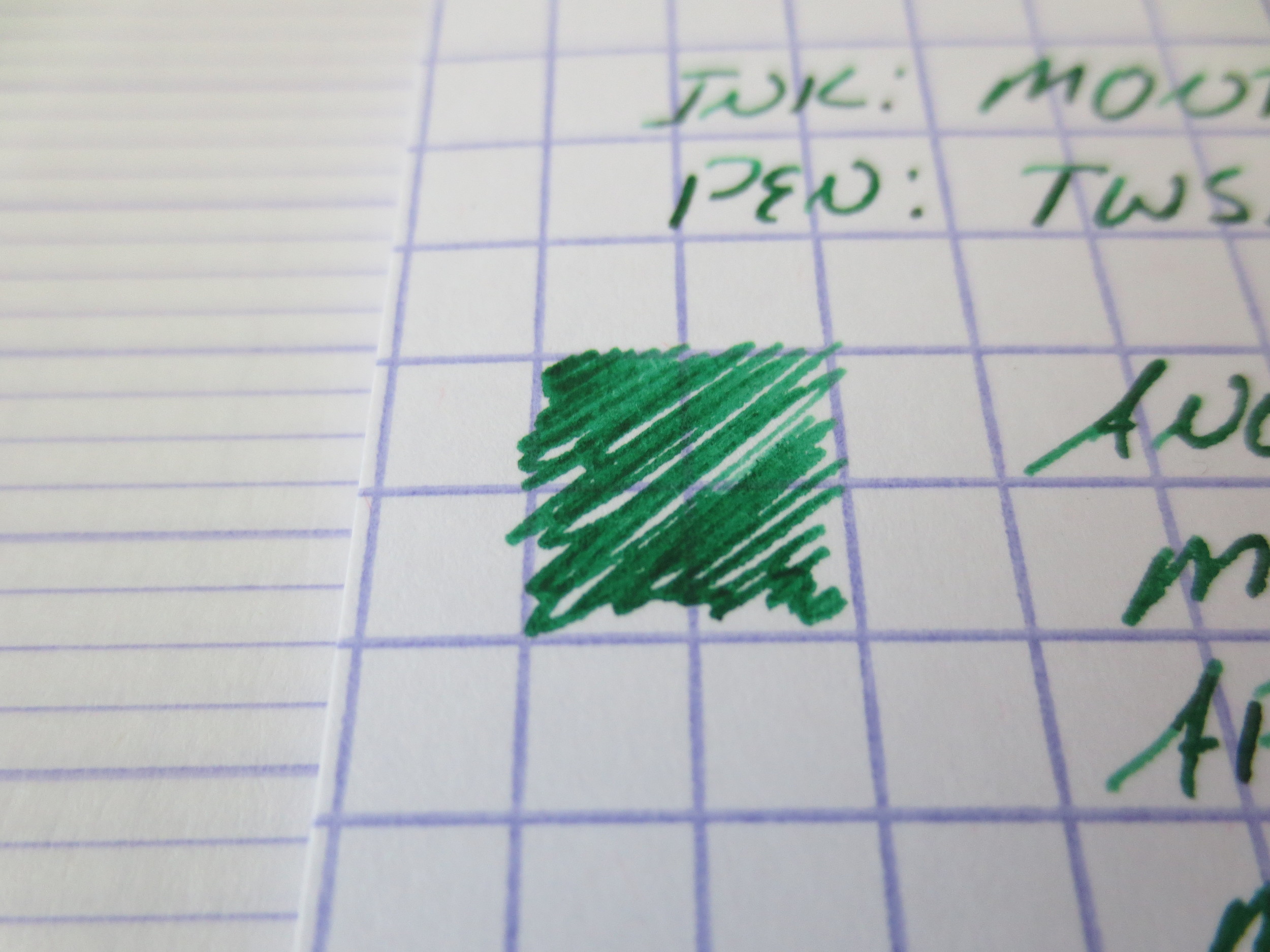
I did a quick comparison with two other green inks I have loaded up:  Franklin Christoph's Olde Emerald and Montblanc's Irish Green.  The Kaweco ink is pretty close to the Montblanc; I would venture to say slightly brighter. 

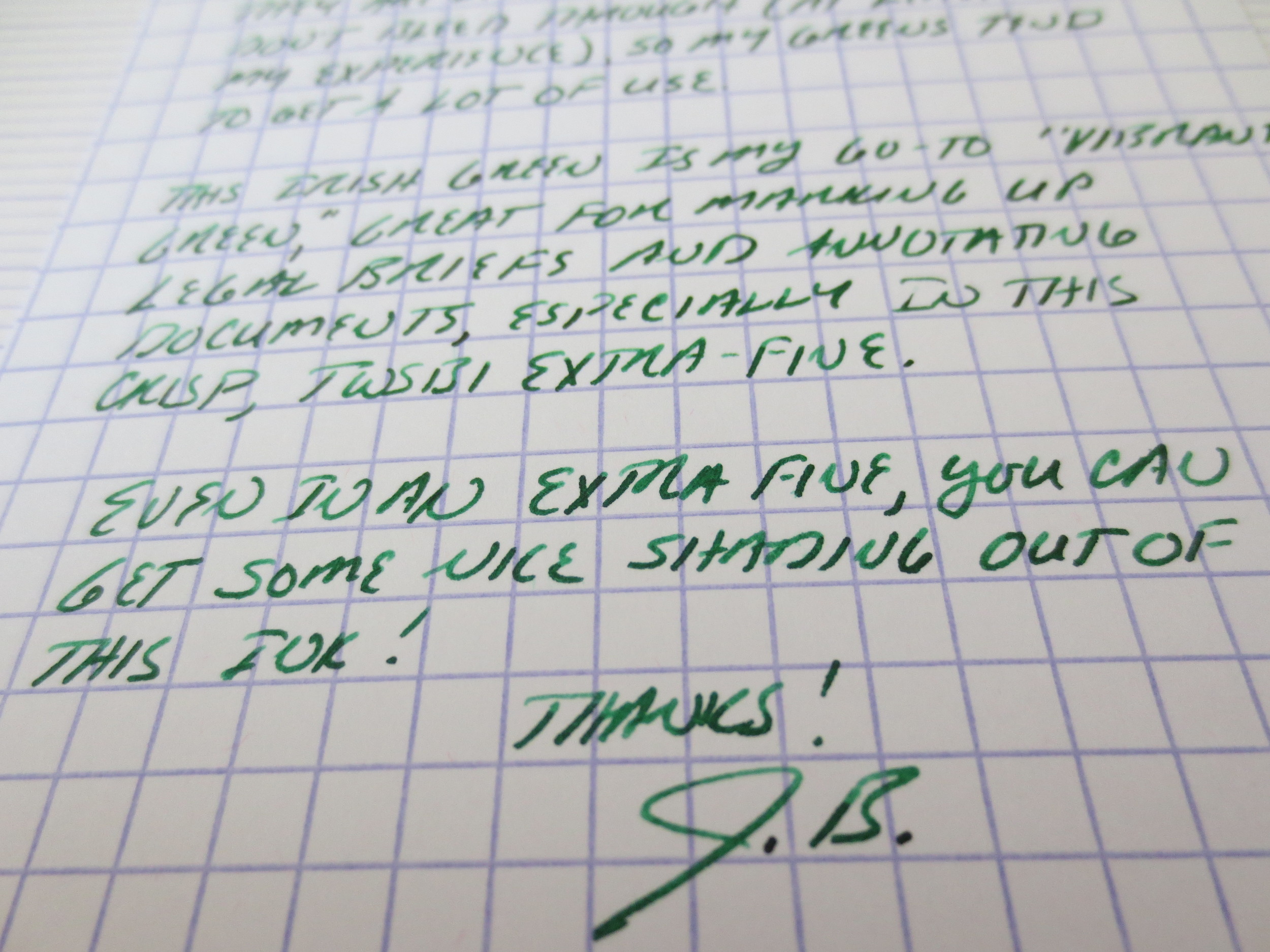
A close-up shot of Kaweco's vibrant Palm Green ink exhibiting gorgeous shading in a double broad nib.

My Verdict

I'm undecided right now.  I LOVE the way this pen looks.  It has everything I typically look for in a good mid-range fountain pen:  good materials, tight tolerances and excellent quality control on the pen's body.  Plus it's red!  Kaweco's double broad nib, however, left me wanting more.  I'm sure with a little tweaking, it could be turned into a fairly good writer, but as I get deeper into this hobby, and at this price point, I'm not so eager to spend time doing nib work or sending it off to be tweaked.  From reviews I have read elsewhere, I suspect the problem may lie with the small feeds used in these pens, which seem to have a hard time keeping up with the ink flow on a broader nib if you write fairly quickly, like I do.  That said, I'd love to try this pen again with Kaweco's medium nib, which I think hits the sweet spot for me in terms of line width and ink flow. 

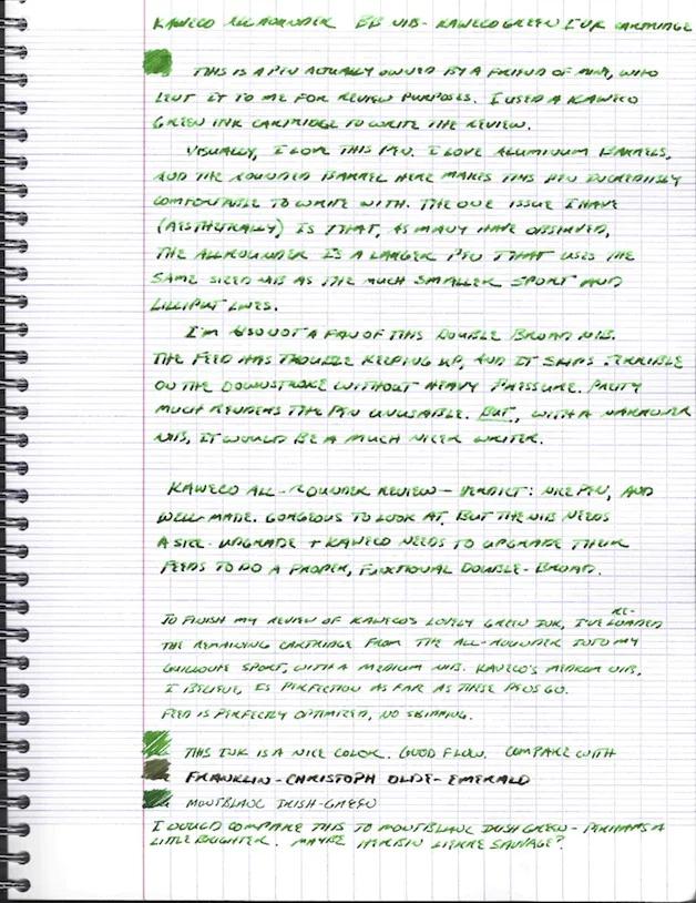
Handwritten review.  As you can see at the bottom, I loaded the remainder of the Palm Green cartridge into my Kaweco Sport with a medium nib.  The flow was much more consistent than the BB. 

Handwritten review.  As you can see at the bottom, I loaded the remainder of the Palm Green cartridge into my Kaweco Sport with a medium nib.  The flow was much more consistent than the BB. 


Ink Review: Montblanc Irish Green

I've worked my way through approximately three quarters of the dozen or so pens I had inked up when I started this blog a month ago.  If you're like me (and I assume most of you reading this are), you'll understand my reluctance to ever flush out a pen when it's still full of ink, even if I've long since grown tired of the color.  It's a completely irrational hesitation, I recognize, because it often amounts to about .2ml of ink from a nearly full 50ml bottle that will take me years to finish, but I digress.....  What I meant to say was that writing all these ink reviews was my way of cleaning out these pens (so I can try new inks, of course).  Now that I'm almost finished, I've got loads of new non-ink review material coming your way. 

I think that Montblanc has some of the nicest ink bottles on the market, up there with Pilot-Namiki Iroshizuku and the Akkermans.  I need to get my hands on some of the vintage Montblanc "shoe" bottles, which have a more rounded shape. 

But in the meantime, I present to you Montblanc's Irish Green.  The name is self-explanatory--it's a very bright, "Happy St. Patrick's Day"-type green ink that I would label a "Kelly Green."  No comparison to the Diamine by that name is intended--I've never tried it.  I use this ink for multiple purposes:  annotations, personal/work notes, and even some limited correspondence, although I write very few letters these days.  (Next year I'm going to participate in InkoWriMo, I swear.)  Irish Green is great for pretty much any use.  It's a Montblanc ink, which means that it works well on a wide range of papers without feathering, bleeding, or ghosting (all must-have characteristics for me) and the dry time is almost immediate.  It washes out of a pen very easily.  I've been using this on a clear plastic TWSBI 580 demonstrator, and have had no problems with staining.  Shading is average, but if you use a broader nib than the TWSBI EF that I used to write this review, you will see more.    

This scan nails it on color replication.  Paper is an Exacompta index card.

N.B. : I was recently shocked to learn that writing people letters in green ink has "negative" connotations (if you consider being labeled a nutter "negative.").  See Here.  Those in Great Britain might want to be more careful than those in the U.S.     

Ink Review: Sheaffer Skrip Turquoise

Turquoise inks started appealing to me after I read a review somewhere of one of the "classic" vintage inks, Sheaffer's original Peacock Blue.  Somewhere along the line, the ink was renamed simply "Turquoise," probably after Sheaffer's U.S. ink factory closed and production was moved to Slovenia.  I've never had the opportunity to try the original Peacock Blue, but I am a huge fan of Sheaffer's Turquoise. 

One major disappointment when Sheaffer revealed their new "modern" ink line was that they had done away with their traditional "inkwell" bottle in favor of this smaller, triangular bottle that can make it more difficult to get at all of the ink, especially if your pen has a larger nib.

For lack of a better way of expressing myself, I would characterize Sheaffer Turquoise as having a good, pure turquoise tone.  It's got enough blue in it to make the ink dark enough to be used as a regular writing ink, yet not so heavy on the dark blue or green that would render it more teal than turquoise.  Some people might hesitate to do so, but I have no issue using this ink at work.

For some reason (maybe the green background), this photograph seems to be a more accurate representation of the actual color I see on a day-to-day basis.  Depending on the pen and the paper, it can look very similar to Iroshizuku Kon Peki.

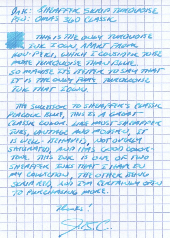
I picked this ink up at the D.C. pen show a couple years back, when I sampled several turquoise inks at the ink testing table.  I liked this one the best.  I've found that in order to get good shading using this ink, you should use a broader nib.  Generally, it's a very well-behaved ink that doesn't feather or bleed, even on the cheapest-of-the-cheap office paper that I'm forced to use at work.  I've even been able to use this ink on Field Notes paper (with a medium nib!) without feathering, depending on the pen.  Some people complain that Sheaffer's selection of colors is boring, but I disagree with that characterization.  The selection of colors may be "standard," in the sense that the have the traditional blue/black, blue, green, black, brown, red, and purple offerings, but there's something to be said for a company sticking with what it knows, especially where the result is this good.  (Side note:  I've heard that Sheaffer revamped their Slovenian-manufactured ink formulas a couple years back to make the colors more vibrant, among other things, so if you have bottles that are more than one or two years old, of if your merchant's stock was old, YMMV.)  Personally, I've never worried about staining, clogging or other maintenance issues using these inks.  A great review of Sheaffer's entire line of inks can be found on Glenn Marcus's blog here.

I also have a bottle of Sheaffer Skrip Red, a classic, as well as a few bottles of vintage Skrip Washable Blue.  Reviews of those forthcoming.