• Blog
  • Shop
  • Resources
  • FAQ (Ask TGS)
  • About
  • Archive
  • Contact
  • Sign In My Account
Menu

The Gentleman Stationer

Vintage Living in the Modern World.
  • Blog
  • Shop
  • Resources
  • FAQ (Ask TGS)
  • About
  • Archive
  • Contact
  • Sign In My Account

Perfect Pairing: Faber-Castell Loom Fountain Pen and Colorverse Quasar Ink

March 24, 2018

Sometimes you run across a pen and ink combination that works especially well, and you just have to review them together. Such is the case with the Faber-Castell Loom and one of the new inks I received last week, "Quasar" by South Korean company Colorverse. 

The Faber-Castell Loom: Budget Workhorse?

First off, I've written about Faber-Castell pens before, and in my opinion, the German company sells some of the best steel-nibbed fountain pens on the market. I've never had a Faber-Castell pen with issues, and I've owned several. The nibs always write smoothly and have especially good ink flow. The Loom is no exception. 

Since you can purchase the Loom for as little as $40, you might ask why it's taken me so long to review this pen. Well, in pictures, I was always a little put off by the cap. I thought it looked chunky and heavy, and suspected it would throw off the balance of the pen when posted. I was wrong. The cap on the gunmetal versions pictured here is a lightweight plastic, which posts fairly deeply on the aluminum body. I've been writing with the Loom nonstop for the past week and it's extremely comfortable to use for long periods of time. 

The Shiny Gunmetal version, which I demoed in-store at Vanness. The pen sits nicely in the hand, and is a great length. 

The only real critique I would have is with the grip. The section has raised ridges to give it some texture, but it's still pretty slick, even on the matte pen. It wasn't that big of a deal for me, but I know some readers are sensitive to this issue. I believe the "Piano" versions of the Loom add even more texture to the section in the grip area, which may help. 

The Faber-Castell Loom that I actually took home with me was this matte version. I like both Gunmetal versions (matte and shiny), but this one spoke to me more. 

Colorverse Quasar: A Sheeny Ink You Can Actually Use

That reddish-purple sheen is insane. And it dries relatively quickly. No smearing three days later like some other sheeny inks. 

So what's been my favorite ink to use in the Loom? So far, I've had great luck with one of the new Colorverse inks that I received in the mail last week. Colorverse Quasar is a rich, dark blue that features a reddish sheen, reminiscent of other inks I've tried such as Akkerman Shocking Blue and Diamine Majestic Blue. 

I love the fact that Colorverse includes two bottles with every purchase. You can use the smaller bottle for travel, or - even better - you can trade the smaller bottles among friends, making it easier to collect all the colors!

The Faber-Castell Loom ended up being a perfect pen for this ink because the medium nib was wet enough to show off some of the sheen, but not such a gusher that I ended up with bleedthrough or smearing issues. One thing I've loved about the Colorverse inks is the fact that for such saturated, sheeny inks, they seem to be relatively low maintenance, especially with respect to dry time. 

No issues with bleedthrough, feathering, or smearing on Baron Fig Mastermind paper. Even on office paper, this ink performed decently. 

Take that last comment with a grain of salt, because it's more of an initial impression than a final verdict. I plan to do a more thorough write-up of the Colorverse inks in the future after I test more of the line. I have additional colors on the way. That said, I'm impressed so far, and others whose opinions I trust have had equally positive experiences. 

You also get some fun extras in the box, including stickers, a pen rest, and a bookmark. (They also throw in a Colorverse cocktail napkin, which I've heard some people describe as "blotter paper." It's not. It's a cocktail napkin.) 

A note on Colorverse pricing: At first glance, the Colorverse inks might appear expensive at $36 apiece, but once you break that down a bit it's not that bad. For each color, you get not one, but TWO bottles (65ml and 15ml) for a total of 80ml of ink. That comes out to roughly $0.45 per ml, which on a per-ml basis is similar to the new Sailor Jentle inks ($0.44) and Iroshizuku ($0.40). All calculations were done using Pen Chalet's best pricing.

Takeaways and Where to Buy

The Faber-Castell Loom took me by surprise. This pen represents excellent value and has one of the best nibs that I've used in the $40-55 price range.  Vanness currently has a large stock of these pens in various colors, but unfortunately the "Gunmetal Matte" version is sold out. During my visit to Vanness Pens back in December, I was torn between the matte pen and the "Gunmetal Shiny" version (which I photographed in the store), as well as the "Piano White", both of which Vanness still has in stock.  

While I expected to like the Colorverse inks, simply because the "space/astrophysics" concept behind the brand was so well thought-out and intriguing, I didn't expect these inks to work as well as they do for everyday use. As I mentioned, I've ordered more, and look forward to testing the other colors.  You can purchase all three "seasons" of Colorverse inks from Pen Chalet, who (along with Vanness) carries the entire line.  

Disclaimer: Vanness Pens provided the Faber-Castell Loom for review purposes, free of charge. Pen Chalet supplied me with the Colorverse Ink. This post contains affiliate links. 
In Pens, Ink Reviews Tags Faber Castell, Colorverse, Vanness, Pen Review, Ink Review, Pen Chalet, Perfect Pairing
2 Comments

Ink Review: Sailor Rikyu-Cha

February 24, 2018

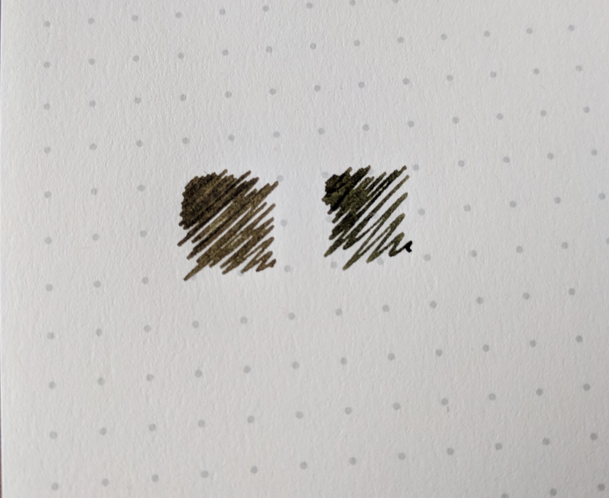
One of the things that I love about Sailor inks, aside from their excellent quality and overall versatility, is the range of offbeat colors that Sailor offers. An ink that I picked up last year but only just now got around to reviewing is Rikyu-Cha, a unique green-brown that definitely appears more olive green in the bottle/pen but dries to a brownish shade on the page. 

You can see how green this ink looks when wet. Check out the gallery below, as I've tried to document the color shift from green to brown as the ink dries. 

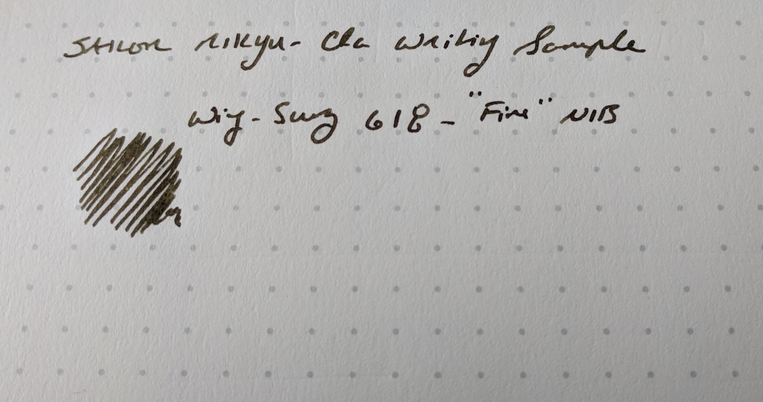
Like all Sailor inks, I've experienced no issues with bleedthrough or feathering. This ink also dries incredibly fast, which combined with it's darker color makes it a good choice for me to use at work. I've had this loaded into a Wing-Sung 618 demonstrator for most of the past two weeks, and have enjoyed the pen/ink combination. 

Robert Oster Signature Melon Tea dries quite a bit darker. You can see the green (and even a bit bluish) undertones to the Rikyu-Cha from where I dripped coffee on the swab.  Intentionally, I promise. 

For comparison purposes, the closest ink in my own collection color-wise is probably Robert Oster Melon Tea, though the Rikyu-Cha definitely falls more on the reddish-brown end of the spectrum, and even has a bit of sheen to it.

Sailor Rikyu-Cha Writing Sample
Rikyu-Cha Wet/Dry Writing Sample

Takeaways and Where to Buy

I like this ink, which will definitely stay in the rotation for the foreseeable future. If Rikyu-Cha interests you, our sponsor Pen Chalet stocks the full range of Sailor Inks, and periodically has them on sale. Now that Sailor has reissued certain previously discontinued colors (such as personal favorites Apricot and Epinard), there are 25+ different colors available in the regular line. While the prices have increased in the past few years, Sailor inks still represent excellent value at $18 MSRP.

You can also out some of my previous reviews of other Sailor inks, including: Apricot (a bright orange); Souten (a sky blue); Yama-Dori (a dark teal); Doyou (a dark brown); Epinard (a dark green); Shigure (a dark purple); Miruai (Sea Green); and Nioi-Sumire (a violet blue).  Of course, this doesn't include the seemingly endless array of store-brand inks that Sailor makes for Japanese retailers Bungubox and Kobe Nagasawa. I have reviews of these elsewhere on the site, but there are too many to list them all here! 

Disclaimer: I purchased the ink featured in this review with my own funds, for my own use, though I did receive a slight discount. This post contains affiliate links. 
In Ink Reviews Tags Sailor, Ink Review, Sailor Rikyu-Cha
Comment

Swabs of the four Kyo-iro Inks from Kyoto TAG

Ink Review: Kyoto TAG Kyo-Iro 02 (Ohara's Morning Snow)

February 10, 2018

During my visit to Vanness Pens in December, Lisa and Mike were kind enough to send me home with samples of essentially the full line of Kyoto TAG inks, save for a couple that were out of stock. If you're unfamiliar with these inks, they're yet another line of specialty Japanese inks developed for specific stores. These inks are made by the TAG stationery store in Kyoto, Japan using traditional Japanese dyeing techniques and named after locations in and around Kyoto.  

Swabs of the Kyo-no-oto inks from Kyoto TAG

The Kyoto TAG inks are divided into two groups: Kyo-iro and Kyo-no-oto inks. So far, I've had the opportunity to use three of these inks extensively: Kyo-no-oto 01 Nureba-iro (a very interesting black ink with undertones of blue and green, as well as some sheen); Kyo-no-oto 02 Imayou-iro (a bright pink ink that's surprisingly usable as an everyday writer); and Kyo-iro 02 Morning Snow of Ohara (a deep blue black/blue-gray). So far, the latter is my favorite of the bunch. 

Morning Snow of Ohara (Kyo-iro 02) which can alternately appear blue-black, blue-gray, or even purplish, depending on the light. 

Kyo-iro 02 / Morning Snow is a softer dark blue that probably falls into the "blue-black" category, though the tone changes depending on the lighting. It's a highly usable, work-friendly ink that shades nicely. Standard blue-black inks can be a bit on the boring side, so it's always fun to find one that has some character.  

All of the Kyoto TAG inks that I've used have been super well-behaved, and I've had no issues using Morning Snow on cheaper copy paper at work, even in a stub nib. This is pretty remarkable to me because I've found the Kyoto TAG inks to be on the wetter side, with above-average ink flow. Morning Snow of Ohara stands a chance of becoming a go-to blue ink for work, since it's interesting, yet at the same time not distracting. Another thing I'll note is how easy these inks are to clean out of pens - I had no trouble quickly flushing the Nureba-iro or the Morning Snow, and even the Imayou-iro cleaned up easily, which is notable for a pink ink. I'd characterize these inks as "safe" to use in most pens (with the proviso that any pink or red carries the possibility of staining). 

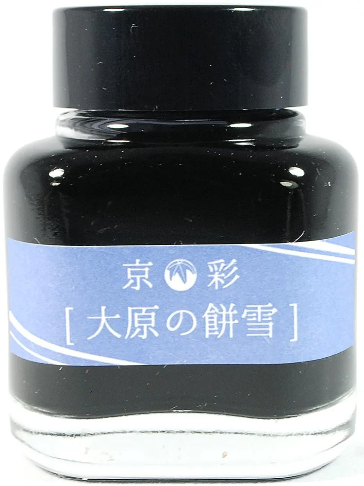
View fullsize Kyo-iro No. 02 - Morning Snow of Ohara
View fullsize Kyo-iro Box Label - Morning Snow of Ohara

Takeaways and Where to Buy

For the past month or so I've had this ink loaded into my Montblanc 146 Ultra Black, and I'm on my second fill. I switch inks constantly, and rarely refill a pen with the same ink twice in a row unless I'm at the office or on the road without a new option, so that tells you something about how good this ink is. It's on the list for a full-bottle purchase at the upcoming Baltimore Pen Show. 

You can purchase the full line of Kyoto TAG inks from Vanness Pens. The inks come in 40ml bottles - slightly smaller than the standard 50ml - and are priced at $28 per bottle. Since they're made in small batches and imported from Japan, they're on the pricier side, but there are much more expensive inks out there, and if you're a fan or collector of the Japanese boutique inks you don't want to miss this particular line. 

Disclaimer: Site sponsor Vanness Pens provided me with a sample of the ink featured in this review free of charge, for review purposes. The pictures of the ink bottle and label are courtesy of Vanness Pens, since I don't have a full bottle of this ink at home. 

In Ink Reviews Tags Ink Review, Kyo-iro, Kyoto TAG, Vanness
Comment

Dark Green Ink Shootout: What's the Winner?

December 20, 2017

I entered the fountain pen hobby shortly after Montblanc announced that it was discontinuing its now legendary "British Racing Green” ink. Though I never had the opportunity to try a sample of this stuff, I love Montblanc ink and pictures I’ve seen of the British Racing Green leave me fairly certain that it’s an ink that I would have been a staple in my rotation. Long story short, I’ve spent a lot of time over the past several years chasing the “perfect” dark green / racing green ink for my collection that approximates the look of the old Montblanc. 

I never really fell down the rabbit hole of chasing actual bottles of discontinued or limited edition inks. If I came across one at a pen show or in a store at a reasonable price, I’d pick it up for sure, but I’ve never felt comfortable spending the $100-plus price that these old inks can command. Plus, given the rapid expansion of the market for fountain pen ink over the past several years, chasing discontinued colors has become completely unnecessary, since it’s highly unlikely there won’t be at a close match to your “grail ink” out there on the market.

I'll go ahead and throw the spoiler out there: My favorite of all these inks is Sailor Jentle Epinard, and I also LOVE Robert Oster Signature Melon Tea, even though it's more of an olive/khaki brown. The sample doesn't really show it, but Epinard has some nice reddish sheen in a wet nib. 

Based on my years of "research", here are a few current favorites, grouped by similarities in color:

  • Darkest Greens / Green Black: Sailor Bung Box Dandyism and Robert Oster Grun Schwartz. Both of these inks are pretty close, with Dandyism being ever-so-slightly darker and the Grun Schwartz having a touch more grey in the mix. Another somewhat similar color is Sailor Jentle Miruai, though this ink definitely has hints of blue and ends up being more of a dark seaweed green.

  • Green-Brown: Sailor Epinard and Robert Oster Melon Tea. While still a very dark green ink, Epinard has a touch of yellow/brown and even shows some red sheen. Melon Tea can dry very dark in a wet nib, and certainly has some green to it, but it definitely leans towards the brown end of the spectrum. (Note that my bottle of Epinard is the old formulation, from before Sailor temporarily discontinued the ink. I’ve heard the new formulation is slightly different, but have not tried it out myself.)

  • Brighter Greens: Private Reserve Avacado and Sailor Jentle Waka-Uguisu. I expected the Avacado (yes, that’s how Private Reserve spells it) to be a bit darker. It's brighter and has more yellow to it than I expected. Waka-Uguisu is a nice tea green, and included here mainly for comparison purposes.   

These are all more or less a tie for second place. Of these three, I prefer the Dandyism when I'm considering the ink alone, but once you take price into account it's hard to justify given how close the Robert Oster Grun Schwartz is. 

I’m not in a position to say which of these is the closest to the old Montblanc ink. I’ve never had the opportunity to try the Montblanc British Racing Green and photograph it in person. Also, online ink swatch photos can be inaccurate (mine included, depending on the calibration of your monitor, lighting, the camera taking the photos, etc.), and people's perception of color is highly subjective. Pictures I’ve seen range from so-dark-it’s-almost-black to a lighter greenish brown. If I had to guess, however, I would say that Sailor Dandyism or Epinard would be the two closest matches.  

I was surprised at the brightness/yellow hue to the Avacado. Granted, when you write with it, it lays down a darker line, but in the swab it really is more of a saturated dark green than a true green-black. 

Takeaways and Where to Buy

All of the inks on this list are generally well-behaved without any bleedthrough, feathering, or excessive dry times. This includes the Private Reserve Avacado, which was a pleasant surprise, though it is the slowest to dry of all the inks featured here. Sailor and Robert Oster inks do dry extremely fast, in my experience, so that’s not to say there’s any major issue with the Private Reserve.

Pricing on these inks is a bit all over the place. Private Reserve ink costs $11 for 66ml, making it a bargain.  Standard Sailor Jentle Inks (here, Miruai and Waka-Uguisu) cost $18, with the Epinard priced at $25, both for 50ml of ink.  Robert Oster costs $17, for a 50ml bottle, and Bung Box is the most expensive, coming in at a whopping $43 for 50ml. 

I purchased or received all of these inks from Pen Chalet, Anderson Pens, or Vanness Pens. Since my policy is to link to the retailer who provided me with the product, the links correspond accordingly.

Disclaimer: This post contains links to paid sponsors and affiliates. To the best of my recollection, I paid for all of these inks with my own funds (receiving a slight discount), with the exception of the sample of Avacado, which I received free of charge from Anderson Pens for review purposes.

In Ink Reviews Tags Ink Review, Ink Comparison, Green Inks, Green Ink Brigade
7 Comments

Ink Review: Noodler's Blue

November 25, 2017

I rarely review an individual ink by itself. I tend to prefer to review them in batches of three or more from a particular line or brand because it makes it easier to see whether the line as whole is consistently good or whether certain inks are outliers. Occasionally, however, an ink will surprise me, and I'll give it its own writeup. One of those inks turned out to be Noodler's Blue.

Ink swab on a Col-O-Ring Ink Testing Book. 

Noodler's Blue is one of the standard Noodler's colors, meaning that the ink is not waterproof, "bulletproof," lubricating, glow-in-the-dark, etc. It's straight up water-based fountain pen ink, and I found it to be very well behaved, with a reasonable dry time and no smearing. The color is gorgeous - a bright blue with none of the washed-out look that you sometimes get with standard blues.   

While Noodler's Blue isn't what I would call a heavy shader, you will probably see a bit of shading and variations of tone and color with a wider nib. 

With an ink this vibrant, I expected to have issues with staining. When I was syringe-filling a pen from a sample vial, I spilled a rather significant amount of Noodler's Blue into a white sink. I'm happy to report that the ink cleaned right up with water and a paper towel, and my marriage survived. That said, I currently have this ink loaded into a TWSBI 580 clear demonstrator, so we'll see how easy that pen can be cleaned out after a few weeks.     

A Note on Noodler's

Noodler's gets a bad rap in certain corners of the pen community because some of their inks have a tendency to be "high maintenance," meaning that they can exhibit slow dry times, clog and stain pens, and bleed through what should otherwise be fountain pen friendly paper. A few general observations that I try to keep in mind when using Noodler's:

  • The brighter, more saturated colors contain high concentrations of dye. These are often beautiful, very unique colors, but be aware that inks with heavy dye loads often have a tendency to smear even after the ink is dry, and can clog a pen if you leave it unattended for too long. I sometimes decant Noodler's Ink into a sample vial and add a couple of drops of water, which dilutes the ink ever so slightly without affecting the color much at all. 
  • Some Noodler's inks are famous for their "special properties." (i.e., the "bulletproof" inks are permanent, the "eel" series contains added lubricant, the "polar" inks won't freeze, etc.) Those properties, however, require adding chemicals to the ink that may impact the ink's performance in everyday writing situations. The trade-off may not be worth it if you don't have a good use-case for an "eternal" ink or one that doesn't freeze. A great guide to the different Noodler's Inks and their special properties can be found at Goulet Pens. 
  • Because so many Noodler's Inks are "permanent" or "bulletproof," that necessarily means that they not only are hard to wash out of paper, but also pens (and carpet). Exercise good judgment when deciding which pens to use with permanent ink - your light-colored vintage celluloid collection isn't the best option here.       

Where to Buy

You can purchase a bottle of Noodler's Blue at Anderson Pens. One great thing about Noodler's is the value - you get 3 oz. (90ml) of ink for $12.50. A single bottle of Noodler's will last you a long time, especially if you dilute the more saturated colors with a bit of water, as I discussed above. Each of these glass bottles comes filled to the brim, so be careful when uncapping.  

Disclaimer: Anderson Pens sent me this ink sample free of charge, for review purposes. Many thanks to the folks at Anderson Pens for sponsoring the blog and making this review possible.  

In Ink Reviews Tags Noodler's, Ink Review, Anderson Pens
3 Comments
← Newer Posts Older Posts →
Store Hours and Location
Visit the T.G.S. Curated SHOP
*New* Updated "Best Pens" Guide (2025)
TGS x Hinze Pens Violet Tendencies Taschenstift Fountain Pen
Hierarchies of Fountain Pen Friendly Paper
Allex Scissors arrayed on a desk showing link to desk accessories

Join Our Patreon!
Subscribe to the TGS E-mail List

Featured Posts

Featured
Iro-Utsushi-Fine-Dip-Pens.jpeg
Oct 1, 2025
The Pilot Iro-Utsushi Dip Pen (and in General, Simple vs. Fancy Dip Pens)
Oct 1, 2025
Oct 1, 2025
Levenger-Annotation-Pad.jpeg
Sep 20, 2025
Five Boutique Paper Brands I'm Watching Closely and Why
Sep 20, 2025
Sep 20, 2025
Playing-ink-MD-Cotton-Glass-Pens.jpeg
Sep 17, 2025
What's On Your Desk? My Personal Favorite Papers for Fountain Pens, 2025
Sep 17, 2025
Sep 17, 2025
The Gentleman Stationer RSS

© Digital Divide Media, LLC, 2014-present.

All content is the exclusive property of Digital Divide Media, LLC, d/b/a The Gentleman Stationer, including “The Gentleman Stationer” website and trademark, and should not be reproduced without express written permission.  All rights reserved.

All content containing paid advertising, affiliate links, or sponsored content will be plainly disclosed by a disclaimer when/if featured.

Contact Information

Store Shipping Policy and Return Policy

Privacy Policy

Cookie Policy

Terms and Conditions

Powered by Squarespace