• Blog
  • Shop
  • Resources
  • FAQ (Ask TGS)
  • About
  • Archive
  • Contact
  • Sign In My Account
Menu

The Gentleman Stationer

Vintage Living in the Modern World.
  • Blog
  • Shop
  • Resources
  • FAQ (Ask TGS)
  • About
  • Archive
  • Contact
  • Sign In My Account

Mini Collections, Part V: All The Blue Inks (Including Blues, Blue-Blacks, Teals, and Turquoise)

August 14, 2021

I have way too many blue inks, and need to do some serious housecleaning. Part of this, of course, is by default. Over the years I’ve purchased many pens that ship with a bottle of ink, and nine times out of ten, it’s a bottle of “house brand” blue or black. But at the same time, I’ve fallen into the habit of constantly searching for that perfect shade of blue, even though we all know that’s impossible. I’ve accumulated dozens of blues, many in nearly identical shades, without realizing it.

It goes without saying that I’m going to be selling off a lot of the duplicative bottles very quickly, as those are no-brainer choices to let go. Some of the rest, however, are more difficult. Here are my takeaways from this latest round of swabbing inks:

A General Note:

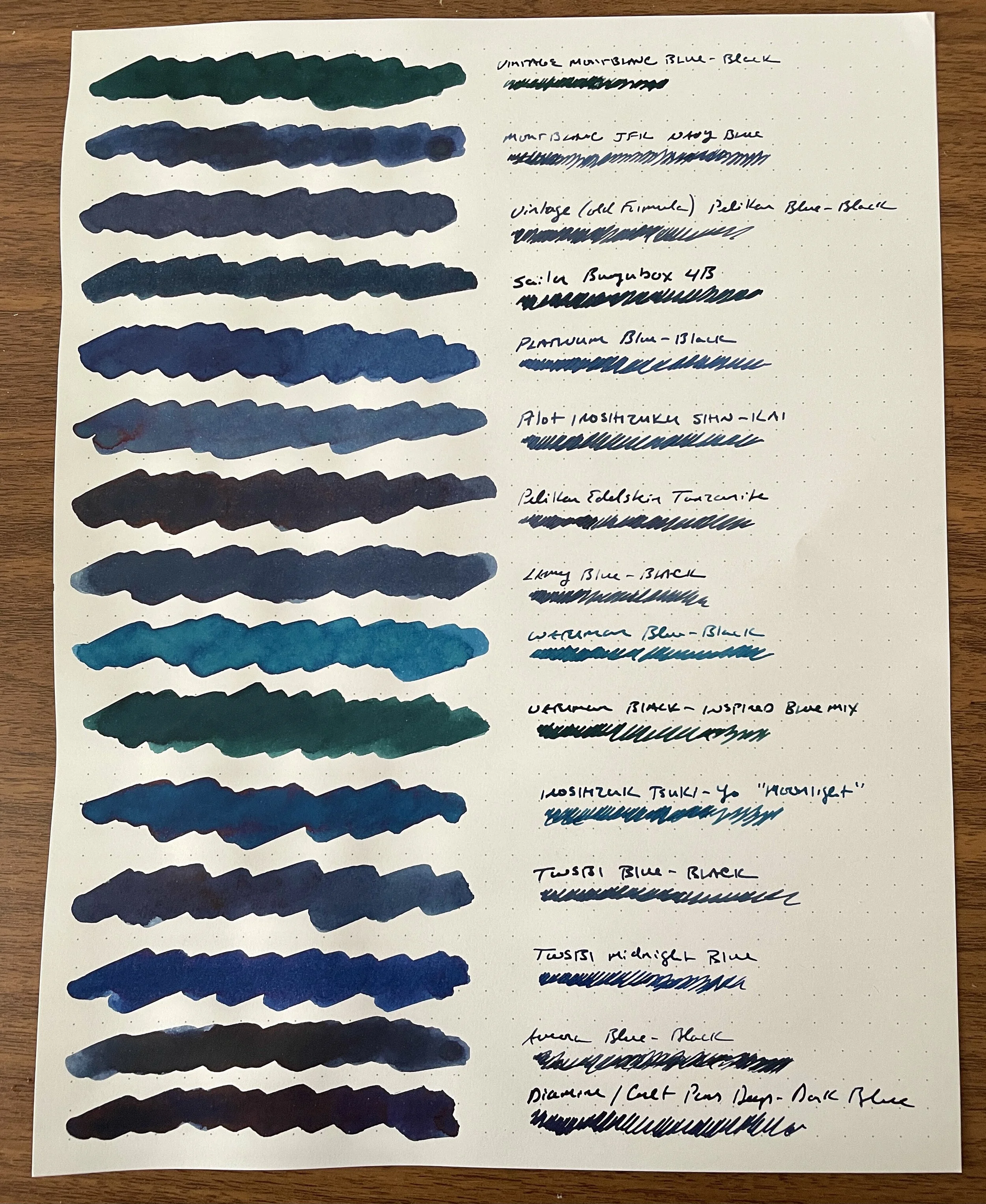
  • I found the blue inks more difficult than the other color ranges to photograph correctly, especially where you have shades of standard blue, turquoise, and blue-blacks together, and where certain supposedly “blue” inks tend to lean heavily green or teal. The blue-blacks are represented fairly accurately here. Otherwise, these photos tend to slightly overstate the vibrancy of the standard blues and understate the vibrancy of the teals and turquoises.

From Top: Vintage Montblanc Blue-Black; Montblanc JFK Navy Blue; Vintage Pelikan Blue-Black; Sailor Bungubox 4B; Platinum Blue-Black; Pilot Iroshizuku Shin-Kai; Pelikan Edelstein Tanzanite; Lamy Blue-Black; Waterman Blue-Black; Waterman Black-Inspired Blue Mix; Pilot Iroshizuku Tsuki-Yo; TWSBI Blue-Black; TWSBI Midnight-Blue; Aurora Blue-Black; Diamine Cult Pens Deep-Dark Blue.

With Respect to Blue-Black Inks:

  • I’m much more of a “midnight/navy blue” person than a steel blue, iron gall fan. I intend to move on from inks that essentially dry grey. Farewell, vintage Pelikan Blue-Black, Lamy Blue-Black, Iroshizuku Shin-Kai, and others that have very little actual blue in them.

  • I’ll probably keep at least one or two bottles of iron gall ink in the collection because it works so well on cheap paper and I sometimes like to use them for work. I don’t need six bottles though, and TWSBI Blue-Black is an inexpensive favorite.

Blue-Ink-Volume-2.jpeg

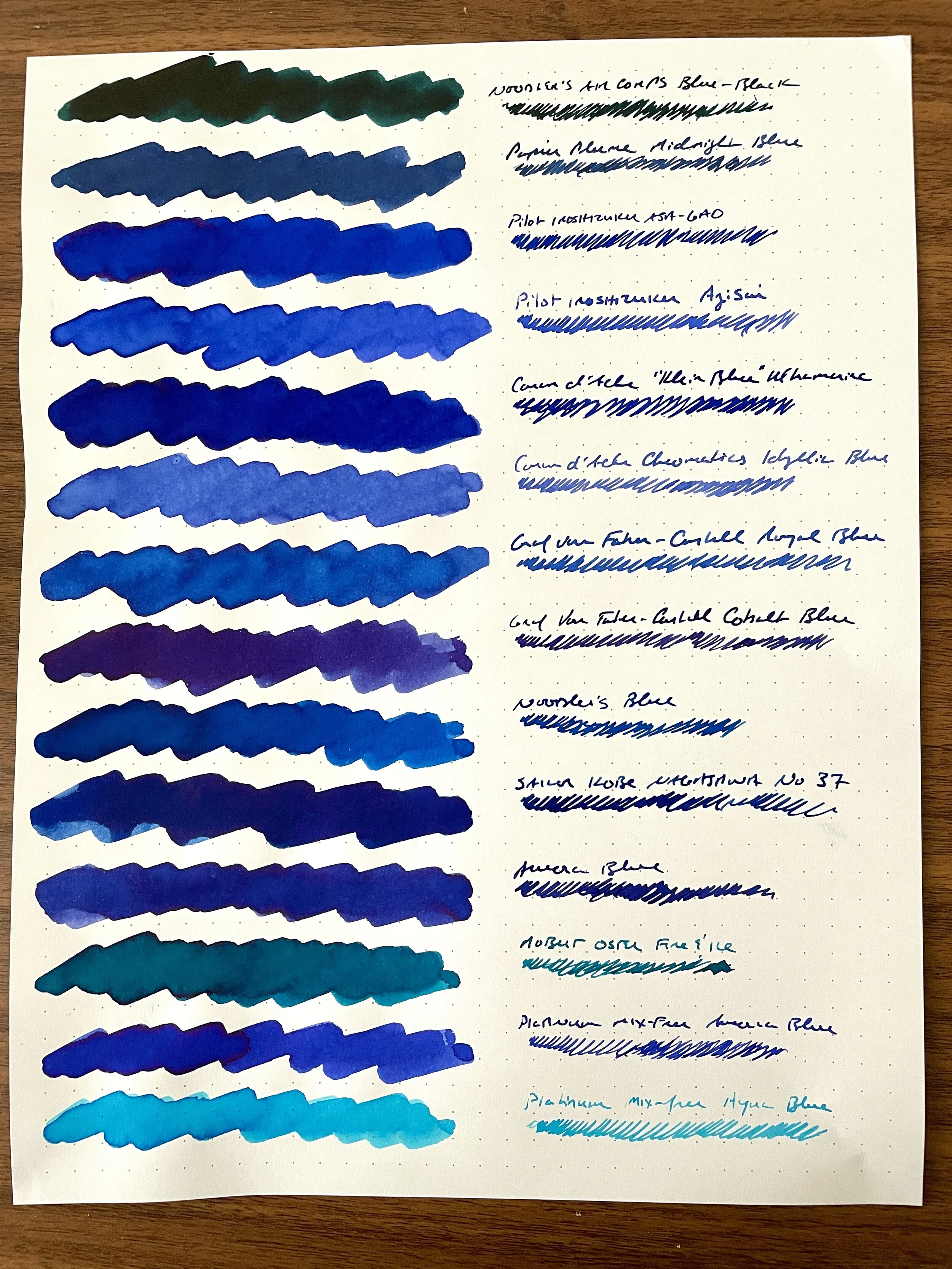
From Top: Noodler’s Air Corps Blue-Black; Papier Plume Midnight Blue; Pilot Iroshizuku Asa-Gao; Pilot Iroshizuku Ajisai; Caran d’Ache “Klein Blue” limited edition; Caran d’Ache Chromatics Idyllic Blue; Graf von Faber-Castell Royal Blue; Graf von Faber-Castell Cobalt Blue; Noodler’s Blue; Sailor Kobe Nagasawa No. 37; Aurora Blue; Robert Oster Fire & Ice; Platinum Mix-Free Aurora Blue; Platinum Mix Free Aqua Blue.

With Respect to “Standard” Blue Inks:

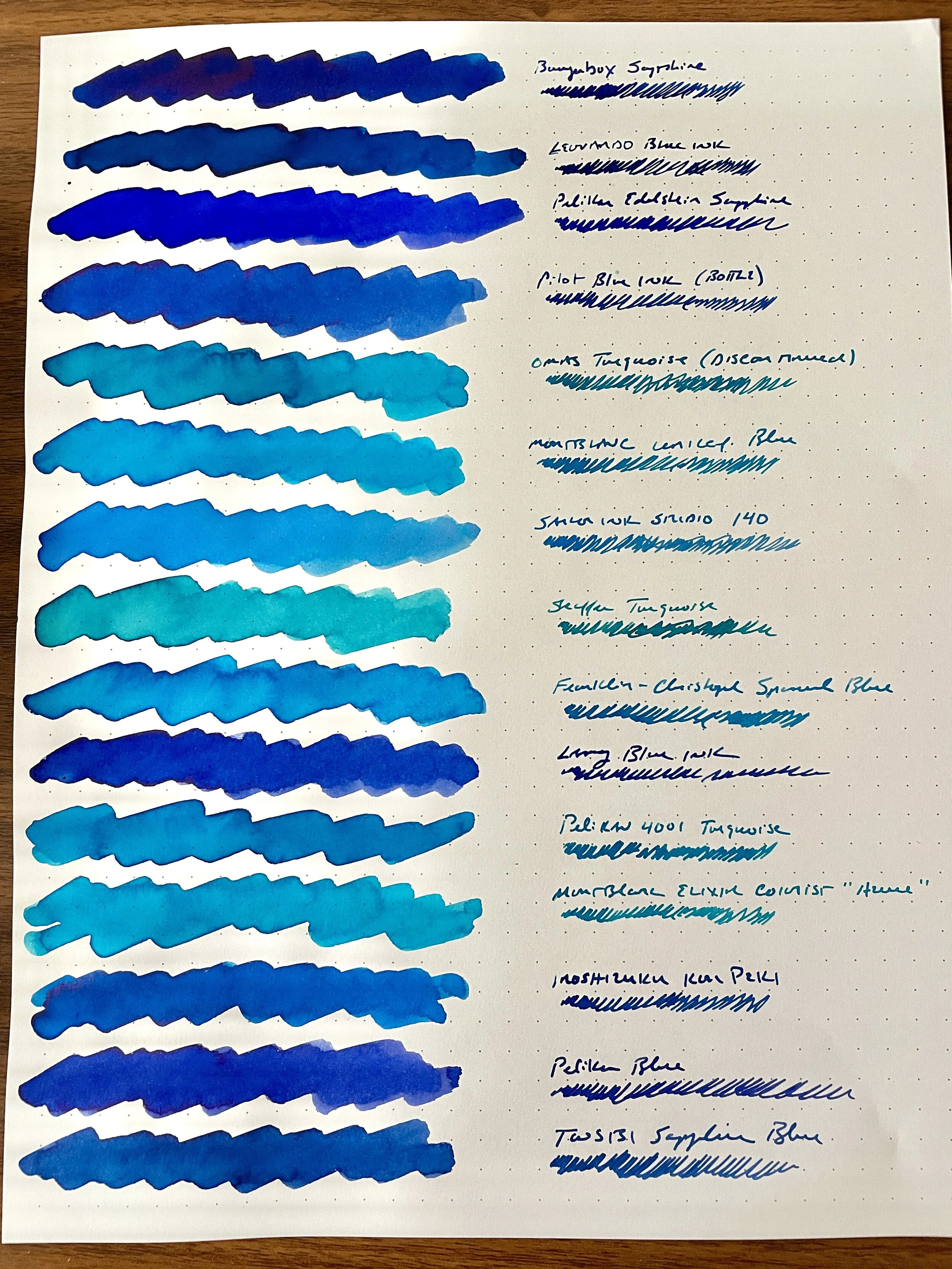
  • Standard Pelikan, Lamy, and Pilot blue inks are far too washed out to warrant taking up space in the collection. If you’re a serious vintage pen collector, which I’m not, you may prefer one or more of these “safe inks” for use in your more delicate pens prone to staining, but it’s not an issue I face, and in any event I prefer Waterman Florida (“Serenity Now”) Blue.

  • Aurora Blue remains a favorite inexpensive blue ink. Noodler’s Blue is also very good, and I’ve found it to be better behaved than other Noodler’s colors. It also dries fairly quickly and doesn’t smear. (At least, the bottle I have doesn’t. As with most Noodler’s ink, there are batch variations so YMMV.)

  • The Pilot Iroshizuku line has the best blue inks across the board of any ink line on the market. I could happily live in this ink lineup forever. Asa-Gao, Ajisai, and Kon-Peki are exceptionally vibrant blue inks that have become staples in my rotation.

  • I don’t like Sailor blues as much as I used to. I don’t find them as vibrant as the Pilot inks, and even Bungubox Sapphire (which I used to think was the best blue ever) can’t hold a candle to Asa-Gao, IMHO. The ridiculous price point of the Sailor Bungubox inks make this an even easier call.

From Top: Bungubox Sapphire; Leonardo Blue; Pelikan Edelstein Sapphire; Pilot Blue; Omas Turquoise; Montblanc UNICEF Blue; Sailor Ink Studio 140; Sheaffer Turquoise; Franklin-Christoph Spanish Blue; Lamy Blue; Pelikan 4001 Turquoise; Montblanc Elixir “Azure”; Pilot Iroshizuku Kon-Peki; Pelikan Blue; TWSBI Sapphire Blue.

With Respect to Teal and Turquoise:

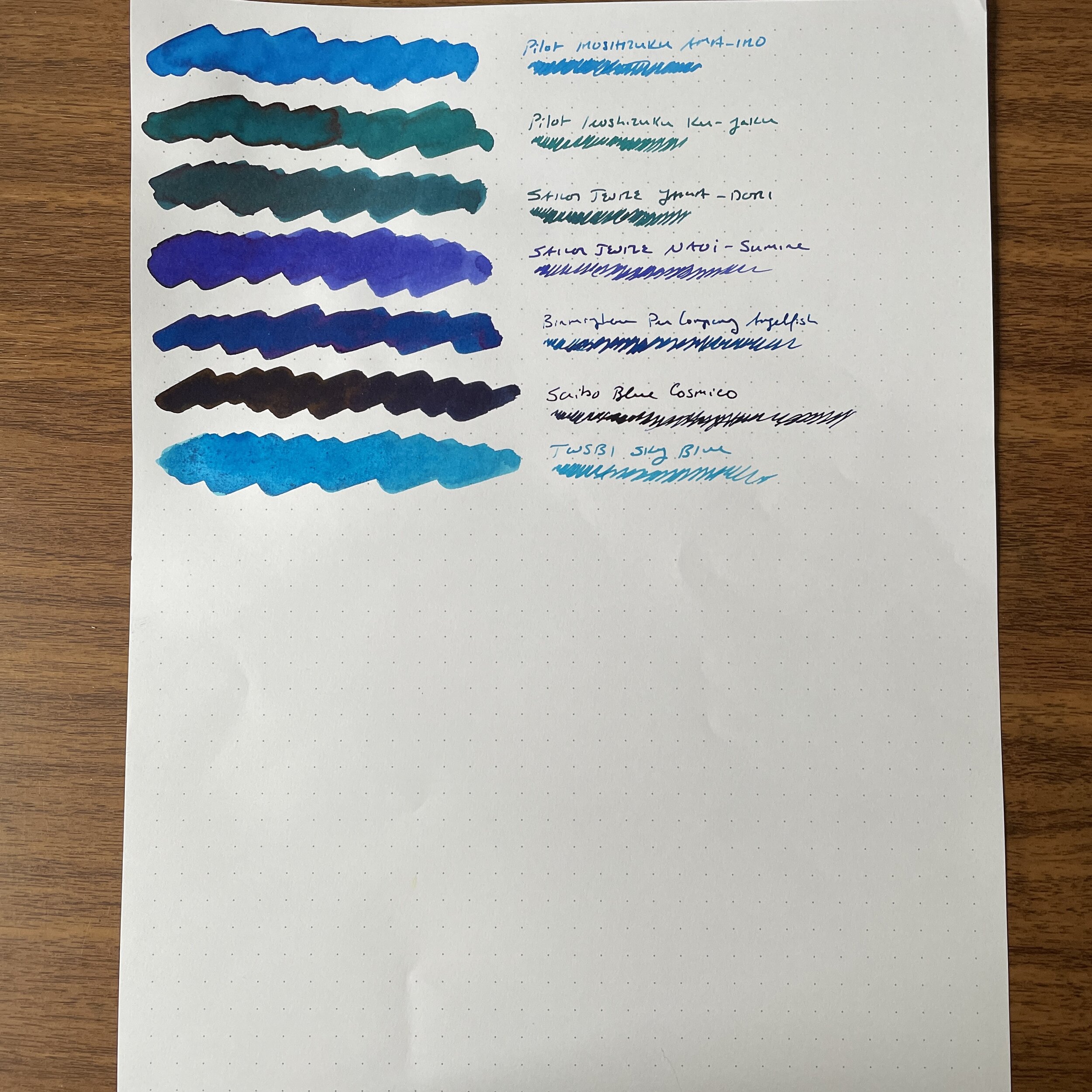
  • The big winner from this round of swatching is once again an Iroshizuku ink. Ama-Iro, which I’ve never used before, is absolutely gorgeous. A close second is the standard Pelikan 4001 Turquoise, which also shocked me with its vibrancy.

  • Iroshizuku Ku-Jaku over Sailor Yama-Dori. Again, Pilot also wins in the category of “dark teal inks with shading.”

  • Many turquoise inks are too watery for my taste. The one lighter ink I may make an exception for is Sailor Ink Studio 140, since it’s a relatively rare example of a “double shader” that is legible enough for everyday writing.

From Top: Pilot Iroshizuku Ama-Iro; Pilot Iroshizuku Ku-Jaku; Sailor Jentle Yama Dori; Sailor Jentle Naoi-Sumire; Birmingham Pen Company Angelfish; Scribo Blue Cosmico; TWSBI Sky Blue.

So. Many. Blue. Inks.

View fullsize Blue Inks, Vol. 1
View fullsize Blue Inks, Vol. 2
View fullsize Blue Inks, Vol. 3
View fullsize Blue Inks, Vol. 4

As always, watch the “Gently Used” Page in the coming weeks. I plan to aggressively unload some of these inks, cycling them through the Patreon first and then move them over to the public sale page after a week. Some greens and pinks still remain from my prior ink testing marathons, along with vintage pencils and office supplies that I’m clearing out.

Disclaimer: This post does not contain paid affiliate links. Going forward, T.G.S is supported entirely by purchases from the T.G.S. Curated Shop and the T.G.S. Patreon Program, which offers access to online meetups, exclusive discounts and pre-orders, and more!

In Ink Reviews Tags Ink Comparison, Inks, Ink Review, Blued Inks
7 Comments

Favorite Workhorse Fountain Pen Inks, as Determined by Actual Use

April 27, 2019

I’ll preface this post with the admission that I’m a serial ink changer and I have more ink than five people could use in a lifetime. That makes it hard to pick “favorite” inks, since I rarely use the same one twice in a row, and in the nearly ten years I’ve been active in this hobby have probably only finished a couple of bottles, though I have several that are close to empty. It’s these latter inks that caught my attention as I was sorting through my ink cabinets this past weekend. Despite changing inks frequently, I evidently keep coming back to these particular colors and brands.

  1. Waterman Serenity/Florida Blue. The king of “safe” fountain pen ink, which represents the gold standard for testing at pen shows due to how easily this ink flushes out of pens. I also love how this ink behaves in daily use, finding that it flows well and typically won’t feather or bleed on most papers. While some people find the blue color washed-out, particularly after it dries, I think it lends your writing a retro/vintage look. Also, if you’d like to add some vibrancy to standard Waterman Blue, just mix in a bit of Waterman Purple, which creates a lovely ultramarine color that’s been dubbed “Blurple” in pen circles.

  2. Waterman Tender Purple/Violet. I’ve gone through 3/4 of a bottle of Waterman purple over the years. This particular ink is a bit more temperamental than others in Waterman’s lineup, mainly due to its potential to stain, but I’ve always loved the vibrant color. As noted above, this ink mixes well, and another fun experiment is to mix this ink with Sheaffer Skrip Red to form a nice burgundy.

  3. Iroshizuku Tsuki-Yo. The first expensive bottle of ink that I purchased, back when Iroshizuku was considered a “luxury” ink and cost much more than the $20 per 50ml currently charged at retail. I loved (and still love) everything about the Iroshizuku lineup, from the glass bottle that looks great on a desk to the range of colors based on Japan’s natural features. Tsuki-Yo (“Moonlight”) is a blue-black-teal color reminiscent of the night sky, and the exact shade of this ink changes depending on lighting and whether it’s wet or dry. This is one I always find myself coming back to!

  4. Iroshizuku Yama-Budo. The only magenta ink I use regularly. I don’t know what it is about this one, as pink-purples aren’t in my usual wheelhouse of colors, but Yama-Budo is up there as one of my favorite inks of all time. I think it has to do with the ink being just “loud” enough to be interesting, while remaining somewhat work-appropriate. It behaves well in most pens and on most paper. I’m down to less than half a bottle!

  5. Aurora Black/Aurora Blue. Until last year, when Aurora went wild and released a blue-black ink, they had a simple lineup of two colors, both of which flowed extremely well and which have remained staples in my pens. Aurora Blue is a rich blue ink that has undertones of purple/violet, and Aurora Black is one of the best “pure black” inks out there. If you crave simplicity in your ink choices, and want to stick with a two-color rotation, you won’t go wrong with Aurora.

I’ve also killed one or two bottles of special or limited edition inks, and am close to finishing a few more, but I won’t list those here because it’s not helpful to people when you can no longer buy the inks. Each of the seven listed above is a standard ink made by a pen manufacturer, which means that it’s not only generally safe to use in most pens, vintage or modern, but it’s also easily purchased at retail. You can buy any of the inks listed above from ink retailers Vanness Pens, Pen Chalet, Anderson Pens, Goldspot, and Appelboom.

In Ink Reviews, Editorial Tags Ink Comparison, Workhorse Inks, Ink Review, Editorial
2 Comments

Ink Spotlight: Three Recent Montblanc Special Editions

July 25, 2018

I make no secret that I love Montblanc Inks. In fact, I think they’re some of the best all-around inks out there. Why? Because the company makes a well-behaved, “safe” fountain pen ink that comes in unique, interesting colors. Though the craze has cooled a bit lately, Montblanc attracts a lot of attention for their annual special edition inks, many of which correspond to a special or limited edition pen. While I don’t have the coin to collect all of the various pens, I do tend to pick up the special edition inks. The past few have been superb, and include some of my favorites since the release of the legendary Alfred Hitchcock limited edition ink in 2012.

Montblanc-Unicef-Beatles-Saint-Exupery

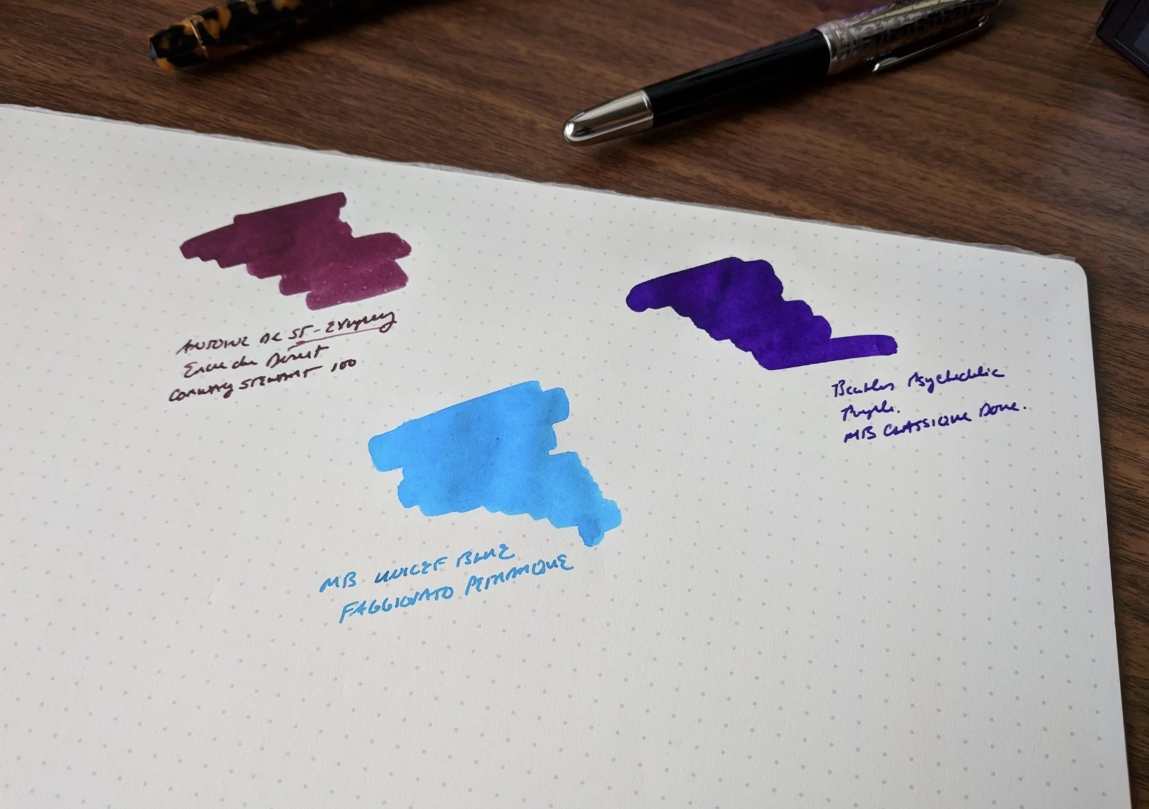
Montblanc Antoine de Saint-Exupery Encre du Desert (Burgundy/Maroon)

Antoine de Saint-Exupery is my personal favorite of the three inks reviewed here. It’s a rich burgundy, with more depth of color than the standard Montblanc Burgundy or the now-discontinued Bordeaux. There’s even a rollerball version of the Saint-Exupery, though the color is much more gray/brown than the fountain pen ink, which has purple undertones.  

Review Pen: Conway Stewart 100 in Honey Noire, courtesy of Vanness Pens. 

The rollerball refill compared against the fountain pen ink (which I prefer). Review pen: Montblanc Le Petit Prince Classique Rollerball, courtesy of Appelboom.

Montblanc Great Characters the Beatles (Psychedelic Purple)

Another riff on one of Montblanc's standard ink colors, the Beatles "Great Characters" ink is a bright rich purple that has a some “psychedelic” pop. If the limited and special edition Beatles pens are too out there for you, consider the ink.  It's tame enough to use at work, but just loud enough to be interesting.

Review Pen: Montblanc for UNICEF Doue Classique, courtesy of Appelboom. 

Montblanc for UNICEF Blue (Turquoise)

I reviewed this ink last year alongside the Montblanc for UNICEF Solitaire Doue Classique fountain pen, and while turquoise will never rival burgundy as my favorite color, this vibrant blue remains one of my favorite Montblanc inks overall. UNICEF Blue is still available, but it's unclear how long Montblanc will continue with the UNICEF lineup.   

Review Pen: Faggionato Petrarque in Blue Tortoise, available at Papier Plume. 

Takeaways and Where to Buy

In my opinion, you can never go wrong with Montblanc ink. The colors are always interesting, and the ink behaves well on most paper types, without bleeding, feathering, or slow dry times. Moreover, Montblanc makes high-end pens, which generally means that their ink should be “safe” to use, without undue concern for staining or corrosion. (PLEASE take this with a grain of salt and use common sense. Ink is ink, and even “safe” inks can stain or cause problems if you don’t clean your pens regularly. Light colored pens, celluloids, and valuable/rare writing instruments need to be treated with caution, especially with bright colors like purples, reds, and oranges.)

Montblanc’s standard lineup of inks is priced at $23.50 USD for 60ml of ink, representing good value, especially in today’s market with rising ink prices. The special edition inks are pricier, at $43 USD for the larger 50ml bottle and $20.50 USD for 30ml. All three of the special edition inks featured here in this review come in the larger 50ml bottle, and are still available from most Montblanc retailers, including Anderson Pens, Appelboom, Pen Boutique, and Goldspot. Montblanc also releases rollerball versions of the special edition colors, but not all retailers stock them. Goldspot and Pen Boutique carry some, and if I come across these refills on Amazon I typically add them to my affiliate storefront (link at the top of the sidebar).

Disclaimer: With the exception of the UNICEF ink, which was supplied by site sponsor Appelboom, I purchased the inks featured in this review with my own funds, for my own collection. This post contains affiliate links. 

The three pens pictured in this review, from left, include the Faggionato Petrarque in Blue Tortoise, the Conway Stewart 100 in Honey Noire, and the Montblanc for UNICEF Solitaire Doue Classique. 

In Ink Reviews, Comparison Tags Montblanc, Montblanc Inks, Special Edition, Limited Edition, Ink Review, Ink Comparison
Comment

Dark Green Ink Shootout: What's the Winner?

December 20, 2017

I entered the fountain pen hobby shortly after Montblanc announced that it was discontinuing its now legendary "British Racing Green” ink. Though I never had the opportunity to try a sample of this stuff, I love Montblanc ink and pictures I’ve seen of the British Racing Green leave me fairly certain that it’s an ink that I would have been a staple in my rotation. Long story short, I’ve spent a lot of time over the past several years chasing the “perfect” dark green / racing green ink for my collection that approximates the look of the old Montblanc. 

I never really fell down the rabbit hole of chasing actual bottles of discontinued or limited edition inks. If I came across one at a pen show or in a store at a reasonable price, I’d pick it up for sure, but I’ve never felt comfortable spending the $100-plus price that these old inks can command. Plus, given the rapid expansion of the market for fountain pen ink over the past several years, chasing discontinued colors has become completely unnecessary, since it’s highly unlikely there won’t be at a close match to your “grail ink” out there on the market.

I'll go ahead and throw the spoiler out there: My favorite of all these inks is Sailor Jentle Epinard, and I also LOVE Robert Oster Signature Melon Tea, even though it's more of an olive/khaki brown. The sample doesn't really show it, but Epinard has some nice reddish sheen in a wet nib. 

Based on my years of "research", here are a few current favorites, grouped by similarities in color:

  • Darkest Greens / Green Black: Sailor Bung Box Dandyism and Robert Oster Grun Schwartz. Both of these inks are pretty close, with Dandyism being ever-so-slightly darker and the Grun Schwartz having a touch more grey in the mix. Another somewhat similar color is Sailor Jentle Miruai, though this ink definitely has hints of blue and ends up being more of a dark seaweed green.

  • Green-Brown: Sailor Epinard and Robert Oster Melon Tea. While still a very dark green ink, Epinard has a touch of yellow/brown and even shows some red sheen. Melon Tea can dry very dark in a wet nib, and certainly has some green to it, but it definitely leans towards the brown end of the spectrum. (Note that my bottle of Epinard is the old formulation, from before Sailor temporarily discontinued the ink. I’ve heard the new formulation is slightly different, but have not tried it out myself.)

  • Brighter Greens: Private Reserve Avacado and Sailor Jentle Waka-Uguisu. I expected the Avacado (yes, that’s how Private Reserve spells it) to be a bit darker. It's brighter and has more yellow to it than I expected. Waka-Uguisu is a nice tea green, and included here mainly for comparison purposes.   

These are all more or less a tie for second place. Of these three, I prefer the Dandyism when I'm considering the ink alone, but once you take price into account it's hard to justify given how close the Robert Oster Grun Schwartz is. 

I’m not in a position to say which of these is the closest to the old Montblanc ink. I’ve never had the opportunity to try the Montblanc British Racing Green and photograph it in person. Also, online ink swatch photos can be inaccurate (mine included, depending on the calibration of your monitor, lighting, the camera taking the photos, etc.), and people's perception of color is highly subjective. Pictures I’ve seen range from so-dark-it’s-almost-black to a lighter greenish brown. If I had to guess, however, I would say that Sailor Dandyism or Epinard would be the two closest matches.  

I was surprised at the brightness/yellow hue to the Avacado. Granted, when you write with it, it lays down a darker line, but in the swab it really is more of a saturated dark green than a true green-black. 

Takeaways and Where to Buy

All of the inks on this list are generally well-behaved without any bleedthrough, feathering, or excessive dry times. This includes the Private Reserve Avacado, which was a pleasant surprise, though it is the slowest to dry of all the inks featured here. Sailor and Robert Oster inks do dry extremely fast, in my experience, so that’s not to say there’s any major issue with the Private Reserve.

Pricing on these inks is a bit all over the place. Private Reserve ink costs $11 for 66ml, making it a bargain.  Standard Sailor Jentle Inks (here, Miruai and Waka-Uguisu) cost $18, with the Epinard priced at $25, both for 50ml of ink.  Robert Oster costs $17, for a 50ml bottle, and Bung Box is the most expensive, coming in at a whopping $43 for 50ml. 

I purchased or received all of these inks from Pen Chalet, Anderson Pens, or Vanness Pens. Since my policy is to link to the retailer who provided me with the product, the links correspond accordingly.

Disclaimer: This post contains links to paid sponsors and affiliates. To the best of my recollection, I paid for all of these inks with my own funds (receiving a slight discount), with the exception of the sample of Avacado, which I received free of charge from Anderson Pens for review purposes.

In Ink Reviews Tags Ink Review, Ink Comparison, Green Inks, Green Ink Brigade
7 Comments
Store Location
Visit the T.G.S. Curated SHOP
*New* Updated "Best Pens" Guide (2025)
TGS x Hinze Pens Violet Tendencies Taschenstift Fountain Pen
Hierarchies of Fountain Pen Friendly Paper
Allex Scissors arrayed on a desk showing link to desk accessories

Join Our Patreon!
Subscribe to the TGS E-mail List

Featured Posts

Featured
Pilot-Iroshizuku-Yama-Budo-Writing-Sample.jpeg
May 24, 2025
Joe's Picks: Five Favorite Inks From Pilot's Iroshizuku Lineup
May 24, 2025
May 24, 2025
Yamamoto-Gray-Paper-Sampler-Set.jpeg
May 10, 2025
Discovering Unusual Paper: "Paper Tasting" Sets from Yamamoto Paper
May 10, 2025
May 10, 2025
Four-Micarta-Fountain-Pens.jpeg
Apr 19, 2025
Yes, Micarta for me! I finally got my hands on Some Micarta Pens, Plus My Own Special Edition
Apr 19, 2025
Apr 19, 2025
The Gentleman Stationer RSS

© Digital Divide Media, LLC, 2014-present.

All content is the exclusive property of Digital Divide Media, LLC, d/b/a The Gentleman Stationer, including “The Gentleman Stationer” website and trademark, and should not be reproduced without express written permission.  All rights reserved.

All content containing paid advertising, affiliate links, or sponsored content will be plainly disclosed by a disclaimer when/if featured.

Contact Information

Store Shipping Policy and Return Policy

Privacy Policy

Cookie Policy

Terms and Conditions

Powered by Squarespace