• Blog
  • Shop
  • Resources
  • FAQ (Ask TGS)
  • About
  • Archive
  • Contact
  • Sign In My Account
Menu

The Gentleman Stationer

Vintage Living in the Modern World.
  • Blog
  • Shop
  • Resources
  • FAQ (Ask TGS)
  • About
  • Archive
  • Contact
  • Sign In My Account

Ink Spotlight: Three Recent Montblanc Special Editions

July 25, 2018

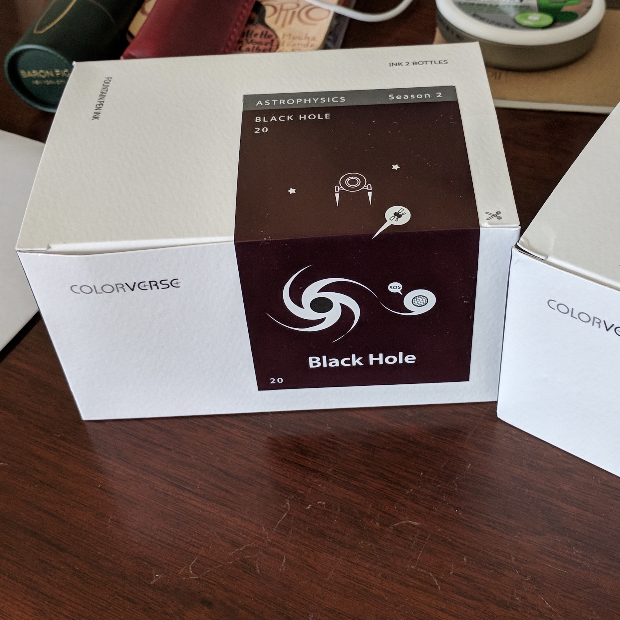
I make no secret that I love Montblanc Inks. In fact, I think they’re some of the best all-around inks out there. Why? Because the company makes a well-behaved, “safe” fountain pen ink that comes in unique, interesting colors. Though the craze has cooled a bit lately, Montblanc attracts a lot of attention for their annual special edition inks, many of which correspond to a special or limited edition pen. While I don’t have the coin to collect all of the various pens, I do tend to pick up the special edition inks. The past few have been superb, and include some of my favorites since the release of the legendary Alfred Hitchcock limited edition ink in 2012.

Montblanc-Unicef-Beatles-Saint-Exupery

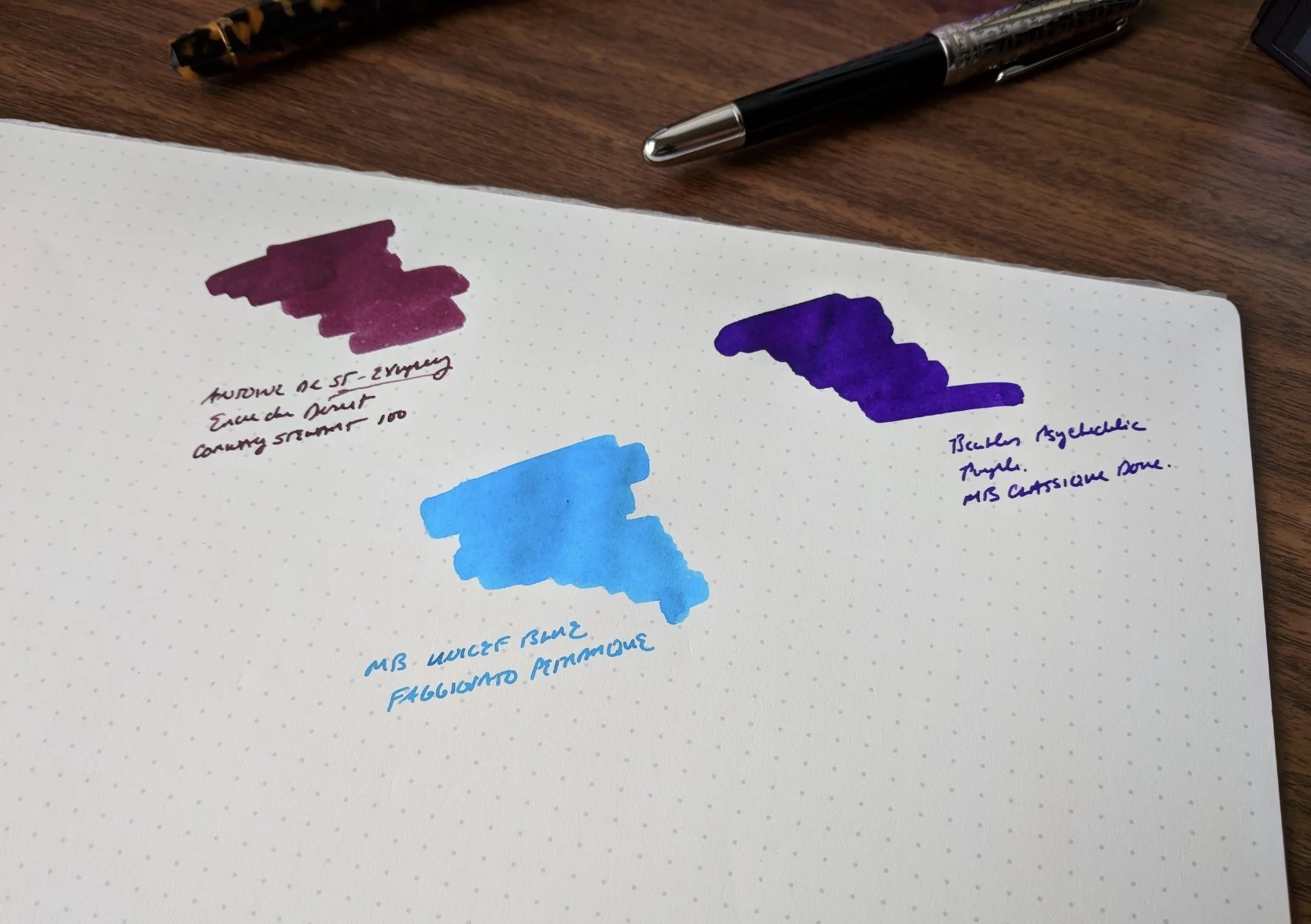
Montblanc Antoine de Saint-Exupery Encre du Desert (Burgundy/Maroon)

Antoine de Saint-Exupery is my personal favorite of the three inks reviewed here. It’s a rich burgundy, with more depth of color than the standard Montblanc Burgundy or the now-discontinued Bordeaux. There’s even a rollerball version of the Saint-Exupery, though the color is much more gray/brown than the fountain pen ink, which has purple undertones.  

Review Pen: Conway Stewart 100 in Honey Noire, courtesy of Vanness Pens. 

The rollerball refill compared against the fountain pen ink (which I prefer). Review pen: Montblanc Le Petit Prince Classique Rollerball, courtesy of Appelboom.

Montblanc Great Characters the Beatles (Psychedelic Purple)

Another riff on one of Montblanc's standard ink colors, the Beatles "Great Characters" ink is a bright rich purple that has a some “psychedelic” pop. If the limited and special edition Beatles pens are too out there for you, consider the ink.  It's tame enough to use at work, but just loud enough to be interesting.

Review Pen: Montblanc for UNICEF Doue Classique, courtesy of Appelboom. 

Montblanc for UNICEF Blue (Turquoise)

I reviewed this ink last year alongside the Montblanc for UNICEF Solitaire Doue Classique fountain pen, and while turquoise will never rival burgundy as my favorite color, this vibrant blue remains one of my favorite Montblanc inks overall. UNICEF Blue is still available, but it's unclear how long Montblanc will continue with the UNICEF lineup.   

Review Pen: Faggionato Petrarque in Blue Tortoise, available at Papier Plume. 

Takeaways and Where to Buy

In my opinion, you can never go wrong with Montblanc ink. The colors are always interesting, and the ink behaves well on most paper types, without bleeding, feathering, or slow dry times. Moreover, Montblanc makes high-end pens, which generally means that their ink should be “safe” to use, without undue concern for staining or corrosion. (PLEASE take this with a grain of salt and use common sense. Ink is ink, and even “safe” inks can stain or cause problems if you don’t clean your pens regularly. Light colored pens, celluloids, and valuable/rare writing instruments need to be treated with caution, especially with bright colors like purples, reds, and oranges.)

Montblanc’s standard lineup of inks is priced at $23.50 USD for 60ml of ink, representing good value, especially in today’s market with rising ink prices. The special edition inks are pricier, at $43 USD for the larger 50ml bottle and $20.50 USD for 30ml. All three of the special edition inks featured here in this review come in the larger 50ml bottle, and are still available from most Montblanc retailers, including Anderson Pens, Appelboom, Pen Boutique, and Goldspot. Montblanc also releases rollerball versions of the special edition colors, but not all retailers stock them. Goldspot and Pen Boutique carry some, and if I come across these refills on Amazon I typically add them to my affiliate storefront (link at the top of the sidebar).

Disclaimer: With the exception of the UNICEF ink, which was supplied by site sponsor Appelboom, I purchased the inks featured in this review with my own funds, for my own collection. This post contains affiliate links. 

The three pens pictured in this review, from left, include the Faggionato Petrarque in Blue Tortoise, the Conway Stewart 100 in Honey Noire, and the Montblanc for UNICEF Solitaire Doue Classique. 

In Ink Reviews, Comparison Tags Montblanc, Montblanc Inks, Special Edition, Limited Edition, Ink Review, Ink Comparison
Comment

Ink Review: Lamy Vibrant Pink Special Edition Ink

July 11, 2018

Around this time every year I review Lamy's special edition inks that they release to complement their special edition Safari and AL-Star fountain pens. If you recall, last year Lamy released their "Petrol" fountain pen ink, which ended up gaining more attention for its scarcity than the actual color. This year they have another winner with Vibrant Pink, though it seems to fall a bit outside of the typical Lamy "safety zone," as I'll discuss more below. 

Wait, Sheen AND "Glistening"? 

What is this madness? 

Yep. In a Lamy ink. Until now, the craziest thing about Lamy ink was the bottle, with its incorporated roll of blotter paper. The inks themselves were fairly staid inks that didn't venture into outlandish colors or properties. So when I inked this one up and wrote with it, I was surprised to see a fair bit of gold (or sometimes greenish?) sheen, as well as a subtle glistening/glitter effect. 

This photo came out better than I thought it would! You can see a lot of the sheen in the wetter areas of this swab, as well as some of the glistening effect. In normal writing both are fairly subtle. 

Some sheeny and glistening inks suffer from slow dry times and smearing, but this one not so much. I've been using this ink to mark up documents at work, and it even works fairly well on cheap paper, so in that respect Vibrant Pink is similar to your standard Lamy ink. You may get a bit of precipitation on the nib (i.e., "gunk"), which is not uncommon with sheeny inks, but it didn't affect the ink flow or writing experience in any way. 

Comparison swabs with the other two pinks in my collection: Callifolio Andrinople (top) and Kyoto TAG Imayou-Iro (bottom). 

Takeaways and Where to Buy

Lamy makes great inks, and IMHO they don't get enough attention. The limited edition Vibrant Pink is a bit of an outlier, with the gold sheen and shimmer, but I haven't had any issues in the two or three fills of this ink that I've used. Since I have so much ink right now, including several different pinks, I won't be stockpiling extra bottles, but if you're looking to add a pink to your rotation, this is a good one. 

You can purchase Lamy Vibrant Pink Special Edition Ink from our site sponsor Pen Chalet. One nice thing about Lamy Ink is the price point - you get excellent ink for $12 per bottle, and that's before any applicable coupon codes or discounts. 

Disclaimer: I purchased this ink from Pen Chalet using affiliate credit. I was not compensated monetarily for this review, though this post does contain affiliate links.   

In Ink Reviews Tags Lamy, Pen Chalet, Lamy Vibrant Pink, Special Edition
Comment

Ink Review: Colorverse Schrodinger and Cat

May 16, 2018

Well, I'm back with another round of Colorverse inks for you. Up today is an ink, or rather, a set of inks, from Colorverse Season 3: Multiverse. For it's third "season," Colorverse released the inks in packs of two different colors, both featuring physics or space-themed names per the Company's usual practice. It's a cool idea, in that it gives you some variety within a single purchase, and also allows the company to play on some more complex themes. (I won't even try to explain the "Schrodinger/Cat" connection here. That's what Wikipedia is for.)

You can just see the shimmer in "Cat" at the edges of the swab. 

There's not too much to say about these inks in addition to what I've already said about other Colorverse inks that I've reviewed. Both Schrodinger and Cat flow well, dry relatively quickly, and behave in the sense that they don't bleed or feather on decent paper, only becoming unusable for me on the cheapest recycled copy stock. Schrodinger is a mid-bright green, maybe slightly darker than Montblanc Irish Green, while Cat is a cobalt blue that "glistens" (i.e., shimmers). A note about Colorverse "shimmer inks": somewhat surprisingly, I like them! I find the glitter effect much more subtle than in the J. Herbin or Diamine offerings, and I had no issues with Colorverse Cat drying out in or clogging a pen. I've used it a fair bit, even at work. 

I spent most of this review with Schrodinger loaded into my trusty Faber-Castell Loom, a pen I'm liking more and more as a daily writer. 

One thing I like about Colorverse Cat (and most of the Colorverse glistening inks) is that it can pass as a "normal" ink for everyday writing. The "shimmer effect" is subtle and will likely only be noticeable in very wet nibs, unless you look pretty hard. 

Takeaways and Where to Buy

While I like some better than others from an aesthetic perspective, I have not tried a "bad" Colorverse ink. For further reading, check out my earlier reviews of Colorverse Black Hole and Dark Energy, as well as my review of Colorverse Quasar. 

Swabs of my current stash of Colorverse Inks. 

Swabs of my current stash of Colorverse Inks. 

Site sponsor Pen Chalet carries the full range of Colorverse inks, including Schrodinger/Cat. The inks cost $36 per two-pack of bottles - one 65ml bottle of Schrodinger and one 15ml bottle of Cat - for a total of 80ml of ink. While the cash outlay "per ink" isn't insignificant, given the volume you get in a box the price doesn't strike me as unreasonable (though of course opinions will vary on this). 

Disclaimer: I purchased this ink from Pen Chalet using affiliate credit. I was not compensated monetarily for this review, though this post does contain affiliate links.   

In Ink Reviews Tags Ink Review, Pen Chalet, Colorverse, Colorverse Schrodinger, Colorverse Cat
Comment

Ink Review: Papier Plume Chicago Special Editions

April 11, 2018

When I visited New Orleans a few weeks ago, I was fortunate enough to leave with two bottles of still-secret special edition inks that Papier Plume was working on for the 2018 Chicago Pen Show. Now that the embargo has been lifted, I can give you a sneak peek at "Da Blue" - a Chicago Bears-themed ink that I'd characterize as a steel blue; and "Bootlegger's Sacrament," a dark red/burgundy wine color that's easily my favorite of the two. Don't get me wrong, both are excellent, but my love of dark burgundy inks wins the day here. 

These photographs make the inks look slightly darker than in real life, but the colors are fairly accurately reproduced, at least on my monitor. 

Papier Plume inks are starting to receive more attention lately. One thing I learned during my recent visit is that the shop makes all of its inks in-house, and over the year's they've accumulated quite an array of colors. Da Blue and Bootlegger's Sacrament are special "pen show" inks, and while there will likely be stock left over after the Chicago Pen Show, these won't be added to the regular lineup (even though they'd be great additions). 

Some color comparisons: Bootlegger's Sacrament is pretty close to Franklin-Christoph Black Cherry, though the Papier Plume ink has more purple. When I first saw "Da Blue," Montblanc JFK Navy Blue came to mind, though the Papier Plume ink has a lot more green and grey. 

The lineup of Papier Plume inks that I have in my personal "ink library." I'm looking forward to visiting with them at this coming weekend's Atlanta Pen Show. 

What I like most about Papier Plume inks is that they are straight-up, water-based, vintage-style fountain pen inks. There are no special properties or fancy gimmicks. The inks dry quickly, despite being moderately wet writers, and are usable on nearly all paper, even cheap copy stock. Where Papier Plume does get "fancy" is with their bottles - their show special editions and "New Orleans" series inks are all dipped in wax and embossed with a fleur-de-lis. A nice reminder that they're from New Orleans.

View fullsize Papier Plume Bootlegger's Sacrament
View fullsize Papier Plume Da Blue

Takeaways and Where to Buy

The Chicago Pen Show has really taken off, and is moving up the ranks into one of the top pen events of the year. If you're in the area, or willing to travel, it represents your best chance to snag one of these two inks, though I expect some stock may be available on the Papier Plume website after the show. Anyway, even if you don't manage to obtain bottles of these specific inks, I highly recommend Papier Plume inks in general. While the bottles are on the smaller side, they're also extremely reasonably priced (starting at $8 for 30ml). 

Disclaimer: Papier Plume provided me with the inks featured in this review free of charge, for review purposes. I was not otherwise compensated for this review. 

In Ink Reviews Tags Papier Plume, Ink Review, Bootlegger's Sacrament, Da Blue, Chicago Pen Show
Comment

Ink Review: Colorverse Black Hole and Dark Energy

April 4, 2018

I've got two more Colorverse inks for you this week! I'm loving this brand so far, and these two are among my favorites: Dark Energy, a deep burgundy, and Black Hole, which is what I would call an "off black." So far, nothing has changed from my initial impressions of Colorverse Quasar, which I reviewed a couple weeks ago. All of the Colorverse inks I have tried exhibit reasonable dry times, especially for inks with sheen, and while they aren't the absolute best inks I've ever used on cheap paper, they're more than serviceable. Performance-wise, I'd compare them to Pilot Iroshizuku, though the colors are more saturated. 

Two swabs of Colorverse ink on Col-O-Ring paper. 

These two inks are from the "Astrophysics" Series. Colorverse manufactures their inks in "Seasons," each of which has a different theme. Season 1, titled "Spaceward," has - you guessed it - a space/space exploration theme, with inks such as "Einstein Ring," "Hubble Zoom," and "Saturn V." The "Astrophysics" inks are from Season 2, which in addition to the two inks reviewed here include "Andromeda," "Gravity Wave," "Quasar" (which I've already reviewed), and "Supernova." Season 3, titled "Multiverse," takes a different approach by offering different inks in pairs, some of which obviously complement each other, but others are more subtle. The three seasons all emphasize unique properties: Season 1 inks tend to shade nicely; Season 2 inks have nice sheen; and the smaller bottles in the Season 3 sets "glisten" (i.e., shimmer ink). So far I have most of the Season 3 inks, which I'm still working through for review purposes. 

The burgundy tone on the Dark Energy comes through much more than in a swab. 

Since both of these inks are part of "Season 2," they have a lot of sheen. Dark Energy might turn into one of my favorite inks overall. I originally thought the color would contain too much brown for my taste, but that's not the case. While there are hints of brown, the end result is still a rich burgundy red with a dark sheen that I haven't seen before in any other ink. 

Black Hole is another winner. I love "off-black" colors, where black ink has a hint of something else like green, blue, or purple. I'm not sure how best to describe "Black Hole" - it has an a purple/red sheen to it when it dries, though I've also seen pictures where the sheen looks almost blue. A very cool ink, overall, and a perfect pairing for my Montblanc 146 Ultra Black.  

View fullsize Colorverse Packaging
View fullsize Dark Energy Packaging
View fullsize Black Hole Packaging

Takeaways and Where to Buy

Colorverse continues to impress, and I honestly don't remember the last time I had this much fun with a new line of ink.  I can't wait to see what they have in store for Season 4. 

You can purchase the full line of Colorverse ink from our sponsor Pen Chalet. Pricing starts at $36 per ink, though this snags you two bottles for a total of 60ml, which on a price-per-ml basis is comparable to Pilot Iroshizuku and Sailor Jentle (after the latest price increase). The two-bottle packaging creates a great opportunity to go in on these inks with friends, and trade the smaller bottles so that you have samples of all the colors. 

Disclaimer: I purchased this ink from Pen Chalet using affiliate credit. I was not compensated monetarily for this review, though this post does contain affiliate links.   

In Ink Reviews Tags Colorverse, Ink Review, Pen Chalet
Comment
← Newer Posts Older Posts →
Store Hours and Location
Visit the T.G.S. Curated SHOP
*New* Updated "Best Pens" Guide (2025)
TGS x Hinze Pens Violet Tendencies Taschenstift Fountain Pen
Hierarchies of Fountain Pen Friendly Paper
Allex Scissors arrayed on a desk showing link to desk accessories

Join Our Patreon!
Subscribe to the TGS E-mail List

Featured Posts

Featured
Iro-Utsushi-Fine-Dip-Pens.jpeg
Oct 1, 2025
The Pilot Iro-Utsushi Dip Pen (and in General, Simple vs. Fancy Dip Pens)
Oct 1, 2025
Oct 1, 2025
Levenger-Annotation-Pad.jpeg
Sep 20, 2025
Five Boutique Paper Brands I'm Watching Closely and Why
Sep 20, 2025
Sep 20, 2025
Playing-ink-MD-Cotton-Glass-Pens.jpeg
Sep 17, 2025
What's On Your Desk? My Personal Favorite Papers for Fountain Pens, 2025
Sep 17, 2025
Sep 17, 2025
The Gentleman Stationer RSS

© Digital Divide Media, LLC, 2014-present.

All content is the exclusive property of Digital Divide Media, LLC, d/b/a The Gentleman Stationer, including “The Gentleman Stationer” website and trademark, and should not be reproduced without express written permission.  All rights reserved.

All content containing paid advertising, affiliate links, or sponsored content will be plainly disclosed by a disclaimer when/if featured.

Contact Information

Store Shipping Policy and Return Policy

Privacy Policy

Cookie Policy

Terms and Conditions

Powered by Squarespace