• Blog
  • Shop
  • Resources
  • FAQ (Ask TGS)
  • About
  • Archive
  • Contact
  • Sign In My Account
Menu

The Gentleman Stationer

Vintage Living in the Modern World.
  • Blog
  • Shop
  • Resources
  • FAQ (Ask TGS)
  • About
  • Archive
  • Contact
  • Sign In My Account

Special Edition Ink Alert: Two Papier Plume Inks for the Chicago Pen Show

April 23, 2019

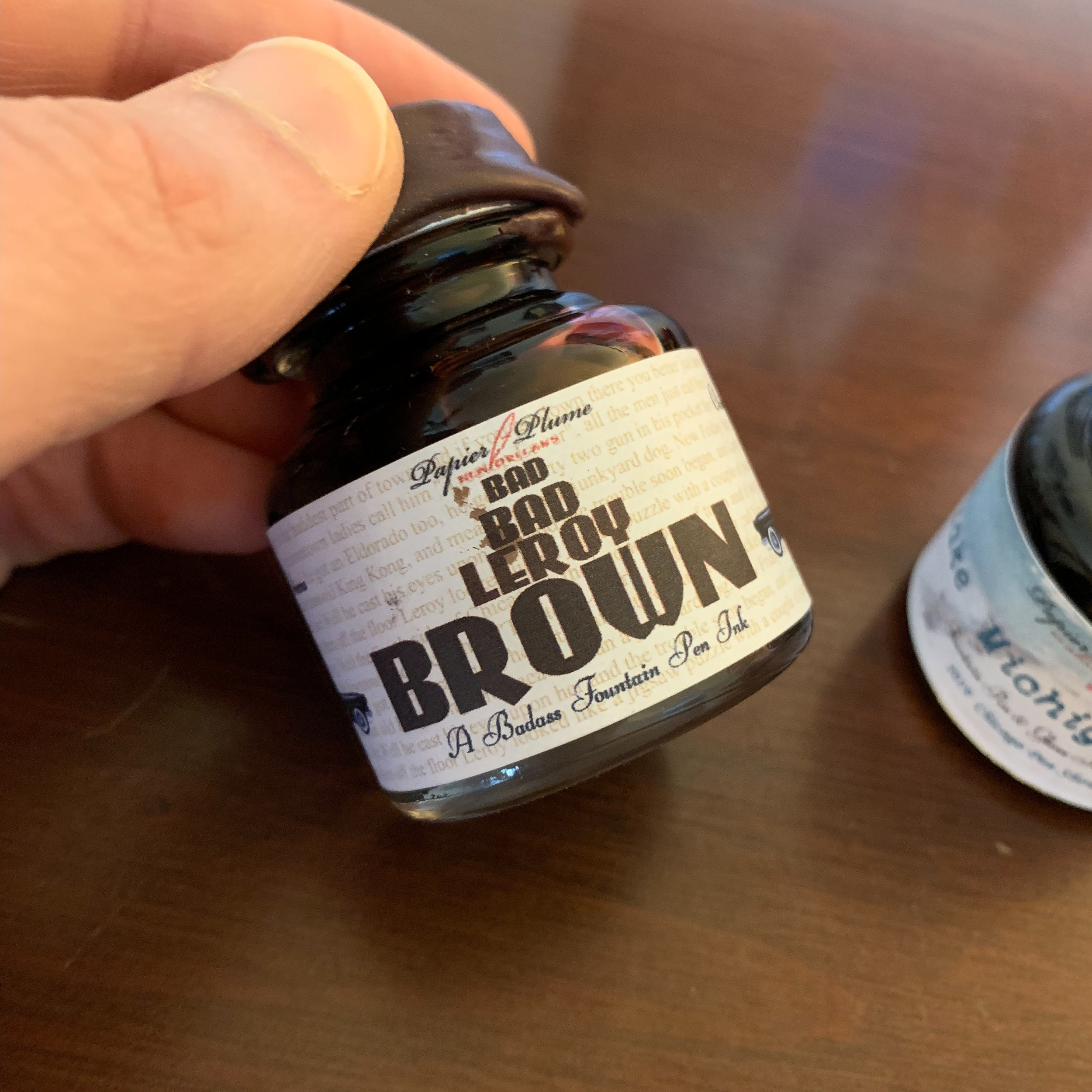
Every year, Papier Plume releases one or two special edition inks for the Chicago Pen Show. Building on last year’s Bootlegger’s Sacrament (a wine red) and “Da Blue,” (a Chicago Bears-inspired blue-black) this year’s inks include “Lake Michigan Winter,” (a turquoise/teal) and “Bad Bad Leroy Brown” (you guessed it).

For those of you attending the Chicago Pen Show from May 2-May 5, you’ll be able to purchase these inks at Papier Plume’s table, and from their website after the show. Most of the Chicago Pen Show inks have always sold out quickly, however, and Papier Plume typically only makes a single batch, so if you want to get your hands on either of these you’ll need to find someone attending the show to hook you up or quickly place an order afterwards.

View fullsize Bad, Bad Leroy Brown
View fullsize Lake Michigan Winter

Generally speaking, Papier Plume inks are unsaturated, so they play nice in most pens and offer good ink flow and shading. I’d compare them to Callifolio, Waterman, or standard (non-shimmer) Herbin, though the colors tend to have more pop than the Herbin inks. Papier Plume inks also offer good value, with the larger 30ml bottles costing $8 for the standard lineup of colors and $10 for special editions. You can also purchase smaller 15ml bottles of the standard colors for $5. Count me a fan!

Papier Plume also specializes in wax seals, an example of which you will find on the caps of their special edition inks.

Disclaimer: Papier Plume provided me with these two bottles of ink at no charge for review purposes. Many thanks!

In Ink Reviews, Pen Shows Tags Chicago Pen Show, Limited Edition, Papier Plume
Comment

Ink Review: Pilot Iroshizuku 100th Anniversary Inks, Bishamonten (Red) and Hoteison (Dark Green)

April 20, 2019

Pilot really puzzled me (and a lot of other people), because the company’s 100th anniversary was last year (2018), yet for some reason their “100th Anniversary Iroshizuku Inks” didn’t hit the states until March 2019. Better late than never, I guess.

The 100th Anniversary Iroshizuku inks consist of a fairly basic lineup of colors: Benzaiten (pink), Bishmonten (red), Daikokuten (yellow), Ebisu (light blue), Fukurokuju (green), Hoteison (dark green), and Jurojin (purple). As you can see, Pilot didn’t go out on too much of a limb here. Benzaiten, Bishamonten, and Hoteison are probably the most unique, whereas the others appear similar to inks already in the standard Iroshizuku lineup, though slightly different in tone. The inks are named to correspond to each of the “Seven Gods of Good Fortune” 100th Anniversary Pens, and if you have $30,000+ to drop, you can play the ultimate pen and ink matching game! (Or you can buy yourself a new BMW. Your choice.)

I like the label design - classic, yet still different, and the Iroshizuku ink bottle might be my current favorite. Bishamonten also has a slight gold sheen, which you can barely make out in this photograph. It’s subtle and will likely only appear in swabs or particularly wet writing pens.

The ink that interested me the most, and in the end, disappointed me somewhat, was Bishamonten . The standard Iroshizuku lineup doesn’t feature a “true red” - the colors that many people characterize as “red” tend to lean pink (Tsutsuji and Momiji) or purple/magenta (Yama Budo). So when I saw a new ink advertised as a “red”, I was thrilled. But while Bishamonten definitely appears less pink or purple than any of the existing inks, there’s still a pinkish hue, which is more pronounced in certain lights. I’m still holding out for Pilot to make an actual red ink, and dare I hope for a burgundy?

Hoteison is a green-black ink that has strong undertones of gray to it once it dries. The dark, muted Iroshizuku colors are some of my favorites, including Shin-Kai (blue-black), Syo-Ro (a dark teal-gray-green), Take-Sumi (a charcoal gray) and Tsuki-Yo (blue-black with teal undertones). Hoteison falls into this category, and will get a lot of use even if I already have a lot of similar shades in my collection.

Both colors are fairly saturated. They won’t appear washed-out. Like all Iroshizuku inks, Hoteison and Bishamonten are low-maintenance inks that don’t bleed or feather on most decent paper. (I’d still caution that Bishamonten, as a red ink, will have the potential to stain certain light-colored, porous, or transparent materials.)

Takeaways and Where to Buy

As always, Pilot makes a quality product, and Iroshizuku inks are among the best and most reliable out there. Bishamonten and Hoteison are no exception. I do have to admit, however, that the 100th Anniversary colors left me a touch disappointed. The two inks I reviewed here are by far the most interesting to me, and they’re a pinkish red and a dark green-black - not exactly imaginative shades. Regardless, these inks will sell well, simply because they’re special edition Iroshizukus, and if you don’t already have similar colors in your collection you can’t go wrong with any of them.

I purchased the two inks featured in this review from Vanness Pens at this year’s Atlanta Pen Show. Hoteison is currently in stock, but Bishamonten is sold out for the time being. Vanness has most of the other colors as well, and I expect they will get at least one other shipment of ink, though I have no insight into how long Pilot intends to make the 100th Anniversary colors before discontinuing them. If they interest you at all, I’d recommend that you purchase these inks now while they’re generally available.

Disclaimer: This post contains links to paid sponsors and affiliates. I purchased the inks featured in this review with my own funds, for my own use, though Vanness Pens did offer me a discount.

In Ink Reviews Tags Ink Review, Pilot, Iroshizuku, 100th Anniversary Iroshizuku
Comment

Ink Review: Taccia Ebi (Purple Red) and Uguisu (Olive Green)

April 3, 2019

Taccia is a Taiwanese brand that has grown significantly over the past couple of years, releasing some very nice pens at both a moderate and luxury price point, and just this past year releasing an entire range of inks. Today’s review will take a look at two of the inks: Ebi (described as a “purple red”) and Uguisu (described as an “olive green”). I chose these particular colors because, as you all know, I’m partial to deep reds/burgundies and darker greens. Neither Taccia ink disappoints.

I’d consider Taccia “Ebi” to be a solid burgundy/maroon option, if you prefer your burgundies with a lot of purple. Comparable colors would include Montblanc Burgundy Red (the closest match in my collection) and Sailor Oku-Yama (more pink/red and less purple). Colorverse Dark Energy has a lot more black to it.

“Uguisu” is an ink that’s going to get a lot of use. I’ve had a hard time finding a true “olive green” that isn’t too yellow and/or pale. By far the closest match in my collection is Sailor Jentle Epinard, since both inks have a slight red sheen to them, but the Uguisu is a shade lighter with enough yellow to make it a pure olive. Other comparable colors include Sailor Waka Uguisu (much lighter) and Monteverde Olivine (much darker, with nib crud issues).

Writing sample on Clairefontaine French Ruled A5 notebook. The tester pen for the Ebi was a KACO Retro, and a Parker 51 for the Uguisu.

Because Japanese pen company Sailor has made nibs for Taccia in the past, it begs the question: Are these Sailor inks? No. While these inks are made in Japan, I understand they’re manufactured by another company (Nabayashi), though the range of colors Taccia chose definitely bears some similarity to the Sailor Jentle/Pilot Iroshizuku lineup. The Taccia inks also behave somewhat differently. Both Ebi and Uguisu were slightly wetter than most Sailor inks I have used, though they still worked well on most types of paper, with the exception of the super-cheap recycled copy paper that is always loaded into one of my office printers. (Side Note: does anyone else have a situation at work where one printer has the “good paper” and other has the “terrible paper”? Apparently I have a reputation for backing up the “good printer” with print jobs because I refuse to use the bad one.)

Takeaways and Where to Buy

Burgundy reds and olive greens are always two of my favorite colors, and I found both Taccia inks to be well-behaved. I’ve heard good reports about the brand in general. With Sailor upping their prices per ml by cutting bottle sizes in half, Taccia presents an attractive alternative by selling quality ink that behaves similarly at a lower price point. Vanness Pens currently stocks the entire line, and has 12 of the 13 inks in stock at $12 per 40ml bottle. I also expect that Lisa will be bringing Taccia inks to this weekend’s upcoming Atlanta Pen Show.

Many thanks to Vanness Pens for providing me with these two bottles of Taccia Ink (in exchange for helping to work the table at the Baltimore Pen Show).

I love the box art on the Taccia inks. Ebi on the left, Uguisu on the right.

In Ink Reviews Tags Ink Review, Vanness, Taccia, Taccia Ink
1 Comment

Ink Review: J. Herbin 1798 Cornaline D'Egypte

August 25, 2018

The 1798 Collection of inks from J. Herbin is built around the theme of gemstones. The last ink to be released was Amethyste de l'Oural, followed by the ink featured here, Cornaline d'Egypte.  (For those of you who don't speak French or know your gemstones, that's Amethyst and Carnelian, respectively.) 

A shot of the silver shimmer coming off the Cornaline d'Egypte. 

A shot of the silver shimmer coming off the Cornaline d'Egypte. 

Cornaline d'Egypte is a cool reddish-orange with some brown tones to it. I'd characterize it as a "pumpkin" hue. In addition to the silver shimmer, the ink shades fairly well and dries relatively quickly compared to other Herbin shimmer inks that I've used. 

The Herbin shimmer inks always look amazing in clear pens, but it can also serve as a reminder to clean your pens well before swapping in a new ink, and not to let them sit too long! 

Takeaways and Where to Buy

With very limited exceptions, shimmer inks aren't something I can use on a regular basis, but they're fun to play around with, especially if you load them into a transparent demonstrator or eyedropper pen where you can watch the different components of the ink swirl around. As with all shimmer inks, be sure to exercise good pen hygiene, since the shimmer particles can clog if you let the pen sit for too long or don't flush the pen properly before changing inks. 

You can purchase Cornaline d'Egypte, along with the other J. Herbin inks, from site sponsor Vanness Pens. Since these inks are Herbin's speciality line, they're a bit pricier than the standard bottle, at $26 for 50ml. Many thanks to Exaclair, Herbin's U.S. Distributor, for providing this bottle for review! 

Further Reading  

If the J. Herbin shimmer inks appeal to you, check out the 1670 series as well. I've previously reviewed several colors in that range, including Emerald of Chivor and Caroube de Chypre.  

Disclaimer: J. Herbin's U.S. Distributor, Exaclair, provided me with this bottle of ink for review purposes, free of charge. 

In Ink Reviews Tags Herbin 1798 Inks, Herbin, Shimmer Inks, Inks, Ink Review
Comment

Ink Review: Colorverse Season 4, "Trailblazers In Space" (Albert/V2 Rocket)

July 28, 2018

Colorverse recently launched Season 4, titled "Trailblazers in Space," and once again the company has shown that it really has no competition in terms of marketing creativity. This season's theme is again well-thought out, and the inks in the various sets seem to complement each other well.  For those of you who aren't space geeks, the names are a tribute to the various animals, mainly monkeys and dogs, who were the first "Trailblazers" to "visit" space. (To be honest, after reading up on this theme in depth, I personally found the history behind these sets more than a little morbid. For example, I think there were technically six "Alberts", which is reflected on the design of the Colorverse box.)

Colorverse-V2-Rocket-Albert-Ink-Samples

Anyway, back to the ink. The set that I have is Albert/V2 Rocket, which pairs a bright grass green (Albert) with a bright orange (V2 Rocket). I say "bright" - both colors aren't quite what I would call fluorescent, but it's close. While V2 Rocket is easily my favorite here, Albert is also a great color. Both are on the drier side for Colorverse inks, though there were no flow issues. One thing to note about Season 4 is the new and improved packaging. Colorverse now includes foam inserts to help keep the bottles in place during shipping and prevent spillage, which had been an issue with the previous packaging design. (Check out the photo below.)

Colorverse Albert in my Franklin-Christoph Model 02 with a Masuyama-Rouse 14k needlepoint nib. 

Colorverse Albert in my Franklin-Christoph Model 02 with a Masuyama-Rouse 14k needlepoint nib. 

Colorverse V2 Rocket in my Jim Rouse Sheaffer Legacy. 

View fullsize Colorverse Season 4 Packaging - V2 Rocket
View fullsize Colorverse Season 4 Packaging - Albert
View fullsize Colorverse Season 4 - New Box

Takeaways and Where to Buy

Colorverse inks continue to pleasantly surprise me. With all the crazy colors, sheen, and "glistening" properties, one might think that these inks would be slow to dry, or otherwise have issues with feathering and bleeding. Not so - every single one of these inks has behaved itself in any pen I've tried, and Albert/V2 Rocket are no exception. You can check out my prior reviews of other Colorverse inks, including Black Hole and Dark Energy, Schrodinger and Cat, and Quasar. 

Many thanks to our sponsor Pen Chalet for graciously supplying this set of Colorverse Ink for review. Pen Chalet carries the entire range of Colorverse, including Season 4. Each set is priced at $36 USD for 80ml of ink (a large 65ml bottle and a smaller 15ml bottle), and with this season you get two different inks per box, much like Season 3. 

Disclaimer: Pen Chalet provided me with the ink featured in this review free of charge. This post contains affiliate links. 

In Ink Reviews Tags Colorverse, Ink, Colorverse Albert, Colorverse V2 Rocket, Ink Review
1 Comment
← Newer Posts Older Posts →
Store Hours and Location
Visit the T.G.S. Curated SHOP
*New* Updated "Best Pens" Guide (2025)
TGS x Hinze Pens Violet Tendencies Taschenstift Fountain Pen
Hierarchies of Fountain Pen Friendly Paper
Allex Scissors arrayed on a desk showing link to desk accessories

Join Our Patreon!
Subscribe to the TGS E-mail List

Featured Posts

Featured
Iro-Utsushi-Fine-Dip-Pens.jpeg
Oct 1, 2025
The Pilot Iro-Utsushi Dip Pen (and in General, Simple vs. Fancy Dip Pens)
Oct 1, 2025
Oct 1, 2025
Levenger-Annotation-Pad.jpeg
Sep 20, 2025
Five Boutique Paper Brands I'm Watching Closely and Why
Sep 20, 2025
Sep 20, 2025
Playing-ink-MD-Cotton-Glass-Pens.jpeg
Sep 17, 2025
What's On Your Desk? My Personal Favorite Papers for Fountain Pens, 2025
Sep 17, 2025
Sep 17, 2025
The Gentleman Stationer RSS

© Digital Divide Media, LLC, 2014-present.

All content is the exclusive property of Digital Divide Media, LLC, d/b/a The Gentleman Stationer, including “The Gentleman Stationer” website and trademark, and should not be reproduced without express written permission.  All rights reserved.

All content containing paid advertising, affiliate links, or sponsored content will be plainly disclosed by a disclaimer when/if featured.

Contact Information

Store Shipping Policy and Return Policy

Privacy Policy

Cookie Policy

Terms and Conditions

Powered by Squarespace