• Blog
  • Shop
  • Resources
  • FAQ (Ask TGS)
  • About
  • Archive
  • Contact
  • Sign In My Account
Menu

The Gentleman Stationer

Vintage Living in the Modern World.
  • Blog
  • Shop
  • Resources
  • FAQ (Ask TGS)
  • About
  • Archive
  • Contact
  • Sign In My Account

Everyday Writers: The Best Fountain Pen Inks for Daily Use (2020 Edition)

February 26, 2020

It’s been a long time since I’ve updated one of the more popular posts on the website: Best Inks for Everyday Writing. As I was preparing for my seminar at the upcoming Baltimore Pen Show this Saturday, I reviewed this post and was surprised to discover it was somewhat out-of-date. Not substantively, mind you - all five inks that I originally discussed back in 2016 make excellent daily drivers - but a few of them have fallen by the wayside over the course of another four years of daily (and much more intense) fountain pen use.

What Makes a Fountain Pen Ink a Great Everyday Writer?

So what inks am I currently using for most of my everyday writing, and why have I chosen these specific inks? Let’s start by revisiting my criteria for an “everyday writer” ink:

  • Cost. The ink must be relatively inexpensive for those who actually cycle through a high volume of ink in writing-intensive professions. Most of the inks featured on the list below cost anywhere from $0.15 to $0.23 per milliliter, well below the cost of most boutique inks. Sure, the range of available colors isn’t as extensive, but in certain contexts that’s less important than cost and versatility.

  • Versatility. In terms of versatility, these inks work exceptionally well on a range of paper types, from your high quality Clairefontaine and Tomoe River notebooks to standard copy paper. Sure, you might get some feathering and bleedthrough on the latter, but the stuff they give us in my office won’t even handle a gel pen. (In worst-case scenarios, you just have to use a pencil.)

  • Safety. All five of these inks are manufactured by companies that also sell pens, which is a good rule of thumb to follow when looking for inks that won’t damage your fountain pens, vintage or modern. That’s not to say that you should abandon all common sense - for example, don’t use red or purple inks in a clear demonstrator or a light-colored pen you want to keep absolutely stain-free - but you’re not going to melt the feed or tarnish a nib by using any of the inks on this list.

My Top Five Fountain Pen Inks for Everyday Writing

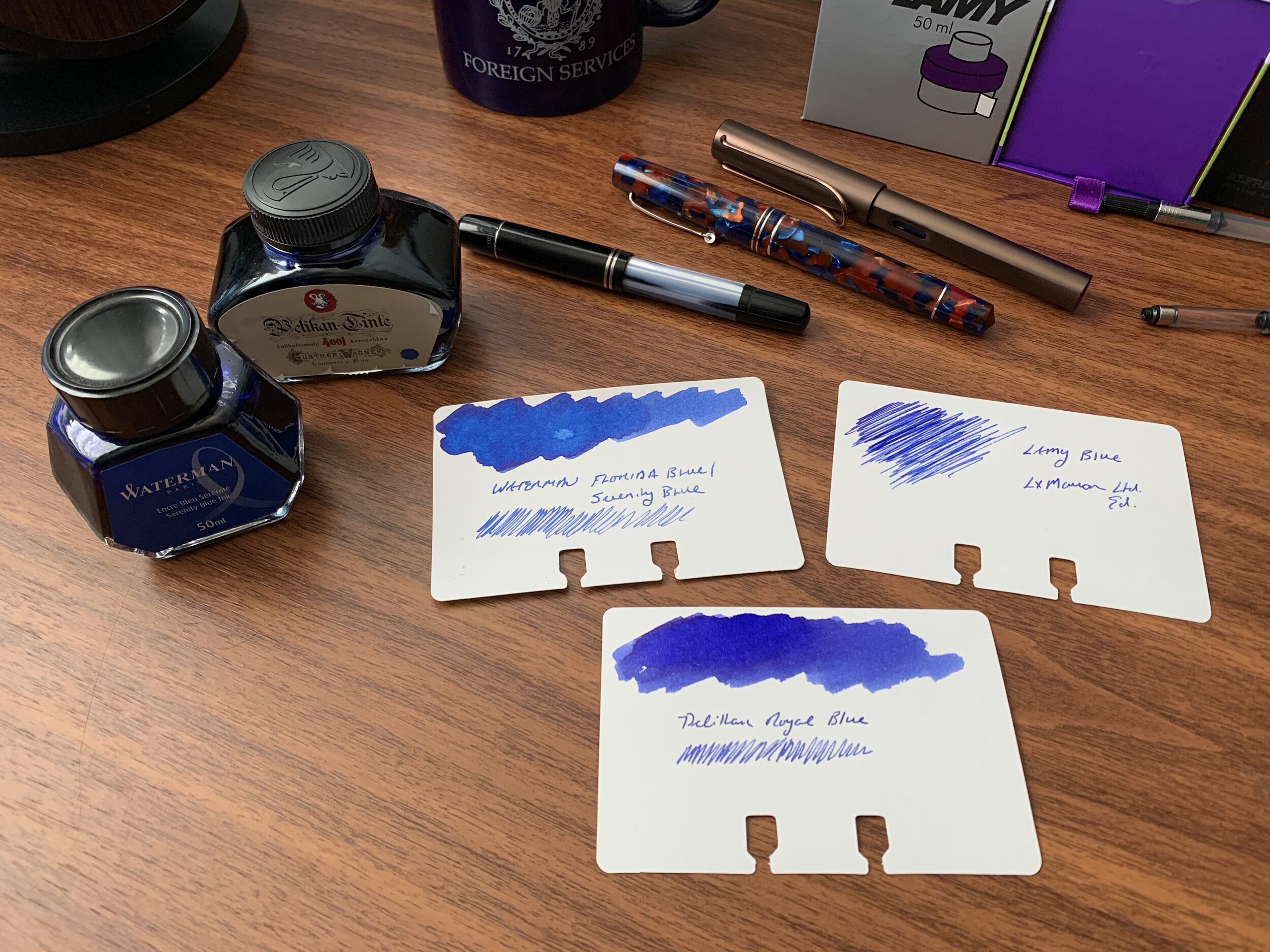
  1. Waterman “Serenity Blue”. In my opinion, one of the best all-around fountain-pen inks ever made. Unlike many standard blue inks, Waterman Blue - which I’ll forever think of by it’s old name, “Florida Blue” - has a bright, jewel-like quality to it, and it mixes well with other colors. (Combine 50/50 with Waterman Violet for the original “Blurple” ink.) Waterman blue is also widely-regarded as one of the safest inks around, especially for vintage pens.

  2. Sheaffer Skrip Red. Red like a fire engine, or from your elementary school report card (or maybe just mine). That’s what I think of when I look for a pure red. Sheaffer Skrip Red has long been regarded as the “safe” red ink that won’t stain your pens. Personally, I take this with a grain of salt. As noted above, if I have a prized transparent or light-colored pen that I don’t want to stain, I’ll avoid any ink other than the aforementioned Waterman Blue.

  3. Lamy Blue-Black. After jumping around for years, I’ve settled on Lamy Blue-Black as my preferred blue-black ink of choice. It’s what I consider a “pure” blue-black, that plays things right down the middle without either leaning too far to the blue or black end of the spectrum, and without appearing gray.

  4. Lamy Black. I used to think of black inks as boring, but as I’ve settled into my fountain pen habits over the years, I’ve come to appreciate (1) how using a somewhat nondescript ink color can help you focus when you’re trying to get difficult work done, and (2) how Lamy Black can’t actually be described as “nondescript,” since the ink has subtle gray-green-purple undertones that make it one of the more interesting black inks out there.

  5. Monteverde Passion Burgundy. This company flies under the radar of many fountain pen enthusiasts, but Monteverde makes excellent inks, and I’m partial to their burgundies. “Passion Burgundy” is one of my personal favorites, since it has a bit more pop than traditional wine-colored inks. When you don’t want to use a standard blue, black, or blue-black, and red ink feels too loud for professional correspondence, a deep burgundy offers a classy alternative. (Dark green is another option, but burgundy remains my favorite.)

“Everyday Writers” Sample Packs and Where to Buy Full Bottles

As noted above, one great thing about all of these inks is widespread availability. We carry Lamy inks directly (as well as a diverse selection of others). The great thing about these four brands (especially Waterman, Sheaffer, and Lamy) is that most pen shops carry them and they remain relatively easy to find. either online or brick-and-mortar. If you regularly rely on one of these inks to get your work done, you shouldn’t have to worry about these inks becoming unavailable.

In Ink Reviews Tags Everyday Writers, Best Inks, Fountain Pen Inks, Ink Review, Top 5
Comment

Why Everyone Needs at Least One Green Ink

February 5, 2020

In a more traditional professional setting, you can sometimes find yourself a bit restricted in terms of what ink you feel comfortable using at the office. Sure, blue, black, and blue-black are the “safe” choices, but there are benefits to choosing a color that stands out a bit more. Whether your job involves project-based collaborations, or drafting documents subject to comments and revisions by multiple people, situations will arise when you’ll want your comments and input to stand out from the rest of the herd. Personally, that’s when I reach for the red or the green.

While both Montblanc Irish Green and Bungubox Norwegian Wood are darker greens, I wouldn’t call them green-blacks. They have more blue in them.

Before I go further: Yes, I know that green ink carries some baggage. Apparently, in the UK especially, green ink has become associated with so-called “green ink letters.” Back in the day when people actually still wrote physical letters to the newspaper, the more “interesting” submissions were stereotypically written in green ink. Just look up the term “Green Ink Brigade.” That said, there is also a tradition of green ink being used by MI6 and the British intelligence services, so you’re not necessarily labeling yourself as a nut by signing that memo to your boss in green.

Writing samples done with the Kanilea Pen Co. Mauna Kea (left) and Leonardo Momento Zero Grande Arlecchino (right).

For professional purposes, I prefer a classic darker green, but not necessarily a “green-black.” Green-black inks tend to see use as substitutes for standard blues or blacks as a drafting ink, whereas for editing or annotation I prefer a true green. The two I have been using lately are Montblanc’s Irish Green, which has been a favorite for years and previously reviewed on its own, as well as Bungubox Norwegian Wood Emerald, which is a shop-exclusive Sailor ink that made an appearance in my list of Best Fountain Pen Inks for Editing and Annotation. I traveled with both loaded into pens on my trip last week, and what I love about both inks is that they are generally low-maintenance and dry quickly, a key consideration for a professional road trip where you have to take quick notes in a conference or on a trade show floor.

Takeaways and Where To Buy

Both green and red inks sometimes bear an unfair connotation as unnecessarily loud or obnoxious colors for writing. That needs to change. You can only take so many blues, blacks, blue-blacks, and even purples in the professional context, and greens present an opportunity to distinguish yourself a bit without going full-on orange shimmer ink. I get more comments - nice ones - on my green inks at work than any other color, and they show especially well in written correspondence.

Both of these inks look exceptional on bright white paper, here Clairefontaine French Ruled.

As luck would have it, of course, these two specific inks are becoming somewhat difficult to find. While Montblanc Irish Green is a standard option in Montblanc’s ink lineup, it’s becoming harder to find an independent U.S. pen retailer that stocks Montblanc due to what I understand to be a policy that all authorized retailers have a brick-and-mortar store. Both Dromgoole’s and Appelboom currently have Irish Green ink in stock. On the other hand, Bungubox inks are made in much smaller runs, and I heard that Sailor recently required that they impose a hefty price increase on these inks in the U.S., so that Bungubox inks now cost nearly $40 for a 30ml bottle. I love Norwegian Wood, but there are other options and I likely won’t be purchasing the ink again at the new price point unless something changes. If you absolutely must have this color, Pen Chalet stocks most Bungubox colors.

If you’re interested in reading further, I’ve previously reviewed dark greens that lean more green-black, as well as lighter “grass green” inks.

Disclaimer: I purchased both bottles of ink featured in this review with my own funds, for my own use. This post contains affiliate links.

In Ink Reviews Tags Ink Review, Green Ink Brigade, Green Inks
5 Comments

Ink Brand Profile: Platinum Mix-Free Inks

January 25, 2020

Occasionally I get to review a product (or line of products) that has been around for a long time, but that I’ve never reviewed. Platinum’s “Mix-Free” inks fall into that category. While Platinum has manufactured these inks for years, availability has been spotty at times, and the Mix-Free inks have never received the kind of attention you would expect for a product of this quality, especially given enthusiasts’ obsession with color-matching discontinued inks and the ability to create unique mixes from scratch.

Part of the issue is likely Platinum itself, which until recently never made much of an effort to promote their products heavily outside of Japan, and therefore trailed Pilot and Sailor as a “distant third” in terms of popular Japanese pen companies around the world. As Platinum’s limited and special edition pens have taken off in popularity, Platinum’s inks have also received more attention, including the Mix-Free line.

The nine base colors, unmixed. Ink swabs done on Canson White Mixed Media Paper. These colors are quite vibrant, and I plan to try out a few of them on their own.

How Do the Mix-Free Inks Work?

It’s pretty self-explanatory: Platinum sells nine base inks (Aqua Blue, Aurora Blue, Cyclamen Pink, Earth Brown, Flame Red, Leaf Green, Silky Purple, Smoke Black, and Sunny Yellow) that you can combine to form your own colors, whether that be your perfect shade of blue-black, or a reproduction of that long-discontinued Montblanc Writer’s edition ink. As long as you have a syringe or pipette and a sample vial or empty ink bottle, it’s quite easy to experiment. (I’d personally recommend a syringe, since it’s easier to get precise measurements.)

I’ve come up with two different mixes that I like a lot: a “Racing Green” mix, the base formula for which I found online and modified somewhat (Top) and a mix of my own creation that I refer to as “Alfred” (second from bottom). Montblanc Hitchcock is one of the hardest discontinued inks to duplicate, in part because of the rust-colored sheen it leaves. For now, I’m happy with how close I’ve gotten.

Formulas are: Racing Green (1 part Leaf Green, .5 parts Earth Brown, .5 parts Sunny Yellow, .3 parts Aurora Blue, and .3 parts Black); and “Alfred” (3 parts Earth Brown, 1 part Flame Red, 1 part Silky Purple, .5 parts Sunny Yellow). Forgive the janky measurements - for mixing purposes, equate “parts” with “milliliters” as measured on an ink syringe.

I’ve found the Mix-Free inks to be well-behaved and low-maintenance. The mixes that I use flow better than other Platinum inks (which can be on the dry side), and none of mine have feathered or bled on decent paper. I’ve also not had any trouble with staining or difficulty flushing the inks out of pens.

A Note of Caution: I’ve been warned by a couple different people that Platinum Mix-Free inks don’t “play nice” with Sailor and Pilot inks, due to their different chemical compositions. While I have used the Mix Free inks in pens that have previously held inks from Sailor and Pilot, I’ve always been sure to flush the pens thoroughly to avoid any clogging that might occur. If you are considering mixing inks, only mix the Platinum Mix-Free inks with other Platinum Mix Free inks, and not with inks from any other brand.

Takeaways and Where to Buy

I have had Platinum Mix-Free inks loaded into several pens more or less nonstop since early December. Sure, I’ve used ink lines exclusively for long stretches before, but eventually I do get tired of the same colors. Here, with the ability to change up the colors, that same risk of boredom doesn’t really exist, and you can experiment with creating your own unique mixes without worrying whether your signature ink is “safe” for all pens, since the ink is still made by a reputable pen company.

In recent years, Platinum Mix-Free Inks have been hard to find at times, but that’s changed as the brand has improved distribution and experienced a surge in popularity. Not only are these inks in stock, but they sit at an attractive price point and come in two bottle sizes: larger 60ml bottles and smaller 20ml bottles. Given there is only a $4 price difference between the two sizes (currently $16 vs. $12 at site sponsor Pen Chalet), the larger bottles are a no-brainer for me. If you don’t already have syringes, pipettes, and leftover ink sample vials or empty ink bottles to hold your new creations, you can also purchase a “mixing kit” for $16, which also contains “dilution liquid” (i.e. ink with no dye) to soften colors. I don’t have the kit or the dilution liquid, so I can’t speak to its capabilities, but I’d imagine you could simply use distilled water to achieve the same effect.

I’m really enjoying these inks and look forward to sharing new mixes in the future as I get more experience mixing the colors. Stay tuned! After I dial in the formulas, maybe I’ll giveaway some samples of my creations.

Disclaimer: This post contains links to paid sponsors and affiliates. I purchased the inks featured in this review from site sponsor Pen Chalet, using store credit generated through the Pen Chalet affiliate program, which is one of many ways I support the blog.

In Ink Reviews Tags Platinum Mix-Free Inks, Platinum Ink, Inks, Ink Review, Ink Mixing
Comment
IMG_2214.jpg

Back to Basics: Blue Ink for Everday Writing

November 27, 2019

Ten years ago, I never would have imagined the size and scope of today’s stationery marketplace, much less the depth of the community surrounding it. Indeed, there were times when I was convinced I had picked a hobby that wouldn’t even exist in ten years, much less have expanded so much. While this is mostly a good thing - and a topic I plan to explore in depth in future posts - I sometimes find myself experiencing a sense of overwhelm and paralysis-by-choice. There are simply so many different brands and models of pens, inks, pencils, and paper out there that I can only imagine how confusing it must be to someone diving in for the first time, especially when it comes to fountain pens and fountain pen ink.

In all of our enthusiasm for chasing the next hot thing, I don’t want people to lose sight of the fact that you can always go back to the basics and still have a great experience. When you just want to enjoy a long writing session with a new pen or an old favorite, sometimes the best thing you can do is stop worrying about which ink would make the “perfect pairing,” ditch chasing “shimmer” and “sheen,” and ink up a basic blue or black ink. A few weeks ago I wrote about how I’ve grown to appreciate Lamy’s standard Black and Blue-Black offerings. Not only have I continued to use those two warhorses, but I’ve reached back into my ink cabinet and pulled out a few more favorites, namely some basic blue inks.

Waterman Serenity Blue

My number one work-friendly ink of all time, Waterman “Serenity Blue” (formerly “Florida Blue”) might be the best all-around fountain pen ink ever made. That’s a pretty big claim, but it’s not hard to support. Waterman ink (1) can be found at $12 or less per bottle at retail; (2) is widely regarded as one of the safest fountain pen inks available for use in vintage pens and materials prone to staining, like celluloid; and (3) works well on nearly all types of paper, making it a versatile ink suitable for pretty much any use case. Waterman ink bottles are also extremely functional: the faceted design lets you tilt the bottle for easier filling once the ink level gets low.

Pelikan 4001 Royal Blue

Slightly darker than Waterman Serenity Blue, Pelikan 4001 Royal Blue has its own group of devotees, some of whom love this ink so much that Pelikan sells it in massive 1 liter bottles (though recently I’ve currently only been able to find this size available in Pelikan Brilliant Black in the U.S.). While I personally prefer Waterman’s brighter tone, Pelikan Royal Blue likewise performs well on most papers and is a “safe” ink to use in nearly all pens. Pelikan inks come in a wider variety of bottle sizes than Waterman, with a few more reasonable options than the liter jug: around $11 for a 30ml bottle, or $14 for a 62.5ml bottle. The “historic” bottle of Royal Blue (same ink, different packaging) is priced at $12 for 60ml.

Lamy Blue

Finally, the last of the three basic blue inks that I use on a regular basis is standard Lamy Blue. If you’ve purchased a Lamy cartridge-converter pen, you have a sample of this ink on hand, since Lamy includes a blue cartridge with every pen sold. Though I still use it fairly regularly - mainly for the convenience of cartridge form - Lamy Blue is my least favorite of the three inks discussed here. It’s less vibrant than both Waterman Serenity Blue and Pelikan Royal Blue, with a tendency to take on a washed-out tone and fade after the ink dries. What this ink does have going for it is Lamy’s excellent ink bottle (complete with blotting paper) as well as the fact that it’s erasable using one of Lamy’s Ink Eraser Pens.

Takeaways and Where to Buy

You can’t go wrong with any of these three blue inks, all of which are inexpensive, reliable, and widely available. While nothing is certain, you probably don’t have to worry about getting attached to any of these three inks, only to have the formulation change or the ink disappear from the market. Waterman, Pelikan, and Lamy inks have all been around forever and I haven’t seen any signs that is about to change.

The one drawback is impermanence: none of these inks are waterproof, so if you’re looking for that you should go elsewhere (Pilot Blue-Black is an exceptional ink with decent water resistance, also available in large quantities).

You can purchase these three inks from nearly all major pen retailers, including site sponsors Pen Chalet and Vanness Pens.

Disclaimer: This post contains links to paid sponsors and affiliates. I believe that I purchased the inks featured in this review with my own funds, for my own use, though it’s possible I used store credit generated through affiliate programs in which I participate. I’ve gone through multiple bottles of Waterman Blue over the years so I can’t be sure.

In Ink Reviews Tags Basic Inks, Blue Ink, Waterman, Pelikan, Lamy, Ink Review
5 Comments

Ink Review: Vanness Pens / Joey Feldman "Inktober" and "Good Evening"

November 2, 2019

Most people know Vanness Pens in Little Rock, Arkansas as the go-to resource for rare and unusual inks. They have one of the largest selections of fountain pen inks in the world, and are always the first to import new lines of ink from Japan, Korea, the Netherlands, the Philippines - you name it. As experts in the subject, I guess it was only a matter of time before they started mixing their own inks! Today I’m reviewing two inks developed in collaboration with artist Joey Feldman: a black ink called Inktober 2019, as well as a red/burgundy called “Good Evening,” which you might find reminiscent of a certain highly coveted limited edition ink from around 2013. (It’s intentional.)

Let’s start with Inktober. For those of you unfamiliar with the term, #inktober is an online challenge in which participants post one drawing per day for the month of October. As someone with zero artistic ability who assumes that people will be easily bored by an endless array of stick-figure cartoons, I’ve not participated, but I always enjoy seeing the amazing work that everyone else can do.

As the name implies, the Inktober ink was formulated as a black ink for sketching during the month of, well, Inktober. It’s impermanent by design - many of the #inktober entries have featured brush and ink-wash techniques that take advantage of this ink’s ability to shade when diluted. That said, I absolutely LOVE this ink as a black ink for writing. I’d compare it to Lamy Black or Rohrer & Klingner Leipziger Schwarz, which are both interesting black inks with different tones to them. I do think that the Inktober dries quicker and feathers less on inexpensive paper, and of course, with these two inks you don’t get a bottle featuring Joey Feldman artwork.

I think I like Joey’s caricature better.

“Good Evening” is easily my favorite of these two releases, which should come as a surprise to no one. It’s a rich red ink that I could alternately describe as “burgundy red” or “blood red,” depending on the light. Both the name and the design on the bottle should give you a good idea of the inspiration for this particular ink, and it’s absolutely amazing to see someone come EXTREMELY CLOSE to duplicating what I consider one of the best red inks ever made. Good Evening also makes for an excellent writing ink, and given that it writes relatively wet and flows well, the lack of feathering and bleedthrough surprises me. (The writing sample featured here was done with a firehose broad nib on a Lamy 2000.)

Some of the difference here is the lighting, and the fact that the Montblanc Hitchcock is still wet, but the ink on the left has a bit more red in it than the “Good Evening.” Once the inks are thoroughly dry, the match is closer, but not exact.

Another picture taken after the ink swatches are dry. You’ll notice that the Good Evening still has slightly more purple/blue, while the Hitchcock has more red. Hitchcock can also have a slight gold/brown sheen to it (the “dried blood” effect).

Takeaways and Where to Buy

Inktober and Good Evening both have the potential to become favorites, and I’m looking forward to more special edition runs and, hopefully, a standard lineup from Vanness in the future. Right now, you can purchase the Inktober 2019 Limited Edition Ink and “Good Evening” for $15 per bottle on the Vanness website. If I didn’t already have a gazillion bottles of ink sitting in a cabinet in my home office, I’d be buying multiples. These inks are that good.

Also, don’t miss the Vanness Fountain Pen Day Orange Ink, made to match the Limited Edition FPD Franklin-Christoph 31 pen released yesterday! Vanness still has both pens and ink in stock, though the pens are a limited run of 88 so I’m not sure how long they will last. Also, be sure and check out yesterday’s Deals & Drops post, which highlighted this and several other Fountain Pen Day promotions. At least one sale (Pen Chalet) has been extended through Sunday.

Disclaimer: I received the two bottles of ink featured in this review, free of charge, from Vanness Pens for review purposes. This post contains links to paid sponsors and affiliates.

In Ink Reviews Tags Vanness Ink, Vanness Pens, Joey Feldman, Ink Review
Comment
← Newer Posts Older Posts →
Store Hours and Location
Visit the T.G.S. Curated SHOP
*New* Updated "Best Pens" Guide (2025)
T.G.S. 2025 Holiday Gift Guide
TGS x Roterfaden TGS_25
Hierarchies of Fountain Pen Friendly Paper

Join Our Patreon!
Subscribe to the TGS E-mail List

Featured Posts

Featured
Cover On the Paper Trail Intro Clip.jpeg
Dec 3, 2025
Introducing "On the Paper Trail," a New Podcast/Video Collaboration with Lisa Vanness of Vanness Pens!
Dec 3, 2025
Dec 3, 2025
Iro-Utsushi-Fine-Dip-Pens.jpeg
Oct 1, 2025
The Pilot Iro-Utsushi Dip Pen (and in General, Simple vs. Fancy Dip Pens)
Oct 1, 2025
Oct 1, 2025
Levenger-Annotation-Pad.jpeg
Sep 20, 2025
Five Boutique Paper Brands I'm Watching Closely and Why
Sep 20, 2025
Sep 20, 2025
The Gentleman Stationer RSS

© Digital Divide Media, LLC, 2014-present.

All content is the exclusive property of Digital Divide Media, LLC, d/b/a The Gentleman Stationer, including “The Gentleman Stationer” website and trademark, and should not be reproduced without express written permission.  All rights reserved.

All content containing paid advertising, affiliate links, or sponsored content will be plainly disclosed by a disclaimer when/if featured.

Contact Information

Store Shipping Policy and Return Policy

Privacy Policy

Cookie Policy

Terms and Conditions

Powered by Squarespace