• Blog
  • Shop
  • Resources
  • FAQ (Ask TGS)
  • About
  • Archive
  • Contact
  • Sign In My Account
Menu

The Gentleman Stationer

Vintage Living in the Modern World.
  • Blog
  • Shop
  • Resources
  • FAQ (Ask TGS)
  • About
  • Archive
  • Contact
  • Sign In My Account

Diving into Diamine Inkvent for the First Time: Days One and Two

December 2, 2023

2023 marks the first year that I’ve acquired a Diamine Inkvent Calendar and had my stuff together far enough in advance to play along here on the blog. This “project” is pure fun for me and a bit out of my comfort zone for the blog, not being known for ink reviews and also as someone who’s admittedly a bit “boring” in terms of the inks they use on a daily basis. So how’s it going? So far, so good, and as expected about 1/3 of the inks have turned out to be colors that I would use semi-regularly.

Note: In order to allow myself adequate time to photograph and video each ink, I’m currently working about five days ahead. So even though we’re technically only on “Day Two” of Inkvent, I’ve already opened and swatched through Day 5.

How Does the Diamine Inkvent Calendar Work?

Like a typical Advent calendar. You receive a box that has 25 numbered “doors” punched into it. If you use the calendar as intended, you open one door for each day of Advent. The calendar contains 25 bottles of different inks behind each door: 24 15ml bottles and one 30ml bottle, with the latter intended to be a “special” ink opened on Christmas Day. Diamine claims these inks are all unique for each year’s Inkvent, and they have started releasing the inks in full bottles about six months later.

What Inks Are In and Inkvent Calendar?

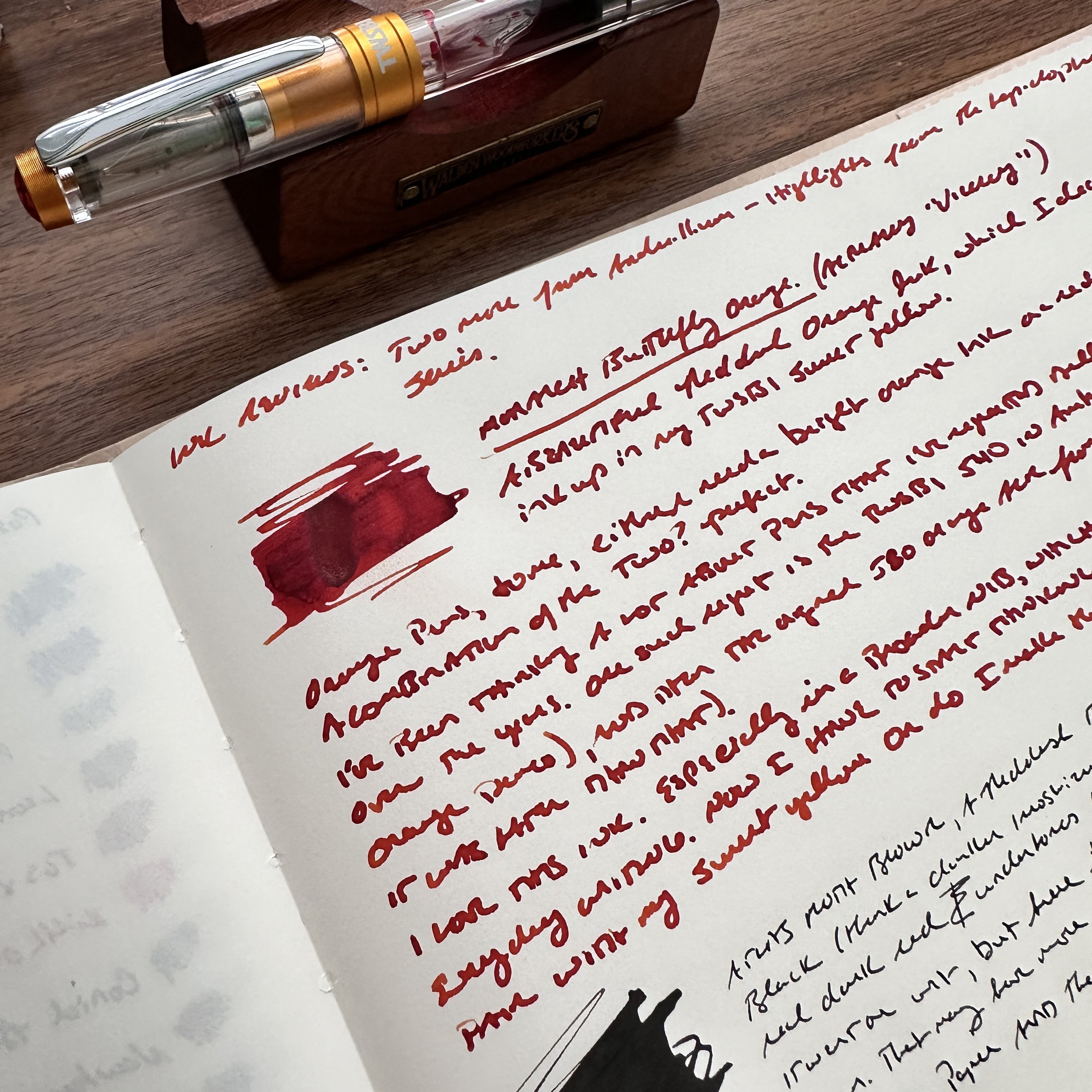
Diamine includes 25 different ink samples featuring “Holiday-themed” inks from across their various lines, including standard ink, Shimmer Inks, and even “Chameleon” inks (shimmer inks that change color depending on the light). This week, Door No. 1 included “Fortune’s Gold,” a gold ink with gold shimmer that leans yellow-green in different light. Door No. 2 contained “Cashmere Rose”, a dusty pink that’s more my style, and will probably end up inked soon as I have several pens getting ready to run dry and will need a refill.

This year, I plan to use a large Col-o-Ring Folio pad to swatch all 25 inks side by side. Many thanks to my friend Ana over at the Well-Appointed Desk for supplying the large Col-o-Ring!

What Are You Going to Do with All That Ink?

Probably keep the ones I like and give away the ones I won’t use, including most of the Shimmer and Chameleon series. It’s not that I don’t enjoy playing around with these inks - I might use them to jot quick holiday messages to friends and family - but afterwards will probably pass them along since inks containing shimmer or heavy sheen don’t receive much long-term use from me.

How to Follow Along with Inkvent 2023

I won’t be posting regular Inkvent updates here on the blog - there’s simply too much ink to do individual reviews, though I might do a general overview at month’s end. I will, however, be doing daily - or as close to daily as I can manage - posts over on Instagram and YouTube, as well as posting more detailed thoughts on the inks on the Patreon Channel. If you’d like to follow along in person with your own Inkvent Calendar, we still have a few available in the shop. Enjoy the holiday season!

The Gentleman Stationer is supported entirely by purchases from the T.G.S. Curated Shop and pledges via the T.G.S. Patreon Program. If you’re looking for gift ideas, check out our 2023 Holiday Gift Guide!

In Ink Reviews Tags Diamine Inkvent 2023, Inkvent, Fountain Pen Inks
Comment

Ink Review: Anderillium Viceroy Butterfly Orange and Atlas Moth Brown

October 23, 2023

Wow, do I have a large backlog of products to review! Before I left on vacation earlier this month, I had somehow ended up with 30 inked fountain pens, most of which I had intended to review (either the pen itself or the ink), but at the end of the day I figured it was best to do a reset and choose 10 or so combinations on which to focus. Today, I’m going to look at two of the inks I selected, both of which come from Anderillium: Viceroy Butterfly Orange and Atlas Moth Brown, from the recently released Lepidopteran Series.

Yes, I know it says “Monarch” - whenever I think of an orange butterfly I think of Monarchs, and apparently the two are easily confused!

As many readers already know, Anderillium is one of the brands that we stock in our own shop (full disclosure!), and we love their inks not just because they represent good value and good quality, but because we also enjoy the company’s carefully thought-out themes - typically based around nature - and their offbeat takes on classic ink colors. The initial two series of Anderillium Inks included the Cephalopod Series (squids and octopuses) and the Avian Series (Birds), so the recently released Lepidopteran Series (moths and butterflies) continues the nature trend.

There is no red ink in the Lepidopteran Series: Viceroy Butterfly Orange is a dark reddish-orange that serves that role. You can check out a picture of the full range of colors - some of which are quite unusual - at the bottom of this post.

Viceroy Butterfly Orange - which I keep trying to call “Monarch Butterfly Orange” - is a beautiful dark orange that leans heavily red. Unlike many orange inks, I’ve had no issues with nib crud forming, which is a huge bonus for an ink in this color family since orange and yellow dyes can be finicky in that regard. I chose this ink as the perfect pairing for my TWSBI Diamond 580 Sunset Yellow fountain pen. I typically enjoy pairing orange pens with a red ink (and vice-versa), and this particular ink is red enough that it accentuates the lighter orange/gold of TWSBI’s latest Diamond 580 release. This particular pen also sports a broad nib, which gave me the opportunity to test how the Anderillium ink behaved in a pen that lays down a thicker, wetter line. The end result? Viceroy Butterfly Orange is a great ink that dries relatively quickly and resists smearing. Once you consider this alongside the lack of precipitation/nib crud, you have a fabulous orange workhorse.

Atlas Moth Brown is a VERY dark brown. While you can make out the slight brown hue when it dries (particularly in a broader nib or a wet writing sample), in a finer nib this ink appears black. Also be sure to check out the writing sample below, which definitely shows green undertones, and the reverse shot of the page, which shows purple?

Atlas Moth Brown is the “Black” ink from the Lepidopteran Series. While technically a very dark reddish-hued brown, I can really only discern these undertones when this ink is wet. (Those looking for a more traditional brown should check out “Toltype Moth Warm”, which itself isn’t necessarily traditional, but will get you more shading and visible brown tones.) Like the Viceroy Butterfly Orange, Atlas Moth Brown is well-behaved. Though it dries perhaps a touch slower than the Viceroy, I experienced no bleedthrough or feathering in everyday writing except on the cheapest of copy paper. The almost-black hue when dry lends itself quite well to office use, and this ink will see a repeat run through the rotation when I have to return to the office in two weeks. :(

In my Midori MD Cotton ink journal (which I’ve been using for my ink reviews), this ink looks almost green-black. AND then…

On the reverse of the page, the bleedthrough from the swabs appear purple? (This bleedthrough is not reflective of everyday writing. I literally poured ink onto the page with a pipette to see what kind of sheen I could get when the very wet samples dried.) This is a truly interesting one.

Takeaways and Where to Buy

I’ve been extremely pleased with the performance of both inks, having written with them consistently over the past three weeks. The Viceroy Butterfly Orange in particular stands out - strike up another win for Anderillium in the yellow/orange category that includes their excellent Flapjack Octopus Orange (from the Cephalopod Series) and American Goldfinch Yellow (from the Avian Series). Orange inks, and particularly lighter oranges and golds/yellows, can be tricky to get right, as ink makers have to balance legibility with the tendency of orange dyes to precipitate and form nib crud. All three Anderillium inks strike a good balance. The Atlas Moth Brown is what I’d probably characterize as an “interesting black ink alternative,” because it dries so dark. I rarely write with pure blacks, opting for darker versions of other colors that can look black when dry, especially in a finer nib, making them good work alternatives yet at the same time less “boring”.

You can purchase Anderillium Inks, including the two featured here, directly from us in the T.G.S. Curated Shop. As I mentioned above, both of these inks are from Anderillium’s recently released “Lepidopteran Series,” where all the inks are themed around moths and butterflies. Other series from Anderillium include the Cephalopod Series (based on squids and octopuses) and the Avian Series (based on birds). Inks are sold in individual 1.5oz widemouth bottles ($14.50) or in sets of 8 mini-bottles ($50), which allow you to sample the entire line.

I likely won’t re-review these two pens, given that they are simply new colors of two pens that I’ve already reviewed multiple times: the TWSBI Diamond 580 and the Sailor Pro Gear. But I will say that I absolutely adore both of these editions. As I mentioned above, the TWSBI is the recent “Sunset Yellow” release, and the Pro Gear is this year’s “Moonlight over the Ocean”.

The T.G.S. Curated Shop is an authorized retailer of all brands sold, including Anderillium Inks.

In Ink Reviews Tags Ink Review, Anderillium Ink, Anderillium Ink Lepidopteran Series
1 Comment

Cartridges from left: Pilot, Platinum, Sailor, Lamy, and “Standard” International

Proprietary Ink Cartridges: Endearing or Annoying?

June 21, 2023

It doesn't take long for new fountain pen users to recognize that all fountain pen ink cartridges aren't created equal. While there is such a thing as a "standard international" ink cartridge and converter, it’s neither “standard” nor particularly “international”, as that term has essentially come to mean that the standard version "fits pens with JoWo, Bock, or Schmidt nib/feed assemblies." Nearly all of the Japanese brands, as well as some European brands like Lamy, use their own proprietary cartridge/converter format. Today I'll talk a bit about why I tend to prefer the Japanese-style cartridges to the standard international format.

Note: Whenever you buy a new pen from a brand you haven't previously used, ALWAYS check whether you also need a specific converter and/or cartridge to go with that brand.

Pilot pens such as the Custom Heritage 912, the Custom 74, and the Vanishing Point all take the proprietary Pilot Cartridge.

Pilot Makes My Favorite Ink Cartridge, Followed By Platinum

Why these two, you might ask? Capacity. While each format is unique to each brand, these cartridges hold a LOT of ink. Moreover, the "wide mouth" format of the cartridge both ensures better ink flow than the typical international cartridge (which has a narrower opening) and makes the cartridge easier to refill with ink of your choice using a pipette or small eyedropper rather than a syringe. Of course, part of the reason why these cartridges tend to work so well may be due to the proprietary nature itself, with the cartridge engineered to fit the brand's specific nib and feed.

Pilot cartridges are among the easiest to refill, so there’s even an “aftermarket” for things like these small rubber stoppers if you want to refill a full set. (Search eBay or your online marketplace of choice.)

As an aside, there has been a lot of speculation as to why Pilot recently released the Iroshizuku Inks in cartridge form, and why they believe they can price these cartridges at the relatively high price point of $14 for six. Personally, I think it's because a large portion of users write with fine or extra-fine nibs (if not finer). Given that Pilot cartridges hold a decent volume of ink, six of these cartridges could last someone up to a year, especially if they don't write extensively by hand and, for example, use their pen to make occasional notes in a planner. (Standard Pilot cartridges are much less expensive, as are Platinum cartridges, and are sold in boxes of one dozen.)

While Sailor cartridges also feature a proprietary format with a wider opening similar to Pilot and Platinum, and work just fine, they don't hold as much ink. On the other hand, I find that Lamy cartridges have narrower openings similar to the Western-style Standard International cartridge. As a result, the ink doesn't flow quite as well, and Lamy cartridges can be difficult to puncture to the point where I sometimes worry I'm about to break the pen.

Don’t be like me. Use your cartridges.

Takeaways and Lessons Learned Over the Years

At the end of the day, the proprietary systems of cartridges and ink converters can be both a pain to navigate and part of the charm of using fountain pens. Sure, it would be much more convenient to have a single universal format for all brands, and to not have to worry about stocking refills from multiple brands, but over time I've just come to accept that "the cartridge singularity" is not going to happen and learned to love the different shapes and peculiarities of each cartridge. My own opinion is that the Japanese pen companies make better cartridges than Western manufacturers. Not only do I get better performance - mainly ink flow - when I use these cartridges, but the cartridges seem to last longer on the shelf. My insanely busy week/weekend of work saw me cycling through several cartridges on the fly, and the number of half-evaporated cartridges I discovered in my office desk drawer stash (mostly standard short international) reminded me that these things don't last forever. Use 'em if you got em'!

The Gentleman Stationer is supported by purchases from the T.G.S. Curated Shop and pledges via the T.G.S. Patreon Program.

In Ink Reviews, How To, Editorial Tags Fountain Pen Inks, Ink Cartridges
4 Comments

Tones Within Tones: Blue-Black Inks of Choice

June 17, 2023

We’re running a sale this weekend in the shop for Father’s Day - through 11:59pm on Sunday, June 18, take 10% off paper and desk accessories using the coupon code “DAD10” at checkout!

A while back I did an "inks of choice" post in which, for the first time, I discussed my favorite inks by broad color category. This wasn't easy, as many of the colors I love and use on a regular basis aren't easy to categorize. Is it a blue? A blue-black? A dusky purple? Is this a yellow or an orange? A red or a brown? Is burgundy it's own color family? (You get the idea.)

Lately I've been involved in a project at my job that has required me to do more writing than I've done in a long time, given my mostly supervisory responsibilities at this point in my career. This has resulted in (1) a lot of different pens getting written dry; and (2) lots of different pens getting inked up, mainly with unassuming blue-black inks chosen for both performance and the fact that they're less distracting than other brighter options. Whenever I get caught up in a project like this one, and find myself looking at multiple inks in the same color family, I end up struck by how much variation there is among supposedly "identical" inks and ultimately realize that it's a key part of why I have so much fun with this hobby. Here, you have six inks that vary pretty wildly, even within brands. At the same time, it’s fun to see the commonalities that certain brands have, like that Pilot red sheen!

My standard ink testing paper is Midori MD Cotton. It accurately reflects color despite being slightly off-white, and showcases ink properties such as sheen and shading fairly well.

Five Inks of Choice (Blue-Black)

Iroshizuku Tsuki-Yo. Tsuki-Yo won the "Blue-Black" slot in the "Favorite Inks" post, and as I mentioned in that post, the main reason I love Tsuki-Yo so much is because it's not your traditional blue-black ink. Typically translated as "Moonlight", this ink features a navy undertone with reddish sheen - an office-friendly ink with just enough subtlety to make it interesting for fountain pen aficionados.

Iroshizuku Shin-Kai. Shin-Kai is what I would call the "true" blue-black in the Iroshizuku lineup. Typically translated as "Deep Sea," Shin-Kai somewhat resembles standard Pilot Blue-Black, but dries to an almost steel grey with blue undertones and, again, red sheen.

Pilot Blue-Black. Whenever I get a new Vanishing Point or other Pilot cartridge-converter pen, often the first ink to run through that pen is a standard Pilot Blue-Black ink cartridge. This particular ink has a degree of water-resistance, which is one reason why so many people enjoy it. What surprises me the most with this ink is the degree of red sheen this ink exhibits, which is even more pronounced than its Iroshizuku counterparts.

I forget how much red sheen Pilot inks exhibit, until I swatch them next to other brands. The standard Pilot Blue-Black is kind of crazy, though the sheen only really comes out

Caran d'Ache Magnetic Blue. The "Grey-Blue-Black" of this group, albeit with purple (?) undertones when wet, Caran d'Ache Magnetic Blue is the most "traditional" blue-black ink of this group. It exhibits some shading but no sheen.

Platinum Blue-Black. Another standard Japanese blue-black ink that I use primarily in cartridge form, Platinum Blue-Black is more blue than other options, and also shows a good degree of water resistance.

Sailor Nano Souboku. Sailor makes a line of "nano" pigmented inks that are permanent, yet still "safe" for use in fountain pens. I've reviewed Kiwa-Guro (the "Nano-Black") in the past, but I've had this pack of the blue-black Souboku cartridges for more than a year and figured that I needed to put them through the rotation. Souboku looks almost teal when wet, and dries to a lighter blue-black shade than the other inks shown here. I like the Sailor "Nano" pigmented inks because they are permanent and tend to perform well on even the cheapest of office papers.

These three are the more “standard” blue-black inks that I’ve used.

Note: Why so many cartridges, you may ask? During my office reorganization/clean-out project from earlier this year, I came across more than a dozen boxes of cartridges, some of which had to be tossed because the ink had evaporated. Cartridges don't last forever, so if you have them, use them!

The Gentleman Stationer is supported entirely by purchases from the T.G.S. Curated Shop and Pledges via the T.G.S. Patreon Program.

Look Ma! No Bleed-through!

In Ink Reviews Tags Inks of Choice, Blue-Black Inks, Pilot Blue-Black, Iroshizuku, Platinum Blue Black, Caran d'Ache
Comment

The Gentleman Stationer Ink Cabinet. Part of it.

The Gentleman Stationer's Favorite Fountain Pen Inks, Inaugural Edition (2023)

May 27, 2023

While I publish an annual list of "Best Pen" recommendations, inks are far trickier, made especially difficult by the dozens of brands and thousands of different colors now available, which wasn't the case when I first started TGS. Over the years, I've done a few lists of my favorite inks for specific purposes, such as office use and annotation, but have shied away from anything more categorical. Then I had the idea: What if I made a list of my current preferred ink for each color category, which I could easily update over time? Here are the rules I came up with:

  1. The ink has to be available. No limited editions that are impossible for people to find because that's no fun to read. (Those can have their own list, if people are interested.)

  2. Broad color categories only with no sub-categories. Keep it simple. Here, I've organized this initial list with 12 slots that loosely tracks the major colors that pen companies typically include in their lineup.

  3. I have to have used the ink in multiple pens over the past year. Some of these inks have been used more than others (brown and yellows don't actually get much time in my rotation), but generally, frequency of use + simple joy determines whether an ink makes the cut.

Here we Go! Fountain Pen Inks of Choice by Color (2023)

Pilot Iroshizuku Asa Gao

Blue: Pilot Iroshizuku Asa-gao. I sometimes go far too long without using this particular ink, but whenever I use it to fill a pen I wonder why I don't just keep a bottle of it on my desk. A bright royal blue that borders on "electric," but is still professional enough to use at the office. It reminds me of Waterman blue that doesn't fade to a duller color after drying.

Black: Lamy Black. When choosing a black ink, some go for the darkest line possible, but not me. I prefer some shading and undertones, especially the purple cast that Lamy Black has when it dries, which gives the ink added depth.

Blue-Black: Iroshizuku Tsuki-Yo. The name translates as "Moonlight", and though I can't exactly explain why, it fits this shade of ink perfectly. Tsuki-Yo leans more blue on the blue-black scale, and exhibits a slight red sheen on some papers. As one of the longest-running inks in my collection, which at the moment I have loaded into three pens, Tsuki-Yo might be my favorite of the Iroshizuku Inks and one of my favorite inks of all time.

Turquoise: Kaweco Paradise Blue. Some of you may be surprised to see two Kaweco inks on this list, but I absolutely love Kaweco's ink offerings and find them extremely underrated. The inks are vibrant, low-maintenance, and inexpensive, and the fact that they come in both cartridges and bottles ensures that you can use them in your Kaweco Sports as well as your piston fillers.

Kaweco Palm Green Fountain Pen Ink

Green: Kaweco Palm Green. I consider Kaweco Palm Green to be of the most underrated inks of all time, not just in the Kaweco lineup. It’s a beautiful rich color that I use regularly even if it can take a bit of time to dry.

Red: Dominant Industry Romania Red. If you were going to have a blood-red vampire-themed ink, it would be this one. This bold, rich color flows well, dries quickly, and doesn't create nib crud. Vampire-themed inks cannot be “pink”, which seems to be a hot topic of conversation these days. Fight me ;)

Burgundy: Montblanc Burgundy Red. The hardest color for me to choose (since most of my favorite burgundy inks are limited editions). I finally went with standard Montblanc Burgundy Red. Though perhaps not as vibrant as some of Montblanc's special edition burgundies, it's a consistently good performer that's a favorite standby.

Orange: Laban Apollo Orange. This orange has been making its way through my orange and yellow TWSBI demonstrators for the past six months. Inspired by the Greek God Apollo, whose symbol traditionally is the sun, this is a “pure orange” ink with a slight tinge of red to help with the legibility.

Yellow: Anderillium American Goldfinch Yellow. The first yellow ink I've found that's truly legible, due to its gold/goldenrod hue, American Goldfinch Yellow can be used for actual writing in addition to highlighting and annotation.

Brown: Laban Demeter Brown. A dark brown, but not quite a brown-black. For my brown inks, I tend to enjoy the darker browns and sepias, because they take on a vintage look as they dry.

Waterman Tender Purple Fountain Pen Ink

Purple: Waterman Violet. Not "Tender Purple" or whatever they're calling it these days. Violet. Be warned that of all the Waterman inks, this one has a tendency to stain, so be sure you don't mind your converter (or clear demonstrator) having a slight purple tint long-term. (Definitely do not use in light-colored celluloid pens.) That said, it’s one of the most vibrant purple inks out there, and when I want my writing to stand out, this is my choice.

Grey: Scribo Grigio. I've been on a massive grey ink kick over the past year, and I keep returning to Scribo Grigio. While some might argue with me on this point and call the ink more of a blue-black, I'm going with grey here and the blue tint is what makes it interesting.

Pink: Laban Aphrodite Pink. This final color is extremely difficult, but at the end of the day I have to go with Aphrodite. Some would say this isn't a pink ink at all, but the criteria here dictate that I have to stick with an ink that I've actually used over the past year. In the pink category, this is the clear winner.

Some of the aforementioned inks we sell directly in the T.G.S. Curated Shop, where we are running a Memorial Day Weekend Promotion (10% Off) with the code “SUMMER23” at checkout. Otherwise I have linked to retailers who are friends of mine. This post does not contain paid advertising or affiliate links.

In Ink Reviews, Top 5 Tags Best Inks, Inks of Choice, Fountain Pen Inks
9 Comments
← Newer Posts Older Posts →
Store Hours and Location
Visit the T.G.S. Curated SHOP
*New* Updated "Best Pens" Guide (2025)
TGS x Hinze Pens Violet Tendencies Taschenstift Fountain Pen
Hierarchies of Fountain Pen Friendly Paper
Allex Scissors arrayed on a desk showing link to desk accessories

Join Our Patreon!
Subscribe to the TGS E-mail List

Featured Posts

Featured
Iro-Utsushi-Fine-Dip-Pens.jpeg
Oct 1, 2025
The Pilot Iro-Utsushi Dip Pen (and in General, Simple vs. Fancy Dip Pens)
Oct 1, 2025
Oct 1, 2025
Levenger-Annotation-Pad.jpeg
Sep 20, 2025
Five Boutique Paper Brands I'm Watching Closely and Why
Sep 20, 2025
Sep 20, 2025
Playing-ink-MD-Cotton-Glass-Pens.jpeg
Sep 17, 2025
What's On Your Desk? My Personal Favorite Papers for Fountain Pens, 2025
Sep 17, 2025
Sep 17, 2025
The Gentleman Stationer RSS

© Digital Divide Media, LLC, 2014-present.

All content is the exclusive property of Digital Divide Media, LLC, d/b/a The Gentleman Stationer, including “The Gentleman Stationer” website and trademark, and should not be reproduced without express written permission.  All rights reserved.

All content containing paid advertising, affiliate links, or sponsored content will be plainly disclosed by a disclaimer when/if featured.

Contact Information

Store Shipping Policy and Return Policy

Privacy Policy

Cookie Policy

Terms and Conditions

Powered by Squarespace