• Blog
  • Shop
  • Resources
  • FAQ (Ask TGS)
  • About
  • Archive
  • Contact
  • Sign In My Account
Menu

The Gentleman Stationer

Vintage Living in the Modern World.
  • Blog
  • Shop
  • Resources
  • FAQ (Ask TGS)
  • About
  • Archive
  • Contact
  • Sign In My Account

Announcing the Baron Fig "Alphabet" Squire Limited Edition

February 22, 2017

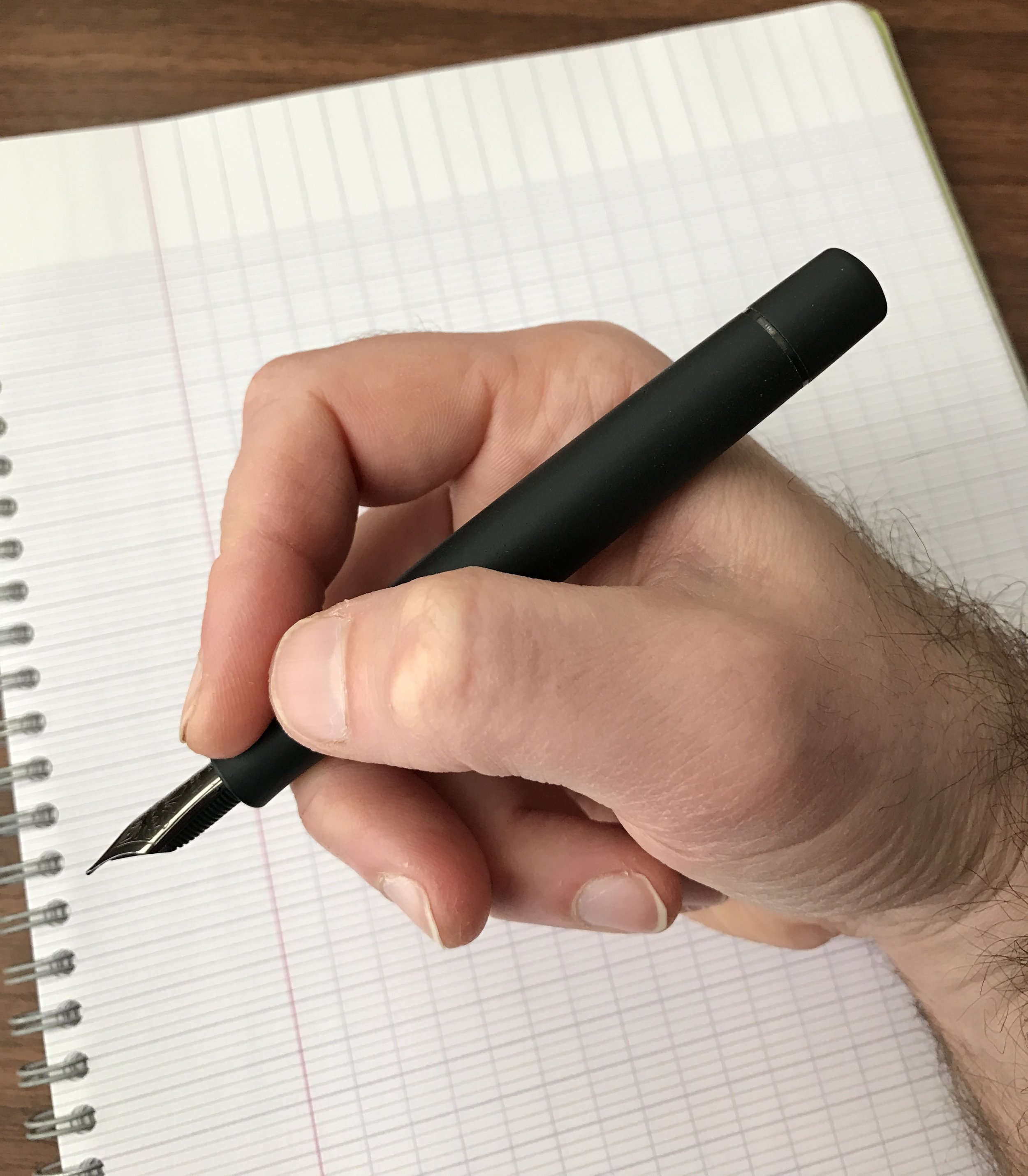
Last week, Baron Fig released the "Alphabet": their first limited edition Squire rollerball/ballpoint pen featuring a new matte black finish with the alphabet etched in white down the side. It's a cool looking pen, and I'm glad to see that Baron Fig went the "understated" route, rather than the somewhat over-the-top approach taken by other companies with their limited editions. 

The finish on the "Alphabet" version of the Squire is "grippier" than the finish on my standard model. I think I prefer the matte black over my standard charcoal, though both are great. 

The finish on the "Alphabet" version of the Squire is "grippier" than the finish on my standard model. I think I prefer the matte black over my standard charcoal, though both are great. 

The "Alphabet" is available as part of the Squire subscription service, in which you can sign up to receive a new limited edition pen each quarter. So far, Baron Fig has more than met my expectations with their subscription service offerings, having released two versions of the Confidant (the Work/Play II and the Askew), one of the Vanguard (the Black Box), and now the Squire. Of all their existing product categories, the Squire was the one that gave me the most heartburn as part of a subscription service. It's Baron Fig's priciest product at $60, and I suspect it might be a hard sell to get many people to commit to pre-purchasing four of them per year. That said, the Alphabet makes for a great start: it maintains the classic style of the standard Squire while offering two new design elements, the "A to Z" detailing and the matte finish. It's distinct enough to convince existing Squire owners to pick up another, and for those who don't have a Squire already, well, it's a great pen. Personally, I'd take the Squire over the Retro 51 Tornado any day, but that's a matter of personal preference.     

If you're inclined to keep the packaging, it makes for a great desktop stand for your pen. 

You can purchase the Squire "Alphabet" limited edition directly through Baron Fig's website. A single pen is $60, but the price drops to $50 per pen if you subscribe and pre-pay for four quarterly limited editions. Baron Fig fans should keep a hand on their wallets: I have it on good authority that the second Vanguard edition will be released shortly, and I suspect the first limited edition set of Archer pencils will follow. Stay tuned! 

Disclaimer: Baron Fig sent me this product free of charge for review purposes.

In Pens Tags Baron Fig, Squire, Limited Edition
Comment

Pen Review: The Pilot Custom 74

February 11, 2017

I've reviewed a lot of Pilot pens on this blog, but for some strange reason I've never taken the opportunity to review what I consider one of their best, and certainly one of their more accessible, fountain pens. The Custom 74 is one of the first higher-end Pilots that I purchased, and I recently added another to my collection. I'm glad I did!

This blue demonstrator might be one of the prettiest pens in my collection. 

Pilot makes several versions of the Custom 74, but only the demonstrators are available on the North American market, to my knowledge. The Japanese market offers some lower-cost pens in solid acrylics, including Dark Blue, Black, Deep Red, and Dark Green. (You can sometimes find these Japanese pens with in-between nib sizes, like SF (soft fine) or FM (fine medium).) Along with the Vanishing Point, you'll often see the Custom 74 marketed as the "entry level luxury" Pilot fountain pen, and it's a great option for those looking to buy their first $150+ fountain pen, or upgrading from a steel nib to 14k gold. 

An older photo of the Custom 74 violet demonstrator (far left) that I no longer have. This picture offers a good size comparison of the Custom 74 to the (from left) Pilot Vanishing Point, Sailor Pro Gear Imperial Black, Sailor 1911 Large, Nakaya Portable Writer, and the Pilot Metropolitan.

The Custom 74 is a good size pen, but at the same time there's no excess length or girth, and the transparent acrylic weighs very little. I can use this pen comfortably posted and unposted, though some might find it a touch too long posted. As I mentioned, I've owned two of these colored demonstrators over the years - the blue and the violet - and both pens were stunning to look at. The sapphire-blue acrylic featured here is a personal favorite, and pairs perfectly with Sailor Bungubox Sapphire ink.

I've always found Pilot nibs very tastefully engraved. I especially like the rhodium-plated version. 

The Custom 74 color demonstrators feature a relatively stiff, rhodium-plated 14k Pilot nib that offers a super smooth writing experience. I would say these nibs (which come in fine, medium, and broad) correspond more to western sizing, as opposed to traditional Japanese nib sizes that tend to run narrower. The pen shown here has a wet medium nib that writes a fairly broad line for a Japanese pen, but on a brightly colored pen like this one, I prefer a nib that lays down some ink. Fortunately, the Custom 74 comes paired with Pilot's high capacity CON-70 push-button converter, which only works with Pilot's larger pens. (Make sure you check compatibility before purchasing a CON-70 for another pen.)   

The Pilot Con-70 converter on the Custom 74, showing the length. Be sure to check compatibility.

A final note on the Custom 74 nibs: these nibs tend to have a lot of tipping material, which make them excellent - and relatively inexpensive - options for nib customization. Before my next pen show, I may try to pick up a couple of Custom 74s with broad nibs to take with me, just to make sure I have a good option to give to Mike Masuyama or Mark Bacas....

The nib on this Pilot Custom 74 writes a nice fat medium line.  

Takeaways and Where to Buy

The color demonstrators are by far the most popular options in the Custom 74 line, and are available in transparent blue, orange, smoke, and violet. This pen, in my opinion, is one of the better buys in the fountain pen world at $176 (as of 2023, available directly from us in the T.G.S. Curated Shop). You get an incredibly attractive pen with an amazing nib and a high-capacity converter. For these reasons it's made my list of Best First Fountain Pens over $100. Personally, I think the color models are attractive enough to justify the extra money, especially with the rhodium trim, but it's a matter of personal preference.    

The Gentleman Stationer is supported entirely by purchases from the T.G.S. Curated Shop and pledges via the T.G.S. Patreon Program. We no longer participate in third-party advertising or affiliate programs.

In Pens Tags Pilot, Pilot Custom 74, Pens
6 Comments

Pen Review: Visconti Homo Sapiens Dark Ages

February 4, 2017

Some of my favorite pens in my collection are what many people refer to as “blacked out” or “stealth” pens. I’m not sure where the trend originated, but I suspect it started with Pilot’s Matte Black Vanishing Point. That’s the earliest “stealth pen” I can recall receiving a lot of attention. Next, I purchased the Sailor Pro Gear Imperial Black fountain pen, which remains a personal favorite to this day. I like this pen not just because of the ion-plated trim, but because of its compact size. The Pro Gear is the perfect pen to stick in a shirt pocket and take to work: it’s portable, but when posted expands to a comfortable length for longer periods of writing. 

But I still found myself looking to add a larger pen that would spend most of its time at my desk at home, for journaling and the occasional letter writing. I’d been eyeing Visconti’s Homo Sapiens line of pens for a while, and had come close to pulling the trigger on the “Steel Age” model but never loved the overall look enough to do it. Then, last year, Visconti introduced the Homo Sapiens “Dark Ages,” and I finally jumped. 

The Homo Sapiens Dark Ages features a blacked-out version of Visconti's trademark "arc" clip, plus "Homo Sapiens" engraved around the barrel. If you look closely, you can see that the lava-resin composite material is porous. 

First, a bit about the Homo Sapiens line in general. Visconti markets these pens as being made from hardened volcanic lava from Mount Etna in Sicily, which is mixed with a proprietary resin to create what most vendors describe as a “virtually unbreakable” pen. Much like celluloid and ebonite, the pen warms to the touch as you write with it, and absorbs moisture from your hands. Originally, the Homo Sapiens only came with bronze trim (the “Bronze Age” pen), but Visconti has since released the HS with steel (“Steel Age”) and the all-black (“Dark Age”) furniture. 

View fullsize Homo Sapiens Unposted
View fullsize Homo Sapiens Capped

The Homo Sapiens pens are sold in two sizes: Maxi and Midi. The Maxi size - what I have here - is a large pen that realistically can only be used unposted. It features Visconti’s 23ct Palladium “Dreamtouch” nib with Visconti’s “Power Filler” filling system. I love the nib, but I’ve found the “Power Filler” to be a bit overrated. I understand that the slightly smaller Midi pen also features a Palladium nib and a piston-fill mechanism. 

The Nib and Writing Experience

The "Dark Ages" Dreamtouch 23ct Ruthenium-plated Palladium nib, with classic Visconti engraving. You can also see Visconti's "locking" threat system, which allows the cap to attach securely, 

If you like soft, wet nibs, then you’ll love Visconti’s Palladium nibs. Once these nibs are set up properly (more on this in a minute), they write with almost no pressure. “No pressure” is key: apply too much and you could end up springing the nib or gushing ink onto the page. I purchased this pen at the 2016 DC Pen Show, and immediately had Mike Masuyama grind this nib down to an EEF and attempt to reduce the ink flow as much as possible, yet this pen will bleed through even very thick paper if I bear down too hard. That said, once you get the hang of writing with little to no pressure, this is a very pleasant and comfortable pen to use. 

The ink in this writing sample is Montblanc Leo Tolstoy Sky Blue. You can tell how wet this nib is from how dark the ink appears. 

The Puzzling “Power Filler”

The filling system on this pen merits extended discussion. I’m not sure what the purpose of Visconti's “Power Filler” is, because it doesn’t seem to hold a lot of ink, which, to me, is what the name would imply. It's a vacuum-fill system, similar to the Pilot Custom 823, where to fill the pen, you place the nib and section in the ink bottle and depress the plunger. From a normal ink bottle, I’ve found the usual fill holds just over 1ml of ink. (Supposedly, you can get a bit more into the barrel using Visconti’s “Traveling Inkwell,” but I don’t have one and don’t particularly fancy spending more $$$ just to get a couple ml more into the pen.) For a pen of this size, that’s not a huge ink capacity, and certainly seems to fall well below what my other similarly sized pens (i.e., the Pilot Custom 823, Pelikan M800 or Montblanc 146) can hold. Given that most Visconti pens are very wet writers, you'll probably find yourself refilling your Power-Filler pen more than you’d expect. 

Takeaways and Where to Buy

Of all the Visconti’s I’ve had the opportunity to try at pen shows, etc., none of them spoke to me more than the Homo Sapiens Dark Age. It’s a great-looking pen, and as modified, the nib is a very nice writer. That said, my experience with this pen doesn’t have me jonesing to go out and buy another Visconti without careful consideration. This pen was a temperamental and inconsistent writer out of the box, and if I hadn’t had Mike Masuyama there to work on the nib immediately, this experiment definitely would’ve ended in frustration. If you’d like to add a Visconti to your collection, I’d recommend purchasing at a pen show or from an online vendor who is willing to check the nib prior to sending it to you. 

I purchased this pen from Bryant Greer of Chatterly Luxuries at the 2016 D.C. Pen Show. I’ve made several purchases from Bryant in the past, and have nothing but good things to say about him and his company. (I've heard that Bryant will also ship new pens directly to Mike Masuyama for nib customization/tweaking.) If you have a relationship with another major pen retailer, most of those who carry Visconti keep the various Homo Sapiens models in stock. For example, both Pen Chalet and Anderson Pens have the Dark Ages available on their website. I’ve not seen anything to suggest that this pen is a limited or special edition, and will likely be available as part of the regular Homo Sapiens lineup for the foreseeable future. 

Disclaimer: I purchased this pen with my own funds for my own collection. While certain links in this post are affiliate links, I have not otherwise been compensated in any way for this review. 

In Pens Tags Visconti, Black Pen Society, Stealth Pen, Homo Sapiens
5 Comments

Pen Review: Pelikan M800 Souverain Burnt Orange Special Edition

January 28, 2017

I guess it's time that I finally got around to reviewing this pen, seeing that I've been talking about it for nearly a year since I bought it at last year's Atlanta Pen Show. The Pelikan Souverain M800 is one of the more iconic modern pens, and certainly one of the best known and most easily recognizable modern German pens. While the (much) larger M1000 holds the title as the largest Pelikan available, I regard the M800 as Pelikan's "flagship." Over the past several years, Pelikan has issued "limited" and "special" editions of the M800 in colors and materials outside the standard lineup. The pen featured in this review, the "Burnt Orange" edition, is one of those pens. 

Size and Construction 

The Pelikan M800 is a well-built workhorse that will last you a lifetime. It has a brass piston mechanism, which gives the pen some heft and a nice balance in the hand. The piston turns smoothly and holds just under 1.5ml of ink, which is more than enough to get me through a week of intense writing at work.

Like all Souverains, the Burnt Orange Special Edition features the Pelikan logo engraved on the cap.  

The M800 is also a large pen. Most people will find it too big to use posted. The issue isn't necessarily weight - the cap is fairly light - but rather length. I prefer to post my pens, and even I find myself using this one unposted most of the time. 

View fullsize Pelikan M800 Size Comparison
View fullsize Pelikan M800 Unposted
View fullsize Pelikan M800 Posted

The Burnt Orange Special Edition is your typical M800 as far as size and overall construction go, but the unique color has some history behind it. This is not your "blaze orange," or "hunters orange" pen - rather, the muted "burnt orange" color is reminiscent of the red hard rubber pens from the 1920s, and made famous again by Montblanc's "Hemingway" Writer's Edition from the early 1990s (which now commands a premium price on the collector's market). Moreover, the section, cap, and piston knob are not black, but rather a very dark brown. They appear black at first glance, but in the right lighting, the brown comes out.    

Writing Experience

The nib on the Pelikan M800 is stiff, yet very pleasant to write with. It makes for a great cursive italic modification.

The Pelikan M800 offers a different writing experience than both the smaller M600, which I've previously reviewed here, and the larger M1000. The nib on the M800 is fairly stiff, whereas the nibs on the other two pens are slightly softer and offer a touch of line variation, the M1000 more so than the M600. That said, the M800 is an extremely nice writer. This pen started life as a broad nib, but I had it ground to a relatively crisp .4mm cursive italic by Mike Masuyama at the Atlanta Pen Show. This particular grind gives my handwriting exceptional line variation, but unlike a stub, isn't so wet that I can't use it on the ordinary office paper that I use daily at work. 

Masuyama Cursive Italic (.4mm) with Montblanc Jonathan Swift Seaweed Green Ink (discontinued limited edition).

Takeaways and Where to Buy

I love my M800, and I'm sorry that I waited so long to add one to my collection. That said, I'm not sure that I would choose this particular model of Pelikan to collect, since it's just a touch too large for me to carry around easily in a shirt pocket. I tend to break it out when I need to do lots of long-form writing at a desk, or for when I want to journal. However, for work, when I'm running between meetings and need something a bit more portable, I tend to go with my M600 or my M205. 

The standard Pelikan M800 is available in black with gold furniture, or in blue, red, or green striated celluloid, and can be found at most pen retailers for $500-600.  (The M805 model comes with chrome trim.)  While that's far from inexpensive, the M800 is a very well-built, reliable piston-filler with a large gold nib, so the materials and construction drive the price up. I know a few attorneys who have one fountain pen (the M800) that they've owned for years and use daily, so you'll get your money's worth and the pen will hold up over time.  

As you might expect, special and limited editions will run you a bit more, typically pushing into the $600-700 range, and Pelikan typically offers these models for a year or less, depending on popularity. While the standard M800 is readily available from any major pen retailer, the Burnt Orange Special Edition featured in this review will likely become unavailable soon. As of the time of this review, you can still pick one up at Pen Chalet for $676, minus whatever discount code Ron is currently offering.  

Disclaimer: This post contains affiliate links.  

In Pens Tags Pen Review, Pelikan Souverain, Pelikan
4 Comments

Pen Review: The Pokka Pen

January 25, 2017

The Pokka Pen is the pen that you want to stash everywhere: in your car, in every bag you own, in desk drawers, and next to the telephone (assuming you still have one that isn't a cell). Developed by Terry O'Connor as an inexpensive replacement for his Fisher Space Pens (which he kept losing), the Pokka Pen is a fun and convenient tool that's received rave reviews from everyone I know who's tried it, including my non-pen-obsessed family members. 

The Pokka Pen is extremely portable: closed it measures just over 3.3", shorter than a Kaweco Sport and much narrower. Open, it extends to 5.5", slightly longer than a Sport and more than sufficient for most writing tasks. The pen feels sturdy and well-made, and makes a satisfying "pop" when it closes and posts due to the o-rings that hold the cap on. I found it very comfortable to write with, including for fairly long spells. While you're probably not going to want to use the Pokka pen to write your dissertation longhand, that's not the point. The Pokka is designed for ultimate portability.

The Pokka Pen offers a fairly standard ballpoint writing experience.

The Pokka's writing experience is very similar to that of a standard BIC crystal, which I enjoy. It writes a relatively dark line for a standard ballpoint pen, and would be suitable for most notetaking and signing purposes. The Pokka would be a great addition to an everyday carry kit, especially for those who don't want to shell out a lot of money for an expensive pen, or who tend to misplace pens very easily.  

Where to Buy

Update: The Gentleman Stationer is now an authorized retailer of Pokka Pens, and you can purchase three-packs in our curated shop for $8.45 US. Also check out the Pokka site for regular releases of limited edition Pokka pens, as well as to buy in bulk packs of 10, 15, or 20 pens. Pokka pens come in a range of fun colors, including EDK Blaze (orange), EDK Earth (brown), EDK Klear (yellow/clear), Kustom Kryptek (camo), EDK Blakk ("stealth") and more. 

For further reading, I'd encourage you to visit the Pokka Pens website and watch Terry's video in which he tells the story about how Pokka came to be. Also, check out Brad's review of the Pokka Pen over at The Pen Addict, as well as this review at The Gadgeteer. 

Disclaimer: Terry at Pokka Pens sent me these pens free of charge for review purposes. I was not otherwise compensated for this review. 

In Pens Tags Pocket Pens, Ballpoint, Pokka Pens
Comment
← Newer Posts Older Posts →
Store Location
Visit the T.G.S. Curated SHOP
*New* Updated "Best Pens" Guide (2025)
TGS x Hinze Pens Violet Tendencies Taschenstift Fountain Pen
Hierarchies of Fountain Pen Friendly Paper
Allex Scissors arrayed on a desk showing link to desk accessories

Join Our Patreon!
Subscribe to the TGS E-mail List

Featured Posts

Featured
Pilot-Iroshizuku-Yama-Budo-Writing-Sample.jpeg
May 24, 2025
Joe's Picks: Five Favorite Inks From Pilot's Iroshizuku Lineup
May 24, 2025
May 24, 2025
Yamamoto-Gray-Paper-Sampler-Set.jpeg
May 10, 2025
Discovering Unusual Paper: "Paper Tasting" Sets from Yamamoto Paper
May 10, 2025
May 10, 2025
Four-Micarta-Fountain-Pens.jpeg
Apr 19, 2025
Yes, Micarta for me! I finally got my hands on Some Micarta Pens, Plus My Own Special Edition
Apr 19, 2025
Apr 19, 2025
The Gentleman Stationer RSS

© Digital Divide Media, LLC, 2014-present.

All content is the exclusive property of Digital Divide Media, LLC, d/b/a The Gentleman Stationer, including “The Gentleman Stationer” website and trademark, and should not be reproduced without express written permission.  All rights reserved.

All content containing paid advertising, affiliate links, or sponsored content will be plainly disclosed by a disclaimer when/if featured.

Contact Information

Store Shipping Policy and Return Policy

Privacy Policy

Cookie Policy

Terms and Conditions

Powered by Squarespace