Many smaller pen brands perennially get lost in the noise and excitement surrounding new product announcements from well-established companies such as Sailor, Pilot, Aurora, etc. To me, Taccia is a perfect example. Taccia has released and hyped some odd pens in the past, that appeal to more of a niche customer than the wider market (the Taccia Savanna, anyone?). This year, that changed, when they announced the release of the Spectrum and the Pinnacle - two classic-looking pens that received mainstream attention. I had my first opportunity to handle the Spectrum at this year's Baltimore Pen Show, and while the pen impressed, I felt the price point was high. I also thought the pen was maybe a touch - boring? - but the main sticking point was value. In my mind, I kept comparing it to the Platinum 3776, which offered similar aesthetics and an exceptional gold nib at a similar, and sometimes lower, price.
The Taccia Spectrum compared against what I'd consider to be its closes "rival," the Platinum 3776 Century. The two pens have a similar shape, but different hardware.
The Spectrum gained some momentum through the year, and because I kept hearing so much about this pen I wanted to give it a more thorough review than my initial "pen show" impressions. As I mentioned above, Taccia started out selling these pens for $160, the high-end of the market for a rather basic pen with a stainless steel nib, and a price point that placed the Spectrum in direct competition with the Platinum 3776 and the Sailor 1911 Standard. Retailers have since lowered the price of the Spectrum to $127, which is a MUCH better deal, and brings this pen into a range at which I can comfortably recommend it.
Build and Writing Experience
The Spectrum is a classic, cigar-shaped pen that I could comfortably use posted or unposted. With the rounded ends, the shape reminds me, again, of the Platinum 3776 or even a Nakaya Portable writer. I did find myself wishing that the cap posted just a touch deeper, like the cap on the Platinum, but I probably value this sort of versatility more than most - I'm a hardcore "poster." There's also a bit of a step from the body to the grip section and metal threads. Neither bothered me, but be advised of the potential issue if sharper threads and steps on pens have a tendency to dig into your hand.
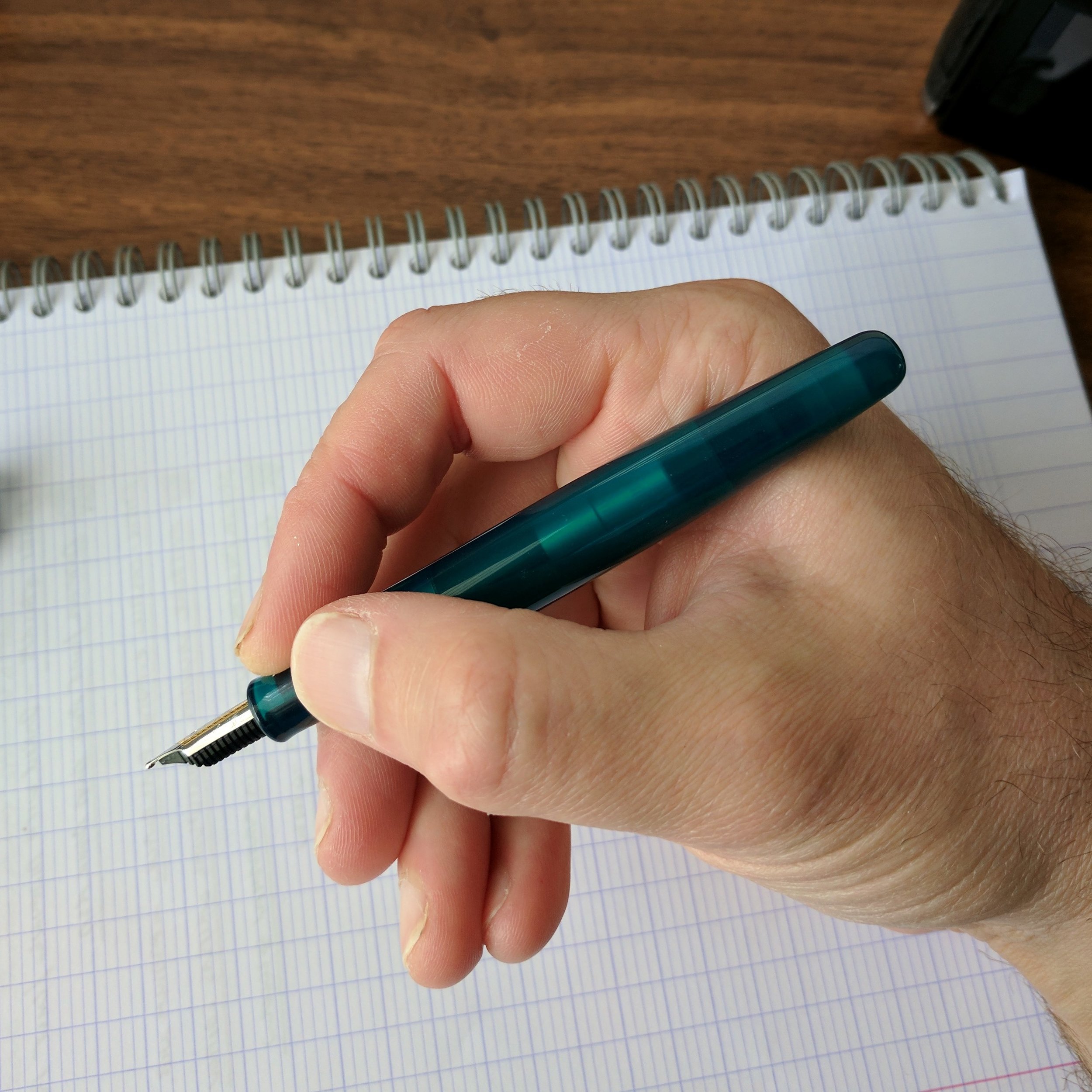

The Spectrum comes in three attractive shades of translucent acrylic: Merlot (which is a brighter red than the name would suggest), Ocean Blue, and Forest Green (reviewed here, which in person looks lighter and a bit more teal). These technically qualify as "demonstrator" pens, but the effect is more subtle here since the acrylic isn't completely transparent.
The one design choice I wish Taccia had done differently was the logo - this appears to be an applied logo - not etched - so I worry it may wear off over time.
Taccia and Sailor share a U.S. distributor (Itoya), and Taccia has leaned heavily on their relationship with Sailor when marketing this pen. Both the Spectrum and the Pinnacle feature Sailor stainless steel nibs. The Taccia representative in Baltimore indicated that a gold-nib option was available for a sizeable upcharge, but I've not seen this option available at retailers so far.
No complaints whatsoever about the Sailor stainless steel music nib - it was super smooth, with a ton of tipping material.
The stainless steel music nib on the Spectrum is more appropriately characterized as a stub - Sailor music nibs don't have three tines, as you would find on a classic music nib. My Spectrum wrote quite smoothly, with a surprisingly even ink flow more suitable to my writing style than the wetter 14k or 18k Sailor music nibs I've tried in the past. I didn't experience any skipping or hard starting.
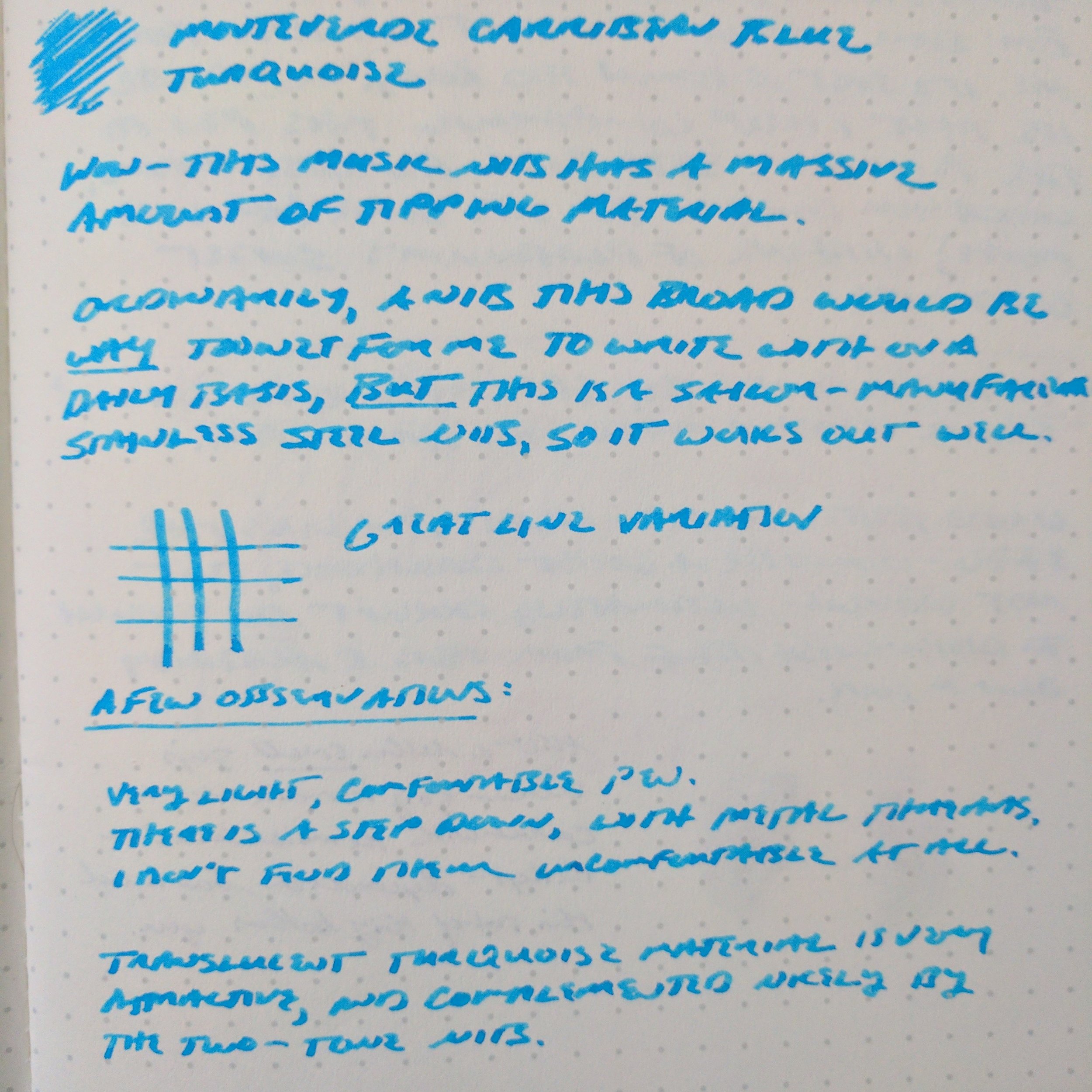
The review ink here is Monteverde Caribbean Blue. This Sailor steel music nib gave me decent line variation, and wrote a slightly narrower line than its 18k and 14k equivalents.
Takeaways and Where to Buy
At the current price point, Taccia is competing not only against other high-quality steel-nibbed pens like the Diplomat Aero and the Pelikan M205, but also against the Platinum 3776 and the Sailor 1911 Standard, both of which feature very nice 14K nibs. Based on my brief experience with the Spectrum, it should hold its own, though this market segment can be difficult to thrive in given the extent of the competition. The nib is the key selling point here, and if you're a fan of Sailor nibs and like the aesthetics of the Spectrum you won't be disappointed.
Many thanks to the awesome team at Anderson Pens for loaning me this pen to review. Anderson Pens stocks both the Taccia Spectrum and the Taccia Pinnacle in a wide range of nib options, from extra fine to music. The Spectrum is currently priced at $127, and the Pinnacle at $119.
Taccia pens on display alongside some gorgeous celluloid Platinum 3776s at the Anderson Pens table at the 2017 D.C. Pen Show. On the far left, the Taccia Pinnacle, followed by two Taccia Spectrums in Blue Ocean and Merlot.
Further Reading
The team at Hand Over That Pen reviewed the Taccia Spectrum a few weeks back. Check out their review here. Apparently their review units were provided directly by Taccia, so they had the opportunity to sample both the steel and gold nibs.
Disclaimer: Anderson Pens loaned me this Taccia Spectrum for review purposes at no charge. This post may contain affiliate links.