• Blog
  • Shop
  • Resources
  • FAQ (Ask TGS)
  • About
  • Archive
  • Contact
  • Sign In My Account
Menu

The Gentleman Stationer

Vintage Living in the Modern World.
  • Blog
  • Shop
  • Resources
  • FAQ (Ask TGS)
  • About
  • Archive
  • Contact
  • Sign In My Account

Pen Review: The Waterman Carène

December 6, 2017

Of all the high-end pens on the market that receive far less attention than they should, the Waterman Carène sits near the top of the list. I have a soft spot for modern Watermans (defining “modern” as 1980s forward, when the pens were exclusively made in France), mainly because a Waterman Laureate was the first “nice” fountain pen I ever purchased. To date, I haven't reviewed that many Watermans on the blog, which is something I plan to change in the coming year because these pens deserve better. They're reliable, "long-haul" workhorses that really stand up to daily use.  

Waterman has scaled back its offerings in recent years. The Carène’s mid-tier companion, the Charleston, is currently very hard to find, and the Edson and the Exception - Waterman’s $500-plus luxury offerings - have been or are in the process of being discontinued, leaving the Carène and the Élégance at the head of Waterman’s product line. Due to my love for the brand, I hope this represents a simple consolidation as opposed to financial trouble, though given the company’s general lack of marketing to and connection with the pen enthusiast community, I can see how they might be missing out on the analog writing renaissance that’s occurring right now.   

Waterman designed the Carène to invoke the hull of a racing yacht. (“Carene” means “hull” in French.)

After the discontinuation of the Edson, the Carène emerged as easily the most distinctive pen in Waterman's lineup. Waterman designed the Carène to invoke the hull of a racing yacht. (“Carène” means “hull” in French.) Personally, when I look at the Carène I see more of an "Orca"-shape, but regardless, Waterman really doubles down on the "yacht" theme in their marketing materials.

“Carène rides the crest of the innovation wave. Taking inspiration from luxury boat design, the result is our most distinguished example of pioneering vision. Crafted in noble materials, with an artist’s attention to detail, its pure fluid curves conjure up the sleekest lines of a leisure cruiser, or the billowing sails of a luxury yacht. Set sail for the adventure of a lifetime.”
— Waterman Website

A bit over the top, but you get the drift. It’s inspired by boats. 

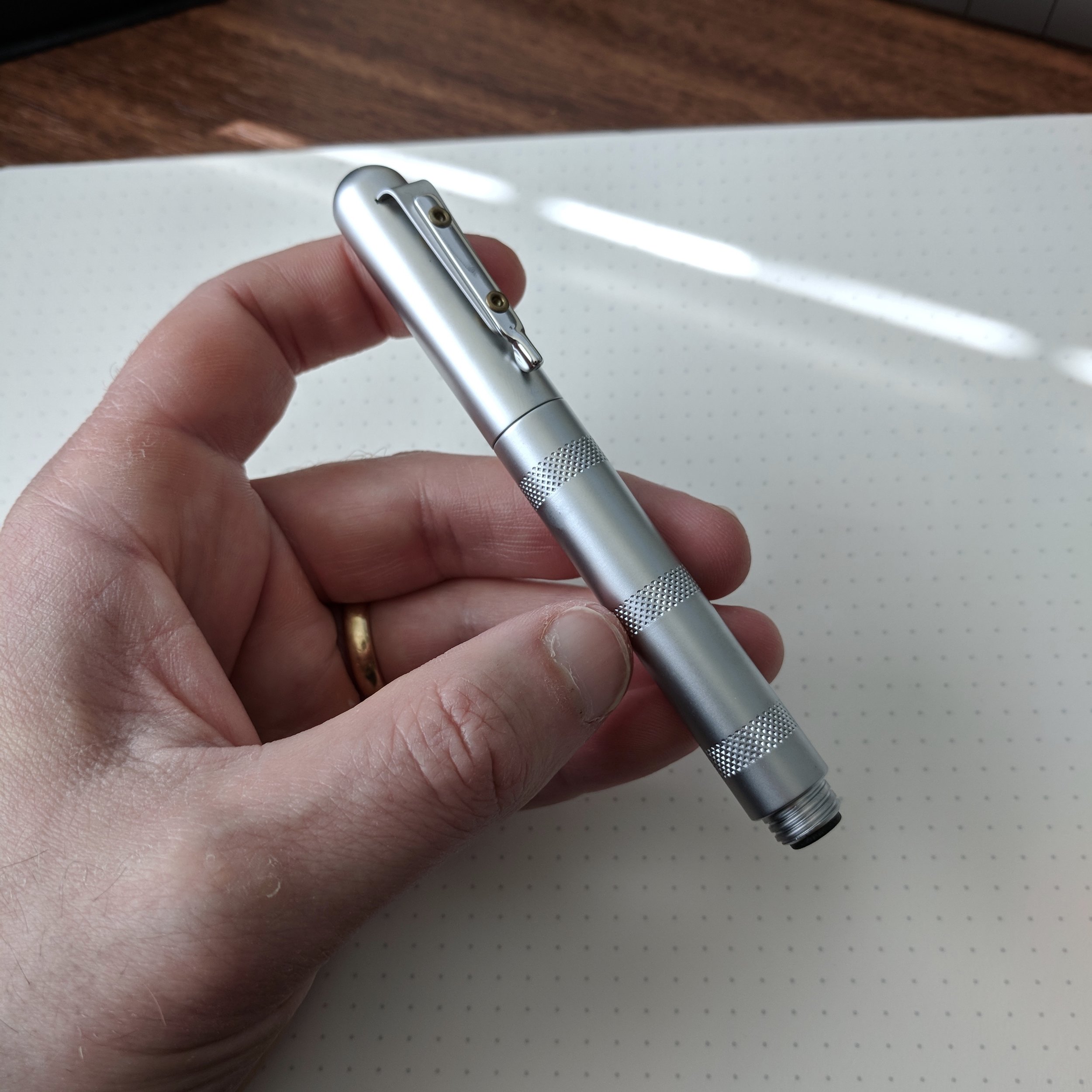
Despite the lacquered metal construction, I've never found Waterman pens uncomfortably heavy. The company designs them in such a way that they maintain a nice balance. The clip on this pen is well-made and spring-loaded, like the Lamy 2000, so the pen clips easily to a shirt pocket or into the slot of a pen case.  

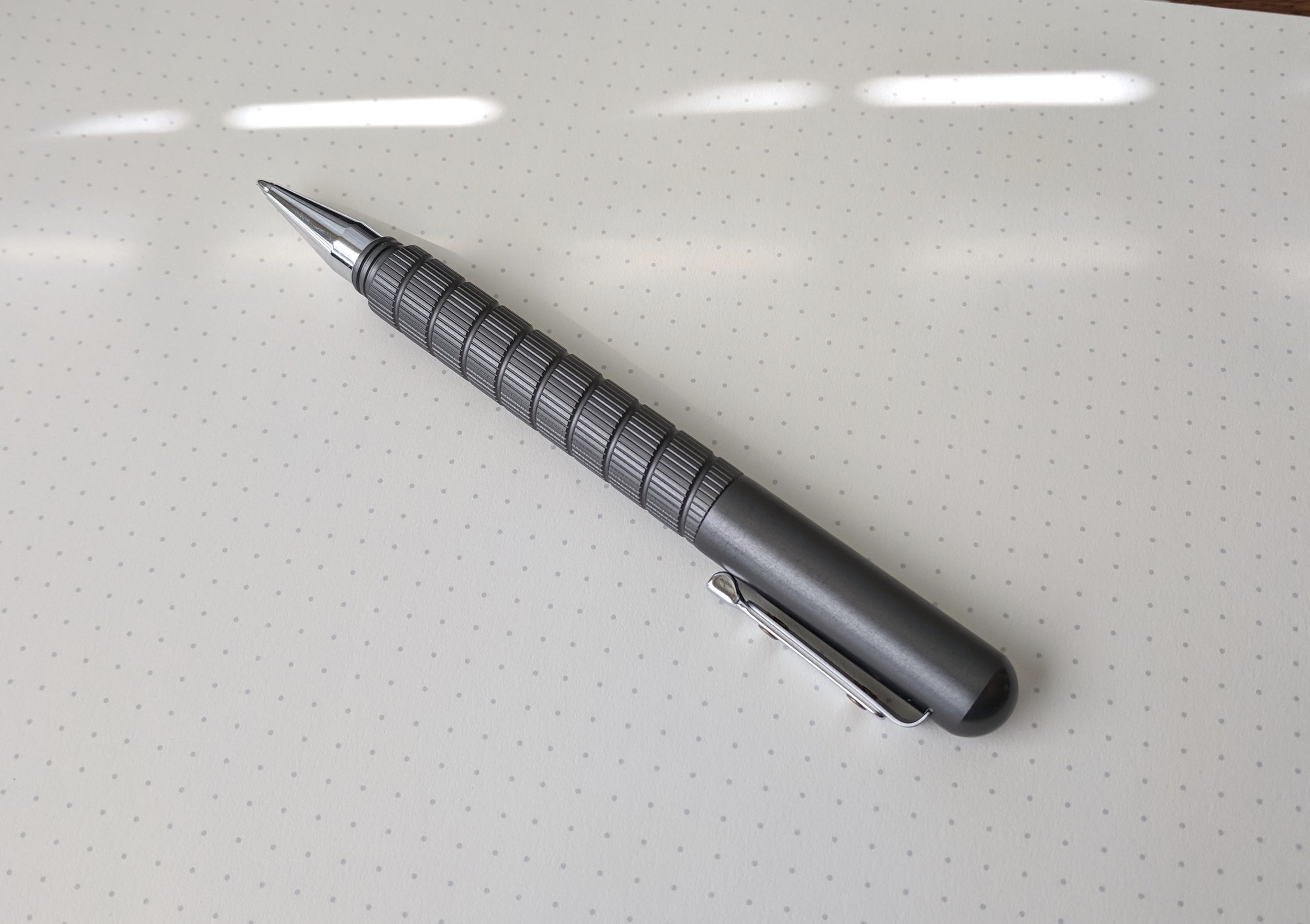
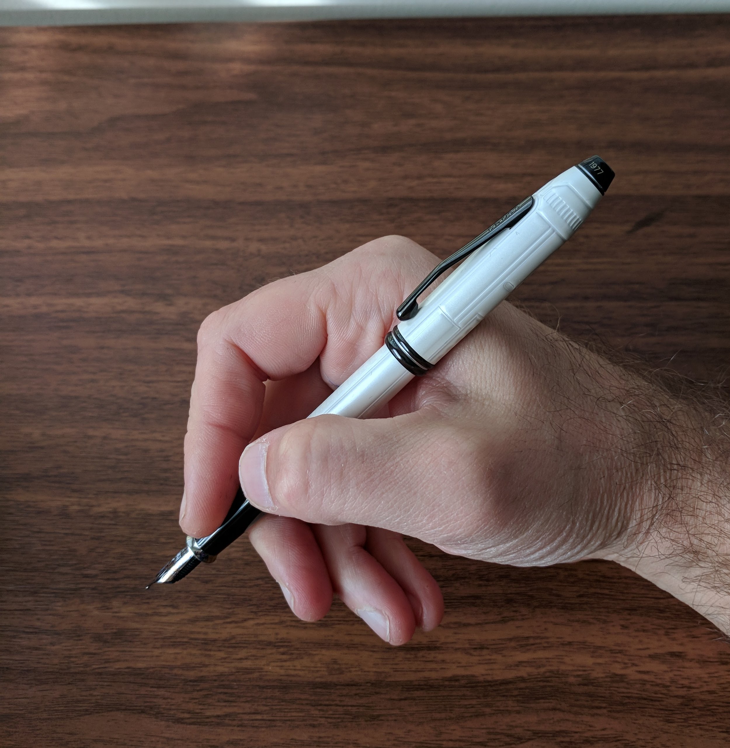
Like most modern Waterman pens, the Carène features a lacquered metal body and cap, but also sports something relatively uncommon today: an 18kt integrated nib incorporated into the design, tapered like a ship's bow. 

I love the classic black-and-rhodium combination of the Carène "Black Sea" model. 

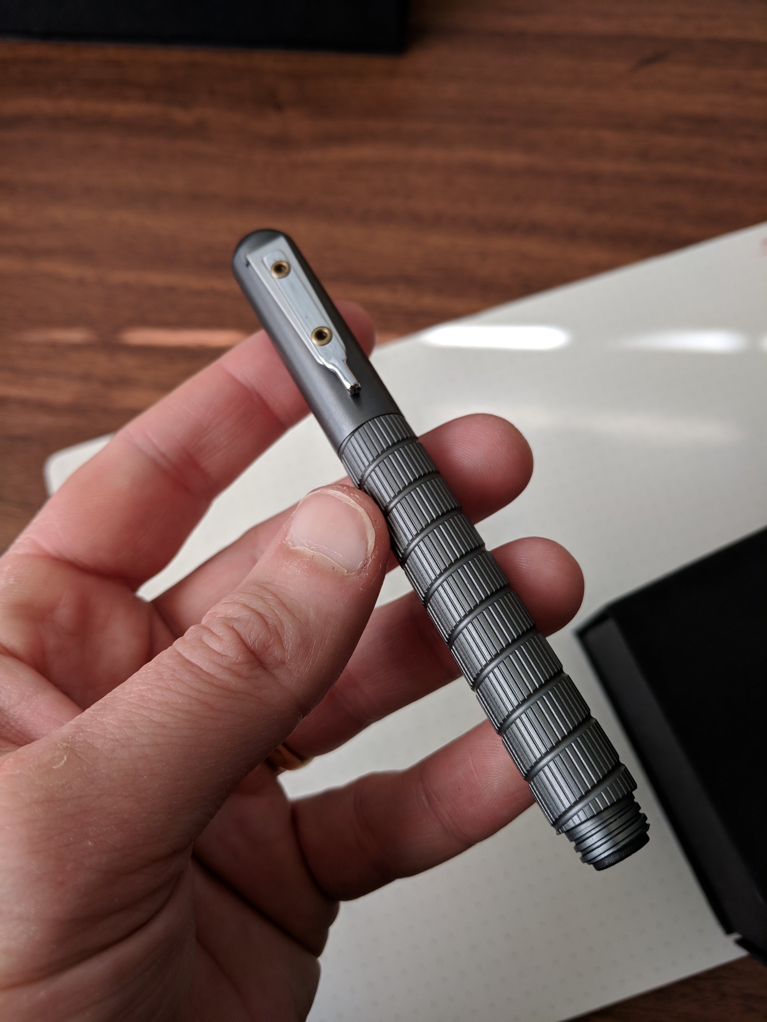
The Carène features Waterman’s high quality cartridge/converter system, and will take the high-capacity “long international” cartridges in addition to the standard shorter ones. I consider Waterman converters to be among the best. They’re well-designed in that they generally don’t leak or cause inkflow issues, and also have a relatively large capacity.

In order to get a full fill, make sure to fully submerge the breather hole on the bottom of the nib section. This can be challenging with certain ink bottles. (Ahem, Sailor.)

Note: I’ve owned a few Carènes in my “career” as a pen enthusiast. The first I ever purchased I ended up selling because of an issue with ink leaking out of the integrated nib onto the section, presumably due to the clutch cap creating suction and pulling ink out of the feed when I uncapped the pen. After asking around, and realizing that this issue was probably an anomaly, I tried again with the pen featured in this review. Several months in, I’ve not experienced any leaks or inky fingers. Looking back, I probably should have returned the pen for repair or replacement rather than sell it. 

Writing Experience

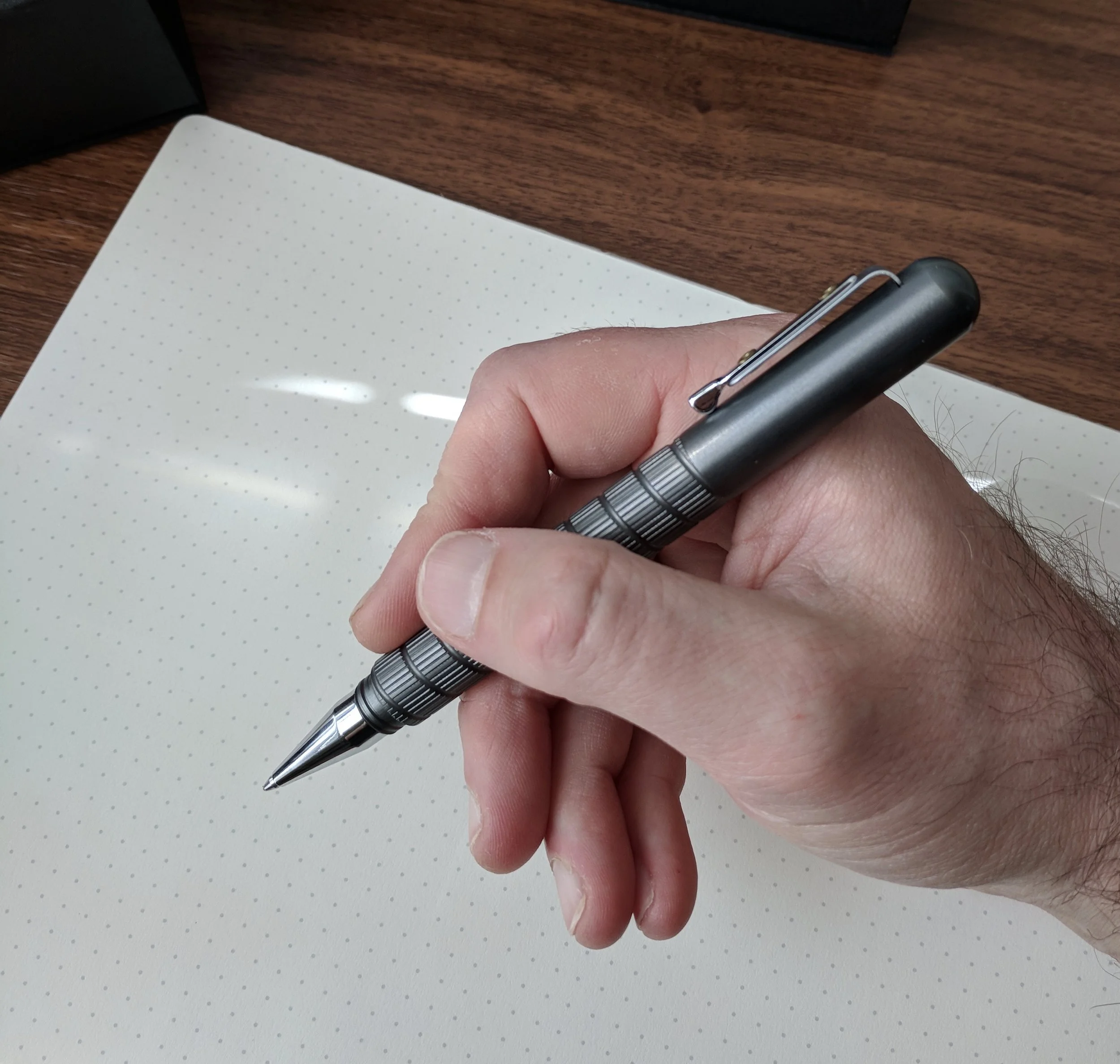
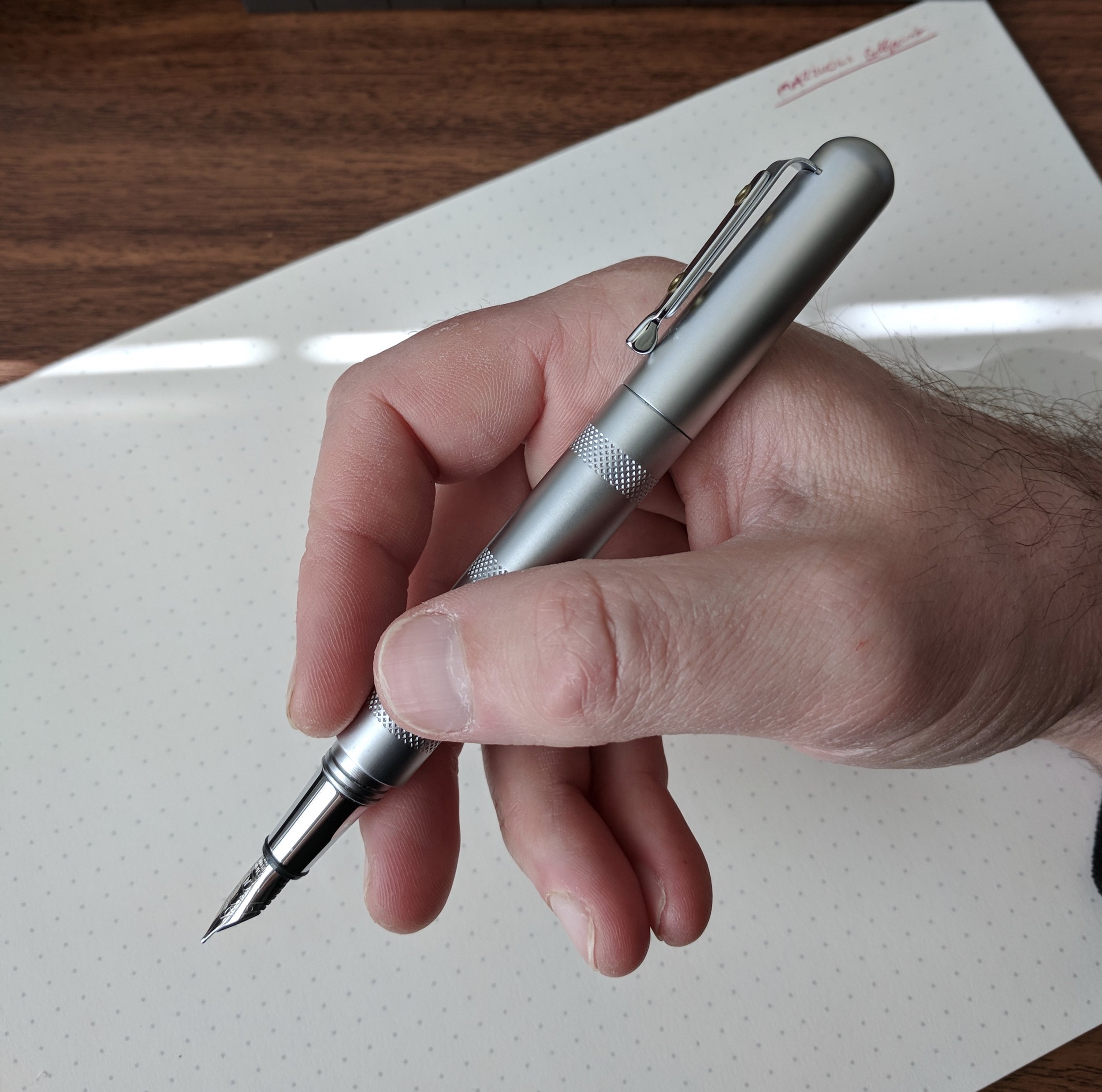
The Carène is one of the more comfortable writers in my collection. Despite the metal construction, the streamlined body sits in your hand quite comfortably, and the length/girth are perfect for me when the pen is posted. Unposted, it’s a touch narrow for my taste but definitely usable.

View fullsize Waterman Carene Posted
View fullsize Waterman Carene Unposted

The 18kt integrated nibs are smooth, wet writers - not quite a "firehose", but this pen will put some ink on the page. The nib on this pen has a lot of tipping material for a “medium,” and writes on the fat side of it’s designation. If you’re used to writing with Japanese nibs or German stainless steel nibs from Bock or JoWo, you could mistake this for a broad. Waterman does make nib sizes other than fine or medium, including extra fine, broad, and a stock stub, but they typically are available only via special order. Some retailers also sell nib units separately, though the cost represents a substantial portion of the price of a new pen. 

A writing sample with Sailor Bung Box Dandyism, a very dark green-black. Don't expect any bounce or flex whatsoever out of modern Waterman nibs. They're very firm, and it would be fair to call them "nails." 

Takeaways and Where to Buy

You can’t go wrong with a modern classic like the Waterman Carène. If you appreciate the aesthetics, the Carène makes for a durable, reliable writer that I’m going to have a hard time keeping off my recommendations list for a “first pen over $200.” The Carène also forms a key part of my "work carry" rotation. Like the Lamy 2000, due to the unusual nib the casual observer who knows nothing about pens might assume that this was a nice Waterman rollerball or ballpoint, which are still common in the corporate world. This isn't a distracting or flashy pen and therefore great for a stodgy office environment. 

Since Waterman still maintains a fairly large retail footprint, it’s somewhat easy to find the Carène in brick-and-mortar stores, even at non-specialized retailers that have a small “luxury” pen selection. You therefore shouldn’t have much trouble at all locating one from an online pen retailer. I acquired this pen from Pen Chalet, which as of the time of publication of this review stocks the Carène in four different models: black with gold or chrome trim (the “Black Sea” models, featured here), Blue ST, and a matte Charcoal Grey with chrome trim. While not inexpensive at around $220 retail, the Carène’s price is in-line with (or below) other cartridge-converter pens with gold nibs such as the Sailor 1911 Large and the Sailor Pro Gear.  Many other variations of the Carène exist, including some that are special editions and therefore more expensive.

Disclaimer: I acquired the pen featured in this review from Pen Chalet with my own funds.

In Pens Tags Pen Review, Waterman, Waterman Carene
10 Comments

Pen Review: Giuliano Mazzuoli Officina Ballpoint and Fountain Pen

November 22, 2017

Giuliano Mazzuoli is one of those brands that’s come on and off my radar over the past few years. I recall reading about one of their pens on the now-dormant FPGeeks website four or five years ago, but then they seemed to have dropped out of sight until this year’s D.C. Pen Show, when I noticed them at the table for distributor Luxury Brands. A month or so later, Carol from Luxury Brands reached out and asked whether I would be interested in borrowing some pens for review.

A Bit About Mazzuoli, the Company

Mazzuoli pens are the product of their eponymous designer, and are sold as part of his 3.6.5 sub-brand that focuses on writing instruments. (Giuliano Mazzuoli also designs a line of wristwatches.) Per the company, the pens are made in the Chianti region of Tuscany, Italy, and the website references a design partnership with motorcycle company Ducati. 

While I have a few different Mazzuoli models to review, I figured that I would start with the most classic design, the “Officina,” which Luxury Brands sent me in both a fountain pen and ballpoint version. Capped, the fountain pen and ballpoint look the same: a medium-sized, semi-cigar shaped metal pen (but for a flat back-end), featuring different patterns of knurling on the barrel. The first thing I noticed was the weight: these are very light metal pens, made from aluminum, yet they don’t feel insubstantial. The pens were a touch short for me to use unposted, but posting the cap did not affect the weight and balance at all.    

Officina “CassetTa” Ballpoint

The Officina "Cassetta" includes a leather pen sleeve. 

The Officina ballpoint (dubbed the “Cassetta”) is my favorite of these two pens. And it’s not just a ballpoint - it’s a convertible clutch pencil! While not a true “multi pen,” the option to swap in a pencil scratches that itch for me, and I love how Mazzuoli includes all of the necessary accessories in the box, so you don’t have to go searching for a lead pointer, etc.

Under the "false bottom" of the box, you'll find three additional Schmidt Easyflow Refills, the clutch pencil insert with multicolor leads, a lead pointer, and an eraser.

One note on the ballpoint’s design: I had to adjust my grip a bit to account for the lack of a smooth section on the Cassetta. In order to avoid holding the pen by the somewhat sharp threads, I had to either slide my grip back higher than I normally would, or move it down almost to the tip. Since I don’t use ballpoints for longer writing sessions, but rather only for shorter notes, this didn’t end up being that big of a deal, but it warrants mentioning here.

View fullsize Cassetta Ballpoint
View fullsize Mazzuoli Cassetta Ballpoint
View fullsize Mazzuoli Cassetta Ballpoint Capped

Officina Fountain Pen

The fountain pen version of the Officina that I received sported a different design, called “Micrometer Chrome.” While the pen kept the same shape, it featured three “bands” of knurling on an otherwise smooth metal pen. (Note, the fountain pen is also available in the “End Mill” and “Knurler Chrome” designs, if you prefer a completely textured barrel.)

Giuliano Mazzuoli fountain pens feature stock Schmidt stainless steel nibs. Not particularly exciting, but quality and reliable.

The fountain pen does not have the same section as the ballpoint. It instead sports a polished metal section that offers more room to grip the pen, and as a result the Officina fountain pen ended up being quite comfortable during my limited test. Mazzuoli chose to go with a Schmidt stainless steel nib - a reliable German workhorse that is relatively inexpensive, and has the added benefit of keeping the price of the pen down. The Officina uses a cartridge/converter filling system.    

View fullsize Mazzuoli Officina Fountain Pen Capped
View fullsize Mazzuoli Officina Fountain Pen Posted
View fullsize Mazzuoli Officina Fountain Pen Unposted
View fullsize Mazzuoli Medallion End Cap

Takeaways and Where to Buy

The Mazzuoli Officina collection is a fun set of writing instruments all around, but if I had to choose, I’d probably go with the Cassetta ballpoint. For starters, it’s a good value, considering what is included in the package. In the box, you receive the pen, three Schmidt Easyflow refills (red, black, and blue), a swappable clutch pencil mechanism, a set of clutch pencil leads, and eraser, lead pointer, and a leather pen sleeve. I love the presentation, and the Officina Cassetta would make a great gift idea for a ballpoint fan who also draws or enjoys writing with pencils. MSRP on the Cassetta ranges from $172-183, depending on the model, with the retailer "street" price typically coming in lower. MSRP on the Officina fountain pen ranges from $103-112 (again, typically with a lower price at actual retail) and also represents good value, but for some reason the uniqueness of the Cassetta "system" really drew me in - I've never seen anything like it on the market.       

While more retailers are starting to stock Giuliano Mazzuoli writing instruments, the pens are still relatively difficult to find. Currently, you can purchase them from our sponsor Pen Chalet, who carries both of the Officina pens reviewed here (the fountain pen and the “Cassetta” ballpoint) as well as other available models. Stay tuned for additional reviews!

Disclaimer: These two pens were sent to me on loan by Luxury Brands, the U.S. distributor for Giuliano Mazzuoli writing instruments, as well as Platinum, Noodler’s Ink, and others. Many thanks to Carol for making this review possible. This post contains affiliate links. 

EDIT: This post has been modified to clarify some information on pricing. 

In Pens Tags Giuliano Mazzuoli, Officina, Ballpoint, Pen Review, Pens
Comment

Star Wars Stationery Extravaganza!

November 4, 2017

It's a good time to be both a Star Wars fan and a stationery enthusiast! With the impending release of Star Wars: The Last Jedi coming up on December 15, you've probably seen "Star Wars" swag of all sorts on sale anywhere from Target to Office Depot. Here, I'll take a quick look at two products that have received a lot of press: the Cross Townsend "Star Wars" Limited Edition in Stormtrooper white, and the Sheaffer Star Wars fountain and rollerball pens that you may have even seen at your local Office Depot. 

The Cross Townsend Star Wars Pens come with this nifty clear acrylic pen stand. 

Cross Townsend

The Cross Townsend Star Wars special edition pens received a lot of press at their initial release, in connection with Star Wars: The Force Awakens back in 2015. While most commentary directed at these pens focused on the (too high, IMHO) price point, I found the designs well-executed, especially the "Stormtrooper" and "R2D2" pens. Goldspot was kind enough to loan me a Stormtrooper to review, and while I didn't feel comfortable carrying a loaner pen of this value "out in the wild," I did write with it for a bit and have some initial impressions. 

The only branding on this pen is the Imperial logo with a small, tastefully executed "Star Wars" imprint (with LFL trademark, as was probably required). 

What I liked: 

  • Design: The Star Wars theme is understated and not at all gaudy. As you can see from the pictures, a small Imperial logo appears on the back side of the cap, and I love how the limited edition run ends at "1977." The pen is a pleasant shape, and comfortable to use either posted or unposted, though when posted the cap wiggles and rattles a bit. 
  • Nib: The medium two-tone 18kt gold nib on this pen is an outstanding writer - wet and smooth, though the pen writes more like a broad than a true medium. While Cross makes most of its nibs in-house (with nibs on certain models made by Sailor Japan), this nib both looks and feels like a Pelikan nib. Why? Because apparently Pelikan is also making nibs for Cross. Pelikan is not an inexpensive brand - in part because of the craftsmanship that goes into their excellent nibs, and I suspect that drives up the price on these pens. (More on that below in "What I did not like").  

Look familiar? The nib on the Townsend looks remarkably similar to a Pelikan M400 nib, though it's 18kt instead of the standard Pelikan 14kt. (It's also an exceptional writer.)

What I Did Not Like: 

  • Price. While it's a nice pen, the $575 price bumps you into Pelikan M800 territory. I'm aware that die-hard Star Wars fans who also love fountain pens have snapped these up, but I likely will take a pass because $575 is a LOT of money. Even once you factor in the Pelikan nib, the comparably-sized Pelikan M400 starts around $350. 
  • Cap and Clip. Not the design, but the construction. The cap is friction-fit, and there's a bit too much wiggle, both when the pen is capped and posted. The clip isn't spring-loaded, and the folded metal construction looks like a minor upgrade from those used on much less expensive Cross pens. The fit and finish here doesn't rise to the level of a nearly $600 pen.  

The clip design and construction on the Townsend didn't exactly blow me away. 

Overall, the pens that I would consider comparable to the Cross Townsend would be the Aurora Ipsilon, the Parker Sonnet, and - with respect to the nib - the Pelikan M400. All of those pens are excellent, and the Parker and Pelikan are personal favorites, but they sit at a price point well below what Cross is asking for here. 

View fullsize Cross Townsend Box
View fullsize Cross Townsend in packaging
View fullsize Cross Townsend Unposted
View fullsize Cross Townsend Posted

Cross recently announced the release of three new limited edition Townsend pens in the following themes: Han Solo, Chewbacca, and Boba Fett. 

The Sheaffer Star Wars Pens

Though I'm a semi-die hard Star Wars nut, I probably couldn't justify the purchase of the Townsend. Sheaffer, on the other hand, knocks it out of the park with their latest release, coming in at just over or just under $20, depending on whether you go with the rollerball or fountain pen version.

Why did both Cross and Sheaffer decide to jump in on the "Star Wars" pen game? For starters, they're the same company. Cross acquired Sheaffer from Bic in late 2014, so it's a fair assumption that these two pens are part of the same overall branding strategy/collaboration between Disney (which now owns the rights to Star Wars) and Cross. 

I love that Sheaffer has now decided to include the white dot on all their pens, resurrecting an iconic trademark that used to appear only on high-end models. 

Personally, I think the Sheaffer is the better pen of the two, all things considered. It's an inexpensive pen, yet at the same time feels well made. When I first saw pictures of these pens posted online, I expected cheap, thin plastic fountain pens with a cellophane/plastic wrap decoration applied to them that would flake and peel off over time. Not the case. The Star Wars detailing is either painted or a well-applied decal. Sure, it might wear away over time, but it's a $20 pen. Construction-wise, the plastic on these pens feels pleasantly thick and sturdy, and probably would withstand minor drops onto a hard surface.

The nib selection is excellent, as long as you like medium! Each design is also available as a rollerball pen, which accepts Sheaffer's "Gel Rolling Ball Refill." This refill may be proprietary - I've not found another refill among my collection that fits but check out Ana's refill guide for possibilities. 

The Sheaffers also offer a great writing experience, especially at the $20 price point. The round section is soft rubber, so it's grippy and very comfortable to use. These nibs won't win any awards for character, but for a workhorse stainless steel nib on a cheap fountain pen, the quality was consistent across both pens that I tried, with the Sheaffer writing a wet line without any skipping. The pens are a bit long posted but they're also very light so I could go either way. Well done, Sheaffer!   

Writing Sample, in black gel and fountain pen ink. The Sheaffer fountain pen comes with one Sheaffer proprietary cartridge.

If you're interested in ordering online, Goldspot has the full range of Sheaffer Star Wars pens in stock, in both fountain and rollerball.  Many thanks to Goldspot for making this review possible! 

Further Shopping Options

Finally, if you're a fan of Bic products, or simply want to spend even less money to scratch your "Star Wars" itch, you'll want to check out the Star Wars-themed Bic ballpoint pen, Bic Multipen, and Bic Mechanical Pencils. Oddly, I've not seen these carried in any office supply stores - and I've looked pretty hard - so you may be limited to ordering online.  (The other day, I could swear I saw a Star Wars-themed Bic cigarette lighter that said "Join the Dark Side," but now I can't find it anywhere. Must've ruffled a few feathers and been pulled.)

Disclaimer: The Cross Stormtrooper pen and the Darth Vader Sheaffer fountain pen were sent to me by Goldspot for review purposes (the Stormtrooper pen on loan). This post contains affiliate links.  

In Pens Tags Star Wars, Townsend, Pen Review
Comment

Pen Review: 3952 X800

October 30, 2017

Several weeks back Ron at Pen Chalet reached out and offered to send me a pen from a new line out of Taiwan, “3952,” for which Pen Chalet is the exclusive U.S. distributor.  As always, I quickly agreed, since I’m ever on the lookout for pens from brands that I’ve never tried - something that’s rare these days.  

3952 is a division of BonArtek, a Taiwanese writing instrument manufacturer. I have no prior experience with any pens by BonArtek, and to the best of my knowledge, until the release of the 3952 pens, they have not sold any pens under their own mark or the “3952” brand in North America or Europe. “3952” derives its name from the height of Mount Jade, the highest peak in Taiwan at 3952 meters high.  The initial batch of 3952 pens includes three models: a rose wood pen with a metal cap, an abalone shell model, and the X800, which is a larger black and chrome metal pen featured here.

First Impressions

3952 has done a nice job with the presentation and packaging on the X800, which looks high end without appearing ostentatious or wasteful, and is appropriate to the price point of the pen.

View fullsize 3952 Packaging
View fullsize 3952 X800 in Packaging

The pen itself definitely has that a certain “metal pen look”, which you either appreciate or you don’t. The barrel feels like coated brass with an engraved “twist” pattern, and features a smooth chrome section. My pen appears to be very well-machined, with none of the dings, chips, or manufacturing flaws that you see on cheaper metal pens. The smooth section itself is quite comfortable to grip and I haven’t had any issues with it becoming slippery. (As I think I noted in a previous review, one of the ways in which I’m trying to improve my handwriting and overall penmanship is by loosening my “death grip” on the pen. As a result, metal sections haven’t bothered me as much because my hand gets much less sweaty/oily, but I digress.) The pen does post, but the hefty metal cap will make this pen too unbalanced for most people, save those who have very large hands. While I prefer to be able to post my pens, the X800 has a nice balance to it unposted, with the metal section front-weighting the pen.

View fullsize 3952 X800 Unposted
View fullsize 3952 X800 Posted

My favorite feature of the X800 is the cap and magnetic closure. Many modern pens use either a threaded cap, which screws onto the barrel and takes time to deploy, or a friction-fit “snap” closure, which often utilizes a plastic inner cap that can loosen (or even crack) over time. 3952 has chosen to use a magnetic cap that closes very securely with a quarter twist. I also appreciate how the clip is incorporated into the overall design of the pen, similar to the Karas Kustoms Ink. The clip itself is tight with very little wiggle, while still allowing you to slip the pen into a shirt pocket or clip it to a pen sleeve in a bag.

The clip is integrated into the design of the cap. It's not coming loose anytime soon. 

Writing Experience

3952 Pens use a cartridge/converter filling system with stainless steel Bock nibs, which are generally smooth and reliable, but they won’t show you much in the way of line variation or overall “character.” I personally tend to find steel Bock nibs slightly dry. This one was no exception, though skips or hard starts were rare, coming mainly after I had left the pen sitting for over a week.

Factory standard medium nib and section. If you look closely, you can see how 3952 incorporated a curved metal "lip" at the base of the section, which serves as the "threading" for the twist closure.

Out of curiosity, I pulled the stainless nib and swapped in a Bock titanium nib and feed from another pen, which worked perfectly and now this pen is what I would call an insanely good writer. This, of course, is entirely a matter of personal preference, since I prefer more ink on the page than most steel nibs offer "out of the box" and lean towards moderately wet gold nibs for most of my writing. (I typically modify my steel nibs to write wetter than the “factory setting.”) Though 3952 does not offer nib upgrades (at least not yet), you can pull the nib from the X800 and swap in another Bock nib and feed "borrowed" from another pen or purchased separately from a source like fpnibs.com.

If you want to swap a Titanium nib into this pen, you probably will want to use the feed that came with the Ti nib unit, since Titanium nibs generally have heavier flow and the feed channels are cut differently.

Takeaways and Where to Buy

3952 makes a solid fountain pen. The X800 is a comfortable, well-balanced writer with a reliable German stainless steel nib from a reputable manufacturer. The magnetic twist closure on the X800 is probably the trait that most distinguishes the pen from its competition, and one I wish that other pen companies would incorporate, given that slip caps tend to loosen and/or crack over time. 

As I mentioned above, through the end of the year you can purchase 3952 fountain pens from Pen Chalet as the exclusive U.S. distributor. The MSRP on the 3952 X800 is $187. Street price, after incorporating standard discounts/coupon codes, is around $135, which places the X800 in the same price bracket as brands such as Faber-Castell, Diplomat, and Otto Hutt. One pen that the X800 might be comparable to is the Diplomat Excellence. Diplomat pens use JoWo nibs, and the 3952 pens use Bock. JoWo and Bock both make a good nib, but they do have a different feel to them, with Bock nibs typically writing slightly drier out of the box, in my experience. While the X800 holds its own in terms of quality, I suspect that 3952 may gain the most traction with their other offerings such as the Rose Wood and Abalone Shell fountain pens, which are somewhat unique designs at this price point and have received good reviews. 

Disclaimer: The pen featured in this review was sent to me by Pen Chalet for review purposes, free of charge. This post contains affiliate links.

In Pens Tags Pen Review, 3952
Comment

Pen Review: Visconti Van Gogh "Vincent's Chair"

October 21, 2017

Visconti’s “Van Gogh” Impressionist Collection receives scant attention, at least as compared to the Italian company’s other flagship pens such as the Homo Sapiens and Divina. That’s a shame, because of all the Visconti pens I’ve had the opportunity to test out, this might be my favorite. (Sorry, Homo Sapiens Dark Ages.)  

Each pen in the Van Gogh series is cast from an acrylic resin specially mixed to match the palette of colors found in a Vincent Van Gogh painting, in this case, Vincent’s Chair. (Pens based on the works Starry Night, Shoes, Irises, and one of his self-portraits are also available, among others). Each piece is unique, and even those pens based on the same painting will still feature different swirls and patterns in the acrylic.

The Van Gogh packaging includes a reproduction of the original artwork on the inside flap of the leather box, so you can compare the colors in your pen to the painting that inspired it.

This particular Van Gogh features a very nice steel nib - actually, one of the best Visconti nibs out of the box that I’ve used. As I’ve mentioned in prior reviews, Visconti nibs can be supremely frustrating because the company’s quality control is all over the place. These pens sit at a very high price point, and of the three Visconti Pens that I’ve reviewed (Homo Sapiens Dark Ages, Rembrandt Back-to-Black, and this Van Gogh), all three required some sort of nib adjustment out of the box. Not exactly what you would expect when you are shelling out anywhere from $150-700 for a fountain pen.

The stainless steel nib on the Van Gogh is quite attractive, with the crescent-shaped breather hole and scrollwork. 

The stainless steel nib on the Van Gogh is quite attractive, with the crescent-shaped breather hole and scrollwork. 

In the case of this Van Gogh, the “nib work” required to get the pen in writing order was fairly minor: the tines were misaligned but I was able to easily push them back into place with my thumbnail after straightening out the feed. After this ten-second adjustment, the pen wrote exceptionally well: a wet medium line with no hard starts or skipping.

Note: I’m experienced with fountain pens, and consider a tine adjustment to be “minor” and something I can handle myself. I recognize that someone spending $200 on their first expensive fountain pen might not be so brave. For that reason, I generally do not recommend Visconti as a brand for beginners. Regardless, if you are considering purchasing a Visconti, purchase from a reputable retailer (like Goldspot) and specifically ask them to inspect the nib for you prior to shipment to avoid any problems on the front end.

The Van Gogh pens feature the patented Visconti clip, and have the name of the painting that inspired the pen engraved around the cap band. 

So what keeps bringing people back to Visconti, despite the temperamental nibs? The design, which always has a lot of personality to it and inspires strong opinions (positive and negative), particularly surrounding Visconti's larger clips. Those who enjoy Visconti design, however, demonstrate exceptional loyalty to the brand, and Visconti collectors/enthusiasts are well-represented in the pen community. Personally, I like the Visconti “Bridge Clip,” and the polished version here works especially well on the smaller, faceted Van Gogh pen. Yellow pens also tend to be hard to find, and I found this color combination on the “Vincent’s Chair” pen, with its swirls of blues and greens, especially attractive on the faceted barrel. The silver trim also sets off the acrylic nicely.

The Van Gogh also features a secure magnetic closure on the cap, and is compatible with Visconti’s “My Pen” personalization system, if that’s something that interests you.

The Van Gogh might end up as one of my preferred Visconti models. The compact size, light weight, and excellent nib (once adjusted) combine to form an extremely comfortable daily writer. The pen also posts well. While the pen has a metal section, I didn’t end up with a slippage problem, and this is something that bothers me less and less as I learn to not grip my pens so tightly. 

Takeaways and Where to Buy

You can purchase this Visconti Van Gogh Vincent’s Chair fountain pen, as well as the other pens in the Visconti Van Gogh Impressionist Collection, from Goldspot Pens. The Van Gogh sits around the midpoint of Visconti’s pricing scale at $289, which admittedly is on the high side for a steel-nibbed acrylic pen. That said, the effort required to mix and pair each resin with a particular Van Gogh painting likely took work and drove up the cost, so when viewing these pens from a cost/value perspective, it’s probably more appropriate to compare them to a custom pen like an Edison or a Newton, which sits around that same $300 price point.

I've posted this pic before I know, but to give you a sense of the size, here's the Visconti (far right) compared against (from right) a Pilot Vanishing Point, a Ryan Krusac Legend L-14, and a 3952 X800.

Many thanks to Goldspot for loaning me this pen for review. Overall, I’m sad to have to send this one back, but a Vincent’s Chair and/or Starry Night pen might be making its way into my collection in the future.

Disclaimer: Goldspot loaned me this pen free of charge for review purposes. 

In Pens Tags Visconti, Van Gogh, Pen Review
1 Comment
← Newer Posts Older Posts →
Store Hours and Location
Visit the T.G.S. Curated SHOP
Updated "Best Pens" Guide
On the Paper Trail Podcast
TGS x Roterfaden TGS_25
Hierarchies of Fountain Pen Friendly Paper

Join Our Patreon!
Subscribe to the TGS E-mail List

Featured Posts

Featured
Cover On the Paper Trail Intro Clip.jpeg
Dec 3, 2025
Introducing "On the Paper Trail," a New Podcast/Video Collaboration with Lisa Vanness of Vanness Pens!
Dec 3, 2025
Dec 3, 2025
Iro-Utsushi-Fine-Dip-Pens.jpeg
Oct 1, 2025
The Pilot Iro-Utsushi Dip Pen (and in General, Simple vs. Fancy Dip Pens)
Oct 1, 2025
Oct 1, 2025
Levenger-Annotation-Pad.jpeg
Sep 20, 2025
Five Boutique Paper Brands I'm Watching Closely and Why
Sep 20, 2025
Sep 20, 2025
The Gentleman Stationer RSS

© Digital Divide Media, LLC, 2014-present.

All content is the exclusive property of Digital Divide Media, LLC, d/b/a The Gentleman Stationer, including “The Gentleman Stationer” website and trademark, and should not be reproduced without express written permission.  All rights reserved.

All content containing paid advertising, affiliate links, or sponsored content will be plainly disclosed by a disclaimer when/if featured.

Contact Information

Store Shipping Policy and Return Policy

Privacy Policy

Cookie Policy

Terms and Conditions

Powered by Squarespace