• Blog
  • Shop
  • Resources
  • FAQ (Ask TGS)
  • About
  • Archive
  • Contact
  • Sign In My Account
Menu

The Gentleman Stationer

Vintage Living in the Modern World.
  • Blog
  • Shop
  • Resources
  • FAQ (Ask TGS)
  • About
  • Archive
  • Contact
  • Sign In My Account

From Left: Sailor Sapporo Mini; Sailor Pro Gear Color; Sailor Pro Gear Imperial Black.

Pen Review: Sailor Pro Gear Sapporo Mini

December 1, 2018

Sailor discontinued the "pocket” version of its popular Pro Gear fountain pen, the Sapporo Mini, a few years ago, prompting a run on retailers’ remaining stock and, from what I recall, somewhat of a frenzy at a recent Atlanta Pen Show when a former Sailor distributor showed up with a handful of pens she was looking to unload. What many people don’t realize, however, is that Sailor continues to make these pens for the Japanese market, including for Nagasawa department store’s private label, “PenStyle." Fans of Sailor will know that Nagasawa has a close relationship with the pen company, and that Sailor private labels dozens of “Kobe Inks” for the store in addition to special edition pens.

The Nagasawa cap finial (left) compared against the standard Sailor design (right). Note that the yellow used in the Sapporo Mini is a deeper, mustard yellow, which I prefer to the brighter yellow acrylic used on the Pro Gear Color.

The differences between a standard Sailor Sapporo Mini and the Pen Style version are mostly cosmetic. The cap band is engraved “PenStyle Memo,” and instead of the Sailor anchor logo, the finial features a plain yellow dot bordered in black. While the nib is stamped “Sailor” at the bottom, leaving no doubt who made it, the primary artwork is an engraved dragon with “Kobe” and “1882” inscribed over it - a reference to the founding date of Nagasawa, from what I understand.

A different style of nib engraving, but you still know it’s a 14k Sailor nib, meaning that it’s stiff as a nail but quite smooth.

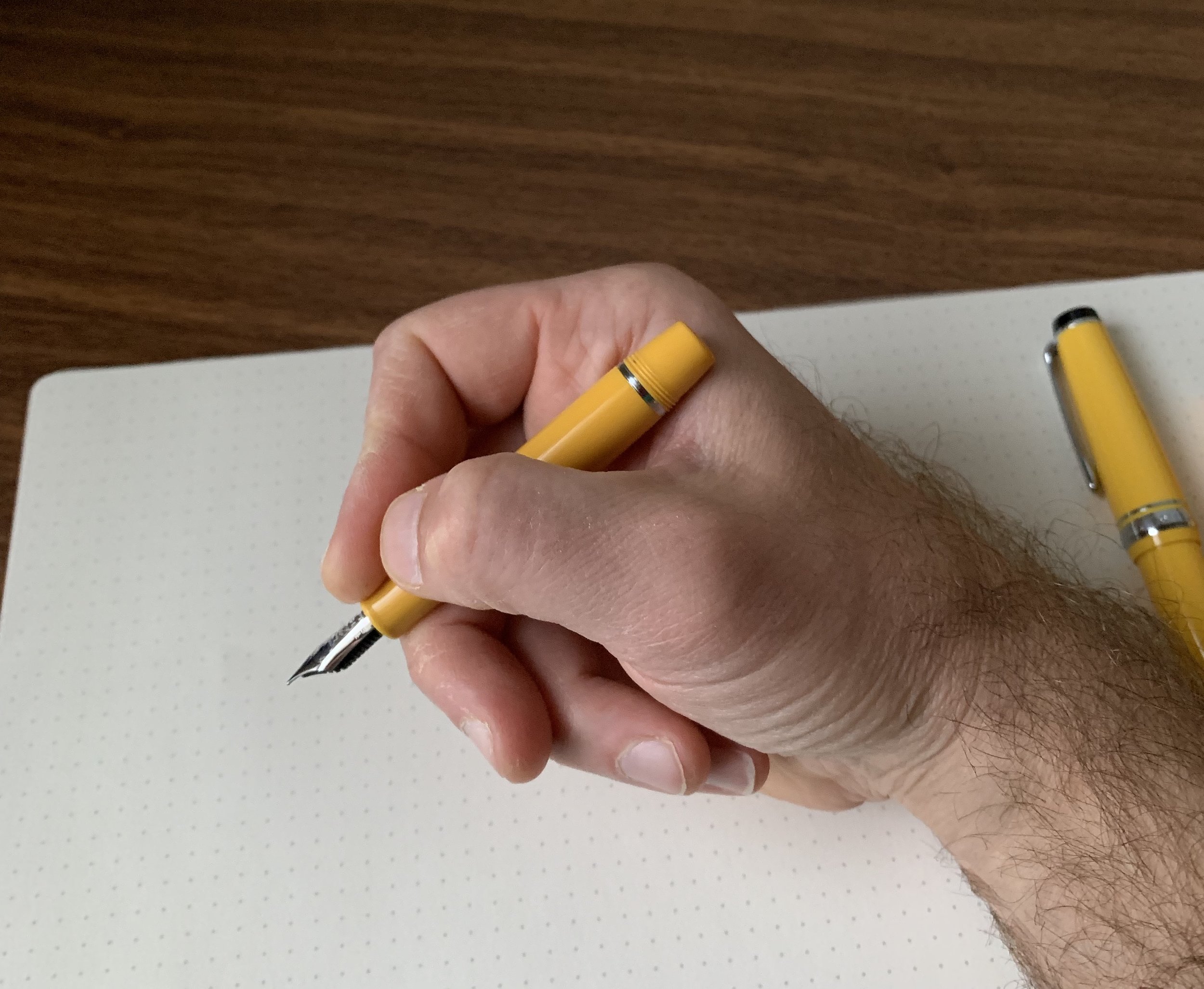
You all know that I love the standard Pro Gear, and if you’re also a fan of that pen, or a fan of the Pro Gear Slim, you’ll appreciate the Sapporo Mini as a true “pocket carry” iteration of those pens. Capped, the Sapporo Mini is tiny, fitting almost entirely inside my closed hand. Unposted, the pen feels very small and too short to be usable by almost anyone - it’s meant to be posted. The short barrel has threads at the back, allowing you to post securely, and this pen extends to almost the same length as a standard Pro Gear Slim. While it’s definitely on the smaller side, I can use it comfortably for longish periods of time.

Once this pen is posted and fully extended, it’s actually not that small (shown here compared against a standard Pro Gear).

View fullsize Sailor Sapporo Mini Posted
View fullsize Sailor Sapporo Mini Capped
View fullsize Sailor Sapporo Mini Unposted

Note that the Sapporo Mini is cartridge-only, as the barrel is too short to accept a converter. (Sailor apparently made a “mini converter” for this pen years ago, but discontinued it.) Typically, the lack of a converter option wouldn’t bother me much, since I have a bunch of cartridges lying around at any given time, but Sailor cartridges are proprietary so this ended up being a bit of a pain. I chose to stock up on cartridges of Sailor’s pigmented inks. I’m partial to the Souboku Blue-Black, but the Kiwa-Guro Nano-Black is also excellent.

Sailor’s pigmented “nano” blue-black, Souboku, has a great color that’s fairly unique. It’s water-resistant and dries quickly.

The Sailor Nano-ink cartridges have an extra little touch that I find kind of charming.

Takeaways and Where to Buy

I purchased my Sapporo Mini in yellow because, well, I have a thing for yellow pens and if yellow is an option, I’m probably going with that. The pen also comes available in red or black, with a choice of extra fine, fine, and fine-medium nibs. If you’re in the States, you can order through eBay Seller Cool Japan, where you can pick one of these up for a bit less than the price of a standard Pro Gear Slim. Cool Japan also carries a range of other Sailor/Nagasawa collaborations and other special editions, including Pro Gear Slims in custom colors like Tarumi Apricot, the Sailor 1911 Standard Clear Demonstrator with black-plated trim (referred to as the “Proske”), and the “Tequila Sunrise” Pro Gear from Sailor’s “Cocktail” series.

I keep this pen in my collection for two reasons. First, it’s a unique iteration of one of my favorite pens, the Sailor Pro Gear, and I suspect it eventually will have some value as a collectible because I don’t see Sailor/Nagasawa making this pen forever. Second, I only have one Sailor “Fine-Medium” nib in my collection, and I love this line width.

One final thought on “pocketability” - I don’t use this pen as a true “pocket pen” because it’s plastic and far from indestructible. That said, I do enjoy having a more portable version of the Pro Gear that’s very light in the shirt or jacket pocket, especially when I travel. While this isn’t a pen I ink up all the time, it’s also not one I can see myself parting with anytime soon.

Further Reading

If you like the look of the Sapporo Mini, check out my other reviews of the full-size Sailor Pro Gear fountain pens. I’ve previously reviewed the “Imperial Black” version, the Pro Gear Sky limited edition, and the “Soleil” version of the piston-filling Pro Gear Realo, which was another limited edition collaboration between Sailor and Japanese retailer Bungubox. While I’ve scaled back my collection in recent years, the Pro Gear remains one of my favorite fountain pen designs of all time.

Disclaimer: I purchased the pens featured in this review with my own funds, for my own collection. This post contains affiliate links.

In Pens Tags Sailor Pro Gear, Sailor Sapporo Mini, Kobe Nagasawa, Pen Review, eBay
Comment

Pen Review: Graf von Faber-Castell Classic

November 14, 2018

I firmly believe that Graf von Faber-Castell makes some of the most beautiful stationery items in the world. The high-end, luxury arm of the global Faber-Castell stationery empire, their stated goal is to “embody ‘Luxury in Simplicity’ by combining selected materials, functionality and superb aesthetics.” While I’m not yet sure that the overall design of their pens works for me from a purely functional perspective, I can’t argue with the beauty and the quality.

At first I wasn’t sure how I felt about the two-toned gold nib, but ultimately I think it works paired with the dark brown wood.

The GvFC Classic, which I’ll review here, is the company’s flagship pen. I wouldn’t call the design “simple” - there’s a lot of different design elements going on - but at the same time GvFC has made an elegant writing instrument that doesn’t lose its functionality as a pen that you could use every day. And the nib… I’ve written before about how I think Faber-Castell makes some of the best stainless steel nibs available, including at relatively low price points. The 18k gold fine nib on the pen I tested writes even better, and has a surprising bit of spring to it. You won’t get much line variation, as it’s still a relatively stiff 18k nib, but a touch of bounce makes for a smooth and comfortable writing experience.

As with most pens made from wood, each Graf von Faber-Castell Classic and Classic Anello is going to show variations in the wood grain, making each pen unique.

As with most pens made from wood, each Graf von Faber-Castell Classic and Classic Anello is going to show variations in the wood grain, making each pen unique.

The two core elements of the Classic are Graf von Faber-Castell’s signature cap and the wood used to make the barrel. The different versions of the Classic are named to reflect the various woods used, including ebony, pernambuco, snakewood, grenadilla, and macassar. The standard Faber-Castell Classic features solid wood barrels with a ribbed texture, while the “Classic Anello” model, pictured here, features wooden barrels with inlaid metal rings.

The coin-edging on the top of the cap is one of my favorite details on this pen.

In my opinion, along with the nibs, the caps on Faber-Castell pens set them apart. The Graf von Faber-Castell Classic features a platinum-plated, solid metal cap that looks sort of like a chimney or old-fashioned smokestack that flares out at the top with coin edging. It’s similar, but not identical, to the cap used on Graf von Faber-Castell’s iconic - and somewhat ridiculous - “Perfect Pencil”. Even on most of their lower-end pens, Faber-Castell uses sturdy, spring-loaded clips that attach well to pen cases, bags, and shirt pockets. (Yet another sign that these pens aren’t just eye candy, but meant to be used.) The downside to these caps, however, is the weight, which brings me to….

What About Posting…?

Finally, the big potential drawback for me, and the reason why, at least to date, I don’t have a Graf von Faber-Castell Classic in my collection: this pen doesn’t post. (Technically, the pen will post, but the weight of the metal cap on the back end renders the pen far too heavy to make posting comfortable for even short writing sessions.) On the flip side, for such a slender pen, the Classic feels perfectly balanced and comfortable unposted. The combination of wood/metal construction, a long grip section, and a bit of added length helps in this regard. Prior to an extended test-run with the Classic, I had thought that the Classic would be too slim, and that I’d ultimately conclude “nice pen; not for me.” That’s not the case. I’m still considering this pen, especially now that I know they have a dark-trim Macassar version, but I need to get comfortable with the fact that I won’t be able to post it.

View fullsize Graf von Faber-Castell Classic Unposted
View fullsize Graf von Faber-Castell Classic Posted

Takeaways and Where to Buy

I’m a huge fan of standard Faber-Castell products, and, as I expected, I also enjoyed my first experience with the Graf von Faber-Castell Classic. In fact, I would say that if the ability to post your pens is not a must-have feature, a Classic is a no-brainer addition to any high-end pen collection. The 18k nib writes exceptionally well, and the intricate combination of wood and metal in the design, especially the GvFC signature clip and cap, render Graf von Faber-Castell pens unlike anything else on the market.

Pricing on the Graf von Faber-Castell Classic typically runs from $400-500. The Classic Anello Grenadilla, as pictured here, is priced at $458 at Appelboom, based on the current exchange rate. While certainly an expensive pen, the Classic sits on the lower end of the pricing spectrum for luxury brands of this quality. Site sponsor Appelboom, who loaned me this pen for review, carries the full range of Graf von Faber-Castell products.

Did I mention that the packaging and presentation on GvFC products are top notch? A few more pictures are shown below, including the presentation box which doubles as a three-slot pen case.

View fullsize Graf von Faber Castell Logo on Presentation Box
View fullsize Graf von Faber-Castell Classic in the Presentation Box
View fullsize GvFC Classic Anello, Grenadilla
View fullsize GvFC Classic Anello Grenadilla, in Presentation Box

Further Reading

I’ve recently reviewed several Faber-Castell pens, including the E-motion Pure Black and the Loom, and both pens have remained fixtures in my rotation. They are also significantly less expensive than the Graf von Faber-Castell pens, demonstrating that you can get the same Faber-Castell quality for less money. Their ink is also excellent.

Disclaimer: The pen featured in this review was loaned to me by Appelboom for review purposes. This post contains affiliate links.

In Pens Tags Graf von Faber-Castell, Appelboom
Comment

Pen Review: The Esterbrook "Estie"

November 8, 2018

Getting to handle the new Esterbrook pens was one of the highlights from this year’s D.C. Pen Show. When Kenro first announced that they had acquired Esterbrook back in April, I suspected they would turn out something good, but the Estie far exceeded my expectations. Given the history with the “new” Esterbrook brand, first resurrected a few years ago to little acclaim and much derision in the pen community, I was concerned that the Estie wouldn’t get a fair shake, but it appears that the reception has been largely positive, mainly because you can’t argue with the fact that the quality is top notch.

For my two review pens, I chose Esties in Cobalt Blue with chrome trim and Tortoise with gold-plated trim. An ebony model is also available, and you can opt for either trim on any color pen.

Particularly striking to me is how this pen feels in the hand. I’ve used a LOT of turned acrylic pens - I probably own dozens - but the materials chosen for the Esties feel solid and have a lot of warmth, reminiscent of ebonite or celluloid (even though they’re obviously not). The section in particular is quite comfortable, and I find myself wanting to write with this pen for long periods of time. I also absolutely love the vintage cigar shape. Though I’m not a collector of vintage pens, I very much appreciate vintage-inspired design, and the Estie sports the beautifully streamlined look of a classic Sheaffer balance, sans cap band or any adornments other than the clip and an engraved “Esterbrook” logo.

Two features are being used extensively to market the Estie: the “cushion cap” closure and the “MV Adapter,” the latter of which is available for purchase separately, and allows you to use your vintage Esterbrook nibs in the new pen. After some initial skepticism, I’m a fan of the cushion-cap. It’s a spring-loaded inner cap that requires you to push the cap down and turn in order to engage the threads to close the pen. It takes a time or two to get used to, and after that you don’t notice it much. The one thing I don’t love about it is that it makes it difficult to post the cap straight on the barrel - a very minor annoyance, but I’m a poster, so there it is. On the other hand, the purpose behind the cushion cap is similar to Platinum’s “Slip & Seal” system on the 3776 Century: the nib won’t dry out even if you leave the pen sitting unused for long periods of time. This may be convenient for some people, but it’s not so much a selling point for me, nor is it a feature I’m likely to test. I tend to write my pens dry fairly quickly.

The MV Adapter alters the overall look of the pen quite a bit. The adapter only comes in black, and vintage Esterbrook nibs are narrower than their modern JoWo counterparts. From an aesthetic perspective, if you’re looking to purchase this pen primarily for the MV Adapter, consider the Ebony model.

Similarly, while vintage Esterbrook enthusiasts who own a large collection of vintage nibs might view the MV Adapter as an essential, those who merely want a smooth steel nib on their daily workhorse can probably take a pass. I honestly prefer the feel of modern steel JoWo nibs to standard Esterbrook fines or mediums, and wouldn’t spring for the MV Adapter unless you want to use your vintage Esterbrook stubs, flexies, or stenography nibs. (Confession: I’m not a vintage Esterbrook enthusiast. I like the “J” series and Dollar Pens just fine, but I only own one or two vintage nibs, and I didn’t get particularly invested in the drama over the sale of the brand. The MV Adapter therefore doesn’t have much emotional resonance with me personally.)

Even the packaging has a retro flare. I love the cloth box.

Even the packaging has a retro flare. I love the cloth box.

That said, major kudos to Kenro for making peace with vintage Esterbrook enthusiasts, and for envisioning a way to connect the “new” and “old” Esterbrook pens by incorporating a key feature of the vintage brand: the ability to swap the absolutely massive array of available Esterbrook nibs. The MV Adapter works quite well, though you do have to use a different converter, and I suspect that the relaunch of the brand and nib compatibility will prompt vintage nib hoarding and, eventually, price gouging. While Esterbrook nibs are fun to play around with, I don’t personally think the quality justifies the prices some people are willing to pay today for what amounts to a stainless steel nib that can be kind of scratchy. For the prices charged on some of the vintage specialty nibs you could purchase a custom grind.

View fullsize Esterbrook Estie Unposted
View fullsize Esterbrook Estie Posted

Takeaways and Where to Buy

Short answer: the Estie is a great pen that I can wholeheartedly recommend as an everyday writer, but it’s the overall classic look of the pen and comfort in the hand that wins my recommendation, rather than a fancy cap closure or vintage-nib adapter that, frankly, most brands do just fine without and that I could take or leave.

Esterbrook Pens are available from most Kenro retailers and were widely distributed at launch. Site sponsors Pen Chalet, Vanness Pens, Anderson Pens, and Goldspot all stock the Estie. (Full Disclosure: I acquired the Cobalt Blue Estie pictured here from Pen Chalet using affiliate credit, and Kenro sent me the brown Tortoise Estie for review purposes.) The pricing of the pen has prompted some debate. Currently the standard (MSRP) pricing on the Esterbrook Estie is around $195, with the retailer “street price” around $156, after applying all permissible discounting and coupon codes. The standard Estie comes in three colors: Cobalt Blue, Tortoise, and Ebony, with all colors available in either chrome or gold-plated trim. Esterbrook also has released an oversized version of the Estie, available in Ebony only, at a MSRP of $250 and a street price of $200.

Some people have remarked that this pricing is inconsistent with the spirit of the brand. Esterbrook, after all, was a “budget-friendly” pen back in its heyday. Some vintage Esterbrooks cost only a dollar (hence the “dollar pen” models). I tend to disagree with such assessments. In today’s market, given the realities of manufacturing and distribution costs, $150 seems to be the price point at which smaller brands are able to make a high-end fountain pen without running into significant quality control problems. Turned acrylic pens are more expensive than cheaper injection-molded plastic models, and the $155 price point is lower than both Edison and Franklin-Christoph pens, with which the Estie compares favorably. Plus, if we want these companies to stick around to serve a small (albeit growing) niche market, they need to be able to turn a profit.

Disclaimer: This post contains affiliate links.

In Pens Tags Pens, Esterbrook, Estie, Kenro
4 Comments

Pen Review: Aurora Optima Rollerball

November 3, 2018

I’ve been on a rollerball kick lately, especially at work. Rollerball pens are among the most versatile and practical pens out there for many reasons: they’re smooth writers, refills are easy to come by, and the ink is typically permanent. Rollerball cartridges use writing technology similar to a ballpoint (i.e., the ink flows from the cartridge to a metal ball, which “rolls” the ink onto the paper), but instead of oil-based ballpoint ink, Rollerballs use a liquid ink formulation. This assists with the “smoothness” factor, giving rollerball pens a feel closer to a fountain pen, but not as close as a fineliner or a felt-tip pen.

My “go-anywhere” rollerball pen: the Aurora Optima, shown here on top of my Nanami Paper Cafe Note B6 in Gfeller natural leather cover, which is starting to show some wear!

The other thing I appreciate about rollerball pens is the price - a “nice” rollerball pen will run you much less than the same model of fountain pen. Take, for example, the Aurora Optima. I’ve previously reviewed the Aurora Optima fountain pen, which sports a price $200 north of the rollerball version. (I’ve not managed to add a fountain pen version to my permanent collection yet, but perhaps that’s coming?) In the meantime, I found myself in the market for one or two understated, business-appropriate rollerball pens that I could take to business meetings, depositions, and even to court, so I could have a reliable writing instrument that is much less distracting than a fountain pen. The Optima ticks all of these boxes:

  • It’s understated. No non-pen-person is going to look twice at the black-with-gold-trim design, or feel that it’s overly showing or ostentatious (often an issue when you want to “blend in” at the back of a courtroom or board meeting). At the same time, you’ll notice that I used the term “understated,” and not “boring.” The Optima rollerball sports Aurora’s signature “Greek Key” design around the cap band that lends the pen character.

  • It features a solid refill. I enjoyed using the Aurora-branded refill that shipped with the pen, but I did end up swapping in a finer-tip Schneider Topball 850 .5mm refill, which doesn’t get nearly the amount of attention that it should. Because rollerball pens feature a sharper point which can dig down into the paper fibers, the liquid ink in the cartridges has a tendency to feather and bleed through the page, even on fountain pen-friendly stock such as Tomoe River and Rhodia. The stock Aurora refill and the Topball 850 both perform well in this regard - you might have a bit of showthrough but I experienced less bleeding than with Schmidt refills.

  • It’s comfortable and well-balanced. Here’s where I think the Aurora Optima truly shines as a rollerball. Many companies make their rollerball pens slimmer and lighter, presumably to mimic consumer preferences in the disposable pen market. The Optima, on the other hand, sticks to the same dimensions as the fountain pen, which strikes me as a larger version of my beloved Sailor Pro Gear. It’s an amazingly comfortable pen to write with - if you need to use a rollerball pen for longer writing sessions, consider splurging on an Aurora Optima.

The vintage-style barrel engraving adds a touch of class to this pen, imho.

View fullsize Aurora Optima Rollerball Posted
View fullsize Aurora Optima Rollerball Unposted
View fullsize Aurora Optima Rollerball Trim and Cap Band Design

Takeaways and Where to Buy

The Aurora Optima rollerball has served as a solid addition to my daily rotation alongside my Montblanc Classique Le Petit Prince rollerball, which I’ve been using as a fineliner. While the Optima doesn’t necessarily have the visual “wow” factor that turns heads, I wasn’t looking for that in this pen, which was intended to meet a specific need in my kit.

I purchased the pen pictured here from our site sponsor Pen Chalet. This black pen with gold trim is the “base model,” with prices starting at $265. The “Auroloide” versions are more expensive, starting at $445, and of course there are limited edition versions running as high as $800. Pen Chalet also carries the fountain pen versions of the Optima, with prices starting at $445 and running all the way north of $1200.

Disclaimer: This post contains affiliate links. I purchased this pen using affiliate store credit, which is one of the ways I manage to keep this blog going. Many thanks for your support!

In Pens Tags Aurora Optima, Rollerball, Pen Review
4 Comments

A New Distributor and Other Updates from Diplomat, Germany's Unsung Hero

October 31, 2018

Diplomat is one of those pen companies that traditionally has flown under the radar. They make high quality pens that are true workhorses, yet for whatever reason never garner the same amount of attention as the other major German brands. With a new distributor in place for the U.S. (Yafa, who also distributes Monteverde, Pineider, and Stipula, among other brands), I would expect that to change. Diplomat pens certainly had a wider presence at this year’s D.C. Pen Show, and more retailers are starting to carry their full lineup.

So What’s New with Diplomat Pens?

I’ve previously reviewed a couple of Diplomat’s offerings, including the iconic, Zeppelin-inspired Aero. During a bout of downsizing a year ago, I sold off my two Aeros, but missed having the pen so I picked up a new one in matte black. I immediately noticed a few differences.

The logo on this Aero seems like it will stay put. The one aspect of the Excellence A2 that I dislike is the plastic cap finial - I think it cheapens the look of the pen.

While Diplomat has not made any major design changes to the Aero, the finish seems less “matte” than in previous versions. This change may have been intended to increase durability - while the previous version looked great, the coating had a tendency to chip and flake, and as reflected in my prior review, the logo on the top of the cap actually scratched off. The snap cap also feels tighter, which is a welcome adjustment and makes the pen feel higher-quality. Previously, I had heard reports of Aero caps loosening over time and developing a tendency to spin and rattle, much like I experienced with the Lamy Aion.

Even though Diplomat uses standard JoWo nib options in stainless steel or gold, they’re well-tuned and come engraved with Diplomat’s “propeller” logo.

Recently, I’ve also had the opportunity to test the Excellence A2, Diplomat’s follow-up to the Excellence A. While the Aero receives most of the attention due to its distinctive design, the “Excellence” series is Diplomat’s conservative “flagship” pen - plainly directed at a business crowd - and it may remind you of a rounded version of Waterman’s “Exception” series (only much less expensive). According to the Diplomat website, the updated “A2” features a new and improved spring-loaded clip, as well as a “soft sliding click” cap that Diplomat claims is more durable. (From the product descriptions on the Diplomat website, it appears they made the same adjustments to the cap closure on both the Excellence line and the Aero.) I wrote with the Excellence A2 at work fairly extensively for two weeks, and enjoyed the pen. The section offers plenty of grip space, and the pen itself seems indestructible.

A good clip is a crucial element to a daily workhorse, at least for me. The spring-loaded clip on the Excellence A is solid - no cheap folded metal here.

The one potential drawback to the Excellence A2 is the weight, especially if you post. The pen is very well-balanced either way, but it’s still substantial. This didn’t end up as an issue for me - my hands are just large enough to handle a heavier pen - but if weight tends to bother you I’d test this one in person before committing to a purchase.

The overall build quality on the Diplomat Excellence A2 impressed me, from the simple, subtle engraving around the cap band to the metallic “Midnight Blue” finish. Here you can also see the addition of the spring loaded hinge on the clip.

View fullsize Diplomat Excellence A2 Unposted
View fullsize Diplomat Excellence A2 Posted

Takeaways and Where to Buy

Both the Excellence A2 and the Aero are nice pens that deserve your consideration if you’re in the market for a reliable workhorse that’s compatible with all of the JoWo nib units you may own. As I’ve mentioned before, as far as JoWo nibs go, Diplomat’s are some of the best out there. I’ve heard the company works closely with JoWo to ensure the nibs used on Diplomat pens are properly tuned, and I’ve not experienced any issues with them being misaligned or scratchy.

I acquired both of the Diplomat pens featured in this post from site sponsor Pen Chalet. Pricing on both the Excellence A2 and the Aero ends up at a street price of around $150, sometimes a bit less if there’s an applicable coupon code. This places Diplomat around the same price point as brands such as the new Esterbrook, production-line Edison pens, and Franklin-Christoph (and maybe even a bit lower). Given the quality, the price is reasonable, and I have no difficulty recommending Diplomat as a brand to someone who likes their style.

In addition to the traditional matte brown, black, silver, and orange, Diplomat recently released the Aero in two new colors: blue and “factory” (raw aluminum). Also, our sponsor Anderson Pens currently stocks a special edition version of the Aero in a gorgeous bright red. Be sure not to miss the latter if you’re considering an Aero. That one’s a stunner.

Disclaimer: This post contains links to paid sponsors and affiliates.

In Pens Tags Diplomat, Diplomat Aero, Diplomat Excellence A2, Pens, Pen Chalet, Anderson Pens
Comment
← Newer Posts Older Posts →
Store Location
Visit the T.G.S. Curated SHOP
*New* Updated "Best Pens" Guide (2025)
TGS x Hinze Pens Violet Tendencies Taschenstift Fountain Pen
Hierarchies of Fountain Pen Friendly Paper
Allex Scissors arrayed on a desk showing link to desk accessories

Join Our Patreon!
Subscribe to the TGS E-mail List

Featured Posts

Featured
Joe's-Journals-New-Old.jpeg
Jul 2, 2025
Time to Pick a New Personal Journal: Maruman Mnemosyne Hardcover A5 Journal
Jul 2, 2025
Jul 2, 2025
Desk-Accessoris-Unstaged.jpeg
Jun 25, 2025
Getting Personal: Five "Stationery Adjacent" Items I Can't Live Without
Jun 25, 2025
Jun 25, 2025
Pilot-Iroshizuku-Yama-Budo-Writing-Sample.jpeg
May 24, 2025
Joe's Picks: Five Favorite Inks From Pilot's Iroshizuku Lineup
May 24, 2025
May 24, 2025
The Gentleman Stationer RSS

© Digital Divide Media, LLC, 2014-present.

All content is the exclusive property of Digital Divide Media, LLC, d/b/a The Gentleman Stationer, including “The Gentleman Stationer” website and trademark, and should not be reproduced without express written permission.  All rights reserved.

All content containing paid advertising, affiliate links, or sponsored content will be plainly disclosed by a disclaimer when/if featured.

Contact Information

Store Shipping Policy and Return Policy

Privacy Policy

Cookie Policy

Terms and Conditions

Powered by Squarespace