• Blog
  • Shop
  • Resources
  • FAQ (Ask TGS)
  • About
  • Archive
  • Contact
  • Sign In My Account
Menu

The Gentleman Stationer

Vintage Living in the Modern World.
  • Blog
  • Shop
  • Resources
  • FAQ (Ask TGS)
  • About
  • Archive
  • Contact
  • Sign In My Account

Pen Review: Esterbrook Estie "Maraschino" Is a Welcome Surprise

September 30, 2020

I’ll be honest: This pen landed in my mailbox out of nowhere and I wasn’t particularly excited about reviewing another Esterbrook just yet, given all the hype surrounding the Esterbrook JR and the deluge of reviews that followed the pen’s release. That is, until I actually got my hands on this “Maraschino” Estie. While I’m a fan of red pens, my tastes typically run to darker burgundy or red-black finishes, not necessarily “cherry” or “fire engine” reds. This pen serves as yet another example of why it’s good to unexpectedly step out of your comfort zone every once in a while.

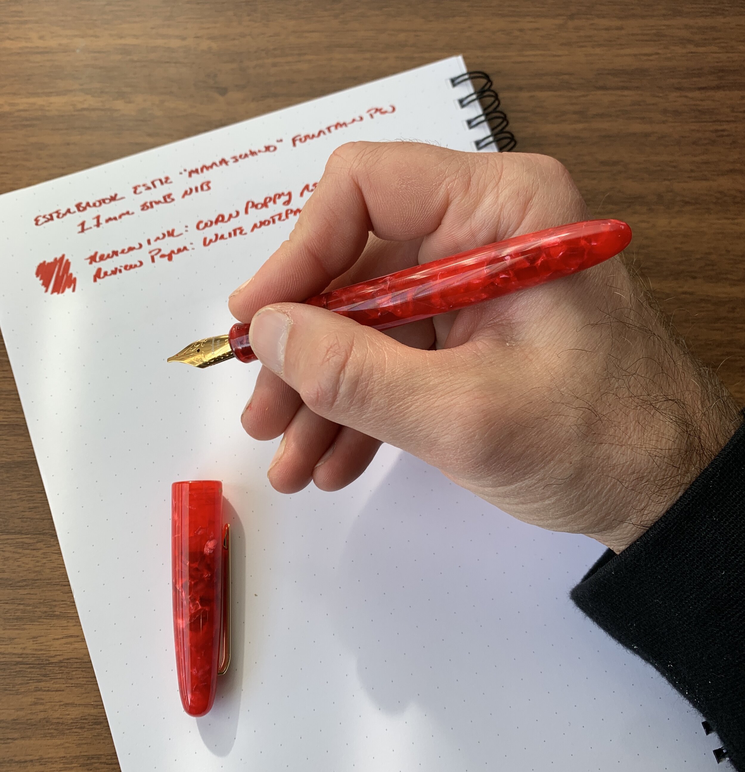
I went with an all-red setup for this review. Montblanc Corn Poppy Red is a perfect pairing for this pen (and if I might say so myself, so is the T.G.S. “Aged Red” Penwell).

The bright “end of summer” theme pays homage to visits to your local ice cream parlor for a sundae, including the cherry on top. Personally, I’ll pass on the cherry (I have plenty of others in my house who will eat them), but I appreciate the imagery and the name nails the color of this red “cracked ice” acrylic. Like all of the materials Esterbrook uses in the Estie lineup, the “Maraschino” material is vibrant, feels solid, and packs a ton of depth reminiscent of what you would find on a much more expensive custom pen.

Gold trim is also a perfect pairing for the bright red of the Maraschino, IMHO.

Reviewing this pen also gave me a chance to revisit the Estie itself, a pen I haven’t used in a while. I won’t rehash my full review of this pen (which is available here), but suffice to say the Estie remains a supremely comfortable writer with good balance, “all day” writing comfort, and a reliable JoWo No. 6 nib. I have a few more Esties that I picked up at pen shows last year, in both the “Blueberry” and “Honeycomb” finishes, and I’ll be inking them up soon.

View fullsize Esterbrook Estie Maraschino Posted
View fullsize Esterbrook Estie Maraschino Unposted

Takeaways and Where to Buy

As I’ve said before, and will say again, the Esterbrook Estie is a great pen, and whether or not you’ll want to run out and pick up this particular model hinges on whether you love the color. I do, and I wouldn’t cry if Esterbrook ended up adding the bright red “Maraschino” finish to their standard lineup.

Three Esterbrook Estie Limited Editions, from left: Maraschino, Honeycomb, and Blueberry. I believe the Honeycomb joined the regular lineup.

The Estie Maraschino is designated as a limited edition, meaning that at least for now, it’s not part of the regular lineup and already has started to sell out. Vanness Pens has limited stock of the fountain pen with chrome trim, as well as the chrome and gold trim rollerballs. Goldspot also has Maraschino Esties available, in both the standard and oversize fountain pens. Regular Estie pricing applies, with the Maraschino priced at $156 for the standard version and $200 for the oversize.

Disclaimer: I received the pen featured in this review from Kenro Industries, Esterbrook’s parent company and distributor, free of charge for review purposes. This post contains links to paid sponsors of the blog.

In Pens Tags Esterbrook Estie, Esterbrook Estie Maraschino, Fountain Pen
Comment
Kaweco-Sport-Frosted-Blue-Rollerball-Ballpoint

Kaweco Sport: It's More Than Just a Fountain Pen

September 26, 2020

The Kaweco Sport long ago solidified its status as one of the best pocket pens available, and most of the attention (deservedly) falls on the fountain pen version of the Sport. But you shouldn’t overlook the rollerball and ballpoint versions, especially if, like me, you appreciate the flexibility afforded by non-fountain pens.

The Kaweco Sport rollerball looks essentially identical to the fountain pen and has similar ergonomics when deployed for writing, with the only difference being the grip section. The Sport ships with a Kaweco-branded Parker-style gel refill labeled “Gel Ceramic Roller .07,” and since it says “Made in Japan” the refill is likely manufactured by a company such as Ohto. While the stock refill is excellent, you can find many different compatible Parker-style refills if you’d prefer a finer tip size, a liquid-ink rollerball, or even a classic ballpoint.

The Kaweco Sport ballpoint is a different animal entirely, as it’s a clipless click pen that accepts D1 refills and may honestly be too short for many people. Kaweco has used a variety of different ballpoint formats over the years, including a Kaweco Sport “Luxe” version (now discontinued) that featured a clip and a twist mechanism. Honestly, on a pen this small I think I prefer how the Luxe was set up - I love to clip that pen to my pocket or to the front of a notebook. Without the clip, the Sport ballpoint is otherwise prone to accidentally deploying in your pocket, though if you always carry your pen in a purse or bag this may not present any issues.

The current Kaweco Sport shown here compared against the now-discontinued Kaweco Sport “Luxe”. I will note that the current version best approximates the vintage Sport ballpoint, like this one I have in my collection.

View fullsize Kaweco Sport Ballpoint Refill (D1)
View fullsize Kaweco Sport Rollerball Refill (Parker/G2)

If you’re interested in further exploring different refill options for these two pens, check out Ana’s refill guide over at the Well-Appointed Desk for a comprehensive list of compatible Parker-style and D1 refills.

Takeaways and Where to Buy

The Kaweco Sport remains one of my favorite options for portable, on-the-go writing and a core recommendation whenever someone tells me they’re looking for a reliable pocket pen. The Sport format translates well from fountain pen to rollerball to ballpoint (and even to a clutch pencil), and Kaweco makes these pens in a wide range of materials at pretty much every price point. If you like the look of the Kaweco Sport, you shouldn’t have trouble finding a version that suits you. If you’re interested in reading more on the various versions of the Kaweco Sport and other “Pocket Pen” options, check out my Guide to Pocket Writing, which I recently updated!

You can usually find Kaweco Sport rollerballs and ballpoints sold alongside the fountain pen at any authorized Kaweco retailer, including our sponsor Goldspot who provided the two pens pictured here for review. Both the rollerball and ballpoint are priced at $22. You can’t argue with Kaweco’s value!

Disclaimer: This post contains links to paid sponsors. I received the pens featured in this review from Goldspot, free of charge, for review purposes.

In Pens Tags Kaweco Sport, Kaweco Sport Rollerball, Kaweco Frosted Sport, Kaweco Sport Ballpoint, Kaweco Sport Luxe
1 Comment

Pen Review: Montegrappa Miya Fountain Pen

September 19, 2020

It might surprise you to hear that Montegrappa has become one of my favorite pen brands, and we’re talking top three. While the Italian company attracts a lot of attention for its high-profile, ultra-limited edition brand collaborations such as the Lord of the Rings and Game of Thrones releases, the best of what Montegrappa has to offer, in my opinion, lies in their classic, vintage-inspired lineup that includes pens such as the Extra 1930 and Miya, which I’ll review here.

Put simply, I find the Miya one of the most comfortable pens on the market today. I have written with my two Miyas for hours over the past three weeks. The contoured barrel sits perfectly in my hand, and the tapered end allows the cap to post at what is, for me, the perfect depth. The fact that the Miya uses a cartridge-converter filling system reduces the weight of the pen and creates an exceptionally well-balanced writing instrument.

View fullsize Montegrappa MIA Meteor Shower In-Hand (Posted)
View fullsize Montegrappa Miya 450 in Celluloid (Posted)

The versatility of this design makes the Miya more suitable to “dressing up and down” than other Montegrappa pens. As shown here, Montegrappa has offered the Miya in both the “Miya 450” limited edition celluloid variant, as well as the resin “MIA” limited edition sold by shops in Italy such as Casa della Stilografica. While the underlying pen is the same, featuring an identical shape and cartridge-converter filling system, the Miya 450 features celluloid construction, hand-engraved sterling silver trim, and Montegrappa’s 14k “high flex” nib, which I recently reviewed. The “MIA,” on the other hand, still showcases the unique materials that Montegrappa is known for, but with fewer bells and whistles on the trim that allows them to offer this pen at a (relatively) more accessible price without sacrificing the luxury feel.

The resin on the Montegrappa MIA “Meteor Shower” is a collection favorite. I’ve had to resist getting the other three in different color striated materials. (Links below)

I’ll conclude my review by noting that Montegrappa has been well-served by the move to JoWo nibs. Both the 14k and stainless steel nibs that have shipped on my Montegrappa pens since the company changed over from Bock have written exceptionally well, with none of the hard-starting and ink starvation issues that I sometimes experienced back when they still sourced their nibs from Bock. While some will quibble that they are “boring,” the fact is that they are far more reliable writers than most anything on the market, and easy to customize should you desire a specialty grind.

Two Montegrappa 14k JoWo nibs. Note that I swapped the steel nib in my MIA Meteor Shower for the 14k gold nib from my Monte-Grappa. Montegrappa JoWo nibs are interchangeable, but they do not use threaded nib units so you will have to pull them manually. (The EF steel nib that shipped on my Meteor Shower wrote perfectly well, I just swapped them out because I wanted to experiment with interchangeability.)

Takeaways and Where to Buy

Personally, I would love to see more Miya/MIA models released in the U.S. The comfortable shape and versatility of the cartridge-converter format makes me think this pen would have wide appeal, and in my opinion, it’s more attractive and more comfortable to use than the Fortuna series. Honestly, if Montegrappa wants to continue to target the $200-300 price point for a steel nib pen, the Miya strikes me as a better fit. This pen feels more substantial than the Fortuna, and with limited edition acrylics thrown into the mix, it presents a better justification for the price point.

I acquired the Miya 450 featured in this review directly from Kenro Industries, the U.S. Montegrappa distributor, at this year’s Baltimore Pen Show. Though a limited edition, Nibs.com has the pen in stock in all five colors, priced at $796. The “MIA” in “Meteor Shower” resin was purchased from Casa della Stilografica in Florence, Italy, which also sells limited edition steel-nib pens in two other striated materials: “Spicy Explosion” and “Adriatic Sea.” Though still expensive, these pens are priced at a more accessible $280 USD (subject to exchange rate fluctuations). I do not believe there is a steel-nib version of this pen currently available in the United States.

Disclaimer: I acquired the Montegrappa Miya 450 from Kenro Industries, the U.S. Montegrappa distributor, at a discount, as part of their sponsorship of this blog. I acquired the “Meteor Shower” MIA from Casa della Stilografica at standard retail using my own funds. This post does not contain affiliate links.

In Pens Tags Montegrappa Miya
Comment

Everyday Writing with a Modern Flex Pen

September 9, 2020

I’ve always been a “firm nib” person for the majority of my everyday writing. While I enjoy flexible nib fountain pens, my experience has been limited to the occasional review and playing around with vintage flex after-hours at pen shows. I use a combination of italic-style script and cursive for my everyday writing, so firmer nibs typically work better for my handwriting, particularly cursive italics and stubs.

But I’m still intrigued by the new “flex” nibs pen companies have been releasing over the past few years. I use the term “flex” loosely - in my opinion, there is no such thing as a modern equivalent of true “vintage flex” like you would find in a vintage Waterman pen from the first half of the 20th century. What you have today, rather, are softer nibs that can provide a fair bit of line variation if pushed, but you need to be careful and manage your expectations.

Both of these nibs are No. 6 JoWo. The one on the left is a 14k fine nib custom engraved for Montegrappa, with carve-outs on the side to increase flexibility. The one on the right is a Franklin-Christoph stainless steel nib with an elongated nib slit, which also increases the ability to flex the tines.

For today’s post, I’m not so much interested in further discussion of “whether these nibs are truly flex nibs.” Each person tends to have their own opinion on that issue, influenced mainly by how much line variation they like in their writing and whether they have experience in the vintage market. I’m more curious about the practicality of these softer nibs and whether or not I can actually use one as a daily driver. Will I spring the nib? Will the pen write too wet, creating a feathering, bleeding mess? Given that I don’t write in pure cursive, will I even be able to notice a difference?

Review Pen No. 1: A Montegrappa Miya 450 with a 14k Fine Flex.

Review Pen No. 2: A Newton Shinobi with a Franklin-Christoph HPSteel Flex Extra-fine nib unit.

For this experiment I chose two pens that sit on the firmer end of the flexibility scale: a Montegrappa Miya 450 with Montegrappa’s 14k “fine flex,” and my Newton Shinobi with Franklin-Christoph’s HP Steel Flex nib. I picked both up at pen shows earlier this year before everything shut down. As it turns out, I’ve enjoyed using these pens, including as daily writers, though I would advise anyone interested in these pens to take a few things into consideration:

  • Use a lighter hand. Not only will this create more noticeable line variation, but you’ll avoid springing the tines. Less writing pressure will also result in less ink being poured onto the page - a key consideration if you need to take notes or do a lot of other writing where you need the ink to dry quickly. If, like me, you tend to use a fair bit of pressure when you write, consider a drier steel flex nib. I’m still getting the hang of writing with the Montegrappa 14k flex, and the Franklin-Christoph steel nib offered a more seamless transition for my writing style.

  • Pay attention to your paper. Because softer nibs tend to lay more ink on the page (especially gold nibs), you will likely experience feathering and bleedthrough on cheaper and/or more absorbent paper. The writing samples for this review were done in a Write Notepads Dot Grid Spiral, which performed beautifully. Other paper options include Tomoe River and Clairefontaine. I’ve had mixed results on Rhodia with super-wet pens, and sometimes get spots of bleeding.

  • Pay attention to your ink. While you might be tempted to use more flexible nibs to show off your highly saturated “super sheeners” and “super shaders,” be aware that these inks might not be the best choice for everyday writing in a super wet pen. If you plan on using the pen for notetaking or office work, consider an ink that dries relatively quickly and is known to behave well. Sailor and Montblanc make excellent inks, and the two used for this post (Montblanc Irish Green and Sailor Ink Studio 140) worked quite well, without complications.

Takeaways and Final Thoughts

So could I see myself using either of these nibs as a regular everyday writer over the long haul? Yes and no. Since it takes more pressure to flex the nib, the Franklin-Christoph HP Steel Flex nib writes like a slightly softer, standard extra-fine JoWo steel nib that has the option to add line variation if you so desire. I could easily use this particular nib all day, every day, and it may have found a permanent home in my Newton Shinobi. While I enjoy the 14k “fine flex” nib in the Miya, it’s still slightly too wet for me to use as an everyday work pen. I typically have to take notes quickly which doesn’t allow enough time for the ink to dry before I need to turn the page. For me, the Miya will mainly be used for personal writing in my journal.

I acquired the pens featured in this review directly from Kenro (the U.S. Montegrappa distributor), and from Franklin-Christoph. Kenro provided me with the Miya as part of their generous sponsorship of The Gentleman Stationer; the Franklin-Christoph was acquired with my own funds for my own collection. This post contains links to paid sponsors and affliates.

In Pens, Editorial Tags Flex Nib, Montegrappa Flex, Franklin-Christoph Steel Flex, Newton Pens
1 Comment

First Impressions: Esterbrook JR Pocket Pen in Tuxedo Black

September 5, 2020

This week, Esterbrook announced arguably its biggest release to date: the “JR Pocket Pen”, which is the first modern Esterbrook that actually attempts to replicate the design of the famed vintage “J” pen. As such, Esterbrook knew that there would be heavy expectations piled on this release, and there was no room for error. So how did they do?

While I’ve only had the pen for a week, what I’ve seen so far leads me to believe that the JR will be widely viewed as a success. As with all “heritage” releases - which is how I generally refer to products such as pens and watches that draw inspiration from a vintage product without copying it exactly - the JR borrows from those aspects of the original “J” that translate best into a modern fountain pen, and dispenses with others that, well, wouldn’t work so well today. I’ll briefly run through the similarities and differences:

The Esterbrook JR comes in three different colors: Tuxedo Black (shown here), Carmine Red, and Capri Blue (which is the only one with gold trim). Based on pictures alone, the Tuxedo Black and Capri Blue are my favorites.

First of All, What’s Changed?

  • The new Esterbrook JR is slightly slimmer than a standard vintage Esterbrook J, and the barrel and ends less rounded. While I don’t currently have any vintage Esterbrooks in my collection, Ana over at the Well-Appointed Desk has published her own review and has some extremely thorough comparison photos that show the JR compared against various vintage Esterbrook fountain pens.

  • Esterbrook has dispensed with the black plastic cap jewels in favor of metal finials. The finial on the cap bears the Esterbrook “infinity” logo also found on the Camden. While the black plastic finials lent the original J a unique, almost Art Deco look, they also grew fragile over time and had a tendency to crack and/or fall out if you accidentally dropped the pen. Here, I would say that gains in long-term durability make up for any losses in terms of aesthetics and faithfulness to the original design.

  • The filling system on the JR, predictably, is cartridge-converter instead of a lever-filler. I’m sure many vintage pen die-hards will complain (loudly) about this fact, but seriously, is Esterbrook really going to release a lever-filling fountain pen that would require periodic ink sac replacement? No. Nor should they. Even back in its heyday, Esterbrook was a mass-market brand, and to me, going with cartridge-converter is more faithful to the original vision of Esterbrook than releasing a throwback pen with a high-maintenance lever-filling system.

Size comparison, show here between a Kokuyo Sketch Notebook (left) and a Hobonichi Techo A6. Writing samples in this review are shown in the Kokuyo Sketch.

What’s the Same or Similar?

  • The overall look, feel, and aesthetic of the pen are very similar. As someone who has used vintage Esterbrooks extensively, I will say that the modern iteration of the company has definitely managed to “recapture the magic” of the original brand. A key part of this reissue is the choice of pearlescent acrylic: Vintage Esterbrooks are known for the depth of the material used to make the barrels, which was largely unique to that brand. The black, blue, and red materials chosen for the JR, while not an exact match, replicates at least some of that same depth.

  • While slightly longer and slimmer than the clip on the original J, the clip on the JR retains the same ribbed look while omitting the “Esterbrook” engraving, which moves to the cap band. While I’m glad they retained some version of the classic clip, I’m torn over the placement of the engraving. Could they have gone with a wider clip and kept the vintage-style engraving? Possibly, but I suspect this would present production issues, whereas placing the Esterbrook engraving on the cap band also creates branding consistency with the Estie and the Camden.

  • The JR features an interchangeable stainless steel JoWo No. 5 nib unit, which allows you to swap in different nib sizes, and even JoWo nib units you may have had ground to a stub, italic, architect, etc. It remains to be seen whether the JR will get its own adapter that will allow you to use the full array of vintage Esterbrook nib units.

Esterbrook is marketing the JR as a “pocket pen.” I typically don’t pocket-carry pens like this one - it’s slightly too large for that purpose, at least for me - but it’s quite portable. The JR would make a great planner pen. (Picture below)

Perhaps my one critique of this pen is that I wish the cap posted a touch deeper as it looks a little awkward. The pen itself is so light, however, that it makes very little difference from a functionality perspective.

No surprises with the line written by a medium No. 5 JoWo nib.

Takeaways and Where to Buy

The Esterbrook JR is a very well done heritage pen that I expect will please the majority of Esterbrook fans while still managing to tick off those few who would only be pleased with a “J” replica. As evidenced by the visceral reaction to Parker’s recently announced Parker 51 re-release, attempting to recreate a vintage pen design for modern users can be a risky move, in that you need to strike a balance between catering to fans of the original pen while still making a product that is marketable to new customers. So far, Esterbrook seems to have done just that, and I’m excited to see where they take this pen design over the next year or so. The next logical step would be to introduce additional colors, either special editions or green and grey pens to match the original lineup, as well as a vintage nib adapter.

You should now be able to purchase the Esterbrook JR at most Esterbrook retailers, including site sponsors Vanness Pens and Goldspot. Current MSRP on the Esterbrook JR is $175, with most retailers so far pricing this pen at $140, which is becoming the standard price point for a steel-nib pen of this quality.

The Esterbrook JR fits perfectly in the pen slots on my Hobonichi Techo. Planner pen, anyone?

Disclaimer: Many thanks to Esterbrook/Kenro Industries for sending me this pen for review. This post contains links to paid sponsors/affiliates.

In Pens Tags Esterbrook, Esterbrook JR
6 Comments
← Newer Posts Older Posts →
Store Location
Visit the T.G.S. Curated SHOP
*New* Updated "Best Pens" Guide (2025)
TGS x Hinze Pens Violet Tendencies Taschenstift Fountain Pen
Hierarchies of Fountain Pen Friendly Paper
Allex Scissors arrayed on a desk showing link to desk accessories

Join Our Patreon!
Subscribe to the TGS E-mail List

Featured Posts

Featured
Yamamoto-Gray-Paper-Sampler-Set.jpeg
May 10, 2025
Discovering Unusual Paper: "Paper Tasting" Sets from Yamamoto Paper
May 10, 2025
May 10, 2025
Four-Micarta-Fountain-Pens.jpeg
Apr 19, 2025
Yes, Micarta for me! I finally got my hands on Some Micarta Pens, Plus My Own Special Edition
Apr 19, 2025
Apr 19, 2025
2025-Arkansas-Pen-Show-haul.jpeg
Mar 29, 2025
Unboxing the Arkansas Pen Show Haul! Two Nib Grinds, Inks, and a New Pen
Mar 29, 2025
Mar 29, 2025
The Gentleman Stationer RSS

© Digital Divide Media, LLC, 2014-present.

All content is the exclusive property of Digital Divide Media, LLC, d/b/a The Gentleman Stationer, including “The Gentleman Stationer” website and trademark, and should not be reproduced without express written permission.  All rights reserved.

All content containing paid advertising, affiliate links, or sponsored content will be plainly disclosed by a disclaimer when/if featured.

Contact Information

Store Shipping Policy and Return Policy

Privacy Policy

Cookie Policy

Terms and Conditions

Powered by Squarespace