• Blog
  • Shop
  • Resources
  • FAQ (Ask TGS)
  • About
  • Archive
  • Contact
  • Sign In My Account
Menu

The Gentleman Stationer

Vintage Living in the Modern World.
  • Blog
  • Shop
  • Resources
  • FAQ (Ask TGS)
  • About
  • Archive
  • Contact
  • Sign In My Account

Pen Review: The Good Blue R615 "Titanium Blue" Vanness Exclusive Edition Fountain Pen

June 10, 2023

The pen I'm reviewing today is part of my ongoing effort to break out my fountain pen comfort zone and try things that I wouldn't typically purchase to use at work, but rather pick up just for fun. The Good Blue is a London-based company that specializes in flexible-nib fountain pens paired with a unique feed system designed to ensure and adequate supply of ink to the nib, which is where most "modern flex" pens have underwhelmed. So how does The Good Blue R615 perform? Honestly, very well.

I absolutely love the color of the Cerakote on this pen. Read more on the history of the pen design and materials used directly on The Good Blue website.

Pen Design and Aesthetics

This particular model, the R615 "Titanium Blue" is a special edition collaboration between our friends at Vanness Pens and The Good Blue. The pen features a streamlined, 6082 Aluminum body with "Titanium Blue" Cerakote coating, paired with a section machined from untreated CZ121 brass. The body of the pen is deceptively comfortable - I expected the step down from the pen body to the section to be too steep and severe for my taste, but as it turns out the grip area is long enough that this is not an issue.

The brass section will patina due to both your grip and exposure to ink. Note the porous feed and compare to the photo of the un-inked pen below.

While the R615 has no clip, the streamlined body features a facet on one side, which acts as a roll-stop. It's a simple, practical design. The brass components, per the company's website, are untreated and "precision textured with a surface roughness for ergonomic grip." Note that the untreated brass will absolutely patina, and may also change color due to exposure to ink. This doesn't bother me at all, and I find it to be part of the charm of the pen.

The pen doesn’t post, given the design, but is very well balanced in the hand.

Nib and Writing Experience

As I mentioned above, the main issue that people run into with so-called "modern flex pens" is ink starvation. Namely, modern plastic feeds have a difficult time maintaining ink flow sufficient to write broader lines as you flex the nib from extra-fine to double-broad. The Good Blue appears to have solved this issue by using in-house polymer feeds made from an absorbent material that not only absorbs the ink to keep the feed saturated but changes color to match the ink (helpful if you, like me, often forget what ink you have in a pen.)

The engraving on the nib says “For the love of flex.” These nib units are in JoWo-threaded housings and therefore interchangeable with pens from other brands.

The Good Blue offers several different nib options. There are, of course, standard stainless steel nibs available, but with a company known for flex, I had to try the titanium flex nib. Once broken in, the titanium nib lays down a ton of ink, and line width ranges from a bouncy fine/medium, writing with little pressure, to around a double broad if I really try to push things. (By “broken in,” I mean that the nib will soften with use. Mine was fairly stiff when I first received it, but has gradually opened up to where I can get significantly more line variation.) I have experienced zero "railroading" as long as I use moderately wet inks, and have only had issues with a couple of drier or extremely saturated shimmer inks.

Writing sample on Write Notepads paper with Iroshizuku Asa-Gao fountain pen ink.

Takeaways and Where to Buy

I didn't intend to purchase this pen, but after playing around with the demo model at the Vanness Table at the Arkansas Pen Show (dangerous table neighbors there), I couldn't pass it up. My R615 has remained inked ever since March, and while I don't write with it every day, it sees regular use in my journal and written correspondence, as well as when I'm doodling around with ink - something I've tried to do more of for the simple joy of it. The Good Blue makes one of the best modern "stock" flex nibs I've used, and I'd like to try their calligraphy and 14k nibs in the future.

Because this particular pen is exclusive to Vanness Pens, you can only purchase it through them (though it is currently out of stock as of the time of writing). Vanness does carry other versions of the R615, including the acetate and Ultem versions, as well as a selection of the standard and flex nibs. Prices start at $140 and increase depending on your choice of materials and nib, with the pen shown here coming in at $220 for the special finish plus the titanium flex. The pens and various specialty nibs (including 14k flex and untipped "Calligraphy Flex") can also be ordered directly from The Good Blue, though they will ship from the U.K.

I purchased this pen from Vanness Pens with my own funds for my own collection, though I received a discount for review purposes. This post does not contain affiliate links or paid advertising. The Gentleman Stationer is supported entirely by purchases from the T.G.S. Curated Shop and pledges via the T.G.S. Patreon Program.
In Pens Tags The Good Blue, Vanness Pens, Flex Nib, Titanium Nib
1 Comment

Everyday Writing with a Modern Flex Pen

September 9, 2020

I’ve always been a “firm nib” person for the majority of my everyday writing. While I enjoy flexible nib fountain pens, my experience has been limited to the occasional review and playing around with vintage flex after-hours at pen shows. I use a combination of italic-style script and cursive for my everyday writing, so firmer nibs typically work better for my handwriting, particularly cursive italics and stubs.

But I’m still intrigued by the new “flex” nibs pen companies have been releasing over the past few years. I use the term “flex” loosely - in my opinion, there is no such thing as a modern equivalent of true “vintage flex” like you would find in a vintage Waterman pen from the first half of the 20th century. What you have today, rather, are softer nibs that can provide a fair bit of line variation if pushed, but you need to be careful and manage your expectations.

Both of these nibs are No. 6 JoWo. The one on the left is a 14k fine nib custom engraved for Montegrappa, with carve-outs on the side to increase flexibility. The one on the right is a Franklin-Christoph stainless steel nib with an elongated nib slit, which also increases the ability to flex the tines.

For today’s post, I’m not so much interested in further discussion of “whether these nibs are truly flex nibs.” Each person tends to have their own opinion on that issue, influenced mainly by how much line variation they like in their writing and whether they have experience in the vintage market. I’m more curious about the practicality of these softer nibs and whether or not I can actually use one as a daily driver. Will I spring the nib? Will the pen write too wet, creating a feathering, bleeding mess? Given that I don’t write in pure cursive, will I even be able to notice a difference?

Review Pen No. 1: A Montegrappa Miya 450 with a 14k Fine Flex.

Review Pen No. 2: A Newton Shinobi with a Franklin-Christoph HPSteel Flex Extra-fine nib unit.

For this experiment I chose two pens that sit on the firmer end of the flexibility scale: a Montegrappa Miya 450 with Montegrappa’s 14k “fine flex,” and my Newton Shinobi with Franklin-Christoph’s HP Steel Flex nib. I picked both up at pen shows earlier this year before everything shut down. As it turns out, I’ve enjoyed using these pens, including as daily writers, though I would advise anyone interested in these pens to take a few things into consideration:

  • Use a lighter hand. Not only will this create more noticeable line variation, but you’ll avoid springing the tines. Less writing pressure will also result in less ink being poured onto the page - a key consideration if you need to take notes or do a lot of other writing where you need the ink to dry quickly. If, like me, you tend to use a fair bit of pressure when you write, consider a drier steel flex nib. I’m still getting the hang of writing with the Montegrappa 14k flex, and the Franklin-Christoph steel nib offered a more seamless transition for my writing style.

  • Pay attention to your paper. Because softer nibs tend to lay more ink on the page (especially gold nibs), you will likely experience feathering and bleedthrough on cheaper and/or more absorbent paper. The writing samples for this review were done in a Write Notepads Dot Grid Spiral, which performed beautifully. Other paper options include Tomoe River and Clairefontaine. I’ve had mixed results on Rhodia with super-wet pens, and sometimes get spots of bleeding.

  • Pay attention to your ink. While you might be tempted to use more flexible nibs to show off your highly saturated “super sheeners” and “super shaders,” be aware that these inks might not be the best choice for everyday writing in a super wet pen. If you plan on using the pen for notetaking or office work, consider an ink that dries relatively quickly and is known to behave well. Sailor and Montblanc make excellent inks, and the two used for this post (Montblanc Irish Green and Sailor Ink Studio 140) worked quite well, without complications.

Takeaways and Final Thoughts

So could I see myself using either of these nibs as a regular everyday writer over the long haul? Yes and no. Since it takes more pressure to flex the nib, the Franklin-Christoph HP Steel Flex nib writes like a slightly softer, standard extra-fine JoWo steel nib that has the option to add line variation if you so desire. I could easily use this particular nib all day, every day, and it may have found a permanent home in my Newton Shinobi. While I enjoy the 14k “fine flex” nib in the Miya, it’s still slightly too wet for me to use as an everyday work pen. I typically have to take notes quickly which doesn’t allow enough time for the ink to dry before I need to turn the page. For me, the Miya will mainly be used for personal writing in my journal.

I acquired the pens featured in this review directly from Kenro (the U.S. Montegrappa distributor), and from Franklin-Christoph. Kenro provided me with the Miya as part of their generous sponsorship of The Gentleman Stationer; the Franklin-Christoph was acquired with my own funds for my own collection. This post contains links to paid sponsors and affliates.

In Pens, Editorial Tags Flex Nib, Montegrappa Flex, Franklin-Christoph Steel Flex, Newton Pens
1 Comment
Pineider-Arco-Collection-Fountain-Pen

First Impressions: Pineider Arco Collection Limited Edition with 14k "Quill" Nib

March 27, 2019

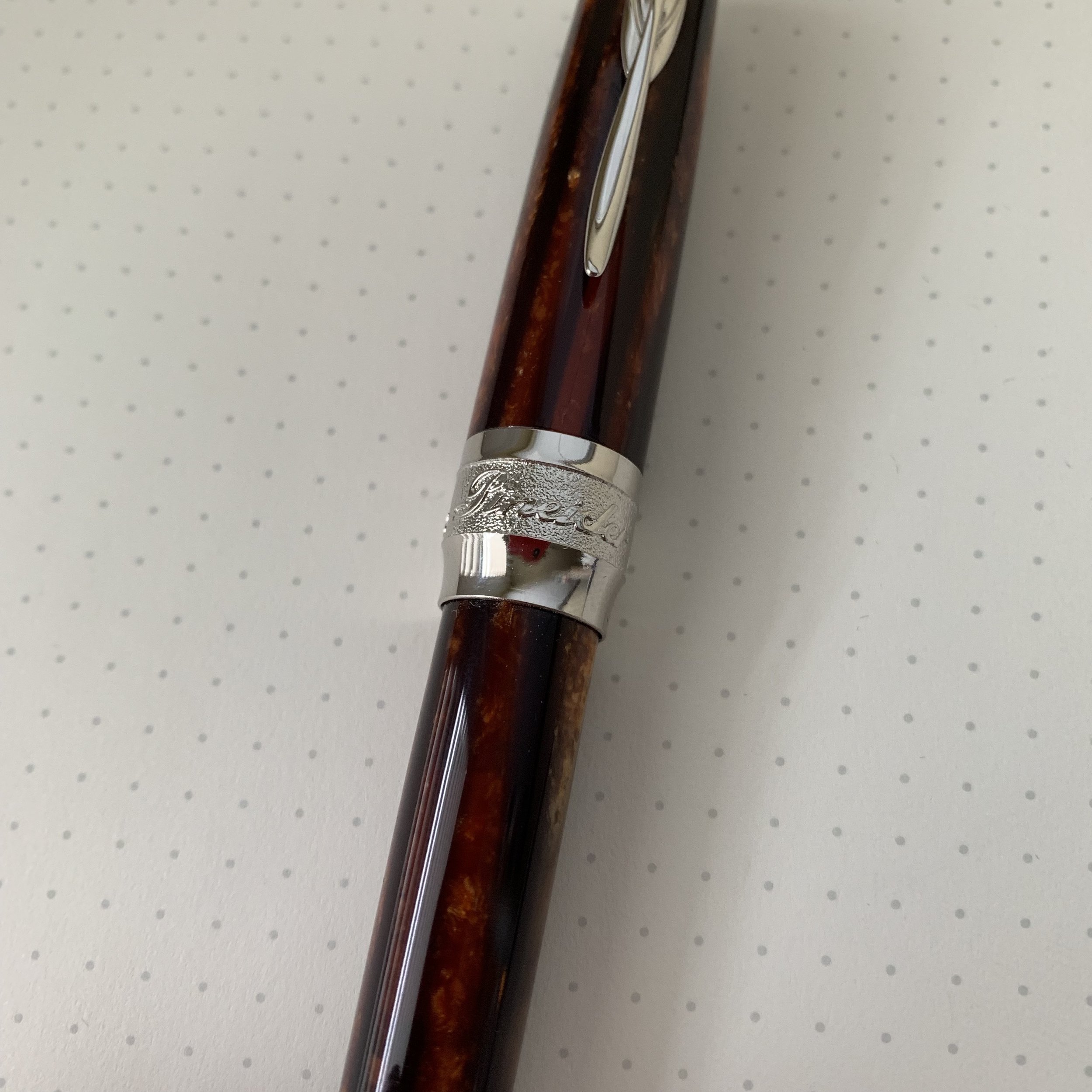
Few materials have captivated the pen community in the same way as Arco celluloid, especially in pens made by the Italian pen manufacturers, and Omas in particular. After Omas folded, legacy company Armando Simoni Club/ASC Pens purchased the remaining Omas celluloid rod stock, and has released a series of pens in both the green and brown Arco celluloid under its own name and in partnership with Leonardo. (I own a Leonardo pen in green Arco Verde celluloid, and it’s gorgeous.)

But the rumor is that once ASC Pens’ current stock of Arco celluloid is gone, it’s gone. Celluloid is extremely time consuming and difficult to make, requiring a large (and expensive) investment of time and materials up front, followed by a years-long period of waiting for the celluloid to cure. As it turns out, however, companies don’t want the Arco “look” to go away (especially given the price Arco celluloid is commanding on the secondary market). This year, Pineider announced and released a limited edition “Arco Collection” pen in which Pineider attempted to duplicate the look of Arco celluloid using a layered acrylic.

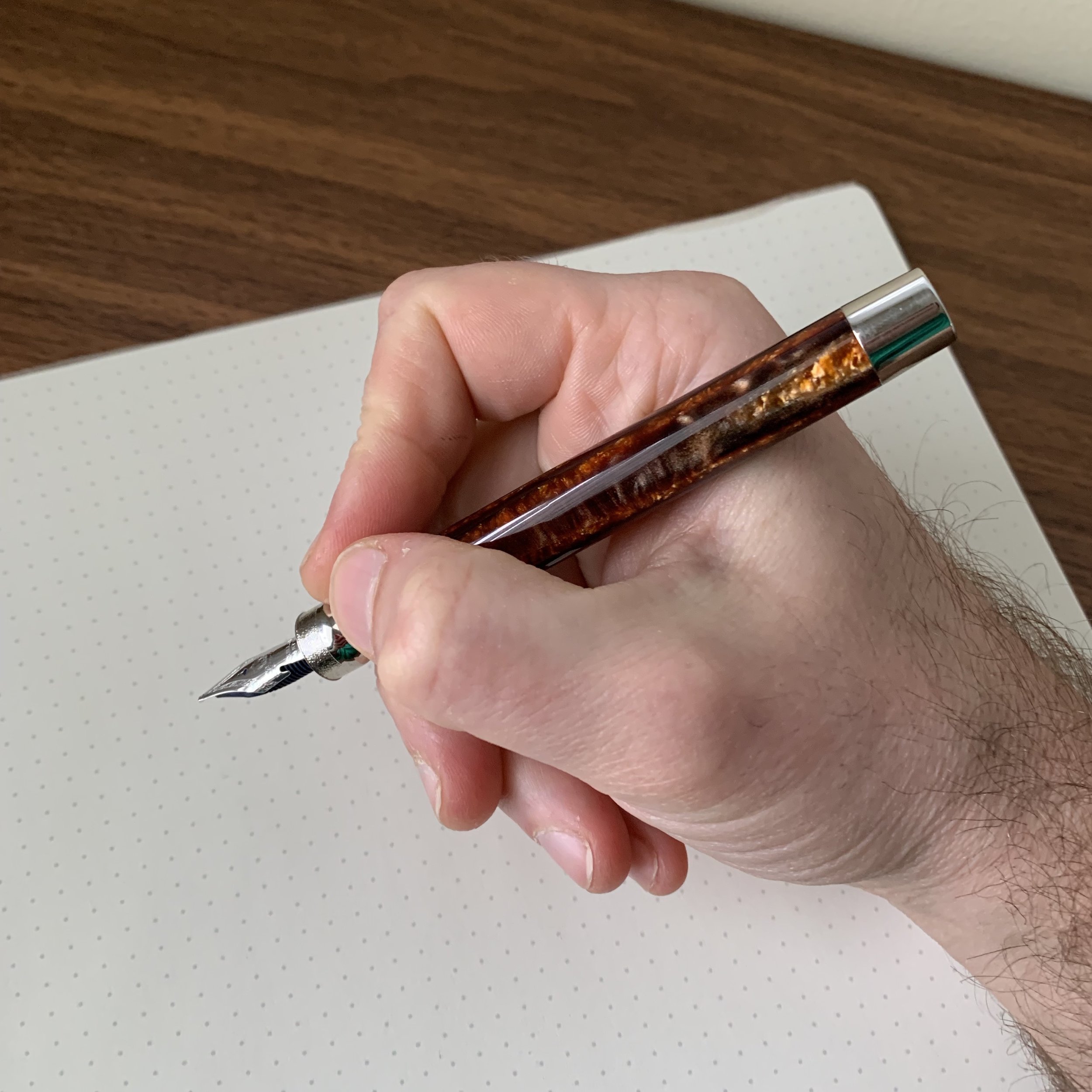
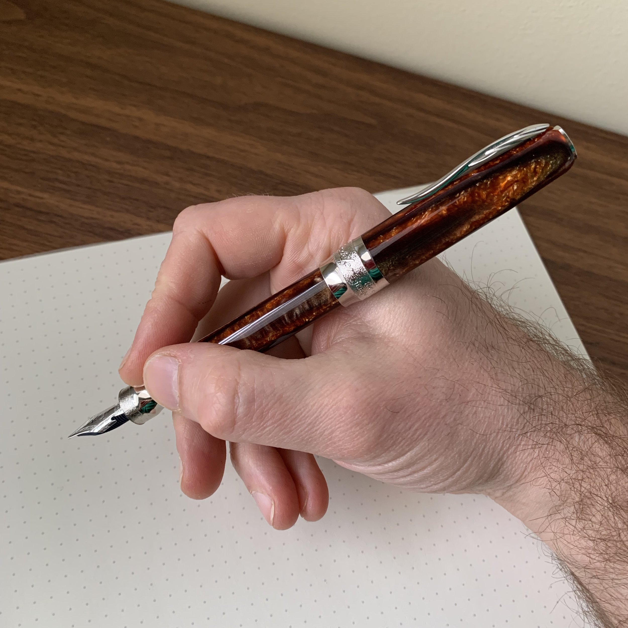
Here you can see the striations in the acrylic. Lovers of vintage Arco celluloid will say it's not the same - and it’s not - but the material is beautiful in its own right. The cap features a twist magnetic closure, with a metal piston knob that all…

Here you can see the striations in the acrylic. Lovers of vintage Arco celluloid will say it's not the same - and it’s not - but the material is beautiful in its own right. The cap features a twist magnetic closure, with a metal piston knob that allows you to post the pen using the magnet in the cap.

Pineider pens present a mixed bag for me. Functionally, the company makes a high-quality product. I previously reviewed the Pineider Avatar, which I enjoyed reviewing but the pen didn’t do it for me in terms of aesthetics, mainly because I found it a bit boring. Last year, Pineider released a new series of pens that I liked better, the La Grand Bellezza “Gemstone” collection, which featured new materials and came equipped with a new 14k “hyperflex” nib that Pineider dubbed the “Quill.” The new Arco Collection pens generally take the shape of the Grand Bellezza models, adding a piston filler and limited edition numbering.

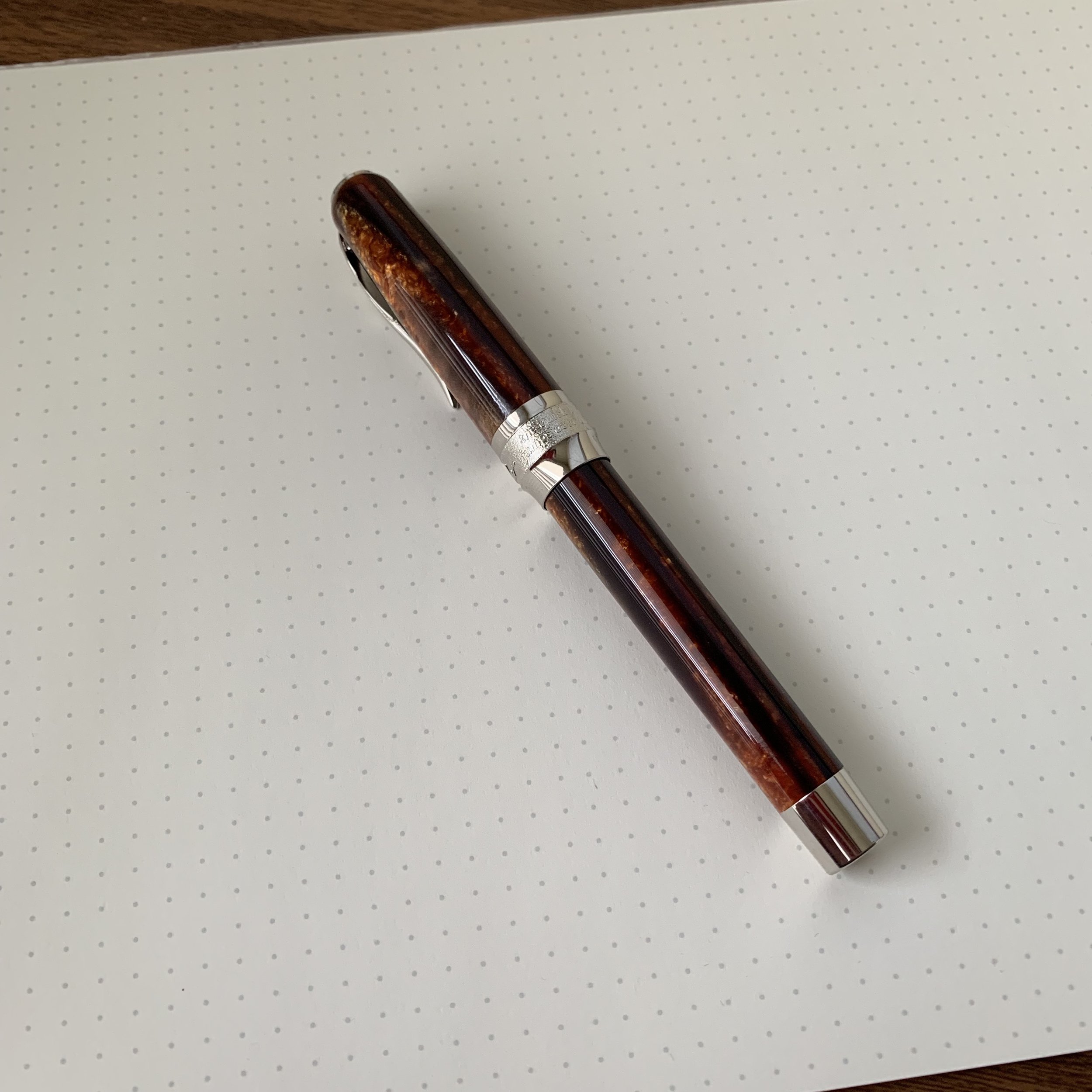
There are 888 Arco collection pens, with each one numbered on the piston knob.

What everyone wants to know, of course, is how the new “Arco” acrylic compares to Arco celluloid. Short answer: it’s beautiful in its own right but not the same. Classic celluloid has a depth to it that’s practically impossible to duplicate, which is why it remains such a coveted material among pen collectors despite its many downsides. (i.e., it stains, it’s fragile, it’s flammable, and it’s expensive… I could go on, but you get the point.) Pineider’s Arco acrylic definitely captures some of the look of classic Arco, but is much darker and doesn’t quite get all of the gold and copper highlights found in the celluloid. There definitely will be a trade-off for the durability and lower price point of an acrylic pen.

The broad “Quill” nib on this Arco pen is more than a little stubbish.

For me, the Quill nib is what makes this pen (and the other Gemstone/Grand Bellezza pens) really shine. Pineider describes the nib as “hyperflex,” but as is often the case with so-called “flex” pens, there’s more than a bit of hyperbole involved. I’d describe the Quill nib as “true semi-flex,” in that you will get some significant line variation, especially in the narrower nib widths (EF-F). The stubbish broad nib I tested had a nice bounce to it, and really put a lot of ink on the page. To me, the Pineider nib is certainly “flexier” than Aurora’s flex nib, but you still shouldn’t expect a vintage-style flex pen.

Takeaways and Where to Buy

Pineider has my attention more than than they did when they first appeared on the scene. After spending two weeks with the Arco pen, I could see myself picking up one of the Grand Bellezza “Gemstone” pens just to have a Quill nib in my collection, probably opting either for a broad or an extra fine. The standard “Gemstone” pens have an MSRP of just under $500, with an actual retail price that typically sits just under $400. Vanness, however, is currently running a 40% off promotion in which the cost of the Pineider La Bellezza fountain pen with the Quill nib is just $298. That’s a very good price on an excellent pen, especially for a semi-flex nib of this quality.

As a limited edition with a piston filler, the Arco collection pens are more expensive, with MSRP at around $700 and retail price between $500-600. They’re also selling quickly, so you’re probably going to have to hunt around to find one. Vanness Pens is currently sold out, and they may or may not get more, depending on availability.

Many thanks to my sponsors at Vanness Pens for loaning me this Arco Collection pen to review. It made for an enjoyable two weeks between the Baltimore and Arkansas pen shows!

Disclaimer: This post contains links to paid sponsors and affiliates. Vanness Pens loaned me pen featured in this review at no charge.

View fullsize Pineider Arco Unposted
View fullsize Pineider Arco Posted
In Pens Tags Pens, Pineider, Pineider Arco, Vanness, Flex Nib
Comment

Flex It! A First Look at the Aurora Vintage-Style Flex Nib

March 11, 2017

While many pen companies have attempted to replicate vintage-style flexible nibs, from the inexpensive steel-nib pens sold by Noodler's to the more expensive offerings from the new Wahl-Eversharp, no one has been able to get it exactly right. Until (maybe) now. Aurora's new 70th Anniversary 88 sports a specially developed 14k flexible nib which comes as close to reproducing true "vintage-style flex" as I've experienced in a modern pen. While flex nibs aren't exactly my thing, I can still recognize a good one when I see one.

"Flexit" Events Sponsored by Kenro

The Aurora Flex Pen Demo at last week's 2017 Baltimore Washington International Pen Show

Aurora's US distributor Kenro Industries has been actively promoting the new 70th Anniversary pen by hosting "Flexit" events in cities around the country, including at the recent Baltimore Washington International Pen Show that I attended. (Just search the Instagram hashtag #flexitbwi.) Kenro had several of the new flex pens on display at their table for attendees to test, and they graciously allowed me to take one of them home to review (along with a bottle of their long-awaited Aurora blue-black ink). So what's the verdict? 

I like this pen and this nib. And this is coming from someone who can't write with a flex nib to save his life. No, I'm serious, just watch the video of my comically bad writing sample. But, if you regularly write in cursive, or enjoy calligraphy, you'll want to check out Aurora's latest creation. The 14k nib is soft in the sense that it gives you easier and greater line variation than the various steel nibbed "flex" pens out there - not to mention a smoother writing experience - but it's not so soft that you feel like you're going to spring the nib. It's somewhat similar to the Omas "Extra-Flessible" nibs released a few years ago, but those were way too wet, felt extremely delicate to me when I tested them out, and I heard reports of them springing easily and not holding up well to everyday use. The Aurora nib feels sturdier, and it actually works fairly well as a regular writer, laying down a fine/medium-fine line when writing with light pressure and minimal flexing of the tines. It's a bit wet to use on office paper, but the Rhodia dot-grid paper handled it quite nicely. 

The Aurora 88 flex nib is fitted with an ebonite feed so that the ink flow keeps up with the nib. The 88 also has a nice big ink window so you can see when you need to refill.  

I'm not familiar enough with vintage flex pens to provide any intelligent commentary on how it compares to very soft "wet noodle" flex pens like those manufactured by Waterman in the 1920s and the 1930s. If that's your expectation with the Aurora Flex nib, you may be disappointed, but I will note that Dan Smith of The Nibsmith has indicated that he'll be able to grind the nib to maximize line variation, and I'd recommend that you contact him for additional information.  

A Note on the Aurora 88

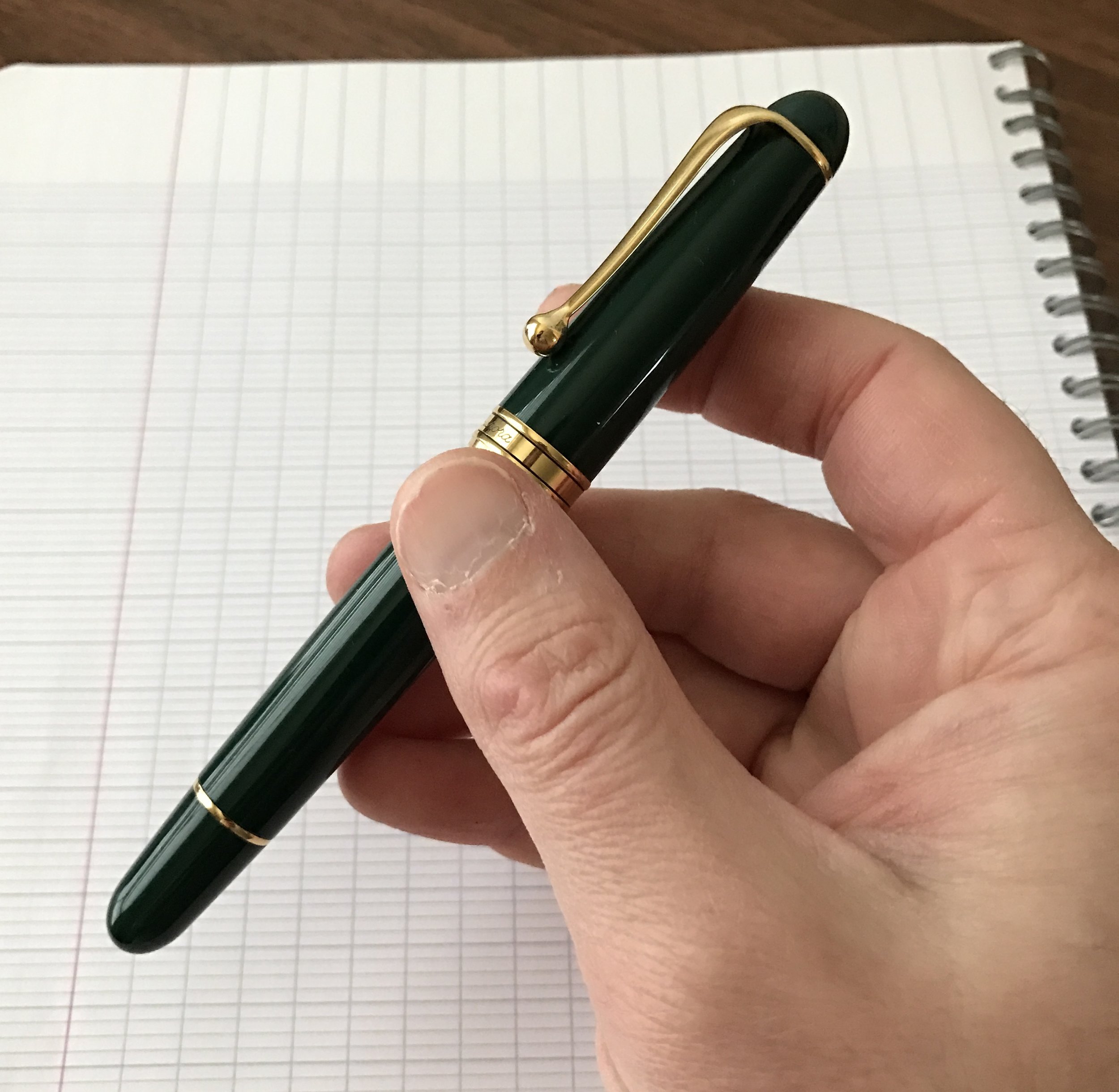
The Aurora 88 is a classic fountain pen. The version that I have is made from a dark green polished resin with gold trim. 

The "88" is Aurora's longtime flagship pen, and one of those pieces that has sat on my list for years but for whatever reason never made it into my pen case. Even though I probably won't go in on the flex nib, there are some strikingly gorgeous models of the 88 out there, whether it be the Satin Black with Rose Gold Trim, last year's "Sole" limited edition, to this year's upcoming "Nebulosa" limited edition. I enjoy the size of the 88, it has a high-capacity piston filling system, and it's extremely comfortable to write with. You'll probably be seeing one on the blog soon! 

View fullsize Aurora 88 in hand
View fullsize Aurora 88 Posted
View fullsize Aurora 88 Unposted

Takeaways / Where to Buy

I probably won't be picking up a 70th Anniversary Aurora 88 with the new flex nib, but that doesn't mean you shouldn't! Supply is extremely limited, with only 188 pieces distributed worldwide in each color. The pen will cost $650, and will be available in limited quantities from Aurora dealers such as Anderson Pens, Vanness Pens, Pen Chalet, and the Nibsmith. If this is a pen that interests you, I'd act quick as soon as the color you want becomes available. 

Disclaimer: As I mentioned, Kenro Industries loaned me this pen for review purposes. Other than a bottle of Aurora Blue-Black ink, I was not compensated for this review. This post does contain affiliate links. 

In Pens Tags Aurora, Aurora 88, Flex Nib, Aurora Flex, Pen Review
1 Comment
Store Location
Visit the T.G.S. Curated SHOP
*New* Updated "Best Pens" Guide (2025)
TGS x Hinze Pens Violet Tendencies Taschenstift Fountain Pen
Hierarchies of Fountain Pen Friendly Paper
Allex Scissors arrayed on a desk showing link to desk accessories

Join Our Patreon!
Subscribe to the TGS E-mail List

Featured Posts

Featured
Pilot-Iroshizuku-Yama-Budo-Writing-Sample.jpeg
May 24, 2025
Joe's Picks: Five Favorite Inks From Pilot's Iroshizuku Lineup
May 24, 2025
May 24, 2025
Yamamoto-Gray-Paper-Sampler-Set.jpeg
May 10, 2025
Discovering Unusual Paper: "Paper Tasting" Sets from Yamamoto Paper
May 10, 2025
May 10, 2025
Four-Micarta-Fountain-Pens.jpeg
Apr 19, 2025
Yes, Micarta for me! I finally got my hands on Some Micarta Pens, Plus My Own Special Edition
Apr 19, 2025
Apr 19, 2025
The Gentleman Stationer RSS

© Digital Divide Media, LLC, 2014-present.

All content is the exclusive property of Digital Divide Media, LLC, d/b/a The Gentleman Stationer, including “The Gentleman Stationer” website and trademark, and should not be reproduced without express written permission.  All rights reserved.

All content containing paid advertising, affiliate links, or sponsored content will be plainly disclosed by a disclaimer when/if featured.

Contact Information

Store Shipping Policy and Return Policy

Privacy Policy

Cookie Policy

Terms and Conditions

Powered by Squarespace