• Blog
  • Shop
  • Resources
  • FAQ (Ask TGS)
  • About
  • Archive
  • Contact
  • Sign In My Account
Menu

The Gentleman Stationer

Vintage Living in the Modern World.
  • Blog
  • Shop
  • Resources
  • FAQ (Ask TGS)
  • About
  • Archive
  • Contact
  • Sign In My Account

Why It's Time to Stop Reflexively Avoiding Gold Trim: The Caran d'Ache 849 "Gold Bar" and Others

April 13, 2022

One of the more unfairly enduring myths in the pen hobby is that gold trim is somehow “generic”, “undesirable,” or “boring” - you pick the descriptor, but you get the gist. It’s a throwback to the early 2010s, when interest in high-end pens and other fine writing instruments was starting to take off, and gold trim was the default option for nibs, clips and other hardware regardless of whether it was the best choice for the pen material. I clearly remember those days when it was a considerable coup for a manufacturer to respond to consumer demand by offering rhodium trim on a standard pen - more exotic options such as ruthenium or rose gold were nearly unheard of and mostly confined to much more expensive limited editions. No choice is a good choice when it’s forced upon you.

Don’t get me wrong, the Black Code 849 looks great, and it’s one of the signature shop items, but that matte gold finish on the Gold Bar stands out without looking showy or ostentatious.

These days, it’s time to reconsider gold trim and to evaluate it on its merits with respect to individual pens - namely, whether it’s actually the best choice to pair with a given design or material. Three pens in particular prompted me to write this article. The first is the Caran D’Ache “Gold Bar” 849 ballpoint, which is a distinguished matte-gold ballpoint pen that I’ve watched sit (relatively) unloved in the shop, despite its “Black Code,” “Original,” and “Brut Rosé” counterparts selling briskly to the point where I have trouble keeping them in stock. Of the four entries in Caran d’Ache’s “Pop Line” series, the Gold Bar might be my favorite, simply because it’s so different from what “Pen Instagram” and popular “Penfluencers” say you should like.

Honestly, I couldn’t imagine pairing the Diamondcast material on the Accutron Estie with anything other than gold trim.

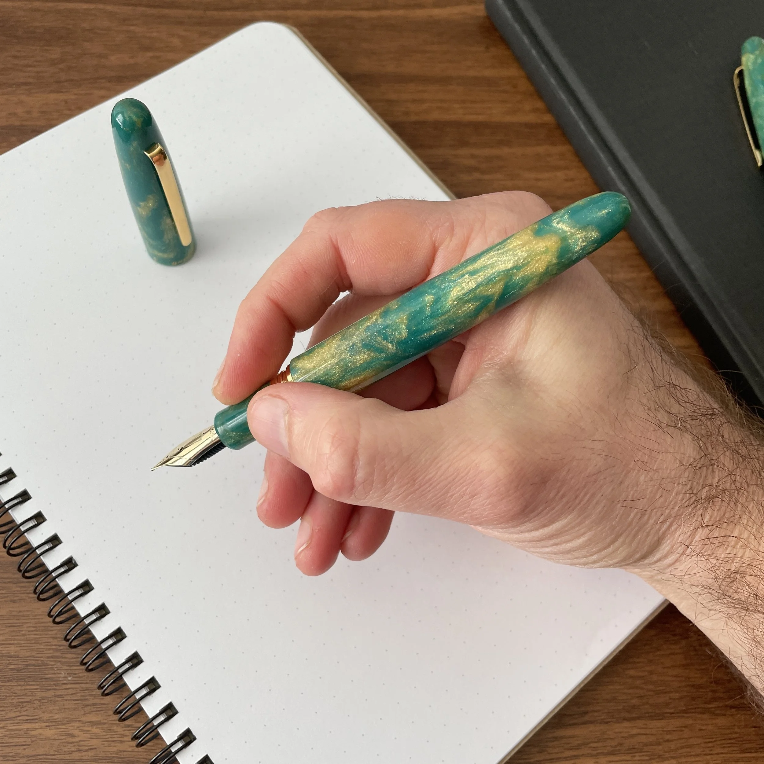
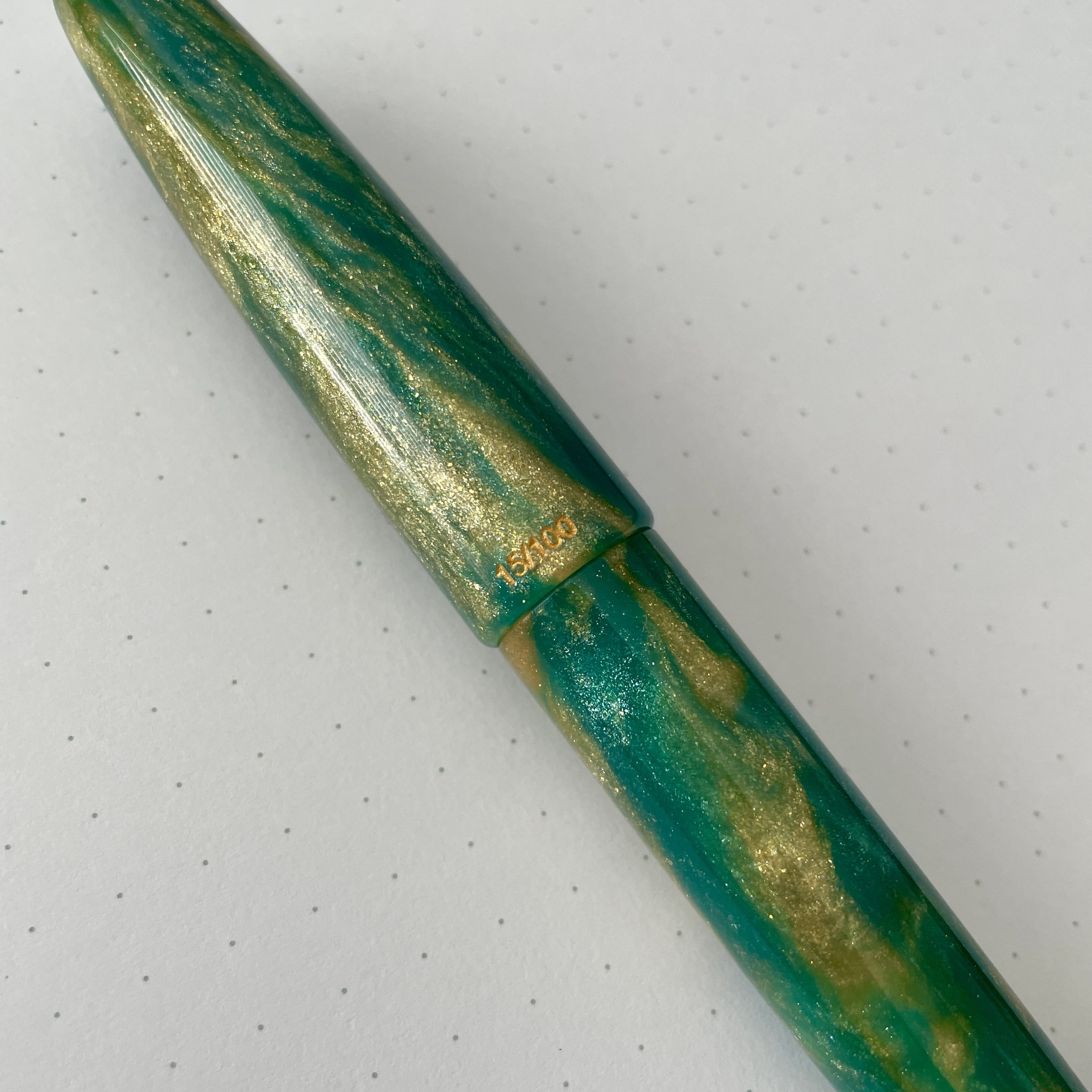
The other two pens with gold trim versions that caught my eye are the Esterbrook Estie in Nouveau Blue and Scarlet. While there’s nothing necessarily wrong with rhodium trim on either of those pens, the gold highlights the depth in the materials, especially the golden brown undertones in the Nouveau Blue. Pairing either of these vintage-inspired resins with rhodium trim leaves both of them looking a bit flat. Of course, this is my opinion, but the point here is that I made an informed choice of trim based on what I think looks best and what I want to see in my hand when I’m writing every day, not because pen-related social media tells me that gold trim “isn’t popular.”

View fullsize Esterbrook Estie Scarlet
View fullsize Esterbrook Estie Nouveau Blue

Even Blackwing has explored using gold, adding a gold ferrule clip to certain special releases such as these 2019 Black Friday pencils.

It’s long past time that we stop reflexively rejecting gold trim pens as the “generic” or “uninteresting” option, and consider them on their merits. While I was once as eager as anyone to have rhodium trim available as a regular option, I think I’ve gone too far in the other direction. As I’ve considered recent pen acquisitions, including my Nouveau Blue Estie at the Baltimore Pen Show, and certain of my Stacy Robinson pens in Atlanta, I’ve started to reconsider what’s become a default preference, as certain materials just don’t look right when paired with chrome. If you like the gold trim, then get the gold trim! I’ve found that by opening myself to considering finishes beyond rhodium, including ruthenium, rose gold, and now, standard gold, my pen collection started to take on a less one-dimensional look and became more visually interesting. (And I’ve already gotten at least four comments at work on how great that gold ballpoint looks!)

This post does not contain paid third-party affiliate links. The Gentleman Stationer is supported by purchases from the T.G.S. Curated Shop, as well as the T.G.S. Patreon Program. I was not otherwise compensated for this post. Esterbrook Nouveau Blue and Scarlet images courtesy of Vanness Pens.

In Editorial Tags Gold Trim, Esterbrook Estie, Caran d'Ache, Caran d'Ache 849, Caran d'Ache Gold Bar
Comment

Esterbrook x Accutron: The Collaboration Continues with New Esties, Including an Oversize!

November 24, 2021

When we last looked at the collaboration between American “heritage” brands Esterbrook and Accutron, it was limited to a special edition Esterbrook Camden fountain pen in a gorgeous green shade. Recently, Esterbrook and Accutron have followed up with two new limited edition Estie fountain pens in green and gold DiamondCast material, in both standard and oversized versions. All feature details such as the Accutron “tuning fork” logo on the cap and nib that set these pens apart from the standard Esterbrook lineup.

To recap a bit from my previous post, the “Accutron” brand was first associated with a line of watches manufactured by Bulova, and recently relaunched as a separate company by the Citizen Group. You can read more about both vintage and modern Accutron watches on dedicated watch sites such as Hodinkee, and the story behind the development of the technology is fascinating. Short version: Accutron watches bridged the gap between traditional mechanical watches and modern quartz watches, introducing a unique “tuning fork” movement that was one of the first mass-market electronic watches available. Esterbrook distributor Kenro and Accutron were kind enough to send me the modern Accutron “Spaceview” watch pictured here, so that I could get a sense of the current company’s aesthetic and how it complements the limited edition Esterbrook pens. I won’t do a full watch review, since that steps out side my area of expertise, but I did enjoy wearing the watch for a few days, and if you enjoy the Accutron look, I’d encourage you to read the full Hodinkee write-up of the Spaceview 2020 here.

My First Experience with the Oversized Estie

This particular post will focus on one of the two pens I was sent for review: the Accutron x Esterbrook Oversized Estie, which - believe it or not - I’ve never had the opportunity to test for an extended period of time. I’ve always though I would remain partial to the “standard” size Estie fountain pen, since (1) it’s quite comfortable and nearly the perfect size for me; and (2) it posts, which can be important given how/where I do much of my daily writing. That said, after having a few weeks to test out the oversized version, I’m beginning to reconsider.

Here’s what I enjoy about the Oversized Estie:

  • This pen has fantastic balance. While the standard Estie is extremely comfortable to use, the Oversized pen is perfectly weighted for unposted use, and even though it’s a big pen, you don’t notice the size. I would compare the overall length and proportions to a slightly slimmer Opus 88 Jazz.

  • JoWo 18k nibs are among my favorite stock nib units. I’ve had several JoWo 18k gold nibs in my collection over the years, and they never fail to disappoint. This medium nib arrived perfectly tuned, and I’ve not experienced any issues with skipping or hard-starting.

  • The larger pen body is the perfect canvas for showcasing the DiamondCast material. If you’re unfamiliar with “DiamondCast”, it’s a material made by McKenzie Penworks in here in Tennessee, which features a mixture of alumilite, pigment and real diamond dust. You can read more on the McKenzie Penworks website.

View fullsize Estie Oversized Unposted
View fullsize Estie Standard Unposted
View fullsize Estie Standard Posted

If there’s anything that I don’t enjoy about the Estie Oversized, it would be the metal threads on the barrel, which, in my opinion, somewhat disrupts the streamlined design of the pen. At the same time, the threads are not sharp at all, so they don’t interfere with a comfortable grip, and the added bit of metal front-weights the pen which likely contributes to the excellent balance I noted above. Taken as a whole, this is an aesthetic preference for me that at the end of the day, won’t prevent me from adding an Oversized Estie to my collection.

The Accutron “Tuning Fork” logo dates back to the “tuning fork movement” used in vintage Accutron watches.

Takeaways and Where to Buy

Unlike the Camden, which was available only from select Accutron watch retailers, the new Esterbrook x Accutron Diamondcast Esties pictured here are also available through most major Esterbrook pen retailers. Like other Esties made from Diamondcast material, the price point is higher than standard Estie fountain pens, with the standard model bearing an MSRP of $395 / $316 retail, and the oversized priced at $750 MSRP / $675 retail. (The Oversized version comes only with a 18k JoWo Nib.) If you’re a fan of this green and gold Diamondcast material, or looking for an Accutron-branded Estie to match a recent watch purchase, I’d act quickly because these pens are part of a limited edition series and won’t be around forever. In fact, they’re already sold out at some retailers.

The Esterbrook x Accutron Estie Oversize pens are numbered in an edition of 100.

On a more general note, count me a fan of the Estie Oversized! I’m already looking for the perfect model to add to the permanent rotation, and strongly considering one of the “Nouveau Bleu” models with the gold trim, perhaps adding a “Scribe” specialty nib.

Many thanks to Esterbrook and Kenro Industries for making this review possible. This post does not contain affiliate links, nor was I compensated for this review. All products shown here were lent to The Gentleman Stationer for review purposes and returned afterwards.

In Pens Tags Esterbrook Estie, Esterbrook x Accutron, Kenro, Esterbrook Accutron, Esterbrook, Pen Review
Comment

Pen Review: Esterbrook Estie "Maraschino" Is a Welcome Surprise

September 30, 2020

I’ll be honest: This pen landed in my mailbox out of nowhere and I wasn’t particularly excited about reviewing another Esterbrook just yet, given all the hype surrounding the Esterbrook JR and the deluge of reviews that followed the pen’s release. That is, until I actually got my hands on this “Maraschino” Estie. While I’m a fan of red pens, my tastes typically run to darker burgundy or red-black finishes, not necessarily “cherry” or “fire engine” reds. This pen serves as yet another example of why it’s good to unexpectedly step out of your comfort zone every once in a while.

I went with an all-red setup for this review. Montblanc Corn Poppy Red is a perfect pairing for this pen (and if I might say so myself, so is the T.G.S. “Aged Red” Penwell).

The bright “end of summer” theme pays homage to visits to your local ice cream parlor for a sundae, including the cherry on top. Personally, I’ll pass on the cherry (I have plenty of others in my house who will eat them), but I appreciate the imagery and the name nails the color of this red “cracked ice” acrylic. Like all of the materials Esterbrook uses in the Estie lineup, the “Maraschino” material is vibrant, feels solid, and packs a ton of depth reminiscent of what you would find on a much more expensive custom pen.

Gold trim is also a perfect pairing for the bright red of the Maraschino, IMHO.

Reviewing this pen also gave me a chance to revisit the Estie itself, a pen I haven’t used in a while. I won’t rehash my full review of this pen (which is available here), but suffice to say the Estie remains a supremely comfortable writer with good balance, “all day” writing comfort, and a reliable JoWo No. 6 nib. I have a few more Esties that I picked up at pen shows last year, in both the “Blueberry” and “Honeycomb” finishes, and I’ll be inking them up soon.

View fullsize Esterbrook Estie Maraschino Posted
View fullsize Esterbrook Estie Maraschino Unposted

Takeaways and Where to Buy

As I’ve said before, and will say again, the Esterbrook Estie is a great pen, and whether or not you’ll want to run out and pick up this particular model hinges on whether you love the color. I do, and I wouldn’t cry if Esterbrook ended up adding the bright red “Maraschino” finish to their standard lineup.

Three Esterbrook Estie Limited Editions, from left: Maraschino, Honeycomb, and Blueberry. I believe the Honeycomb joined the regular lineup.

The Estie Maraschino is designated as a limited edition, meaning that at least for now, it’s not part of the regular lineup and already has started to sell out. Vanness Pens has limited stock of the fountain pen with chrome trim, as well as the chrome and gold trim rollerballs. Goldspot also has Maraschino Esties available, in both the standard and oversize fountain pens. Regular Estie pricing applies, with the Maraschino priced at $156 for the standard version and $200 for the oversize.

Disclaimer: I received the pen featured in this review from Kenro Industries, Esterbrook’s parent company and distributor, free of charge for review purposes. This post contains links to paid sponsors of the blog.

In Pens Tags Esterbrook Estie, Esterbrook Estie Maraschino, Fountain Pen
Comment
Store Location
Visit the T.G.S. Curated SHOP
*New* Updated "Best Pens" Guide (2025)
TGS x Hinze Pens Violet Tendencies Taschenstift Fountain Pen
Hierarchies of Fountain Pen Friendly Paper
Allex Scissors arrayed on a desk showing link to desk accessories

Join Our Patreon!
Subscribe to the TGS E-mail List

Featured Posts

Featured
Joe's-Journals-New-Old.jpeg
Jul 2, 2025
Time to Pick a New Personal Journal: Maruman Mnemosyne Hardcover A5 Journal
Jul 2, 2025
Jul 2, 2025
Desk-Accessoris-Unstaged.jpeg
Jun 25, 2025
Getting Personal: Five "Stationery Adjacent" Items I Can't Live Without
Jun 25, 2025
Jun 25, 2025
Pilot-Iroshizuku-Yama-Budo-Writing-Sample.jpeg
May 24, 2025
Joe's Picks: Five Favorite Inks From Pilot's Iroshizuku Lineup
May 24, 2025
May 24, 2025
The Gentleman Stationer RSS

© Digital Divide Media, LLC, 2014-present.

All content is the exclusive property of Digital Divide Media, LLC, d/b/a The Gentleman Stationer, including “The Gentleman Stationer” website and trademark, and should not be reproduced without express written permission.  All rights reserved.

All content containing paid advertising, affiliate links, or sponsored content will be plainly disclosed by a disclaimer when/if featured.

Contact Information

Store Shipping Policy and Return Policy

Privacy Policy

Cookie Policy

Terms and Conditions

Powered by Squarespace