• Blog
  • Shop
  • Resources
  • FAQ (Ask TGS)
  • About
  • Archive
  • Contact
  • Sign In My Account
Menu

The Gentleman Stationer

Vintage Living in the Modern World.
  • Blog
  • Shop
  • Resources
  • FAQ (Ask TGS)
  • About
  • Archive
  • Contact
  • Sign In My Account

Exploring Custom Nibs: Predator Hybrid by Mark Bacas

May 28, 2022

Late last year I embarked on what I expect to be a year-long experiment of comparing custom nibs available from the different nib grinders currently working, focusing on those grinds from each that can be considered a specialty or “signature”. Mark Bacas is one of the most experienced nib grinders out there, and whether you’re looking for a simple tuning or a more complex grind like the “Predator Hybrid” I’m discussing today, Mark will work with you to ensure the nib is ground to your personal preferences, and that you’re happy with the result.

So What the Heck is a “Predator Hybrid” Nib?

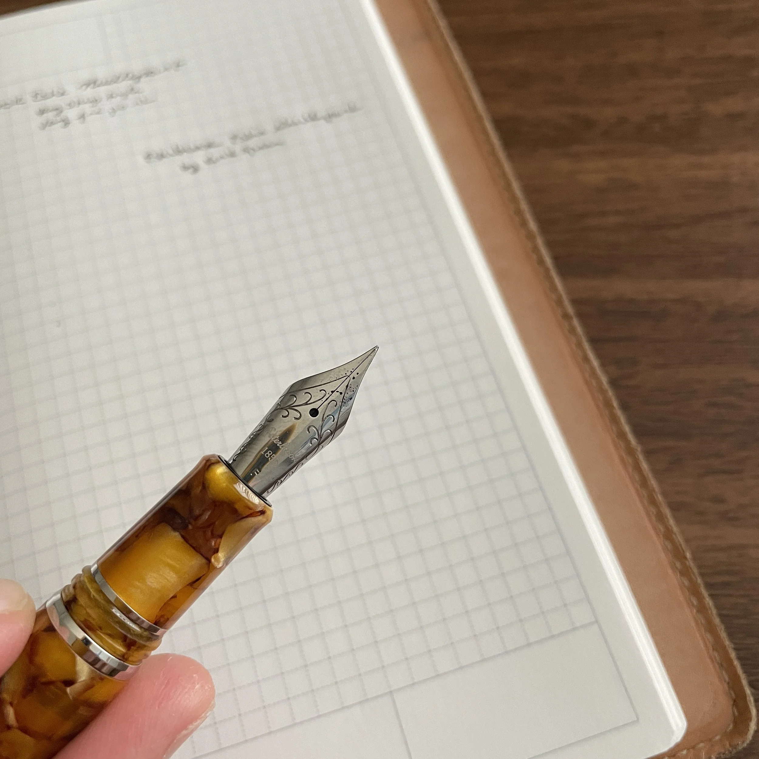
I can only assume that the “Predator” name draws its inspiration from the shape - pictured at the top - which resembles a bird’s beak. The “Predator Hybrid” nib is ground to an ultra-fine point on the normal side, with the reverse a wider, slightly brush-like medium. To compare, a “Predator Extreme” nib has the same ultra-fine point on the normal side, with the reverse ground to a full architect. You can read Mark’s own descriptions on these and other nib grinds he offers directly on his site. I would say that on this “Hybrid” version, the reverse is slightly softer than a full architect, while still offering a bit of the line variation you would expect from that grind.

A writing sample showing the “normal” (i.e., nib down) width, compared against the reverse (i.e., nib upside down) width.

So in practice, how do I use this nib? If you’ve read my past pen reviews, you’ll know that I value pens I can use for annotation during my reading and research. This particular nib falls squarely into that category. The ultra-fine point accommodates my tiny handwriting and allows me to make even the smallest margin notes, while the reverse side is perfect for underlining, highlighting, and even standard writing. Frankly, I’ve never had a reversible nib write well to the point where I could use the reverse side for much more than a line or two. This one is smooth enough for standard writing.

The TWSBI Diamond 580 Fountain Pen is one of many that features interchangeable nib units, so you can have multiple custom nibs ground to switch among your various TWSBI Pens.

Why I Love Interchangeable Nib Units for Custom Nib Work

For this grind, I chose to have Mark modify a TWSBI 580 medium nib unit, so that I can swap the nib between my various TWSBI Diamond 580 pens. Lately, wherever possible I’ve been having nib grinders modify interchangeable nib units from JoWo, Bock, and TWSBI so that their work isn’t tied to any particular pen. It’s quite helpful to be able to move the nibs around at times - some grinds are more suitable to different pens, depending on weight, balance, etc., and these threaded nib housings make swapping nibs a cinch.

Cost of Nib Modification - Cheaper Than Buying a New Pen

The grind featured here cost $50, and since I did not pay a rush fee, it took several weeks for Mark to turn around. (Mark is fast - some nib grinders take months, or even up to a year.) In response to posts like these, I often get the question: “Why pay extra money to ‘fix’ a pen that should write perfectly out of the box?” Here I think we need to break down the question a bit: Are you paying to fix a manufacturer’s flaw with the nib, in which case I absolutely agree with you that the cost of any repair should be born by the company that made the pen, or are you looking to personalize the pen for how you write? It should be fairly obvious that if you write extremely small, a standard stainless steel extra-fine nib may not be narrow enough for you, and you should consider a needlepoint or a nib like the Predator.

The “normal” point of the Predator nibs writes a very fine line, even finer than a needlepoint nib like the one ground by Kirk Speer (Pen Realm) for Esterbrook.

Even with standard nib widths, it’s impossible for a manufacturer to anticipate things like the amount of pressure you use and how you hold the pen. I have pens in my collection that, out of the box, wrote within “the range of reasonableness” and wouldn’t be considered defective, but still didn’t work for me until I had them tuned. I would estimate that 80-85% of the pens in my collection have been modified or tuned from “factory standard,” either by a nib grinder or yours truly. At the end of the day, if you love the look of a pen, and it’s not writing perfectly, consider paying a little extra to make it yours. If you keep it for years, you’ll get more enjoyment from the writing experience than the $20-50 modification fee, and in many cases it’s cheaper than buying a new pen.

Further Reading

If you enjoyed this article, you may want to check out some previous posts discussing fountain pen nib modifications. I’ve written a general introductory piece on some of the more common grinds, as well as an article looking at custom grinds from The Nib Tailor (Architect + Inverted Architect), as well as the Kirk Speer Needlepoint nib currently available from Esterbrook as an add-on to Estie purchases.

This post does not contain third-party affiliate links. The Gentleman Stationer is supported entirely by purchases from the T.G.S. Curated Shop, as well as pledges via the T.G.S. Patreon Program. Since it’s Memorial Day Weekend, all orders placed in the Curated Shop from Saturday, May 28 through Monday, May 30, will receive a complimentary add-on gift! Many thanks for all of your support!
In Pens, Editorial Tags Mark Bacas, Nibgrinder, Nib Grinding, Nib Modification
1 Comment

Workhorse Pens: Metal Pens as Workhorse Pens

May 14, 2022

I talk a lot about unintentionally accumulated “mini-collections,” where I buy a lot of a seemingly-random type of pen over a period of months (or years) and then decide that the accumulation wasn’t really random at all, but rather says something about my changing needs and work habits. Over the past two years, I — like the rest of the world — have been working remotely, either from home, or outside or in a corner of the local library. A recent review of my collection shows that since that first quarantine period in early 2020 (and probably starting slightly before that), I’ve picked up more metal pens, especially pocket pens, since they’re durable and useful for working on the go.

I’ve not been a huge proponent of machined or all-metal pens in the past, generally finding them heavy and awkward, but in recent years certain makers have revolutionized the writing experience by using different machining techniques to reduce weight and improve the ergonomics, particularly with respect to the grip section. If you enjoy the look of a machined pen, fountain or otherwise, you no longer have to sacrifice comfort and usability over long writing sessions. Today I’ll discuss a few considerations that I take into account when selecting a metal pen, all of which relate to their usability as daily writer (or “workhorse”).

The Baron Fig Squire in brass is quite heavy, but still comfortable to write with due to the contoured “teardrop” shape.

Balance

To me, the balance of a pen is far more important than the overall weight. A heavy, well-balanced brass pen can be more comfortable for me to use than an oversized resin pen that’s been manufactured solely for purposes of “looking big and expensive” without any concern for usability. I use the term “balance” to refer to how the pen sits in my hand when writing, but be aware a certain pen may feel different from person to person, depending on things like hand size and underlying conditions such as arthritis. Metal pens that I consider particularly well-balanced given my average hand size include the Baron Fig Squire, with it’s contoured shape that places most of the weight towards the middle-front, as well as the Schon Full-Size Fountain Pens, aluminum pens which are so light and well-balanced that you can even post the cap without sacrificing comfort - something you rarely see in the machined pen universe.

The Schon DSGN Full-Size Fountain Pen has become one of my favorite designs of all time. I know that’s lofty praise, but rarely a day goes by when I don’t use this particular model.

Weight Reduction Machining

Weight remains a significant consideration. In recent years, makers have been machining the walls of their pens thinner to control for this factor. Thus, while I consider balance to be more important overall, for something like a thicker fountain pen that has to be wide enough in diameter to hold a converter, you won’t be able to achieve good balance without paying close attention to weight, even with lighter materials such as aluminum and titanium. Favorite makers of mine who have done excellent work in this regard include Ian Schon (see the Full-Size Fountain Pen, discussed above), and Matthew C. Martin. Though not currently in production, the titanium version of the Gist 2.0 fountain pen by Tactile Turn is also a delight to use, as well as the bullet-style metal fountain pens made by Traveler’s Company (and the ballpoint).

View fullsize Schon DSGN Full-Size Unposted
View fullsize Schon DSGN Full-Size Posted

A Comfortable Grip Section

When you mention “metal pens” to many fountain pen enthusiasts, they envision a smooth section that becomes slippery as you write for longer periods of time. While that problem still exists for those of us that tend to use a tighter grip, many companies have introduced a slight texture to their sections in the form of machined grooves or the application of a matte finish. One of the more comfortable sections I own, machined or not, is the longer, ridged section on my brass Schon DSGN Pocket Six.

I’m glad I sprung for the elongated grip section (though the standard smooth section is also excellent).

The end result of all this is that I no longer necessarily look at metal pens as occupying their own category or product segment, separate from "normal pens.” I find the pens mentioned here indistinguishable, usability-wise, from traditional celluloid, resin, or acrylic pens, and some are in fact even more comfortable. If you’ve been considering a metal pen, but have been put-off by potential weight issues, please reconsider, especially if you have the opportunity to test out one of these pens at a pen show or local pen club.

Further Reading

If you’re interested in reading more about the idea of “workhorse pens,” you can check out the rest of this series here. The “Workhorse Pens” series of blog posts explores those pens that I love to use for, well, actual work, and contains longer write-ups on how and why I enjoy these particular pieces from my collection.

I purchased all of the pens featured here with my own funds, for my own use. This post does not contain third-party affiliate links. The Gentleman Stationer is supported by purchases from the T.G.S. Curated Shop and the T.G.S. Patreon Program.

In Workhorse Pens Series, Pens Tags Machined Pens, Metal Pens, Schon DSGN Pocket SIx, Schon DSGN
1 Comment

Exploring Stock Custom Nibs: The Esterbrook Needlepoint by Kirk Speer

May 11, 2022

In my past few pen show reviews, particularly my review of the Baltimore Pen Show, I remarked on how there are many more nib grinders working at pen shows than there used to be. The result is not only shorter wait times and more options for those looking to tune or customize their fountain pens to their personal preferences, but a wider range of styles and specialties that only make this hobby more fun and more interesting.

A secondary benefit to having more working nib grinders is yet another trend: manufacturers offering pre-ground specialty nibs as an add-on to standard pens. While Franklin-Christoph has done this for years, with their Masuyama, SIG, and Nagahara-ground nibs, Esterbrook now offers a cursive italic (“Journaler”), an architect (“Scribe”), and now a needlepoint, from Kirk Speer of Pen Realm.

This Kirk Speer needlepoint nib from Esterbrook balances a narrow line with smooth writing.

Needlepoint grinds, or “extra, extra-fine” or “ultra-extra fine” nibs, aren’t necessarily as popular among enthusiasts as stubs, italics, and architects. They require you to use light writing pressure, or else the sharp tip will dig into the paper, and even with a light hand needlepoint nibs can feel toothy, which some people consider “scratchy.” That said, if you have small handwriting, or need a fountain pen to use for annotations or marginalia, I’m a firm believer that you need at least one needlepoint nib in your collection.

Kirk ground this needlepoint from a fine, as opposed to an extra-fine. Having more tipping to work with on the original nib often leads to better results, in my experience, especially if you value smoothness.

This particular nib, ground for Esterbrook by Kirk Speer of Pen Realm, is smoother than most needlepoints I’ve used, making it a perfect nib for those who want something that writes a narrower line than your typical JoWo steel extra fine nib, but isn’t so fine that it can’t easily be used for everyday writing. I would compare this needlepoint nib to a standard Japanese extra-fine nib (or even some Japanese fine nibs), rather than something like the Platinum Ultra-Extra Fine or the Franklin-Christoph Nagahara nibs. That said, because these nibs are ground by hand, there will lbe at least some variation between them, and the nib I received may not be identical to every nib out there.

Comparing the line from a Platinum Ultra-Extra Fine Nib (top), the Franklin-Christoph Nagahara needlepoint (middle), and the Esterbrook by Kirk Speer needlepoint (bottom). The Esterbrook nib writes a wider line, but is much smoother and better for everyday writing than the other two, which many people find too toothy. (I personally love them, but I have situations where I need to write very, very small.)

Takeaways and Where to Buy

Esterbrook has done the pen community a great service by introducing these custom nib options into its standard lineup, and by making it easier to get a custom nib grind as an add-on to your purchase of an Esterbrook pen without having to travel to a pen show or separately send your pen off to a nib grinder for what can be a weeks-long waiting period. While an ultra-fine needlepoint grind may not be for everyone, I found this particular nib to be well-made, and it will have a permanent home among my various Esties.

The Esterbrook featured here is the Honeycomb with Chrome Trim, one of my favorite materials.

You can purchase the nib and pen featured in this review from most Esterbrook retailers, including our friends at Vanness Pens. Typically, the custom-ground Esterbrook nibs cost an additional $48, with most of the markup going to cover the cost of the nib work. (To compare, having a pen ground to a needlepoint typically costs around $50, excluding the cost of shipping.) If you’re interested in further exploring Kirk’s work and having him grind or modify a pen for you, visit his site at Pen Realm.

Further Reading

Those interested in reading further on different types of custom nib grinds should start with this post I wrote a couple of years ago. In terms of other specialty Esterbrook nibs, I have reviewed the Esterbrook “Journaler” nib - a cursive italic nib ground by Gena Salorino of Custom Nib Studio, which is still available. There is also an architect nib, the “Scribe”, ground by Josh Lax of J.J. Lax Pen Co., which I’ve not had the opportunity to try but I have used Josh’s architect nibs and enjoy them.

Disclaimer: Esterbrook provided me with the nib featured in this review free of charge, for review purposes. This post does not contain paid third-party affiliate links. The Gentleman Stationer is supported entirely by purchases made through the T.G.S. Curated Shop and the T.G.S. Patreon Program.

In Pens Tags Esterbrook Needlepoint, Custom Nibs, Nib Grinding, Fountain Pen, Esterbrook
2 Comments

The More Things Change, The More They're The Same: The Visconti Homo Sapiens Revisited

March 26, 2022

Back in 2017, I reviewed a Visconti Homo Sapiens “Dark Ages” fountain pen that I purchased at the D.C. Pen Show, and while my impressions of the pen were generally favorable, I ultimately moved on from it due to usability concerns. The 23k Palladium nibs that Visconti used at the time wrote far too wet for my preference, making it extremely difficult for me to use the pen at work, even with an “extra fine” nib that Mike Masuyama had ground down even further. Though it wasn’t a particularly difficult decision to sell this pen, I still found myself admiring the Homo Sapiens, with its comfortable size and shape and unique texture. When I saw that Visconti had moved away from Palladium nibs and back to 18k gold, I snagged a standard “Bronze Age” pen on sale. While the experience hasn’t been perfect, I do intend to keep this pen as part of my personal collection.

For the most part, my previous review of the Visconti Homo Sapiens remains accurate, and I would encourage you to start there for background on the pen design and overall usability and build quality. In short, the pen itself has not changed, other than Visconti has now made it available in many new materials. As noted above, however, I wanted to take the opportunity to update the review to reflect the new nib, as well as updated impressions of the filling mechanism now that I have a Visconti Traveling Inkwell.

The Visconti Homo Sapiens 18k nib. Certain of the new models have a 14k, but the Bronze Age is 18k.

Visconti Should Stick with the 18k Nib

In my personal opinion, the 18k gold nib is a huge upgrade over the previous Palladium “Dreamtouch” nib, at least for those of us who use our fountain pens for everyday writing. While still a wet writer, the 18k nib writes a much more usable, consistent line, and I’ve not experienced nearly the same amount of bleed-through as with the Dreamtouch. That said, my “extra fine” Visconti nib lays down what I would consider a “fine-medium” line, or even what many might consider a medium in a Japanese pen. If you like to go much narrower with your nib sizes, you’ll need to have the nib ground. (More on that below.)

The “extra fine” nib on the Visconti Homo Sapiens writes a broader line than some might expect.

The Visconti Homo Sapiens is a large pen, and doesn’t post. I find the combination of size and material extremely comfortable to use.

The Visconti Traveling Inkwell Is a Recommended Add-on Purchase

If you recall from my previous review, one of the critiques I had about the Homo Sapiens was ink capacity. Despite Visconti’s use of the vacuum “Power Filler,” it was hard to get a full fill. For example, I was barely able to get the filling system to take more than 1ml of ink - little more than a standard converter. While there are many tips and tricks that people use to get more ink into their Homo Sapiens fountain pens, the best method is to use Visconti’s Traveling Inkwell, which creates a seal around the section and allows you to invert the inkwell above the pen while you’re filling, maximizing the volume drawn into the barrel. (Just remember to hold on tight, lest you inadvertently create an “ink rocket”.) Since I last reviewed the Homo Sapiens, I’ve picked up a Traveling Inkwell, and I can confirm that it does maximize the ink capacity. While the pen still doesn’t hold as much ink as the Pilot Custom 823 or even the TWSBI Vac700R, you won’t need to refill as often, a point helped by the fact that the pen no longer has the ink-gushing Dreamtouch nib.

The Visconti Traveling Inkwell in action (shown here with a TWSBI Vac700R)

Alas, Visconti Nib Quality Control Remains Maddeningly Inconsistent

When Visconti switched from the Palladium nibs to the 18k, there was hope that it would improve the consistency in the “out of the box” writing experience. I had no such luck, and still had to have the 18k nib adjusted by Mark Bacas (who discovered that the tines were actually bent into a “wave” shape). While the pen is an exceptional writer now, it still required an after-market nib adjustment, which at this price point simply should not happen. The Homos Sapiens Bronze Age pictured here retails for $895 MSRP, with most retailers selling for around $715 street price. It is entirely unacceptable for a pen at this price point to have serious nib issues, especially things like bent tines, and even though Visconti accepts returns, I always end up avoiding the delay and inconvenience by simply sending the pen off for work myself, especially where there’s no guarantee that the replacement pen will write any better.

Look, I’m not a Visconti “hater”, even if I’m not a Superfan. I have no axe to grind agains the company, and I enjoy their designs, with two expensive pens in my personal collection that I purchased with my own money. Moreover, my experience is consistent with other reviewers. It still frustrates me, however, to see the price of these pens climb ever higher without corresponding improvements in quality control, with the company likely banking on the fact that people will like the unique designs enough to overlook the continued nib inconsistency. Nib issues on Visconti pens have persisted for years, and even it QC is anecdotally “better” with the gold nibs than it was with the Dreamtouch, Visconti has a long way to go. Yesterday I did an unofficial (and admittedly unscientific) Instagram poll, and 36 out of the 60 respondents reported that their Visconti did not write correctly out of the box (approximately 60%). Is that possibly overstated? Sure, since there’s a bias towards those who experienced problems with a product being more willing to report an issue than people who didn’t. But that’s a lot of people who bought expensive pens, and it does reflect my own experience. The three Viscontis that I’ve purchased myself (disregarding those sent to me specifically for review) all required nib adjustments for issues ranging from the minor (inconsistent flow/baby’s bottom) to the major (bent tines). As one nib worker messaged me in response to my post, “Visconti keeps me in business.”

The finish on my Visconti Bronze Age is already developing a patina, which will look even better as time goes on.

Takeaways and Overall Impressions

I guess it’s true that “the more things change, the more they stay the same.” While Visconti has updated the Homo Sapiens to include new colors and materials, and has moved to a gold nib that I find much more usable and pleasant to write with than the old Palladium Dreamtouch, it’s hard for me to recommend that anyone purchase a Homo Sapiens new, unless a nib adjustment is included with the purchase. Viscontis can be exceptionally good pens, and their designs are gorgeous, but if you’re looking to make this kind of investment you will be better served, in my opinion, by purchasing on the secondary market and budgeting for a nib adjustment. The Visconti Homo Sapiens Bronze Age shown here, as noted, retails for around $715 and can be found at most authorized Visconti dealers.

The Visconti Homo Sapiens compared to the Montegrappa Extra 1930 (right), and the Lamy 2000 (left).

I purchased this pen with my own funds, for my own personal use. I was not compensated for this review, and this post does not contain third-party affiliate links. The Gentleman Stationer is supported entirely by purchases from the T.G.S. Curated Shop and the T.G.S. Patreon Program.

In Pens Tags Visconti Homo Sapiens, Visconti, Fountain Pens, Pen Review
7 Comments

State of the Collection: My Franklin-Christoph Fountain Pens after Baltimore

March 19, 2022

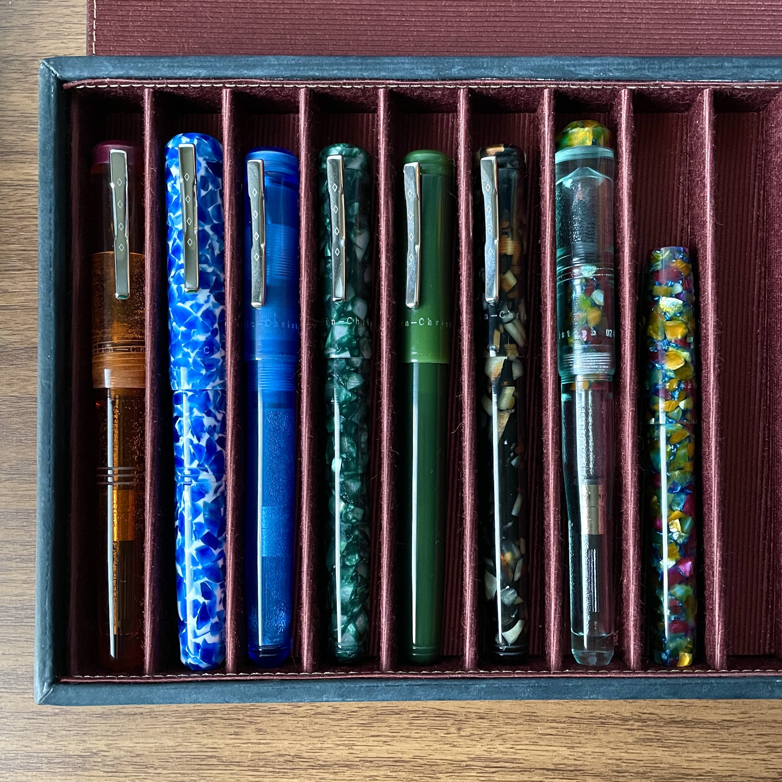
I’ve not written about my Franklin-Christoph fountain pens in a while, even though the brand has been a mainstay of my “daily workhorse” rotation for years now. Previously my collecting has focused on the Model 20 “Marietta” fountain pen, the slip-cap pen that’s one of my all-time favorites, especially for showing off acrylics and other materials. In recent years, however, I’ve expanded my repertoire and added several new pens in different models, including the Model 31 “Omnis”, the Model 02 “Intrinsic”, and the Model 45.

From left: two Model 31 fountain pens, four Model 20s (still my favorite), a Model 02, and a Model 45.

Even if I don’t end up purchasing anything, browsing the prototype trays at the Franklin-Christoph tables is one of my favorite pen show experiences. (It’s rare that you don’t end up walking away from the table with something.) This past weekend, I purchased the Model 02 and Model 45 shown here, both in this dark flecked acrylic with scattered gold, burgundy, blue, and green. (I believe this material is called “Cathedral,” and it’s made appearances at pen shows in the past but I was never able to snag it in a pen model that appealed to me. I’m still looking for a Model 20.)

The Model 02 features this material on the section and finial, with the slightly blue-tinted “Antique Glass” body.

Another reason I never feel guilty about picking up more Franklin-Christoph pens is because the purchase includes a tuned JoWo nib, with numerous specialty grinds available for a small uncharge. In addition to Franklin-Christoph’s own excellent in-house nib grinds, you can opt for work done by Japanese nib crafter Yukio Nagahara. I chose Nagahara needlepoint nibs for both of the pens shown here. I haven’t inked these pens up yet, but you can expect these pens (and these nibs) will get a full write-up sooner rather than later.

Catch Up on the Rest of My Baltimore Pen Show Adventures

You can read my full recap of the 2022 Baltimore Pen Show here, and you can also view additional show photos on my Instagram, including in the Stories where the pics and running commentary are saved to the highlights. I got home late last night, so I’m still getting settled, but you can expect the blog to resume a normal schedule this week.

Finally, T.G.S. Curated Shop orders are no longer delayed and will ship within the typical 2-3 business days. All orders placed during my absence started shipping out LATE last night and will continue through the weekend. Many thanks for all your support!

In Pen Shows, Pens Tags Franklin-Christoph, Pen Show, Custom Nibs
Comment
← Newer Posts Older Posts →
Store Location
Visit the T.G.S. Curated SHOP
*New* Updated "Best Pens" Guide (2025)
TGS x Hinze Pens Violet Tendencies Taschenstift Fountain Pen
Hierarchies of Fountain Pen Friendly Paper
Allex Scissors arrayed on a desk showing link to desk accessories

Join Our Patreon!
Subscribe to the TGS E-mail List

Featured Posts

Featured
Yamamoto-Gray-Paper-Sampler-Set.jpeg
May 10, 2025
Discovering Unusual Paper: "Paper Tasting" Sets from Yamamoto Paper
May 10, 2025
May 10, 2025
Four-Micarta-Fountain-Pens.jpeg
Apr 19, 2025
Yes, Micarta for me! I finally got my hands on Some Micarta Pens, Plus My Own Special Edition
Apr 19, 2025
Apr 19, 2025
2025-Arkansas-Pen-Show-haul.jpeg
Mar 29, 2025
Unboxing the Arkansas Pen Show Haul! Two Nib Grinds, Inks, and a New Pen
Mar 29, 2025
Mar 29, 2025
The Gentleman Stationer RSS

© Digital Divide Media, LLC, 2014-present.

All content is the exclusive property of Digital Divide Media, LLC, d/b/a The Gentleman Stationer, including “The Gentleman Stationer” website and trademark, and should not be reproduced without express written permission.  All rights reserved.

All content containing paid advertising, affiliate links, or sponsored content will be plainly disclosed by a disclaimer when/if featured.

Contact Information

Store Shipping Policy and Return Policy

Privacy Policy

Cookie Policy

Terms and Conditions

Powered by Squarespace