July EDC Update

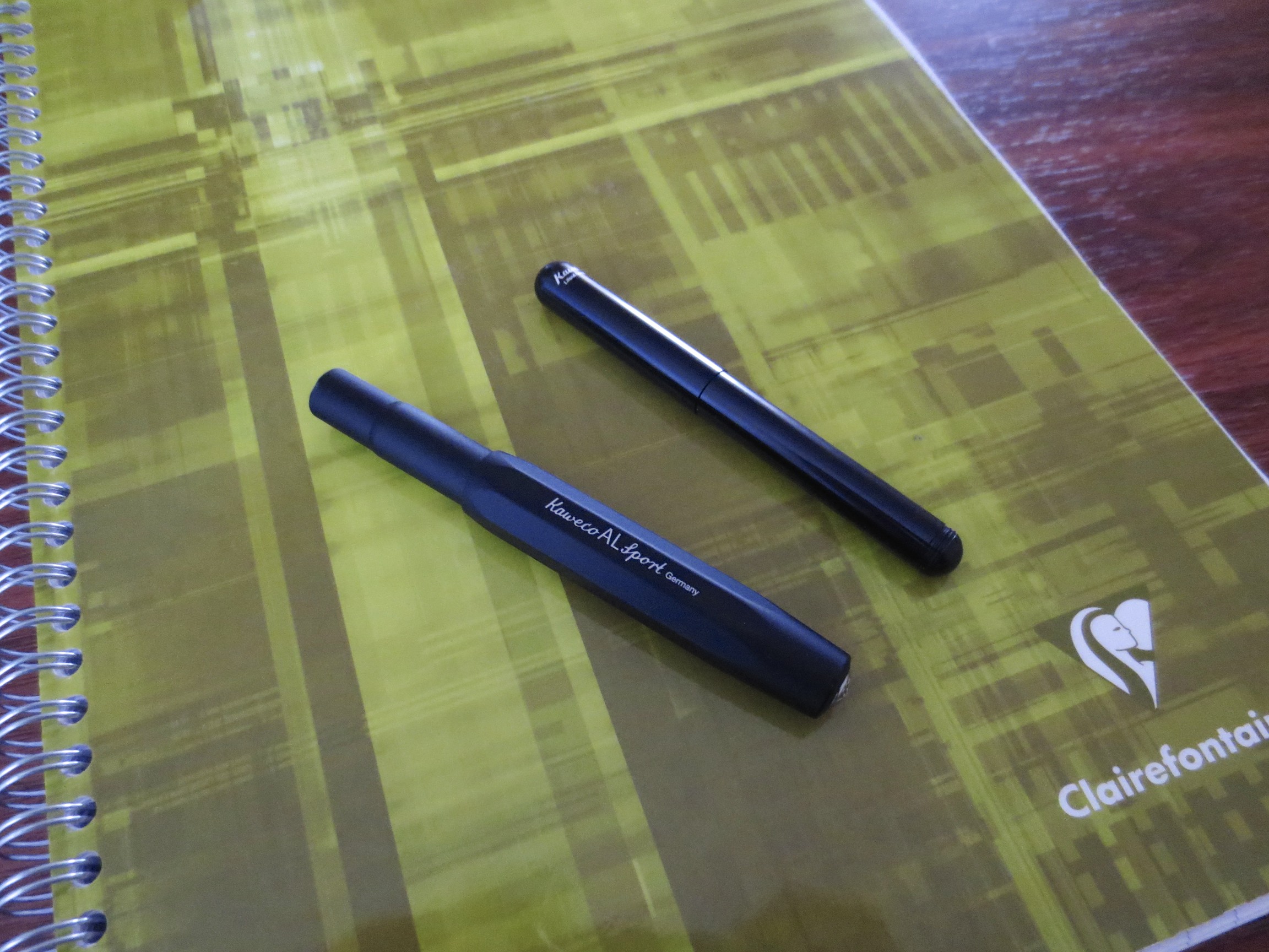
When I got home last weekend, I switched up the pen and ink rotation.  I've been using these since, and will probably use most of them for another week or two before I get the itch to update. 

Pens from left:  (1) Omas Ogiva in Saft Green with Masuyama-ground medium nib, loaded with Iroshizuku Kon Peki (2) Nakaya portable writer with medium nib, loaded with Montblanc Alfred Hitchcock; (3) Lamy 2000 with Greg Minuskin retipped .9mm stub nib, loaded with Akkerman Voorhout Violet; (4) Parker Sonnet Cisele with Fine Nib, loaded with Aurora Black; and (5) Waterman Phileas with Medium Nib, loaded with Iroshizuku Yama Budo.

Of this loadout, my favorite combos have been the Parker Sonnet with the Aurora Black (a classic pairing, IMHO), and the Nakaya with the Montblanc Hitchcock (the only ink I've hoarded).  I haven't spent a lot of time with the Omas yet, but that's primarily due to the fact that it's a wet writer and most of my work this week has been done on cheapo paper that feathers and bleeds like crazy.  I'm also really starting to love the Phileas, which I recently received in a trade.  Finally, Greg Minuskin did some masterful work retipping this Lamy 2000, which had been ruined by nib work so bad that even Mike Masuyama couldn't salvage it.  Reviews of all will be up at some point.  Enjoy the weekend everyone!  

Pen Review: Kaweco Liliput

The Liliput is one of those pens that doesn't get as much attention as its slightly larger pocket pen brethren, the Kaweco Sport Series.  I understand why--the pen is very small, and is a "pocket pen" in the truest sense of the word.  While the Sport and the AL Sport both post in a way that makes them almost full size, the Liliput remains, well, liliputian.  This pen probably appeals to a smaller group of users than the rest of Kaweco's offerings:  those people who absolutely must carry a fountain pen with them everywhere they go.  

As you can see, the pen is small, but not so small as to render it unusable.  I like this pen a lot, and use it regularly as a pocket carry. 

The pen certainly is not so small as to render it unusable.  I use this pen a lot, particularly as a pocket carry when I'm out and about.  With the right ink, it's a good Field Notes/pocket notebook pen because it slides into your pocket easily and the EF nib that I have is not so wet that the ink bleeds through the page significantly.  I can still write on both sides.

Other reviewers have found the pen too light.  The version I have is the black aluminum version, and true, there isn't much weight to it.  BUT, Kaweco now offers a brass version available from Jetpens.com here in a new "Wave" styling.  Brad at the Pen Addict has reviewed this pen and likes it a lot.  (Link Here)  If you're concerned about the weight of the pen, and would like a pen with more heft, consider the brass version.

It goes without saying that this pen is cartridge-fill only.  The much-maligned Kaweco mini-converter might fit, but I would not recommend it.  Instead, pick up some cartridges of Kaweco's great ink, and refill those with a syringe.    

The Liliput is ultraportable.  See here compared to the Kaweco AL Sport.

If I had to choose one "negative" to discuss, I would raise an issue with the nib that I chose.  The tines of my EF nib are cut unevenly, which you can see in the picture below.  This causes the pen to write with slightly more tooth than I would otherwise prefer and to dig into the paper if I catch a wrong angle.  I've not seen the same issue with the Kaweco Medium I own, or the fine or broad nibs that I've tried.  In the future on Kaweco pens, I would probably stick to the absolute basics (F,M,B).    

Overall, the verdict on this pen is positive.  For a pocket pen, It's a definite "recommend," but it's important to keep the "pocket pen" part in mind.  This pen was not designed to take 20 pages of longhand notes in a sitting or write a novel.  I'm glad to have it as part of my Kaweco collection.  

The nib slit looks unevenly cut on this pen.  I'll probably purchase a new nib eventually, and switch to the smoother writing fine or medium.  Kaweco nibs are interchangeable, at least for the Sport and Liliput models. 

Scan of handwritten review in Kaweco Ruby Red, and ink I've grown to love but a discussion of which is outside the scope of this review.

Scan of handwritten review in Kaweco Ruby Red, and ink I've grown to love but a discussion of which is outside the scope of this review.

PUBLIC SERVICE ANNOUNCEMENT:  To all of those who participated in my giveaway last week, check the comments of that post to see if you've won!  I've only heard from two of my four winners and if I don't hear from the other two by Sunday I'm going to have to pick two new ones. 

Ink Review: Pelikan Edelstein Turmaline (2012 Ink of the Year)

I'm back.  And after taking a bit of time to sort through my ink sample drawer (after reading this scary FPN post), I decided to ink up a few samples for review.  (This one ended up being for review only, because it turns out it was not a fave.)  The ink in question is Pelikan Edelstein Turmaline, which is Pelikan's 2012 "Ink of the Year" for their Edelstein line, which, to my knowledge, means that the ink is produced for one year only and then it goes out of production.  They must produce a ton of ink during that one year, however, because both Turmaline and Amber (the 2013 Ink of the Year) are still in stock at retailers like Anderson Pens (links here and here).

In truth, I have not tried many of the Edelstein Inks.  I hear great things about the Topaz and Tanzanite colors, and mixed reviews on the others.  For one thing, the ink is somewhat expensive at approximately $23 for 50ml, although this price point is sadly becoming more the rule than the exception (Thanks Sailor!).  Another issue I have is that the ink is fairly dry, a characteristic of Pelikan ink in general.  I write with a lot of extra fine nibs and stubs, and I prefer a relatively wet writing pen, so drier inks are not as enjoyable to me as others because they tend to be scratchy.  That said, I used a Waterman medium nib here, and Edelstein Turmaline had fairly good flow and dried very quickly on the page (about 3 seconds).  So why was this ink not a winner for me?

Two reasons:  (1) the color; and (2) the twenty minutes it took me to flush this ink out of my pen.  With regard to the color:  I would characterize this ink as a fuschia.  Some call it pink, but to my eyes it has a slight purple tinge to it, although it is very bright (almost neon).  Compare with Iroshizuku Yama-Budo below.  I much prefer the Yama-Budo, which I think has greater depth and is a much richer color, without sacrificing any positive attributes such as good dry time, etc.  With regard to cleaning, I used this pen in my new (review forthcoming) Waterman Phileas, and it took approximately 15 flushes with a bulb syringe (three with J.B.'s perfect pen flush) to get the water to stop running pink.  I actually filled the pen with Yama Budo afterwards because I was tired of trying to clean this ink out and the Yama Budo would mask any residual pink.  Anyway, some may love this color, and I wouldn't rule out Edelstein Ink in the future, but it's not for me.

I didn't notice until I posted this picture that when you view these two inks side by side, the Yama-Budo appears much more crimson.  I think this highlights how much "pinker" the Turmaline is. 

Vacation Planning

And so, when it comes to deciding what pens and paper to take on my upcoming weeklong vacation, I--as do all pen enthusiasts--face some difficult choices.  Fountain pens or non-fountain pens?  Bottled ink or cartridges?  Unfortunately, this may turn into a "working vacation," so I can't exactly go penless.  Paper will most likely be Field Notes.  As I mentioned earlier, I'm on the cusp of finishing my last Doane Utility Journal, which will happen before I leave on my trip, so I've got my Shelterwood and a fresh Field Notes Kraft edition ready to go.  So what else to take?  Since this is a road trip, there's no need to worry about the "airplane" factor. 

Sailor Pro Gear Imperial Black Edition with Sailor Kiwa Guro Nano Black Ink

Kiwa Guro and Pro Gear Imperial Black:  This pen and ink combo were made for each other, IMHO. 

Probably my all-time favorite pen and ink combination for pocket notebooks and Moleskines.  As Brad on the Pen Addict noted during his most recent podcast, which I was listening to driving home last night, Sailor's Nano-Black ink is incredibly dark and well-behaved, keeping a very clean line.  It is a pigmented ink, meaning that it contains superfine particles of pigment that theoretically could cause a clog, if you don't practice good pen hygiene.  Personally, I have never had a problem with this ink, except for possibly having a minor stroke when I got to the register and realized what it cost.  At close to $30 a bottle, it had better be good, but two years later I'm glad I made the investment.  Because the pigment sits on the paper and dries quickly, there is no feathering or bleedthrough on Field Notes or any other pocket notebook I have tried.  The only paper I could remotely get this ink to bleed on was a cheap Tops yellow legal pad, which frankly was useless with anything other than a pencil. 

So, for a one-week trip where I can bring one or two pens that I'm sure will write on basically anything, this combination makes the cut. 

Other Possibilities

Kaweco Sport with Kaweco Green Ink:  I've had this pen inked up for a week or so but have not had a chance to use it much.  I typically use my Kawecos when I'm on the road, so I'll probably take this one with me.

Karas Kustoms Render K:  As Ed Jelley observed, another great Field Notes pen.

This has turned into kind of a random post, but I'm excited to go on vacation, so there.  What are your favorite travel combos?

Note:  Because I will be on vacation starting this Friday, and I have no idea what my internet situation will be, posting may be spotty.  I intend to keep to my regular schedule if at all possible. 


Shelterwood

Due to the large number of Field Notes Shelterwood reviews that have been out there recently, I was hesitant to add yet another, but I found myself using my first book for a project this weekend and was inspired.  I also realize that this is my first Field Notes post since my review of the original Kraft Paper version, which was not my intention.

Field Notes Shelterwood, the Spring 2014 Colors Edition. 

Most of the attention given to this edition has to do with the cover:  It's cherry wood veneer grafted onto Field Notes standard Kraft Paper stock and left unfinished.  What you have is a notebook cover that looks like it is solid wood.  When I received the single pack I ordered in the mail (I'm not a subscriber and probably won't be until I run through at least some of the huge backlog of pocket notebooks I have lying around here), all I could do was marvel at the feat of arts and sciences (!!!!!!) that it must have taken to put this thing together.  While the notebook looks like it's solid wood, I was struck by how supple the cover still feels.  Many people comment about how they feel they can't use this as a typical pocket notebook, reserved primarily for more formal, desktop writing,  but at first glance I'm not sure I agree.  I'm going to give it a try using it as I would typically use another Field Notes.  [Caveat:  my impressions may change as I use this notebook.  If the cover starts to splinter, fray or wear in a way that would prevent this notebook from living out its intended 3 week to one-month lifespan of daily pocket use, I could see myself shifting it to less "extreme" applications.  However, I'm not the typical back-pocket user--I have to wear a suit or jacket most days so I carry mine either in my jacket, shirt or side pocket, which limits the wear they suffer.] 

The wood grain on this particular notebook is gorgeous.  The printing on the cover (in "ghost white") ink, looks like whitewash you would see on a wooden fence. 

The paper in this notebook almost warrants its own review.  I'm typically not one to geek out on specs such as paper weight, etc. so I won't do that here.  My primary concern is whether or not I can use it for the vast majority of intended purposes.  Since this is a lined notebook, the question becomes, can i use it to write longhand with a fountain pen, as opposed to jotting quick notes with a gel pen or pencil?  The answer, here, is yes. 

The first page of a fresh Shelterwood (outlining Friday's blog post), written in Iroshizuku Tsuki-Yo with a wet Waterman Perspective sporting a fine nib.

Take a look at the page on the left, which is the flip side of the notebook's first page.  No bleed-through at all.  There is some minimal show-through, but not near enough to bother me, and this pen is a fairly wet writer.  

As most fountain pen users have said, I'd love to see this paper used in more Field Notes editions.  I have a single pack of the America The Beautiful edition as well, and I'll be cracking those open soon.  The one critique I have of this notebook (and it's a small one) is the ruling.  As you can see, I write fairly small.  I do wish that the ruling on the lined paper was narrower so that I could take better advantage of this paper and not use it up as quickly. 

Announcement!  This blog is now taking up enough of my time that it warrants its own pocket notebook for projects/ideas, so the Shelterwood has been given the task.  I'll update this review or revisit the project as the notebook gets more use and some more wear.  I'm also on the cusp of finishing the third notebook of a Doane Paper Utility Journal 3-pack, and after that I've got the third book of a Field Notes Drink Local Ales 3-pack, so there should be some more pocket notebook reviews coming your way.  In short, I really like both the Doane and the Drink Locals, but I'm leaning towards sticking with Field Notes just because they have more character, IMHO.  I can get my Doane fix with the larger Idea Journals and the writing pads.