Double Ink Review: Sailor Jentle Miruai and Nioi-Sumire

Today I'm going to try something new:  In an effort to get these new Sailor Inks reviewed and posted ASAP, I'm going to review them two at a time.  Generally, I keep about six fountain pens inked up at any given time, but carry two with me on any given day.  One is filled with a dark ink for notes, signing documents, etc.  The other is filled with a brighter ink that I use for marking stuff up, and is typically a red, orange or purple.  The past two days I've been using this pair.  Miruai is a deep blue/green-black ink, and apparently translates as "Seaweed."  Nioi-Sumire is a bright blue-violet ("Sweet Violet"), but to me leans more towards the blue end of the spectrum.  I think both are gorgeous.  Thank you Anderson Pens!

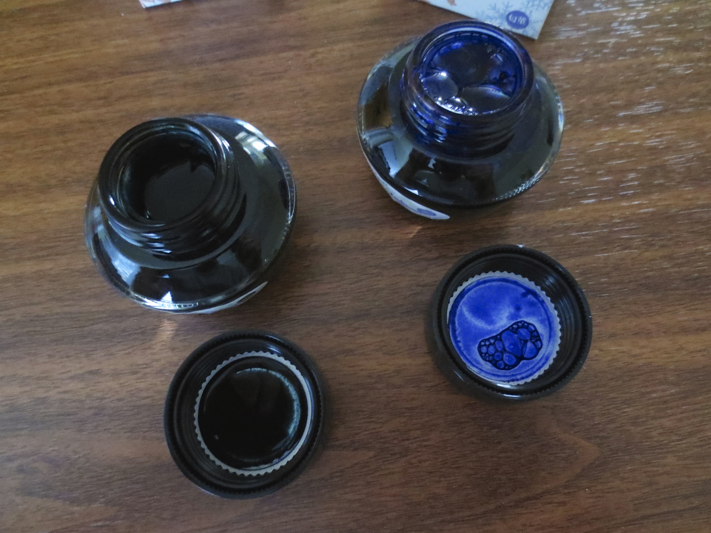
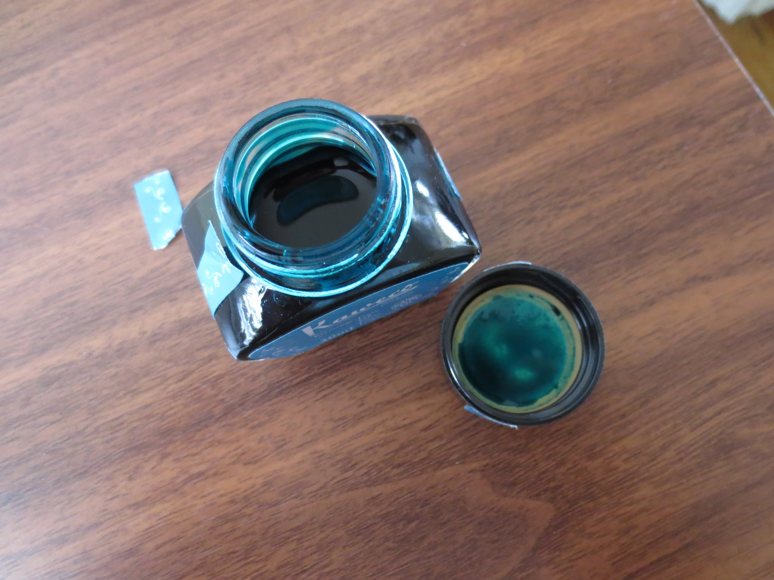
Sailor kept the same bottle with the internal inkwell.  I personally like the Sailor bottle, although some complain that the inkwell makes it difficult to flil pens with larger nibs.

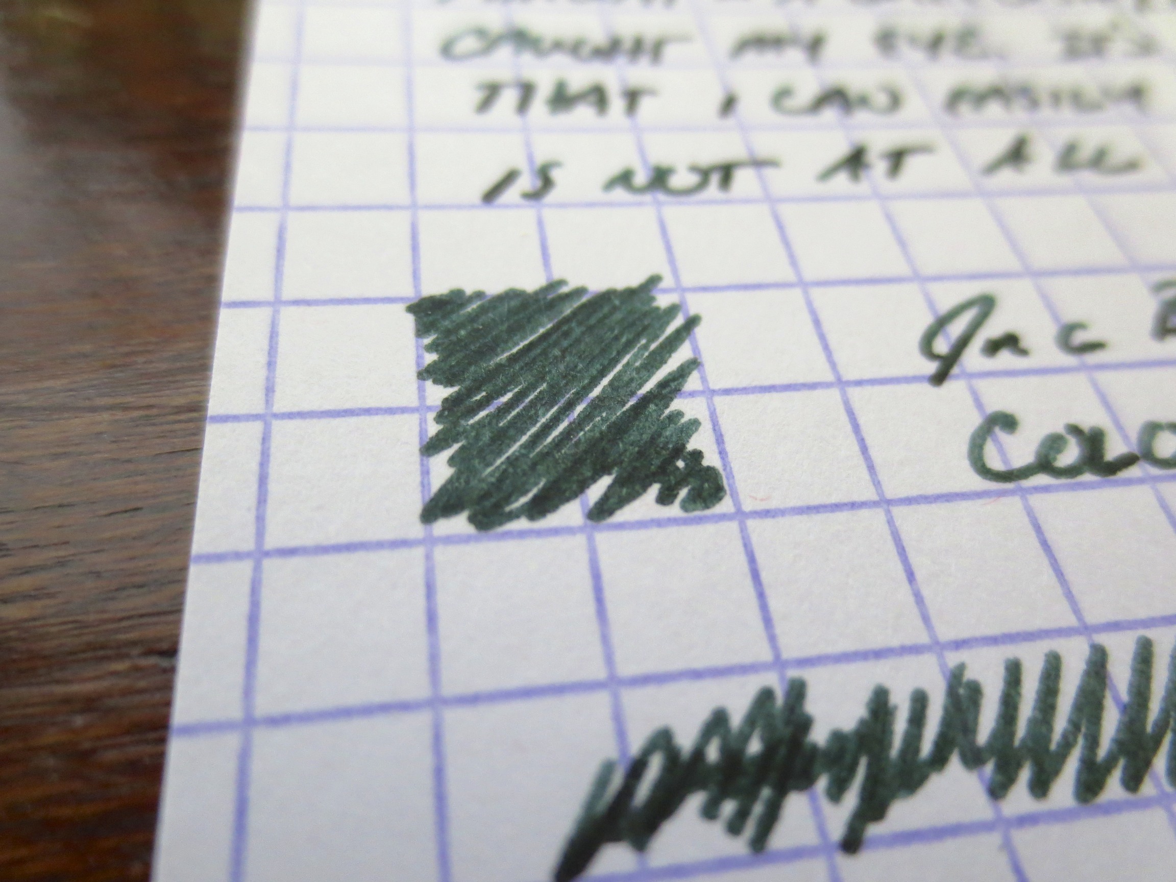
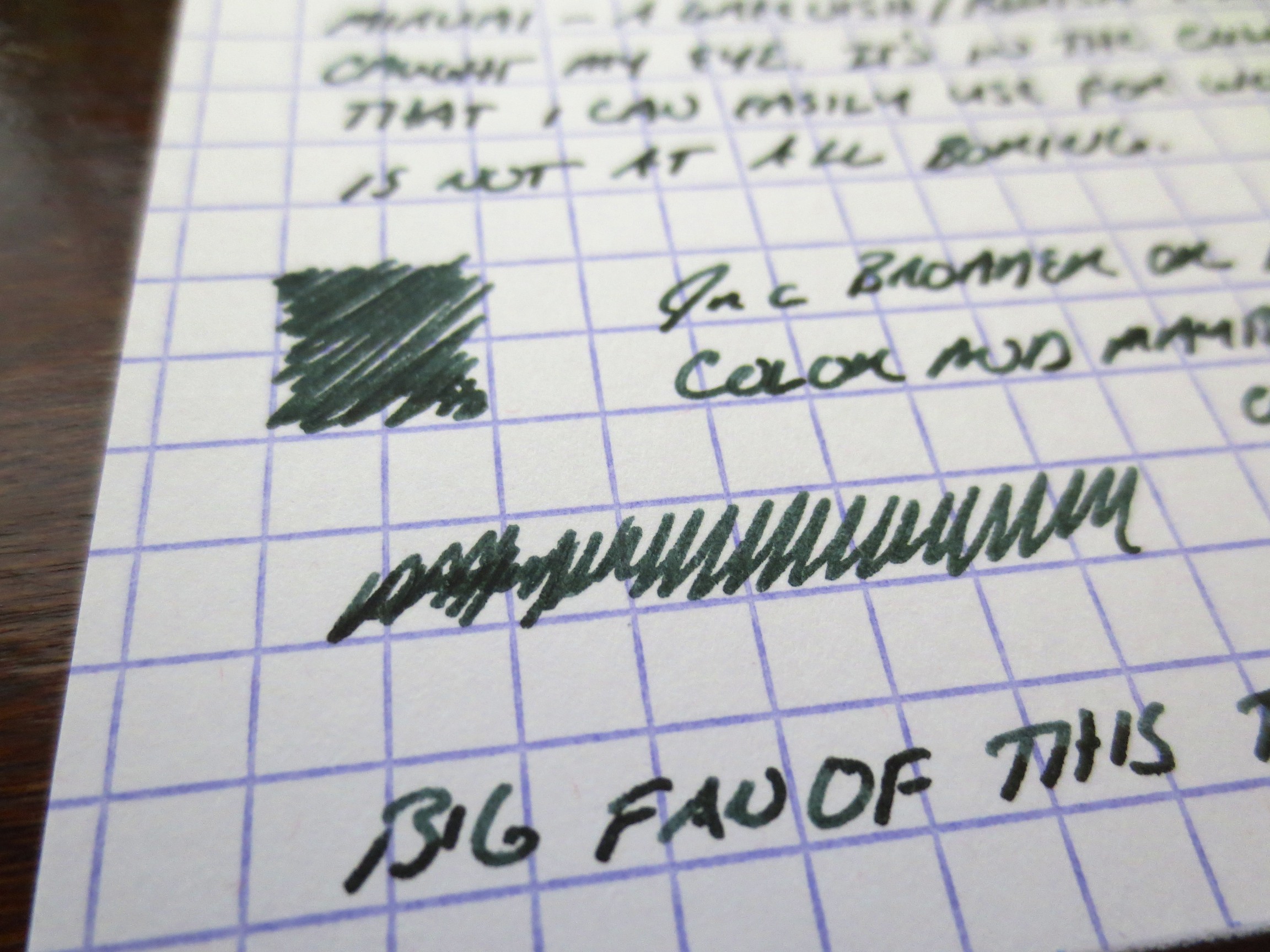
This gives you an idea of how dark Miruai is.  The ink is probably a bit blacker than Epinard, but I have not done a side-by-side comparison.  Miruai has more blue in the color. 

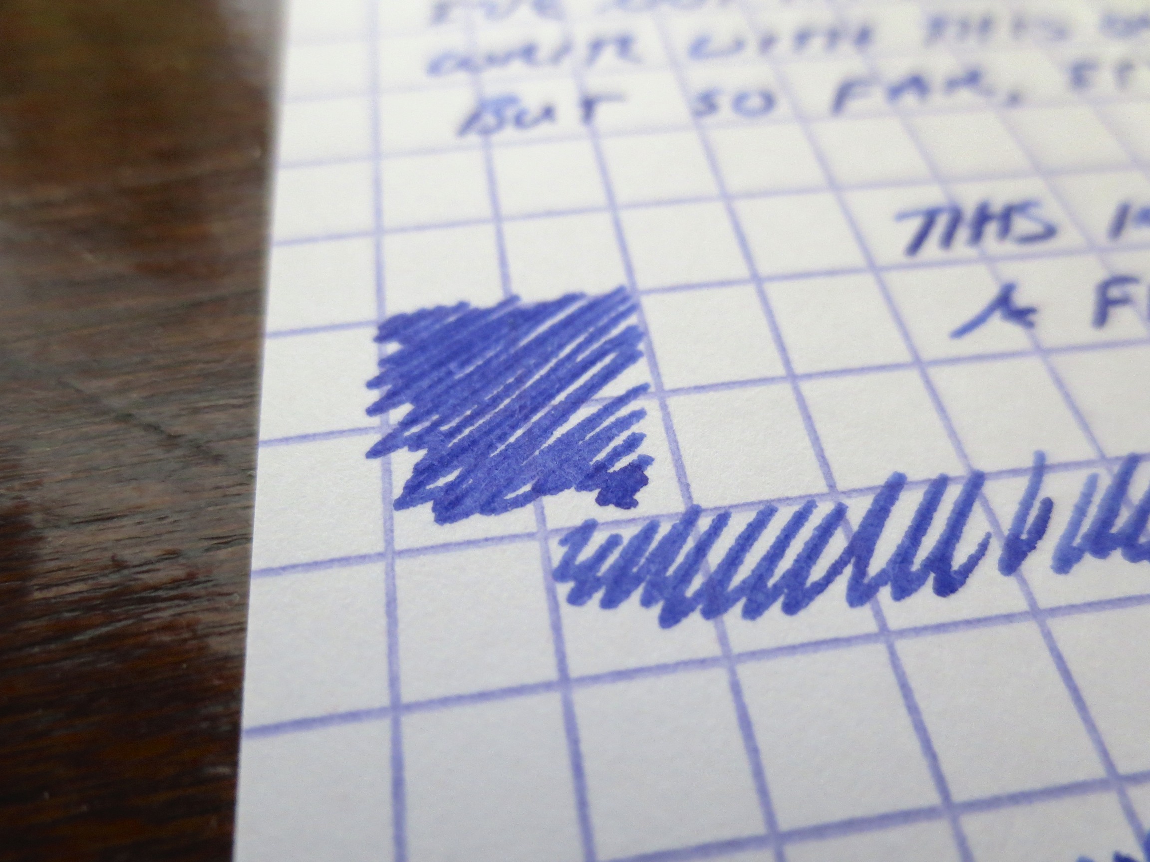
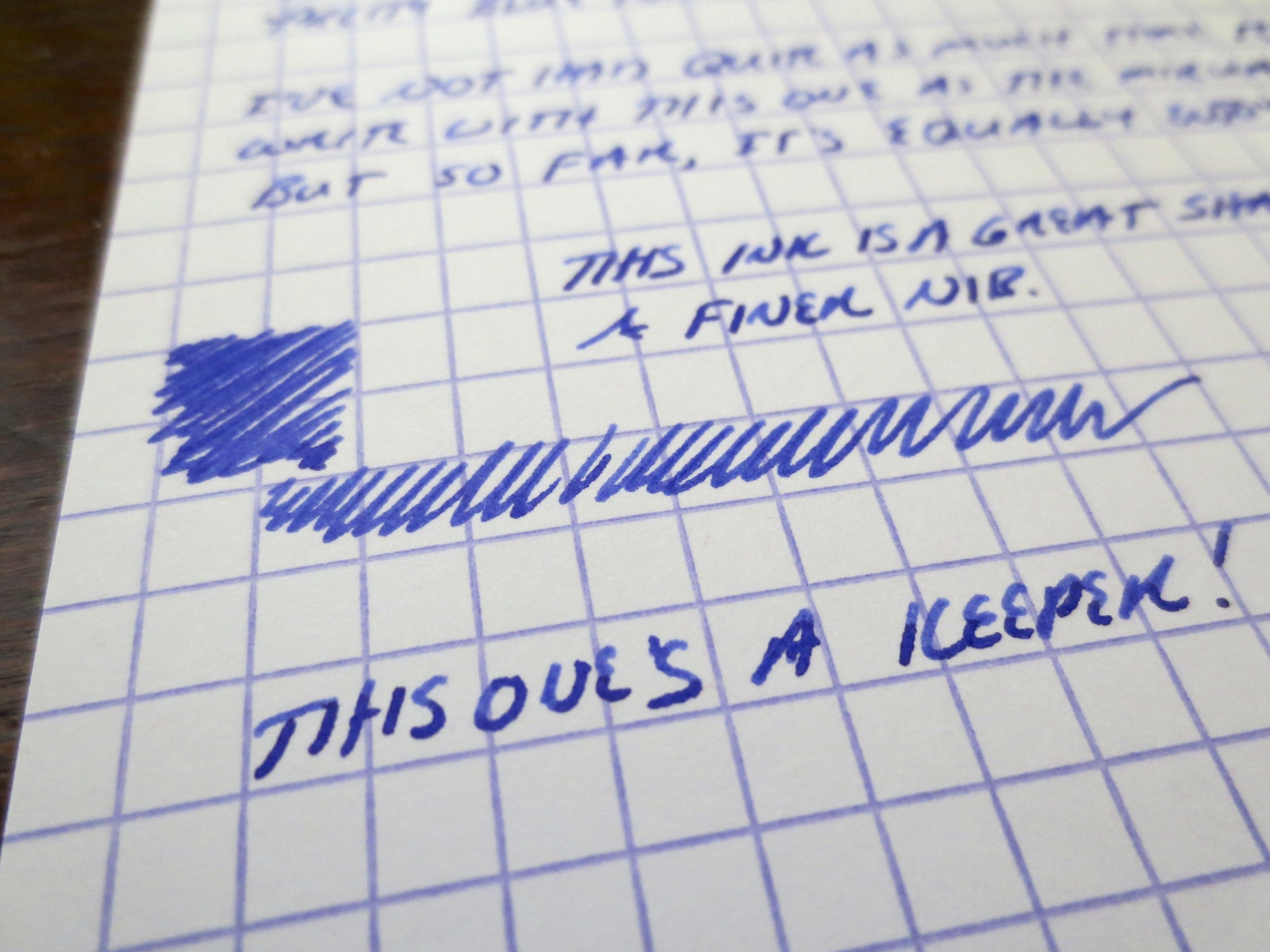
Nioi-Sumire, to me at least, is far more blue than purple.  If you are looking for a very purple ink, try Shigure (review forthcoming). 

I've enjoyed working with both of these inks.  They share the same great properties with the rest of Sailor's Jentle line.  As you may have heard, Sailor discontinued its "regular" line of inks earlier this year, and resurrected several "limited edition" inks from 2010 to replace them.  Because of the somewhat unique range of colors and the fact that these inks were so well-behaved (meaning they clean easy, dry quickly, and don't crust up on nibs), people were up in arms.  Rest easy, folks.  While Apricot, Epinard, Sky High, etc. may be gone (at least until Sailor brings them back as "limited editions" at a higher price point, as some have speculated), we have an entirely new line of great colors to play with.

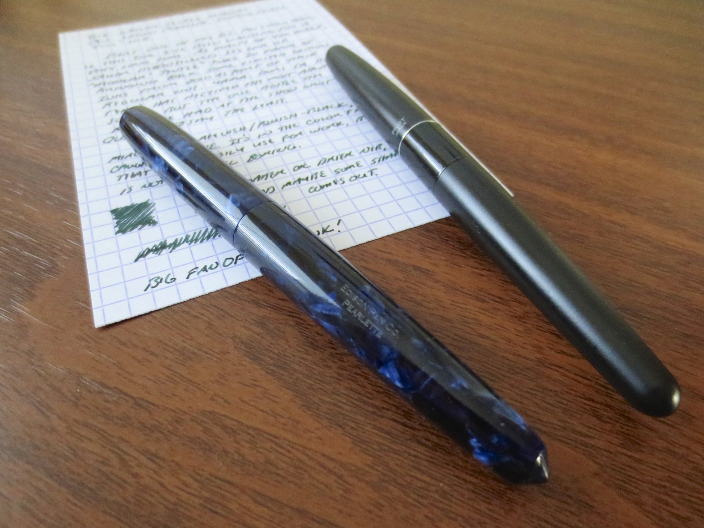
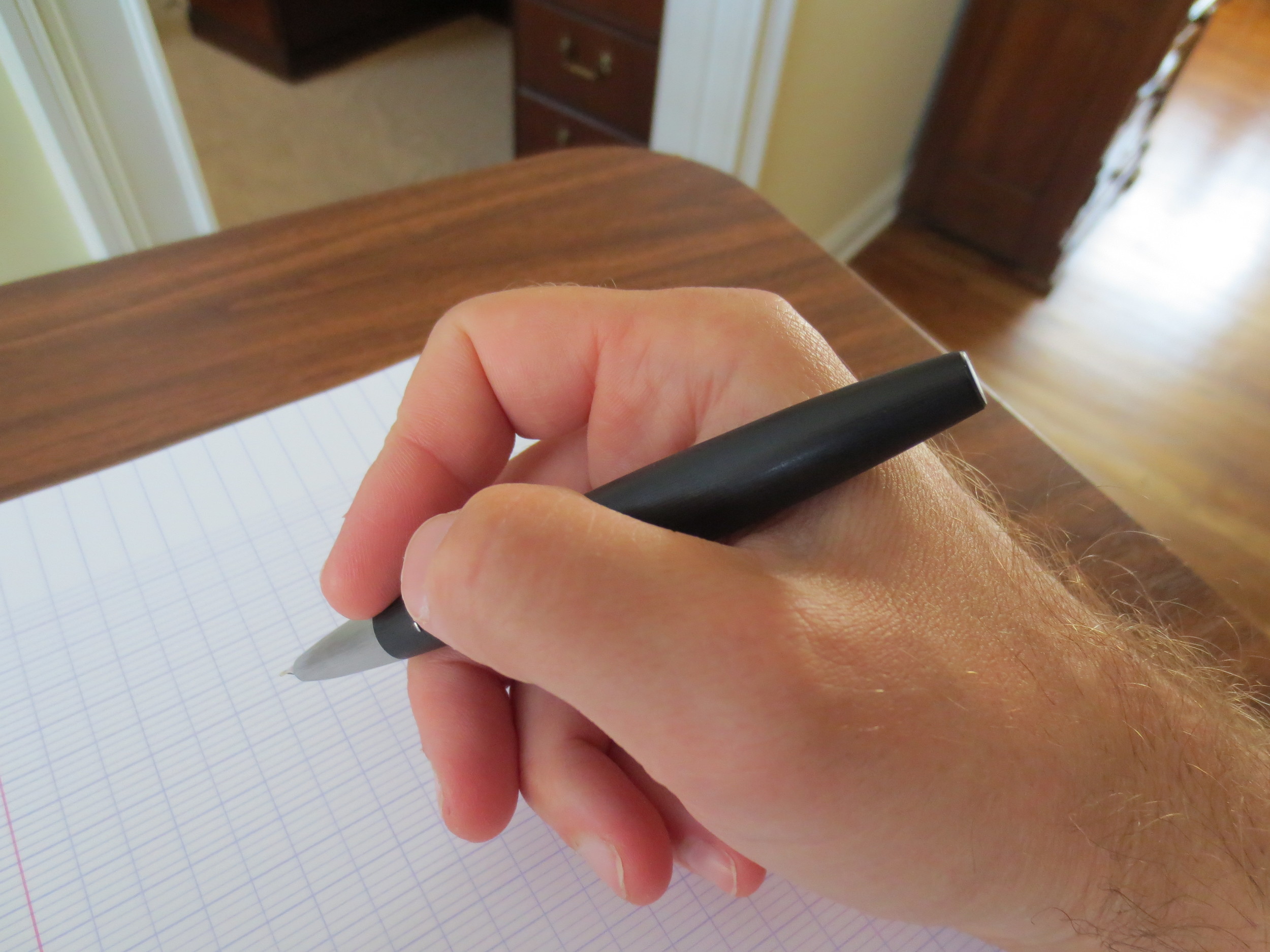
Both of these inks are moderately saturated, and a touch dry, but I had no flow issues with either.  I have the Nioi-Sumire in a Pilot Metropolitan with a medium nib, and the Miruai in a brand-spankin'-new Edison Pearlette in deep indigo flake acrylic (fine nib) which I absolutely love.  Card stock is Exacompta, and the scanner is a Doxie Flip.  Here are the results:

Scan of Nioi-Sumire.  This is a fairly accurate representation of what the color looks like when the ink is dry.  I've also included some photographs in the gallery below to show some of the shading. 

This scan captured the blue-green edge to the Miruai pretty well.  In a very fine nib, the ink can appear almost black.  In this Edison Pearlette "fine," which runs wider than the typical fine nib, you get some shading and a touch of sheen.

Supershow Wish List

Short post today, I'm getting ready for the DC Supershow!  Here's my 2014 "wish list":  

  1. Get pens tuned by Mike Masuyama (or, "run to his table as soon as I walk in the door and get on the list");
  2. Go to the Andersons' table and check out the new Sailor inks;
  3. Go to the Edison table and check out the Menlo pump filler;
  4. Visit Nibs.com's table and gawk over another Nakaya that I can't afford right now; and
  5. Meet as many people as possible.

I'm actually not going to this show with a very large budget, but then again I've got my collection more or less where I want it right now.  I did manage to sell or give away a large volume of ink that had fallen out of favor or just never struck my fancy, so if I take any chances and make any impulse buys it will probably be on ink.  Hope to see you there!  I will be monitoring my twitter feed on my phone, so if anyone is there and wants to say hello reach out to me @vintagegentlmn.  I'll take pictures and post a report upon my return!  


Kaweco Paradise Blue: A Different Kind of Turquoise

Thanks to JetPens for sending me this bottle of Kaweco Paradise Blue ink to review.  Of all of Kaweco's colors, this is the one that I probably have seen reviewed the least, though there are a few floating around out there.  I'll give my conclusions up front:  in my opinion, Kaweco makes some great inks.  I would go so far to say that they are some of the best I have tried recently, which include the Ruby Red, Midnight Blue, Palm Green, and now the Paradise Blue Colors. 

As good as the ink is, I do wish that Kaweco would increase the size of their bottle.  As of now, the ink is fairly pricey, at $19 for 30 ml of ink. 

Kaweco does not offer a super extensive range of colors.  Their options actually parallel those offered by Waterman (black, blue, red, green, purple, blue-black, brown, and turquoise).  Paradise Blue is intended as the turquoise offering in their line, and it's a great turquoise ink.  It actually has a bit more green in it than most turquoise inks on the market, which I think gives it a "truer" turquoise color, at least to my eyes.  I tested this ink in my Pilot Metropolitan with a medium nib, and experienced no problems.  Kaweco inks do run on the dry side, but I had no trouble with skips or hard starts.  There was no bleed-through or feathering on the cheapo office copy paper I have to use on a daily basis.

The Verdict.  If you don't mind paying a bit of a premium (which is becoming more the norm for imported inks these days), Kaweco Paradise Blue is a gorgeous color that shouldn't give you any trouble in any of your pens.  If this ink interests you, you can can find it offered at JetPens.com, who also offers the full Kaweco line.

This scan provides a fairly accurate representation of the ink's color.  I've provided some comparison to other similar colors in the gallery below.

Disclaimer:  This ink was provided to me by JetPens for review purposes, and I received the product free of charge.