• Blog
  • Shop
  • Resources
  • FAQ (Ask TGS)
  • About
  • Archive
  • Contact
  • Sign In My Account
Menu

The Gentleman Stationer

Vintage Living in the Modern World.
  • Blog
  • Shop
  • Resources
  • FAQ (Ask TGS)
  • About
  • Archive
  • Contact
  • Sign In My Account

Waterman Man 100 Patrician in its original box. 

Pen Review: Waterman Man 100 Patrician, a Neglected Workhorse

June 8, 2016

I have a soft spot in my heart for modern Waterman fountain pens, even though their line has become a bit stale since they were acquired by Newell-Rubbermaid in 2001, with fewer models introduced into the lineup.  To me, the pens that Waterman manufactured during the 1980s and the 1990s are excellent--I think of them as "vintage" in the sense that they aren't available anymore, but "modern" in that they use contemporary Waterman cartridges and converters. The term I use to describe pens like these is "near modern," and they are a fixture in my collection.  

History of Waterman Pens

The name "Waterman" has a storied history in the fountain pen world, with the lore (repeated on the Company website) being that Lewis Edson Waterman invented the modern fountain pen.  Others have recently cast doubt on this version of history, but the story still sticks. However, what many people don't know that the modern Waterman Pen Company is not the same company that made many of the classic Waterman pens from the 1930s and 1940s, but rather is a descendant of Jif-Waterman, the French subsidiary, which is now owned by Newell-Rubbermaid.  Waterman has an interesting timeline on their website that shows various events from the history of the French and American companies, including all the major pen models introduced over the years.  Of all these designs, the classic "Le Man 100" (known simply as the "Man 100" stateside), first introduced in 1982 for the company's 100th anniversary, is my favorite.  

Design and Build

The Waterman Man 100 is a large pen with a lot of heft, since the construction is lacquer over brass.  The lacquer is very thick--despite the years and heavy use (from me), the finish is still flawless. 

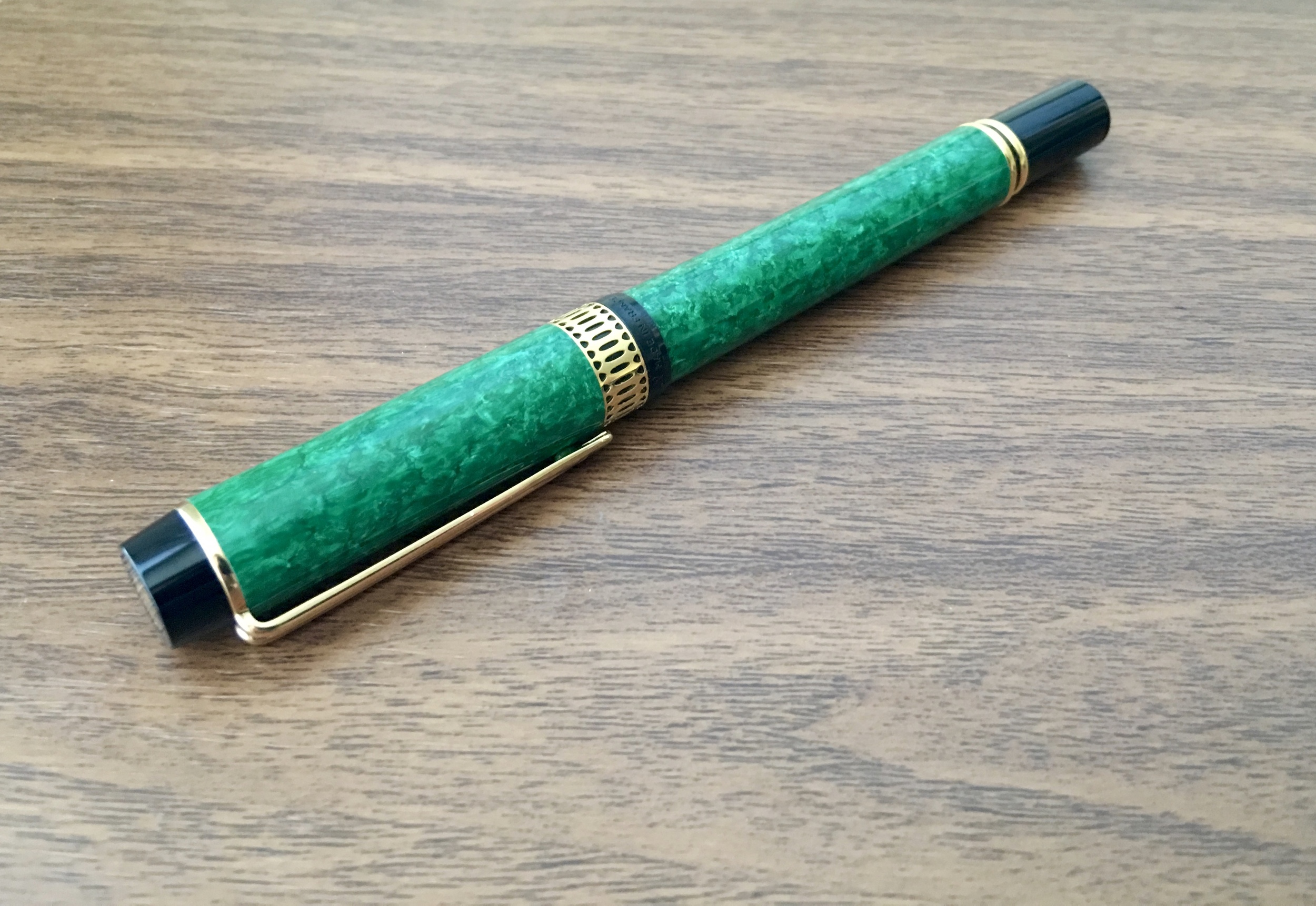
The Waterman Man 100, at first glance, resembles a larger version of the Laureate and other more modern Waterman pens.  It is solidly built using the typical Waterman lacquer-over-brass construction that gives the pen some weight.  The style is classic Waterman, with the traditional "Waterman clip" the French company has used since the 1960s and the large 18k "Ideal" nib (borrowed, of course, from the early days of the Waterman "Ideal" fountain pen). The Man 100 was introduced in 1982 and intended to serve as Waterman's flagship luxury pen, competing with Montblanc and Pelikan.  What makes this particular version unique, however, is the cap band. 

Note the stylized Waterman "W" logo on the finial and the cap band.  Also, the cap is friction fit, with the back of the pen tapered to allow the pen to post firmly and securely.  

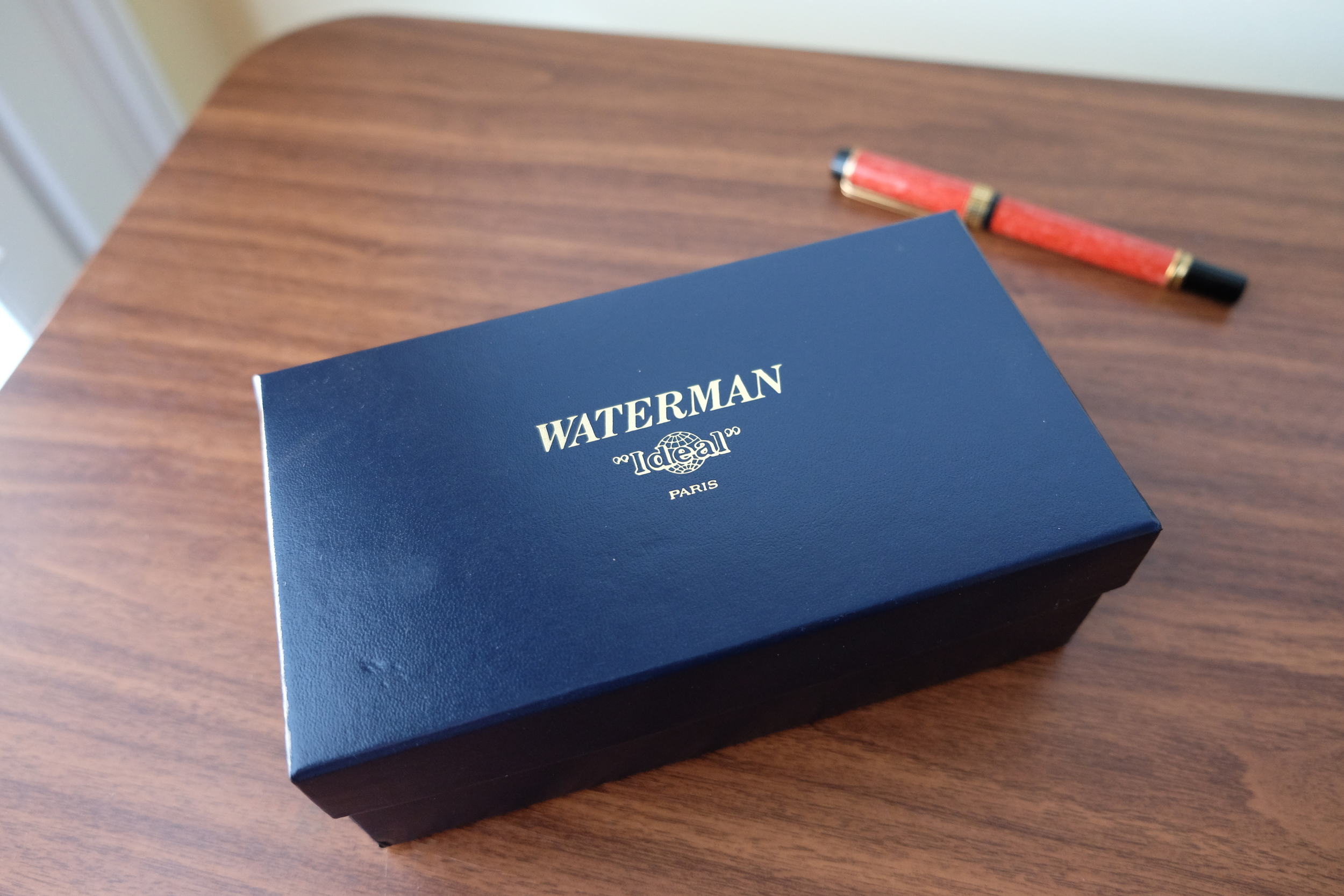
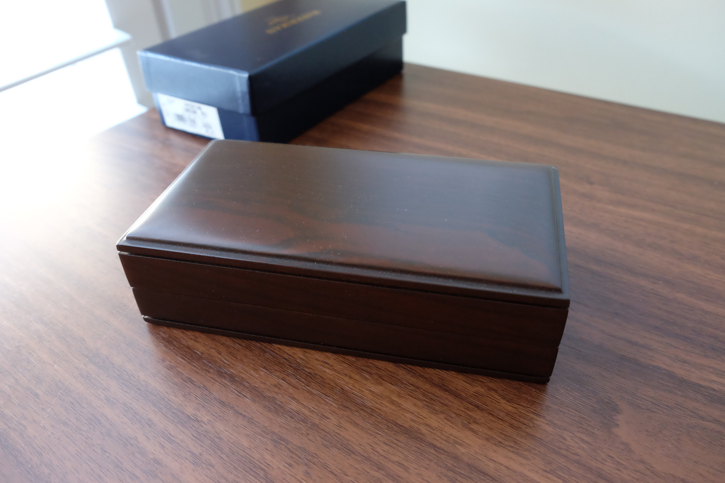
The band on this version of the Man 100 is modeled after the Waterman Patrician fountain pen from the 1920s and 1930s.  Waterman manufactured these "Patrician" Man 100s as special editions from 1992 to 1994.  If you shop around, they are starting to command what I consider to be extremely high prices.  I'm glad I bought when I did:  I love my two Man 100 Patricians, but I'm not sure that I'd be willing to pay what people are asking these days.   One thing I will say--if you can find these new-old-stock, the packaging on these older pens is gorgeous.  It comes with a nice wooden box.  The faux-leather on the inside is a bit worn, but hey, it's almost 25 years old. 
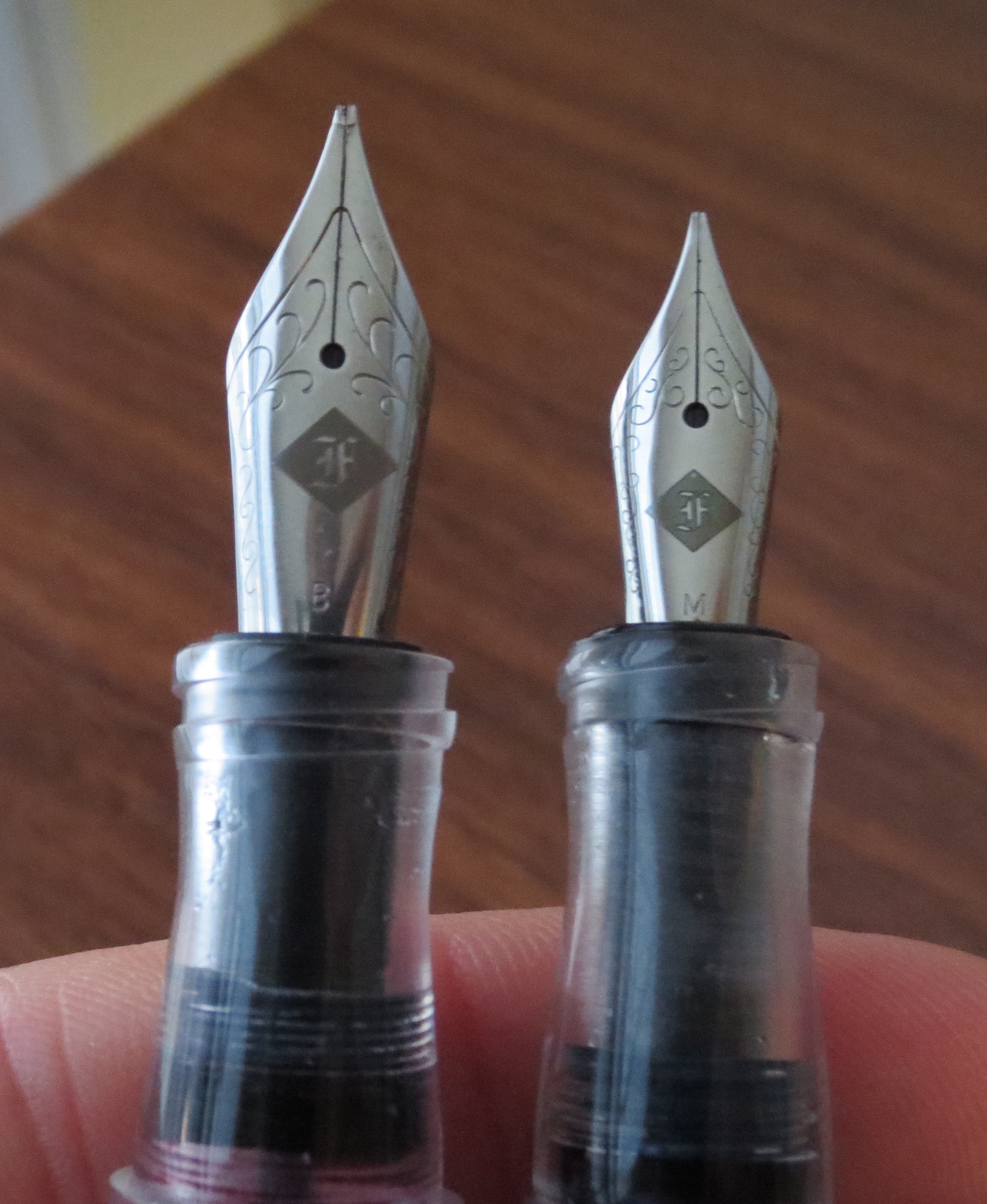
View fullsize Waterman Man 100 Box
View fullsize Man 100 Inner Wooden Box

The Nib

The Waterman Man 100 Ideal Nib.  

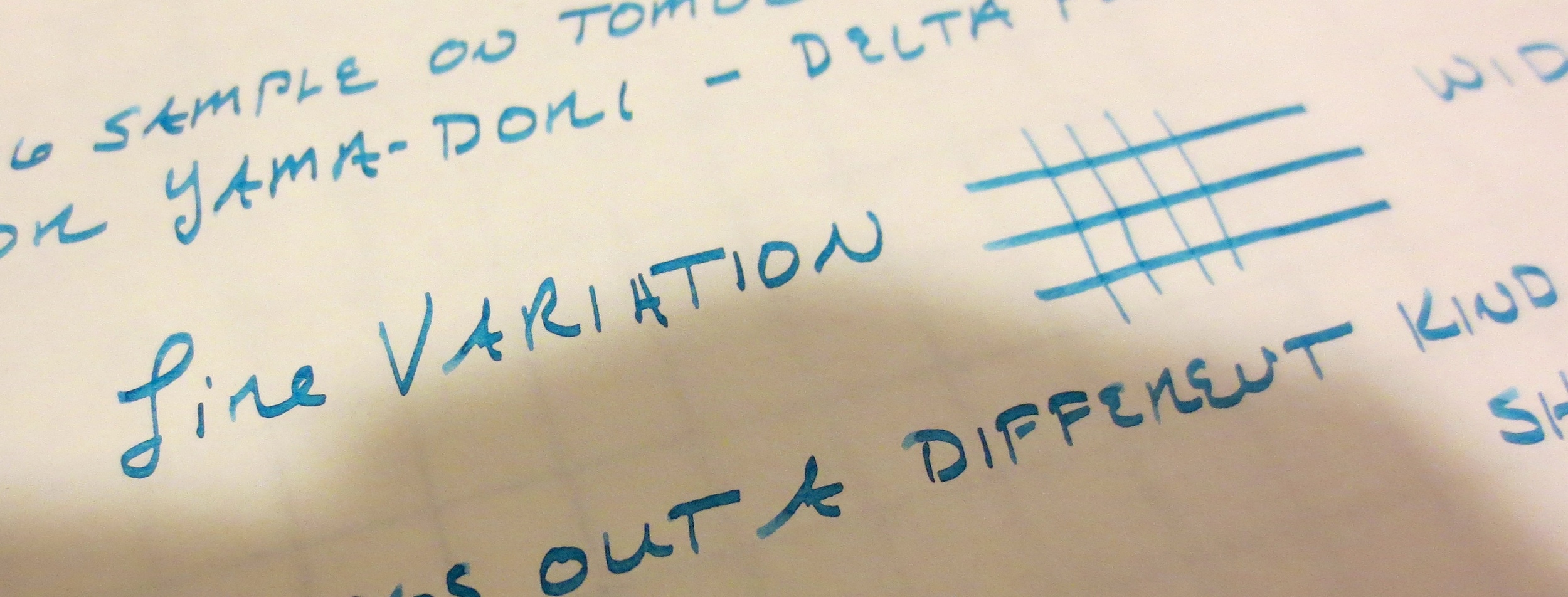
Now for the writing experience:  Waterman nibs are on the stiff side.  The stainless and gold-plated nibs are definitely nails, but the 18k gold nibs have the tiniest bit of spring to them--just enough to keep the writing interesting.  I have two of these pens:  a coral ("Cardinal Red") and a green.  Both of my pens have fine nibs and wrote adequately out of the box.  My coral pen was N.O.S., so the fine nib wrote like a dream.  My green pen was used, and the nib was slightly worn in (to someone else's writing style), so I had Mike Masuyama tweak it.  No big deal.  Both are now very nice daily workhorses.        

View fullsize Waterman Man 100 Writing Sample
View fullsize Waterman Man 100 in Green

Further Reading (and Shopping): 

I use my Waterman pens a fair bit, but I haven't written much about them, probably because I'm just as liable as the next person to get caught up in the latest "craze" to the detriment of my workhorse pens.  A while back I did write a piece for Maybelline over at her blog On Fountain Pens discussing my first "nice" pen, the Waterman Laureate.   

As I mentioned, the Patrician models of the Man 100 pens are becoming difficult to find. Occasionally, they come up on Gary Lehrer's GoPens newsletter, which is where I purchased mine.  I'm still looking to acquire the blue version to complete my collection.  If anyone has one they are looking to unload, please reach out!   

Waterman pens from the Company's current lineup can be purchased from our sponsors Pen Boutique and Pen Chalet.  Waterman also sells a lot through larger retail channels like Staples and Amazon.  You can occasionally find Waterman pens in big-box office supply stores, if they still have a "fine writing" section.

The pens featured in this review were purchased with my own funds for my own collection.  I was not compensated for this review.  

DISCLAIMER:  This post contains affiliate links, through which I may be compensated a small amount if you purchase a pen from certain sites linked to in this article.  While I'd greatly appreciate it if you use these links to purchase something you are interested in, you are, of course, under no obligation to do so.  Many thanks! 

In Pens, Vintage Pens Tags Waterman, Vintage, Near Modern
3 Comments
The year is half full, not half empty.  Plenty of time left for more stationery purchases!   

The year is half full, not half empty.  Plenty of time left for more stationery purchases!   

An Almost Mid-Year Review (and a Sneak Peak at the Rest of 2016)

June 1, 2016

I've been really happy with how things have gone on the blog this year.  For the most part, my readership and traffic have grown slowly but steadily, which suits me just fine.  Being on vacation for a week has given me a chance to--what else--go back through my posts and pick out a handful of favorites. Even though it's not quite mid-year, I've got a quiet morning and lots of coffee, so why not get an early start recapping the first part of 2016?  

  1. My Top Three Favorite Pen Brands.  Without a doubt, my favorite post that I've done this year, and probably one of my top five of all time.  Narrowing the pens that I like down to three major brands has also cut down on the number of impulse purchases I've been making (at least with regards to more expensive pens) and my pens are starting to resemble an actual collection rather than just a random accumulation of shiny things that I've snatched up.
  2. Controversial Changes in the Pen Community.  Another post I enjoyed writing, that generated much discussion in the form of tweets, comments, and Facebook posts.  Many people agreed with me, and some (strongly) disagreed with me, but the point was to provoke a conversation that I felt needed to be had.
  3. 2016 Atlanta Pen Show Recap.  Probably my best pen show experience to date.  If you missed it, you can check out my two-part recap here:  Thursday/Friday, Saturday. 
  4. Pen Show Primer Series.  I've made an effort to create more searchable resources that are helpful to people just entering this hobby (or people who are looking to "go deeper").  Volume I: Why Visit a Pen Show, Volume II: Getting Ready for a Pen Show, and Volume III: Tips for Surviving the Pen Show.  
  5. Delta Dolcevita Soirée Review.  It wasn't until I wrote this review, and started thinking about why I liked it so much, that Delta really solidified its place among my top three favorite pen brands.  Look for more Delta reviews this year.  

Favorite Stationery Purchases of 2016

Some of these products I've reviewed on the blog, and some of these are still works in progress since I haven't had this stuff for long, but these are things that have stuck with me for more than a few weeks, which typically is a good indicator of whether or not I'll use the product long-term. 

  1. The Hobonichi Techo.  Not quite a notebook, not quite a journal.  Whatever you choose to use it for, it makes me want to write in it daily.  I recently wrote up my first impressions here. 
  2. The TWSBI Eco.  Ever since I picked up TWSBI's low-price-point offering, the ECO, it's been a fixture in my rotation.  This pen posts fairly well (unlike most of their other large pens), and is a comfortable, reliable writer.  
  3. The Pilot Custom 823.  I won't spoil my thoughts on this one too much, since my review is still in progress, but this pen is going to be in my EDC rotation for a long, long time.   It's also a favorite of Neil Gaiman, so I'm in good company here. 
  4. The Pilot Custom Heritage 92 Demonstrator.  As I said in my review, this pen's crazy overpriced in the States, and the color demonstrators are Japan-only, but it's a relatively inexpensive, high-quality import. 
  5. Pelikan M800 in Burnt Orange.  Some people have tagged this pen as Pelikan's effort to "knock-off" the Montblanc Hemingway, but this pen has its own charm.  For one thing, the color is slightly different, and these pens with the "burnt orange" color schemes were all designed as homages to the reddish-orange hard rubber pens from the 1920s, like the classic Parker "Big Red" Duofold. I love writing with this pen, and the .4mm Masuyama cursive italic nib is sweet.  These are getting scarce, I believe, so if you see one, act now.    

Looking Forward to the Rest of 2016: Vacation Semi-Impulse Purchases

As I alluded to yesterday on Twitter, I went a little nuts.  Not that any of this was crazy expensive (at least standing alone), but there's a backlog of products I've been itching to try. Among other things, I picked up: 

  1. Some more KWZ inks from Vanness Pens.  KWZ has all sorts of offbeat colors, including Honey and Brown Pink.  I also ordered two additional colors of Callifolio, Olivastre and Adrinople. 
  2. Pocket notebooks and accessories from Write Notepads.  I'm ashamed that I've waited this long to try these out. 
  3. A Seven Seas Writer, Life, and Midori notebooks from Nanami Paper. 
  4. A Dark Lilac Safari and a bottle of the Dark Lilac ink from Goldspot.  (Currently sold out at Goldspot, but as of the time of writing it looks like Goulet Pens still has some in stock.) 

In other words, I'm restocked for the second half of the year, and looking forward to the rest of 2016! 

In Editorial Tags 2016 Recap, Retrospective
Comment

Mike Masuyama and his nib customization setup at the 2016 Atlanta Pen Show. 

An Introduction to Nib Customization

May 29, 2016

I've wanted to write a piece about custom nibs for a while.  As the "pen world" explodes in popularity (well, at least relatively speaking), more and more people are discovering the world of nib customization.  And at the same time, more people who have been tuning and grinding their own nibs at home have begun to transition their hobby into a small business.  Only a few years ago, There were but a handful of reliable people who performed nib modifications.  (Mike Masuyama, Richard Binder, and John Mottishaw, to name a few.) Today, there are even more, including Mark Bacas, Tim Girdler, Linda Kennedy, Dan Smith, and Shawn Newton.  There's enough demand to support multiple people plying their trade, and I know of several individuals experimenting at home who may "go public" in the future. 

What exactly is a custom nib? 

The majority of fountain pen manufacturers offer nibs in four standard sizes: extra-fine, fine, medium, and broad. These "factory" nibs have round tipping material and produce a uniform line of writing that has little variation, meaning that the pen writes with a consistent line width in all directions. While it's become increasingly common for manufacturers to offer stub nibs (discussed further below) in 1.1mm and 1.5mm widths as part of their standard line, and certain manufacturers offer double or triple-broads, ultra-extra fines, obliques, crisp italics, and other specialty nibs.  But even these are not truly "custom".  

As I consider it, true nib "customization" involves sitting down at a table with the nib technician (or "nibmeister", as some might call them, though I prefer "nib technician" and will use that term here for simplicity's sake), having him or her watch you write, and adjusting the nib specifically to your writing style, accounting for various factors.  Of course, this process often involves a nib "grind," (i.e., changing the shape of the tipping material using a grinding stone, wheel, or a rotary tool) but it can also involve smoothing the nib on sandpaper and/or mylar sheets, increasing or decreasing ink flow to the writer's preference, resetting the nib and feed, or aligning the tines. When you walk away from an appointment with a nib technician, you should have a pen that writes perfectly for you and your writing style.  

That said, part of what I love about nib customization is the ability to get unique nib grinds. I'll briefly walk you through a few of my favorites: 

Cursive Italic.  A traditional "true italic" nib has little-to-no tipping material, is cut square across the tip, and has very sharp edges.  I've found sharp italic nibs very difficult to use for daily writing (as opposed to calligraphy) because the sharp edges snag the paper, and the lack of tipping material makes the nib prone to skipping unless the nib is held at exactly the proper writing angle.  A cursive italic nib captures most of the excellent line variation of an italic nib, but slightly rounded edges and a bit more tipping material makes it a better choice for daily writing.  The cursive italic has become one of my favorite nibs for use at work, in part because it's not as wet as a stub and therefore works better on cheaper grades of paper.  I have cursive italic nibs in various widths, ranging from .4mm (a fine) to 1.0mm (a broad).     

View fullsize Two Franklin-Christoph Nibs
View fullsize Franklin-Christoph Writing Sample

Stub. The stub nib is the most common "gateway" nib grind that people start with, in part because the difference between a stub nib and a standard round nib can be subtle. A stub nib is squared, like an italic, but generally has much more tipping material and the edges are even more rounded off than a cursive italic. The result is a nib that's very smooth to write with, but can be wet. For this reason, I find stubs hard to use on a daily basis at work because they bleed through the paper. 

View fullsize Lamy 2000 Stub Nib
View fullsize Lamy 2000 Stub Writing Sample

It may be helpful to think of Italics, Cursive Italics, and Stubs as steps in a progression, from "sharpest" to "smoothest" nibs, or from most to least line variation.  Italic nibs will have the most line variation, meaning that your horizontal cross-strokes will be much thinner than your down-strokes.  Cursive Italics will create almost as much line variation in your writing, but will be much easier to write with for most people due to the edges not catching the paper.  Stubs won't show as much line variation, but will also be noticeably smoother writers than both italics and cursive italics.   

Architect's Point/Hebrew Italic. Some traditionalists think the Architect's nib is "trendy" or a "fad" that will go the way of the dodo soon. I hope not. It's quickly becoming one of my favorite grinds.  An architect's nib is a stub or cursive italic "in reverse", meaning that it's ground to a wedge-shaped point.  As a result, your handwriting will have broad cross-strokes and narrow downstrokes.  The point is to mimic the script and writing style of architects and draftsmen.  I like this grind because it allows me to write fairly small while still giving my writing some personality.      

View fullsize Richard Binder Architect's Grind
View fullsize Architect's Grind Writing Sample

Needlepoint. A "needlepoint" is a nib that's been ground to a super-fine point. It's sometimes called a "Japanese extra fine" or "ultra extra fine".  I don't currently have any custom-ground needlepoint nibs in my collection, though I do have a Platinum Ultra-Extra fine stock nib that's been tuned by Mike Masuyama, and it's a favorite writer for note-taking and annotation. Needlepoint nibs are becoming increasingly popular.      

Gratuitous shot of me writing smaller than a penny with the Platinum Ultra-Extra Fine Nib.  I've not reviewed this pen, but I've done a "first impressions" Youtube review (linked below).

Where To Start with Nib Customization

My own adventures with custom nibs started at a pen show (the 2013 Ohio Pen Show, to be exact).  What I did - and what I recommend most people do - is start with a simple nib tuning.  You'd be shocked at how much difference these simple adjustments can make.  While most nib technicians accept work by mail, I've had the best results with in-person adjustments at pen shows.  Once you know what you like, and you've worked with a nib specialist a few times, then it's very easy to send work to them via mail.  If you can't get to a pen show, and have to send your pens off, nearly all nib technicians will work with you to get the pen writing exactly how you like it, though you may have to send it back and forth a time or two before it's "perfect".   

In terms of custom grinds, I started with stubs and then progressed to cursive italics.  As I mentioned above, the stub provides a gentle introduction to line variation, and once you get used to writing with a squared-off nib the cursive italic can really make your handwriting pop. But go slowly! Once you enter the world of custom nibs, it's tempting to get carried away and convert all of your old, "boring" nibs into stubs, needlepoints, etc., before you know what you like.   

I'll close by noting one option that's become increasingly popular:  Franklin-Christoph's Masuyama-ground JoWo nibs.  Franklin-Christoph has partnered with Mike Masuyama to offer a line of pre-ground stubs, cursive italics, and needlepoint nibs that can be fitted to pretty much any of the pens in their lineup for a slight upcharge, which is much less than the cost of having Mike grind a custom nib for you.  Granted, these nibs won't be ground or tuned specifically for you (unless you visit them at a pen show), but I've had very good results. Bonus:  Franklin-Christoph uses No. 5 and No. 6 JoWo nibs, which are interchangeable with other JoWo-compatible pens like Edison and Bexley.     

For further reading, you can visit the websites of any of the nib technicians linked above.  Most of their web pages contain excellent descriptions of the various services and grinds they offer. I don't claim to have discussed all of the available customizations out there: there are many, and learning and trying all of them is the fun part of the journey!  Enjoy!

Disclaimer:  The pens pictured in this article are pens from my own collection.  

In Editorial Tags Custom Nibs, Nib grinding, Stub Nibs
2 Comments

I won't even go into how many pens you can cram into this case, if you're not squeamish about them touching.

Nock Co. Sinclair: The Most Practical Pen Case

May 25, 2016

It's no secret how much I love the Nock Co. line of pen cases, primarily because of their versatility and functionality.  The designs of the various cases lend themselves to many more uses than advertised.  The Sinclair is a prime example.  While it's billed as a "three pen and a notebook" case, I've used the Sinclair as a "three pens, index cards, and my iPhone 6s-plus" case (yes, it fits), a "how-many-pens-can-I-cram-in-this-thing" case (see picture above), and a general carryall where I throw in some cash, a debit card, a pocket notebook, and a couple pens to go to a coffee shop.  It's this ability to use the Sinclair as a zippered pouch for stuff other than pens that makes it particularly useful for me.  

The Nock Co. Sinclair comfortably fits three pens (from top, Newton Shinobi, Tactile Turn Gist, and Sailor Pro Gear Realo), my iPhone 6s Plus, and a Field Notes pocket notebook.  You could easily squeeze in another pocket notebook and some business or index cards. 

Nock Co. has carved out a niche for themselves in the accessories world.  The Sinclair is a unique product:  I have not been able to find anything comparable.  Lihit Labs makes some nice zippered pen cases, at a lower price point, but the construction isn't as good and the pens generally aren't separated in their own slots--they will touch and, eventually, scratch.  I'm not particularly squeamish about that with most of my pens--I use them pretty hard, after all--but I have a handful that I'm protective of.  Since the Sinclair has three dedicated single-pen slots, I don't think twice about using this case to carry my nicer pens.       

View fullsize Nock Co. Sinclair Open
View fullsize Nock Co. Sinclair Closed

Like all Nock Co. products, the Sinclair is reasonably priced at $35, though prices are set to increase to a still-reasonable $40 in the near future.  Given that all of Nock's cases are handmade in the good-ol' USA, I consider that a bargain.  The construction is impeccable and the color schemes are classic.  Customers seem to agree:  Nock can't keep these in stock and they are currently sold out AGAIN, despite just restocking a few days ago.  (I managed to snag this one at the 2016 Atlanta Pen Show.)  They are in the process of building up their production capacity so keep checking the website, get on their mailing list, follow them on Twitter, etc. if you see something you are interested in. 

Back in the day, when I was just starting out in the blogging world, I did a three-part mega review of my Nock Co "All the Cases" Kickstarter Reward.  If you missed that review, you can find the parts here: 

Part I:  The Chimneytops. The smaller Chimneytop has been discontinued, from what I understand.  I use these as stuff-sacks for cables, small chargers, lip balm, ink cartridges, etc.

Part II:  The Lookout, the Sassafras, and the Maryapple. The Sassafras and the Maryapple have been discontinued, or at least are no longer featured on the Nock Co. site.  I use the lookout a lot, but sold the other two cases since the Hightower met all my needs. 

Part III: The Hightower and the Brasstown.  Two of the most successful Nock cases, and other than the Sinclair, the two that I still use the most.  I picked up another special edition Hightower in the 2015 Atlanta Pen Show Kickstarter.   

DISCLAIMER:  I purchased all items featured in this review for my own collection with my own funds, though I will disclose that I am personal friends with the proprietors of Nock Co., so take that for what it's worth.  Many thanks! 

In Pen Storage Tags Nock Co., Sinclair, Pen Cases
3 Comments

A Few Favorite Brands, from left:  Pilot, Diamine, and two Sailor Variants

What Makes A Favorite Pen or Ink Brand?

May 21, 2016

What do people consider to be "great brands", and what makes them feel that way?  Over the past few weeks I had a couple posts on which I received a lot of feedback.  The first was my post on my "Top Three Favorite Pen Brands," and the second was a post on Sailor Ink, which has long been my preferred brand of fountain pen ink.  The interesting part for me was hearing back from all of you readers on your own favorite brands.  Here's a few that kept coming up: 

  1. Pilot and Sailor.  No surprise here.  A lot of people love these two Japanese companies for both their pens and their inks.  I slightly prefer Sailor inks over Pilot inks, because I think they perform slightly better on cheap "office stock" paper, but as you know from my previous posts, I think highly of both Sailor and Pilot pens.   
  2. TWSBI.  I received a couple e-mails and comments asking for my thoughts on TWSBI, which makes excellent pens at the sub-$75 price point.  TWSBI doesn't design their pens specifically for fountain pen "newbies", but they are approachable provided that you don't mind filling from an ink bottle.  Since they've tamed their quality control problems, I've kept a couple TWSBI's in my collection, and generally have one inked up and in the rotation.  TWSBI makes excellent workhorse daily carries, and since their pens are demonstrators, I like to use them for testing inks.  The nibs on the TWSBI 580 are interchangeable, and I have several spare nibs that have been ground into various configurations (i.e., a cursive italic and and architect's grind) that I can swap in and out of the pen.    
  3. Platinum.  This Japanese brand, often thought of as the "third" Japanese brand behind Pilot and Sailor, as well as the sister company of Nakaya, is gaining popularity here in the U.S.  I recently acquired my first two Platinum pens, 3776 Century demonstrators in Bourgogne and Chartres Blue, and despite some annoying nib issues on the Chartres, which took some time to resolve, I'm enjoying both of them.  Platinum definitely has the potential to break into my "Top Three" in the future, but I need some more time with the pens.  And I still have my eye on their celluloid and Izumo lines...   
  4. Diamine.  A British ink company, based in Liverpool, that's beloved for their extremely broad range of colors. Diamine's ink line, however, is so broad that I find it hard to categorize due to the wide assortment of different dyes used, etc.  In my experience, some inks behave differently than others, and I've had their reds and oranges tend to crust up on the nib.  I've had an excellent experience with Diamine's 150th Anniversary Inks (especially the Terracotta), but I've yet to test the waters with their "Shimmer-tastic" glitter inks.      
  5. Waterman.  This brand holds a special place for me (and others, I might imagine) because for a long time, these inks were one of the only brands of fountain pen ink widely available in the U.S.  For example, it wasn't too long ago that you could occasionally find bottles of Waterman (and sometimes Phileas fountain pens) at university bookstores or big-box office supply stores.  I've always believed that Waterman makes good pens, too.  (My first "nice" fountain pen was a Waterman Laureate.) 

There are many more out there that people use and love.  This list got me thinking on what these various brands have in common, and why certain brands become favorites.  I settled on three major factors that play into it, at least for me:

Pilot's Kakuno fountain pen:  Reliability (excellent QC), Variety (lots of color combinations), and Affordability ($10!!!) all in one package.  

Reliability.  Number one for me.  You could also call this "consistency."  No matter what specific item I pick up from one of my favorite brands, I know that it's going to write well, without serious problems.  Reliability and consistency largely determined who made it onto my Top 3 list.  A lot of people were surprised that I included Delta on that list, but Matt Armstrong (Pen Habit) echoed my sentiments in a recent review: every Delta nib he's used has written exceptionally well out of the box.  Reliability and consistency issues have kept other pens that I otherwise like out of my "top" lists.  For example, my experience with the Platinum UEF nib docked them a bit in my book, and TWSBI has a ways to go before I truly believe that they've overcome the cracking problem that plagued them early on.   

Variety. This is a tricky balancing act:  You want your favorite brands to offer enough of a range that you don't get bored, yet at the same time you don't want to see them issuing new models left and right chasing trends indiscriminately.  

Sailor issues variations on its Pro Gear line of pens, with the Imperial Black Edition being a favorite. 

Who does this well?  Sailor is a big winner here, and it's a major reason why I like them so much.  They refresh their ink line every few years, and make special runs of ink for specific retailers.  They also issue different color schemes and designs without departing from their classic pen models, such as the Pro Gear.  Pilot, Platinum, and Pelikan also do a nice job balancing their traditional lines with tasteful special and limited editions.  Diamine has shown that it can manage a massive line of different inks without any consistency or serious Q.C. problems.   

Who Needs Work? Brands like Monteverde, which frankly makes a lot of weird pens.  Even Delta can be borderline tacky, with a lot of over-the-top limited editions, but the quality of their nibs saves them (at least in my book).  Ink brands like Noodler's and Private Reserve have wild variations in performance (sometimes even across different batches of the same colors), and you never really know what you are going to get with a specific ink.  On the other hand, Waterman suffers from the opposite problem:  their line seems stale.  They haven't introduced any interesting new pens or inks in the past few years, and their product line largely looks like it did in the late 90s (or even the 80s).     

Price Point/Accessibility.  Again, the Japanese companies end up on a lot of people's lists of favorites because their product lines run the gamut of price points from $12 entry-level pens to pens in the $1000s, without sacrificing quality.  Delta does a decent job on this as well, though they haven't yet introduced any pens designed to compete with the Pilot Metropolitan or Kakuno.  Lamy's Safari has been at the top of many "best first fountain pen lists" for decades.  On the other hand, companies such as Pelikan have struggled to broaden their appeal. They've had a lot of success with their higher-end pens, but still can't figure out how to make a true entry level pen that isn't overpriced or doesn't look childlike.  Waterman discontinued their excellent Phileas, which was a great entry-level pen available at office-supply stores, and now their pens start around $100.          

Perhaps the big winner in the non-fountain pen world is Retro 51, which has been wildly successful with their Tornado line of rollerballs.  With a few exceptions, their various editions (both standard and limited) are consistently priced in the $30-50 range, and their quality control is exceptional.  

Of course, lots of different factors go into the business strategies pursued by these different companies.  I'm no economist, so admittedly my thoughts here are entirely subjective and based on what I, personally, value in a brand, as well as discussions with other pen nerds about what we like about certain companies.  Hope you enjoy! 

DISCLAIMER:  This post contains affiliate links, through which I may be compensated a small amount if you purchase an item from any of the sites linked to in this article.  While I'd greatly appreciate it if you use these links to purchase something you are interested in, you are, of course, under no obligation to do so.  Many thanks! 


In Top 5, Editorial Tags Editorial, Top Pen Brands
1 Comment
← Newer Posts Older Posts →
Store Hours and Location
Visit the T.G.S. Curated SHOP
*New* Updated "Best Pens" Guide (2025)
TGS x Hinze Pens Violet Tendencies Taschenstift Fountain Pen
Hierarchies of Fountain Pen Friendly Paper
Allex Scissors arrayed on a desk showing link to desk accessories

Join Our Patreon!
Subscribe to the TGS E-mail List

Featured Posts

Featured
Levenger-Annotation-Pad.jpeg
Sep 20, 2025
Five Boutique Paper Brands I'm Watching Closely and Why
Sep 20, 2025
Sep 20, 2025
Playing-ink-MD-Cotton-Glass-Pens.jpeg
Sep 17, 2025
What's On Your Desk? My Personal Favorite Papers for Fountain Pens, 2025
Sep 17, 2025
Sep 17, 2025
San-Francisco-Pen-Show-Hotel-view.jpeg
Sep 3, 2025
2025 San Francisco Pen Show Recap: Still The Best "Big" Show!
Sep 3, 2025
Sep 3, 2025
The Gentleman Stationer RSS

© Digital Divide Media, LLC, 2014-present.

All content is the exclusive property of Digital Divide Media, LLC, d/b/a The Gentleman Stationer, including “The Gentleman Stationer” website and trademark, and should not be reproduced without express written permission.  All rights reserved.

All content containing paid advertising, affiliate links, or sponsored content will be plainly disclosed by a disclaimer when/if featured.

Contact Information

Store Shipping Policy and Return Policy

Privacy Policy

Cookie Policy

Terms and Conditions

Powered by Squarespace