• Blog
  • Shop
  • Resources
  • FAQ (Ask TGS)
  • About
  • Archive
  • Contact
  • Sign In My Account
Menu

The Gentleman Stationer

Vintage Living in the Modern World.
  • Blog
  • Shop
  • Resources
  • FAQ (Ask TGS)
  • About
  • Archive
  • Contact
  • Sign In My Account

Ink Review: Robert Oster Midnight Sapphire and Astorquiza Rot

May 20, 2017

Robert Oster Signature Inks from Australia is one of the most prolific ink brands on the market right now, seemingly introducing new colors on an almost weekly basis. I recently reviewed their acclaimed "Fire and Ice" ink, and ended up enjoying it despite the fact that I typically avoid highly saturated inks with a lot of sheen. Every Robert Oster color that I've tried has behaved so well - both in pens and on paper - that I'm making an effort to try as many of the inks as I can. A huge thank you to Vanness Pens for providing me with the two ink samples featured in this review.

Robert Oster Midnight Sapphire

The Midnight Sapphire struck me as a touch flat. Maybe it's a bit too gray for my taste? 

While Robert Oster Midnight Sapphire is an excellent ink that can serve as your everyday "blue-black," this color left me wanting something more. I guess the "sapphire" reference led me to expect a bit more blue "pop" than this ink delivers. Once it dries, it actually turns out to be a fairly standard dark blue-black ink with grayish undertones, though it does exhibit some nice shading, especially in a wet nib on Tomoe River paper. 

Robert Oster Astorquiza Rot

Astorquiza Rot is a gorgeous red ink, just not what I expected, and not a color I currently need in my collection. I didn't find quite as much shading as with the Midnight Sapphire.

I would characterize Astorquiza Rot as a darker red with hints of brown, orange, and/or copper. I originally picked this sample because I hoped it could serve as a replacement for my rapidly dwindling supply of Montblanc Alfred Hitchcock Red. As it turns out, the Hitchcock doesn't have nearly as much orange and might have a touch more black. A better comparison to the Astorquiza Rot would be Montblanc's latest William Shakespeare Limited Edition. The search for a Hitchcock replacement continues! 

Robert Oster Astorquiza Rot (top) compared against three other red inks: Montblanc Alfred Hitchcock 2012 L.E., William Shakespeare Velvet Red (current L.E.), and the Diamine/Cult Pens collaboration Deep Dark Red. 

Takeaways and Where to Buy

While neither of these inks blew me away from a color perspective, that's more of a function of my ridiculous ink collection/hoard than anything else. I simply have too many other inks that are too close to these. That said, if you're looking for a nice standard blue-black ink with a fair amount of shading, Midnight Sapphire would be a solid choice. Similarly, if you're looking for a brick/blood red, Astorquiza Rot is a perfectly serviceable red ink that seems to be fairly low-maintenance, which can be rare with colors like red and orange. Both inks flow well, dry quickly, and didn't crust up or demonstrate any other "behavioral problems."  

Robert Oster's Signature Ink Bottle

You can purchase both Midnight Sapphire and Astorquiza Rot, as well as all the other Robert Oster inks, from Vanness Pens. I'm a big fan of Robert Oster's bottles: their tall-and-slim design makes them easy to store, and at $16 for a 50ml bottle, the price is right. 

Further Reading

I've previously reviewed several other inks from Robert Oster. Check out these reviews here:  

  • Brand profile plus a review of Robert Oster Direct Sun, Tranquility, Khaki, Lime Green, and Claret
  • Review of Robert Oster Fire and Ice and Melon Tea

Disclaimer: I was provided with the ink samples in this post free of charge, for review purposes. I was not otherwise compensated for this review.   
In Ink Reviews Tags Robert Oster, Ink Review, Inks
Comment

The Lamy 2000 makes multiple appearances on my "Best Pens" Page, in all its various versions. 

Updated "Best Pens" Recommendation Resource, with New Additions!

May 17, 2017

A revised “Best Pens” page is now live on the blog! I haven’t updated this list in a while (since September 2016), and I wanted to account for several changes that have occurred since then, both in the market and in my personal use. 

So What's New?

On the lower end of the pricing spectrum, nothing changed at all, other than some minor additions to the "Pocket Pens" category. Moving towards the “higher end,” I restructured things a bit. Major changes include: 

  1. Splitting my “Best First Fountain Pen over $100” list into two separate categories: gold nibs and steel nibs. The category is getting crowded, and I find myself becoming more and more a fan of higher-end steel nibs, especially those coming out of Germany. I suspect that using steel nibs allows pen companies to be more creative with their design and materials, while still keeping the price point reasonable. Faber-Castell, Diplomat, and Franklin-Christoph are all good examples.  
  2. Dropping Delta. The Delta Fusion 82 sat in the No. 5 slot on my “Personal Favorites” list for a while, and I still love the pen. The problem is that Delta seems to have discontinued this model and jacked the price up on other “Fusion” pens, and appears to be in the midst of reshuffling its entire product line. While my experience with Delta pens (and especially their nibs) has been on the whole positive, I have absolutely no idea what to recommend to people at the moment. 
  3. Overhauling my ballpoint and rollerball recommendations. I’m using a lot more non-fountain pens these days, and my tastes have evolved. These recommendations probably won’t surprise many people, as they are decidedly mainstream, but I go with what works. 

Enjoy! I don't have a regular schedule for updating my recommendations pages, but I do review them a few times a year to make sure they still reflect my opinion and my own personal use.  

In Editorial, Top 5 Tags Top 5, Editorial
Comment

Giveaway! Journals from Laurence King Publishers

May 15, 2017

Many of you are probably familiar with Laurence King, a visual and creative arts publisher based in London. Laurence King publishes a wide array of journals and adult coloring books that are distributed through Chronicle Books here in the U.S. They were gracious enough to send me a massive box of samples to give away to you, my readers! 

While I'll be doing some reviews and running some more giveaways over the next few weeks, to kick things off I have three sealed Dreamday Pattern Journals and one three-pack of Johanna Basford "Secret Garden" mini journals to give out. These are all very nice notebooks/journals, containing blank pages for writing and drawing interspersed with "coloring in" sheets consisting of patterns and, in the case of the mini-journals, Johanna Basford drawings. I have not opened the Secret Garden Mini Journals, but the Dreamday Pattern Journals have very nice paper stock that should hold up well to most inks (and maybe watercolors?).  

Giveaway Terms and Conditions are as follows: 

  1. In order to enter the giveaway, leave a comment on this blog post indicating which book you want. While you don't need to provide your full name, be sure to leave at least some identifying information. (A first or last name plus an initial is generally sufficient.) The options are: (1) Dreamday: Art Deco; (2) Dreamday: Marrakech; (3) Dreamday: Heraldic; and (4) Johanna Basford: Secret Garden Mini Journals. I've included Amazon links here to provide details on each book, including pictures and retail value.
  2. The Giveaway will end at 11:59pm Central Time on Sunday, May 21, 2017.
  3. At the close of the giveaway, I will assign each entry a number and pick four winners using a random number generator. I will announce the winners on the blog the following Monday or Tuesday and give each winner exactly one week to contact me to provide a shipping address. Information submitted by entrants and/or winners will be used by me solely to ship your item and will not be sold or otherwise provided to Laurence King or any other sponsor. In the event more than one person indicates a preference for the same journal, the person who reaches out to me first to claim their prize will have first refusal. 
  4. Limit one entry and one prize per person. Your odds of winning are directly proportionate to how many people enter. Giveaway is open to U.S. Residents only (sorry, international shipping on books is expensive). 

Thanks again to Debra and the team at Laurence King for sending these over! 

Disclaimer: I was provided with these books free of charge by Laurence King. I was not otherwise compensated in any way for this post and giveaway, though the links I've included in this post are Amazon Affiliate Links. 

In Giveaway Tags Giveaway
24 Comments

Pen Review: Michael's Fatboy High Voltage TeslaCoil

May 13, 2017

Many thanks to my friend Bob over at My Pen Needs Ink for letting me spend the day with this TeslaCoil pen from Michael's Fatboy. In case you're unfamiliar with Michael's Fatboy, the company is most famous for its large (hence the name) retractable ballpoint/gel pens, though they also sell rollerballs and fountain pens as well. Michael himself is based in Indiana, and is a fixture at some of the larger pen shows, including the Washington, D.C. Supershow and the Los Angeles Pen Show.  

Build/Construction

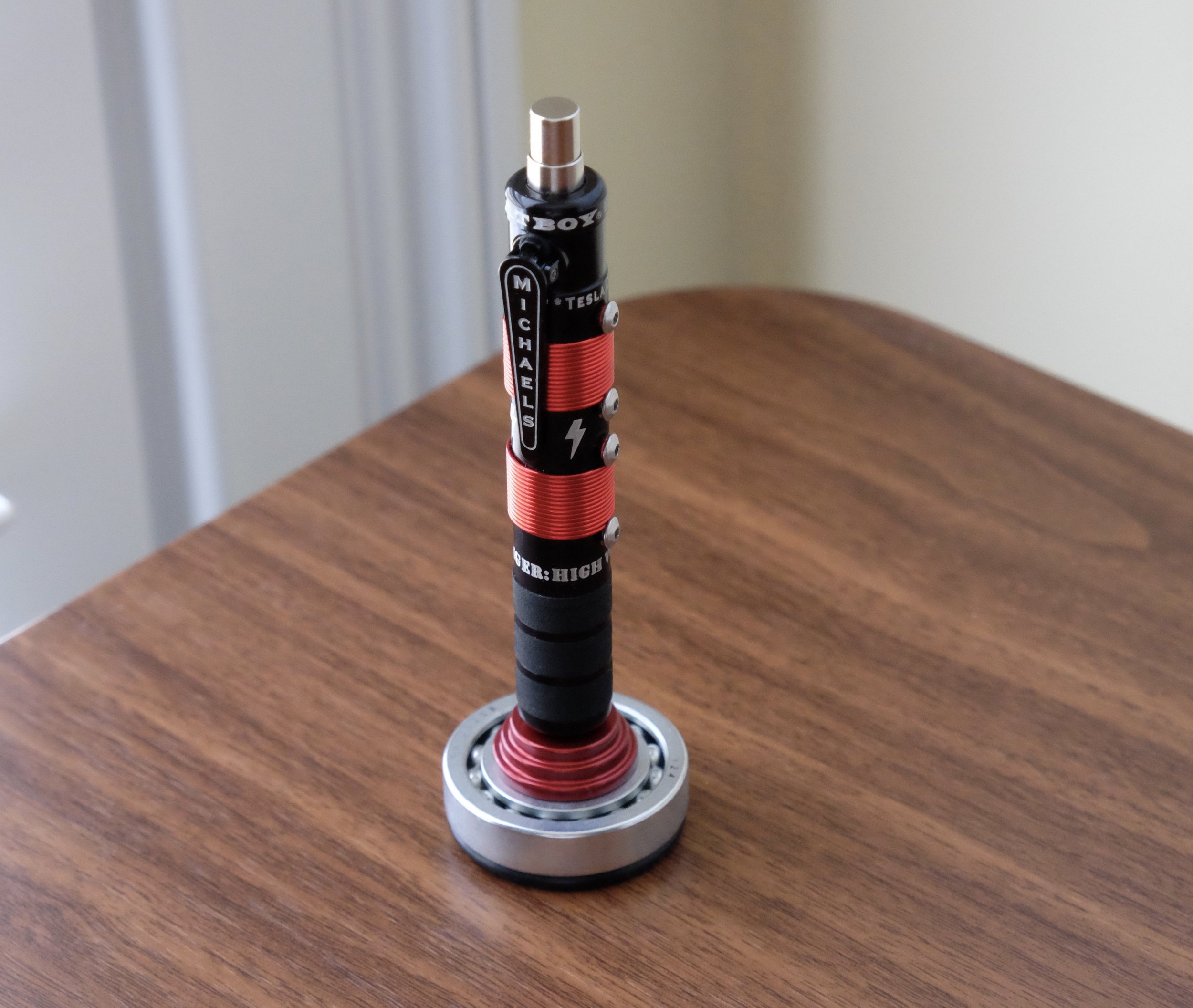
The TeslaCoil series of pens is self-explanatory by virtue of its namesake: the defining features are the copper wire and stainless steel bolts lining the barrel, which is pretty chunky and definitely gives you something to hold onto when you're writing. That said, once you have it in hand, this pen is surprisingly comfortable to write with and is no novelty: it's meant to be used. 

The Fatboy features a spring-loaded clip that's bolted onto the pen - it's not going anywhere. That said, I mainly clipped this pen to a pocket inside my bag. It was too bulky to carry comfortably in a shirt pocket. 

This particular model has a red and black color scheme, which I love. The lower part of the barrel is lined with what appears to be vulcanized rubber, creating a nice surface to grip. With a metal pen of this size and weight, you need some sort of padding and/or texture, otherwise the pen would slide around and become difficult to manage during longer writing sessions. The pen accepts standard Parker-style ballpoint or gel refills. Here, I believe Bob swapped in a Schmidt EasyFlow 9000, which is my favorite Parker-style ballpoint/hybrid refill.     

The length and balance on this pen is perfect, but it's a little too "fat" for me to hold comfortably for long periods of time. To compare, the pen has a similar feel to fatter fountain pens like the Pelikan M1000, Montblanc 149, Delta Dolcevita Oversize, or even a Jinhao 159.

Sold separately: a machined metal pen stand with matching trim that rotates on ball bearings. The pen and the stand make for a very nice-looking desk set, and the stand is worth the small upcharge.

View fullsize Michael's Fatboy TeslaCoil in Stand
View fullsize Michael's Fatboy Stand Close-up

Takeaways/Where to Buy

Michael's Fatboy makes some unique pens that brings a different aesthetic to the market, and I'm glad that I was able to try this one out. Despite its size, the pen is generally comfortable to write with, and I can see how someone with larger hands than mine could use this as an everyday writer. Because I have only moderately-sized hands, at the next pen show (probably D.C.) I'm going to test out the "S-Model" series, which is a slimmer pen.  

Because of the attention to detail and obvious quality control that goes into manufacturing these pens, they command a premium price. Fountain Pen Hospital has the largest selection that I'm aware of, and the TeslaCoil pen featured in this review goes for $219, with the rotating pen stand available for an extra $45. The slimmer "S-Model" series that I discussed above is less expensive, starting at $85 and up, depending on the material/design you choose.

Further Reading 

Michael's Fatboy pens don't get reviewed that often, from what I can tell. Bob has a VERY comprehensive review available here, which I'd highly recommend, especially if you'd like to delve further into the specs and construction. He also looks at some different models, in addition to the TeslaCoil. Jeff Abbott has reviewed the slimmer S-Model over at the Pen Addict, which further reinforces my suspicion that it might be a better pen for me.    

Disclaimer: This pen was loaned to me by a friend, and was returned following completion of the review. This post contains affiliate links.  

In Pens Tags Pen Review, Ballpoint, Michael's Fatboy
Comment

Pen Review: Sailor 1911 Black Luster

May 10, 2017

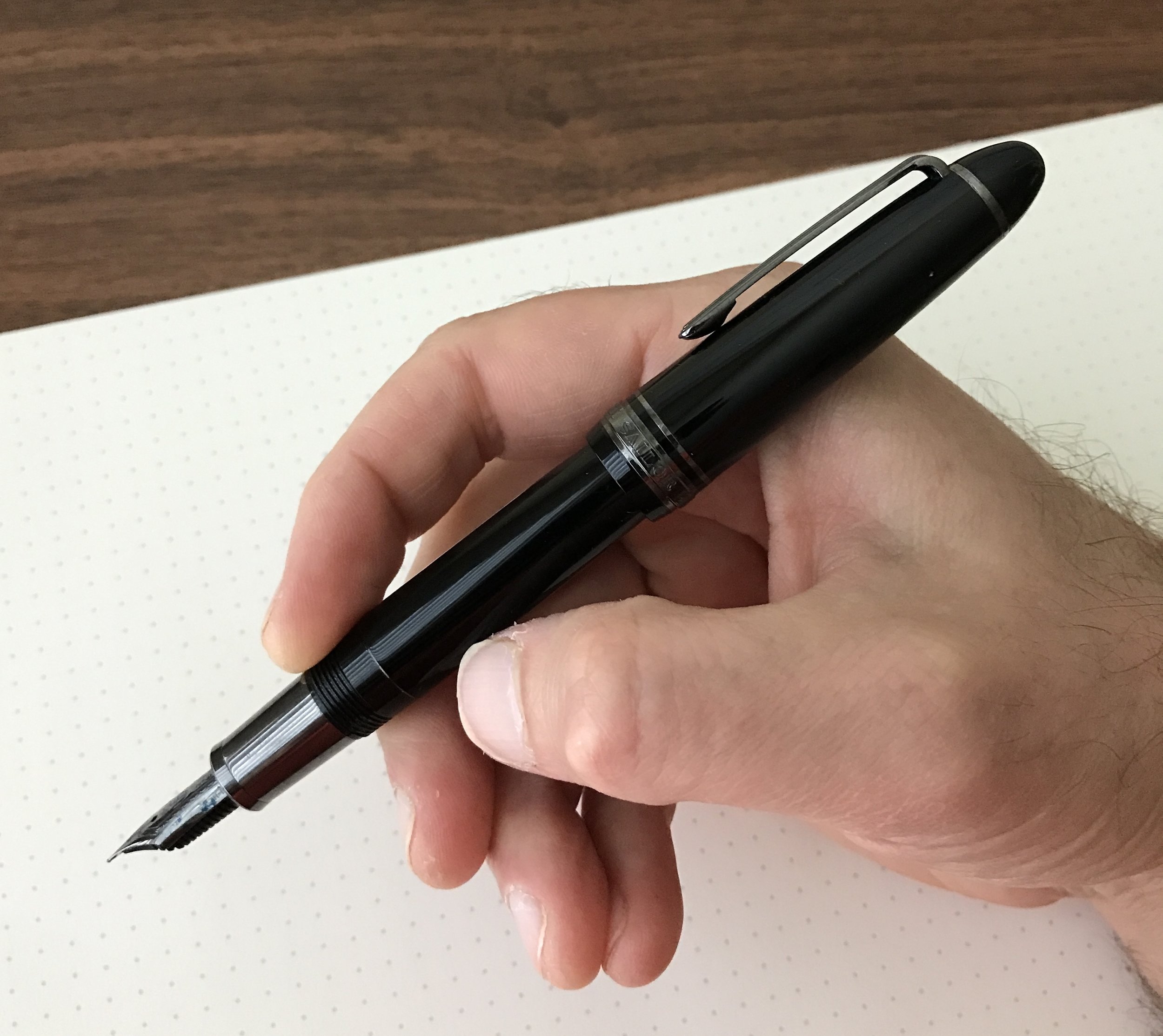
This was a very hard review for me to write, and it's been in the works for quite some time. Not because I don't like the pen: to the contrary, the Sailor 1911 Black Luster is one of my favorite writers, alongside the Sailor Pro Gear Imperial Black. But while I enjoy the build quality, the "blacked out" color scheme, and the excellent all-around writing experience that this pen offers, I do believe that it's priced too high, at least in the U.S. market.

Design and Build Quality

The Sailor 1911 Black Luster compared to a Montblanc 146.

I've reviewed the regular Sailor 1911 Large before, and as I observed in my previous review, to the untrained eye this pen would be a dead-ringer for a Montblanc 146 (without the Snowcap and piston-filler, of course). The 1911 Black Luster, however, does have some significant differences, featuring black ion-plated trim on the clip, cap band, and barrel. It also has a metal ion-plated section, which gives the pen a totally different feel in-hand. It's front-weighted, which when paired with the somewhat softer ion-plated nib (discussed further below), makes for a comfortable writing experience without throwing off the balance. Ordinarily I'm not the biggest fan of pens with metal sections, but something about this one is different. Perhaps the ion plating gives it a slightly "grippier" texture? For whatever reason, I haven't had any issues with the section slipping out of my fingers.

View fullsize Sailor 1911 Black Luster Unposted
View fullsize Sailor 1911 Black Luster Posted
View fullsize Sailor 1911 Black Luster Trim
View fullsize Sailor 1911 Black Luster Closed

Nib and Writing Experience

Like most Sailor nibs, this Hard Fine (or H-F) was an exceptional writer straight out of the box, and wrote a very fine, yet still wet, line. The 21k ion-plated nibs on the Pro Gear Imperial Black and the Black Luster are somewhat "springier" than the standard Sailor nib. They're not flexible, or even close to semi-flex, but they have a bit more cushion and write a slightly wetter line than the hard-as-a-nail H-F or H-M non-plated nibs. 

The scrollwork on the Sailor nibs looks especially nice on the black ion-plating.

On a cautionary note: since these blacked out 21k nibs are softer, they are VERY easy to bend and/or spring. I've had to send a couple of them off to be adjusted/straightened due to minor drops that probably wouldn't have affected a 14k (and certainly not a stainless) nib.

Takeaways and Where to Buy

The Sailor 1911 Black Luster is one of those pens that falls victim to Sailor's strange pricing differences between the U.S. and Japan. While Sailor always prices their "blacked out" pens higher than their other models, here the U.S. "street price" of a 1911 Black Luster is $392, compared to $248 for the regular 1911 Large. To make things even more difficult for U.S. retailers, Japanese sellers typically have the Black Luster listed anywhere from $200-260 on eBay, while there's not nearly as large of an "eBay discount" on the regular 1911.

Note: I'm not going to link to any specific eBay sellers here, because I haven't put any serious effort into vetting specific individual sellers and any eBay purchase should be made only if one is well-aware of the risks (i.e. potential fakes, long shipping times, bait-and-switch, etc.).

I love this pen, but at the nearly $400 price point, I would say that you'd have to want this pen pretty badly to pay Sailor's current asking price. While the ion-plated nib and section obviously adds some cost to the pen, the total price strikes me as a bit steep. That said, I much prefer the balance and the nib of the 1911 Black Luster over the Montblanc Meisterstuck Ultra Black, and the pricing on the Black Luster compares favorably to the Montblanc. If you're considering spending $650+ on the blacked-out Montblanc, I'd consider the Black Luster as an alternative.     

Disclaimer: I purchased the pen featured in this review with my own funds, for my own collection. This post contains affiliate links. Any discussion of pricing and availability is current as of the time of publication of this review. 

In Pens Tags Sailor 1911, Sailor
2 Comments
← Newer Posts Older Posts →
Store Hours and Location
Visit the T.G.S. Curated SHOP
Updated "Best Pens" Guide
On the Paper Trail Podcast
TGS x Roterfaden TGS_25
Hierarchies of Fountain Pen Friendly Paper

Join Our Patreon!
Subscribe to the TGS E-mail List

Featured Posts

Featured
Cover On the Paper Trail Intro Clip.jpeg
Dec 3, 2025
Introducing "On the Paper Trail," a New Podcast/Video Collaboration with Lisa Vanness of Vanness Pens!
Dec 3, 2025
Dec 3, 2025
Iro-Utsushi-Fine-Dip-Pens.jpeg
Oct 1, 2025
The Pilot Iro-Utsushi Dip Pen (and in General, Simple vs. Fancy Dip Pens)
Oct 1, 2025
Oct 1, 2025
Levenger-Annotation-Pad.jpeg
Sep 20, 2025
Five Boutique Paper Brands I'm Watching Closely and Why
Sep 20, 2025
Sep 20, 2025
The Gentleman Stationer RSS

© Digital Divide Media, LLC, 2014-present.

All content is the exclusive property of Digital Divide Media, LLC, d/b/a The Gentleman Stationer, including “The Gentleman Stationer” website and trademark, and should not be reproduced without express written permission.  All rights reserved.

All content containing paid advertising, affiliate links, or sponsored content will be plainly disclosed by a disclaimer when/if featured.

Contact Information

Store Shipping Policy and Return Policy

Privacy Policy

Cookie Policy

Terms and Conditions

Powered by Squarespace