• Blog
  • Shop
  • Podcast
  • Resources
  • About
  • Archive
  • Contact
  • Cart
  • Sign In My Account
Menu

The Gentleman Stationer

Vintage Living in the Modern World.
  • Blog
  • Shop
  • Podcast
  • Resources
  • About
  • Archive
  • Contact
  • Cart
  • Sign In My Account

A Tale of Two Limited Anniversary Editions: The Lamy 2000 Black Amber

February 19, 2020

Last year, at the time of the Lamy 2000 100th Anniversary Bauhaus edition, I looked at Lamy’s struggles with managing its limited edition portfolio. While most criticism of the “Blue Bauhaus” fountain pen focused on Lamy’s decision to release fewer than 2000 pens - not coming close to satisfying demand - it’s easy to see how the company ended up in that place: three years later, they still haven’t sold out of their previous anniversary edition, the Lamy 2000 Black Amber, released to commemorate the 50th anniversary of Lamy’s flagship writing instrument.

Others (namely Dr. Deans at Pen Economics) have written in depth on the nature of the problems with this release from a business perspective. In short, Lamy grossly overestimated how many limited edition Black Amber Lamy 2000s they could sell at the 500 Euro / $600 USD price point. While most U.S. retailers no longer have the pen in stock, that’s likely the result of the heavy discounting and promotional offers they used to unload inventory. Some European retailers still have pens available for purchase, so at this point I wanted to take advantage of a couple years’ worth of perspective and re-evaluate the Black Amber with some distance, focusing more on this limited edition release as a pen rather than a marketing case study.

Beyond black makrolon: From left, Lamy 2000 Black Amber 50th Anniversary Edition; Stainless Steel Lamy 2000M, and the Bauhaus 100th Anniversary Blue Makrolon pen.

The Black Amber Is Still a Lamy 2000 - And An Exceptional Pen

Disclaimer up front: I don’t necessarily come to this review from a rational standpoint. The Lamy 2000 is easily my favorite fountain pen of all time, and as with the Bauhaus 100th Anniversary Pen, I was eventually going to track down a Black Amber and add one to my core collection. And, it’s going to be no surprise to you all that I love this pen. I disagree with those who criticized this release on the grounds that it was “too similar” to the standard stainless steel Lamy 2000M. The electroplated finish on the Black Amber gives the pen a much different feel in the hand, and it’s noticeably lighter. When I weighed these two pens on my digital scale, the standard stainless steel pen came back at 2.0 oz, and the Black Amber 1.9 oz (and the Black Amber was fully inked at the time). The difference is enough to change the balance of the pen when posted, at least for me. Curiously, much of the extra weight on the stainless model is in the cap, which weighs .8 oz as opposed to .6 oz on the Black Amber.

How does one describe the color? Let me say this: after seeing the Lamy 2000 Black Amber in person, I finally understood the name. The finish alternately appears dark grey, brownish, or even a champagne gold, depending on the lighting. It’s beautiful. Sure, the Black Amber will never appease those clamoring for a yellow or orange or translucent green demonstrator, but I’ve never felt that wild color schemes would be consistent with the Lamy 2000’s design heritage. At the end of the day, I think I’m fine with the decision to explore more subtle variations in color and texture.

I have pen No. 3497/5000. The size of the releases have significance (5000 pens for the 50th Anniversary, and 1919 pens for the 100th Anniversary of the Bauhaus, founded in 1919.)

The engraving on the cap is very subtle, requiring me to enhance the picture so that it’s even visible.

Overall Writing Experience

I’ve previously reviewed both the standard Lamy 2000 and the Stainless Steel Lamy 2000M at length, and to be honest the experience of putting nib to paper with the Black Amber doesn’t differ all that much from Lamy’s standard lineup. The medium nib on my Black Amber writes a smooth, wet line, consistent with the platinum-coated 14k nibs on the other Lamy 2000 fountain pens I currently have in rotation. At one point, the Lamy 2000 developed a reputation for finicky nibs, but I have to say that I’ve not experienced any issues with the pens I’ve owned, and I’ve purchased five or so within the last several years, through regular retail channels.
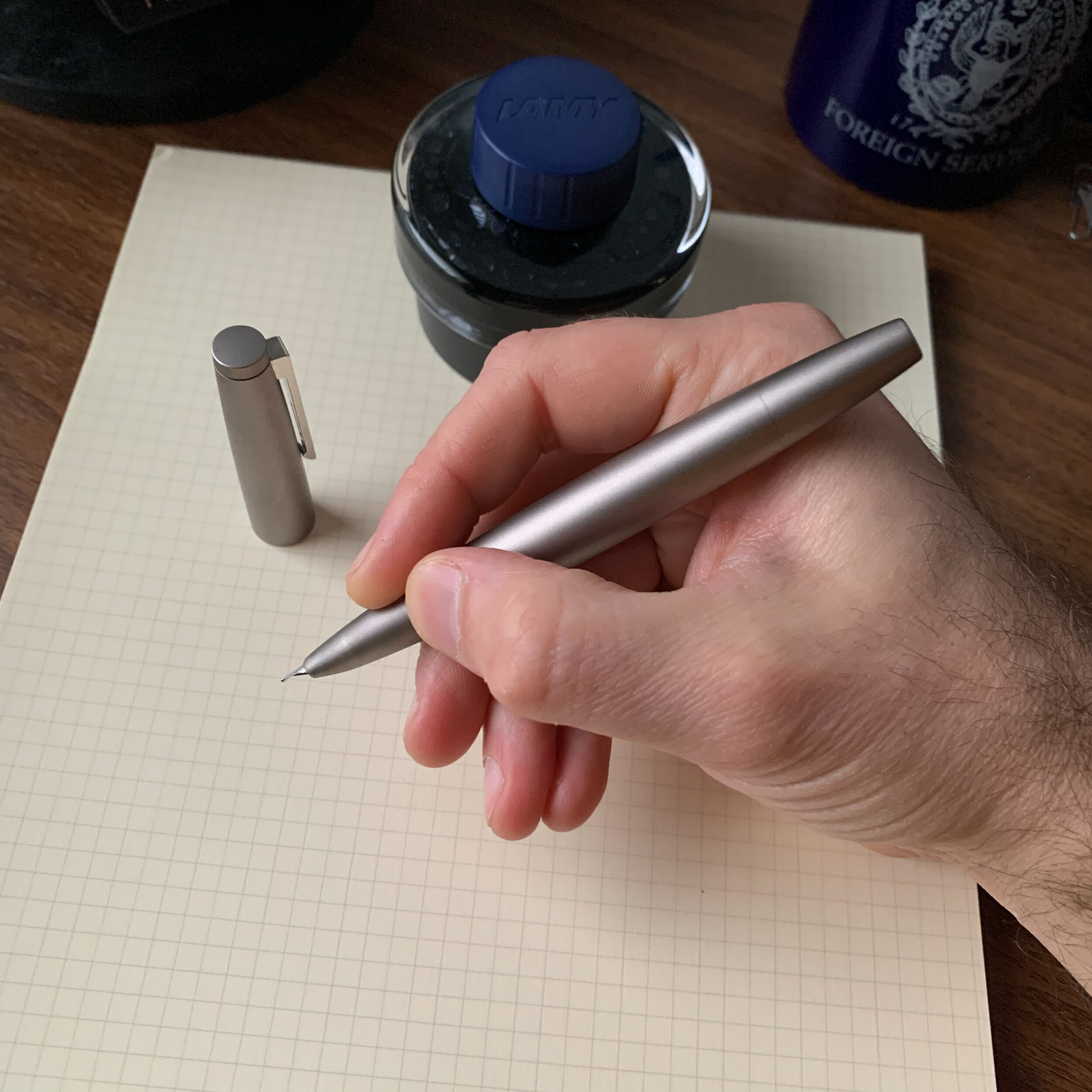
View fullsize Lamy 2000 Black Amber Unposted
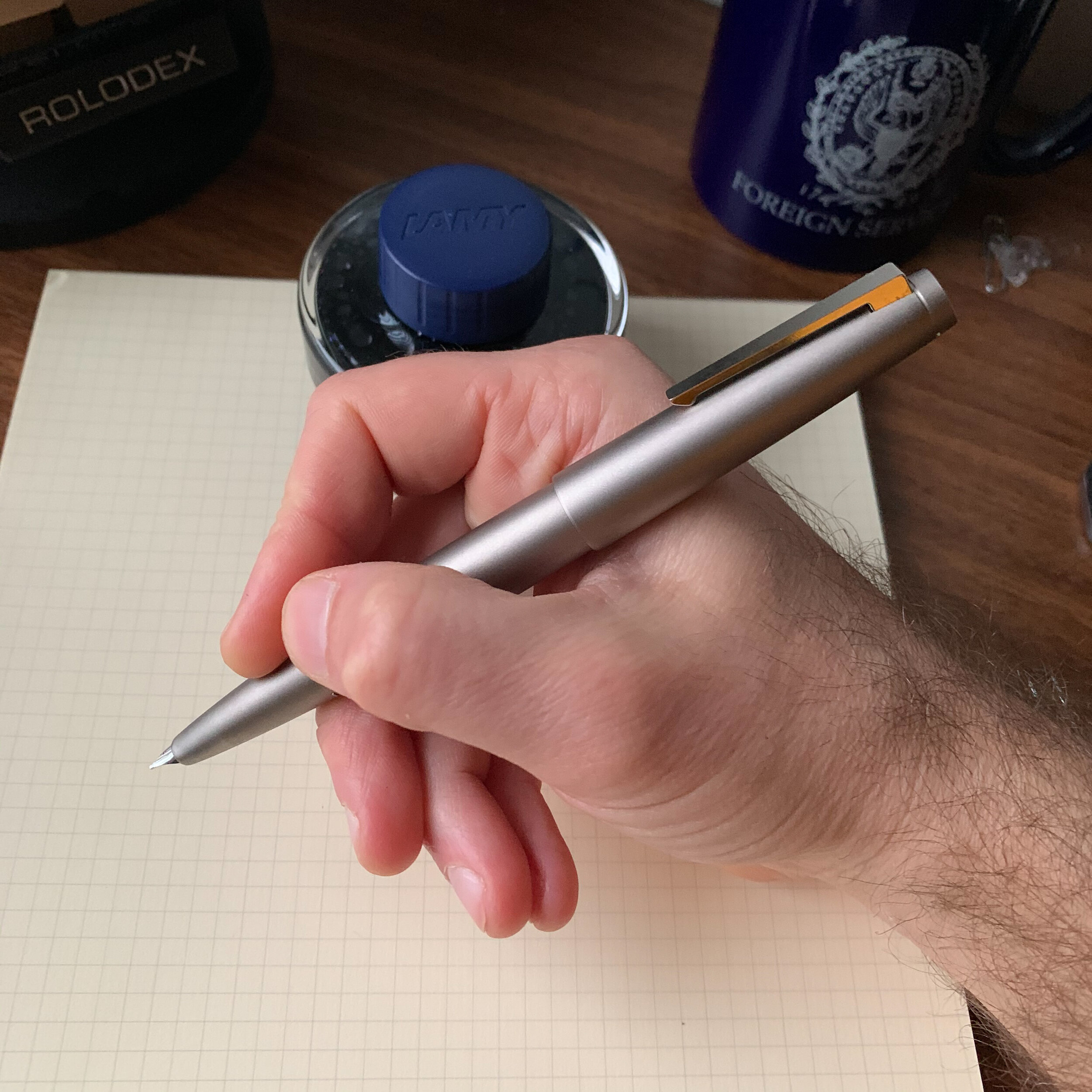
View fullsize Lamy 2000 Black Amber Posted

Takeaways and Where to Buy

I remain convinced that the primary obstacle to the Black Amber selling well was the price, widely perceived as too high for “what the pen was.” While I’m not sure this is fair - other companies have implemented much more egregious price hikes on their limited editions (including instances where the editions weren’t really limited at all), the discomfort I have with high price points on the Lamy 2000 is that it seems somewhat inconsistent with the Bauhaus ethos: well designed, functional items meant to be used, not necessarily collected. But lots of factors go into companies’ pricing decisions that are beyond the scope of this article, including costs of material, manufacture, and distribution, all of which affect how a company can price the pen without losing money. And, don’t forget that the entire run of Bauhaus 100th Anniversary pens sold out immediately, despite similar pricing to the Black Amber, so what do I know? It could simply be an issue of Lamy feeling out the size of the market for a limited edition Lamy 2000, which sits somewhere between 1919 and 5000 pens.

The texture on the Lamy 2000 Black Amber makes for a perfect pairing with my Raven Venture.

Like any limited edition pen priced at a premium, whether the purchase is “worth it” to you remains a highly personal decision. Anytime you move past the $300 mark, you’re buying the pen because it moves you in some way, or, like me, you’re concerned that if you let this pen sell out without acquiring one your status as a Lamy 2000 super-user will be revoked. But in all seriousness, my overall take on the pen is this: I love it, especially the finish, and the pen itself doesn’t deserve the degree of negative attention it’s received. If you appreciate Lamy’s understated designs, especially the subtle variations in finish and texture they’ve chosen for their limited editions on the 2000, and can handle the weight of the stainless steel body, you probably won’t regret the Black Amber. Ignore the hype/haters and trust your own preferences.

I purchased my Lamy 2000 Black Amber from site sponsor Appelboom last year, around the same time that I ordered my blue Bauhaus 100th Anniversary fountain pen. Although I recognize that the Black Amber is not for everyone, I’m somewhat amazed that this pen remains available for purchase, even at the discounted (but still-expensive) 400 Euro price point.

Further Reading on the Black Amber and the Lamy 2000

One reason I wanted to review the Lamy 2000 Black Amber is because so few reviews of this pen exist. Dries over at The Pencilcase Blog is the only one I can find who reviewed the Black Amber, back in 2016 at the time of its release, and had much the same reaction as I did. I’m glad that I can add my own voice to what little is out there, and make sure this gem doesn’t fall into obscurity.

Disclaimer: I purchased the pen featured in this review with my own funds, for my own use. This post contains affiliate links.
In Pens Tags Lamy, Lamy 2000 Black Amber, Lamy 2000, Limited Edition, Pen Review
1 Comment

First Impressions: The AmazonBasics Fountain Pen Is Surprisingly Good

February 15, 2020

As something of an Amazon junkie, I couldn’t help but place an order for the AmazonBasics “Refillable Fountain Pen” after reading Evan’s review over at The Penquisition. His take on this pen is consistent with my own: Amazon has created (or more likely, sourced) an excellent inexpensive fountain pen that deserves consideration as a “First Fountain Pen” recommendation for new users, or as an inexpensive cartridge pen to leave at the office or keep in your travel bag.

The packaging includes a nice presentation box for a $10 pen, so if you’re looking for an inexpensive gift to give someone potentially interested in fountain pens without dropping a ton of money. The pen does not ship with a converter, and I’ve only tested with the short international cartridges that ship in the box. I would expect a converter would work, though you may have to try a few sizes. The pen barrel is fairly narrow.

Design and Build Quality

Look, this pen won’t win any design awards, but for what I paid I’m more than happy with the somewhat generic lacquered brass body with chrome trim, and I’ll even forgive the “AmazonBasics” branding stamped on the clip. Frankly, if Amazon had foregone the latter, this could easily pass to the casual observer as a Cross or Waterman pen that sells for $100 plus.

The AmazonBasics fountain pen features a classic shape and design, sort of similar to my Otto Hutt Design 06, but no one is going to confuse these two pens.

The build quality also feels far above the price point. Inexpensive pens often suffer from loose friction-fit caps that spin or rattle, but this one feels tight. The balance on this pen reminds me of my Otto Hutt Model 06, in that both can be used posted and unposted, and offer a slimmer profile without being too slim for longer writing sessions. The cap posts securely, and though some will find the metal section slippery, the overall weight of the pen is appropriate for a daily writer.

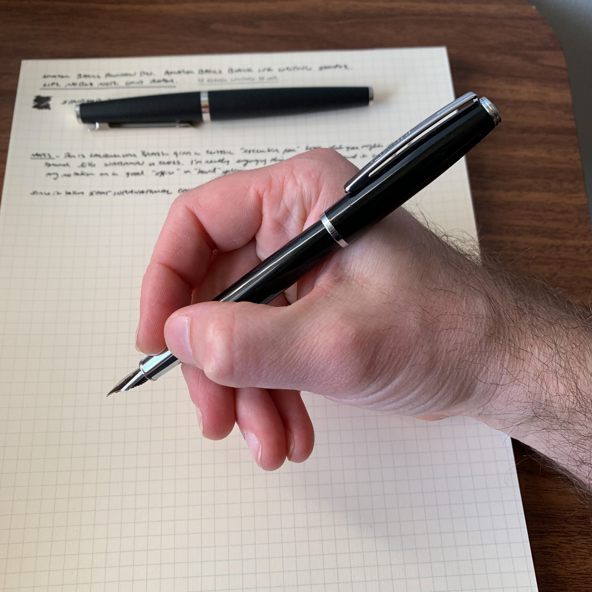
View fullsize AmazonBasics Fountain Pen Posted
View fullsize AmazonBasics Fountain Pen Unposted

Nib and Writing Experience

Amazon’s target customer for the AmazonBasics fountain pen will be perfectly happy with the medium nib on this pen. I actually like the clean design - Amazon didn’t try to stamp a logo on the nib, but rather left it plain save for an engraved “M” to designate the nib width. At the present, only fine and medium nib widths are available, which is consistent with most pens at this price point.

I have no idea who made this No. 5 stainless steel nib. Based on the look of the feed, if it’s a German nib I would say it’s a Schmidt, but it could very well be of Chinese manufacture. It doesn’t matter because my nib writes a smooth, classic western medium line. It worked well out of the box and didn’t require any adjustment whatsoever. As Evan noted in his review, this nib also writes a surprisingly smooth extra fine line if you flip it over and write using the reverse side. That’s apparently not a fluke unique to his specific pen.

Takeaways and Where to Buy

Amazon delivers the goods here: a no-frills black lacquered and chrome cartridge-converter fountain pen with a steel nib that works as advertised. For just under $10, you can’t argue that this pen isn’t good value. I actually find the AmazonBasics Fountain Pen (much) more comfortable than the Pilot Metropolitan, and for those who desire a work friendly “beater” pen made from a material other than plastic, or who are looking for a low-risk way to test the fountain pen waters for the first time, there’s no reason not to give this pen a try.

No surprises on where to buy this pen: Amazon is currently selling the AmazonBasics Fountain Pen in both fine and medium nib sizes. Currently, only one color is available, but again that could change if this pen catches on.

Disclaimer: This post contains affiliate links.

AmazonBasics Fountain Pen compared against, from left: Lamy 2000; Otto Hutt Design 06; TWSBI Eco.

In Pens Tags Fountain Pen, First Impressions, AmazonBasics, Amazon, Pen Review
1 Comment

Stationery as a Inexpensive Way to Relive Your Childhood and The Blackfeet Indian Pencil: My Favorite Pencil of All-Time

February 12, 2020

All this recent hubbub over the return of Dunkaroos has me in a bit of a nostalgic mood. Not necessarily because of Dunkaroos - I was a bit too old for that fad -but it did get me thinking about things from childhood and why we collect and get fixated on certain items. Take stationery. I’d venture that if you ask yourself why you’re stationery obsessed (and if you’re reading this blog, “stationery obsessed” is an accurate description), two things come up: (1) You’ve always been this way, going to back to when you were a kid; and (2) as you’ve grown, you have, at times, found yourself thinking back to certain pens/pencils/notebooks that you remember fondly and wondering whatever happened to them. For me, this resulted in a six-month eBay quest to accumulate a full gross of my favorite school pencil, the Blackfeet Indian Pencil. While reason eventually took hold and I managed to stop myself after buying up six dozen, I don’t regret this little adventure at all.

Background on the Blackfeet Indian Pencil

Those of us who grew up in the 1980s and 1990s probably may remember the Blackfeet Indian Pencil for its promotional gift set, featuring a dozen pencils in a cedar box stamped with a Remington-esque logo. The pencils were made by the Blackfeet Indian Writing Company, founded in 1972 and located on the Blackfeet Indian Reservation in Browning, Montana. Until its closure in the late 1990s, the Blackfeet Indian Writing Company manufactured writing pencils, art pencils, pens (which I’ve never seen but are also available on eBay). Apparently the company passed from tribal control into private hands around 1992, and subsequently went out of business not too long after.

The Blackfeet Indian Pencil Company released multiple versions of their pencil over the years. Shown here are two, with both black and gold writing/ferrule combinations. The font and graphics on the pencils themselves also changed. The particular box shown here was a promotional gift for a building supply wholesaler in Montana and North Dakota.

I received a dozen of these pencils, in the commemorative box, for Christmas one year when I was 12 or 13, which must have placed the timing towards the end of the company’s run. I remember seeing these for sale at The Nature Company and museum gift shops, which I assume is where my parents (probably my Dad) picked these up. I mostly used yellow No. 2 pencils (Faber-Castell Americans) throughout my school years, so the fact that these are natural pencils probably made them stand out in my mind as something different. I loved the fact that they wrote darker than the Faber-Castell American, which has a firmer core, yet lasted a long time. I had a few of these pencils left well into college, so I probably picked up a few dozen more along the way after that initial batch.

I’m not the only to stockpile this pencil. I didn’t know this when I set out on my journey to track it down, but apparently the Blackfeet Indian Pencil has developed its own cult following over the years. For example, the composer John Luther Adams disclosed in a Facebook post a couple of years ago that he uses Blackfeet Indian Pencils to compose, and Ticonderogas for general writing. The “Blackfeet craze” isn’t quite as pronounced as the hype surrounding the original Blackwing, but eBay pricing has steadily risen. Good thing I have 6 dozen.

In terms of lacquered finish, the closest match is the USA-made Ticonderoga Natural on the left. Yes, I have a mini-stash of those too. No, they’re not for sale, and if you make me a trade offer, it had better be good.

So What’s the Verdict, and Where Do I Get This Pencil?

Is the Blackfeet Indian Pencil as good as I remember it? Yes, it is. While certainly not a luxury pencil on par with a Blackwing or a Palomino, this pencil holds its own with its contemporaries (the Ticonderoga Natural) as well as modern equivalents like the General’s Cedar Pointe and Musgrave’s new “Tennessee Red” (discussed further below). Honestly, unless you have a nostalgic connection to this pencil or are a collector who wants to own a piece of history, you can find similar pencils for MUCH less money, and at around $20-30 per dozen (what I’d consider the reasonable eBay rate for Blackfeet Indian Pencils) the Blackwing Natural probably gives you better performance and feel at that price point. In my case, however, I have no regrets due to the personal connection. I’m glad I’ll have a stash of these pencils for a long time to come.

The graphite on the Blackfeet Indian Pencil, the General’s Cedar Pointe No. 2, and the Ticonderoga Natural appear close to identical, though the feel of the Blackfeet and the Cedar Pointe is so close that it has me thinking they might even share a core. Both the Blackwing Natural “extra firm” and the Musgrave Tennessee Red feature much darker graphite.

If you’d like to source a box of Blackfeet Indian Pencils for your own collection, you’re probably reduced to scouring flea markets, garage sales, and eBay. At any given time, there are multiple eBay listings for Blackfeet Pencils. While some sellers are asking $60-100 for a set of pencils in the cedar box, it’s still relatively easy to find loose pencils and even full packs for $20-30 if you’re patient, which can be less than the cost of a Blackwing Volumes edition, so we’re not talking vintage Blackwing money or anything close.

If you’d like a set of beautiful cedar pencils in a commemorative box, and don’t want to pay out the nose on eBay, I’d suggest that you opt for a set of two dozen Musgrave “Tennessee Reds.”

Alternatives to the Blackfeet Indian Pencil

General’s Cedar Pointe No. 2 is the closest match. While the Blackfeet Indian Pencil is coated in a clear lacquer and General leaves the Cedar Pointe unfinished, the pencil offers a similar aesthetic (natural pencil, black ferrule) and the cores are so close on the two (at least the two specific pencils I’m using) that it makes me wonder whether the Blackfeet Writing Company might have sourced them from General.

For a natural pencil with a lacquered finish, you can of course try the Blackwing Natural, which has a softer core despite containing Blackwing’s “firm” graphite, and also the new Musgrave “Tennessee Red,” which has its own lacquered cedar aesthetic, made even more interesting by the fact that Musgrave is now using actual red cedar - a pencil-making material common more than a hundred years ago - as opposed to the incense cedar commonly used to make modern pencils. I just purchased a box of these in their own commemorative cedar packaging and they’re gorgeous.

Pencil reviews are some of the most popular content here at The Gentleman Stationer, and I promise I’ll try to do more, as I use a lot of pencils (and have quite a stockpile).

Disclaimer: I purchased the pencils featured in this review with my own funds, for my own use.

In Pencil Review Tags Pencil Review, Vintage, Vintage Pencils, Blackfeet Indian Pencil
12 Comments

Pen Review: Leonardo Momento Zero Arlecchino

February 8, 2020

Italian brand Leonardo Officina Italiana - referred to as “Leonardo” for short - has developed into one of the major success stories in the modern fine writing market. Founded after the collapse of Delta by designer and penmaker Salvatore Matrone (who previously worked for Delta), Leonardo has gradually expanded its lineup from the original Momento Zero to include the “Furore,” the newly announced “Messenger,” and the pen reviewed here, the “Momento Zero Grande.” I’ve chosen to review a limited edition version of the latter: the Momento Zero Grande Arlecchino (“Harlequin”) that was announced a few months back.

Leonardo’s packaging on the Arlecchino is reminiscent of OMAS, from the box liner to the faceted ink bottle. (The ink is excellent, by the way. Look for a separate review soon.)

The Problematic History of the Omas Arlecchino

This particular pen is inspired by the Omas limited edition “Arlecchino” fountain pen from the early 2000s, of which only 750 were made. While beautiful, the celluloid used to make these pens had a tendency to degrade over time, resulting in cracks and deterioration in the structure of the pen. Instead of attempting to work with the classic Arlecchino celluloid - if any even remains usable - Leonardo (or someone assisting in the production of these pens) developed an acrylic that closely resembled the original, with similar shades of green, black, and orange scattered throughout. I don’t know that it’s been clearly communicated that the material used to make the Leonardo Momento Zero Grande is NOT the same material used by Omas, given that I’ve received multiple comments from those concerned that this pen will disintegrate. The structural issues affecting celluloid generally do not affect acrylic resin (provided it is competently made), and this particular “Arlecchino” pen does not pose the same long-term durability issues.

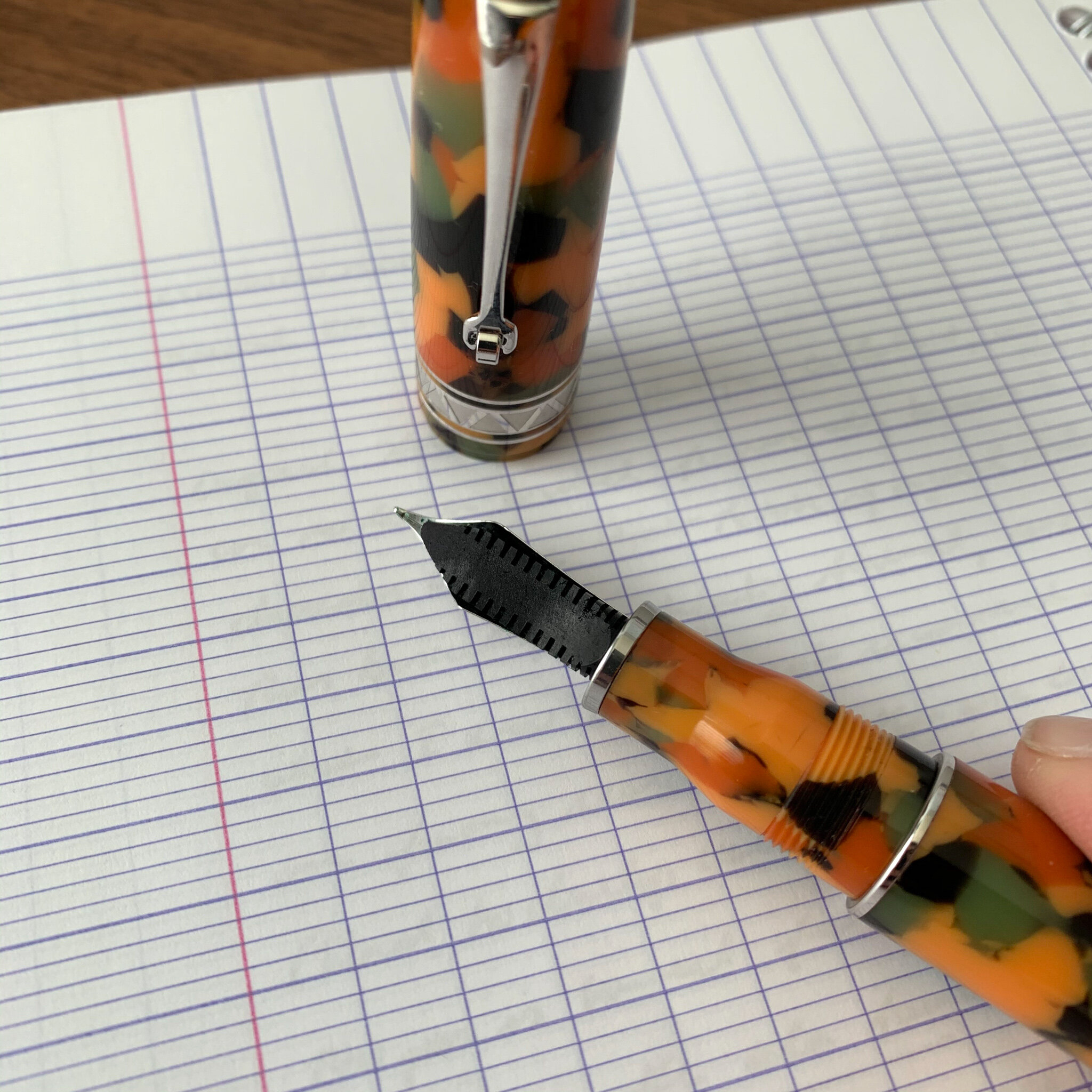
The “Arlecchino” acrylic features darker orange, olive green, and black flecks within a lighter orange/peach base color.

Design and Build Quality of the Momento Zero Grande

Like the standard Momento Zero, the build quality on the larger version is exceptional. I understand that all Leonardo pens are hand-turned, and the pens reflect a high degree of expert craftsmanship in both the design and the finish. The appeal of any pen from a design standpoint is naturally subjective. Longtime readers of this blog know that I was a fan of Delta - at least their “subtler” designs - and the Momento Zero Grande falls squarely within that tradition.

Like many larger Delta Pens, the Momento Zero Grande features a piston/captured converter system that holds a lot of ink. To fill the pen, you don’t need to unscrew the section. The blind cap reveals the end of the converter - in effect the hidden “piston knob” - that fans of Delta pens either loved or hated.

The Arlecchino is far from a minimalist pen, and the material itself may come across as a bit loud to some, but it’s generally free from unnecessary adornments. Leonardo elected use a subtle zigzag engraving on the cap band and the ring just below the blind cap. The design, along with the Greek key pattern etched onto the captured converter, lends the pen an Art Deco vibe.

This is a high capacity converter which threads onto the section. I assume it can be removed for cleaning, but I’m not sure I would do it. I like that you can unscrew the section to check your ink level.

Nib and Overall Writing Experience

The Momento Zero Grande is a large pen. There’s no getting past that, and the size and weight will work for some but not others. After writing with this pen for a month, I actually think it’s at or near the limit of what I could consider comfortable - BUT I love it. Unposted, the balance is perfect for me, because the added weight from the captured converter system falls directly between my thumb and forefinger. Those with smaller hands will likely find the Momento Zero Grande too large and back-weighted. Larger hands shouldn’t have a problem, and may even be able to post this pen comfortably.

View fullsize Momento Zero Grande Unposted
View fullsize Momento Zero Grande Posted

The standard Momento Zero Grande features a stainless steel No. 6 Bock nib, which is typically tuned quite well out of the factory but I sometimes find that I have to reset the nib to adjust ink flow. The Arlecchino limited edition featured here comes with a 14k gold nib on an ebonite feed, and writes quite well, like all the other Leonardo pens I own with this nib/feed combination. I opted for a fine nib here, and while I might characterize the line it writes as closer to an extra-fine, it has a steady inkflow with none of the Bock quality control issues that might give someone pause.

View fullsize Leonardo Momento Zero Grande 14k Nib
View fullsize Leonardo Momento Zero Grande ebonite feed

The color patterns in the Arlecchino material makes this a perfect pairing with green and red inks. Writing sample shown here with Montblanc Irish Green, which I reviewed this past week.

Takeaways and Where to Buy

Because Leonardo speaks to my vintage-inspired design aesthetic, this pen was a no-brainer purchase for me, and I snapped up No. 67/100 immediately. Fans of the Momento Zero probably shouldn’t hesitate to pick one up, especially since the “Grande” line features some of the more interesting materials Leonardo has used. In addition to the Arlecchino, Leonardo also released a series of “Art Deco” ebonite pens that I waited too long on, but I may try to grab one on the secondary market in the “Mustard” color. As noted above, my one word of caution on this pen is the sizing. If you’ve had trouble using larger pens in the past, you may want to hold a Momento Zero Grande in person before purchasing, or buy from a retailer with a flexible return policy in case the pen turns out to be too large and/or heavy.

I was surprised to see that the Momento Zero Grande was actually longer than the Montblanc 149, which I’ll be putting into rotation this month. Here, the Arlecchino is shown compared against, from left: (1) Standard Leonardo Momento Zero (in “Pietra Marina” Sea Stone Acrylic); (2) Montblanc 149; and (3) a Lamy 2000.

As Leonardo pens have grown in popularity, the Momento Zero and the Momento Zero Grande have become more widely available. I purchased the Arlecchino pen featured in this review from site sponsor Appelboom, which still has pens in stock, but only with gold trim. A few stores still appear to have both versions, including Casa della Stilografica and Novelli. The Arlecchino special edition is priced at around $480 at Appelboom, which I consider standard (or even on the lower side) for a larger handmade limited edition pen with a gold nib. If you’re interested in the standard Momento Zero Grande, my go-to sources for Leonardo Pens are Appelboom in Europe and The Nibsmith and Pen Chalet in the United States. The standard pen (with a steel nib) is priced anywhere from $260-300, and some retailers offer a gold nib for an upcharge.

Recommendations for Further Reading

Since it’s release, I’ve written several posts on the Leonardo Momento Zero and various limited and special editions. My original review can be found here, which includes pictures of the celluloid “Maestro Set” I acquired last year, and I wrote a follow up on the Leonardo x Pen Chalet special edition collaboration in which they released a Momento Zero reminiscent of the discontinued Delta Dolcevita. Finally, if you’d like a writing sample of Leonardo’s 14k stub nib, see Part II of my “Stock Stub Nibs” profile.

Disclaimer: I purchased the pen featured in this review with my own funds, for my own use, though I did use some store credit generated through the Appelboom affilate program, one of may ways I use to support the blog.

In Pens Tags Leonardo Momento Zero Grande, Appelboom, Pen Review
Comment

Why Everyone Needs at Least One Green Ink

February 5, 2020

In a more traditional professional setting, you can sometimes find yourself a bit restricted in terms of what ink you feel comfortable using at the office. Sure, blue, black, and blue-black are the “safe” choices, but there are benefits to choosing a color that stands out a bit more. Whether your job involves project-based collaborations, or drafting documents subject to comments and revisions by multiple people, situations will arise when you’ll want your comments and input to stand out from the rest of the herd. Personally, that’s when I reach for the red or the green.

While both Montblanc Irish Green and Bungubox Norwegian Wood are darker greens, I wouldn’t call them green-blacks. They have more blue in them.

Before I go further: Yes, I know that green ink carries some baggage. Apparently, in the UK especially, green ink has become associated with so-called “green ink letters.” Back in the day when people actually still wrote physical letters to the newspaper, the more “interesting” submissions were stereotypically written in green ink. Just look up the term “Green Ink Brigade.” That said, there is also a tradition of green ink being used by MI6 and the British intelligence services, so you’re not necessarily labeling yourself as a nut by signing that memo to your boss in green.

Writing samples done with the Kanilea Pen Co. Mauna Kea (left) and Leonardo Momento Zero Grande Arlecchino (right).

For professional purposes, I prefer a classic darker green, but not necessarily a “green-black.” Green-black inks tend to see use as substitutes for standard blues or blacks as a drafting ink, whereas for editing or annotation I prefer a true green. The two I have been using lately are Montblanc’s Irish Green, which has been a favorite for years and previously reviewed on its own, as well as Bungubox Norwegian Wood Emerald, which is a shop-exclusive Sailor ink that made an appearance in my list of Best Fountain Pen Inks for Editing and Annotation. I traveled with both loaded into pens on my trip last week, and what I love about both inks is that they are generally low-maintenance and dry quickly, a key consideration for a professional road trip where you have to take quick notes in a conference or on a trade show floor.

Takeaways and Where To Buy

Both green and red inks sometimes bear an unfair connotation as unnecessarily loud or obnoxious colors for writing. That needs to change. You can only take so many blues, blacks, blue-blacks, and even purples in the professional context, and greens present an opportunity to distinguish yourself a bit without going full-on orange shimmer ink. I get more comments - nice ones - on my green inks at work than any other color, and they show especially well in written correspondence.

Both of these inks look exceptional on bright white paper, here Clairefontaine French Ruled.

As luck would have it, of course, these two specific inks are becoming somewhat difficult to find. While Montblanc Irish Green is a standard option in Montblanc’s ink lineup, it’s becoming harder to find an independent U.S. pen retailer that stocks Montblanc due to what I understand to be a policy that all authorized retailers have a brick-and-mortar store. Both Dromgoole’s and Appelboom currently have Irish Green ink in stock. On the other hand, Bungubox inks are made in much smaller runs, and I heard that Sailor recently required that they impose a hefty price increase on these inks in the U.S., so that Bungubox inks now cost nearly $40 for a 30ml bottle. I love Norwegian Wood, but there are other options and I likely won’t be purchasing the ink again at the new price point unless something changes. If you absolutely must have this color, Pen Chalet stocks most Bungubox colors.

If you’re interested in reading further, I’ve previously reviewed dark greens that lean more green-black, as well as lighter “grass green” inks.

Disclaimer: I purchased both bottles of ink featured in this review with my own funds, for my own use. This post contains affiliate links.

In Ink Reviews Tags Ink Review, Green Ink Brigade, Green Inks
5 Comments
← Newer Posts Older Posts →
Store Hours and Events
Shop T.G.S. Online
Updated 2026 "Best Pens" Guide
No results found
On The Paper Trail: Live In Nashville Event Tickets Now Available!
TGS_25 Roterfaden Restock Notification
Hierarchies of Fountain Pen Friendly Paper

Join Our Patreon!
Subscribe to the TGS E-mail List

Featured Posts

Featured
Pilot-Custom-Heritage-92.jpg
June 6, 2026
Workhorse Pens: Pilot Custom Heritage 92 Fountain Pen
June 6, 2026
June 6, 2026
Kakimori-Inkstand-Before.jpeg
May 30, 2026
Japan Trip Journal: A Visit to Kakimori, Including Custom Notebooks and the InkStand!
May 30, 2026
May 30, 2026
Five-Foundational-Fountain-Pens.jpeg
April 22, 2026
T.G.S. 12th Anniversary: 5 Fountain Pens Everyone Should Experience
April 22, 2026
April 22, 2026
The Gentleman Stationer RSS

View Cart

© Digital Divide Media, LLC, 2014-present.

All content is the exclusive property of Digital Divide Media, LLC, d/b/a The Gentleman Stationer, including “The Gentleman Stationer” website and trademark, and should not be reproduced without express written permission.  All rights reserved.

All content containing paid advertising, affiliate links, or sponsored content will be plainly disclosed by a disclaimer when/if featured.

Contact Information

Website Terms and Conditions

Store Shipping Policy and Return Policy

Privacy Policy and Cookie Policy

Accessibility Statement

Powered by Squarespace