• Blog
  • Shop
  • Podcast
  • Resources
  • About
  • Archive
  • Contact
  • Cart
  • Sign In My Account
Menu

The Gentleman Stationer

Vintage Living in the Modern World.
  • Blog
  • Shop
  • Podcast
  • Resources
  • About
  • Archive
  • Contact
  • Cart
  • Sign In My Account

Workhorse Pens: Metal Pens as Workhorse Pens

May 14, 2022

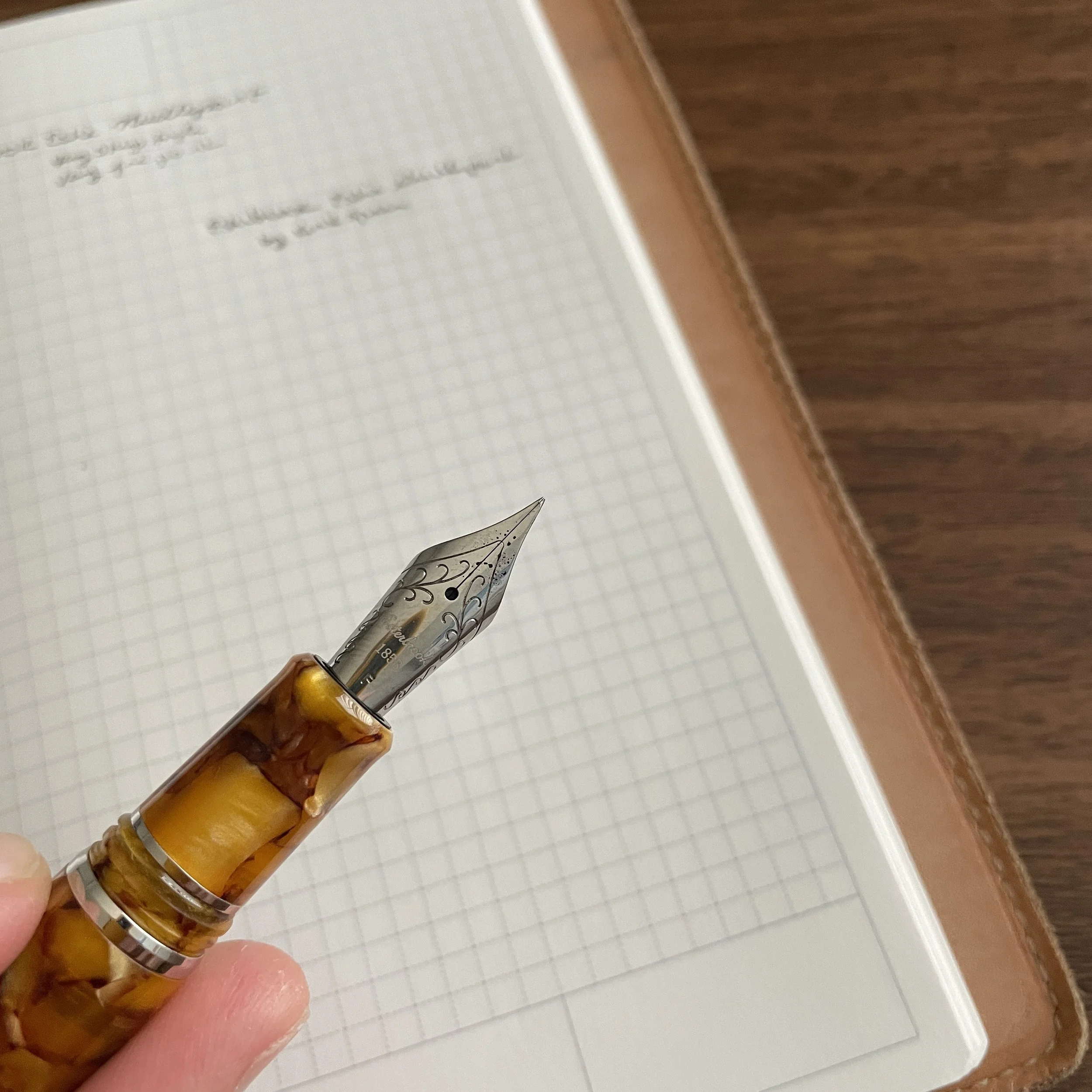
I talk a lot about unintentionally accumulated “mini-collections,” where I buy a lot of a seemingly-random type of pen over a period of months (or years) and then decide that the accumulation wasn’t really random at all, but rather says something about my changing needs and work habits. Over the past two years, I — like the rest of the world — have been working remotely, either from home, or outside or in a corner of the local library. A recent review of my collection shows that since that first quarantine period in early 2020 (and probably starting slightly before that), I’ve picked up more metal pens, especially pocket pens, since they’re durable and useful for working on the go.

I’ve not been a huge proponent of machined or all-metal pens in the past, generally finding them heavy and awkward, but in recent years certain makers have revolutionized the writing experience by using different machining techniques to reduce weight and improve the ergonomics, particularly with respect to the grip section. If you enjoy the look of a machined pen, fountain or otherwise, you no longer have to sacrifice comfort and usability over long writing sessions. Today I’ll discuss a few considerations that I take into account when selecting a metal pen, all of which relate to their usability as daily writer (or “workhorse”).

The Baron Fig Squire in brass is quite heavy, but still comfortable to write with due to the contoured “teardrop” shape.

Balance

To me, the balance of a pen is far more important than the overall weight. A heavy, well-balanced brass pen can be more comfortable for me to use than an oversized resin pen that’s been manufactured solely for purposes of “looking big and expensive” without any concern for usability. I use the term “balance” to refer to how the pen sits in my hand when writing, but be aware a certain pen may feel different from person to person, depending on things like hand size and underlying conditions such as arthritis. Metal pens that I consider particularly well-balanced given my average hand size include the Baron Fig Squire, with it’s contoured shape that places most of the weight towards the middle-front, as well as the Schon Full-Size Fountain Pens, aluminum pens which are so light and well-balanced that you can even post the cap without sacrificing comfort - something you rarely see in the machined pen universe.

The Schon DSGN Full-Size Fountain Pen has become one of my favorite designs of all time. I know that’s lofty praise, but rarely a day goes by when I don’t use this particular model.

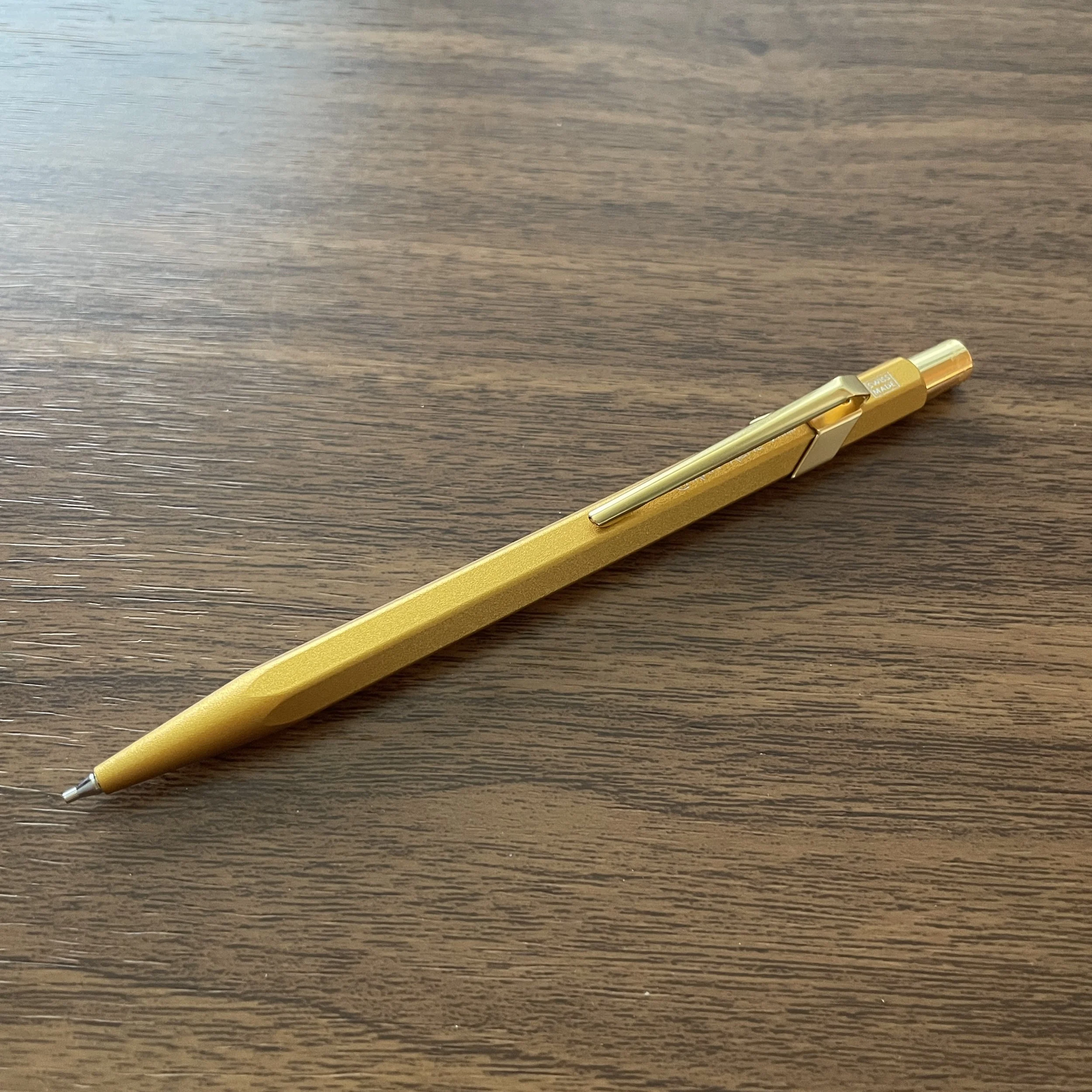
Weight Reduction Machining

Weight remains a significant consideration. In recent years, makers have been machining the walls of their pens thinner to control for this factor. Thus, while I consider balance to be more important overall, for something like a thicker fountain pen that has to be wide enough in diameter to hold a converter, you won’t be able to achieve good balance without paying close attention to weight, even with lighter materials such as aluminum and titanium. Favorite makers of mine who have done excellent work in this regard include Ian Schon (see the Full-Size Fountain Pen, discussed above), and Matthew C. Martin. Though not currently in production, the titanium version of the Gist 2.0 fountain pen by Tactile Turn is also a delight to use, as well as the bullet-style metal fountain pens made by Traveler’s Company (and the ballpoint).

View fullsize Schon DSGN Full-Size Unposted
View fullsize Schon DSGN Full-Size Posted

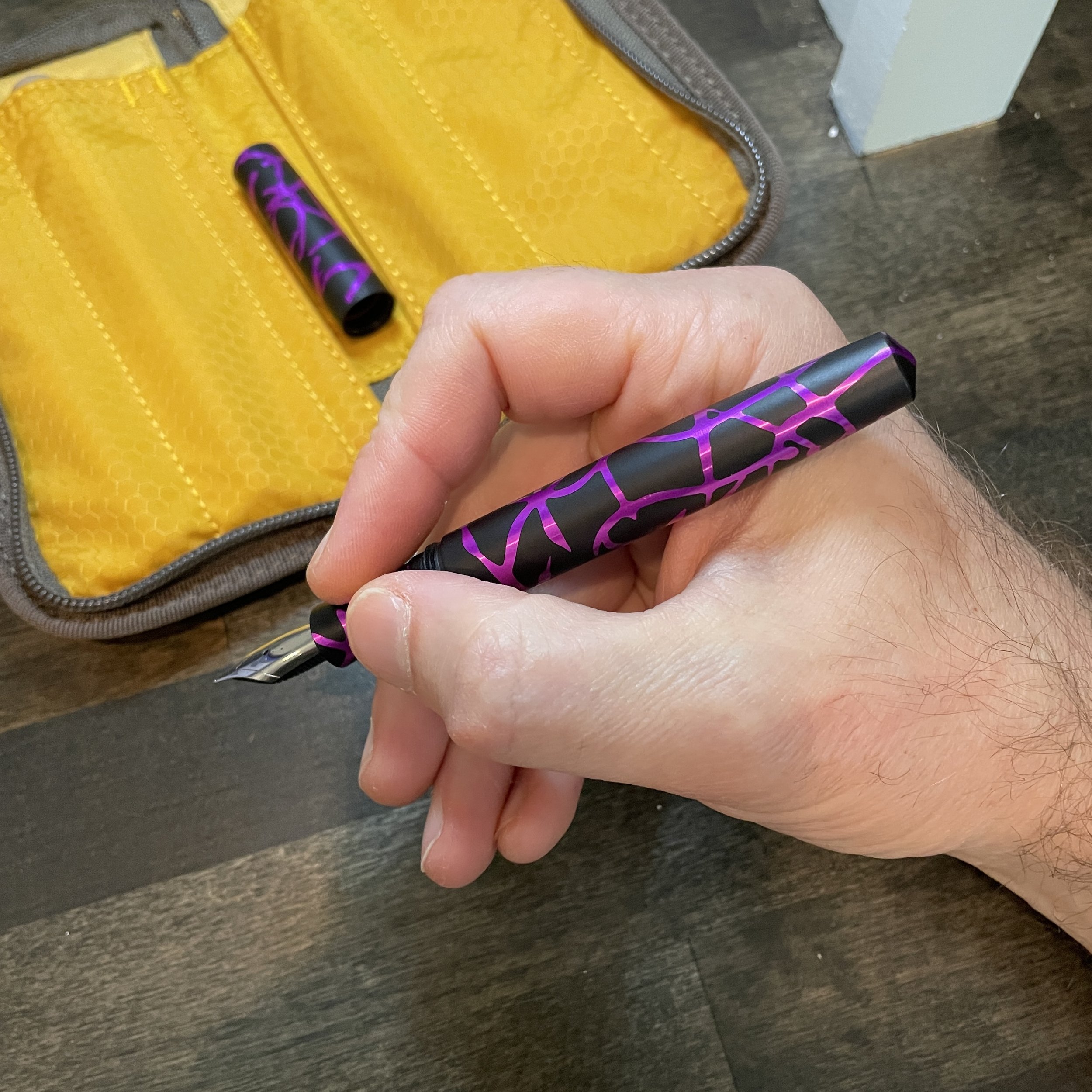
A Comfortable Grip Section

When you mention “metal pens” to many fountain pen enthusiasts, they envision a smooth section that becomes slippery as you write for longer periods of time. While that problem still exists for those of us that tend to use a tighter grip, many companies have introduced a slight texture to their sections in the form of machined grooves or the application of a matte finish. One of the more comfortable sections I own, machined or not, is the longer, ridged section on my brass Schon DSGN Pocket Six.

I’m glad I sprung for the elongated grip section (though the standard smooth section is also excellent).

The end result of all this is that I no longer necessarily look at metal pens as occupying their own category or product segment, separate from "normal pens.” I find the pens mentioned here indistinguishable, usability-wise, from traditional celluloid, resin, or acrylic pens, and some are in fact even more comfortable. If you’ve been considering a metal pen, but have been put-off by potential weight issues, please reconsider, especially if you have the opportunity to test out one of these pens at a pen show or local pen club.

Further Reading

If you’re interested in reading more about the idea of “workhorse pens,” you can check out the rest of this series here. The “Workhorse Pens” series of blog posts explores those pens that I love to use for, well, actual work, and contains longer write-ups on how and why I enjoy these particular pieces from my collection.

I purchased all of the pens featured here with my own funds, for my own use. This post does not contain third-party affiliate links. The Gentleman Stationer is supported by purchases from the T.G.S. Curated Shop and the T.G.S. Patreon Program.

In Workhorse Pens Series, Pens Tags Machined Pens, Metal Pens, Schon DSGN Pocket SIx, Schon DSGN
1 Comment

Thursday Drops: Start Gearing Up for Travel Season

May 12, 2022

Summer is here (earlier than usual, at least for us), and whether you’re doing extensive travel or sticking closer to home, we the Curated Shop is stocked with everything you need to be able to write on the go. We recently received a wide array of travel-friendly products, including a complete restock of Traveler’s Notebooks, some newly arrived Traveler’s Company Spiral Ring Notebooks, and new reading accessories such as these slim Midori bookmarks, perfect for marking your place on the go without adding undo weight.

These low-profile divider stickers are super convenient. I like them because they stay out of the way, but are there when you need them. For me, the numbered dividers are useful to divide my work notebook into sections by month.

We’ve also introduced a new category: Notebook Dividers! We now offer a series of different tools that you can use to divide your planner or notebook into sections, including both metal and plastic/tape-style clips and dividers. These are super convenient (and inexpensive to boot).

The T.G.S. Curated Shop is an authorized retailer of all brands sold.

  1. Traveler’s Company Spiral Ring Notebooks. These versatile notebooks feature a reinforced kraft cover and 100 pages/200 sheets of white Midori MD paper, perfect for use as a journal, notebook, sketchbook, and/or scrapbook. In other words - great for travel! Inexpensive and available in three different sizes: A5 Slim, A6 Slim, and B6, the latter of which can also be turned vertically to use reporter-style.

  2. Midori 70th Anniversary Five-Year Journal. While the Three-Year version is sold out, we have a couple Five-Year journals in stock with the limited edition recycled green leather cover.

  3. Midori 70th Anniversary MD Notebook Slim Limited Edition. Looking for a lighter-weight carry to take with you this summer? These MD Notebook “Light” format versions come as a seven-notebook set, each with different-color threaded bindings and matching grid-rulings.

  4. Midori Clip Bookmarkers. Available in sets of four, with four different themes including travel, weather, flowers, and, of course, cats, these .1mm thin metal book markers can be used to mark your place in the book you’re reading, and can even be used as a stencil for decorating your journals/planners/notebooks.

  5. Midori MD Notebook Dividers. Available in either metal or plastic/tape style, these low-profile notebook dividers offer an easy and inexpensive way to divide your notebook or bullet journal into sections. Personally, I use the numbered Midori tabs to divide my work Traveler’s Notebook into months.

All the various patterns of the Midori MD Clip Bookmarkers. The “Travel” theme is my favorite.

In Deals, TGS Curated Shop Tags Deals, TGS Curated Shop
Comment

Exploring Stock Custom Nibs: The Esterbrook Needlepoint by Kirk Speer

May 11, 2022

In my past few pen show reviews, particularly my review of the Baltimore Pen Show, I remarked on how there are many more nib grinders working at pen shows than there used to be. The result is not only shorter wait times and more options for those looking to tune or customize their fountain pens to their personal preferences, but a wider range of styles and specialties that only make this hobby more fun and more interesting.

A secondary benefit to having more working nib grinders is yet another trend: manufacturers offering pre-ground specialty nibs as an add-on to standard pens. While Franklin-Christoph has done this for years, with their Masuyama, SIG, and Nagahara-ground nibs, Esterbrook now offers a cursive italic (“Journaler”), an architect (“Scribe”), and now a needlepoint, from Kirk Speer of Pen Realm.

This Kirk Speer needlepoint nib from Esterbrook balances a narrow line with smooth writing.

Needlepoint grinds, or “extra, extra-fine” or “ultra-extra fine” nibs, aren’t necessarily as popular among enthusiasts as stubs, italics, and architects. They require you to use light writing pressure, or else the sharp tip will dig into the paper, and even with a light hand needlepoint nibs can feel toothy, which some people consider “scratchy.” That said, if you have small handwriting, or need a fountain pen to use for annotations or marginalia, I’m a firm believer that you need at least one needlepoint nib in your collection.

Kirk ground this needlepoint from a fine, as opposed to an extra-fine. Having more tipping to work with on the original nib often leads to better results, in my experience, especially if you value smoothness.

This particular nib, ground for Esterbrook by Kirk Speer of Pen Realm, is smoother than most needlepoints I’ve used, making it a perfect nib for those who want something that writes a narrower line than your typical JoWo steel extra fine nib, but isn’t so fine that it can’t easily be used for everyday writing. I would compare this needlepoint nib to a standard Japanese extra-fine nib (or even some Japanese fine nibs), rather than something like the Platinum Ultra-Extra Fine or the Franklin-Christoph Nagahara nibs. That said, because these nibs are ground by hand, there will lbe at least some variation between them, and the nib I received may not be identical to every nib out there.

Comparing the line from a Platinum Ultra-Extra Fine Nib (top), the Franklin-Christoph Nagahara needlepoint (middle), and the Esterbrook by Kirk Speer needlepoint (bottom). The Esterbrook nib writes a wider line, but is much smoother and better for everyday writing than the other two, which many people find too toothy. (I personally love them, but I have situations where I need to write very, very small.)

Takeaways and Where to Buy

Esterbrook has done the pen community a great service by introducing these custom nib options into its standard lineup, and by making it easier to get a custom nib grind as an add-on to your purchase of an Esterbrook pen without having to travel to a pen show or separately send your pen off to a nib grinder for what can be a weeks-long waiting period. While an ultra-fine needlepoint grind may not be for everyone, I found this particular nib to be well-made, and it will have a permanent home among my various Esties.

The Esterbrook featured here is the Honeycomb with Chrome Trim, one of my favorite materials.

You can purchase the nib and pen featured in this review from most Esterbrook retailers, including our friends at Vanness Pens. Typically, the custom-ground Esterbrook nibs cost an additional $48, with most of the markup going to cover the cost of the nib work. (To compare, having a pen ground to a needlepoint typically costs around $50, excluding the cost of shipping.) If you’re interested in further exploring Kirk’s work and having him grind or modify a pen for you, visit his site at Pen Realm.

Further Reading

Those interested in reading further on different types of custom nib grinds should start with this post I wrote a couple of years ago. In terms of other specialty Esterbrook nibs, I have reviewed the Esterbrook “Journaler” nib - a cursive italic nib ground by Gena Salorino of Custom Nib Studio, which is still available. There is also an architect nib, the “Scribe”, ground by Josh Lax of J.J. Lax Pen Co., which I’ve not had the opportunity to try but I have used Josh’s architect nibs and enjoy them.

Disclaimer: Esterbrook provided me with the nib featured in this review free of charge, for review purposes. This post does not contain paid third-party affiliate links. The Gentleman Stationer is supported entirely by purchases made through the T.G.S. Curated Shop and the T.G.S. Patreon Program.

In Pens Tags Esterbrook Needlepoint, Custom Nibs, Nib Grinding, Fountain Pen, Esterbrook
2 Comments

New in the Curated Shop: Caran d'Ache 849 Mechanical Pencils in Black Code, Gold Bar, and Brut Rosé Finishes

May 10, 2022

For the longest time, I found myself wishing that Caran d’Ache released matching mechanical pencils in their premium finishes, but apart from the Ecridor Racing series, this wasn’t a possibility. Until now. Caran d’Ache recently announced the release of the 849 “Black Code”, “Gold Bar,” and “Brut Rosé” .7mm mechanical pencils, which complement the existing ballpoints. Personally, the Gold Bar is fast becoming my favorite - surprisingly, perhaps, given my love for all things matte black.

Caran d'Ache Gold Bar Mechanical Pencil

The Gold Bar finish is criminally underappreciated, IMHO.

These Caran d’Ache “Pop Line” mechanical pencils are priced at $42, the same as the ballpoint, and currently available for purchase in the Caran d’Ache section of the T.G.S. Curated Shop. If you’re looking for a matching set, purchasing both automatically qualifies for free shipping, with no coupon code necessary at checkout.

The T.G.S. Curated Shop is an authorized retailer of Caran d’Ache and all other brands we carry.

Both the Black Code (shown top) and the Brut Rosé (shown here) are impossible to keep in stock as ballpoints.

In TGS Curated Shop Tags TGS Curated Shop, Caran d'Ache, Caran d'Ache 849
1 Comment

Paper Review: First Impressions of the New Sanzen Tomoe River Paper

May 7, 2022

Fans of the original lightweight Tomoe River Paper were disappointed to hear last year that it was being discontinued. After a lot of back-and-forth over whether the paper was truly gone forever, it was announced that Japanese paper company Sanzen had purchased the formula and naming rights from Tomoegawa, and Tomoe River Paper would go back into production. But would it be the same? That’s the big question.

A comparison of the original Tomoe River (top) vs. the new Sanzen version (bottom). I have more comparisons of writing samples below.

A good friend of mine placed a large order direct from Yamamoto Paper in Japan, and was kind enough to add a package of A4 Sanzen Tomoe River sheets to his order for me. I’ve had a week or so to test this paper out, and can offer you my initial thoughts. Short Answer: Those looking for an exact replica of classic 52gsm Tomoe River Paper (in terms of both feel and how the paper showcases ink colors) are going to be dissatisfied, those who appreciate any lightweight writing paper that handles fountain pen ink without feathering or bleeding will like this paper just fine, and those who use pencils in addition to fountain pens might strongly prefer the new paper over the old. Let me break this down:

  • Sanzen Tomoe River Paper feels stiffer and has more tooth. While it still manages to have that “crinkly” feel that some people loved about the original, the Sanzen version feels different - more like a traditional writing paper such as Midori MD. It also has more feedback - it’s not rough or scratchy, but the feedback is definitely noticeable when you do a side-by-side comparison with the original. I’ve heard some people complain about the paper “dragging” on nibs, and while I personally would not describe the feel as “draggy,” that may depend on the specific nibs you use and how sensitive you are to writing feel.

  • Sanzen Tomoe River Paper showcases ink much differently than the original. It’s neither good nor bad, but inks look different on the Sanzen paper than on the original: darker with less shading and sheen, and less-pronounced color variation in multi-chromatic inks. You will either like or dislike this property/feature, depending on how you want your inks to look, but there’s really no way to tell other than trying some for yourself. I tend to use less exciting inks for my daily writing than most people, and I don’t use my papers for art and/or calligraphy where ink properties might be more important, but if you do, you may end up disappointed.

  • Sanzen Tomoe River Paper may have less show-through and “ghosting.” I’ve had several questions via Instagram about whether there is “ghosting” with the new Sanzen version. For purposes of answering this question, I’ll equate “ghosting” to “show-through”, meaning that you can still see the writing on the reverse side of the page, even if the ink technically doesn’t bleed through. The short answer is yes, there is still show-through (as you would have with any thin paper - it’s unavoidable), but it’s not as pronounced. I say “may” above because it will likely depend heavily on the ink you use.

    • Note: I personally define “ghosting” differently, and use it to refer to the transfer of ink or graphite from one page to another when you write on the back of a page that already has writing on it. With pencil, it’s near certain that you’ll experience some ghosting with anything HB or softer. With pens, it’s more a function of the ink used rather than the paper, but ultra-smooth paper will exacerbate the tendency of highly saturated or slow-drying inks to ghost.

  • Sanzen Tomoe River Paper will likely be more durable than the original. If I had one complaint about original Tomoe River Paper, it’s that the paper could be so thin and crinkly (especially in looseleaf form), that it could tear easily. For this reason, I often avoided using Tomoe River paper at work, and in situations where I needed a notebook or writing pad to travel in a backpack or briefcase. While far from scientific, I did a “tear test” on both the original Tomoe River and the Sanzen Tomoe River, and the Sanzen version feels stronger and rip-resistant.

  • Sanzen Tomoe River Paper is better for pencil. Given the additional tooth/texture, those of us who use pencils as much as fountain pens may well prefer the Sanzen version to the original, which could be a bit too “glassy smooth” for pencils. Because of the lack of texture, many found that the original Tomoe River Paper smeared with darker pencil, probably because ultra-smooth papers don’t hold the graphite as well as toothier versions.

In this picture, you can see a pronounced difference in color between the inks on Sanzen Tomoe River Paper (top) and the original 52gsm paper (bottom). The two inks are Vinta Perya and Vinta Sirena, respectively, both of which typically have multi-chromatic shading, which is not as visible on the Sanzen paper. To be fair, the lighting in my kitchen makes the Sanzen writing look darker than in real life, and the effect is more pronounced on the blue Perya than the more green-ish Sirena.

Note: In comparing Sanzen Tomoe River Paper with the “original” Tomoe River Paper, I am not distinguishing between any of the formulation changes in the original. Prior to being discontinued, the original paper changed at least once (to much discussion among paper connoisseurs). Because I could never tell a difference between the “new” and “old” original Tomoe River, and because the different versions are not easily identified, I’m not taking that into account in this comparison.

Takeaways and Where to Buy

Sanzen Tomoe River Paper is not widely available at the moment, though that will likely change as it works its way through the supply chain. Personally, I think I’ll be perfectly happy with this new version, should I ever need to purchase additional Tomoe River notebooks, or should companies like Traveler’s Company and Musubi decide to start using this paper in their notebooks. (I have a lifetime supply of pretty much any sort of paper in existence, so I’m not particularly concerned about running low on original Tomoe River.) That said, the Sanzen Paper is different, and if you’re a die-hard fan of the original you shouldn’t expect it to duplicate the experience you’ve grown to love. This is essentially an entirely new paper, and should probably be considered on its own merits.

So where can you get this paper? The Yamamoto Paper Etsy Shop is currently the only source I’m aware of. It’s currently priced at $6.50 for a pack of 50 A4 sheets, with shipping costs of nearly $20 so you’ll want to stock up and make your order count. I expect I’ll be able to offer this paper in the Curated Shop at some point, though if you’re a die-hard fan of old Tomoe River you’ll be happy to know that I still have some 52 gsm paper available in the Traveler’s Notebook “Lightweight Paper” Specialty Refills, in both Standard and Passport sizes. (I tried to stock up on these while they’re still available for purchase). Lochby A5 and pocket notebook refills also feature the 68gsm Tomoe River, and I hear this paper will remain available but that’s by rumor only.

This post does not contain affiliate links. The Gentleman Stationer is supported entirely by purchases from the T.G.S. Curated Shop and pledges/donations via the T.G.S. Patreon Program.

In Paper Products Tags Paper Review, Tomoe River, Sanzen Tomoe River
9 Comments
← Newer Posts Older Posts →
Store Hours and Events
Shop T.G.S. Online
Updated 2026 "Best Pens" Guide
No results found
On The Paper Trail: Live In Nashville Event Tickets Now Available!
TGS_25 Roterfaden Restock Notification
Hierarchies of Fountain Pen Friendly Paper

Join Our Patreon!
Subscribe to the TGS E-mail List

Featured Posts

Featured
Pilot-Custom-Heritage-92.jpg
June 6, 2026
Workhorse Pens: Pilot Custom Heritage 92 Fountain Pen
June 6, 2026
June 6, 2026
Kakimori-Inkstand-Before.jpeg
May 30, 2026
Japan Trip Journal: A Visit to Kakimori, Including Custom Notebooks and the InkStand!
May 30, 2026
May 30, 2026
Five-Foundational-Fountain-Pens.jpeg
April 22, 2026
T.G.S. 12th Anniversary: 5 Fountain Pens Everyone Should Experience
April 22, 2026
April 22, 2026
The Gentleman Stationer RSS

View Cart

© Digital Divide Media, LLC, 2014-present.

All content is the exclusive property of Digital Divide Media, LLC, d/b/a The Gentleman Stationer, including “The Gentleman Stationer” website and trademark, and should not be reproduced without express written permission.  All rights reserved.

All content containing paid advertising, affiliate links, or sponsored content will be plainly disclosed by a disclaimer when/if featured.

Contact Information

Website Terms and Conditions

Store Shipping Policy and Return Policy

Privacy Policy and Cookie Policy

Accessibility Statement

Powered by Squarespace