• Blog
  • Shop
  • Resources
  • FAQ (Ask TGS)
  • About
  • Archive
  • Contact
  • Sign In My Account
Menu

The Gentleman Stationer

Vintage Living in the Modern World.
  • Blog
  • Shop
  • Resources
  • FAQ (Ask TGS)
  • About
  • Archive
  • Contact
  • Sign In My Account

Personal Workflow: It's More Than Novelty - Different Paper Rulings for Different Purposes

September 20, 2023

Between my dual careers as an attorney and a writer/shopkeeper/administrator, I go through a lot of paper. (Seriously - people don’t believe me when I tell them that I’ve been known to write through 1-2 full converters of ink in a single day. That requires a LOT of paper.) But what paper do I use? That depends on the nature of the writing itself. Dot grid has long been my standard “everyday” paper simply because it’s so versatile, but lately I’ve rediscovered the beauty of a plain blank page. I’ve also enjoyed using the “quadrant graph” layout from Plotter/Midori Designphil. I thought it would be fun to talk specifics about each of these papers, how I use them, and in what formats.

My Most Used Paper Rulings and How/WhY I choose Each one

  1. Dot Grid. A light, subtle dot ruling offers just enough structure for actual writing, but it can also “disappear” if you want to draw, take random notes vertically, annotate, etc. To me, dot grid paper represents the perfect compromise between structure and flexibility, and best of all, it’s readily available in pretty much any pad or notebook format you can think of (including colored paper). The three formats I use the most are the Rhodia Dot Pad, a stationery workhorse which has been in my rotation for more than a decade, the letter-sized Write Notepads Memo Pad, and anything with dot grid Tomoe River paper, preferably the 68gsm version because I think it holds up to daily use better. (Get it while you still can.) Dot grid is my default paper.

  2. Reticle/Cross Grid. After dot grid, the next best thing for me is a reticle grid, featuring small crosses instead of dots. (Hence this ruling also being called “cross grid.”) Offering a bit more structure than a dot grid without the fully connected lines to disrupt your writing, I will opt for a reticle grid over standard graph any day. This particular paper first went mainstream back in 2014 with the release of the Field Notes “Night Sky” edition. These days, reticle grid paper can still be somewhat difficult to find - certainly harder than dot grid - but it’s becoming more common. Atelier Musubi offers it as an option in their recently released “Rasa 83” notebooks, as well as their new Spica Bond 75 pocket notebooks. Nanami Paper also continues to sell the Seven Seas “Crossfield” Tomoe River Journal.

  3. Blank. Back at the beginning of the year, I resolved to allow myself to just enjoy using really good paper that didn’t have a set “purpose.” I wanted to play around more with pens, ink, and even paint, and blank paper makes the perfect canvas for experimentation. Moreover, because many specialty Japanese papers only come in a blank format, allowing yourself to enjoy the blank page dramatically expands your range of options. Specific papers I’ve used often include Midori MD Cotton (which sadly no longer comes in anything other than blank), Passepied, Spica Bond, and even the G. Lalo laid paper. I’ve actually come to enjoy taking notes randomly on a blank page, without any “guidelines,” especially when brainstorming.

  4. Multi-Lined. Somewhat sadly, I find myself using lined paper less these days, though that’s more incidental than intentional. I rarely use a standard lined ruling, and when I do I will nearly always opt for Clairefontaine’s French/Seyes-ruled paper and, more recently, the Nakabayashi lined versions that were recommended to me by Ana over at the Well-Appointed Desk. That said, I expect my usage of this multi-lined paper to dramatically increase over the next year. While I’ve been hinting at this on the site (and definitely in the Patreon discussions) for a while, I feel comfortable disclosing that I’m in the middle of a career change that (1) will allow me to devote more time to T.G.S.; and (2) move to a position at my day job that is much more writing-intensive, which is the part of the work that I truly enjoy. Hopefully I’ll shift back to where I was several years ago, using Clairefontaine French-Ruled paper to draft legal briefs by hand, much to the befuddlement of my coworkers! ;)

  5. Quadrant Graph. I’ve been using this new arrival to the lineup almost nonstop since Plotter released their special edition “Japan Blue” notebooks last month. While I don’t typically use graph paper, if I do it’s going to be micro-graph (2mm). After some initial skepticism, I’ve really come to enjoy this layout. I write small, so the micro-graph doesn’t bother me even if a standard graph ruling isn’t my favorite. What’s surprised me is the utility of having a page divided into four quadrants. I make a lot of lists, some of which are related to one another and include “sub-lists” under specific tasks, so this layout has been quite useful for project management and thinking through SWOT-style analyses. It’s also helpful to be able to separate notes on different topics into four sections on a single page. For those who find the blue Plotter paper too dark (or the micro-graph too small), Midori sells a standard A5 journal in what they call a “Grid-Block” layout.

A dot grid ruling (top - Midori Soft Color) compared against reticle grid (bottom - Musubi Pocket Notebook)

Further Reading on My Favorite Papers

Out of the three major categories of stationery (pens, inks, paper), I feel the most comfortable recommending paper, since I have extensive experience using it everyday for 30+ years in a variety of personal and professional contexts. (I can also talk about it for hours - you’ve been warned.) Paper preferences, however, are subjective, with ruling preferences differing from person to person depending not only on need but also handwriting and notetaking style. So my ruling preferences, discussed above, may not equate to yours, and that’s ok! Finding what works for you is part of the fun of this passion/hobby.

If you’d like to read further on the topic of paper and recommendations, I’ll typically direct readers to this post on Fountain Pen Friendly Paper, which has an extensive comments section that contains additional discussion among readers. At some point I will need to update the post based on certain suggestions, but there are so many brands mentioned that there’s probably no way I will get to them all!

The Plotter Quadrant Graph Paper.

The Gentleman Stationer is supported entirely by purchases from the T.G.S. Curated Shop and pledges via the T.G.S. Patreon Program. This post does not contain third-party affiliate links or paid advertising.
In Paper Products, Editorial Tags Editorial, Paper Review
1 Comment
Three Planners for 2023

It's Planner Season, and I'm Not Really Using One: Checking in on the 2023 Notebook Carry

September 9, 2023

I haven’t been paying much attention to “Planner Season” so far this year. By “Planner Season,” I’m referring to that week in September - didn’t it used to be October? - when the next year’s Hobonichi/Midori/Traveler’s dated planners and diaries go on sale and you can start the process of ordering your new book for 2024. While I enjoyed the Hobonichi for a few years, I don’t currently use a dated paper planner, and outside of my Midori 5-Year Diary I’ve not been journaling consistently enough to justify the expense of a dated everyday long-form journal. That said, I’ve been consistently deep into several different notebook systems and figured that it’s time for one of my periodic posts on what I’ve been using, what works, and what might need to change.

A Plotter patina update, with a focus on the Mini 5 that used to be grey ;)

What Notebooks/Planners/Journals Have Been in Rotation?

This year has been a year of transition for me as I figure out a system for juggling multiple projects and increasing responsibilities, complicated by the fact that many of them are unrelated and need to be kept separate from one another.

  • William Hannah A5 Notebook. For the first six months or so of this year I felt like I needed an analog task-management system for my day job, specifically for managing research projects, assignments delegated to others, and piecing together different substantive ideas into a larger case plan. Ultimately, the scope of my primary case contracted to a much narrower focus, and ultimately resolved, so I’m not using the William Hannah as much anymore. I will likely repurpose it - I find notebooks with removable pages extremely useful, and the William Hannah is excellent for projects where you need to carry around more pages than something like the Plotter system will allow.

  • Plotter A5/Narrow/Mini 5. My Plotter A5 binder serves as the repository for most of my notes, research, lists, etc. related to T.G.S. The Plotter Narrow holds all of my personal finance and household management notes, and my Mini 5 is my “safety blanket” pocket notebook that doubles as a wallet and pretty much goes with me anywhere.

  • Roterfaden Taschenbegleiter A5. Less a “notebook” and more a “portfolio”, my Roterfaden Taschenbegleiter holds the two to three loose notebooks that I use on a weekly, and sometimes daily, basis, namely my personal journal and whatever notebook I’m using for morning pages and brain dumps. Right now, it’s the Theme System Journal and a Write Notepads Paper Journal, but these are almost full and I will most likely be swapping new books in soon.

I’ll note that the three above are just what I use regularly. I still keep at least one Traveler’s Notebook ready as a sketchbook/pen show/pen club notebook, alongside another pen testing notebook. I also have a few notebooks that serve as repositories for specialized research and commonplacing that don’t really leave my desk area.

My Midori 5 Year Diary: Probably the closest thing I’ve kept to a daily journal.

What Changes I Plan to Make to the Rotation

The primary change I need to make is to add some sort of monthly calendar to help me plan site content and some longer-form writing projects I’m starting to work on that are related to T.G.S. I’ve been so overwhelmed with work responsibilities and family obligations that I need to start reducing the number of things I’m working on developing a more focused plan. I will be starting a new, hopefully less-stressful position at my day job in the coming months that will make things more manageable.

I could plan this out electronically, but with things like content planning over the course of a month (or longer), it’s more helpful to me to be able to sit down with a month-to-two-pages calendar layout and pencil in the different options, adjusting as I go. I’ve considered undated calendar stickers, but I need a bit more room to write. I would consider a Hobonichi Weeks, but (1) I need to get started with this immediately; and (2) I don’t want to add yet another stand-alone notebook unless it fits into one of my existing cases or covers. The most obvious immediate solution is an undated Monthly/Weekly Laconic or Lochby refill, which I can add to the Roterfaden. Once the year turns over I may move to a Plotter monthly calendar and keep it in my A5 binder.

The interior layout of the Cal Newport Time Block Planner. The paper quality is actually excellent.

Under Consideration In the Laboratory

I’ve been testing out the Time Block Planner. As part of my effort to narrow the volume of projects I have open at any given time and increase the time and attention I can pay to each one, I’ve been working my way through this “planner” developed by Cal Newport, whose work I’ve written about before. It’s been a helpful book, though I would definitely describe the Time Block Planner as more of a workbook than a planner I’d consider buying multiples of. Personally, I would rather take the time-blocking technique and transfer it to a bullet-journal style notebook where I have more control over the layout. A discussion of “time blocking” itself is beyond the scope of this article, but it’s best described as a technique where you move away from list and inbox-based task management and plan larger blocks of time that you can devote to uninterrupted work on specific projects. The goal is to train yourself to focus more on substantive accomplishments rather than the unimportant busywork and mindless e-mail/messaging that occupies so much of our daily work lives.

To Summarize….

So I guess if I had to describe my goal for this “Planner Seasons,” it would best be described as “fine tuning,” without too many major changes. Overall I’m happy with what I’ve been using, and my personal analog system is versatile enough that I can easily add specific functions to it as necessary. Consistency has been difficult over the course of 2023 as my needs have changed throughout the year, but hopefully as things smooth out and changes that are in the works settle down, it will all come together again!

The Gentleman Stationer is supported entirely by purchases from the T.G.S. Curated Shop and pledges via the T.G.S. Patreon Program. This post does not contain paid advertising or third-party affiliate links.

In Editorial, Planners Tags Notebook Systems, Planners, Planners 2023
Comment
Jetstream Edge .28mm and .38mm Refill

.38mm (left) vs. .28mm (right) Uniball Jetstream Edge

When Does "Fine" Become "Too Fine"? Finding the Sweet Spot for Extra-Fine Pens

August 16, 2023

I have relatively small handwriting, though I’m something of a special case since I tend to change my handwriting depending on what exactly it is that I’m working on. For standard writing and journaling, I’ll adopt a larger hand for which a medium nib is more suitable, but as I’ve mentioned before, a large portion of the writing that I do involves marking up and annotating documents that can contain very fine print. For work like this, I’ll typically need at least an extra-fine nib fountain pen, though this is where I tend to incorporate fine tip gel pens and ballpoints into my workflow.

My fine writing lineup, from left: Uniball Jetstream 4+1 Multi Pen, Anterique Brass .5mm Ballpoint, Uniball Jetstream “Tokyo Bike” 4+1 limited edition, two Jetstream Edge ballpoints in .38mm and .28mm, Uniball Jetstream 3 Multipen in .38mm tip size, Pilot Hi-Tec-C Coleto Multi Pen, and the Pilot Custom Heritage 912 with a PO Nib.

How fine can I go? Pretty Fine, But There Are Practical Limits.

On the fountain pen side of things, it’s difficult to get a nib that writes as fine as most .28mm or .38mm gel or ballpoint pens. Even if you’re using the Pilot PO (“Posting”) nib, Platinum’s UEF (Ultra Extra-fine), or a Saibi Togi-style nib, water-based fountain pen ink tends to spread on paper, so unless the pen writes fairly dry or you select a drier ink, you may have trouble obtaining the desired line width. For this reason, most of my annotation work is done with a finer gel pen or, more recently, low-viscosity ballpoint pens. I get a lot of questions about the best pen for “fine writing,” so I thought it might be interesting to talk a bit about the different options I rotate through on a regular basis and what my preferences are:

The Pilot PO nib leaves a line that’s roughly equivalent to a .38mm gel or ballpoint, provided you use good paper like the Midori MD pad pictured here.

  • Fountain Pens. My all-time preferred option for is the Pilot PO (“Posting”) nib, originally intended for addressing mail. It’s a VERY fine, slightly downturned nib that’s relatively dry and, when paired with an ink like standard Pilot Blue-Black, holds a fine line pretty well as long as you are using decent paper. On cheap office paper, however, even this ink tends to spread, which costs you the benefit of the finer point, which is why at the office I always have a gel or ballpoint pen with me.

  • Gel Pens. I rarely go finer than a .4mm Pilot Hi-Tec-C refill, since below that tip size I tend to run into drying/skipping/clogging issues, plus the writing experience becomes scratchy. My pen of choice is the Pilot Hi-Tec-C Coleto multi pen, which allows me to carry up to four different colors in a single pen body (or three plus a mechanical pencil). Lately, I’ve also added the .4mm Pilot Frixion to the rotation, and have been pleasantly surprised with how well it’s performed. The ink isn’t as dark as other gel pens, but it’s better than it used to be, and I plan to write up a full review of the Frixion once I’ve had more longer-term experience with it.

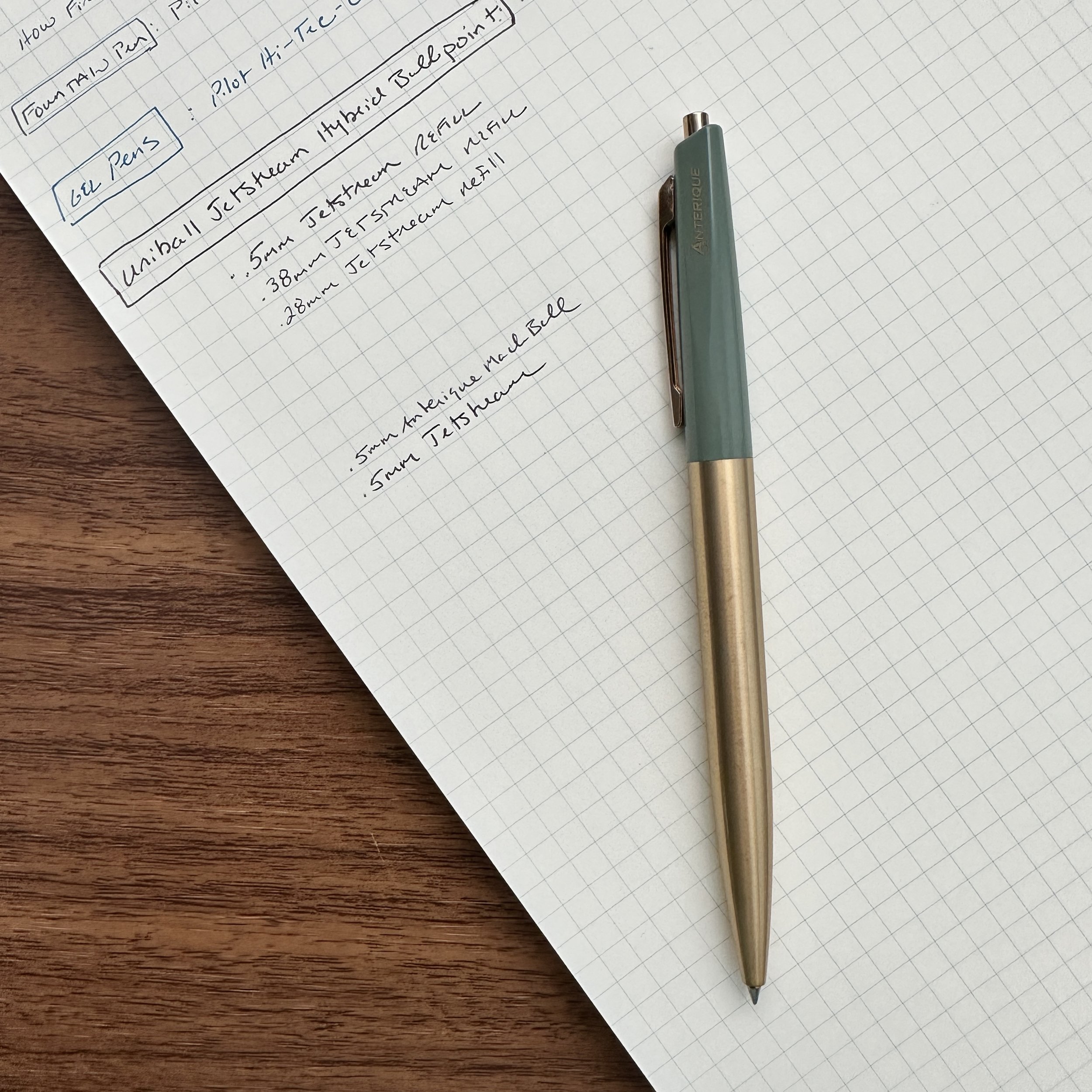
  • Ballpoint Pens. Honestly, where I’ve been spending most of my “fine-writing” time these days is in the hybrid/low-viscosity ballpoint category, since I generally find the writing experience smoother and more reliable, even if you go down to the .38mm tip size. I recently posted about my trip to New York City, where I visited Kinokuniya books and picked up a fistful of Uniball Jetstream multi pens, including a .38mm version that I had never seen before. While some claim to have experienced skipping and scratchy writing with the .38mm Jetstream cartridge, I’ve used this pen for years and never had an issue. That said, there’s no denying that a .5mm low-viscosity ballpoint refill is smoother, and unless I need to write really small, my pen of choice is the .5mm Uniball Jetstream (typically loaded into a multi pen) or the one of the .5mm Anterique “Mach Ball” pens.

The Anterique Mach Ball .5mm writes something more akin to a .4mm line - it’s narrower than the Jetstream .5mm despite having the same nominal tip size.

But What's the Absolute Finest I Can Go?

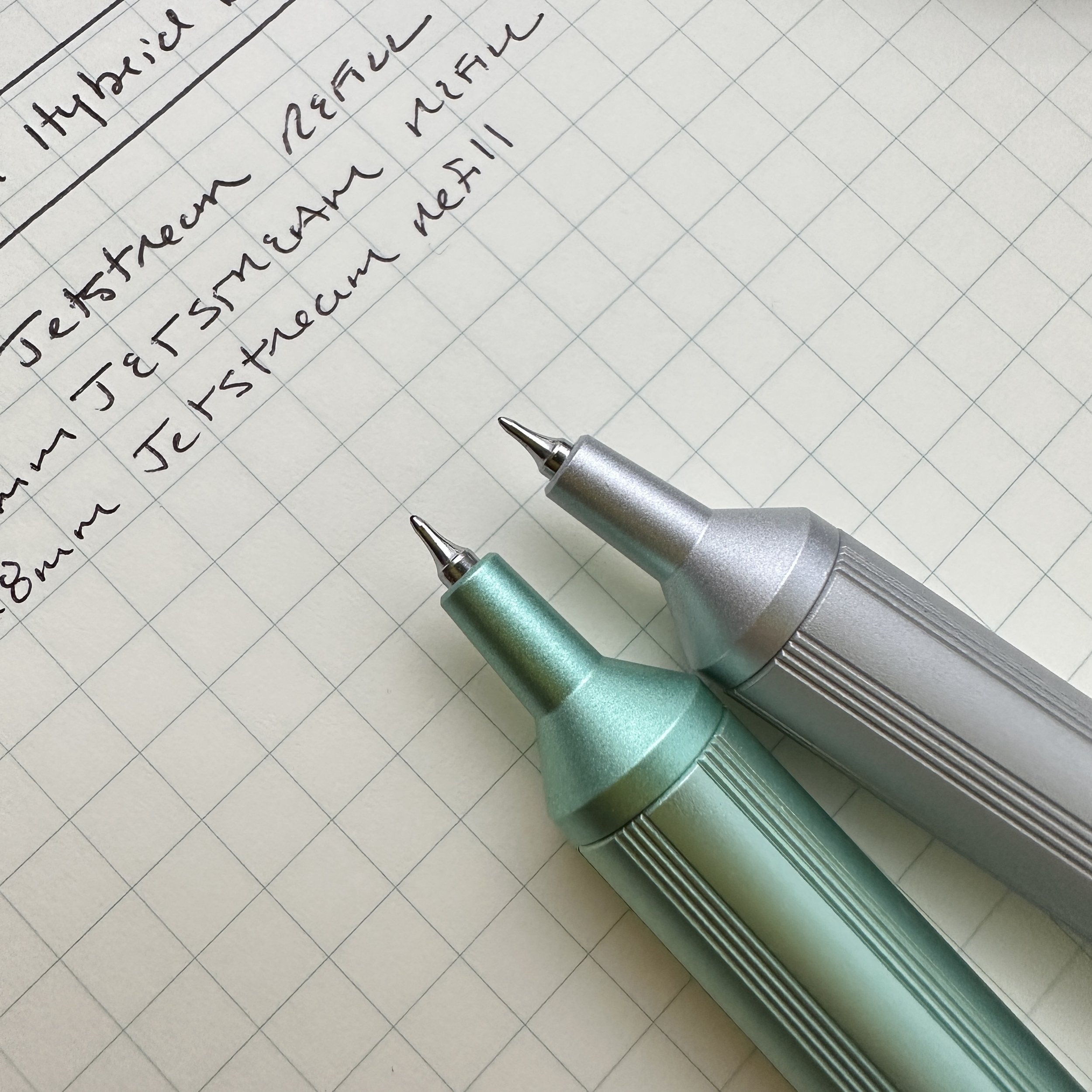
I used to say .38mm, but last month at Kinokuniya I picked up the .28mm Jetstream “Edge”, which features a Rotring-style hexagonal barrel and rounded grip section that some might find more comfortable than your typical technical pen. Check out the difference in tip size from the writing sample below:

Comparing the range of Jetstream tip sizes.

The shocking thing to me is that even at .28mm, you don’t lose that much smoothness or visibility compared to the .38mm. That said, I’m not sure that the .28mm gives you meaningfully more versatility than a .38mm refill for actual writing, as opposed to technical drawing or art where the subtle differences between line widths actually make a difference. Even if the .28mm is usable (which it is!), I’m not sure that there’s a benefit beyond novelty for most people. .28mm probably sets the floor for me personally!

The Gentleman Stationer is supported entirely by purchases from the T.G.S. Curated Shop and pledges via the T.G.S. Patreon Program. This post does not contain paid advertising or third-party affiliate links.

In Pens, Editorial Tags Uniball Jetstream, Small Writing
4 Comments

No More Grail Pens: Hunting Fun Nibs at the 2023 D.C. Pen Show

August 12, 2023

Though not as much anymore, the concept of a “grail pen” was something you once heard discussed a lot in the pen community, particularly at shows. “Grail pen” generally refers to one of two things: (1) the specific pen you are currently looking to add to your collection - i.e., the current subject of “the hunt”; or (2) the pen that you believe will complete your collection - i.e., the prize that you spend most of your time online and at shows searching for. Personally, I don’t really subscribe to the idea that “grail pens” in this second sense exist (because most people’s preferences are always changing), and I don’t really even hunt specific pens at shows anymore. These days, I mostly enjoy allowing pens to “find me”, and my show purchases involve special collaborations and exclusives designed by friends, oddball products and materials, and more adventurous nibs than I’ve tried in the past.

This year I’ve been picking up flex pens left and right, using them mainly for journaling and playing around with inks. Some inks just look exceptionally good in a softer nib, like the new Iroshizuku Sui-Gyoku, a vibrant teal.

Early on in my pen “collecting,” show-attending career, I would visit shows looking to try and acquire specific pens I had never used before: the Montblanc 146, the Pilot Vanishing Point, the Pilot Custom 74, the Sailor Pro Gear, the Pilot 823, etc. Personally, I think this is a critical process for most people who want to get really into pens and develop a deep knowledge of the hobby, because it lets you understand the differences between major brands, models, and styles. But eventually you’ve tried more or less every standard pen out there, and you move on to explore new things like limited and special edition finishes. My next step was the Montblanc 146 Ultra Black, one of the Leonardo Momento Zero “Maestro” sets, and more.

In lieu of adding yet more pens, I’ve worked to upgrade my pen displays and accessories, with items like these trays from Japanese woodworkers Toyooka Craft.

This stage of the hobby can be quite fun, and I still make these kinds of purchases regularly if there’s a finish or material I find compelling. But what draws me in these days is creativity and makers who think outside the box. There are so many new independent makers and smaller brands experimenting with different designs and nib grinds that I’ve largely lost interest in what some of the bigger companies are doing. (I can’t tell you the last time I purchased anything from Montblanc, and my 149 is currently “in the shop” getting the Studio Bokumondoh Urushi treatment, so it won’t be a “standard” pen for much longer.)

It doesn’t get much more vintage looking than red ripple ebonite!

This year’s D.C. Pen Show Haul was no exception. I talked about what I brought home in my main show recap posted earlier this week, but I wanted to add a bit more context to some of these purchases. My first show acquisition was a Daedalus 3.2 from Pierre Miller’s Desiderata Pens, which is a new riff on one of Pierre’s early designs. This pen is a piston-filler that takes either standard JoWo No. 6 nibs or the Zebra G flex nib fitted to a red ebonite feed that allows you to do truly vintage-style flexible writing. I’ve enjoyed Pierre’s work for years, and this special red ripple ebonite version was a must-have.

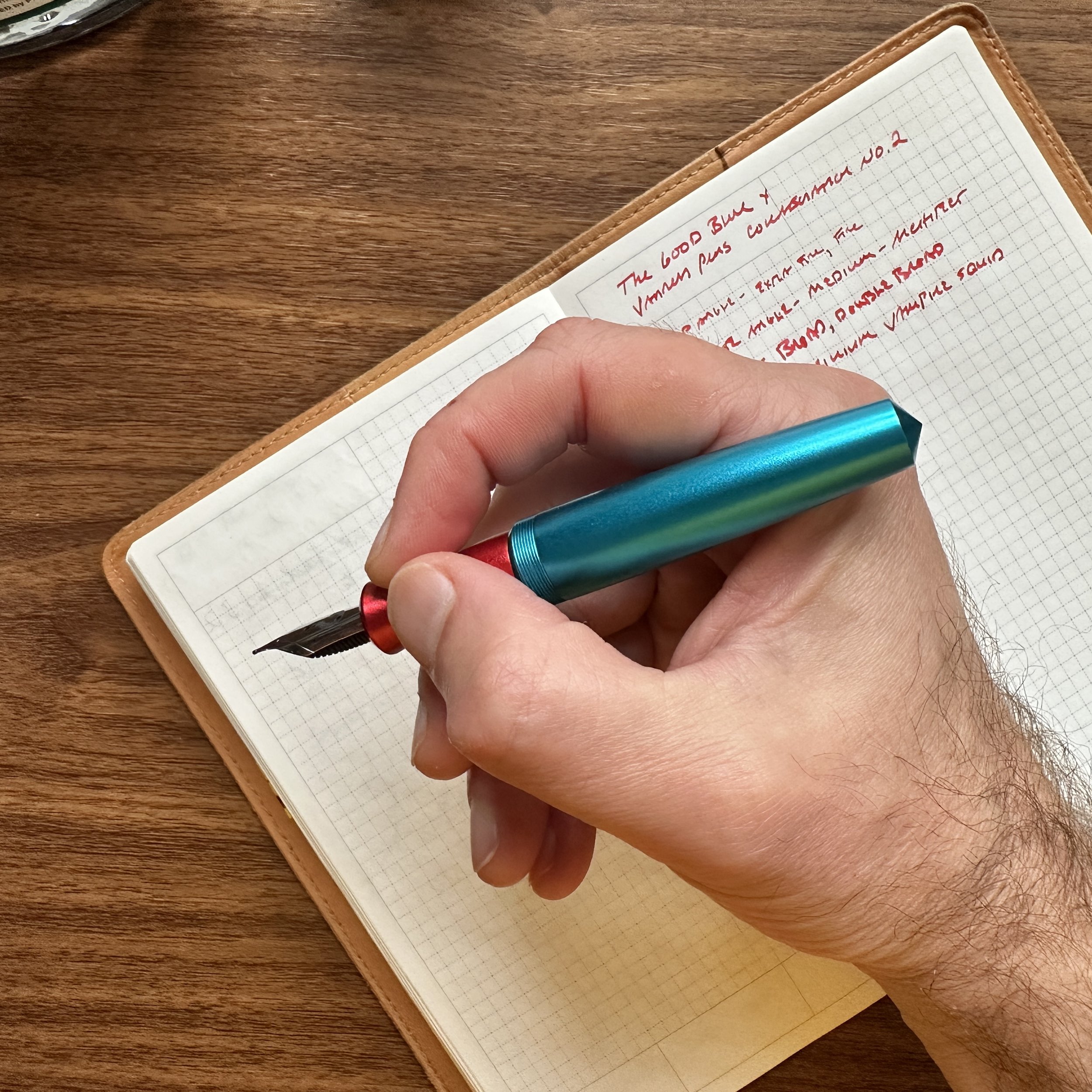
The second acquisition, which I teased on social media, is the second collaboration between Vanness Pens and The Good Blue Co. in a black Cerakote finish with “Vanness Green” splatter. Only 30 of these pens were made, and since I purchased the last Vanness x Good Blue pen with their titanium flex nib, this time I opted for their new “Zoom” nib, which is a somewhat oddball hybrid between Sailor’s version of a “Zoom” nib and a Naginata/Kodachi style nib. Both allow you to change the line width by modifying your writing angle - I would say the Zoom has more extreme variation between angles and isn’t as “smooth” in the transitions as a Kodachi. It’s a cool nib and I can see myself using it often for daily writing.

I made sure to get one of the pens with lots of green splatter, as I mentioned.

I mean, can you resist that nib? Mine came exceptionally well-tuned.

Finally, I snagged one of Evan at Penquisition’s “Touchstone” collaborations with Ben Walsh of Gravitas. Evan set out to make a pocketable pen that was full-sized when posted. Not only does the Touchstone fit that bill, but the color combinations are excellent. I went with the blue and red version (blue pen, red grip), and the blue is more vibrant in person - almost a cerulean/turquoise - than it appears in photos.

View fullsize Penquisition Touchstone Posted
View fullsize Penquisition Touchstone Unposted

It’s been a long time coming, but I finally bought a stacked nib. There will be more.

Circling back to how I began this post - I’ve found that once I let go of the idea of searching for a specific pen or hitting the show with a list, I started opening myself up to trying pens and nibs that I never would have thought I’d liked. I’ll close with my last pen/nib purchase of the show: a double-stacked crosspoint-style nib by Jim Crawford (Pensloth on IG and most other socials). I’ve not had this much fun with a nib in quite some time! What can I say, I thought my Tucker pen in Damascus/Purple from Jason Neil Penworks needed a fun nib to match.

My two oddball nibs from the DC Pen Show: the Pensloth stacked nib and the Good Blue Zoom nib.

Even though my bank account is in pain right now, I can’t wait to see what I’ll find in San Francisco! (Assuming I sell some pens between now and then.)

The Gentleman Stationer is supported entirely by purchases from the T.G.S. Curated Shop and pledges via the T.G.S. Patreon Program. Also, once pen show season starts, I periodically thin out shop samples and underused items from my personal collection in our “Gently Used” page, which is offered to Patreon Patrons first and then to the general readership. You can check it out here.

In Editorial, Pen Shows Tags DC Pen Show 2023, Editorial, Pen Show Haul, Pen Shows
2 Comments

2023 Bag Dump, Part II: Travel Edition and Pen Show Packing

July 29, 2023

August is usually a big month on the road for me. In addition to two of the largest pen shows in the world (the D.C. Pen Show from August 3 - August 6, 2023, and the San Francisco Pen Show later that month from August 25-27, 2023), our family sometimes tries to take one last summer trip before school’s back in full swing, and I occasionally have a 1-2 night trade show with some day-job work travel mixed in. I actually do love being on the road and meeting new people, but this is a lot even for me.

As both a travel and stationery enthusiast, I spend a fair bit of time thinking through what I pack for trips (especially business trips and pen shows). It’s a delicate balance between packing far too much - encumbering yourself in ever-shrinking airports, planes, and hotel rooms - and leaving yourself without the tools you need to do your work, and a modicum of comfort on the road. Today I’ll walk through what I tend to pack, with a focus on pen show travel.

The Rickshaw Banzai Bag is slightly smaller than a 13-inch Macbook Air, making it conveniently small enough to carry over your shoulder in crowded event spaces.

I Bring Two Bags to Pen Shows

Let’s assume that all of my clothing and toiletries go into a carry-on roller bag, and that any shop merchandise I’m bringing to the show goes into checked luggage. There’s not much leeway there in terms of what I can and cannot take, so the focus will be on my “personal items” (to use airline terms). My current travel backpack is an older North Face Surge II (black with red trim), which I like not just because of my signature colors, but because it has a sturdy laptop compartment and more than a half-dozen different compartments for smaller items like headphones, chargers, notebooks, etc.

Inside my backpack (or possibly in my carry-on), I’ll pack my Rickshaw “Banzai” bag, which is a bag that Rickshaw specifically designed for pen and stationery carry, with shows in mind. I did a Banzai-specific post earlier this year, which showcases just how much you can fit inside this relatively small shoulder bag.

But why bring two bags to pen shows? DON’T BE THAT PERSON WHO WEARS A HUMUNGOUS BACKPACK IN A CROWDED BALLROOM. If you don’t want your bag to hit other attendees in the head and/or knock valuable merchandise off vendor tables when you inevitably get jostled, bring a smaller shoulder bag or tote to carry around during the day. The Rickshaw Banzai is perfect for this role.

Believe it or not, by comparison with many people who will be attending, this is a relatively small number of pens to bring to a pen show! All of this fits inside the Rickshaw Banzai with room to spare.

What Goes Into My Pen Show Bag?

This year, I plan on bringing the following stationery gear with me to the D.C. Pen Show, and my San Francisco Pen Show carry will likely look similar if not identical:

  • Lochby Field Journal to Carry Personal Notebooks. I always travel with my personal journal, a notebook for morning pages, and at least one blank “scratch paper” notebook.

  • Plotter A5 Binder. This is my “T.G.S. Notebook” for post ideas, pen and ink testing, notes from meetings with vendors and suppliers, and recent ink swatches for comparison purposes.

  • Plotter Mini 5. If I really want to lighten the load and walk a show with no bag at all, I’ll grab the pocketable Mini 5 with a pocket pen and go. The Plotter paper is exceptionally fountain pen friendly and great for testing any pens and inks, and the Mini 5 pulls double duty as a wallet.

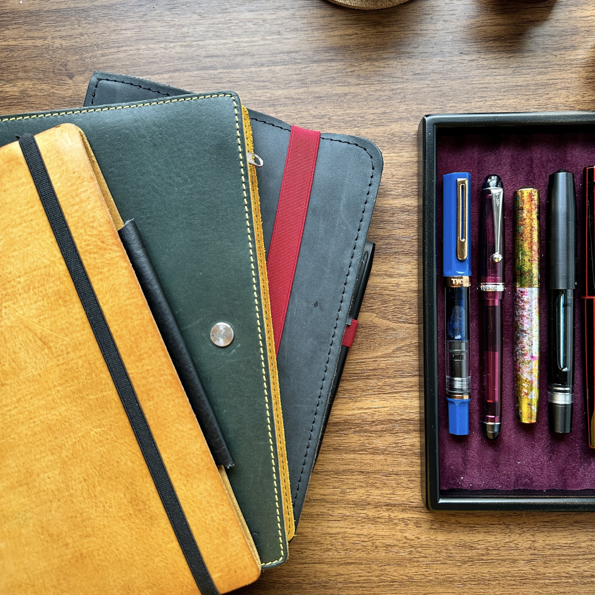
  • Multiple Pen Cases with Pens to Share. I always bring a lot of inked pens to shows for after-hours show-and-tell, and this year will be no exception. I’m currently in the process of packing a Lochby Tool Roll and Quattro, a Rickshaw Sinclair Model R, and a Rickshaw 6-pen roll and three-pen sleeve. The shocking part is that all of these cases will fit inside the Banzai Bag at one time, allowing me to carry up to 30 pens to the after-hours meetups in the hotel bar (though I’ll likely leave at least a few slots open to carry new finds home).

Our table setup from last year.

2023 D.C. Pen Show Details

This year you can find me sharing table space with our friends at Vanness Pens. TGS won’t have a stand-alone table, but I’ll be bringing a handful of items with me, including Lochby cases and notebooks, washi tape, and whatever stock remains from the TGS-exclusive Penwells and Hinze Collaboration pens. While I plan to have a full table setup in San Francisco, I tend to use the D.C. Show to visit with people and scope out new releases. Note: If you have your eye on something from the shop and want me to bring it to the show for you to pick up, you can select “Local Pickup” at checkout to drop the shipping charge and send me a message to arrange for delivery. Just be mindful that I probably won’t be able to bring heavier orders (i.e. 5 or 6 notebooks) due to airline weight restrictions.

Pen Show Primer Series

Every year when I start getting ready to attend the “big” pen shows in Washington, D.C. and San Francisco, I link back to a series of articles I’ve written including Volume 1: Why Visit a Pen Show; Volume 2: Getting Ready for a Pen Show; and Volume 3: Tips for Surviving the Pen Show. While these particular articles have some age on them, I stand by pretty much all of the advice! (You’ll also note that “get a good pen show bag” has remained consistently high on the list of tips for a positive pen show experience.)

This post does not contain paid advertising or third-party affiliate links. The Gentleman Stationer is supported entirely by purchases from the T.G.S. Curated Shop and pledges via the T.G.S. Patreon Program.

In Bag Reviews, EDC, Editorial, Pen Shows Tags Bag Dump, Pen Show Primer, Pen Shows, DC Pen Show 2023
Comment
← Newer Posts Older Posts →
Store Location
Visit the T.G.S. Curated SHOP
*New* Updated "Best Pens" Guide (2025)
TGS x Hinze Pens Violet Tendencies Taschenstift Fountain Pen
Hierarchies of Fountain Pen Friendly Paper
Allex Scissors arrayed on a desk showing link to desk accessories

Join Our Patreon!
Subscribe to the TGS E-mail List

Featured Posts

Featured
Joe's-Journals-New-Old.jpeg
Jul 2, 2025
Time to Pick a New Personal Journal: Maruman Mnemosyne Hardcover A5 Journal
Jul 2, 2025
Jul 2, 2025
Desk-Accessoris-Unstaged.jpeg
Jun 25, 2025
Getting Personal: Five "Stationery Adjacent" Items I Can't Live Without
Jun 25, 2025
Jun 25, 2025
Pilot-Iroshizuku-Yama-Budo-Writing-Sample.jpeg
May 24, 2025
Joe's Picks: Five Favorite Inks From Pilot's Iroshizuku Lineup
May 24, 2025
May 24, 2025
The Gentleman Stationer RSS

© Digital Divide Media, LLC, 2014-present.

All content is the exclusive property of Digital Divide Media, LLC, d/b/a The Gentleman Stationer, including “The Gentleman Stationer” website and trademark, and should not be reproduced without express written permission.  All rights reserved.

All content containing paid advertising, affiliate links, or sponsored content will be plainly disclosed by a disclaimer when/if featured.

Contact Information

Store Shipping Policy and Return Policy

Privacy Policy

Cookie Policy

Terms and Conditions

Powered by Squarespace