• Blog
  • Shop
  • Resources
  • FAQ (Ask TGS)
  • About
  • Archive
  • Contact
  • Sign In My Account
Menu

The Gentleman Stationer

Vintage Living in the Modern World.
  • Blog
  • Shop
  • Resources
  • FAQ (Ask TGS)
  • About
  • Archive
  • Contact
  • Sign In My Account

All 3 Oysters Bottles have a facet on one corner so you can tilt it for easier filling when the ink level gets low.

Ink Review: 3 Oysters Delicious Inks

June 5, 2019

The sheer volume of excellent fountain pen inks on the market continues to astound me. I know I talk about this all the time, but I still remember a time less than ten years ago when there were only two brands (Noodler’s and Private Reserve) that had color options in the double digits. Even as more brands emerged in recent years, most companies focused on bright, highly saturated colors. Those have their place, but when it comes to choosing ink, my interest lies in the darker, more muted, and somewhat murky corners of the color palette. Korean ink maker 3 Oysters checks all of those boxes.

Since I’m a sucker for dark greens, and especially green-blacks, I picked up a bottle of Black Moss as I was leaving this year’s Baltimore Pen Show. A month later in Little Rock, during a visit to the Vanness store, I added samples of Gogung (a grayish brown), Red Wine (self-explanatory), and Chilli Red (a brighter red with hints of orange). The only color I did not care for was Mustard. The color is interesting, but it’s a bit light for everyday writing and doesn’t fit a need in my rotation.

All of the 3 Oysters inks I tested dried quickly and exhibited zero bleeding, feathering, or even show-through. These really are great inks! I used 3 Oysters on a variety of papers across several work days, and never had an issue. If I could anticipate any criticisms that someone might have with the 3 Oysters inks, it would be that some might find certain inks a bit undersaturated (i.e., washed-out), especially colors such as Chili Red and Mustard.

Takeaways and Where to Buy

I’ve enjoyed my time so far with the 3 Oysters “Delicious” inks, and the bottle of Black Moss will certainly see some use. Behavior-wise, they remind me of Pilot Iroshizuku, being slightly less saturated and having similar flow. The price point is $18 for 30ml, which on a price-per-ml basis sits on the expensive side, but I don’t have any information on the scale of production - it’s actually difficult to find much information on the company behind the ink. I assume it’s a relatively small operation, with import and shipping costs driving the price of the ink up even further. That said, the price is not per se unreasonable, and sits well below Sailor’s new price point of 20ml for $15.

You can currently purchase all 3Oysters inks from our sponsor Vanness Pens, which carries the entire line, including not only the “Delicious” inks featured here, but also the “Hun Min Jeong” and “I.Color.U” series, and a special edition “Marine Green” ink.

Disclaimer: This post contains links to paid sponsors and affiliates. Vanness Pens is a sponsor of this site and provided me with the ink featured in this review free of charge, for review purposes.
In Ink Reviews Tags Vanness, 3Oysters, 3Oysters Delicious, Inks, Ink Review
Comment

Rediscovering an Old Favorite: Private Reserve Burgundy Mist

May 11, 2019

I haven’t used Private Reserve ink regularly in years. For those of you who were in this hobby a decade ago, you may recall a time when Noodler’s, Private Reserve, and maybe Levenger were the only options for bright, saturated fountain pen inks that came in dozens of colors. Sure, ink enthusiasts complained about slow dry times, smearing, clogging, feathering and other “high-maintenance” behaviors, but options weren’t plentiful if you wanted to write with an ink other than your basic black, red, or washed-out blue, and these inks were widely available at retail. (Private Reserve ink remains one of the few inks stocked in my local “pen store,” Nashville Trunk & Bag.) Two colors - Private Reserve Burgundy Mist and Sherwood Green, were among the first five bottles of ink I purchased after I discovered fountain pens.

Classic packaging, classic Private Reserve jar/bottle. Though some might claim it lacks aesthetic appeal, Private Reserve makes one of the more practical ink bottles out there.

Unfortunately, over the years, as new ink companies emerged, and as the larger pen companies such as Pilot, Sailor, Pelikan, etc. began to introduce a wider range of options into the ink market, Private Reserve lost ground. Reports of quality control issues didn’t help - I personally lost a bottle of Burgundy Mist to “Slime in the Bottle” (mold) and another red ink turned brown as the dye deteriorated. Then, the owner passed away, and the future of the company was in doubt. You didn’t see much Private Reserve ink in stock at retailers or at pen shows. From an outsider’s perspective, things looked grim.

Not so fast. Recently, things have turned around. A former employee purchased the company. Changes apparently were made to ink formulations. Old favorites such as D.C. Supershow Blue, Burgundy Mist, and Tanzanite began to reappear in stock at retailers. And you know what? The ink I’ve tried thus far is excellent. Back at the beginning of March, as I was getting ready to leave the Baltimore Pen Show, Lisa Vanness asked whether I’d like to take a bottle of Private Reserve to review, as the new owner had been making the rounds at the show - where she had her own table - promoting the company and letting everyone know that Private Reserve is back and ready to do business.

66ml, filled to the brim! (Don’t knock this one over onto the carpet.)

So what about my beloved Burgundy Mist? Is it as good as I remember (minus the whole SITB issue)? In short, yes. Burgundy Mist is the same saturated, classic dark burgundy that shows up well on the page and is perfect for a more conservative office environment. Despite the saturation, the ink behaves incredibly well - it dries nearly immediately in a fine or extra fine nib, with no noticeable feathering and minimal bleedthrough even on the cheapest of generic memo pads from my desk at work. Not what I expected from Private Reserve. Did I mention that the ink remains inexpensive? At $11 for 66ml, you’ll be hard-pressed to find a better deal based on price-per-ml, though I wouldn’t be surprised to see that price come up a bit in the future as the company regains its foothold.

Takeaways and Where to Buy

Based on my experience with Burgundy Mist, I’m going to give Private Reserve another shot, and look forward to picking up more old favorites such as Sherwood Green, Supershow Blue, Tanzanite, Avocado (yes, they fixed the spelling) and Chocolate. At the price-point, it’s a low-risk proposition, and based on my experience with Burgundy Mist I’m confident that at least a few of those will turn out well and wind up back in the rotation.

Though not as widely available as it used to be, Private Reserve is still relatively easy to find at retailers. The deep bottle is more of a jar, with the wide mouth making it easy to fill pens with large nibs.

Disclaimer: This post has been revised to reflect/disclose that as of June 2025, T.G.S. is now a retailer of Private Reserve Ink! You can purchase a selection of the Private Reserve Colors directly from our shop.

In Ink Reviews Tags Private Reserve, Ink Review
2 Comments

Favorite Workhorse Fountain Pen Inks, as Determined by Actual Use

April 27, 2019

I’ll preface this post with the admission that I’m a serial ink changer and I have more ink than five people could use in a lifetime. That makes it hard to pick “favorite” inks, since I rarely use the same one twice in a row, and in the nearly ten years I’ve been active in this hobby have probably only finished a couple of bottles, though I have several that are close to empty. It’s these latter inks that caught my attention as I was sorting through my ink cabinets this past weekend. Despite changing inks frequently, I evidently keep coming back to these particular colors and brands.

  1. Waterman Serenity/Florida Blue. The king of “safe” fountain pen ink, which represents the gold standard for testing at pen shows due to how easily this ink flushes out of pens. I also love how this ink behaves in daily use, finding that it flows well and typically won’t feather or bleed on most papers. While some people find the blue color washed-out, particularly after it dries, I think it lends your writing a retro/vintage look. Also, if you’d like to add some vibrancy to standard Waterman Blue, just mix in a bit of Waterman Purple, which creates a lovely ultramarine color that’s been dubbed “Blurple” in pen circles.

  2. Waterman Tender Purple/Violet. I’ve gone through 3/4 of a bottle of Waterman purple over the years. This particular ink is a bit more temperamental than others in Waterman’s lineup, mainly due to its potential to stain, but I’ve always loved the vibrant color. As noted above, this ink mixes well, and another fun experiment is to mix this ink with Sheaffer Skrip Red to form a nice burgundy.

  3. Iroshizuku Tsuki-Yo. The first expensive bottle of ink that I purchased, back when Iroshizuku was considered a “luxury” ink and cost much more than the $20 per 50ml currently charged at retail. I loved (and still love) everything about the Iroshizuku lineup, from the glass bottle that looks great on a desk to the range of colors based on Japan’s natural features. Tsuki-Yo (“Moonlight”) is a blue-black-teal color reminiscent of the night sky, and the exact shade of this ink changes depending on lighting and whether it’s wet or dry. This is one I always find myself coming back to!

  4. Iroshizuku Yama-Budo. The only magenta ink I use regularly. I don’t know what it is about this one, as pink-purples aren’t in my usual wheelhouse of colors, but Yama-Budo is up there as one of my favorite inks of all time. I think it has to do with the ink being just “loud” enough to be interesting, while remaining somewhat work-appropriate. It behaves well in most pens and on most paper. I’m down to less than half a bottle!

  5. Aurora Black/Aurora Blue. Until last year, when Aurora went wild and released a blue-black ink, they had a simple lineup of two colors, both of which flowed extremely well and which have remained staples in my pens. Aurora Blue is a rich blue ink that has undertones of purple/violet, and Aurora Black is one of the best “pure black” inks out there. If you crave simplicity in your ink choices, and want to stick with a two-color rotation, you won’t go wrong with Aurora.

I’ve also killed one or two bottles of special or limited edition inks, and am close to finishing a few more, but I won’t list those here because it’s not helpful to people when you can no longer buy the inks. Each of the seven listed above is a standard ink made by a pen manufacturer, which means that it’s not only generally safe to use in most pens, vintage or modern, but it’s also easily purchased at retail. You can buy any of the inks listed above from ink retailers Vanness Pens, Pen Chalet, Anderson Pens, Goldspot, and Appelboom.

In Ink Reviews, Editorial Tags Ink Comparison, Workhorse Inks, Ink Review, Editorial
2 Comments

Special Edition Ink Alert: Two Papier Plume Inks for the Chicago Pen Show

April 23, 2019

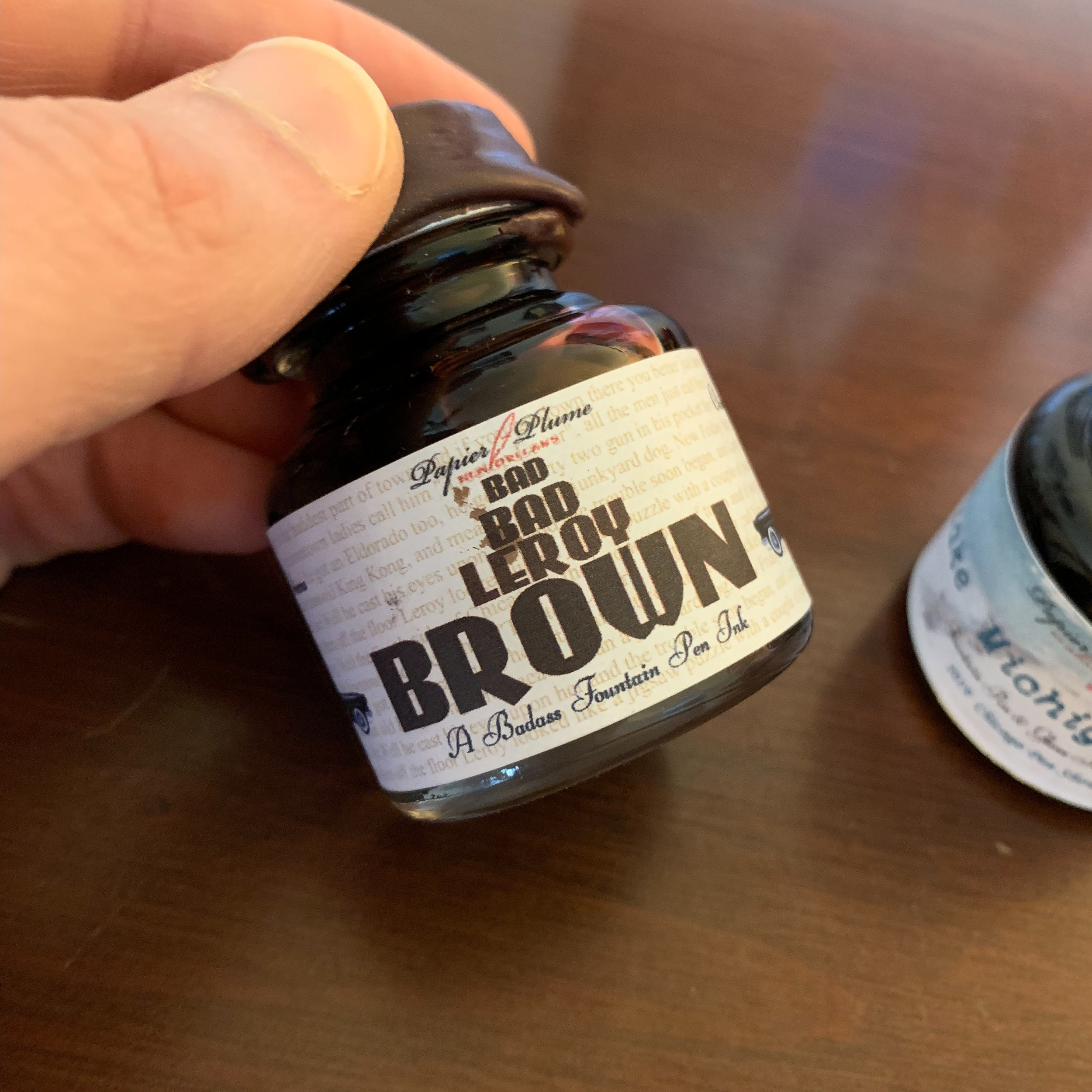
Every year, Papier Plume releases one or two special edition inks for the Chicago Pen Show. Building on last year’s Bootlegger’s Sacrament (a wine red) and “Da Blue,” (a Chicago Bears-inspired blue-black) this year’s inks include “Lake Michigan Winter,” (a turquoise/teal) and “Bad Bad Leroy Brown” (you guessed it).

For those of you attending the Chicago Pen Show from May 2-May 5, you’ll be able to purchase these inks at Papier Plume’s table, and from their website after the show. Most of the Chicago Pen Show inks have always sold out quickly, however, and Papier Plume typically only makes a single batch, so if you want to get your hands on either of these you’ll need to find someone attending the show to hook you up or quickly place an order afterwards.

View fullsize Bad, Bad Leroy Brown
View fullsize Lake Michigan Winter

Generally speaking, Papier Plume inks are unsaturated, so they play nice in most pens and offer good ink flow and shading. I’d compare them to Callifolio, Waterman, or standard (non-shimmer) Herbin, though the colors tend to have more pop than the Herbin inks. Papier Plume inks also offer good value, with the larger 30ml bottles costing $8 for the standard lineup of colors and $10 for special editions. You can also purchase smaller 15ml bottles of the standard colors for $5. Count me a fan!

Papier Plume also specializes in wax seals, an example of which you will find on the caps of their special edition inks.

Disclaimer: Papier Plume provided me with these two bottles of ink at no charge for review purposes. Many thanks!

In Ink Reviews, Pen Shows Tags Chicago Pen Show, Limited Edition, Papier Plume
Comment

Ink Review: Pilot Iroshizuku 100th Anniversary Inks, Bishamonten (Red) and Hoteison (Dark Green)

April 20, 2019

Pilot really puzzled me (and a lot of other people), because the company’s 100th anniversary was last year (2018), yet for some reason their “100th Anniversary Iroshizuku Inks” didn’t hit the states until March 2019. Better late than never, I guess.

The 100th Anniversary Iroshizuku inks consist of a fairly basic lineup of colors: Benzaiten (pink), Bishmonten (red), Daikokuten (yellow), Ebisu (light blue), Fukurokuju (green), Hoteison (dark green), and Jurojin (purple). As you can see, Pilot didn’t go out on too much of a limb here. Benzaiten, Bishamonten, and Hoteison are probably the most unique, whereas the others appear similar to inks already in the standard Iroshizuku lineup, though slightly different in tone. The inks are named to correspond to each of the “Seven Gods of Good Fortune” 100th Anniversary Pens, and if you have $30,000+ to drop, you can play the ultimate pen and ink matching game! (Or you can buy yourself a new BMW. Your choice.)

I like the label design - classic, yet still different, and the Iroshizuku ink bottle might be my current favorite. Bishamonten also has a slight gold sheen, which you can barely make out in this photograph. It’s subtle and will likely only appear in swabs or particularly wet writing pens.

The ink that interested me the most, and in the end, disappointed me somewhat, was Bishamonten . The standard Iroshizuku lineup doesn’t feature a “true red” - the colors that many people characterize as “red” tend to lean pink (Tsutsuji and Momiji) or purple/magenta (Yama Budo). So when I saw a new ink advertised as a “red”, I was thrilled. But while Bishamonten definitely appears less pink or purple than any of the existing inks, there’s still a pinkish hue, which is more pronounced in certain lights. I’m still holding out for Pilot to make an actual red ink, and dare I hope for a burgundy?

Hoteison is a green-black ink that has strong undertones of gray to it once it dries. The dark, muted Iroshizuku colors are some of my favorites, including Shin-Kai (blue-black), Syo-Ro (a dark teal-gray-green), Take-Sumi (a charcoal gray) and Tsuki-Yo (blue-black with teal undertones). Hoteison falls into this category, and will get a lot of use even if I already have a lot of similar shades in my collection.

Both colors are fairly saturated. They won’t appear washed-out. Like all Iroshizuku inks, Hoteison and Bishamonten are low-maintenance inks that don’t bleed or feather on most decent paper. (I’d still caution that Bishamonten, as a red ink, will have the potential to stain certain light-colored, porous, or transparent materials.)

Takeaways and Where to Buy

As always, Pilot makes a quality product, and Iroshizuku inks are among the best and most reliable out there. Bishamonten and Hoteison are no exception. I do have to admit, however, that the 100th Anniversary colors left me a touch disappointed. The two inks I reviewed here are by far the most interesting to me, and they’re a pinkish red and a dark green-black - not exactly imaginative shades. Regardless, these inks will sell well, simply because they’re special edition Iroshizukus, and if you don’t already have similar colors in your collection you can’t go wrong with any of them.

I purchased the two inks featured in this review from Vanness Pens at this year’s Atlanta Pen Show. Hoteison is currently in stock, but Bishamonten is sold out for the time being. Vanness has most of the other colors as well, and I expect they will get at least one other shipment of ink, though I have no insight into how long Pilot intends to make the 100th Anniversary colors before discontinuing them. If they interest you at all, I’d recommend that you purchase these inks now while they’re generally available.

Disclaimer: This post contains links to paid sponsors and affiliates. I purchased the inks featured in this review with my own funds, for my own use, though Vanness Pens did offer me a discount.

In Ink Reviews Tags Ink Review, Pilot, Iroshizuku, 100th Anniversary Iroshizuku
Comment
← Newer Posts Older Posts →
Store Hours and Location
Visit the T.G.S. Curated SHOP
*New* Updated "Best Pens" Guide (2025)
T.G.S. 2025 Holiday Gift Guide
TGS x Roterfaden TGS_25
Hierarchies of Fountain Pen Friendly Paper

Join Our Patreon!
Subscribe to the TGS E-mail List

Featured Posts

Featured
Cover On the Paper Trail Intro Clip.jpeg
Dec 3, 2025
Introducing "On the Paper Trail," a New Podcast/Video Collaboration with Lisa Vanness of Vanness Pens!
Dec 3, 2025
Dec 3, 2025
Iro-Utsushi-Fine-Dip-Pens.jpeg
Oct 1, 2025
The Pilot Iro-Utsushi Dip Pen (and in General, Simple vs. Fancy Dip Pens)
Oct 1, 2025
Oct 1, 2025
Levenger-Annotation-Pad.jpeg
Sep 20, 2025
Five Boutique Paper Brands I'm Watching Closely and Why
Sep 20, 2025
Sep 20, 2025
The Gentleman Stationer RSS

© Digital Divide Media, LLC, 2014-present.

All content is the exclusive property of Digital Divide Media, LLC, d/b/a The Gentleman Stationer, including “The Gentleman Stationer” website and trademark, and should not be reproduced without express written permission.  All rights reserved.

All content containing paid advertising, affiliate links, or sponsored content will be plainly disclosed by a disclaimer when/if featured.

Contact Information

Store Shipping Policy and Return Policy

Privacy Policy

Cookie Policy

Terms and Conditions

Powered by Squarespace