• Blog
  • Shop
  • Resources
  • FAQ (Ask TGS)
  • About
  • Archive
  • Contact
  • Sign In My Account
Menu

The Gentleman Stationer

Vintage Living in the Modern World.
  • Blog
  • Shop
  • Resources
  • FAQ (Ask TGS)
  • About
  • Archive
  • Contact
  • Sign In My Account
IMG_2214.jpg

Back to Basics: Blue Ink for Everday Writing

November 27, 2019

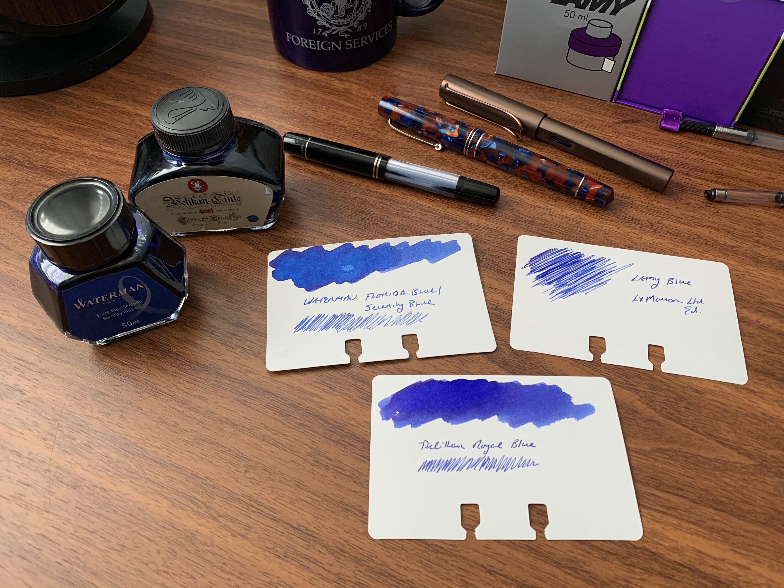
Ten years ago, I never would have imagined the size and scope of today’s stationery marketplace, much less the depth of the community surrounding it. Indeed, there were times when I was convinced I had picked a hobby that wouldn’t even exist in ten years, much less have expanded so much. While this is mostly a good thing - and a topic I plan to explore in depth in future posts - I sometimes find myself experiencing a sense of overwhelm and paralysis-by-choice. There are simply so many different brands and models of pens, inks, pencils, and paper out there that I can only imagine how confusing it must be to someone diving in for the first time, especially when it comes to fountain pens and fountain pen ink.

In all of our enthusiasm for chasing the next hot thing, I don’t want people to lose sight of the fact that you can always go back to the basics and still have a great experience. When you just want to enjoy a long writing session with a new pen or an old favorite, sometimes the best thing you can do is stop worrying about which ink would make the “perfect pairing,” ditch chasing “shimmer” and “sheen,” and ink up a basic blue or black ink. A few weeks ago I wrote about how I’ve grown to appreciate Lamy’s standard Black and Blue-Black offerings. Not only have I continued to use those two warhorses, but I’ve reached back into my ink cabinet and pulled out a few more favorites, namely some basic blue inks.

Waterman Serenity Blue

My number one work-friendly ink of all time, Waterman “Serenity Blue” (formerly “Florida Blue”) might be the best all-around fountain pen ink ever made. That’s a pretty big claim, but it’s not hard to support. Waterman ink (1) can be found at $12 or less per bottle at retail; (2) is widely regarded as one of the safest fountain pen inks available for use in vintage pens and materials prone to staining, like celluloid; and (3) works well on nearly all types of paper, making it a versatile ink suitable for pretty much any use case. Waterman ink bottles are also extremely functional: the faceted design lets you tilt the bottle for easier filling once the ink level gets low.

Pelikan 4001 Royal Blue

Slightly darker than Waterman Serenity Blue, Pelikan 4001 Royal Blue has its own group of devotees, some of whom love this ink so much that Pelikan sells it in massive 1 liter bottles (though recently I’ve currently only been able to find this size available in Pelikan Brilliant Black in the U.S.). While I personally prefer Waterman’s brighter tone, Pelikan Royal Blue likewise performs well on most papers and is a “safe” ink to use in nearly all pens. Pelikan inks come in a wider variety of bottle sizes than Waterman, with a few more reasonable options than the liter jug: around $11 for a 30ml bottle, or $14 for a 62.5ml bottle. The “historic” bottle of Royal Blue (same ink, different packaging) is priced at $12 for 60ml.

Lamy Blue

Finally, the last of the three basic blue inks that I use on a regular basis is standard Lamy Blue. If you’ve purchased a Lamy cartridge-converter pen, you have a sample of this ink on hand, since Lamy includes a blue cartridge with every pen sold. Though I still use it fairly regularly - mainly for the convenience of cartridge form - Lamy Blue is my least favorite of the three inks discussed here. It’s less vibrant than both Waterman Serenity Blue and Pelikan Royal Blue, with a tendency to take on a washed-out tone and fade after the ink dries. What this ink does have going for it is Lamy’s excellent ink bottle (complete with blotting paper) as well as the fact that it’s erasable using one of Lamy’s Ink Eraser Pens.

Takeaways and Where to Buy

You can’t go wrong with any of these three blue inks, all of which are inexpensive, reliable, and widely available. While nothing is certain, you probably don’t have to worry about getting attached to any of these three inks, only to have the formulation change or the ink disappear from the market. Waterman, Pelikan, and Lamy inks have all been around forever and I haven’t seen any signs that is about to change.

The one drawback is impermanence: none of these inks are waterproof, so if you’re looking for that you should go elsewhere (Pilot Blue-Black is an exceptional ink with decent water resistance, also available in large quantities).

You can purchase these three inks from nearly all major pen retailers, including site sponsors Pen Chalet and Vanness Pens.

Disclaimer: This post contains links to paid sponsors and affiliates. I believe that I purchased the inks featured in this review with my own funds, for my own use, though it’s possible I used store credit generated through affiliate programs in which I participate. I’ve gone through multiple bottles of Waterman Blue over the years so I can’t be sure.
In Ink Reviews Tags Basic Inks, Blue Ink, Waterman, Pelikan, Lamy, Ink Review
5 Comments

Ink Review: Vanness Pens / Joey Feldman "Inktober" and "Good Evening"

November 2, 2019

Most people know Vanness Pens in Little Rock, Arkansas as the go-to resource for rare and unusual inks. They have one of the largest selections of fountain pen inks in the world, and are always the first to import new lines of ink from Japan, Korea, the Netherlands, the Philippines - you name it. As experts in the subject, I guess it was only a matter of time before they started mixing their own inks! Today I’m reviewing two inks developed in collaboration with artist Joey Feldman: a black ink called Inktober 2019, as well as a red/burgundy called “Good Evening,” which you might find reminiscent of a certain highly coveted limited edition ink from around 2013. (It’s intentional.)

Let’s start with Inktober. For those of you unfamiliar with the term, #inktober is an online challenge in which participants post one drawing per day for the month of October. As someone with zero artistic ability who assumes that people will be easily bored by an endless array of stick-figure cartoons, I’ve not participated, but I always enjoy seeing the amazing work that everyone else can do.

As the name implies, the Inktober ink was formulated as a black ink for sketching during the month of, well, Inktober. It’s impermanent by design - many of the #inktober entries have featured brush and ink-wash techniques that take advantage of this ink’s ability to shade when diluted. That said, I absolutely LOVE this ink as a black ink for writing. I’d compare it to Lamy Black or Rohrer & Klingner Leipziger Schwarz, which are both interesting black inks with different tones to them. I do think that the Inktober dries quicker and feathers less on inexpensive paper, and of course, with these two inks you don’t get a bottle featuring Joey Feldman artwork.

I think I like Joey’s caricature better.

“Good Evening” is easily my favorite of these two releases, which should come as a surprise to no one. It’s a rich red ink that I could alternately describe as “burgundy red” or “blood red,” depending on the light. Both the name and the design on the bottle should give you a good idea of the inspiration for this particular ink, and it’s absolutely amazing to see someone come EXTREMELY CLOSE to duplicating what I consider one of the best red inks ever made. Good Evening also makes for an excellent writing ink, and given that it writes relatively wet and flows well, the lack of feathering and bleedthrough surprises me. (The writing sample featured here was done with a firehose broad nib on a Lamy 2000.)

Some of the difference here is the lighting, and the fact that the Montblanc Hitchcock is still wet, but the ink on the left has a bit more red in it than the “Good Evening.” Once the inks are thoroughly dry, the match is closer, but not exact.

Another picture taken after the ink swatches are dry. You’ll notice that the Good Evening still has slightly more purple/blue, while the Hitchcock has more red. Hitchcock can also have a slight gold/brown sheen to it (the “dried blood” effect).

Takeaways and Where to Buy

Inktober and Good Evening both have the potential to become favorites, and I’m looking forward to more special edition runs and, hopefully, a standard lineup from Vanness in the future. Right now, you can purchase the Inktober 2019 Limited Edition Ink and “Good Evening” for $15 per bottle on the Vanness website. If I didn’t already have a gazillion bottles of ink sitting in a cabinet in my home office, I’d be buying multiples. These inks are that good.

Also, don’t miss the Vanness Fountain Pen Day Orange Ink, made to match the Limited Edition FPD Franklin-Christoph 31 pen released yesterday! Vanness still has both pens and ink in stock, though the pens are a limited run of 88 so I’m not sure how long they will last. Also, be sure and check out yesterday’s Deals & Drops post, which highlighted this and several other Fountain Pen Day promotions. At least one sale (Pen Chalet) has been extended through Sunday.

Disclaimer: I received the two bottles of ink featured in this review, free of charge, from Vanness Pens for review purposes. This post contains links to paid sponsors and affiliates.

In Ink Reviews Tags Vanness Ink, Vanness Pens, Joey Feldman, Ink Review
Comment

Best Fountain Pen Inks for Everyday Writing: Lamy Inks

October 12, 2019

With so many different brands of fountain pen inks literally flooding the market right now, it’s easy to find yourself paralyzed by indecision. If you’re just starting out, where do you even begin? I recall feeling baffled by the number of different colors and ink properties in the Noodlers and Private Reserve lines, and I’m not sure what I would have done if I’d had to contend with Robert Oster, KWZ, or Iroshizkuku, not to mention all the various lines of Sailor. That’s why, when someone new to the hobby asks me for my recommendation on a “best first bottle of ink” to buy, I often recommend that they stick to the basics. The blue, black, and blue-black inks manufactured by Waterman, Pelikan, and Lamy will all serve you well.

So let’s talk about Lamy, one of my all-time favorite stationery brands. I’ve written repeatedly about how much I enjoy their flagship fountain pen, the Lamy 2000, to the point where I now have one of every model of that pen made available to the general public (yes, even the overpriced Bauhaus 100th Anniversary model and the much-maligned “Black Amber”). Lamy doesn’t experiment much - they typically release a special edition Safari and AL-Star, and maybe a Studio, along with a limited-run ink that matches one of their special edition pens. This perceived lack of creativity causes Lamy a lot of grief in in the '“pen press” and on social media, and their efforts to change and chase trends can come across as ill-conceived and ham-handed, but I wanted to look at the other side of the argument: what if this “slow to change” strategy is one of the reasons Lamy is still around? With Lamy ink, you definitely know what your getting, and its good.

Personally, I find Lamy’s Black and Blue-Black inks to be subtle and interesting standard colors. As you might guess, I added a Black Amber model to my Lamy 2000 collection, and while I understand and agree with a lot of the criticism on how Lamy handled the release, the pen itself is quite nice.

Why Do I Love Waterman and Lamy Inks So Much? Aren’t They Boring?

In short, yes and no. There’s nothing really exciting about Lamy Washable Blue, unless you count the fact that it’s erasable if you use Lamy’s proprietary ink eraser pen. (See note below.) With all the variety available, some people will turn their noses up at anything labeled merely “blue,” “black,” or “blue-black.” What you may not realize, however, is that Lamy Black is actually a rich and interesting black, with subtle variances in tone that make it look dark green in certain lighting, and Lamy Blue-Black is one of those vintage-style blue-blacks with gray undertones. Look, neither of these inks is going to blow up Instagram, but that’s not the point. They work well in most pens, dry relatively quickly, and don’t feather and bleed except on the cheapest of paper. Most notably, Lamy inks are widely available and extremely inexpensive.

Side Note: One neat fact about Lamy’s standard “Washable Blue” fountain pen ink is that you can use Lamy’s “X Eraser Pens” to correct mistakes. I remember seeing these things for the first time when I was attending college in France and thinking they were the coolest stationery item ever made. The white end covers up the fountain pen ink, and you can use the blue end to write over the correction. Be aware that these are only supposed to work with standard Lamy blue ink, and no other colors.

What’s NOT boring is Lamy’s ink bottle. Not only does it incorporate an “inkwell” design with a slight depression in the center to help fill your pen when ink levels get low, but each bottle also comes with a roll of blotting paper to help you clean the nib section after filling. The blotting paper works extremely well, and you don’t need to use that much, so the paper may even last you the life of the bottle.

The inkwell portion of the bottle pops out so that you can access the blotting paper. Notice the depression in the center of the bottle, so that when you’re running low on ink, you can get those last bits and not waste any!

What About the New Lamy Crystal Inks?

This year Lamy released a series of new gemstone-themed inks in smaller 30ml bottles, dubbed “Lamy Crystal.” I have a handful of these inks, and I’m still in the process of working my way through them. My initial impression, however, is that they don’t behave the same as standard Lamy inks. The Lamy Crystal inks are more saturated, which makes the colors pop, but at the price of the consistency I’ve come to expect from Lamy. Certain Lamy Crystal inks tend to feather and bleed, and are slower to dry. While I need to do more testing before I make a general pronouncement, as it stands now I think I prefer the properties of Lamy’s standard lineup.

Takeaways and Where to Buy

Along with Waterman, Lamy makes some of the best inexpensive “no fuss” fountain pen inks you can put in a pen. Standard Lamy Black and Lamy Blue-Black are two standbys that I regularly use, particularly in my Lamy 2000s, and I highly recommend them to both new users anxious to enter the world of bottled inks, as well as those who write a lot on a daily basis and are looking for a reliable standby. To me, the functionality built into the bottle itself is representative of what I’ve come to expect from Lamy as a brand, and why I keep coming back to their products.

As I mentioned, Lamy ink is extremely inexpensive, with retail pricing as low as $10.50 per bottle. We now carry it directly in the T.G.S. Curated Shop (as of 2022). There’s something to be said for being able to easily acquire the entire range of colors for less than $100!

In Ink Reviews Tags Ink Review, Lamy Inks, Lamy
1 Comment

Water and White Lightning: Fixing High Maintenance Inks

September 18, 2019

For years I avoided certain ink brands, namely Noodlers and Private Reserve, not because I actually believed those inks would destroy or “melt” pens, but because of batch inconsistency and the fact that many of the inks bled and feathered on all but the thickest coated paper. Others never dried, remaining tacky and subject to smearing for up to a week or more. I would get frustrated and give up, selling or giving away the bottles I had accumulated.

With nearly a decade in this hobby under my belt, I’m slightly more patient than I used to be, and writing this blog has provided me with the opportunity for experimentation. Noodlers makes a wide range of vibrant and unique colors, and most of the inks are so saturated with dye that you can add a couple drops of water or ink additive to improve the ink’s behavior without changing the color significantly or sacrificing vibrancy. The only caveat is that by diluting the ink, you run the risk of compromising special properties such as “bulletproofing” (permanence/water resistance) or quick-drying. I generally don’t purchase inks for these reasons, however, other than a couple water-resistant inks I keep in my collection, and I’ve found that most aren’t significantly affected by a drop of dilution.

Noodler’s Walnut has always been a favorite of mine, but I’ve had trouble with feathering and slow dry times if I use the ink undiluted. How did I fix it? Read on below.

So How Do I “Fix” Problematic Noodlers Inks?

I’ve found that certain Noodlers Inks that are prone to feathering, bleeding, and extremely slow dry times work better with 1-5 drops of water added to a 5ml sample vial. Inks such as Air Corps Blue Black and Walnut are great colors, but sometimes bleed, feather, and smear on cheaper paper, or take a long time to dry on fountain-pen friendly paper like Clairefontaine, Rhodia, or Tomoe River.

Writing Samples of Noodlers Walnut, Air Corps Blue Black, and Shah’s Rose, three colors that behave extremely well with a touch of water (Walnut, Air Corps) or a tiny drop of White Lightning (Shah’s Rose).

On the other hand, for inks that are too dry, I take the same amount of ink (5ml in a sample vial) and add a tiny drop of Vanness Pens “White Lightning” ink additive. You might remember a version of this product when it was sold by Organics Studio, under the moniker “Cuddles Flo Plus”, but Vanness acquired the formula after Organics Studio discontinued it and are now bottling the product directly. White Lightning is intended “for use in poor flowing or dry inks to increase flow consistency,” and the product really does work. I can’t emphasize enough, though, that you should use this product sparingly, and do not add directly to the bottle unless you are extremely sure of the amount. Use too much and you can turn a dry ink into the inverse: an ink that feathers, bleeds, and never dries. I’ve had success using White Lightning to improve the flow of drier Noodlers Inks such as basic Noodler’s Black, 54th Massachusetts, and Shah’s Rose. I’ve also spoken with other people who swear that White Lightning improves extremely dry inks such as certain Kyoto TAG inks, as well as Platinum’s “Classic” series of Iron Gall inks.

One of the great things about Noodlers is that the bottles come filled to the brim. (Just be careful opening them for the first time.) I’ve actually heard some people describe the full bottle, the super-saturation, and the need to dilute certain colors as a “bonus,” because it makes the bottle last a very long time.

Takeaways and Where to Buy

Noodlers Ink is widely available from most pen retailers, and the bottles pictured here were supplied by site sponsor Pen Chalet. What I’ve discovered over the years is that Noodlers makes “tinkerer’s inks.” If you don’t mind playing around with the formulation, you can better enjoy the wide range of colors and properties that the brand has to offer. White Lightning Ink Additive can be purchased from our sponsor Vanness Pens, and is a product exclusive to them. This unique product really does work, and if you have a large ink collection that includes colors you love but can’t use due to how the inks themselves behave, consider experimenting with water dilution or additives to tailor the inks to your preference.

Disclaimer: The inks and ink additive were provided to me free of charge by my sponsors, for review purposes. Many thanks to Pen Chalet and Vanness Pens for making this review possible!

In Ink Reviews, How To Tags Ink, Ink Review, White Lightning, Noodlers Ink, Vanness, Modifying Inks
2 Comments

Quest for Perfection: My Search for the Best Burgundy Ink

August 28, 2019

Out of all the colors available to me, burgundy is my favorite, and finding the “best” burgundy has become something of a personal quest. I’ve always been a fan of red ink, going all the way back to grade school when your supply list included a pack of those Papermate/Flair felt-tipped correcting pens, but sometimes bright red inks are a bit harsh on the eyes when you’re staring at a full page of writing. That’s where burgundies really shine.

Burgundy ink lends your writing a touch of sophistication, and if your job involves lots of annotation and marking up documents, burgundy ink is a - how shall we put it - “gentler” way to correct the ways of others, as opposed to a sea of bright fire-engine red. The color is much more muted while still remaining interesting. I’ve always thought that burgundy looks especially good in a stub or cursive italic nib, two grinds that I favor.

So What Burgundy Inks Have I Been Writing with Lately?

A current favorite Monteverde Passion Burgundy. Many people write off Monteverde as a brand that makes pens of middling quality, but don’t overlook their inks, which are reasonably priced and come in a wide array of colors. Passion Burgundy has more red to it than other burgundies which can have purple or brownish tinges, especially those inks that try to pull off a “wine” theme. Passion Burgundy also behaves fairly well on most papers, even in wet stub nibs, and Monteverde inks in general behave quite similarly to much more expensive inks produced by a certain German brand that also makes their inks in Austria. Hmmm…..

Out of these inks, I would rank my favorites as follows: (1) Montblanc Bordeaux; (2) Monteverde Passion Burgundy; (3) Montblanc Encre du Desert Le Petit Prince (4) Diamine Burgundy Royale; (5) Montblanc Burgundy Red; and (6) Private Reserve Burgundy Mist. All of these inks are excellent, and lean towards the red end of the spectrum rather than

I also recently re-reviewed Private Reserve Burgundy Mist, which was an old favorite before Private Reserve started having quality-control issues, which have since been resolved by a change in ownership and reformulations of certain colors. Burgundy Mist is a bit more “wine-y” than Passion Burgundy, meaning that you will see more purplish hues, but I’d still call it a “red.” Another relatively inexpensive choice that is closer to Passion Burgundy in color is Diamine Burgundy Royale, from the 150th Anniversary lineup.

Finally, the “classic” burgundies that periodically make their way into my rotation include Montblanc Burgundy Red and the classic Montblanc Bordeaux (now discontinued but still a great color). The standard Montblanc Burgundy works well in a finer nib but can appear a bit washed out in a stub. Montblanc Bordeaux was the perfect shade for me, and a relatively close approximation, though maybe slightly darker, is Montblanc’s Encre du Desert, one of the special edition inks released as part of its Le Petit Prince lineup. Unfortunately both the Bordeaux and Encre du Desert are not readily available.

All of the inks pictured here are “good” inks. Given that I have so many burgundies, including some that are very close approximations of each other and behave similarly, I likely will be thinning out this accumulation at some point in the future. On the whole, Monteverde and Diamine offer the best value by far, along with a steady track record of producing quality inks that won’t harm your pens.

Disclaimer: This post contains links to paid sponsors and affiliates. I can’t remember exactly how I acquired all of the ink featured here in this review, since I’ve owned much of it for years, but you can assume that I received some bottles for review purposes, free of charge, while I purchased others with my own money.

In Ink Reviews, Editorial Tags Burgundy Ink, Red Inks, Favorites, Editorial, Ink Review
3 Comments
← Newer Posts Older Posts →
Store Hours and Location
Visit the T.G.S. Curated SHOP
*New* Updated "Best Pens" Guide (2025)
TGS x Hinze Pens Violet Tendencies Taschenstift Fountain Pen
Hierarchies of Fountain Pen Friendly Paper
Allex Scissors arrayed on a desk showing link to desk accessories

Join Our Patreon!
Subscribe to the TGS E-mail List

Featured Posts

Featured
Iro-Utsushi-Fine-Dip-Pens.jpeg
Oct 1, 2025
The Pilot Iro-Utsushi Dip Pen (and in General, Simple vs. Fancy Dip Pens)
Oct 1, 2025
Oct 1, 2025
Levenger-Annotation-Pad.jpeg
Sep 20, 2025
Five Boutique Paper Brands I'm Watching Closely and Why
Sep 20, 2025
Sep 20, 2025
Playing-ink-MD-Cotton-Glass-Pens.jpeg
Sep 17, 2025
What's On Your Desk? My Personal Favorite Papers for Fountain Pens, 2025
Sep 17, 2025
Sep 17, 2025
The Gentleman Stationer RSS

© Digital Divide Media, LLC, 2014-present.

All content is the exclusive property of Digital Divide Media, LLC, d/b/a The Gentleman Stationer, including “The Gentleman Stationer” website and trademark, and should not be reproduced without express written permission.  All rights reserved.

All content containing paid advertising, affiliate links, or sponsored content will be plainly disclosed by a disclaimer when/if featured.

Contact Information

Store Shipping Policy and Return Policy

Privacy Policy

Cookie Policy

Terms and Conditions

Powered by Squarespace