I’ve been feeling a touch overwhelmed lately, whether it’s the pressure of juggling my work schedule and family responsibilities, or just the sheer volume of stuff I have sitting around my office waiting to be listed and shipped or taken over to the warehouse. Sometimes when this happens, it’s comforting to go back to the basics and ignore the latest-and-greatest, a quick flashback a time when my collection/accumulation included just a handful of pens and five or so bottles of ink. (Hard to believe this was only ten years ago, right?!?) For my first couple of years in this hobby, the two “nicest” inks I owned were Pilot Iroshizuku Tsuki-Yo and Yama-Budo, both of which are still mainstays of my collection.

While I wouldn’t necessarily think of blue-black as having a direct correlation to “Moonlight”, for some reason the name works. The night sky just after dusk, perhaps?
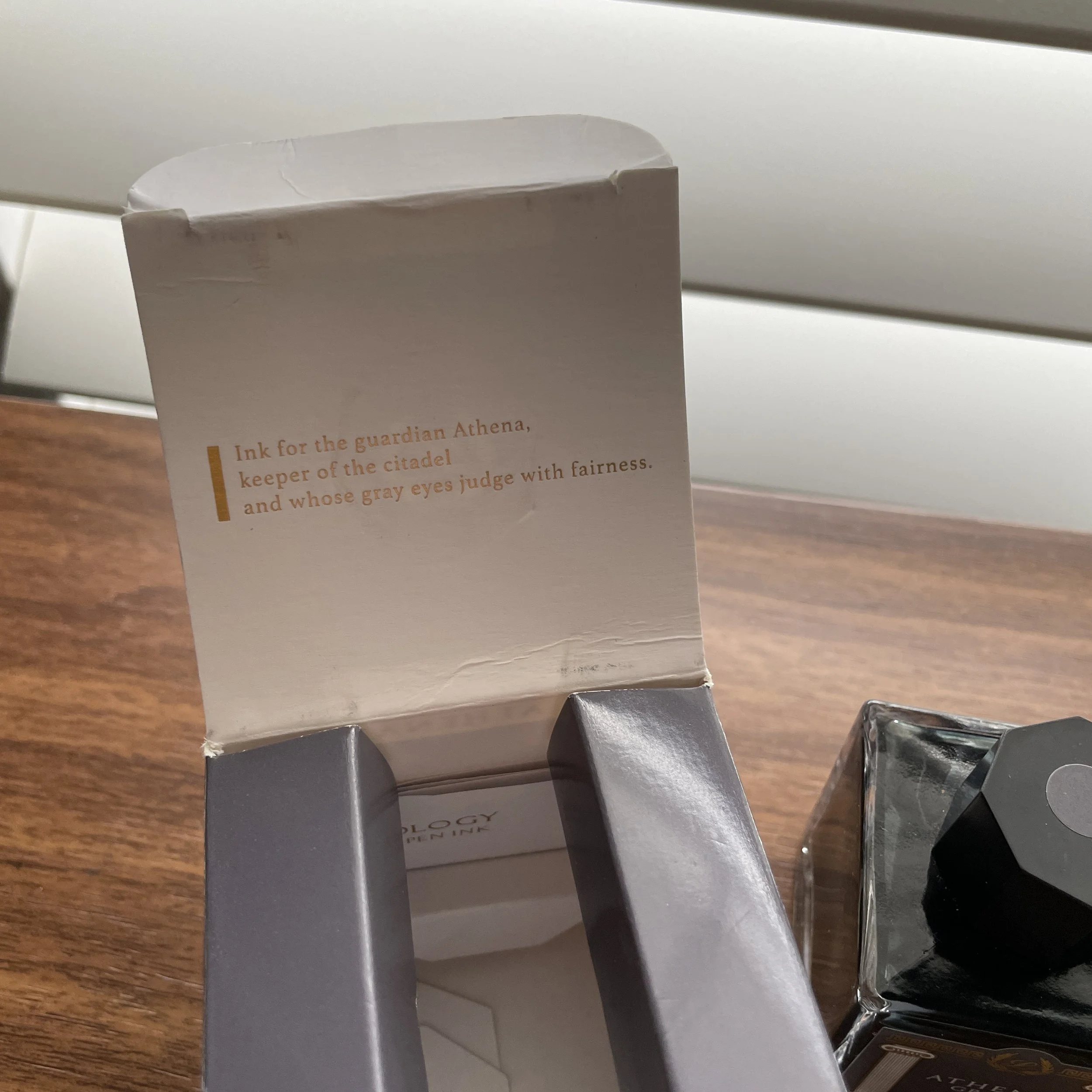
Pilot Iroshizuku Tsuki-Yo
Why do these particular inks have such staying power? Part of it is nostalgia, for sure, but honestly they’re just good. Tsuki-Yo, to me, is a more interesting version of classic Waterman Blue-Black. The name of the ink translates as “Moonlight,” and while it can certainly pass as a standard blue-black ink - making it an excellent choice for the office - there’s just something about this color that causes it to stand out. Maybe it’s the slight red sheen, the hints of teal, or the vintage-style shading? The ink has never given me any problems in any pen or on any paper, and I’ve come close to using up an entire 50ml bottle. (Well, I’ve used about 2/3 of the bottle, and I expect I’ll finish it this year.)
I angled the swatch to get a shot of the slight red sheen.
While Iroshizuku Inks aren’t known as “super-sheeners,” you get the interesting visual effect without any smearing that’s so prevalent with other sheening inks.
Pilot Iroshizuku Yama-Budo
While Yama-Budo isn’t my favorite overall color (it’s an offbeat burgundy-purple-magenta hue with some gold sheen on certain papers), I have a soft spot for it because it was my first “adventurous” ink color. For such a bright ink, it’s also incredibly well-behaved, and while you always have to be cautious in using reds and purples in stain-prone pens such as clear demonstrators, this particular ink cleans out easier than most. Yama-Budo doesn’t get used nearly as much as Tsuki-Yo, but when I do ink it up, well, I kick myself for leaving it out of the regular rotation.
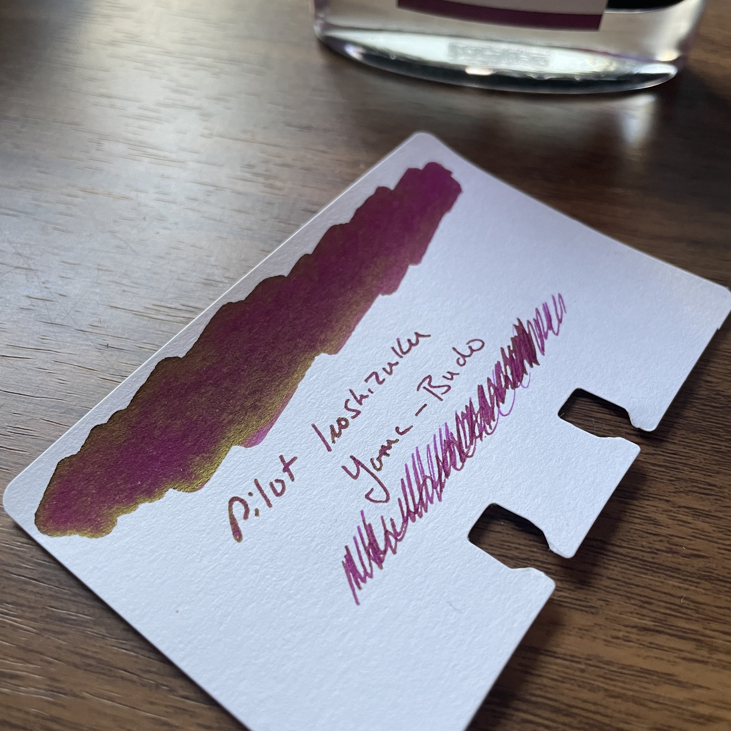
Gold? Green-Gold? Whatever it is, it only appears on certain types of paper. I see it most on Tomoe River and the Col-o-ring paper here.
Takeaways and Where to Buy
Fountain pen ink colors and ink brands can be driven by trends, and fall in and out of favor, but the colors in the Iroshizuku range stand up over time and regularly make their way through my own rotation. Pilot has done an excellent job of selecting a range of interesting, unique colors that can still serve as everyday writers, and they add to the lineup every year or so.
Tsuki-Yo takes on a different look in different nib styles. The top sample is a wet medium stub; the bottom is a medium architect from Mark Bacas. The Yama Budo writing sample is with the Lamy cursive calligraphy nib.
I’ve written a fair bit about Iroshizuku Inks over the years. If you’re curious about reading more, check out my prior reviews of Tsuki-Yo and Yama-Budo, as well as my series on exploring the Iroshizuku line: Part I (Kon-Peki, Shin-Ryoku, and Yama-Budo), and Part II (Asa-Gao, Murasaki Shikibu, and Aji-Sai). I’ve not yet made it through the entire line of Iroshizuku as intended, but now that I have access to all of the inks, well, let’s go!
As I recently announced, we are now able to offer you Pilot pens and inks directly, including the entire Iroshizuku lineup. We currently carry the 50ml bottles of ink, priced at $24. Over the past couple of years I’ve been performing some updates on the site, which includes pruning and updating older content that’s out of date, so you will likely see more “Reviews Revisited” posts in the coming months. It’s been a fun experience to see how my thoughts have changed over the years, and often how my thoughts and opinions haven’t changed much at all!
The Gentleman Stationer is an authorized retailer of all brands sold, including Pilot, and is currently supported solely by purchases from the T.G.S. Curated Shop and pledges via the T.G.S. Patreon Program. Many thanks for your support and patronage!