• Blog
  • Shop
  • Resources
  • FAQ (Ask TGS)
  • About
  • Archive
  • Contact
  • Sign In My Account
Menu

The Gentleman Stationer

Vintage Living in the Modern World.
  • Blog
  • Shop
  • Resources
  • FAQ (Ask TGS)
  • About
  • Archive
  • Contact
  • Sign In My Account

The Gentleman Stationer Ink Cabinet. Part of it.

The Gentleman Stationer's Favorite Fountain Pen Inks, Inaugural Edition (2023)

May 27, 2023

While I publish an annual list of "Best Pen" recommendations, inks are far trickier, made especially difficult by the dozens of brands and thousands of different colors now available, which wasn't the case when I first started TGS. Over the years, I've done a few lists of my favorite inks for specific purposes, such as office use and annotation, but have shied away from anything more categorical. Then I had the idea: What if I made a list of my current preferred ink for each color category, which I could easily update over time? Here are the rules I came up with:

  1. The ink has to be available. No limited editions that are impossible for people to find because that's no fun to read. (Those can have their own list, if people are interested.)

  2. Broad color categories only with no sub-categories. Keep it simple. Here, I've organized this initial list with 12 slots that loosely tracks the major colors that pen companies typically include in their lineup.

  3. I have to have used the ink in multiple pens over the past year. Some of these inks have been used more than others (brown and yellows don't actually get much time in my rotation), but generally, frequency of use + simple joy determines whether an ink makes the cut.

Here we Go! Fountain Pen Inks of Choice by Color (2023)

Pilot Iroshizuku Asa Gao

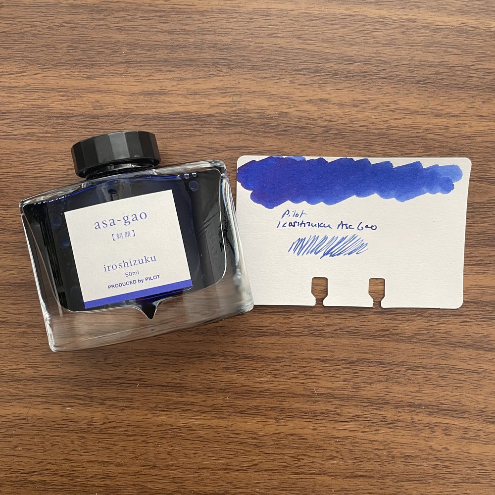
Blue: Pilot Iroshizuku Asa-gao. I sometimes go far too long without using this particular ink, but whenever I use it to fill a pen I wonder why I don't just keep a bottle of it on my desk. A bright royal blue that borders on "electric," but is still professional enough to use at the office. It reminds me of Waterman blue that doesn't fade to a duller color after drying.

Black: Lamy Black. When choosing a black ink, some go for the darkest line possible, but not me. I prefer some shading and undertones, especially the purple cast that Lamy Black has when it dries, which gives the ink added depth.

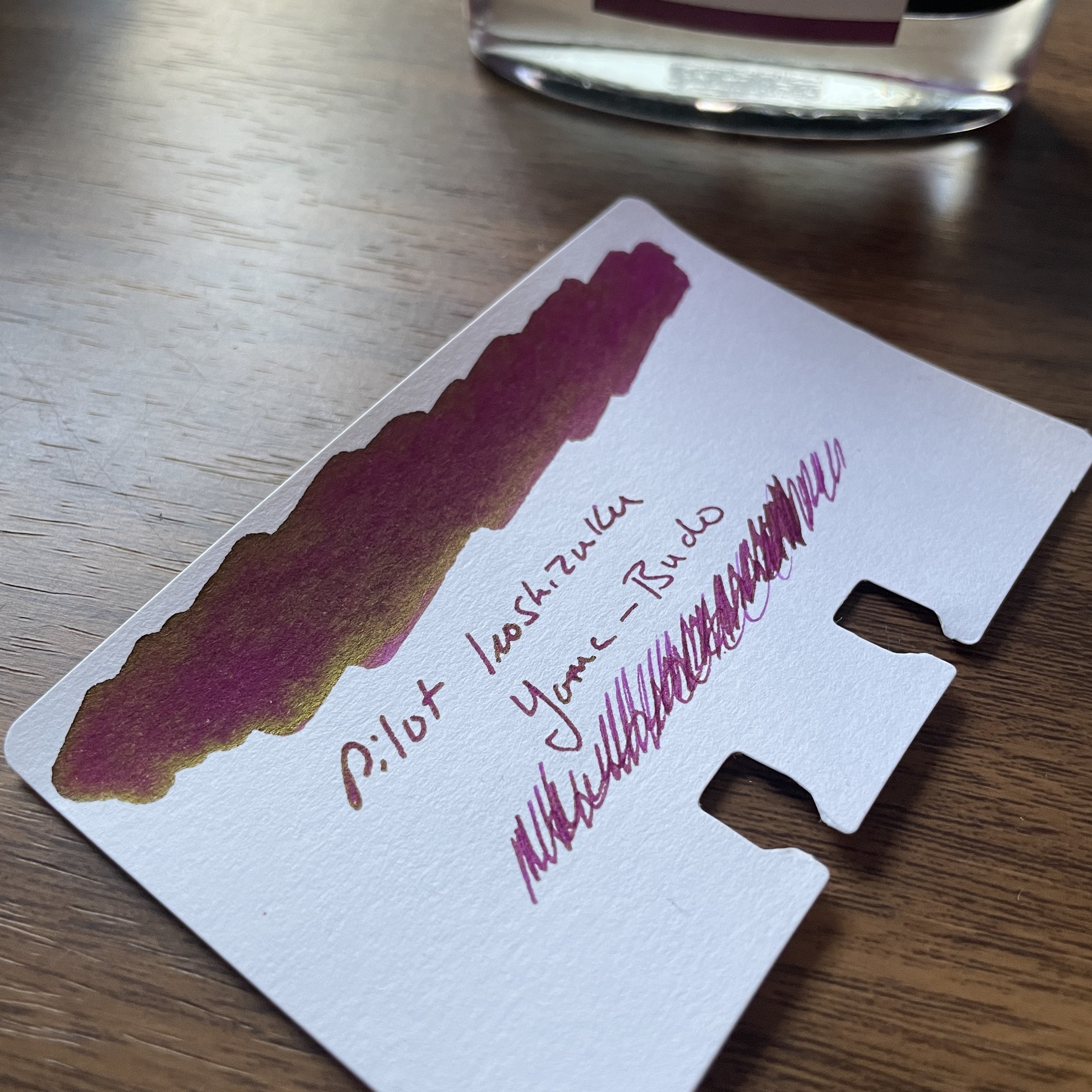
Blue-Black: Iroshizuku Tsuki-Yo. The name translates as "Moonlight", and though I can't exactly explain why, it fits this shade of ink perfectly. Tsuki-Yo leans more blue on the blue-black scale, and exhibits a slight red sheen on some papers. As one of the longest-running inks in my collection, which at the moment I have loaded into three pens, Tsuki-Yo might be my favorite of the Iroshizuku Inks and one of my favorite inks of all time.

Turquoise: Kaweco Paradise Blue. Some of you may be surprised to see two Kaweco inks on this list, but I absolutely love Kaweco's ink offerings and find them extremely underrated. The inks are vibrant, low-maintenance, and inexpensive, and the fact that they come in both cartridges and bottles ensures that you can use them in your Kaweco Sports as well as your piston fillers.

Kaweco Palm Green Fountain Pen Ink

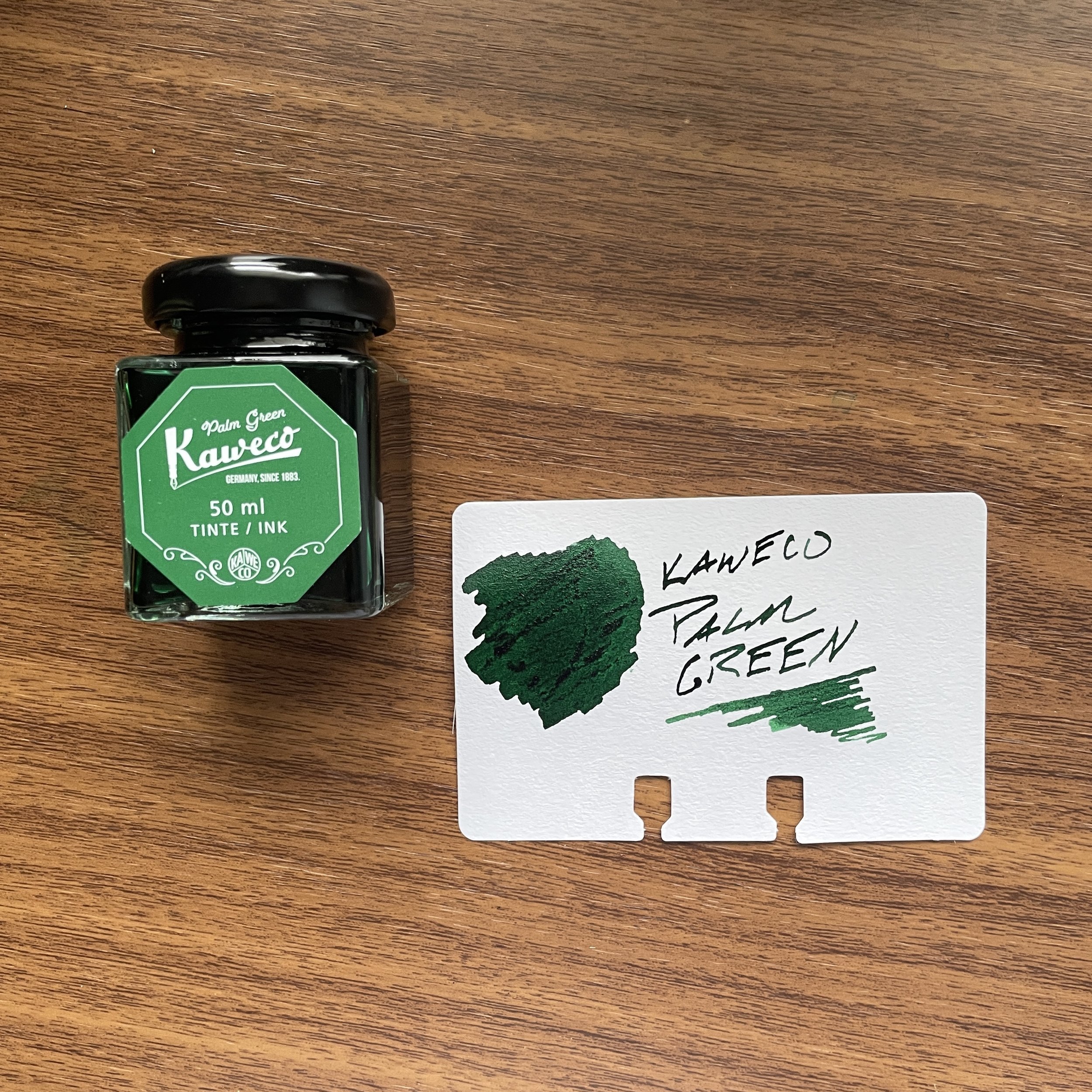
Green: Kaweco Palm Green. I consider Kaweco Palm Green to be of the most underrated inks of all time, not just in the Kaweco lineup. It’s a beautiful rich color that I use regularly even if it can take a bit of time to dry.

Red: Dominant Industry Romania Red. If you were going to have a blood-red vampire-themed ink, it would be this one. This bold, rich color flows well, dries quickly, and doesn't create nib crud. Vampire-themed inks cannot be “pink”, which seems to be a hot topic of conversation these days. Fight me ;)

Burgundy: Montblanc Burgundy Red. The hardest color for me to choose (since most of my favorite burgundy inks are limited editions). I finally went with standard Montblanc Burgundy Red. Though perhaps not as vibrant as some of Montblanc's special edition burgundies, it's a consistently good performer that's a favorite standby.

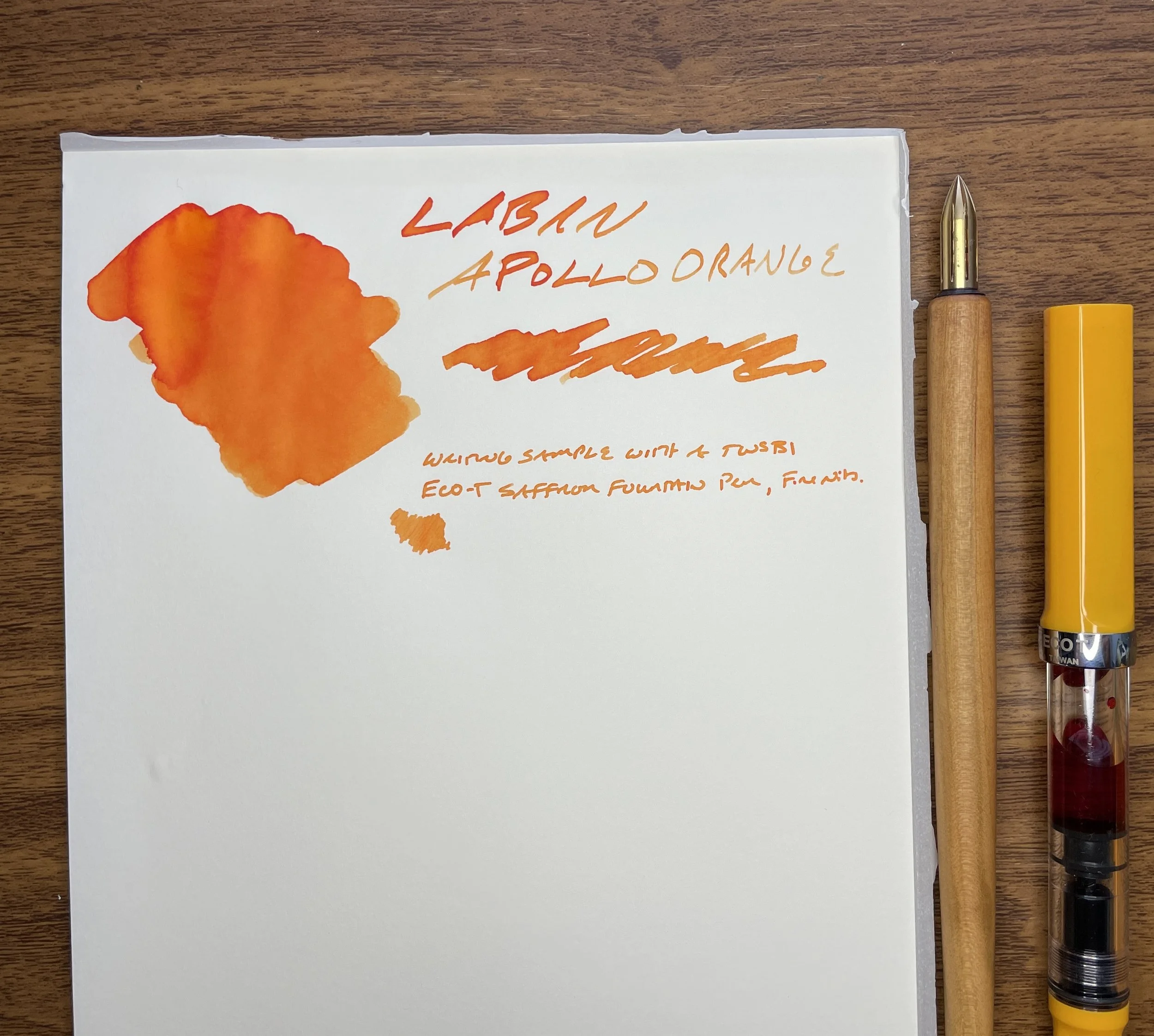
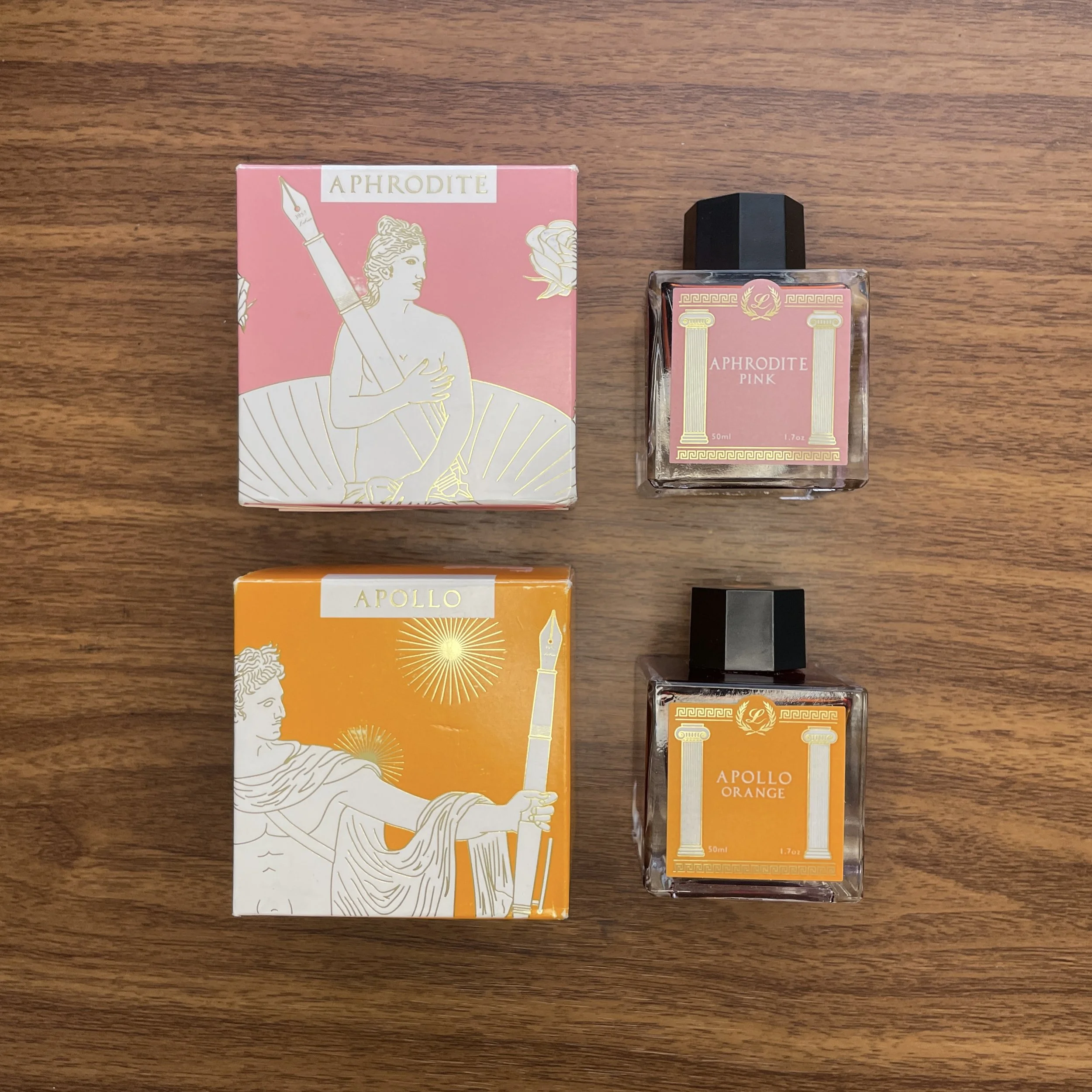
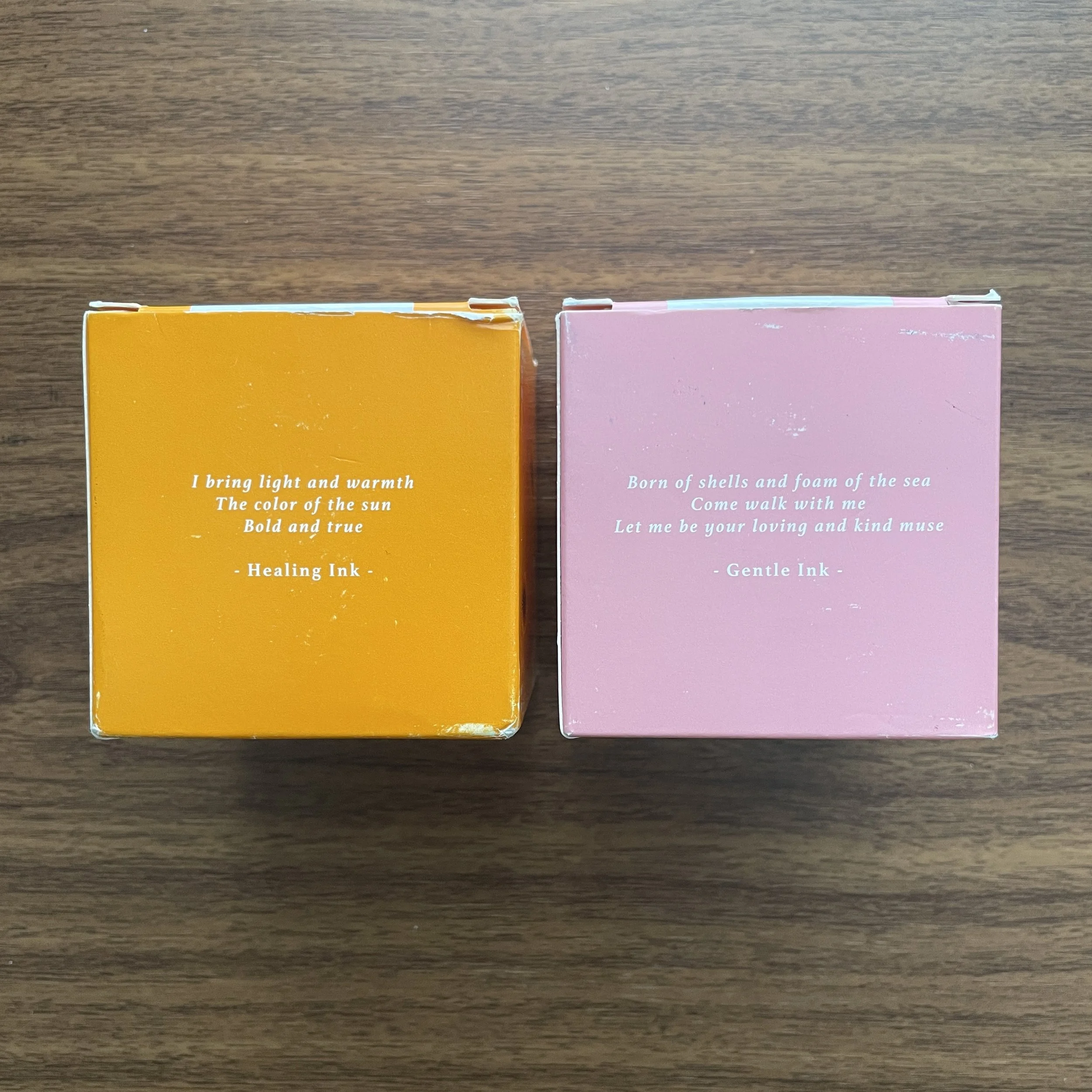
Orange: Laban Apollo Orange. This orange has been making its way through my orange and yellow TWSBI demonstrators for the past six months. Inspired by the Greek God Apollo, whose symbol traditionally is the sun, this is a “pure orange” ink with a slight tinge of red to help with the legibility.

Yellow: Anderillium American Goldfinch Yellow. The first yellow ink I've found that's truly legible, due to its gold/goldenrod hue, American Goldfinch Yellow can be used for actual writing in addition to highlighting and annotation.

Brown: Laban Demeter Brown. A dark brown, but not quite a brown-black. For my brown inks, I tend to enjoy the darker browns and sepias, because they take on a vintage look as they dry.

Waterman Tender Purple Fountain Pen Ink

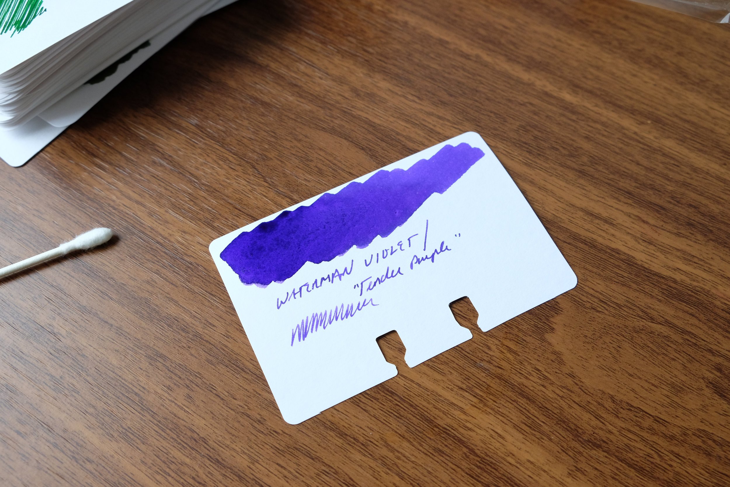
Purple: Waterman Violet. Not "Tender Purple" or whatever they're calling it these days. Violet. Be warned that of all the Waterman inks, this one has a tendency to stain, so be sure you don't mind your converter (or clear demonstrator) having a slight purple tint long-term. (Definitely do not use in light-colored celluloid pens.) That said, it’s one of the most vibrant purple inks out there, and when I want my writing to stand out, this is my choice.

Grey: Scribo Grigio. I've been on a massive grey ink kick over the past year, and I keep returning to Scribo Grigio. While some might argue with me on this point and call the ink more of a blue-black, I'm going with grey here and the blue tint is what makes it interesting.

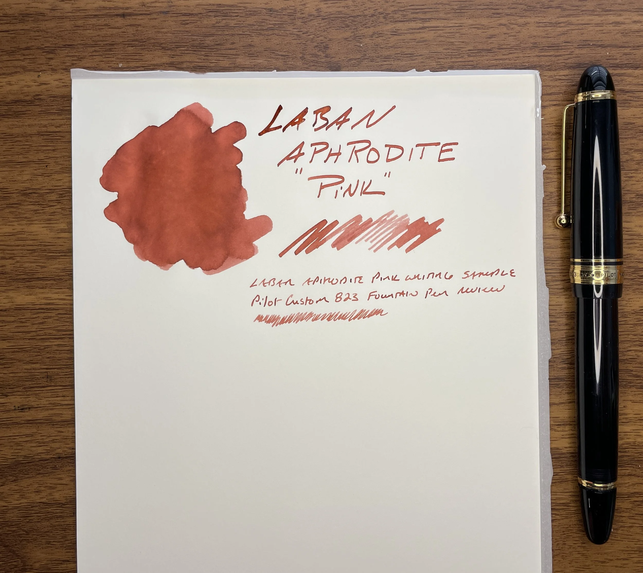
Pink: Laban Aphrodite Pink. This final color is extremely difficult, but at the end of the day I have to go with Aphrodite. Some would say this isn't a pink ink at all, but the criteria here dictate that I have to stick with an ink that I've actually used over the past year. In the pink category, this is the clear winner.

Some of the aforementioned inks we sell directly in the T.G.S. Curated Shop, where we are running a Memorial Day Weekend Promotion (10% Off) with the code “SUMMER23” at checkout. Otherwise I have linked to retailers who are friends of mine. This post does not contain paid advertising or affiliate links.

In Ink Reviews, Top 5 Tags Best Inks, Inks of Choice, Fountain Pen Inks
9 Comments

Reviews Revisited (2023): Pilot Iroshizuku Tsuki-Yo (Moonlight) and Yama-Budo (Crimson Glory Vine)

April 19, 2023

I’ve been feeling a touch overwhelmed lately, whether it’s the pressure of juggling my work schedule and family responsibilities, or just the sheer volume of stuff I have sitting around my office waiting to be listed and shipped or taken over to the warehouse. Sometimes when this happens, it’s comforting to go back to the basics and ignore the latest-and-greatest, a quick flashback a time when my collection/accumulation included just a handful of pens and five or so bottles of ink. (Hard to believe this was only ten years ago, right?!?) For my first couple of years in this hobby, the two “nicest” inks I owned were Pilot Iroshizuku Tsuki-Yo and Yama-Budo, both of which are still mainstays of my collection.

While I wouldn’t necessarily think of blue-black as having a direct correlation to “Moonlight”, for some reason the name works. The night sky just after dusk, perhaps?

Pilot Iroshizuku Tsuki-Yo

Why do these particular inks have such staying power? Part of it is nostalgia, for sure, but honestly they’re just good. Tsuki-Yo, to me, is a more interesting version of classic Waterman Blue-Black. The name of the ink translates as “Moonlight,” and while it can certainly pass as a standard blue-black ink - making it an excellent choice for the office - there’s just something about this color that causes it to stand out. Maybe it’s the slight red sheen, the hints of teal, or the vintage-style shading? The ink has never given me any problems in any pen or on any paper, and I’ve come close to using up an entire 50ml bottle. (Well, I’ve used about 2/3 of the bottle, and I expect I’ll finish it this year.)

I angled the swatch to get a shot of the slight red sheen.

While Iroshizuku Inks aren’t known as “super-sheeners,” you get the interesting visual effect without any smearing that’s so prevalent with other sheening inks.

Pilot Iroshizuku Yama-Budo

While Yama-Budo isn’t my favorite overall color (it’s an offbeat burgundy-purple-magenta hue with some gold sheen on certain papers), I have a soft spot for it because it was my first “adventurous” ink color. For such a bright ink, it’s also incredibly well-behaved, and while you always have to be cautious in using reds and purples in stain-prone pens such as clear demonstrators, this particular ink cleans out easier than most. Yama-Budo doesn’t get used nearly as much as Tsuki-Yo, but when I do ink it up, well, I kick myself for leaving it out of the regular rotation.

Gold? Green-Gold? Whatever it is, it only appears on certain types of paper. I see it most on Tomoe River and the Col-o-ring paper here.

Takeaways and Where to Buy

Fountain pen ink colors and ink brands can be driven by trends, and fall in and out of favor, but the colors in the Iroshizuku range stand up over time and regularly make their way through my own rotation. Pilot has done an excellent job of selecting a range of interesting, unique colors that can still serve as everyday writers, and they add to the lineup every year or so.

Tsuki-Yo takes on a different look in different nib styles. The top sample is a wet medium stub; the bottom is a medium architect from Mark Bacas. The Yama Budo writing sample is with the Lamy cursive calligraphy nib.

I’ve written a fair bit about Iroshizuku Inks over the years. If you’re curious about reading more, check out my prior reviews of Tsuki-Yo and Yama-Budo, as well as my series on exploring the Iroshizuku line: Part I (Kon-Peki, Shin-Ryoku, and Yama-Budo), and Part II (Asa-Gao, Murasaki Shikibu, and Aji-Sai). I’ve not yet made it through the entire line of Iroshizuku as intended, but now that I have access to all of the inks, well, let’s go!

As I recently announced, we are now able to offer you Pilot pens and inks directly, including the entire Iroshizuku lineup. We currently carry the 50ml bottles of ink, priced at $24. Over the past couple of years I’ve been performing some updates on the site, which includes pruning and updating older content that’s out of date, so you will likely see more “Reviews Revisited” posts in the coming months. It’s been a fun experience to see how my thoughts have changed over the years, and often how my thoughts and opinions haven’t changed much at all!

The Gentleman Stationer is an authorized retailer of all brands sold, including Pilot, and is currently supported solely by purchases from the T.G.S. Curated Shop and pledges via the T.G.S. Patreon Program. Many thanks for your support and patronage!

In Ink Reviews Tags Pilot Ink, Iroshizuku
Comment

Ink Review: Laban Greek Mythology Poseidon Green and Hera Dark Green

March 29, 2023

The Laban Greek Mythology Inks continue to impress me with their range of colors, and today I’ll look at the two excellent greens from the lineup (though one I would characterize as a bit more blue/teal). Either way, as someone who loves ink in both of these particular shades, both the Poseidon Green (Blue?) and Hera Dark Green have become standbys in my work pens.

Laban Poseidon Green (or Blue? or Teal?)

First up is “Poseidon Green,” which I view as more of a teal/turquoise blue, but whatever you might call this color, I love it. It’s actually the first ink from this series that I tried, and it has some wonderful shading properties in a nib that provides line variation, especially in those places where the ink pools on the paper. Laban nailed the color matching here. Poseidon (Roman equivalent: Neptune) is the ancient Greek god of the sea, and while this particular color may not necessarily evoke the ocean where I personally go to the beach, they’ve attempted to capture the blue of the Mediterranean islands.

Not a trident, but a fountain pen!

Laban Hera Dark Green

Hera Dark Green is more of your traditional dark green “workhorse ink”. Hera (Roman equivalent: Juno) is the ancient Greek goddess of marriage and “the home,” so I’m not sure I see the connection between the dark green color of this ink and Hera’s traditional affiliations, but it’s a lovely ink nonetheless. As with Poseidon, you’ll experience some shading, with dark teal and grey undertones. Both Poseidon and Hera are drier inks than some of the other Laban colors like Athena Grey, Artemis Navy Blue, and Demeter Brown. That’s not to say they hard-start or dry up in the pen, and I’ve never had that issue with either. It’s more that I’ve noticed they take very little time to dry, making them quite good for work. These are two of the better Laban inks for working on cheaper papers at the office.

Takeaways and Where to Buy

Laban continues to impress me with the Greek Mythology series. As I’ve mentioned before, it’s one of the few ink lines where I purchased a bottle of every color as quickly as I could, but again that says just as much about my personal fascination with mythology as it does about their excellent quality.

You can purchase the Laban Greek Mythology Inks directly from us in the T.G.S. Curated Shop, priced at $25 for a 50ml bottle. At this point, I’ve almost made my way through the entire lineup of the Laban Greek Mythology inks, and have reviewed Athena Grey and Artemis Navy Blue, Apollo Orange and Aphrodite Pink, and Ares Red. Some really interesting options remain, including Demeter Brown, Hermes Sky Blue, and Zeus Purple. Stay tuned as I round out this series of ten!

My Leonardo Momento Zero Maestro in Burkina Celluloid, alongside my Montblanc 146 UNICEF (with the small sapphire on top).

Bonus! The Return of Two Favorite Pens with New Nib Grinds

Back in September at the San Francisco Pen Show, I left a handful of pens with Gena at Custom Nib Studio for modification. Just before the Arkansas Pen Show, I received my pens in the mail, including two to which Gena had added their “Perspective” grind that I love so much. Both of these grinds are just as good as the original I had added to my Pelikan M800 Stone Garden and reviewed last year. You’ll notice that both pens I’ve used for today’s ink reviews feature Perspective nibs, which I highly recommend to those who are looking for some of the line variation of an Architect without the sharp edges. Plus, you get the ability to change line width from EF to Medium by adjusting your writing angle!

The Gentleman Stationer is supported entirely by purchases from the T.G.S. Curated Shop and pledges via the T.G.S. Patreon Program, and is an authorized retailer of all brands sold, including Laban.

In Ink Reviews Tags Laban Greek Mythology, Ink Review
Comment

Ink Review: Laban Greek Mythology Apollo Orange and Aphrodite Pink

March 4, 2023

In the interest of building out a library of ink reviews similar to the current T.G.S. Fountain Pen Archive, I’m going to keep plowing ahead with my write-ups of the Laban “Greek Mythology” Ink Series. This week’s inks up for review are Apollo Orange and Aphrodite Pink. Apollo Orange is a solid mandarin orange ink that will see a lot of use as an annotator. Aphrodite Pink is a truly unique shade that’s difficult to describe and even harder to compare to anything else, but I love the muted tone for everyday use.

Aphrodite “Pink” and Apollo Orange, side-by-side.

This isn’t the first review of inks in this series (see below for links to the prior reviews), so I won’t spend too much time rehashing a history of Laban, but the company is based in Taiwan and has been a longstanding fixture at pen shows. I was somewhat surprised to see Laban launch this line of Greek Mythology-themed inks last year, and was pleased at the obvious level of effort that went into putting together not just excellent ink but an aesthetically pleasing product, packaging and all.

Apollo Orange with my current ink swatching tools. More on that below.

Apollo Orange Should Please Most Fans of Orange Inks

Apollo Orange is named for the Greek God Apollo, God of phrophesy, music, and healing (Roman equivalent: Phoebus), and the traditional association of Apollo with the Sun makes this pairing particularly appropriate! I would describe Apollo Orange as a classic “mandarin orange” with red tones when the ink is wet. Unlike many orange inks, Apollo Orange isn’t a particularly dry writer, so I’ve not had any issues with hard starts or nib crud. I’ve also found the ink cleans out of pens fairly easily, which is always a pleasant surprise with oranges.

Apollo Orange is just different enough from the lighter Saffron TWSBI ECO-T fountain pen to make this pen and ink a perfect match.

Aphrodite Pink: The “Stunningly Weird” Ink From the Series, But Possibly the Best

Finally, this brings us to Aphrodite Pink, one of the most popular inks in the Laban Greek Mythology series and, in my opinion, probably the best simply because it’s so unusual. In fact, I would have to put Aphrodite Pink up there as one of my favorite discoveries over the past year, because there just aren’t that many “pink” inks in general, and certainly not many with this unique shade that falls well outside the typical “hot pink” or “electric pink” colors that companies try to release. Named for the Greek Goddess of love (Roman Equivalent: Venus), Aphrodite Pink is more of a dusty brick red with pink undertones than a true pink. At first, I thought it might be comparable to KWZ Brown Pink, but the latter has much more purple. At the end of the day it doesn’t matter - this ink simply makes for a great everyday writer that I’ve used fairly regularly over the past year, and it’s now in my Pilot Custom 823.

I love nontraditional, muted colors like this one. As with all of the Laban Greek Mythology inks that I’ve used, this one dries quickly and has no maintenance issues.

Takeaways, Where to Buy, and Reviews of the Rest of the Line

I’m currently five inks into my review of the Laban Greek Mythology Series, and I’ve not yet found one that I don’t enjoy. These inks all behave well, and I’ve personally experienced no issues with feathering, bleedthrough, staining, or slow dry times. You can check out my prior reviews of Ares Red, Artemis Navy Blue, and Athena Grey here. In fact, I enjoyed these inks so much that I purchased the entire line at last year’s Baltimore Pen Show for my personal collection, and recently brought them into our own shop. The T.G.S. Curated Shop stocks all colors with the exception of Aphrodite Pink (currently on backorder), and these Laban inks are priced at $25 per 50ml bottle. The packaging alone is a work of art, especially with the incorporation of fountain pens into the different depictions of the various gods and goddesses.

View fullsize Laban Greek Mythology Bottles
View fullsize Laban Greek Mythology Boxes

A Note on Swatching Inks and my “Organizational System”

Somebody recently asked me how I organize ink swatches (probably prompted by my Ink-o-Dex video), and what paper I use to photograph samples and organize my collection. The simple answer is that I really don’t have any sort of system. I’ve been doing this for a long time, and many different storage and sampling options have come and gone over the years.

Laban Aphrodite Pink on a Col-o-Ring Card. (Stamp courtesy of Angela at Inky Converters!)

Currently, I use a combination of Col-o-ring cards (stored in the repurposed Rol-o-dex), A5 planner paper, and a 68gsm Tomoe River notebook. Typically when I’m reviewing/archiving an ink I’ll use a q-tip and my Kakimori Brass Dip Pen to make a standard color sample on Col-o-Ring paper, which goes into the Col-o-dex. Blog posts nearly always feature ink swatches and writing samples on A5 sheets of Midori MD Cotton paper and 68gsm Tomoe River paper (while I can still get it), since these are the two papers I use the most. Lately, in addition to individual ink swatches, I’ve been creating comparison sheets so that I can easily view multiple colors from a single brand or line.

My ongoing ink comparison sheet for the Laban Greek Mythology Series

The Gentleman Stationer is supported entirely by purchases from the T.G.S. Curated Shop and pledges via the T.G.S. Patreon Program. The Gentleman Stationer is an authorized retailer of certain brands, including the Laban inks shown here. This post otherwise does not contain paid advertising or affiliate links.

In Ink Reviews Tags Laban, Laban Inks, Laban Greek Mythology, Ink Review
Comment

"Boring" Can Be Better: In Defense of Standard Stationery

March 1, 2023

Sometimes what’s fun from a hobby perspective isn’t always what’s best for everyday use. That multichromatic triple-shading ink with shimmer? Probably not the best choice for quick meeting notes or signing closing paperwork on your mortgage. That triple-broad double-eagle reversible stub architect nib? That’s gonna bleed through a legal pad. While most of us enjoy our crazy stationery, it can’t take us everywhere.

The most common questions I get, both here on the blog and in-person when I’m behind a table at a pen show, concern what pen/ink/paper I can use everyday, without worrying how it’s going to perform. I often recommend that those planning on using their pens for everyday writing keep at least a couple of “workhorses,” or pens designed to write, without regard to unique design, collectibility, etc. I feel so strongly about this that I’ve devoted an entire series of articles on the blog to this topic, which I’ve compiled into an archive that’s constantly being updated.

So-called “safe”- dare I say “boring” - inks don’t have to be ugly, especially if you like muted shades. It’s when you get into super-saturated colors and special properties when things get tricky.

But while pens get the most attention, more critical components of “everyday writing” are ink and paper. With fountain pens, I would say that ink is the key variable, since you often cannot control the paper you’re forced to use in a context such as the office. You therefore need to have a handful of “workhorse” inks in addition to your “workhorse” pens, that you can use knowing that they will likely perform decently on most paper options. Back in 2020, I even put together a sample pack of some of my favorite inks, including Waterman Blue, Sheaffer Skrip Red, and Lamy Black. While I may consider running that one back in the future, I’m not sure that recommending specific inks is all that helpful or necessary. For the most part, standard inks made by major pen company such as Waterman, Lamy, Sheaffer, Pilot, TWSBI, etc. will generally be “safe” to use in most pens and on most papers, and even boutique lines such as J. Herbin and Diamine - both made by ink companies that have existed for a very long time - are extremely reliable provided you stick to the water-based core lineup for your office writing, as opposed to inks with special properties such as shimmer that can be unpredictable on anything other than high-quality paper.

“Boring” is relative. I’d consider all three of the inks pictured here to be “safe” inks in the sense that they water-based inks from longstanding, well-regarded brands. The Herbin “Vert de Gris” is a new discovery that I spent all day yesterday using at the office.

Advantages and Considerations When Using So-Called “Boring” Inks

So why don’t quality, reliable inks get more attention? Honestly, the fountain pen internet and social media tends to be driven in large part by people who either don’t actually write with their pens everyday, or use their inks for art and journaling where practical considerations are less relevant. When those creating the content consider the inks “boring,” they don’t get promoted and fall by the wayside. But I’m here to tell you that sometimes “boring” has a lot to offer! Consider:

  • Ease of Cleaning. While some exceptions exist (pinks and purples in particular tend to be hard to clean no matter what), I value inks that flush out of pens quickly when you refill or change colors. Most of the brands I mentioned above take little to no effort to flush, and shouldn’t stain most materials, vintage or modern.

  • Expense. Looking for an ink that you’re going to use a lot? While ink isn’t the most expensive part of this hobby, if you write through several converters a week like I can when I’m really busy, you probably don’t want to be stocking up on ink at $50 per bottle. Most of the inks I consider workhorses are less than $20 for 30-50ml.

  • Permanence. People tend to treat “permanence” (more specifically, the lack thereof) as a negative rather than a positive when it comes to fountain pen ink, but I’ve come to believe it’s overrated. While it’s nice to have some water resistance, I can count on one hand the number of times I’ve spilled water or a drink on some notes, and completely lost what I had written. On the other hand, I’ve frequently spilled ink when filling pens, when a pen leaks during travel, or when I accidentally drag a shirtsleeve across some writing that’s not quite dry. If it’s permanent ink, it’s probably going to stain. On the other hand, a few weeks ago I spilled a sample vial of Iroshizuku Tsukushi onto the rug in my office. I ran the rug through the washing machine and the ink washed out completely on the first try. On the other hand, I spilled a bottle of permanent blue-black on some carpet several years back and had to recarpet the room. Personally, I’ll take the safe/impermanent/washable option for those inks I plan to use everyday, but I’m also a klutz.

Oops.

Now here’s the part where I sort of contradict myself: When I first entered this hobby, it used to be a reliable rule-of-thumb that if you were looking for a “safe” ink (i.e., to use in a finicky, valuable, or vintage pen) any ink made by a “pen company” was generally suitable. Today, I still get e-mails from people asking whether “X” shimmer ink is safe for vintage pens, since it’s made by “X” pen company. Having seen the rapidly expanding market for fountain pen ink, including inks that shimmer, sheen, and multi-shade, pen companies are expanding into these more specialized offerings. So while you can take the “pen company manufacturer rule” into account, it’s no longer something you can solely rely upon, and you have to do some homework. I generally advise people that if you want to purchase a particular ink for use everyday, and you want the ink to be versatile enough to use in as many different pens, on as many different papers as possible, it’s wise to avoid inks with special properties.

Come Visit Us At an upcoming pen show!

As I mentioned above, I’m getting ready to visit this year’s Baltimore Washington International Pen Show, as well as the Arkansas Pen Show the following week, and at both shows I’ll be conducting a free workshop tentatively titled “Stationery for Daily Use with the Gentleman Stationer,” in which I plan to discuss pens, inks, paper, and notebook systems appropriate for managing your daily life and work. The class will be similar to the “Everyday Writers: Choosing the Best Pens for Home and Office” seminar that I held at the last Baltimore Show I attended as a vendor, back in 2020.

We will also plan to bring a curated selection of pens, inks, and notebooks with us to both shows, so you’ll have the opportunity to test out many of the goods in our shop in person. We hope to see you there!

The Gentleman Stationer is supported entirely by purchases from the T.G.S. Curated Shop and pledges via the T.G.S. Patreon Program, and is an authorized retailer of all brands sold, including certain ink brands mentioned in this article.

In Editorial, Ink Reviews, Workhorse Pens Series Tags Workhorse Inks, Fountain Pen Inks, Inks, Editorial
2 Comments
← Newer Posts Older Posts →
Store Hours and Location
Visit the T.G.S. Curated SHOP
*New* Updated "Best Pens" Guide (2025)
T.G.S. 2025 Holiday Gift Guide
TGS x Roterfaden TGS_25
Hierarchies of Fountain Pen Friendly Paper

Join Our Patreon!
Subscribe to the TGS E-mail List

Featured Posts

Featured
Cover On the Paper Trail Intro Clip.jpeg
Dec 3, 2025
Introducing "On the Paper Trail," a New Podcast/Video Collaboration with Lisa Vanness of Vanness Pens!
Dec 3, 2025
Dec 3, 2025
Iro-Utsushi-Fine-Dip-Pens.jpeg
Oct 1, 2025
The Pilot Iro-Utsushi Dip Pen (and in General, Simple vs. Fancy Dip Pens)
Oct 1, 2025
Oct 1, 2025
Levenger-Annotation-Pad.jpeg
Sep 20, 2025
Five Boutique Paper Brands I'm Watching Closely and Why
Sep 20, 2025
Sep 20, 2025
The Gentleman Stationer RSS

© Digital Divide Media, LLC, 2014-present.

All content is the exclusive property of Digital Divide Media, LLC, d/b/a The Gentleman Stationer, including “The Gentleman Stationer” website and trademark, and should not be reproduced without express written permission.  All rights reserved.

All content containing paid advertising, affiliate links, or sponsored content will be plainly disclosed by a disclaimer when/if featured.

Contact Information

Store Shipping Policy and Return Policy

Privacy Policy

Cookie Policy

Terms and Conditions

Powered by Squarespace